Want to build production-ready CSS layouts, animations and UI from scratch?
You just browsed 30 text animations. Learn the Flexbox, Grid and animation thinking behind them, so the next component starts in your head, not in a copy-paste.
The 'AI feature' shimmer, done properly: a gradient badge whose four-point sparkles pop in sequence around the label on hover (clip-path stars, no images), and a display word wearing an always-on twinkle field with a hover-accelerated glitter sweep.
Zero-JS scrubbing with CSS scroll-driven animations: a pinned manifesto whose words ink in as you read down (the karaoke effect), and a headline whose letters fly home from scattered poses — both wired to a named view-timeline, no observers, no scroll listeners.
The pinned-hero exit, scrubbed by scroll alone: a full-bleed photographic hero whose title blurs, lifts and fades exactly in step with the panel sliding over it, and a chapter sequence where three pinned lines crossfade through ranges of one shared timeline.
Typography that rides geometry: a sentence surfing a rolling hill whose position is scrubbed by scroll (SVG textPath + 10 lines of JS), and a zero-JS orbiting badge — circular text on a path, spun forever by one CSS rotation.
Depth from speed difference, twice over: a scroll-timeline version where a giant outlined word, a photo card and the headline all scrub different distances, and the classic perspective/translateZ trick that parallaxes in every browser shipped this decade.
The definitive single-line typewriter: a ch-width animation snapped by steps() so exactly one character appears per tick, with a blinking caret — shown three ways: a terminal prompt, a serif marketing hero, and an infinite type-and-delete loop.
Newsletter
Enjoying these demos? Get new ones by email.
A short email when a new collection ships. Unsubscribe any time.
Two load-time entrances for landing-page titles: an editorial word-by-word rise out of masked line boxes, and a cinematic blur-to-focus settle where the headline sharpens as its letter-spacing tightens.
Per-letter choreography for luxury brand intros: a masked serif cascade with a gold rule that draws itself, and a center-out spring assemble powered by the modern linear() easing function.
Two takes on the gradient-clipped headline: an oversized aurora that drifts through the glyphs on background-position, and a hue engine that animates a registered @property angle straight through oklch() for a perfectly even color wave.
The agency-site classic: multi-line headlines where each line climbs out of an invisible overflow:hidden mask — shown as a warm editorial three-liner and a brutalist skew-rise where lines shear upright as they land.
A continuous sine wave rolling through letters two ways: a soft ocean bob for friendly onboarding headers, and a candy-colored jelly squash where each letter compresses as it lands.
Text decoding out of noise, twice: a 14-line JS scrambler that locks characters left-to-right out of a glyph storm, and a zero-JS slot-machine build where every letter rides a stepped reel of decoy glyphs into place.
Real 3D typography: a split-flap departures board whose tiles slam upright one by one on load, and an endlessly turning four-sided word prism for slide-change moments — both driven only by perspective, rotateX and transform-style:preserve-3d.
The two production-grade underline systems: a directional scaleX rule that enters left and exits right on a real glass navbar, and the single-property background-size gradient underline that survives multi-line wrapping — plus a marker-highlight modifier.
Newsletter
Enjoying these demos? Get new ones by email.
A short email when a new collection ships. Unsubscribe any time.
Broadcast-corruption typography for gaming and cyber brands: a data-text double-layer glitch with clip-path slice storms and RGB fringes, and a scanline tear where a sweep bar drags the word into stepped chromatic shivers.
Variable-font choreography with Recursive: a headline whose letters swell toward the cursor like type under a magnet (proximity-mapped 'wght'), and a zero-JS menu where each row transitions weight, slant and the CASL casual axis on hover.
Hollow display type that floods with ink on hover: a two-layer clip-path sweep where a gradient clone wipes across outlined caps, and the single-element trick — one background-size declaration filling stroked text with zero extra markup.
Hero type that leans with the cursor: a JS pointer-tracked tilt with true depth layers (a shadow plane and a floating chip at different translateZ), and a no-JS version steered by nine invisible hover zones and :has().
Letters as loose particles: a word that idles as blurred, scattered debris and springs into crisp alignment on hover (with real linear() spring physics), and its inverse — a tidy word that detonates apart under the cursor.
The infinite ticker rebuilt correctly: a duplicated track translated -50% for a mathematically seamless loop, with masked fade edges and hover-pause — as a SaaS metrics strip and as a two-row fashion band counter-scrolling outlined against filled type.
Believable neon, not just text-shadow spam: a script cocktail sign on brick where one letter buzzes with irregular dropout while the rest of the tube hums, and a power-on sequence where a two-tone diner sign ignites word by word and settles into a steady glow.
Letters as vessels: an SVG-masked word where real vector waves slosh horizontally while the waterline rises through the glyphs, and a no-SVG fallback that fakes the same physics with layered gradients and a repeating crest — both loop fill → hold → drain.
Newsletter
Enjoying these demos? Get new ones by email.
A short email when a new collection ships. Unsubscribe any time.
Fake 3D that fools everyone: a synthwave arcade logo whose stacked text-shadow extrusion stretches and squashes as the word floats over a perspective grid, and a trigonometry build where cos()/sin() aim the extrusion at a light that orbits the text.
Self-writing typography via the dash trick: a script word that hand-draws itself then floods with ink, and a technical neon tracer where a lit dash segment chases endlessly around the letterforms with a glow filter.
Precious-metal typography: engraved gold serif caps with a light streak that passes, pauses, then passes again — like a display case being walked past — and a platinum fintech lockup whose sheen answers only to hover, with embossed edge shadows selling the metal.
Light as an interface: a cursor-held torch whose radial mask uncovers a hidden message (radius eased open by a registered @property), and a self-panning beam that sweeps a headline forever with zero JavaScript — both keep a faint base layer so the copy is never truly invisible.
Spectral celebration without the clown factor: a per-letter hue ripple where one filter keyframe cascades a rainbow along the word (each letter phase-shifted), and a conic prism whose full spectrum rotates inside bold glyphs via one animated @property angle.
Typography that exhales: a checkbox-driven toggle where letters blur, drift on their own vectors and vanish like smoke (then reform on untoggle), and an SVG-filter loop where feTurbulence displacement genuinely shreds the word into vapor before it recondenses.
Trading-card foil for the web: a tiltable membership card whose holo lettering re-angles its iridescence to the pointer (gradient position + card rotation from two custom properties), and an ambient oil-slick wordmark cycling pastel interference colors with a passing reflection — no JS.
The rotating value-prop, both flavors: a masked vertical wheel that steps through four words with hold-and-snap pacing (fifth item duplicates the first for a seamless wrap), and a true 3D drum where words turn on a cylinder under perspective.
FAQ
Frequently asked questions
What is a CSS text animation and what is the canonical recipe?
A CSS text animation moves, transforms, reveals, or stylises text using CSS transitions, @keyframes, or a small JavaScript snippet — it's the dominant pattern for hero headlines, landing-page intros, brand reveals, kinetic typography, and scroll-driven storytelling. There is no single canonical recipe because text animation is a family of techniques, but the most-referenced starter pattern is the animated gradient text: background: linear-gradient(90deg, color1, color2, color3); background-size: 200% auto; background-clip: text; -webkit-background-clip: text; color: transparent; combined with @keyframes animating background-position: 0% → 200%. The text becomes a window into a sliding gradient, producing the "animated rainbow text" effect every modern SaaS hero uses (Stripe, Vercel, Linear, Anthropic). Modern variant: use @property --angle with angle syntax to animate a conic-gradient rotation smoothly — without @property registration the gradient angle jumps in discrete steps because the browser can't interpolate untyped custom properties. Other foundational recipes covered in this collection: steps() + ch typewriter, clip-path reveal mask, per-character span stagger with --i CSS variable, text-shadow layered glow (neon), filter: blur() reveal, transform: rotateY() 3D flip, variable-font weight morph on hover, animation-timeline: scroll() + view-timeline() for scroll-driven text, SVG <textPath> for text along a curve, and multi-layer scroll parallax. Each topic ships 2–3 side-by-side variants using scoped .cat-NN class names so you can drop multiple onto the same page without naming collisions.
Which text animation should I pick for my use case?
Decision rule by intent. Hero headline / above-the-fold: the Gradient Color Wave topic is the modern-SaaS default — Stripe, Vercel, Linear, OpenAI, Anthropic, Notion all ship a variation. Neon Sign Flicker for gaming, esports, cyberpunk, Web3 brands. Holographic Foil Reflection or 3D Extrude Shadow for premium product launches. Landing page subhead / value prop: Staggered Letter Reveal is the highest-converting pattern in Optimizely / VWO data — each line fades up with a 100ms stagger. Split Text Reveal (overflow-hidden) for editorial fashion / luxury. Code demo / docs / IDE replica: Pure CSS Typewriter for terminal feel; Text Unscramble on Load for hacking / security pitch decks. Brand / portfolio: Wavy Text for playful brands, Perspective Text Tilt on Mousemove for architecture / design studios. Scroll storytelling / long-read landing pages: Scroll-Driven Reveal Timeline, Sticky Scroll Opacity Fade, Text Path Curve Scroll, and Multi-Layer Parallax are all built for case studies, manifestos, product launches — pick the one whose motion vector matches your narrative. Loading / progress / waiting states: Metallic Shimmer is the Facebook / LinkedIn skeleton-loader pattern; Text Unscramble for "loading" / "decoding" / "processing" cues. Marketing CTA / button label: Hover Glitch for attention-grabbing limited-time offers; Variable Font Weight on Hover, Text Fill on Hover, or Text Hover Underline Stretch for emphasis on key nav links. Delight micro-interactions: Sparkle Particle Highlight and Hover Scatter Gather Letters for portfolio nav links + creative agency hovers. Announcement bars / news tickers: Marquee Horizontal Scroll for continuous seamless text scroll. Rotating value props: Rotating Text Wheel Vertical for "We build X, we build Y, we build Z" hero patterns (Framer / Webflow / Linear all use this). Pure HTML/CSS sites (no JS allowed): pick from demos with the Pure CSS tag — most demos in this collection are zero-JavaScript. Decorative without distraction: Split Text Reveal and Metallic Shimmer are the subtlest — they catch the eye without breaking reading flow.
Pure CSS vs JavaScript text animation — which should I use?
Pure CSS works for: any animation where the text content is fixed at build time and the effect operates on the whole string or on statically-authored per-letter spans — gradient wave, glitch, neon flicker, clip reveal, split-text reveal, wave, wavy keyframes, staggered letter reveal, 3D flip, stroke draw, liquid fill, blur reveal, perspective rotation, text-shadow pulse, holographic foil, metallic shimmer, marquee, rotating text wheel, and every hover-triggered pattern in this collection (hover underline stretch, hover glitch, variable-font weight morph, text fill on hover, hover scatter-gather, sparkle particle highlight). Most demos in this collection achieve their effect without any JavaScript. JavaScript is required when: the text content changes at runtime (user input, fetched content, randomized strings — text unscramble on load, decryption effects), per-character animation depends on each character's index being injected as a CSS variable at runtime, the animation responds to precise mouse coordinates (perspective tilt on mousemove), or the animation needs scroll-position tracking on browsers that lack animation-timeline support. Modern alternative (Chrome 115+, Safari 26+, Firefox 134+): CSS scroll-driven animations via animation-timeline: scroll() and view-timeline() let you do scroll-triggered text animations in pure CSS — the Scroll-Driven Reveal Timeline, Sticky Scroll Opacity Fade, Text Path Curve Scroll, and Multi-Layer Parallax topics all use these APIs behind @supports gates so unsupported browsers still see the finished readable text. Choose based on whether your text is fixed at build time (CSS) or generated at runtime (JS), and whether you need per-character runtime control (JS) or whole-string / statically-split control (CSS works).
How do CSS text animations compare to Anime.js, GSAP SplitText, Framer Motion, Splitting.js, and Lottie?
Anime.js (~17KB minified, ~80K weekly downloads): lightweight general-purpose animation engine, supports text animations via per-character DOM split + property tweens. GSAP (~23KB core, free) + SplitText plugin (~5KB, paid Club GreenSock): the industry standard for character/word/line text animation — handles edge cases (RTL, ligatures, emoji, line-break-on-resize) better than any other library. Used by Awwwards-winning sites. Framer Motion (~60KB minified, ~5M weekly downloads): React-specific, declarative API, supports text animations via motion.span per character with variants. Splitting.js (~3KB, ~50K weekly downloads): just splits text into spans with --char-index + --word-index CSS variables — pairs perfectly with pure-CSS animations from this collection. Lottie (~250KB + Bodymovin JSON): not really comparable — Lottie ships pre-rendered After Effects animations, not CSS. Typed.js / TypeIt.js / react-typewriter-effect: typewriter-specific (covered in our typewriter collection). What you gain by using a library: well-tested edge cases, dynamic text support, fluent API, easier React/Vue integration. What you LOSE: 5-60KB of JavaScript per page, an external dependency to update + audit for CVEs, slower First Contentful Paint and Largest Contentful Paint (the library has to download + parse + execute before any text animates), and (for GSAP SplitText) a $99/yr Club GreenSock license for commercial use. What this collection gives you: the same effect in 30-60 lines of CSS that ship inline with your HTML — zero bundle cost, zero npm dependency, zero CVE surface, faster FCP/LCP. For 90% of marketing use cases, the pure-CSS approach wins on every Core Web Vitals dimension (CLS, LCP, FCP, INP).
Are these text animations accessible? What about screen readers, motion sensitivity, WCAG 2.2, EU EAA, Section 508?
Four accessibility concerns matter for text animations. 1. Motion sensitivity: approximately 35% of adults have some form of motion sensitivity — vestibular disorders, migraine triggers, ADHD visual-processing differences, PTSD-related photosensitivity. Continuous, looping, or fast text animations can trigger nausea, dizziness, or headache. Fix: every demo in this collection wraps its @keyframes in @media (prefers-reduced-motion: reduce) { animation: none; } so users with that OS setting see the final static text instantly, no animation. WCAG 2.2 Success Criterion 2.3.3 (Animation from Interactions) explicitly requires this. 2. Screen readers: VoiceOver, NVDA, JAWS, and Narrator may either announce each character as it appears (annoying during typewriter / scramble / morph) or announce the empty element + final text (correct). Default behavior varies by AT. Fix: for typewriter / scramble / decryption (#01, #16, #18, #21), set aria-live='polite' on the container so the final text is announced once after the animation completes, NOT per-character. For decorative animations (#02 gradient, #04 neon, #08 shimmer), use aria-hidden='true' on a presentational variant and put the readable text in a separate span. 3. Cumulative Layout Shift (CLS): text animations that change box dimensions (typewriter expanding from 0ch to Nch, split-text duplicating elements, morphing text changing string length) can cause page reflow. Fix: reserve final dimensions with explicit width / min-width in ch units before the animation starts. 4. Color contrast: glitch, neon, gradient, holographic, and shimmer effects can drop contrast ratio below WCAG AA's 4.5:1 threshold for normal text or 3:1 for large text — verify with the WebAIM Contrast Checker, axe DevTools, Lighthouse, or WAVE. Regulatory frameworks: EU EAA (June 2025 enforcement), US Section 508, Canada ACA, UK Equality Act 2010, Australian DDA all require WCAG 2.2 AA compliance for public-facing digital products. Lawsuits under each have specifically cited animated text that didn't honour prefers-reduced-motion or that broke contrast.
How do I prevent Cumulative Layout Shift (CLS) with text animations?
CLS is one of three Core Web Vitals — Google measures it on every Lighthouse / PageSpeed Insights audit and uses it as a ranking signal. Text animations are a notorious cause of CLS spikes. Common causes: (1) Typewriter expanding width: 0 → 22ch shifts every element below it once per step. (2) Split-text JS that calls String.prototype.split('') and injects 22 span elements rewrites the DOM after first paint — every neighbouring element repositions. (3) Variable-font morphing changes glyph width as the weight axis animates from 100 → 900 — the text's bounding box width changes mid-animation. (4) Web-font swap (FOUT — Flash of Unstyled Text) before the variable font loads causes layout to recompute. Fixes: (1) Reserve final character width with width: 22ch or min-width: 22ch on the parent before any animation starts. (2) Pre-render the final text invisibly (visibility: hidden) as a sibling so the layout reserves the box, then animate a positioned overlay. (3) Use font-variation-settings on a monospace variable font (JetBrains Mono Variable, Inter Variable, Geist Variable) where glyph width is constant across weights. (4) Use font-display: optional or preload variable fonts with <link rel='preload' as='font' type='font/woff2' crossorigin>. (5) For per-character animation, render all span elements server-side or at build time, not in useEffect. Tools to measure: Chrome DevTools Performance Insights (Layout Shift detail), Lighthouse, PageSpeed Insights, Web Vitals Chrome extension, Core Web Vitals report in Google Search Console. Every demo in this collection is designed to avoid CLS by default — explicit comment markers in each demo's CSS flag the reserved-box lines.
Tailwind / shadcn / MUI / Chakra / Mantine / Ant Design / HeadlessUI text animation — how do these compare?
None of Tailwind UI (paid, ~$300/yr/dev), shadcn/ui, Material UI / MUI, Chakra UI, Ant Design, Mantine, HeadlessUI, or Radix UI ship first-class text animation components — text animation is one of the few UI patterns these libraries deliberately leave to userland because it's too brand-specific. The community pattern is: (a) the pure-CSS recipes in this collection, (b) Splitting.js for character/word split + custom CSS, (c) Framer Motion (React only) for per-character variants, (d) GSAP SplitText for production-grade edge-case handling. Tailwind v3 / v4: you can compose every effect in this collection using arbitrary-value utilities — e.g. gradient text: bg-gradient-to-r from-pink-500 via-violet-500 to-cyan-500 bg-[length:200%_auto] bg-clip-text text-transparent animate-[gradient_3s_linear_infinite] — but you still need a custom @keyframes gradient in your stylesheet because Tailwind doesn't ship background-position animation out of the box. Our CSS to Tailwind converter handles the conversion automatically. shadcn/ui (React + Radix Primitives): does not ship text animation; the community recommends Magic UI or Aceternity UI for per-character motion. Magic UI: bundles ~30 React-only animated text components — solid quality but ties you to React + Framer Motion. Aceternity UI: similar, also React + Framer. This collection gives you the same effects framework-agnostic (drop into any React, Vue, Svelte, Astro, Next.js, plain HTML), zero JavaScript for 16/25 demos, and no paid licenses.
What's @property, animation-timeline, and view-timeline — and how do they unlock modern text animation?
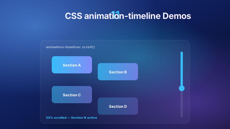
Three modern CSS APIs unlocked text animation patterns that previously required JavaScript. 1. @property (Chrome 85+, Safari 16.4+, Firefox 128+): lets you register a custom property with a typed syntax. Without it, --angle: 0deg → 360deg animation is impossible because the browser doesn't know --angle is an angle — it treats it as a string and jumps to the final value with no interpolation. With @property --angle { syntax: '<angle>'; inherits: false; initial-value: 0deg; }, you can animate conic-gradient(from var(--angle), ...) smoothly. This is what makes Demo #02's modern gradient sweep and Demo #20's holographic shimmer possible without JavaScript. 2. animation-timeline: scroll() (Chrome 115+, Safari 26+, Firefox 134+): drives an animation from scroll position instead of time. Demo #25 (Kinetic Typography) uses this to animate text in sync with scroll progress — no IntersectionObserver, no requestAnimationFrame, no JavaScript at all. Falls back gracefully via @supports (animation-timeline: scroll()). 3. view-timeline() (Chrome 115+, Safari 26+): like scroll() but scoped to when a specific element enters / exits the viewport — perfect for "text reveals when this section comes into view" without IntersectionObserver. Why this matters for SEO / Performance: scroll-driven text animations in pure CSS reduce Total Blocking Time (Lighthouse) and Interaction to Next Paint (INP) Core Web Vitals score because there's no JS executing during scroll. Demos #02, #20, and #25 use these modern APIs.
Why does my text animation break in Safari, Firefox, or older browsers?
Common cross-browser traps. 1. background-clip: text Safari prefix: Safari requires both -webkit-background-clip: text AND background-clip: text on the same element — without the -webkit- prefix the gradient text doesn't render at all in Safari < 26. Every demo using gradient text in this collection ships both. 2. @property registration silent failures: Firefox < 128 ignores @property declarations — the animation falls back to a step-change. Workaround: provide a fallback @keyframes using direct values, then progressively enhance with the @property variant inside @supports (background: linear-gradient(in oklch, red, blue)) (a feature gate that correlates with @property support). 3. animation-timeline in Firefox / Safari < 26: not universally implemented yet. Always wrap in @supports (animation-timeline: scroll()) and provide an IntersectionObserver fallback — Demo #25 ships both side-by-side. 4. steps() + animation-fill-mode: forwards in Safari < 17: drops the final keyframe state. Fix: use animation-fill-mode: both instead. 5. Variable-font axis animation: requires the variable font to be fully loaded before animation starts. Fix: font-display: block on the @font-face rule, or preload with <link rel='preload'>. 6. filter: blur() performance on Firefox: hardware acceleration support varies — pair with will-change: filter and a containing layer to force compositor promotion. 7. Per-character span layout on resize: when text wraps mid-character-span the animation breaks. Use display: inline-block on each span and white-space: pre on the parent. 8. Emoji / RTL / ligatures with split-text: String.prototype.split('') splits surrogate pairs incorrectly. Use [...string] (spread iterator) or Intl.Segmenter for grapheme-cluster splitting.
How do scroll-driven text animations work in modern CSS — and how do I fall back gracefully?
Scroll-driven text animation is any effect where the text's animation progress is tied to scroll position instead of time. Historically this required JavaScript — IntersectionObserver + window.addEventListener('scroll', ...) + requestAnimationFrame throttling — which cost measurable INP (Interaction to Next Paint) and Total Blocking Time. Modern CSS ships two purpose-built APIs that eliminate that JavaScript entirely. 1. animation-timeline: scroll() (Chrome 115+, Safari 26+, Firefox 134+): binds a @keyframes animation to the nearest scroll container's scroll progress (0 → 1). Pattern: @keyframes text-reveal { from { opacity: 0; transform: translateY(30px); } to { opacity: 1; transform: none; } } .headline { animation: text-reveal both; animation-timeline: scroll(); }. The text animates as the user scrolls the page — no JS. 2. view-timeline() (Chrome 115+, Safari 26+): scopes the animation to when a specific element enters / exits the viewport instead of the whole page. Pattern: .section { view-timeline-name: --section; view-timeline-axis: block; } .headline { animation-timeline: --section; animation-range: entry 20% cover 60%; }. Perfect for "text fades in when this card scrolls into view." This collection ships four topics using these APIs: Scroll-Driven Reveal Timeline, Sticky Scroll Opacity Fade, Text Path Curve Scroll, and Multi-Layer Parallax Scroll. Each is wrapped in @supports (animation-timeline: view()) { ... } so unsupported browsers (older Firefox, older Safari) simply see the finished readable text with normal scrolling — the animation is treated as pure progressive enhancement. Why this matters for SEO / Core Web Vitals: pure-CSS scroll-driven animations don't run any JavaScript, so they contribute zero to Total Blocking Time, don't push Interaction to Next Paint (INP), don't block the main thread, and don't compete for CPU with your React / Vue / Svelte hydration. Google's PageSpeed Insights and Lighthouse both measure this, and the difference between a JS-driven scroll effect and a CSS-driven one is often 200-400ms of TBT on a typical marketing page. Debugging tip: Chrome DevTools (2026+) has a dedicated scroll-timeline panel under the Elements > Animations tab that lets you scrub through scroll positions to see each keyframe.
What are hover-triggered CSS text animations — and when should I pick them over autoplay animations?
Hover-triggered animations only run when the user's pointer enters the element (or the element gains keyboard focus via Tab). Autoplay animations run continuously or on page load regardless of user intent. The tradeoff: hover-triggered animations are respectful of user attention, honour prefers-reduced-motion more naturally, and don't compete with page content for attention — but they invisible to touch-only users unless you pair them with an equivalent focus / active state. This collection ships seven hover-triggered topics for surfaces where the user has already indicated interest: Text Hover Underline Stretch (nav links, article footer links — the underline extends beyond the text width on hover), Text Hover Glitch Effect (attention-grabbing CTAs — RGB chromatic aberration on hover), Variable Font Weight Animation on Hover (weight goes from 400 → 900 on hover — requires a variable font like Inter Variable, Geist Variable, or JetBrains Mono Variable), Text Fill on Hover Left-to-Right (background-clip: text + a sliding gradient that reveals color from left to right on hover), Perspective Text Tilt on Mousemove (uses CSS custom properties + JS-driven --mouse-x / --mouse-y to tilt the text toward the cursor), Text Hover Scatter Gather Letters (per-letter spans with staggered transition-delay — letters scatter outward on hover, gather back on unhover), and Text Sparkle Particle Highlight (SVG particle overlay animated in on hover). Accessibility rules for hover animations: (1) always pair :hover with :focus-visible so keyboard users get the same effect, (2) ensure the animation's motion doesn't exceed the flash / vestibular thresholds (avoid animations larger than 25% of the viewport, avoid fast scale changes 3x/second or faster), (3) wrap the @keyframes in @media (prefers-reduced-motion: reduce) { ... } to disable for motion-sensitive users, (4) don't put critical information behind a hover-only reveal (WCAG 2.2 SC 1.4.13 — Content on Hover or Focus). Touch users won't trigger these — plan for that. When to pick hover over autoplay: hover for micro-interactions and delight (portfolio nav, article link footers, agency site interactivity); autoplay for above-the-fold impact (hero gradient text, brand reveals, product launches). Never pick hover for anything the user needs to see.
Are these CSS text animations free, accessible, and how do I attribute them?
Yes — all 25 text animations in this collection are MIT licensed and free for personal and commercial use, including client projects, SaaS products, mobile apps, e-commerce sites, design systems, and open-source libraries. The MIT license requires only that you keep the copyright notice if you redistribute the source code as-is; in shipped production HTML / CSS that you've adapted, no visible attribution is needed. If you ship one as part of an open-source UI library, component kit, or course material, a one-line credit pointing to https://codefronts.com/motion/css-text-animations/ is appreciated but not legally required. Accessibility: every demo honours prefers-reduced-motion: reduce (animations fall back to instantly-displayed final text), uses semantic HTML, and is designed to work with aria-live regions for screen readers — see the WCAG / EU EAA FAQ above for the full a11y pattern. Verify your specific brand colors and contrast ratios with axe DevTools, Lighthouse, WAVE by WebAIM, or the WebAIM Contrast Checker before shipping to EU EAA / US Section 508 / Canada ACA / UK Equality Act / Australian DDA audits — the demos are AA-compliant by default but final color choices and layout context matter. Related collections: CSS Typewriter Effect (14 demos), CSS Fade In Animation (16 demos), CSS Gradient Text (20 demos), CSS Hover Effects. Related tools: CSS to Tailwind converter, CSS Text Shadow generator.