33 CSS Card Hover Effects
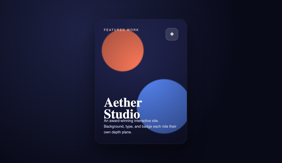
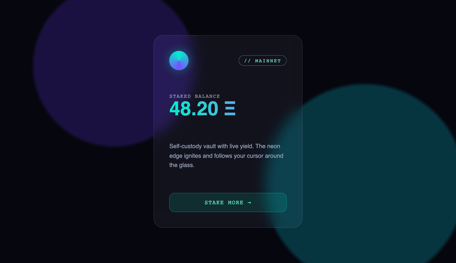
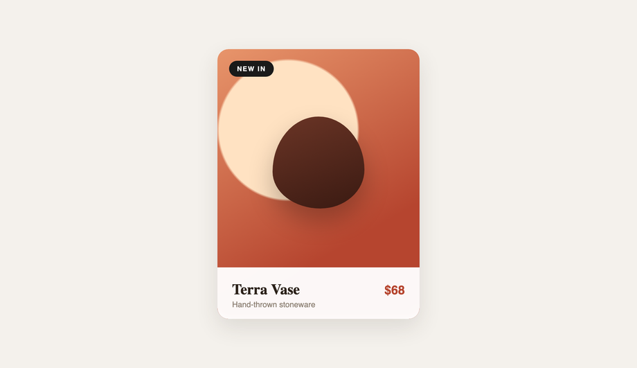
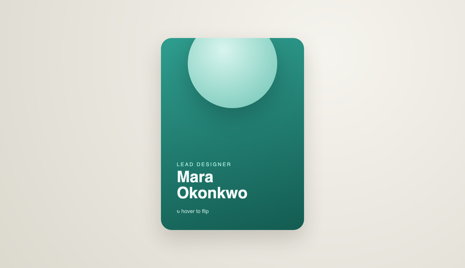
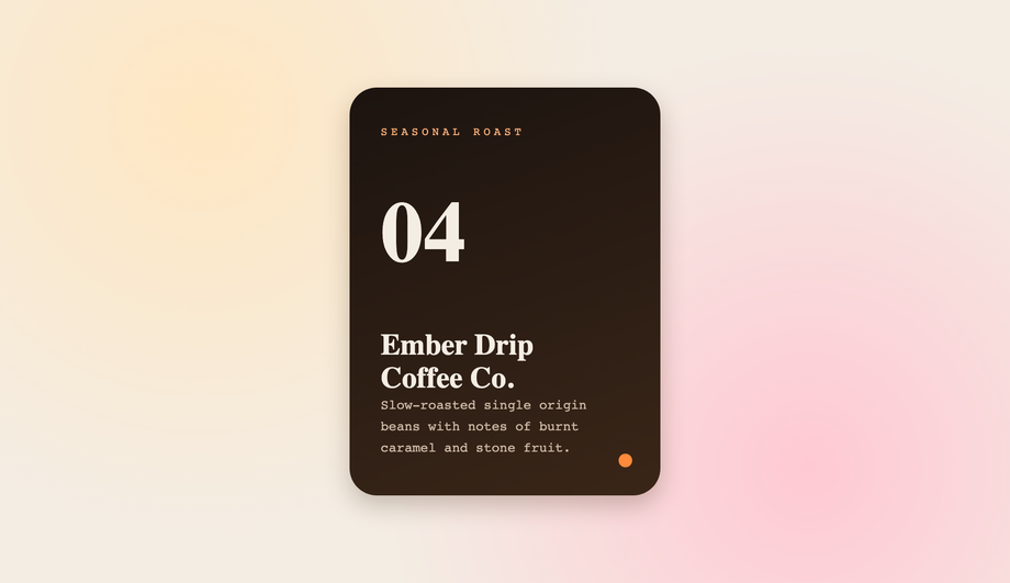
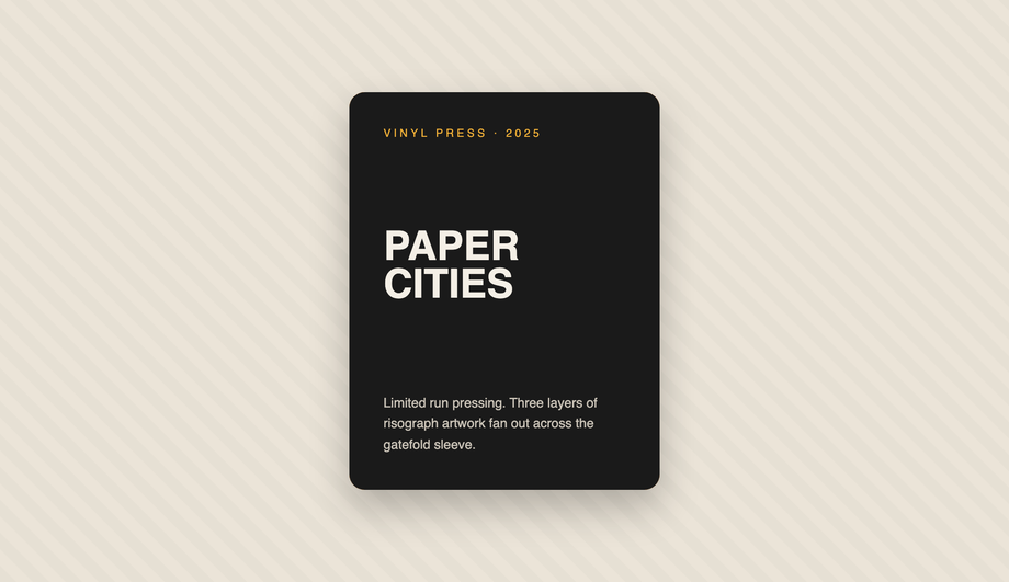
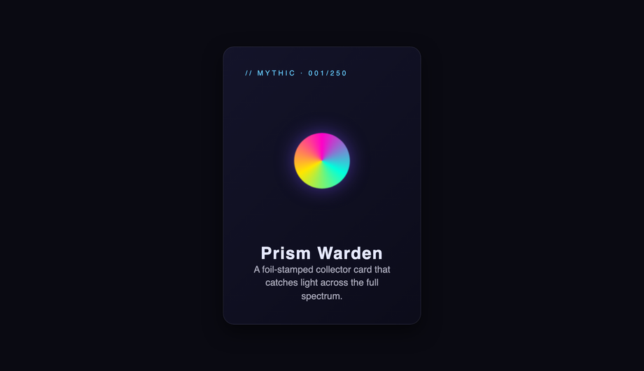
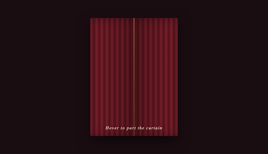
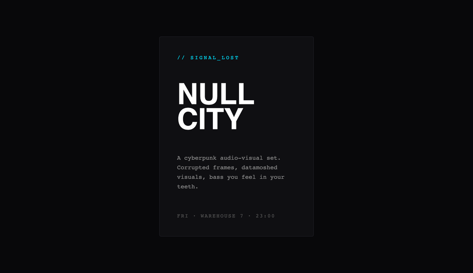
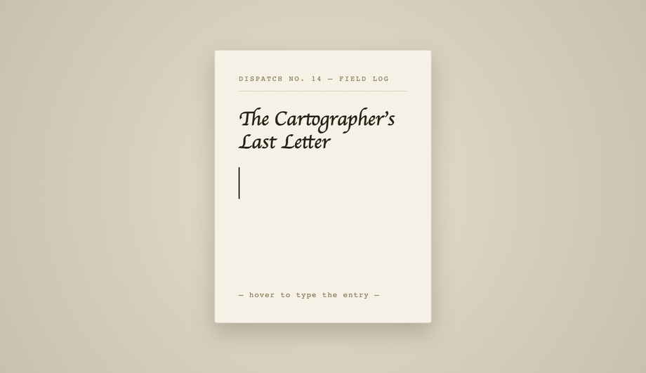
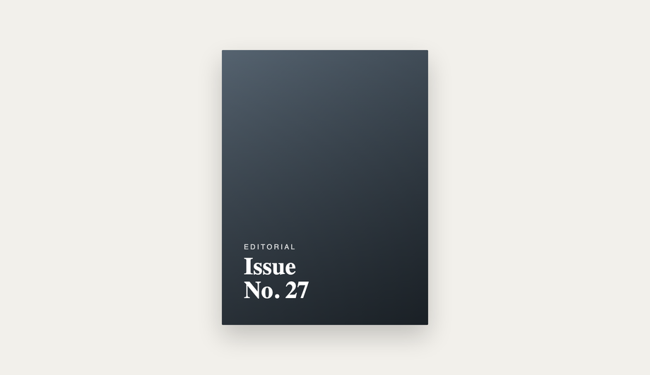
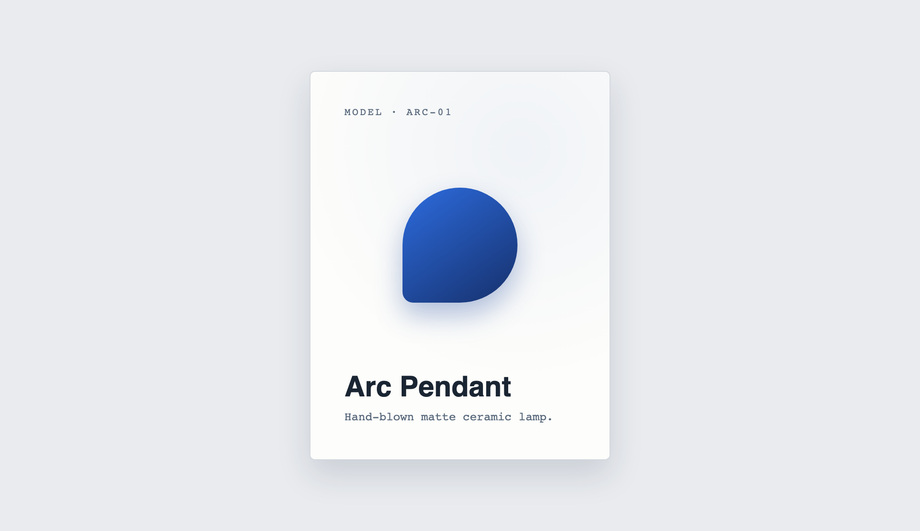
A CSS card hover effect is the motion or transformation that fires when a pointer enters a card surface. These 33 hand-coded effects span the full microinteraction range: a multi-axis 3D tilt card with cursor parallax across layered Z-depth planes, a glowing gradient glassmorphic border that tracks the pointer, an image zoom with a frosted detail panel sliding up from the bottom, a front-to-back 3D flip for team profile cards, a CSS :has() sibling de-emphasis that blurs every non-hovered card in a pricing grid, a minimalist elevation with layered multi-step shadows — plus a bouncy elastic lift, a holographic foil shimmer, an animated @property conic-gradient border, a glassmorphism card whose backdrop-filter blur intensifies on hover, a glitch card with RGB channel split, a spotlight that follows the cursor, a magnetic float, a blueprint reveal, an aurora drift and more. 26 are pure CSS; 7 add a short vanilla JS snippet for cursor tracking. Each demo ships with semantic HTML, scoped .card-NN class names that never collide with your existing styles, prefers-reduced-motion fallbacks, and MIT licensing — copy from any code panel and drop onto your existing card markup.


Build your own
Tweak the exact look in our visual generators — no signup, instant copy-paste.
Frequently asked questions
How do I add a hover effect to a card in CSS?
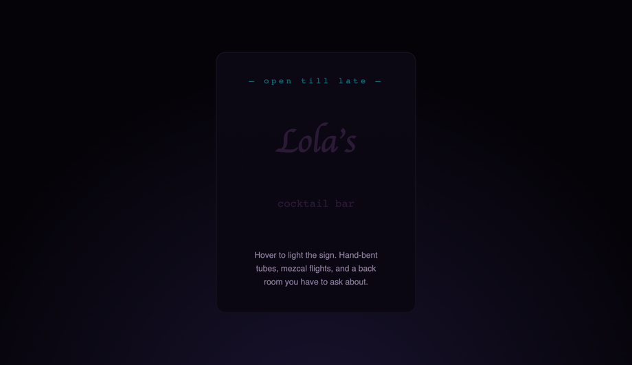
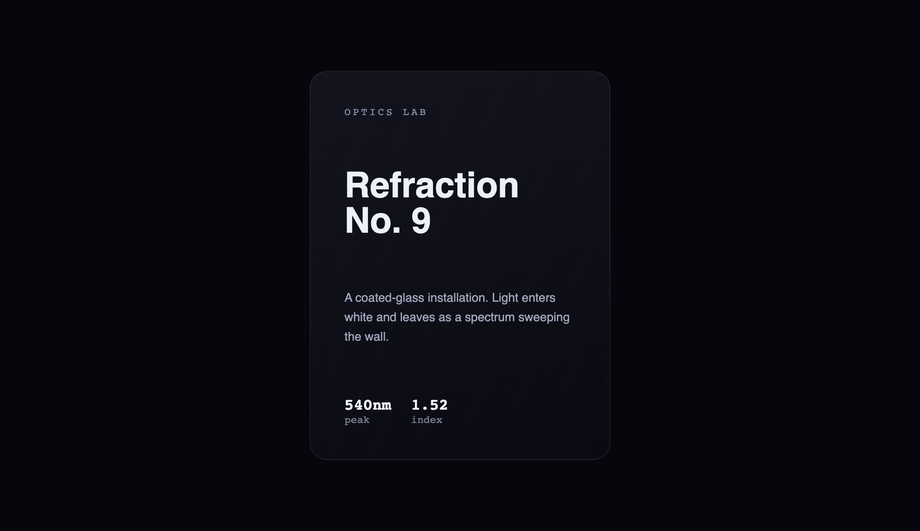
transition on the card's resting state, then change a property on :hover — most commonly transform: translateY(-6px) for a lift, plus a deeper box-shadow. For richer effects, animate a pseudo-element (::before / ::after) or a child layer (a border, a gradient, an overlay). Every one of the 33 effects in this gallery is built from this pattern; copy the CSS from any demo's code panel and drop it onto your existing card markup. The Minimalist Elevation demo (#06) is the cleanest reference for the pure-lift pattern — a flat resting state, one :hover rule with translateY(-8px) + a layered multi-step box-shadow, and a CTA arrow that nudges forward.How do I build a 3D tilt card with multi-axis cursor parallax?
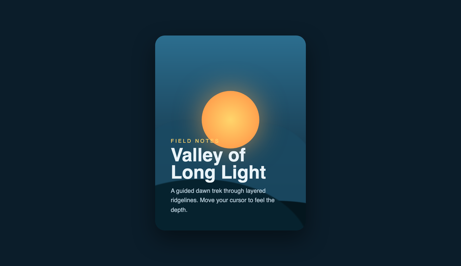
perspective: 1000px so the rotation has depth; (2) on the card, set transform-style: preserve-3d and read the cursor position with a small JS snippet (~15 lines of vanilla JS that listens for mousemove on the card, normalises e.clientX/Y against getBoundingClientRect(), and writes rotateY/rotateX); (3) push child layers (background, badge, title, description, glare) to different translateZ depths so they shift at different rates — that's what gives the parallax depth, not just the rotation. The single-axis Depth Parallax demo (#15) and the simpler 3D Tilt (#17) ship the same pattern at different complexity levels.How do I make a glowing gradient glassmorphic border on hover?
backdrop-filter: blur(20px) + low-opacity white background tint, (2) a radial-gradient glow positioned at the cursor's X/Y (tracked by ~10 lines of JS that writes --x and --y custom properties), (3) a masked gradient ring via border-image or a pseudo-element with mask-composite: exclude. The glow blooms behind the blur (so the glass softens it) AND the border lights up around the cursor's nearest edge. Add -webkit-backdrop-filter for Safari. For a simpler version, the Frosted Glass Intensify demo (#27) does the blur-deepens-on-hover trick without the cursor tracking.How do I make a CSS card flip on hover (front to back)?
perspective: 1000px, set transform-style: preserve-3d on the card itself, then position .front and .back as siblings with position: absolute; inset: 0 and rotate the back face by rotateY(180deg). Both faces get backface-visibility: hidden so the back doesn't show through the front at rest. On :hover, rotate the whole card by rotateY(180deg) — the back face becomes visible while the front rotates out of view. The demo ships a team-member profile pattern with photo + name on the front, bio + social links on the back. The legacy Flip Card demo (#19) ships a credit-card variant with magnetic strip and CVV.How do I blur and dim sibling cards when one is hovered using CSS :has()?
:has() selector with zero JavaScript. The selector reads: .grid:has(.card:hover) .card:not(:hover) { filter: blur(2px); opacity: 0.5; transform: scale(0.96); }. Plain English: 'when the grid contains any hovered card, dim every card that isn't itself hovered.' The hovered card stays sharp and lifts forward (.grid:has(.card:hover) .card:hover { transform: scale(1.04); }), pulling all visual focus to the chosen option. Browser support: Chrome 105+, Safari 15.4+, Firefox 121+ — every current major browser. In older browsers the selector matches nothing and the grid renders normally, no JS fallback needed.Which of the 33 demos use JavaScript? Are they accessible without it?
:hover with transitions, transforms, pseudo-elements, :has(), and @keyframes. The JS demos degrade gracefully: card content is fully visible and interactive without hover (touch + keyboard users see the resting state), the cursor-tracking only enhances the experience for pointer devices. Every continuous animation respects @media (prefers-reduced-motion: reduce). No library required for any of them.How do I add minimalist elevation shadows that feel real?
box-shadow — it's layered. The Minimalist Elevation demo (#06) shows the pattern: at rest, a single tight ambient shadow (0 1px 2px rgba(0,0,0,0.06)). On hover, swap to TWO shadows stacked — a tight one for contact (0 4px 12px rgba(0,0,0,0.08)) and a wider, softer one for ambient diffusion (0 16px 40px rgba(0,0,0,0.12)) — combined with translateY(-8px) to lift the card off the surface. The two shadows expand at different rates because light has two falloffs in reality: hard for nearby surfaces, soft for distant ones. Animate both via a single transition: transform 0.3s, box-shadow 0.3s.How do I keep card hover effects smooth and not janky?
transform and opacity ONLY — they're GPU-accelerated and skip layout reflow. Avoid animating width, height, margin, or top/left on hover (they trigger reflow and paint every frame). Put the transition on the card's base state so it eases out as well as in. Use will-change: transform on the card sparingly — only when an effect is heavy enough to need it; over-using will-change hurts performance because the browser pre-allocates GPU layers for elements that never animate. Keep transition durations in the 150–350ms range — fast enough to feel responsive, long enough to read as motion.Are these card hover effects accessible and free to use?
@media (prefers-reduced-motion: reduce) { animation: none }. Triggered transitions on :hover stay (they're user-initiated, not autoplay). Scoped .card-NN class names never collide with your existing styles. All 33 effects are MIT licensed and free for personal AND commercial projects.Related collections

20 CSS Animated Buttons
20 hand-coded CSS animated buttons — neon glow, ripple, 3D press, liquid fill, jelly bounce, shine sweep, animated border, moving gradient CTA, text flip, submit success state, add-to-cart progress, download icon, hamburger-to-close, toggle switch, loading spinner inside button, next/prev arrow nav, and ghost button background reveal. Half pure CSS, half lightweight JS for production interactions.

15 CSS Background Animations
15 hand-coded CSS background animations with live demos — infinite shifting gradient, floating particle bubbles, parallax starry night, clickable cyberpunk ripple, sliding geometric grid, SVG wave overlays, glassmorphism orbs, aurora borealis ribbons, matrix digital rain, mesh gradient blobs, falling snow, morphing blob, retro synthwave 3D grid, infinite scrolling diagonal marquee, comic-book halftone dots. 100% Pure CSS, no JavaScript, no canvas, no particles.js. prefers-reduced-motion respected, scoped class names, MIT-licensed.

27 CSS Button Hover Effects
27 hand-coded CSS button hover effects — 3D press, neon glow, gradient slide, border draw, liquid fill, ripple, glitch text, and kinetic flips. Every demo is pure CSS (no JavaScript, no framework), tuned for 60fps with transform and opacity, and respects prefers-reduced-motion out of the box.