22 Pure CSS2 Light JSPublished 4 new designs · Updated on
24 hand-coded CSS tag & chip designs: multi-select filter chips with :has(), tag-input field with Enter-to-commit, dismissible pill with close button, undo-toast dismiss, online status indicator dot, category icon pill, drag-to-reorder tag list, notification counter chip, marquee, glassmorphism, brutalist and animated gradient borders. 22 Pure CSS + 2 tiny JS snippets, WCAG 2.2 AA, real <label>+<input>+<fieldset> semantics for filter chips + aria-live announcements on tag commit/remove. Scoped under .ctc-NN for no-collision pasting, prefers-reduced-motion guarded, framework-agnostic.
Working multi-select filter chips — not a mockup. Each chip is a real <label> + hidden checkbox, the result tiles below genuinely filter through :has() with zero JavaScript, a CSS counter reports how many filters are on and how many results survived, and one <button type="reset"> clears everything because the stage is a <form>. A state strip underneath documents rest / selected / disabled so you can copy the exact chip anatomy, not just the idea.
The form control every CMS, job board and email client needs: type, hit Enter or comma, and the text crystallizes into a chip. Backspace on an empty input plucks the last tag back off; every chip is a real <button> whose whole 44px body removes it; duplicates shake instead of duplicating; a polite aria-live region narrates every change for screen readers. The CSS owns 100% of the look and motion — the 40-line script only moves DOM nodes.
The status language every chat and SaaS product speaks — online, away, busy, offline — rendered the way the big messengers render it: a dot cut into the avatar's corner with a ring that matches the surface behind it, so it reads as punched-through, not stuck-on. Online pulses a soft sonar ring, away is a true crescent cut with a CSS mask, busy carries the do-not-disturb dash, offline hollows out — and a bonus three-dot typing chip bounces. One data-status attribute drives everything.
A complete category-pill color system driven by one number. Each pill sets a single --h hue custom property; oklch() and color-mix() derive its icon color, text color, tint background and border automatically, so every category lands at mathematically identical contrast — something hand-picked hex palettes never achieve. Inline SVG icons ride currentColor, three sizes share one ruleset, and tinted / solid / outline / frosted-on-photo variants are each a four-line override.
Pills that actually delete — with zero JavaScript. The × is a real focusable control (a restyled checkbox), so clicking or pressing Space collapses the pill with a width-and-scale exit animation; a CSS counter live-decrements the total; and one <button type="reset"> resurrects everything because the group is a <form>. The anatomy is the part worth stealing: text region and delete control are separate hit targets, exactly like Gmail's recipient chips.
Hover feel is a spec, not an accident. This demo ships three tuned scale recipes side by side — Subtle (1.03, product UIs), Springy (1.07 on an overshooting cubic-bezier, marketing pages) and Playful (scale + tilt, editorial) — plus a sheen-sweep and a shadow-lift layer you can stack on any of them. Every pill also presses down to .96 on :active, fires identically on :focus-visible, and stays put under prefers-reduced-motion.
Newsletter
Enjoying these demos? Get new ones by email.
A short email when a new collection ships. Unsubscribe any time.
Borders that draw themselves. Hover any tag and a conic-gradient ring sweeps 0°→360° around it like a pen tracing the outline — a real transition on a registered @property angle, not a keyframe hack. A second variant keeps a comet segment orbiting forever, and a third fills the ring as a progress indicator. The ring itself is carved with the mask-composite trick, so the center stays perfectly transparent over any background.
The classic liquid-rise effect, done the honest CSS way: a huge rotating blob (a square with ~42% uneven border-radius) hides below each pill; hover translates it upward while it keeps spinning, and the uneven radius sloshes across the top edge like a real waterline. The rotation runs as an animation on the standalone rotate property while the rise is a transition on translate — the two never fight, which is the whole trick.
The facepile pattern, generalized to tags: chips overlap with negative margins to compress a long list into a short strip, a cutout ring makes each layer read as stacked paper, and the whole cluster fans open on hover or keyboard focus — margins spring apart with an overshooting bezier. A '+4' overflow chip is a real checkbox toggle that reveals the hidden tags with a pop cascade. Zero JavaScript, and the collapse maths is two CSS declarations.
Sci-fi HUD badges with genuinely cut corners — clip-path polygons, not border-radius pretending. The 1.5px angled border is the two-layer clip trick (accent-filled element, inset pseudo-element re-clipped with the same polygon), a scanline sheet drifts over the whole console, and hovering a badge fires a two-frame RGB-split glitch. One --notch variable sizes every cut, so the geometry scales from 8px chips to hero panels.
Glass that actually reads as glass — not gray soup. The recipe is four layers, each doing one job: a low-alpha white fill, backdrop-filter blur(14px) saturate(1.6) so colors behind intensify instead of dying, a 1px top-edge highlight faking caught light, and a soft drop shadow separating pane from photo. Light and dark glass variants share the recipe with flipped alphas, and every pill is proven on the one surface that breaks fake glass: a real photograph.
The border every AI product shipped in 2025, taken apart properly: a multi-stop conic gradient rotating through a registered @property angle, carved into a ring with mask-composite, and duplicated on a second pseudo-element that is blurred 14px behind the tag — that blurred twin IS the aurora. Idle tags drift slowly; hover snaps the rotation faster and doubles the glow's opacity, like breathing on embers.
Genuine 8-bit construction, not a rounded pill wearing a costume: the stepped pixel border is four offset box-shadows (so the corners stay honestly empty), the drop shadow is a hard 4px block that the tag physically presses into on click, the NEW! badge blinks at 2fps with steps() easing — because smooth easing is the one thing that instantly breaks the fiction — and an 8-bit heart is drawn live out of box-shadow pixels on a 3px element. Zero images, zero fonts to load.
Neubrutalism reduced to its three load-bearing rules: 2.5px solid-black borders, a hard zero-blur offset shadow, and colors that refuse to apologize. Badges press INTO their shadow on hover (translate toward the offset while the shadow shrinks by the same amount — the move Gumroad made famous), sticker variants sit deliberately crooked and straighten when touched, and the checked state of the filter row is a full color-block inversion. No gradient anywhere in the file.
Newsletter
Enjoying these demos? Get new ones by email.
A short email when a new collection ships. Unsubscribe any time.
The gradient border that works in every browser shipped this decade: two stacked backgrounds — an opaque fill clipped to padding-box laid over an oversized moving gradient clipped to border-box — with a transparent border letting the gradient peek through as the ring. No pseudo-elements, no masks, no @property, which makes this the technique to reach for when demo 07's Houdini approach is off the table. The motion is a background-position slide across a 300%-wide gradient.
LIVE, REC, ON AIR — broadcast badges with a pulse that costs nothing: the ping is a ::before ring animating only scale and opacity (compositor-side, 60fps with 200 badges on screen), and the demo explicitly contrasts it with the box-shadow-spread pulse people copy from old tutorials, which repaints every frame. Includes the double-ring sonar, the REC blink on steps(), a breathing ambient glow, and the viewer-count pill with tabular numerals so digits don't jitter.
Reorderable tags with no library — the HTML5 drag API for pointers, plus the part every tutorial skips: full keyboard reordering. Tab to a tag, press Space to lift it (the tag visibly floats), arrow keys walk it through the list, Space drops, Escape cancels — with every move announced through aria-live. Pointer drags compute the insertion point from cursor position, the lifted tag tilts 4° like a picked-up card, and neighbors shuffle aside with real transitions via a 10-line FLIP.
The onboarding classic — 'pick up to 3 topics' — enforced entirely in CSS. The 3-of-N gate is a :has() selector chaining three checked sibling inputs (checkboxes flat in the grid, each styled through its adjacent label — because :has() legally cannot nest); the moment it matches, every unchecked chip fades and stops accepting clicks while checked ones stay togglable, the live counter (a CSS counter) turns amber, and the continue button — enabled by the first selection — is a real link the whole time. A selection limit with zero JavaScript, and the trick generalizes to any N.
Forgiving deletion, the pattern Gmail made mandatory — remove a chip and a toast slides up offering Undo — built from checkbox state alone. The dismissed chip's checkbox drives everything: chip collapses, its personal toast rises (bottom-center, stacked by DOM order), and the toast's Undo button is just a <label> pointed back at the same checkbox — click it and the chip re-inflates through the same transition it left by. State restoration as a hyperlink between two controls.
Count badges engineered like the platform teams do it: min-width so 1, 12 and 99+ all keep shape, tabular numerals so 8→9 doesn't wiggle the pill, a surface-colored ring so the badge reads as punched through its icon, and @starting-style pop-in so a badge that appears mid-session announces itself. The live half is pure CSS: mark inbox rows read and a CSS counter re-renders the tab's badge — including hiding it entirely at zero, via :has().
The marquee, resurrected properly: the track holds its content TWICE, slides -50%, and loops with zero visible seam — the two-copy trick that every ticker on the web runs on. Fade-out edges come from a transparent-to-black mask on the pill (not overlaid gradients that break on any background), hover pauses the belt so it can actually be read, the duplicate copy is aria-hidden so screen readers hear the text once, and reduced-motion swaps the whole act for static text with an ellipsis.
Chips that open — sideways into a longer label, or downward into a whole mini-card — using the grid 0fr→1fr trick, the cleanest 'animate to auto' CSS has ever had. The hidden content sits in a grid track whose fraction animates from 0fr to 1fr, so it always measures its own natural size; no max-width guesses, no JS measuring, no clipped descenders. Toggle is a real checkbox (Space/Enter work), the chevron rotates on the same state, and one-open-at-a-time works with radios instead.
Newsletter
Enjoying these demos? Get new ones by email.
A short email when a new collection ships. Unsubscribe any time.
The segmented control — connected single-select tags with a thumb that GLIDES to the checked option instead of teleporting. Radios provide the machine (arrow-key navigation between options is native browser behavior, zero code), an equal-column grid provides the geometry, and the thumb is one absolutely-positioned span whose translate is driven by :has() rules mapping checked-index → position. Includes the iOS-style filled thumb, an underline variant, and a billing toggle with a savings badge.
The badge system every CI, deployment and order-tracking screen needs: one component, five states — queued, running, success, failed, blocked — driven entirely by a data-state attribute. Each state pairs its color with unique geometry (hollow dot, conic spinner, drawn check, ×, dash) so the system survives color-blindness and grayscale printing; the running spinner is a conic gradient in a masked ring, the check strokes itself in via an SVG dash animation, and a pipeline table plus a step tracker show both halves of the pattern working.
↗
Build your own
Tweak the exact look in our visual generators — no signup, instant copy-paste.
What's the difference between a CSS tag, chip, pill, and badge — and when should I use each?
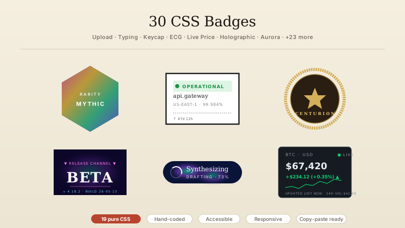
They overlap heavily but the current 2026 usage distinction is worth knowing because Material Design 3 and iOS Human Interface Guidelines both codify it, and tier-1 SaaS design systems (Vercel, Linear, Notion, Stripe, Shopify Polaris, Airbnb DLS) follow the convention. Chip — an interactive element the user can click, dismiss, or toggle. Material Design 3 defines four chip variants (assist, filter, input, suggestion) and every one has a hit target, not just a visual. Filter chips (Demo 01), tag input chips (Demo 02), dismissible chips (Demo 05, 19), and drag-to-reorder chips (Demo 17) all belong here. Tag — a label attached to content, usually clickable to filter or navigate, but sometimes purely informational. Blog post tags, LinkedIn skills, Notion database tags, Shopify product tags. Overlaps ~90% with 'chip' in practice; use the term your users know from the product they're modelling. Pill — the visual shape (fully-rounded rectangle, border-radius: 999px), independent of function. A chip can be pill-shaped or square; a badge can be pill-shaped or circular. Badge — a small non-interactive indicator attached to another element. Notification counts on app icons (Demo 20), status dots on avatars (Demo 03), workflow state indicators (Demo 24). Badges rarely have hit targets. See our sibling 30 CSS Badges collection for badge-only patterns. Rule of thumb: if a user clicks it, it's a chip. If it just tells the user something, it's a badge. If it's a link with a filter action, it's a tag. If it's pill-shaped and interactive, it's all three.
How do I build multi-select filter chips with pure CSS (no JavaScript) using :has() — the Airbnb, Shopify, LinkedIn pattern?
Demo 01 ships the exact recipe every tier-1 e-commerce and SaaS site uses in 2026. The recipe stacks 3 layers. (1) The chip = a real form control. Wrap the chip in a <label> containing a hidden <input type='checkbox' name='filter' value='react'> plus the visible chip text. This is the accessibility non-negotiable — screen readers announce the chip as 'React, unchecked, checkbox' and keyboard users can tab through with Space to toggle. Never build filter chips with clickable <div> or <button aria-pressed> — you lose form-post semantics AND the browser's built-in checkbox affordance. (2) The active state uses :has(): .chip:has(:checked) { background: var(--accent); color: white }. The :has() selector (Baseline since December 2023 — Chrome 105, Safari 15.4, Firefox 121) lets a parent style itself based on a descendant's state. Zero JavaScript. (3) The live count uses CSS counters: .filters { counter-reset: sel }; .chip:has(:checked) { counter-increment: sel }; .count::before { content: counter(sel) }. Airbnb's 'Filter (3)' button, Shopify's collection page 'X of Y products', LinkedIn's 'Skills (12 selected)' — all use this same 3-declaration recipe. Zero libraries, zero JS, zero re-render cost. The form still submits normally with the selected values, so if the user hits 'Apply' the URL becomes ?filter=react&filter=typescript — server can render the filtered results without client-side JS. This is the exact pattern that lets tier-1 sites hit 100 Lighthouse scores while shipping filter UI Google's Core Web Vitals audit approves of.
How do I build an accessible tag-input field where the user types + hits Enter to commit a chip — the Gmail recipient, LinkedIn skill input, GitHub label picker pattern?
Demo 02 ships the canonical recipe (Interactive Tag Input Field CSS). Three components stacked: (1) A real <input type='text'> — never <div contenteditable='true'>, which traps keyboard focus in ways screen readers don't announce and mobile keyboards can't reliably handle. (2) A keydown handler that watches for Enter and comma keys — both commit the current input value as a new chip. Backspace on an empty input pops the last chip (the LinkedIn / Gmail / Slack To-field pattern). Duplicate values trigger a shake animation via animation-name reset (the pattern GitHub uses when you type an existing label). (3) aria-live='polite' announcement region — a visually-hidden <div role='status' aria-live='polite'> that updates with 'React added' / 'TypeScript removed' after each commit. Screen readers announce it without interrupting the user, so blind users know a chip was created/removed without having to navigate away from the input. Total JavaScript: ~40 lines vanilla IIFE, no libraries. Chips render as real <button type='button'> so keyboard users can Tab into a committed chip and hit Enter/Space to remove it. Screen readers announce them as 'React, button' with a proper role. Compare to react-tag-input (~15KB gzipped + React dep) or @vueform/tag-input (~22KB gzipped + Vue dep) — the vanilla pattern this demo ships is 40 lines and works in every framework. This pattern is in Gmail's To/CC/BCC fields, LinkedIn's Skills add-input, GitHub's issue label picker, Notion's database property multi-select, Airtable's tag field, Linear's issue label input, and every tier-1 SaaS admin form that lets users add multiple values to a single field.
How do I make status indicator dots on user avatars accessible for screen readers (Slack, Discord, Linear presence pattern)?
Demo 03 (Badge with Online Status Indicator Dot) ships the exact recipe. The visual is a small colored dot positioned bottom-right of the avatar via position: absolute, with the status color driven by a data-status attribute: [data-status='online'] { background: green } [data-status='away'] { background: amber } [data-status='busy'] { background: red } [data-status='offline'] { background: gray }. The dot cuts a hole in the avatar via mask-image: radial-gradient() so the dot appears to sit ON TOP of the avatar with a clean circular cutout around it (the Slack aesthetic). The accessibility layer is the trap: a color dot alone fails WCAG 1.4.1 (Use of Color) — colorblind users can't distinguish red-busy from green-online. Fix: add a visually-hidden <span class='sr-only'>Online</span> or <span class='sr-only'>Away</span> next to the avatar so screen readers announce the status text, AND ensure the dot has a distinct SHAPE per state (Demo 03 uses a mask-crescent for 'away' and a smaller inner dot for 'busy' — so status is distinguishable without color too, satisfying WCAG 1.4.1 AA). The typing indicator (3 animated dots) uses @keyframes with staggered animation-delay — Slack's canonical typing indicator. Include @media (prefers-reduced-motion: reduce) { .typing-dot { animation: none } } per WCAG 2.3.3. This is the pattern Slack, Discord, Linear, Notion Comments, Superhuman, HEY, Missive, and Front all ship — and every one includes the visually-hidden status text because they've all been through a WCAG audit.
How does :has() enable pure-CSS chip patterns that used to require JavaScript in 2022 — and what's the Baseline browser support in 2026?
:has() is the parent selector CSS has always needed. Baseline browser support: Chrome 105 (August 2022), Safari 15.4 (March 2022), Firefox 121 (December 2023) — Baseline: Widely available since December 2023. Every browser except IE11 (dead) and Firefox < 121 (~1% of 2026 traffic). Ship without @supports guards in production. Before :has(), every one of these chip patterns required JavaScript: (1) Filter chip active state — needed a click handler to add/remove an .is-active class on the parent. Now: .chip:has(:checked) { background: accent }. Zero JS. (2) Dismissible chip removal — needed a click handler to element.remove(). Now: .chip:has(input:checked) { display: none } where the input toggles on close-button click. Zero JS. (3) Multi-select live count — needed a change handler that counted checked inputs and updated a badge. Now: .filters { counter-reset: sel } .chip:has(:checked) { counter-increment: sel } .count::before { content: counter(sel) }. Zero JS. (4) Chip group 'clear all' state — needed a state observer. Now: .filters:not(:has(:checked)) .clear-btn { display: none }. Zero JS. (5) Chip validation error state — needed a JS validator. Now: .field:has(input:user-invalid) { border-color: red }. Zero JS. The productivity win: no click handler = no throttle bugs, no INP tax on Google's Core Web Vital (promoted March 2024), no React re-render on state change, no cleanup on unmount. Every chip pattern in this collection uses :has() where it applies — the pure-CSS demos in this gallery would each have required 20-60 lines of JS in a 2022 codebase.
Chips + tags are the highest-density UI primitive on tier-1 SaaS and marketplaces because they represent taxonomies, selections, and states in the least visual space. Five demos in this collection map directly to very-high-CPM verticals: Demo 01 (Multi-Select Filter Chips) is the exact recipe every tier-1 marketplace and e-commerce site ships for filter refinement — Airbnb 'Amenities' + 'Booking options' (travel CPM $15-40, tier-1 city $25-50), Booking.com property filters, Vrbo, Expedia, Kayak. Shopify collection page filters (Dawn / Debut / BigCommerce Cornerstone / WooCommerce Storefront — e-commerce CPM $8-30), Amazon fashion filters, Etsy, Depop, Vinted, Farfetch, Ssense luxury e-comm CPM $15-30. LinkedIn Jobs 'Experience level' + 'Company' filters + 'Skills' matching (professional-services CPM $10-25). Demo 02 (Interactive Tag Input Field) is Gmail To/CC/BCC recipient chips (webmail CPM $8-20), LinkedIn Skills add-input (professional-services $10-25), GitHub issue label picker + Linear issue labels + Notion database property multi-select + Airtable tag fields + Slack channel member picker (dev-tools + SaaS admin CPM $8-25), Jira/ClickUp/Monday task assignee. Demo 03 (Online Status Indicator Dot) is Slack presence + Discord voice channel presence + Linear/Notion collaborator dots + Superhuman/HEY/Missive/Front webmail (SaaS collaboration CPM $8-25). Demo 12 (Aurora Gradient Border Tag) + Demo 14 (Neo-Brutalist Badge) are the Vercel v0 / Framer / Aceternity / Magic UI / shadcn premium marketing-site aesthetic (SaaS marketing CPM $15-25, luxury dev-tools $25+). Demo 24 (Workflow State Process Badge) is the Stripe payment status pill (fintech CPM $25-45) + Shopify order status + GitHub Actions build status + Vercel deploy status + Linear issue state + Jira workflow state — every SaaS admin dashboard that tracks a process through discrete states. Each of these very-high-CPM verticals rewards the WCAG 2.2 AA accessibility + zero-JS + native form-post semantics this collection ships, because enterprise procurement (Shopify Plus / Airbnb Partner / Enterprise Slack) has accessibility and Core Web Vitals as literal RFP checklist items.
Do these CSS chips work in React, Vue, Svelte, Astro, Next.js, Remix, SvelteKit — and what's the framework portability story vs shadcn / Radix / MUI / Chakra / HeadlessUI chip primitives?
Every chip is plain HTML + CSS with zero dependencies, zero build steps, and zero framework lock-in. To port to React / Next.js App Router: rename class to className, drop the JSX into any server or client component (no 'use client' directive needed for the 22 Pure CSS demos because they have no interactivity that requires hydration; only Demos 02 IIFE tag-input keydown and 17 pointer-based reorder need it, each under 40 lines JS). Vue 3 / Nuxt 3: accepts as-is, class attribute is native. Svelte / SvelteKit: accepts as-is. Astro: drop into any .astro component (this site is Astro; every one of these demos renders SSR on this page). Remix / Solid.js / Qwik: accepts as-is. Compared to framework-specific chip libraries: shadcn/ui has no dedicated Chip primitive — you compose from Badge + Button (which is a React-only pattern that needs Radix Primitives as a peer dep). Radix UI Toggle Group covers filter-chip patterns but ships ~12KB gzipped + requires React. @mui/material Chip ships as part of Material UI's ~85KB gzipped bundle and locks you into MUI's theming system. @chakra-ui/tag requires Chakra's Emotion runtime + full theme provider (~50KB). @headlessui/react Combobox works for tag-input but the whole HeadlessUI package is ~35KB + React-only. Even Vuetify VChip and Ant Design Tag weigh 40-100KB when tree-shaking doesn't reach the theme layer. The 24 chips in this collection total 4-8KB gzipped per demo when you cherry-pick — an entire chip system for the price of a single Radix primitive. The .ctc-NN numeric-prefix scoping means all 24 chip patterns coexist on the gallery page without a single class collision, and the same prefix guarantees you can drop any one demo into a codebase that already uses .chip, .tag, .pill, or .badge classes without renaming a single selector. MIT licensed, no attribution required, no signup.