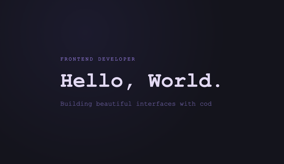
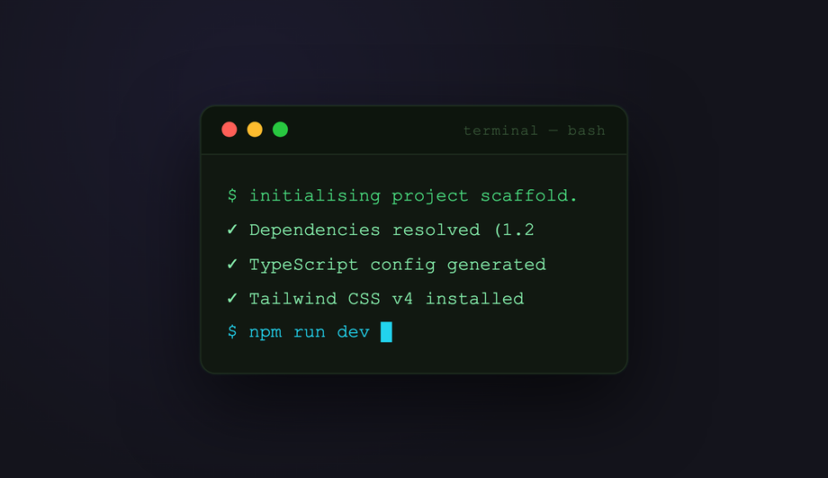
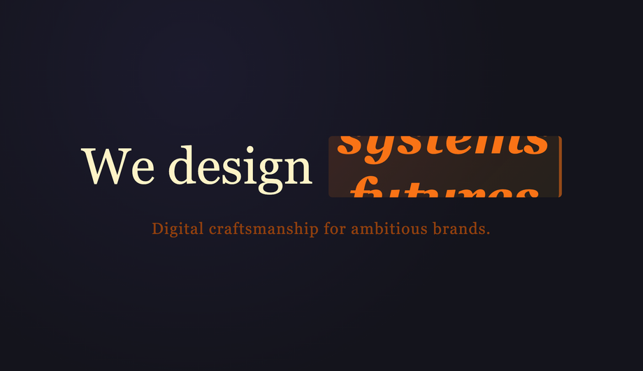
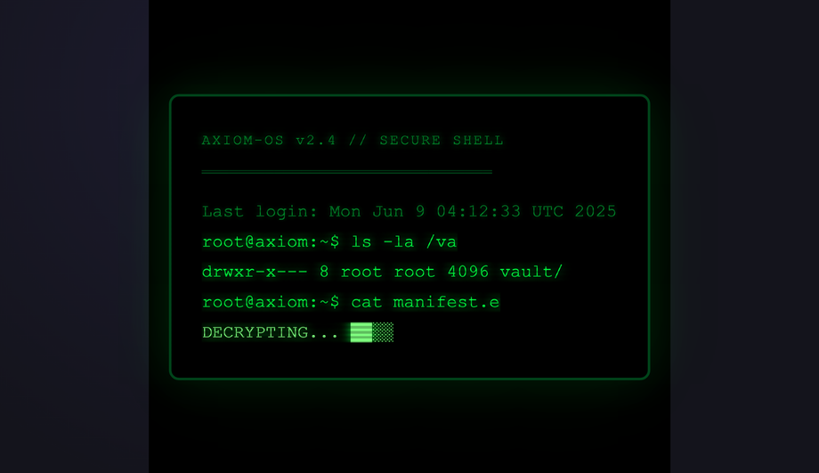
14 CSS Typewriter Effect Designs
A CSS typewriter effect animates text appearing one character at a time, simulating the rhythm of a real typewriter or terminal prompt — the dominant pattern for hero headlines, landing-page intros, and code demos. These 14 hand-coded designs cover the full typewriter playbook — the canonical pure-CSS steps() + ch recipe, multi-line stagger, infinite word-swap loop, neon terminal, clip-path reveal, SVG handwriting, gradient sweep, variable-font weight morph, Matrix scramble decode, glitch-on-type, code editor syntax, and scroll-triggered reveal. Every demo uses scoped .tw-NN class names that never collide with your existing styles, honours prefers-reduced-motion, and ships under the MIT license.
Frequently asked questions
What is a CSS typewriter effect and how does the pure-CSS recipe work?
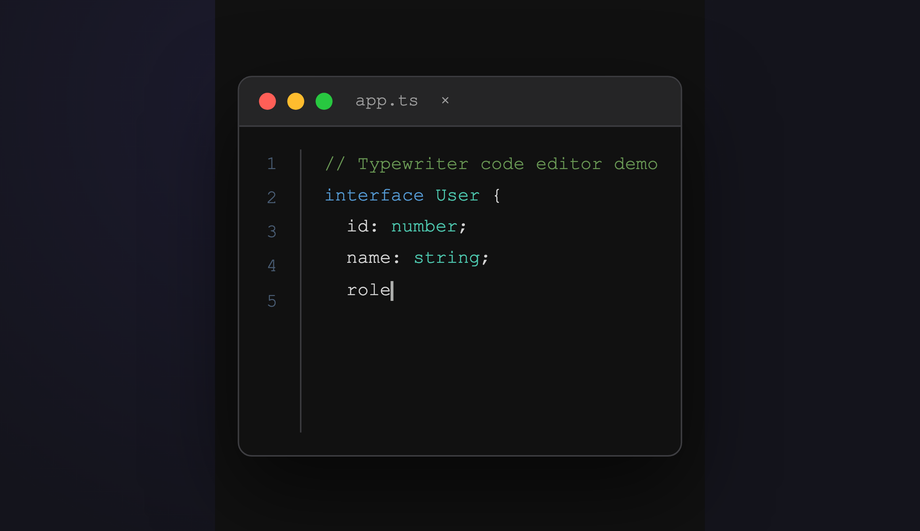
overflow: hidden; white-space: nowrap on the text element clips characters that haven't been revealed yet, (2) @keyframes animating width: 0 → 22ch using steps(22) timing — the steps() function produces discrete jumps rather than smooth interpolation, so each step reveals exactly one more character, (3) a second border-right: 3px solid animation toggling between an accent colour and transparent with steps(2) creates the hard on/off blink of a terminal cursor. Both animations run on the same element. Key insight: the ch unit is the width of the 0 character in the current font — combined with steps(), this gives pixel-perfect character-by-character snapping in any monospace font. Zero JavaScript, zero dependencies, ~30 lines of CSS total. The Animated steps() Cursor demo (#01) is the canonical reference everyone reaches for first.Which typewriter pattern should I pick for my use case?
Pure CSS vs JavaScript typewriter — which should I use?
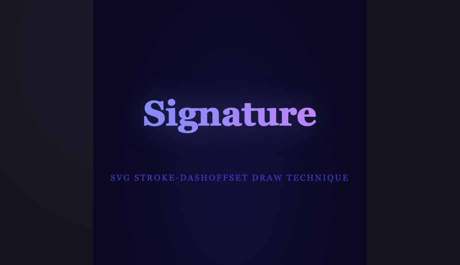
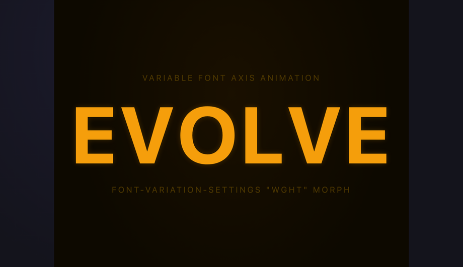
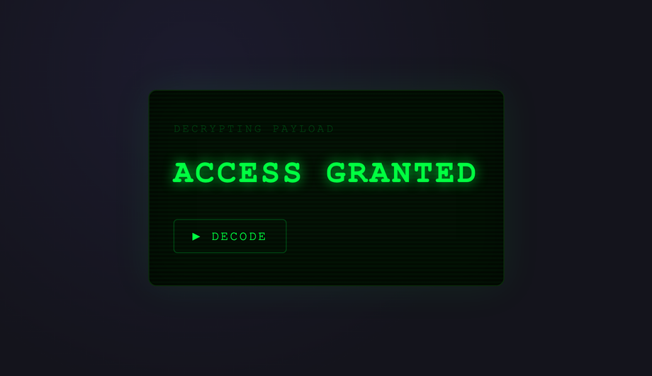
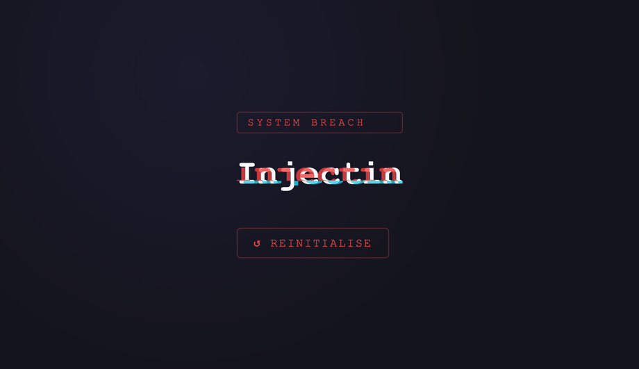
clip-path reveals (#05), SVG stroke-dashoffset drawing (#06), gradient sweeps (#07), variable-font morphs (#08), per-character span stagger (#09). All nine pure-CSS demos in this collection achieve their effect without any JavaScript. JavaScript is required for: dynamic text that changes at runtime (user input, fetched content, randomized strings — Demo #10), Matrix-style scramble decode where intermediate characters are random glyphs that converge to the target (#11), glitch effects that need RGB-channel pseudo-elements driven by typing position (#12), syntax-highlighted code that needs token-by-token coloring as it types (#13), and scroll-driven typewriters that progress based on IntersectionObserver or scroll-timeline (#14). Modern alternative (Chrome 115+, Safari 26+, Firefox 134+): CSS scroll-driven animations via animation-timeline: scroll() let you do scroll-triggered typewriters in pure CSS too — Demo #14 includes a commented-out scroll-driven-animations version next to its IntersectionObserver implementation. Choose based on whether your text is fixed at build time (CSS) or generated at runtime (JS).How is CSS typewriter compared to libraries like Typed.js, TypeIt.js, or react-typewriter-effect?
Is the CSS typewriter accessible? What about screen readers and motion sensitivity?
@keyframes in @media (prefers-reduced-motion: reduce) { animation: none; } so users with that OS setting see the final text instantly, no typing animation. WCAG 2.3.3 (Animation from Interactions) explicitly recommends this. 2. Screen readers: VoiceOver, NVDA, JAWS, and Narrator may either announce each character as it appears (annoying) or announce the empty element + final text (correct). Default behavior varies. Fix: set aria-live='polite' on the typewriter container so the final text is announced once after the animation completes, NOT per-character. For long strings, use aria-label with the full text + aria-hidden='true' on the visual typewriter so screen readers get the complete message immediately and sighted users get the animation. 3. Cumulative Layout Shift (CLS): a typewriter that animates text width can cause page reflow as characters appear — especially bad on hero sections that ship without the final string reserved. Fix: reserve the final character count with width: 22ch on the container (matching the steps() count), or wrap in a parent with explicit min-width matching the longest variant. Regulatory frameworks: EU EAA (June 2025), US Section 508, Canada ACA, UK Equality Act all require WCAG 2.2 AA compliance.Tailwind / shadcn / MUI / Chakra typewriter — how do these compare?
w-[0ch] animate-[typing_2s_steps(22)_forwards] border-r-2 overflow-hidden whitespace-nowrap — but you still need a custom @keyframes typing in your stylesheet because Tailwind doesn't ship width-to-22ch animation out of the box. Our CSS to Tailwind converter handles the conversion automatically. shadcn/ui (React + Radix Primitives): does not ship a typewriter; the community pattern is to wrap react-typewriter-effect or write a custom hook. Animation libraries: Framer Motion's animate() can drive a per-character variant; GSAP's SplitText plus TextPlugin can do glitch + scramble effects but adds ~30KB. The pure-CSS approach in this collection ships zero JavaScript for nine of the 14 demos — for typewriter-driven hero headlines on marketing pages, this is the lowest-overhead approach.Why does my typewriter cause cumulative layout shift (CLS)?
width: 0 and grows to fit the final string. If the parent layout reflows around it, every element below shifts position once per animation step. The fix: reserve the final character width before the animation starts. (1) For single-string typewriters: set width: 22ch on the parent that contains the typewriter, OR set min-width: 22ch on the typewriter element itself with the animation running on a child wrapper. (2) For word-swap loops with variable-length words: use the longest word's character count (e.g. if cycling through 'Designer / Developer / Creator', use width: 9ch matching 'Developer'). (3) For multiline typewriters: explicit height on the parent reserves vertical space. (4) For JS character-injection (Demo #10): pre-render the final string with visibility: hidden via a sibling element so the layout reserves space, then animate a visible sibling on top. Tools: Chrome DevTools Performance Insights (Layout Shift sections), Lighthouse, Web Vitals extension, Core Web Vitals report in Google Search Console. Demos in this collection are designed to avoid CLS by default — see the comment markers in each demo's CSS.What's the difference between steps(), ease, and linear timing — and why does steps() work for typewriter?
linear produces smooth continuous interpolation; ease / ease-in / ease-out produce smooth curves. steps(N, end) is different — it produces N discrete jumps rather than smooth interpolation. So animating width: 0 → 22ch with steps(22) produces 22 discrete width values (0ch, 1ch, 2ch, ... 22ch), each held for 1/22 of the total duration. The text container then jumps from showing 0 characters to 1, to 2, etc. — exactly like a typewriter. Common timing variants: steps(N, start) shows the first step at t=0 (immediate first character); steps(N, end) shows the first step at t=1/N (1-character delay before the first appears) — for typewriter you typically want steps(N, end) or just steps(N) which defaults to end. Pitfall: setting steps(N) where N != character count produces uneven character-reveal timing. Match steps to character count exactly. For variable-length strings (word swap, dynamic content), this means recomputing or using JS character injection (Demo #10). Modern alternative: animation-timing-function: linear(...) with an animation-timeline of scroll() lets you do scroll-driven character reveals via steps() too — see Demo #14.Why does my typewriter look perfect in Chrome but break in Safari?
ch unit calculation: Safari calculates 1ch against the OS-rendered 0 glyph metrics, which can differ subtly from Chrome's rendering — especially with system fonts (San Francisco on macOS vs Inter on Windows). The fix: use a monospace font where ALL characters have identical width (JetBrains Mono, IBM Plex Mono, Geist Mono, Fira Code). With a true monospace font, ch matches every character width exactly, eliminating the Safari/Chrome divergence. 2. steps() + animation-fill-mode: forwards interaction: Safari < 17 has a known bug where animation-fill-mode: forwards combined with steps() sometimes drops the final keyframe state, leaving the typewriter at width: 21ch instead of 22ch. The fix: add animation-fill-mode: both instead of forwards — both applies both 0% and 100% keyframes outside the animation range, which avoids the forwards-only edge case. Demos #01–#09 use both by default for this reason. 3. Variable-font axis animation (Demo #08 — variable-font weight morph): Safari requires the variable font to be fully loaded BEFORE the animation starts, otherwise it falls back to the static weight. Fix: use font-display: block on the variable font's @font-face rule so the page waits for the font before painting — slight FCP cost in exchange for guaranteed rendering.Are these typewriter effects free, accessible, and how do I attribute them?
prefers-reduced-motion: reduce (animations fall back to instantly-displayed final text), uses semantic HTML, and is designed to work with aria-live regions for screen readers — see FAQ #5 for the full a11y pattern. Verify your specific use case with axe DevTools, Lighthouse, WAVE, or WebAIM contrast checker before shipping to EU EAA / US Section 508 / Canada ACA / UK Equality Act audits — the demos are AA-compliant by default but layout-context matters.Related collections

20 CSS Animated Buttons
20 hand-coded CSS animated buttons — neon glow, ripple, 3D press, liquid fill, jelly bounce, shine sweep, animated border, moving gradient CTA, text flip, submit success state, add-to-cart progress, download icon, hamburger-to-close, toggle switch, loading spinner inside button, next/prev arrow nav, and ghost button background reveal. Half pure CSS, half lightweight JS for production interactions.

15 CSS Background Animations
15 hand-coded CSS background animations with live demos — infinite shifting gradient, floating particle bubbles, parallax starry night, clickable cyberpunk ripple, sliding geometric grid, SVG wave overlays, glassmorphism orbs, aurora borealis ribbons, matrix digital rain, mesh gradient blobs, falling snow, morphing blob, retro synthwave 3D grid, infinite scrolling diagonal marquee, comic-book halftone dots. 100% Pure CSS, no JavaScript, no canvas, no particles.js. prefers-reduced-motion respected, scoped class names, MIT-licensed.

27 CSS Button Hover Effects
27 hand-coded CSS button hover effects — 3D press, neon glow, gradient slide, border draw, liquid fill, ripple, glitch text, and kinetic flips. Every demo is pure CSS (no JavaScript, no framework), tuned for 60fps with transform and opacity, and respects prefers-reduced-motion out of the box.