61 CSS UI Components — Free Collections with Live Demos
UI components are the building blocks of every interface. This collection brings together the best free CSS UI components — hand-picked, live-demoed, and copy-paste ready. No frameworks, no dependencies you didn't ask for.
Build UI like this from scratch: Flexbox, Grid, animations & responsive CSS
ZTM · The CSS Bootcamp · 30‑day money-back guarantee · Affiliate link
Looking for animated or hover-effect buttons? See CSS Animated Buttons and CSS Button Hover Effects — they file under Motion because every demo centres on motion.
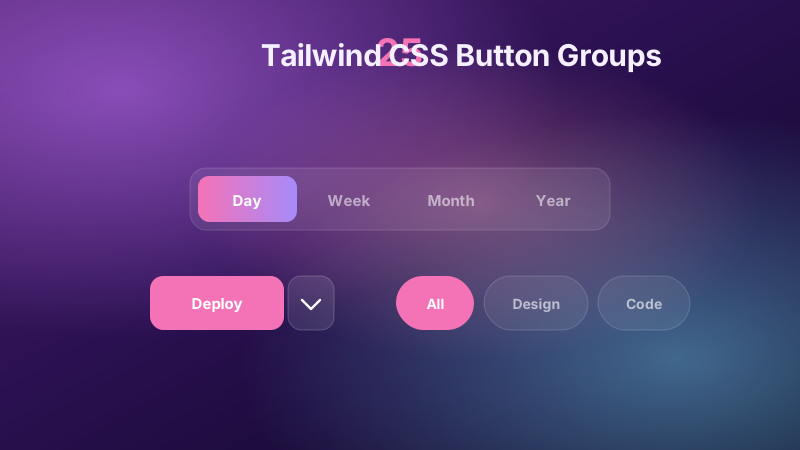
25 Tailwind CSS Button Groups
18 hand-coded Tailwind CSS button groups for SaaS pricing toggles, dashboard tab bars, rich-text editor toolbars, AI model pickers and Web3 wallet selectors. Covers split buttons with popover and details dropdowns, iOS-style segmented controls with sliding thumbs, monthly/yearly billing switches, pill filters, multi-select tag chips, radio export-format pickers, floating action speed dials, hold-to-confirm actions and cursor-following spotlight glows.
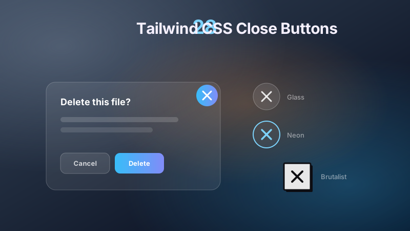
28 Tailwind CSS Close Buttons
Floating chat widget dismissals, cookie consent bars, modal and drawer close buttons, video and lightbox overlays, ad banners, and toast notifications — 28 close buttons covering the full range. Includes the corner-X modal pattern, WCAG focus rings, 48px tap targets, hamburger-to-X morphs, native dialog drawers, rotate-on-hover and magnetic-cursor motion, hold-to-confirm rings, neumorphic and brutalist styling, plus goo, glitch, particle burst, and galaxy vortex effects.
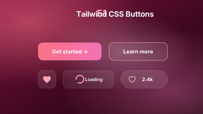
51 Tailwind CSS Buttons
Restaurant recipe cards, SaaS primary and destructive actions, and e-commerce add-to-cart flows all ride on the button. This set covers form submit and primary/secondary pairs, ghost outlines, icon-only tooltip toolbars, gradient and neon CTAs, loading and download-progress state machines, segmented radio groups, like and confetti micro-interactions, inline confirm-delete, play/pause morphs, and tactile material studies from brushed brass to frosted glass, clay, walnut, and punch-card 3D tilt.
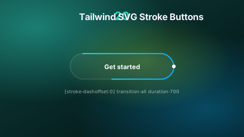
20 Tailwind SVG Stroke Buttons
Browse 20 Tailwind SVG stroke buttons with live demos and copy-paste code. Stroke-dashoffset draw-on-hover, pathLength normalization, gradient strokes.
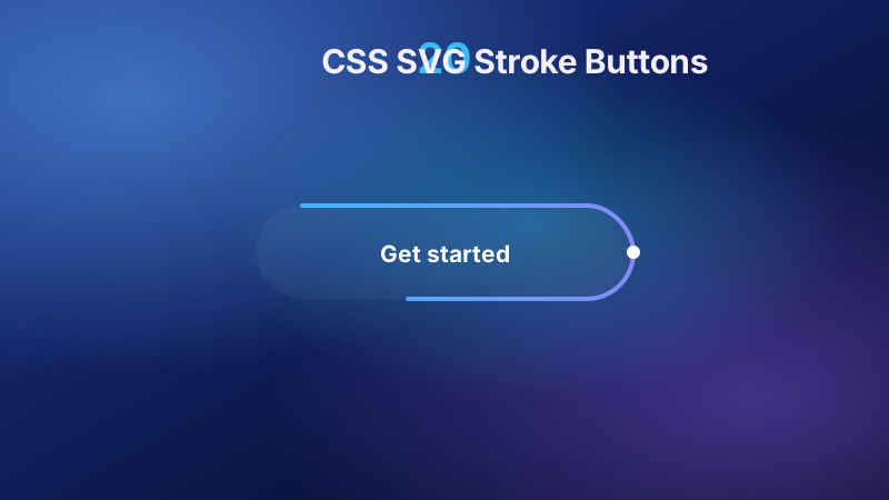
20 CSS SVG Stroke Buttons
Browse 20 CSS SVG stroke buttons with live demos and copy-paste code. Stroke-dashoffset draw-on-hover, pathLength normalization, gradient strokes.
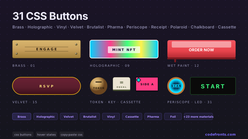
51 CSS Buttons
51 production CSS buttons with copy-paste code — submit and primary/secondary form buttons, ghost and outline variants, icon-only buttons with accessible tooltips, gradient CTAs, loading spinner buttons with state transitions, full disabled-state reference, segmented button groups, interactive state machines (add-to-cart, download progress, like heart, confirm delete, play/pause, subscribe confetti), click-effect studies (magnetic mercury ripple, brutalist glitch, neon plasma burst, clay press, editorial ink spread, particle shards), and material studies (brushed brass, washi paper, frosted ice, walnut lacquer, gel capsule, aged copper patina, holographic foil, IBM punch card, brass periscope). Every button scoped under .cb-NN, prefers-reduced-motion guarded, framework-agnostic — drop into React, Vue, Svelte, Astro, or plain HTML.
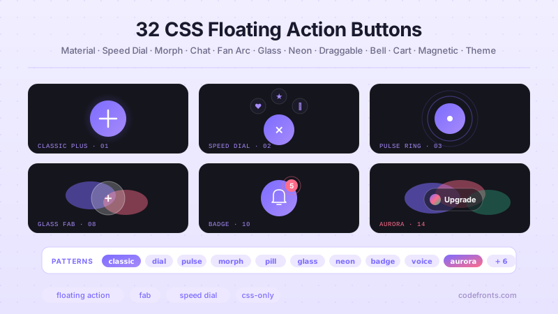
34 CSS Floating Buttons
34 hand-coded CSS floating action button (FAB) designs for SaaS admin dashboards, messaging chat widgets, e-commerce cart badges, and scroll-to-top navigation: Material Design 3 canonical FAB with ripple effect, iOS-style Compose floating button, WhatsApp floating message button, Intercom / Drift chat bubble, accessible WAI-ARIA reference (WCAG 2.2 AA aria-pressed + screen reader), Material Design 3 Extended FAB with icon and label, speed dial radial menu with backdrop, pure CSS FAB speed dial with zero JavaScript (checkbox-hack), Material gradient FAB, vertical and horizontal speed dial FAB menu, morphing FAB button that expands to pill, scroll-to-top floating button with SVG stroke-dashoffset progress ring, floating chat widget with notification panel, fan and arc radial spread menu, Apple squircle superellipse floating button, social share floating button cluster (X / Facebook / LinkedIn / WhatsApp / copy link), glassmorphism FAB with backdrop-filter blur, cyberpunk neon glow with scan-line overlay, floating compose button with hover tooltip, draggable FAB with corner snap and pointer events, notification bell with badge counter and interactive dropdown, floating cart with live badge counter and animated bump, magnetic cursor follower FAB with JS lerp easing, dark mode theme toggle with 4 style variants, classic gradient circle plus, pulse ring attention-getter, pill-shaped FAB with icon and text, neo-brutalist hard shadow, floating button with loading spinner state, draggable FAB with 6-dot grip handle, voice recording microphone with pulsing red halo, aurora gradient drift premium, quick emoji reply reaction picker, and modern squircle rounded square. 16 Pure CSS + 18 Light JS. Every design scoped under .fb-NN prefix for no-collision pasting, prefers-reduced-motion guarded per WCAG 2.3.3, WCAG 2.2 AA accessible, framework-agnostic (React, Vue, Svelte, Astro, Next.js, Nuxt, Remix, SvelteKit).
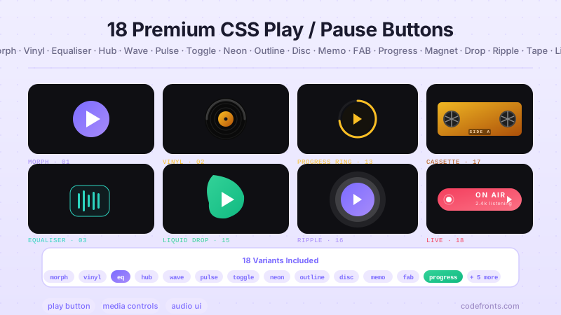
25 CSS Play / Pause Buttons
25 hand-coded CSS play / pause button designs for audio players, HTML5 video controls, podcast UIs, meditation apps, and media dashboards: pure CSS polygon clip-path morph (no JavaScript), custom HTML5 video overlay with backdrop-blur, glassmorphism audio player toggle, neumorphic soft-UI meditation control, Spotify-inspired circular play button with brand green oklch() palette, cyberpunk neon glow, WAI-ARIA accessible pattern (WCAG 2.2 AA reference with aria-pressed + screen reader), SVG path morphing triangle to double bar, vinyl record spinning audio control, equalizer soundwave animated toggle, media player track skip / fast-forward cluster, fluid liquid wave fill, pulsing halo video icon, iOS sliding pill audio toggle switch, retro arcade play pause, minimalist line-art outline, @property-typed conic gradient play button with rotating rim, voice note audio player, Material Design floating action button (FAB), podcast play button with SVG stroke-dashoffset progress ring, magnetic hover cursor follower, organic blob morph, Material ripple click state, vintage cassette tape audio control with spinning reels, and live-broadcast on-air badge. 16 Pure CSS + 9 Light JS. Every design scoped under .pp-NN prefix for no-collision pasting, prefers-reduced-motion guarded per WCAG 2.3.3, WCAG 2.2 AA accessible, framework-agnostic (React, Vue, Svelte, Astro, Next.js, Nuxt, Remix, SvelteKit).
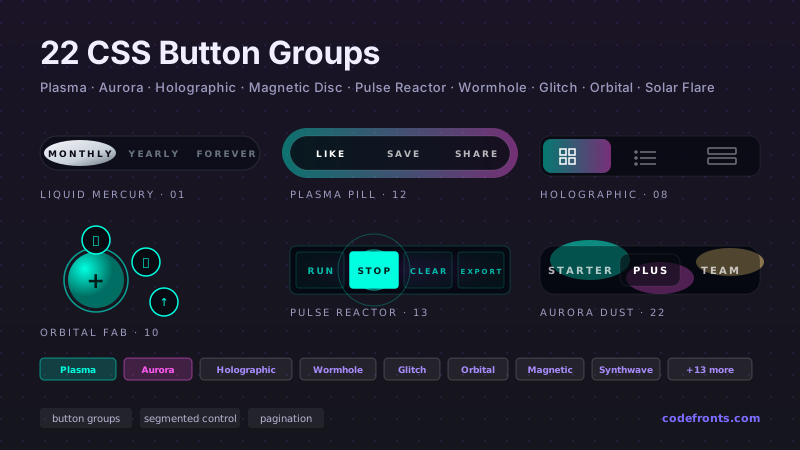
25 CSS Button Groups
25 CSS button groups for SaaS pricing toggles, iOS-style segmented controls, app toolbar actions, Web3 wallet-connect grids, AI model pickers, and date-range presets. Covers split buttons with Popover API dropdowns, radio-driven filter pills with sliding thumbs, single-select alignment toggles, multi-select tag chips, floating action buttons with radial fan-out menus, and view-switcher segments with morphing highlights. Keyboard-accessible, modern CSS.
15 CSS Glowing Border Buttons
15 production-ready CSS glowing border buttons covering rotating gradient ring, neon pulse, animated border trace, cyberpunk clipped-corner, dark-mode form input focus glow, Tailwind blur-underneath recipe, glassmorphism frosted glow, minimalist e-commerce outer glow, breathing pulse SaaS pricing CTA, aria-pressed inner glow toggle, subtle docs button, SVG stroke trace, synthwave dual neon, hue-shift gradient border, and an accessible WCAG-ready focus glow. Every demo is scoped under .gbb-NN with prefers-reduced-motion guards and real semantic HTML.
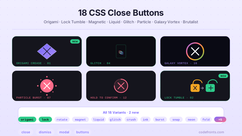
28 CSS Close Buttons
Floating modal dismissals, chat widget launchers, cookie consent bars, ad banners, video overlays, toast notifications, and lightbox media viewers — 28 close buttons spanning the full range. Includes the canonical corner-X modal pattern, WCAG 44px focus rings, iOS circular ×, hamburger-to-X morphs, native dialog drawers, and hold-to-confirm rings, plus neumorphic, brutalist, neon, glitch, liquid metaball, particle burst, magnetic-cursor, and galaxy vortex effects.
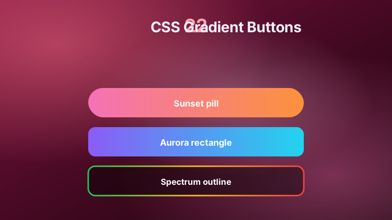
22 CSS Gradient Buttons
22 production CSS gradient button designs covering the full spectrum plus eight unconventional interaction patterns — glow shadows, magnetic pull (cursor-attracting), a subtle inhale-exhale breathing button, gradient border and ghost fills, sliding sweeps, gradient text, shiny sheens, 3D-depth parallax with layered translateZ, neon glows, glassmorphism, futuristic oklch hue-cycling, pill shapes, search-bar combos, checkout CTAs, click-particle celebration trails, Tailwind-style palettes, press-and-hold conic charging ring, sliced shutter roll, gooey liquid pill, and cursor-tracking aurora. Every button scoped, prefers-reduced-motion guarded, copy-paste ready.
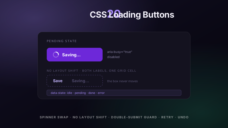
20 CSS Loading Buttons
20 hand-coded CSS loading buttons for checkout flows, dashboards, upload forms and any action that waits on a server. Covers the inline spinner swap, the width jump that makes a button shove its neighbours when the label changes, double-submit guarding with the disabled attribute rather than a class, the aria-busy and live-region contract screen readers need, minimum spinner duration so a fast response does not flicker, progress fill and percentage upload states, and the paths most builds skip entirely — retry after failure, optimistic save with rollback, server validation errors, and an undo window instead of a confirmation dialog.
Cards
14 collectionsLooking for hover-driven card effects? See CSS Card Hover Effects in Motion.
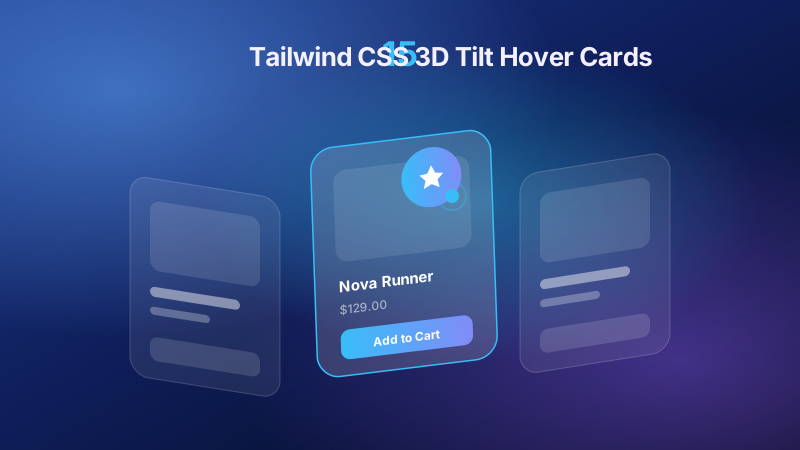
15 Tailwind CSS 3D Tilt Hover Cards
15 Tailwind CSS 3D tilt hover cards for D2C product spotlights, SaaS pricing rows, agency team and mascot cards, streaming music players, FinTech KPI dashboards, real-estate listings, and app-landing phone mockups — spanning parallax hover, glassmorphism and holographic foil, cursor-following border glow, spring physics, click-to-flip, and a zero-JavaScript :has() variant. Scoped under .ttc-NN for no-collision pasting, prefers-reduced-motion guarded, framework-agnostic.
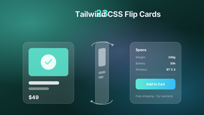
23 Tailwind CSS Flip Cards
23 Tailwind CSS flip cards for e-commerce product and pricing comparisons, meet-the-team reveals, language flashcards, trivia quizzes, gaming trading cards, business cards, and event tickets — spanning hover, tap, and keyboard triggers, <code>rotateY</code>/<code>rotateX</code> axes, diagonal <code>rotate3d</code> twists, book-open unfolds, and no-3D <code>clip-path</code> reveals. Scoped under .tfc-NN for no-collision pasting, <code>prefers-reduced-motion</code> guarded, framework-agnostic.
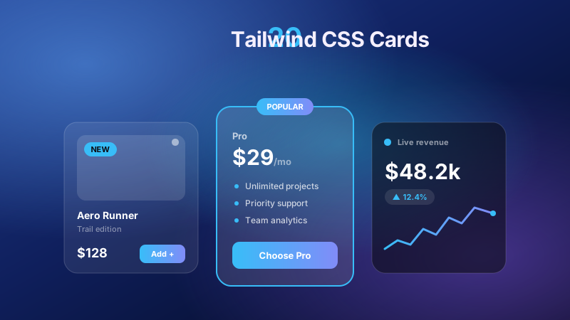
20 Tailwind CSS Cards
Restaurant recipe indexes, SaaS pricing rows, e-commerce product grids, real estate listings, and dark analytics dashboards all lean on card layouts. This set covers hover quick-add product tiles, three-tier pricing with a lifted popular plan, cook-time meta grids, walk-score rings, photo-mosaic booking panels, ranked article feeds, testimonial sentiment strips, KPI sparklines, glassmorphism aurora stages, 3D flip and pop-out lifts, rotating conic borders, and a focus-within stacked cascade.
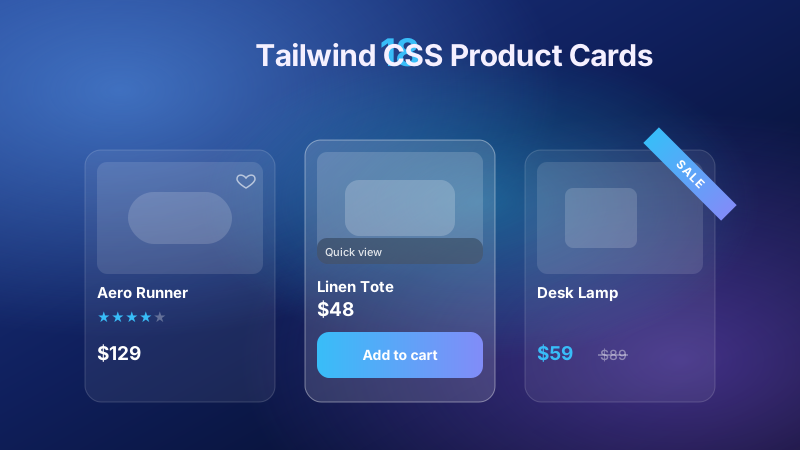
18 Tailwind CSS Product Cards
18 Tailwind CSS product cards for e-commerce catalogs, fashion and gadget shops, food delivery, and real estate listings — hover-reveal add-to-cart, 3D flip and tilt, image zoom, glassmorphism, neon borders, colourway and size pickers, quantity steppers, and favourite toggles. Scoped under <code>.tpc-NN</code> for no-collision pasting, <code>prefers-reduced-motion</code> guarded, framework-agnostic.
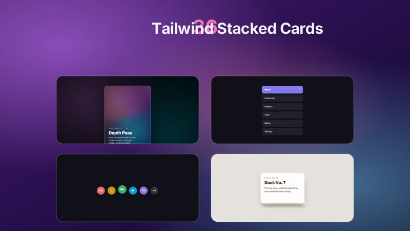
36 Tailwind Stacked Cards
Browse 36 Tailwind stacked cards with live demos and copy-paste code. Scroll-driven card stacks, swipe decks, fan-out photo piles, 3D flip cards.

24 CSS Animated Cards
24 hand-coded CSS animated card patterns organised by what triggers the motion, not by card style. Scroll and entrance triggers: staggered grid reveals, @starting-style mount-in, scroll-driven scale and fade on animation-timeline: view(), View Transitions API card-to-detail morphs, blur-to-sharp lazy image loading, and FLIP re-layout when a filter changes. State-change triggers: add-to-cart success morph, like and save particle burst, expand and collapse to intrinsic height with calc-size(), swipe-to-dismiss on Pointer Events, and skeleton-to-loaded crossfade. Data-driven triggers: count-up KPI metrics, SVG sparkline draw-on-enter, and progress ring fill on load. Ambient idle loops: breathing glow, floating drift, animated gradient mesh backgrounds, conic rotating borders, auto-cycling testimonial decks, and live status pulses. Plus four hover patterns where the effect is the topic itself: cursor spotlight, holographic foil glare, corner ribbon slide, and horizontal accordion expand. Every card is scoped under a .ac-NN prefix for no-collision pasting, guards prefers-reduced-motion, animates compositor-only properties, and ports unchanged to React, Vue, Svelte, Astro, Next.js and Tailwind.
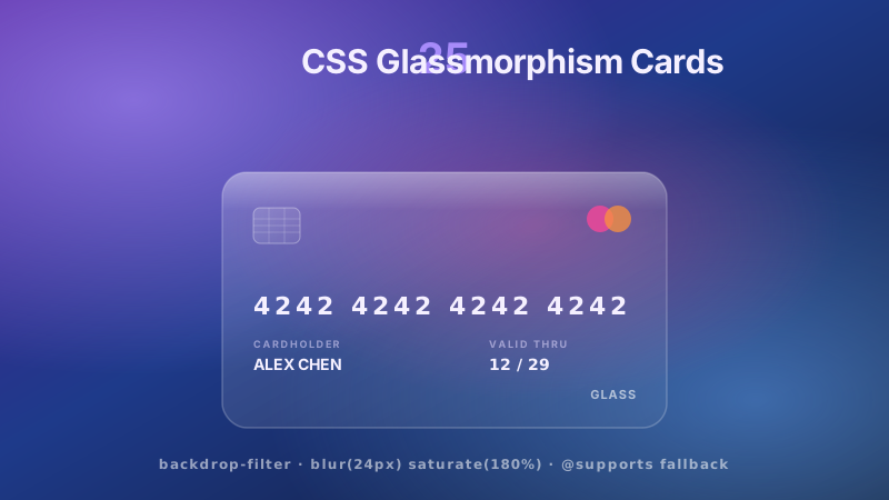
25 CSS Glassmorphism Cards
25 hand-coded CSS glassmorphism card demos — each topic ships 2 side-by-side variants so you can pick the exact treatment for your surface. Covers glassmorphism credit cards, pricing tables, product cards with hover effects, checkout cards, crypto wallet balances, login and signup cards, user profile and team member cards, testimonial cards, dashboard analytics widgets, weather cards, music player cards, stat cards with progress bars, notification cards, blog post cards, feature showcase cards, service card grids, event ticket cards, portfolio item cards with hover, 3D tilt cards with vanilla JS, cards with animated glowing borders, dark mode glassmorphism cards for Tailwind, cards over video backgrounds, and gradient-border-blur cards. Every card uses the canonical backdrop-filter blur + saturate + subtle white border on translucent fill, with an @supports fallback for browsers without backdrop-filter. Modern @property, oklch(), light-dark(), color-mix() and container-query techniques throughout, prefers-reduced-motion honoured, WCAG 2.2 AA compliant, framework-agnostic, MIT licensed.

15 CSS 3D Tilt Hover Cards
15 mouse-aware 3D tilt hover cards — e-commerce product spotlight, glassmorphism parallax team card, interactive pricing tier, holographic NFT collectible, pop-out mascot, dark tech grid with border glow, media player album art, blog article preview, cyberpunk neon glow, dashboard KPI widget, minimalist real estate, flip-to-back tilt, mobile app showcase, course learning card, and a Pure CSS touch-friendly tilt. Vanilla JS writes --rx/--ry/--mx/--my; all rendering stays in CSS on the GPU.
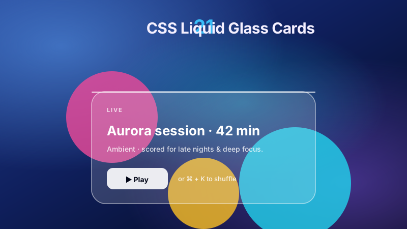
21 CSS Liquid Glass Cards
21 hand-coded CSS Liquid Glass cards inspired by Apple's WWDC 2025 design language (iOS 26 / macOS Tahoe / visionOS). Dashboard analytics widgets, draggable kanban cards, glassmorphic product feature cards, interactive pricing matrices, profile cards, horizontal case-study scrollers, music player widgets, weather cards, secure login forms, payment checkout cards, NFT collectibles, crypto wallet balance widgets, game inventory cards, analytics chart cards with warped grid refraction, digital coupon discount cards, hover-reactive profile bio cards, team member spotlight cards, media slider knob cards, smart home thermostat cards, multi-step wizard progress cards, and RPG game inventory HUD cards. Zero dependencies vs Aceternity UI, Magic UI, shadcn glass. Core Web Vitals safe (CLS 0, INP-friendly), WCAG 2.2 AA accessible, MIT licensed.
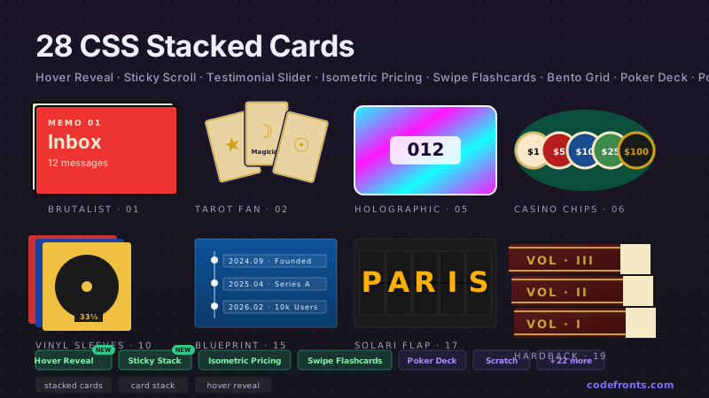
36 CSS Stacked Cards
36 hand-coded CSS stacked-card designs for SaaS product tours, Apple-style scroll pinning, Tinder-style dating card decks, Airbnb / Zillow listing card stacks, Stripe / Notion / Linear pricing tier presentations, testimonial rotators, and 3D isometric dashboards — scroll-driven scaling stack, horizontal swiper deck (Tinder / Bumble / Hinge pattern), glassmorphic floating testimonials, stacked expansion accordion, interactive fan-out photo stack, 3D perspective hover tilt, progressive disclosure step stack, dynamic tabbed deck (8 new demos), plus 28 classic patterns. 25 pure CSS + 11 with under 40 lines of vanilla JS. WCAG 2.2 accessible, MIT licensed.
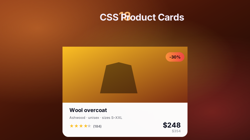
18 CSS Product Cards
18 hand-coded CSS product card templates for Shopify Dawn, WooCommerce Storefront, BigCommerce Cornerstone, Stripe Checkout, real-estate listings (Zillow/Redfin/Airbnb/Vrbo), SaaS subscription pricing (Stripe Billing/Chargebee/Recurly), food-delivery grids (DoorDash/Uber Eats/Grubhub), sneaker retail (Nike/StockX/GOAT), and digital-download stores (Gumroad/Sellfy). Hover-reveal Add-to-Cart, pure-CSS 3D flip with spec back, mouse-tracking 3D tilt, glassmorphism, neon glowing border, sale ribbon, color+size picker, quantity stepper, and more. Semantic HTML with schema.org/Product-ready markup for Google Shopping rich results, WCAG 2.1 accessible, MIT licensed.
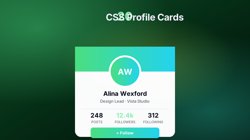
20 CSS Profile Cards
20 hand-coded CSS profile card templates for team pages, SaaS user menus, portfolios, and creator link-in-bio surfaces — Apple bento grid, Vision-Pro glassmorphism, 3D flip, Instagram slide-up, LinkedIn skeleton, Read.cv perspective tilt, Discord gaming overlay, LinkedIn minimalist, retro cyberpunk, Dribbble neumorphic, conic-gradient border, Material 3 avatar, tabbed profile, Etsy hire-me badge, G2 testimonial, Linktree link-in-bio, Superhuman morphing, Stripe/Vercel/Linear SaaS dropdown. Semantic HTML, WCAG 2.1, prefers-reduced-motion guarded. Copy-paste HTML/CSS (+JS on 3 demos).
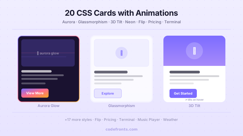
20 CSS Cards
20 hand-coded CSS card components for product grids, pricing tiers, blog previews, testimonials, real estate listings, hotel bookings, team profiles, dashboards, and more — plus the visual patterns developers Google for by name (3D flip, glassmorphism, gradient border glow, 3D pop-out, stacked cascade). Copy-paste HTML/CSS, no dependencies, WCAG AA accessible.
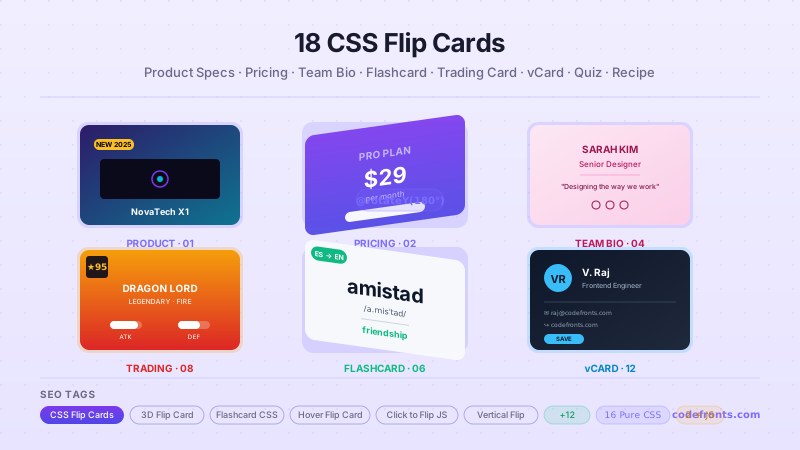
23 CSS Flip Cards
23 CSS flip cards for e-commerce product and pricing comparisons, gift-card coupon reveals, meet-the-team bios, portfolio skill ratings, language flashcards, trivia Q&A, gaming trading cards, restaurant menu recipes, testimonials, and digital business cards. Covers hover, click-to-flip, and keyboard triggers across rotateY and rotateX axes, diagonal rotate3d twists, book-open cube unfolds, clip-path iris and scratch-off reveals, auto-resizing height, and responsive grid matrices.
Forms & Inputs
24 collections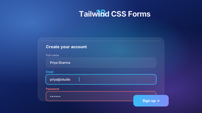
18 Tailwind CSS Forms
18 hand-coded Tailwind CSS forms for contact and support pages, SaaS sign-up and book-a-demo flows, e-commerce checkout and returns, fintech and insurance lead-gen, healthcare patient intake, mortgage pre-qualification and legal consultation requests. Covers character-counter textareas, password-strength meters, card-preview checkout, address autocomplete, inline-to-stacked newsletter signups, NPS surveys, multi-step job and quote wizards, avatar uploads, preset donation amounts, and linked slider-and-number inputs.
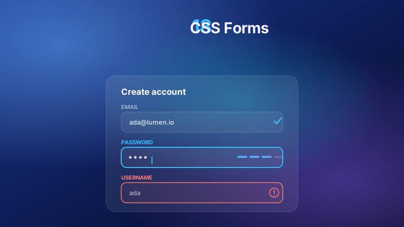
18 CSS Forms
18 hand-coded CSS forms for contact and support pages, SaaS sign-up and demo requests, e-commerce checkout and returns, fintech and insurance lead-gen, healthcare intake, and legal consultation flows. Covers auto-growing textareas with character counters, password-strength meters, live card previews, address autocomplete, inline-to-stacked newsletter signups, color-coded priority controls, multi-step job and quote wizards, avatar uploads, preset donation amounts, linked slider and number inputs, and work-email validation.
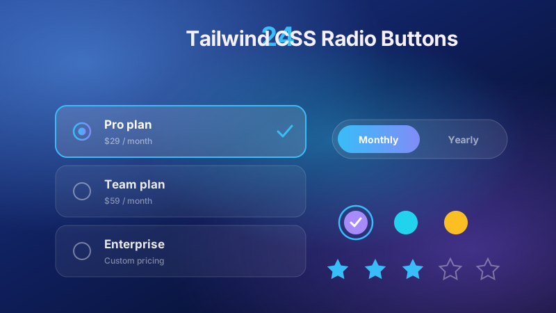
24 Tailwind CSS Radio Buttons
Selectable plan cards and pricing selectors, iOS-style segmented controls and billing toggles, settings-page option rows with icons and descriptions, e-commerce color swatches and image pickers, star ratings, payment-method lists, and avatar profile selectors. Built on appearance-none native inputs with accessible focus rings, plus ripple, ink-splash, liquid-wave, 3D sphere, tilt-card, neon, gradient-border, and pulsing-glow animation styles.
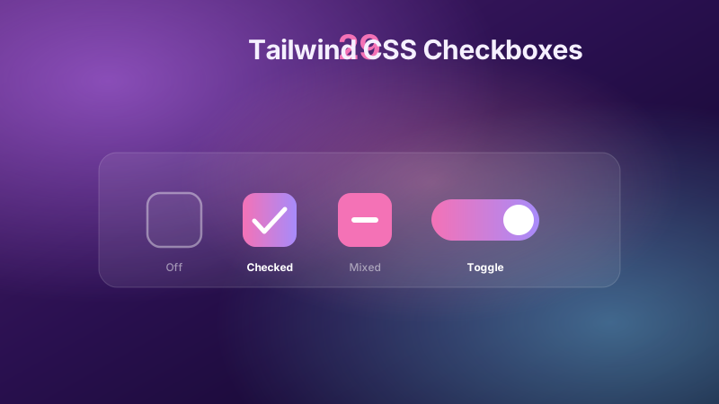
29 Tailwind CSS Checkboxes
Selectable pricing plan cards and e-commerce filter chips built from has-checked, iOS-style toggle switches for SaaS settings, a no-JavaScript FAQ accordion, indeterminate "select all" tri-state masters, and WCAG-accessible focus rings. Covers to-do strikethroughs, dark-mode sun/moon and aurora toggles, plus animated SVG checkmark draws, liquid fill, gooey blob, confetti burst, ripple, neon glow, glassmorphism, neumorphism, brutalist, and 3D flip styles.
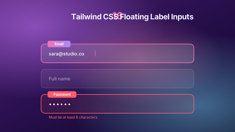
16 Tailwind CSS Floating Label Inputs
Floating label inputs for sign-up forms, login screens, checkout address grids, and settings panels. Covers the pure Tailwind peer pattern, Material Design outlined and filled fields, validation states with error and success messages, icon-inside inputs, select-dropdown and auto-growing textarea labels, a password show/hide toggle, Chrome autofill fixes, dark mode via light-dark(), ARIA/WCAG accessibility, and a mobile no-zoom container-query layout.
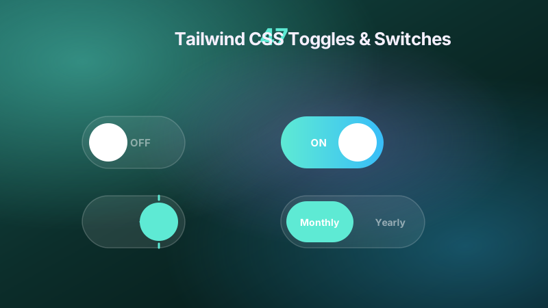
47 Tailwind CSS Toggles & Switches
47 Tailwind CSS toggles & switches for theme and dark-mode switchers, SaaS pricing monthly/annual pills, iOS settings rows, permission and battery-saver panels, and power controls. Patterns include appearance-none checkboxes, gooey SVG-filter morphs, neumorphic and glassmorphism tracks, conic countdown rings, slide-to-confirm and press-and-hold guards, three-position Off/Auto/On selectors, rotary knobs, split-flap flips, indeterminate master toggles, and role=switch buttons.
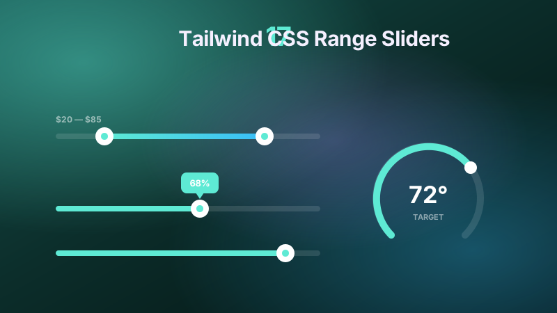
17 Tailwind CSS Range Sliders
17 Tailwind CSS range sliders for e-commerce price filters, media seekbars, audio equalizers, thermostat dials, loan calculators, and password strength meters — spanning dual-handle, vertical, circular, and centre-origin tracks in neumorphic, neon, glassmorphism, and liquid-glass styles with pop-up value bubbles. Scoped under <code>.trs-NN</code> for no-collision pasting, <code>prefers-reduced-motion</code> guarded, framework-agnostic.
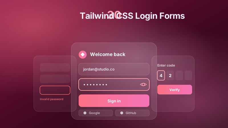
30 Tailwind CSS Login Forms
30 Tailwind login forms spanning split-screen brand heros, floating-label and OAuth social sign-in, passwordless magic-link and Web3 wallet-connect grids, multi-tenant workspace switchers, glassmorphism and aurora-glow cards, terminal CLI and neo-brutalist styles, plus sliding login/sign-up panels, 3D flip password-reset, OTP code grids, PIN pads, password strength meters, show/hide toggles, and inline user-valid validation for fintech, SaaS, and secure-vault auth.
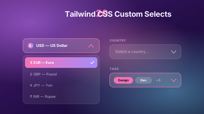
20 Tailwind CSS Custom Selects
Country picker with flag icons, currency and credit-card-type selectors, avatar profile and workspace switchers, language switcher, dark-mode theme selector, multi-select tag dropdowns with chips, status filter badges, date-range period pickers, product sorting, font-family preview pickers, color swatch and file-type selectors, plus floating-label fields, sliding highlight bars, spring open transitions, and a frosted glassmorphism select. Zero-JS state, accessible keyboard nav, semantic markup.
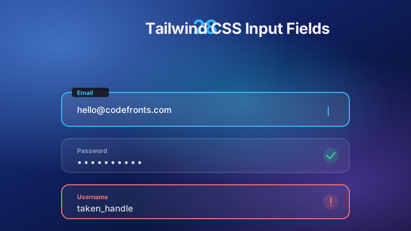
28 Tailwind CSS Input Fields
28 Tailwind CSS input fields covering floating labels, underline-sweep and drawn-border focus effects, frosted-glass and neon-glow styling, and the Material notched outline. Practical form controls include OTP code entry, password strength meters and reveal toggles, tag-chip and email-suggestion comboboxes, search with clear, phone-with-country and currency fields, file drop zones, steppers, range sliders, auto-grow textareas, inline edit, and credit-card formatting.
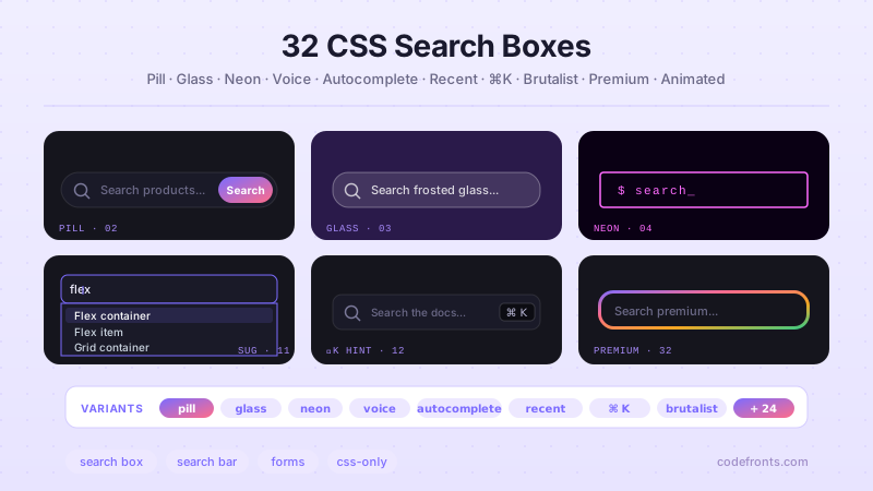
36 CSS Search Bars
36 hand-coded CSS search bars for every product surface — command palette (⌘K), Algolia-style instant search with highlighted results, e-commerce product search with category scope, header navbar sticky search, SaaS dashboard command search, voice input, autocomplete dropdowns, filter chips, recent searches, animated placeholders, glassmorphism, neon glow, and 24 more design and interaction patterns. Every demo scoped under .sb-NN, prefers-reduced-motion guarded, framework-agnostic — copy the CSS into React, Vue, Svelte, Astro, or plain HTML.
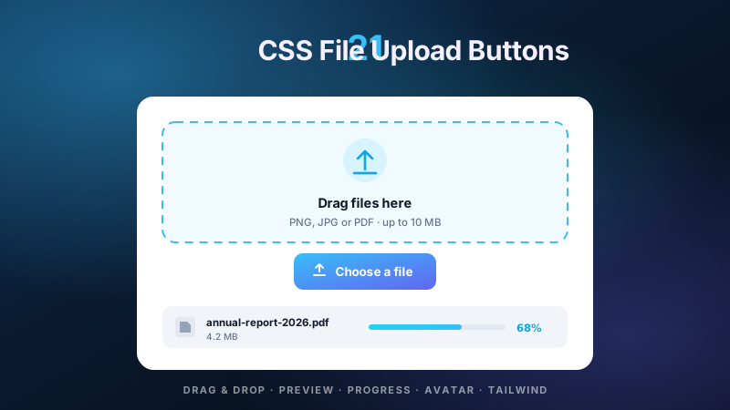
21 CSS File Upload Buttons
21 hand-coded CSS file upload buttons and dropzones for SaaS document flows, e-commerce product media, CMS libraries, support ticket attachments, and profile settings. Covers the custom-label button that replaces the unstylable native control, a pure-CSS version with no JavaScript, selected file name and multi-file list feedback, a WCAG-compliant accessible file input, drag-and-drop zones with grid previews and reorderable lists, a full-page drop overlay, image and video preview thumbnails, circular avatar upload with hover edit, multi-image grids with remove badges, upload progress bars with percentage, chunked multi-file progress lists, a success/error/retry state machine, cloud-storage style drop zones, mobile camera capture, clipboard image paste, plus Tailwind and Bootstrap 5 variants. Every upload is scoped under a .fu-NN prefix for no-collision pasting, keeps the native input keyboard-reachable rather than hiding it from assistive technology, guards prefers-reduced-motion, and ports unchanged to React, Vue, Svelte, Astro, Next.js and Tailwind.
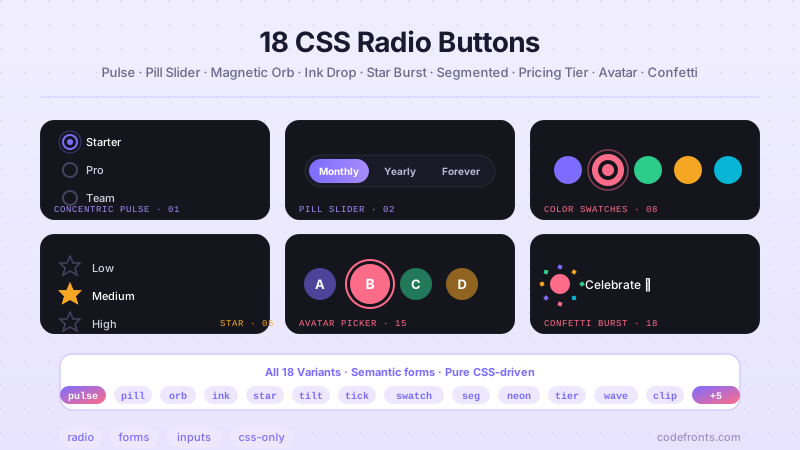
24 CSS Radio Buttons
24 hand-coded CSS radio button designs covering every real-world use case tier-1 SaaS, e-commerce, fintech, and healthcare products reach for radio inputs in 2026: full selectable cards (:has()-driven with icon + title + meta + price), iOS-style pill segmented control (billing period toggle), radio row with icon tile + title + description subtext (settings-page pattern), dark-mode glowing radio with 3-layer box-shadow breathing pulse, pure-CSS accessible radio using appearance:none (WCAG 1.3.1 canonical reference — no wrapper), plan picker rows with 'Most popular' + 'Best value' gradient badges, concentric ripple animation on check, sliding pill toggle switch (2-seg thumb), interactive 3D sphere radio with orb highlight tracking, ink splash animation on select, rating star radio group (reverse-flex flip pattern), 3D tilt card option selector with cursor-tracked perspective, minimal checkmark radio, product color swatch selector (Shopify/Amazon variant picker), segmented control bar, cyberpunk neon ring radio, subscription pricing plan cards (Stripe/Vercel/Linear billing tier pattern), liquid wave fill on select, image clip-mask option selector (Airbnb/Booking destination picker), gradient border card radio, user profile avatar selector (Netflix who's-watching pattern), stacked vertical radio list, tactile 3D push button radio (skeuomorphic keycap depress), and outer glow pulse radio with dual sonar-ping keyframes. 22 truly Pure CSS + 2 with a tiny optional vanilla JS snippet (Demo 09 orb highlight tracking + Demo 12 3D tilt cursor perspective). Every radio group uses real <input type='radio'> inside <fieldset> + <legend> semantic wrappers so screen readers announce the question before the options, keyboard arrow keys move selection natively, and form-post semantics work zero-config. Every visual is scoped under a unique .crb-NN prefix so it drops into any project without CSS collisions, ships prefers-reduced-motion guards, and is framework-agnostic (works as-is in React, Vue, Svelte, Astro, Next.js, Remix, or plain HTML).
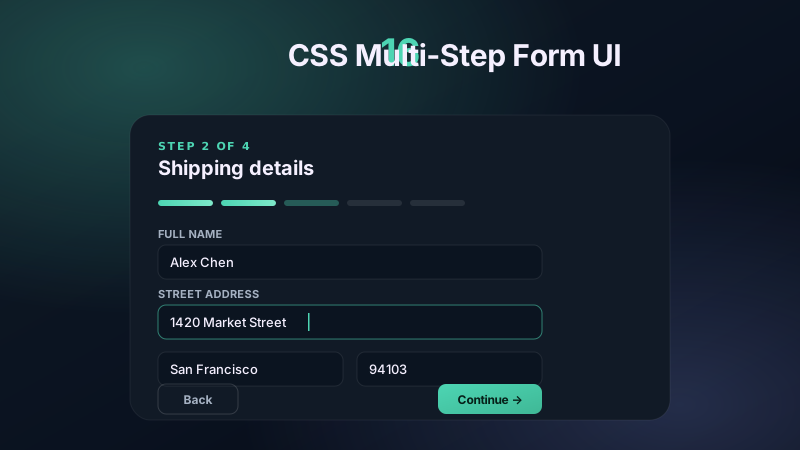
16 CSS Multi-Step Form UI
16 hand-coded multi-step form UI templates for e-commerce checkout, SaaS onboarding, mortgage and insurance applications, patient intake, KYC verification, financial loan wizards, event registration, university admissions, moving quotes, home services, car rental and non-profit donation flows. Copy-paste HTML, CSS and vanilla JS, WCAG 2.2 accessible, mobile-first.
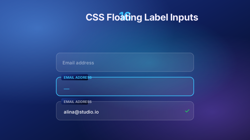
16 CSS Floating Label Inputs
16 hand-coded CSS floating label input demos — pure CSS float triggers, Chrome autofill fix, live validation states, ARIA-accessible fields, select dropdowns, Material Design outlined text field, filled underline minimal, dark mode with light-dark(), icon inputs, mobile-safe (no iOS zoom), auto-growing textareas, password show/hide toggle, multi-column form grid, plus showcase-tier gradient-ink label, conic border-beam, and staggered letter cascade. Copy-paste, zero deps.
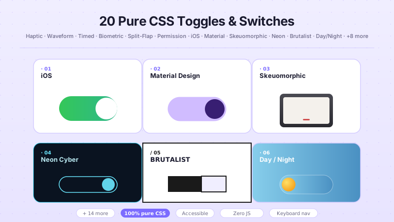
47 CSS Toggles & Switches
47 CSS toggles and switches for dark-mode theme switchers, settings and permission rows, SaaS billing toggles, and destructive-action guards — spanning iOS-style pill and Material 3 switches, neumorphic, glassmorphism, neon and brutalist styles, gooey and squash-and-stretch physics, split-flap and rotary-knob mechanics, and biometric hold-to-confirm kill switches. Scoped under <code>.tgl-NN</code> for no-collision pasting, <code>prefers-reduced-motion</code> guarded, framework-agnostic.
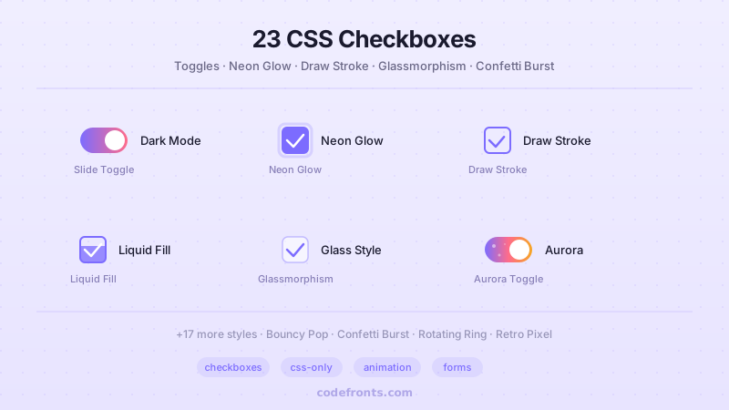
29 CSS Checkboxes
29 CSS checkboxes for SaaS settings toggles, e-commerce filter chips, pricing-plan cards, and to-do lists with animated strikethrough — spanning iOS slide switches, tri-state select-all, SVG checkmark draws, glassmorphism, gooey blobs, confetti bursts, and dark-mode toggles. Scoped under <code>.cb-NN</code> for no-collision pasting, <code>prefers-reduced-motion</code> guarded, framework-agnostic.
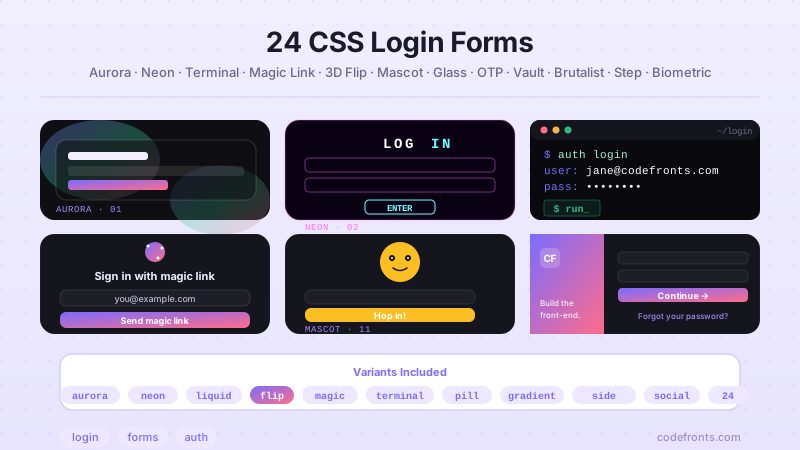
30 CSS Login Forms
30 hand-coded CSS login form templates for SaaS authentication panels, multi-tenant account switchers, passwordless magic-link entry, Web3 wallet-connect, Stripe-style minimalist billing, OTP, biometric passkey and password strength meters. Copy-paste HTML and CSS, WCAG 2.2 accessible, mobile-first.
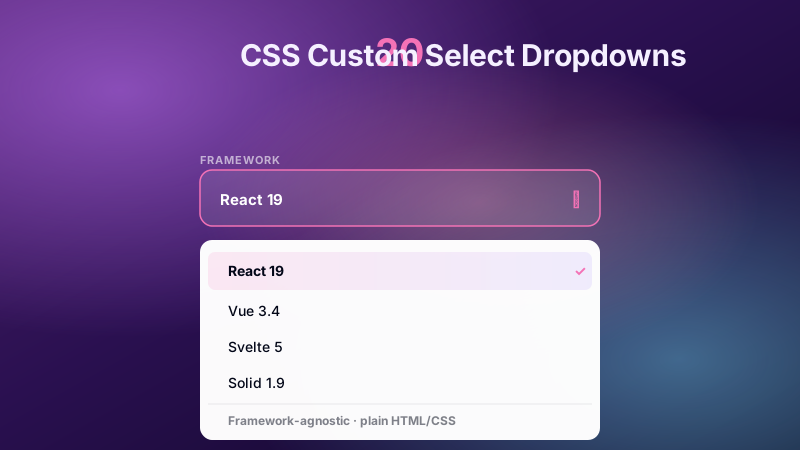
20 CSS Custom Select Dropdowns
20 CSS custom select dropdowns for building rich, styled replacements for the native select element. Includes a country picker with flag chips, currency and credit-card selectors, a pricing-plan switcher, avatar profile and workspace menus, a dark-mode theme picker, multi-select tag chips, status filters, date-range presets, product sorting, font and color swatch pickers, floating-label fields, and a glassmorphism variant with keyboard navigation and slide-fade transitions.
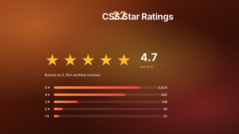
22 CSS Star Ratings
22 production-grade CSS star rating designs with live demos and copy-paste code — pure CSS radio-button stars, modern :has() sibling fill, half-star fractional precision, animated SVG burst particles, accessible ARIA fieldset, read-only review displays, emoji reaction scales, neumorphic soft UI, CSS variable customizer, vertical sidebar filter, gradient fills, single-star numeric, heart-based favorites, tooltip hover labels, plus 8 experimental concepts including liquid mercury, holographic scanner, neural pulse, magnetic field lines, quantum superposition, DNA helix, particle constellation, and glitch corrupt-and-resolve. Every star scoped under .sr-NN, copy-paste ready.
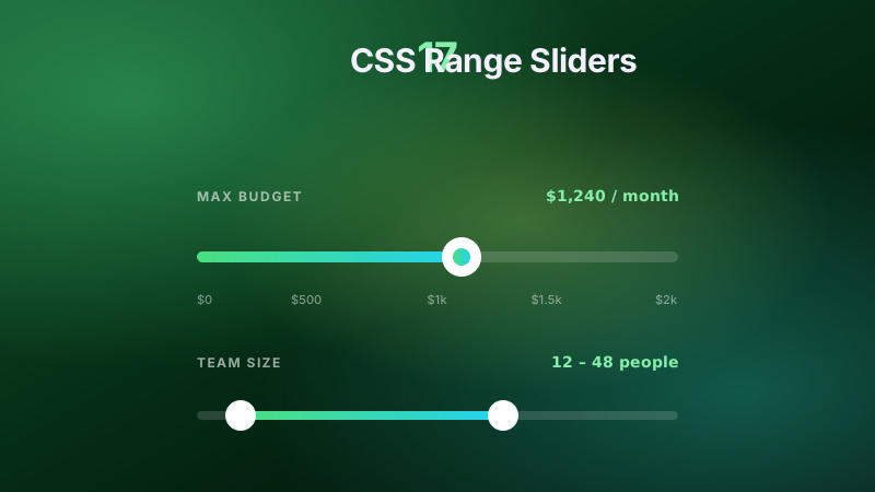
17 CSS Range Sliders
Price range filters with dual handles, neumorphic volume knobs, neon glow tracks, and emoji mood selectors, plus milestone step sliders, video seekbars, vertical equalizers, radial thermostat dials, gradient progress fills, bubble tooltips, brutalist thick-block tracks, password strength meters, audio pan balance controls, retro pixel health meters, isometric 3D tracks, and glassmorphism RGBA mixers. Semantic HTML, dual-thumb and vertical inputs, keyboard support.
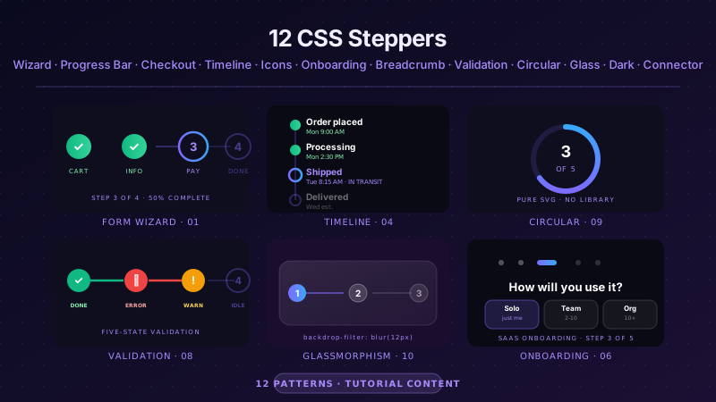
12 CSS Steppers
12 hand-coded CSS stepper UI components covering every production multi-step flow pattern — multi-step form wizard with progress indicator, numbered step progress bar, e-commerce checkout stepper with sidebar order summary, vertical timeline stepper, animated step indicator with icons, onboarding stepper flow (Notion/Linear/Vercel style), breadcrumb-style step tracker, stepper with validation states (success/error/warning), circular SVG progress indicator, glassmorphism stepper, dark mode stepper, and stepper with animated connector lines. All use semantic HTML with proper <code>aria-current="step"</code> and <code>aria-valuenow</code> attributes for screen reader accessibility, scoped <code>.stp-NN__*</code> class names so multiple steppers coexist on the same page without style bleed, respect <code>prefers-reduced-motion</code>, and ship MIT-licensed. 11 use ~30-50 lines of vanilla JavaScript for step navigation, validation, and state persistence; 1 demo (the checkout stepper) is fully static — useful as a display-only progress indicator inside an existing wizard. Drop into any stack: React, Vue, Astro, Svelte, Rails ERB, plain HTML — zero framework dependencies.
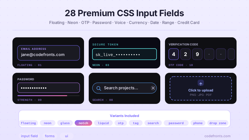
28 CSS Input Fields
28 hand-coded CSS input fields for sign-up flows, e-commerce checkouts, SaaS onboarding, HIPAA patient portals, banking forms, and password reset screens — floating label, OTP, password strength, voice search, autocomplete, range slider, credit card, tag chip, inline edit, and more. Semantic HTML, WCAG 2.1, copy-paste ready.
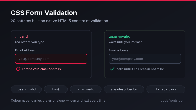
20 CSS Form Validation
20 hand-coded CSS form validation patterns built on native HTML5 constraint validation. Covers the :user-invalid pseudo-class that stops a required field turning red before anyone has typed, inline error messages that reserve their layout space so nothing shifts, required checkbox groups that native HTML cannot express on its own, confirm-password matching through setCustomValidity, character counter limit warnings, the aria-invalid and aria-describedby contract screen readers need, a :has() validation summary box, forced-colors support, and the real-world forms most tutorials skip — checkout card fields with correct autocomplete tokens, relative date ranges, and dark mode validation tokens.
Modals, Media & Data Display
10 collections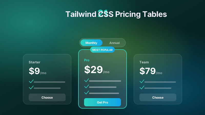
21 Tailwind CSS Pricing Tables
21 Tailwind CSS pricing tables for SaaS plans, product suites, and per-seat billing: monthly/annual toggles, USD/GBP/EUR/AUD currency switchers, expandable feature comparisons, dark-mode themes, 3D flip cards, per-seat and bundle calculators, tabbed and stacking-accordion layouts, usage meters, glassmorphism and neumorphic styling, animated border beams, corner ribbons, mobile swipe carousels, and skeleton loading shimmers. Semantic HTML, appearance-none inputs, copy-paste ready.
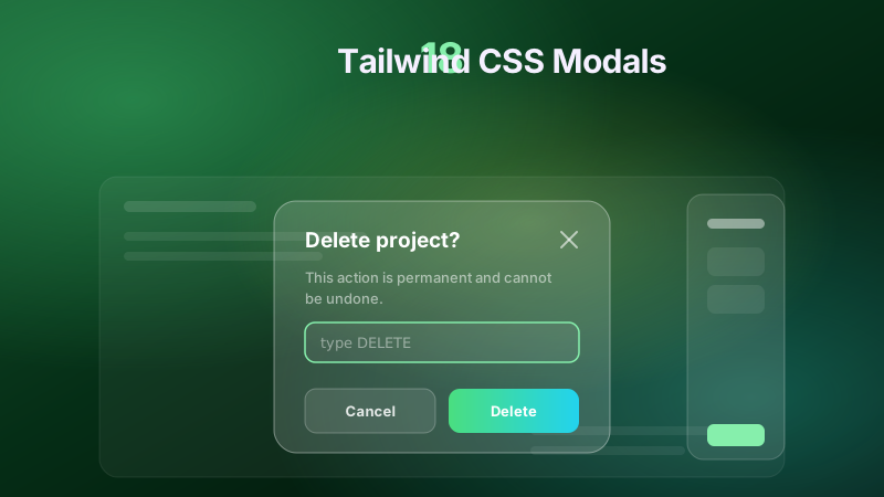
36 Tailwind CSS Modals
36 Tailwind CSS modals for auth and password reset, paywalls and subscribe walls, product quick-views and cart drawers, age gates and GDPR consent, delete confirmations and support forms, plus a ⌘K command palette — spanning native <code><dialog></code> overlays, <code>:has()</code> and <code>:target</code> zero-JS state machines, slide-over drawers, bottom sheets, and radio-driven tabs. Scoped under <code>.tm-NN</code> for no-collision pasting, <code>prefers-reduced-motion</code> guarded, framework-agnostic.
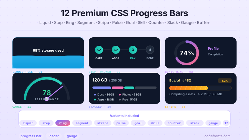
22 CSS Progress Bars
22 hand-coded CSS progress bar patterns — native progress element, fetch upload progress, streaming response, view transition page load, password strength, download queue, dark-mode color-mix tokens, WCAG 2.2 accessible progress, video buffering, conic ring, segmented battery, speed gauge and more.
22 CSS Skeleton Loaders
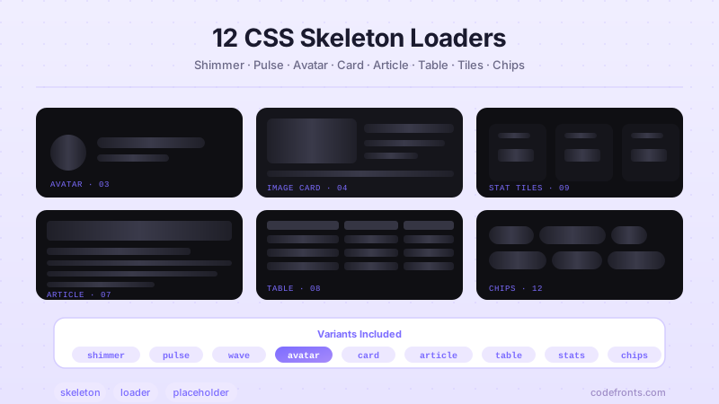
22 hand-coded CSS skeleton loaders — React Suspense fallback, Next.js loading UI, prefers-reduced-motion fallback, dark-mode color-mix, SVG blur-up image, clamp sizing, cross-fade, ARIA live-region, timing recipe, CLS-preserving min-height, plus avatar, article, table, stats, comments, media list, chip cluster.
25 CSS Testimonials & Reviews
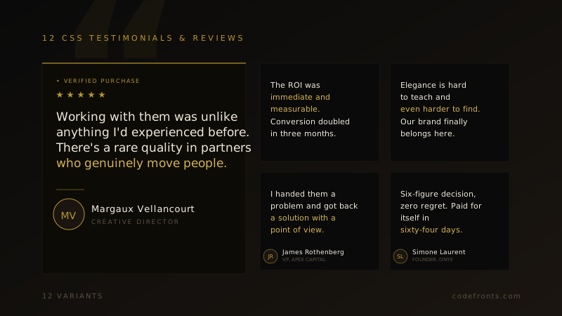
25 hand-coded CSS testimonial and review card templates for SaaS landing pages, e-commerce product pages, agency case studies, course platforms, real-estate sites, and fintech trust sections. Covers wall-of-love CSS-columns grids, verified trust banners, star-rating product review cards, scroll-snap carousels with ::scroll-marker dots, video testimonial modals built on the native dialog element, Trustpilot and Google-style review widgets, before/after case-study metric blocks, mobile swipe decks, read-more line-clamp cards with calc-size() height animation, hero pull-quotes, dark editorial cards, neo-brutalist reviews, bento social-proof grids, glassmorphism cards, restaurant reviews, minimalist agency quotes, Web3 conic-gradient glow borders, EdTech course reviews, real-estate client reviews, esports cards, fashion editorial quotes, fintech trust badges, clean white grids, horizontal sliding rows and staggered portrait grids. Every card uses figure/blockquote/figcaption semantics with a single role=img star rating, is scoped under a .tr-NN prefix for no-collision pasting, guards prefers-reduced-motion, and ports unchanged to React, Vue, Svelte, Astro, Next.js and Tailwind.
21 CSS Pricing Tables
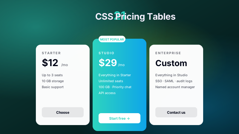
21 production CSS pricing tables and pricing card templates — monthly/annual billing toggle, currency switcher, feature comparison matrix, dark-mode adaptive cards, most-popular border-beam glow, 3D flip plans, usage-based volume slider, bundled checkbox calculator, glassmorphism, gradient border draw-in, ribbon folds, neumorphic tiers, mobile swipe carousel, accordion stacking, skeleton loading states. Copy-paste, zero deps.
36 CSS Modals
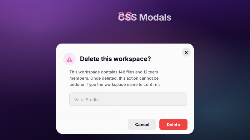
36 CSS modal dialogs for authentication overlays, password reset and Stripe-style payment checkout, age verification and paywall content locks, product quick-views and slide-over cart drawers, newsletter and exit-intent discount popups, image and video lightboxes, delete confirmations with type-to-confirm, GDPR cookie preferences, HIPAA and terms-of-service consent, multi-step onboarding, filter panels, settings tabs, and a ⌘K command palette. Built on native dialog, :has(), :target and starting-style.
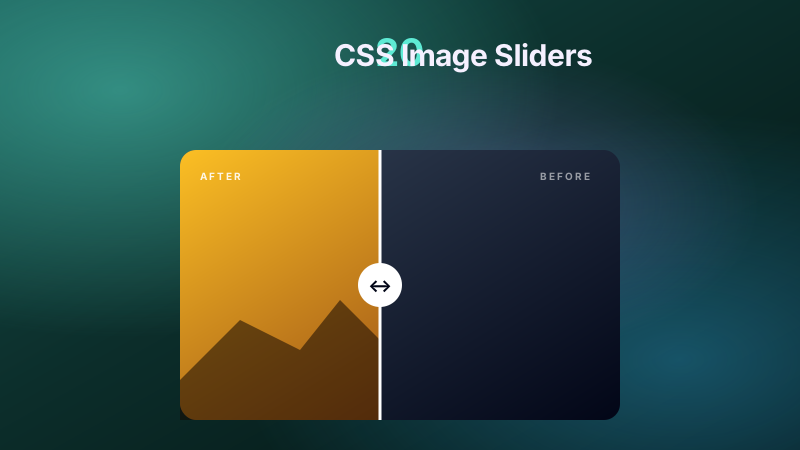
20 CSS Image Sliders
20 hand-coded CSS image sliders and carousels covering product galleries, real-estate listings, before/after comparisons, hero banners, testimonial carousels, and SaaS onboarding scrollers. WCAG-friendly, no-JS options, Core Web Vitals safe.
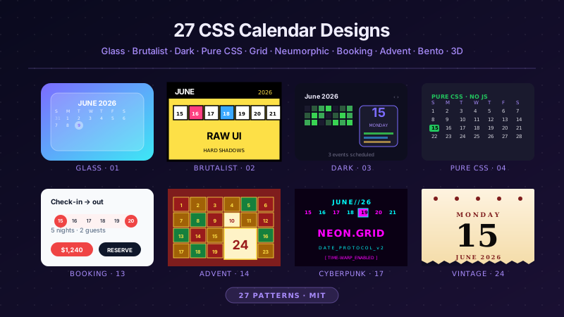
27 CSS Calendars
27 hand-coded CSS calendar UIs for SaaS scheduling (Calendly / Cal.com / SavvyCal patterns), Airbnb / Vrbo / Booking.com date-range pickers, healthcare Epic MyChart / Zocdoc appointment slots, real-estate Zillow / Redfin showing schedulers, event planners, advent countdowns, and bento booking systems — pure-CSS calendar (no JavaScript), CSS Grid layouts, glassmorphism widgets, brutalist designs, dark mode UIs, neumorphic cards, horizontal timelines, sidebar widgets, 3D flip cards, isometric dashboards, split-screen heroes, liquid micro-interactions, vintage paper tear-offs, vertical timelines, kinetic typography. WCAG 2.2 accessible, MIT licensed.

22 CSS Avatars
22 hand-coded CSS avatars for chat apps, team dashboards, comment threads, account menus, and social profiles. Covers circular and squircle shapes, gradient and conic story rings, hexagon clip-path crops, online status dots, notification count badges, verified checkmarks, stacked facepiles with plus-N overflow, initials fallbacks for users without photos, broken-image recovery, avatar pickers, and a size scale system where the ring, badge, and status dot all scale from a single custom property.