16 CSS Fade In Animation Designs
A CSS fade-in animation is the gentle reveal that signals "content has loaded" or "this section is now in view" — the most-used entrance pattern on the web. These 16 hand-coded designs cover the full modern fade-in playbook — staggered opacity hero, clip-path reveals, blur defocus, scroll-triggered IntersectionObserver, directional slide-fade, scale zoom, rotate tilt, word-by-word split, radial mask, greyscale-to-color, glitch flash and more. Every demo uses scoped .fi-NN class names that never collide with your existing styles, honours prefers-reduced-motion, and ships under the MIT license.


Frequently asked questions
What is a CSS fade-in animation and what's the simplest recipe?
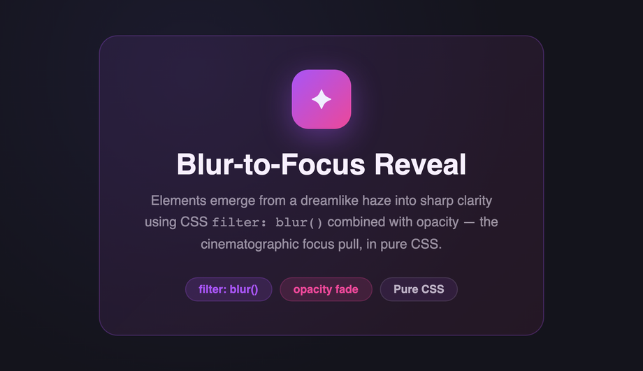
opacity: 0 → 1), often combined with translateY for a slide-in feel. The canonical pure-CSS recipe (Demo #01) is four lines: @keyframes fade { from { opacity: 0 } to { opacity: 1 } } defines the visibility transition, then .element { opacity: 0; animation: fade 0.8s cubic-bezier(.16, 1, .3, 1) forwards; } applies it. Critical detail: animation-fill-mode: forwards locks the final state — without it, the element snaps back to opacity: 0 when the animation ends. The opening opacity: 0 on the element prevents a flash-of-visible-content before JavaScript or CSS loads. cubic-bezier(.16, 1, .3, 1) is the modern fast-out / slow-arrive ease that feels snappy without overshoot. For staggered groups (hero + heading + paragraph + CTA), apply the same animation to each child with incremental animation-delay values (0.1s, 0.35s, 0.55s, 0.75s, 0.95s) to create a sequential cascade. Demo #01 ships the canonical 5-element hero pattern.Which fade-in pattern should I pick for my use case?
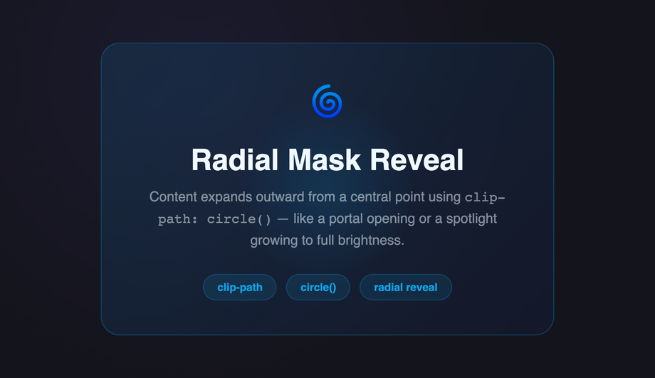
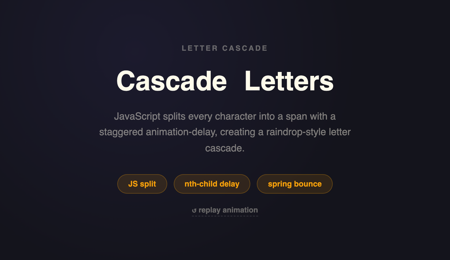
animation-delay across grid items produces a cascading reveal. Text reveals (headlines, quotes, callouts): Demo #10 (Word-by-Word Split), Demo #16 (Cascade Letter Drop). Editorial / brand: Demo #12 (Radial Clip-Path Mask Reveal) for cinematic aperture-style entrances, Demo #13 (Greyscale to Color Saturate) for photo-led storytelling. Directional reveals: Demo #06 (Slide-Fade Up) — the most-used modern entrance, the dominant pattern in Vercel / Linear / Stripe marketing. Playful / interactive: Demo #15 (Glitch Flash Multi-Step) for gaming / Web3, Demo #14 (rotateY Flip Card) for portfolio cards. Whatever you pick: all 16 demos use scoped .fi-NN class names so you can drop multiple onto the same page without conflicts.How do I make a fade-in trigger when the user scrolls to it?
{ threshold: 0.15 }, on isIntersecting add a .is-visible class that triggers the CSS animation. ~20 lines of vanilla JS, no framework, no library. The IntersectionObserver is GPU-friendly and doesn't run on every scroll frame like a manual window.scroll listener would (a major Core Web Vitals win — manual scroll listeners cause INP regressions). 2. Scroll-driven animations (CSS-only, modern): Chrome 115+, Edge 115+, Opera 101+, partial Safari 26+ and Firefox 134+ support animation-timeline: view(block) which lets you drive a fade-in entirely from CSS based on the element's position in the viewport — zero JavaScript. Demo #05's CSS includes a commented-out scroll-driven-animations version next to the IntersectionObserver implementation; uncomment if your target browsers support it. Don't use libraries like AOS (Animate On Scroll, ~15KB) or wow.js (~6KB) for this — both add bundle weight and external dependencies for what's now a 20-line vanilla pattern or zero-line CSS feature.Why does my CSS fade-in flash visible before the animation plays?
opacity: 1) before the stylesheet downloads + parses, so the element flashes visible then disappears when CSS applies opacity: 0. Fix: load your animation CSS in <head> as a critical <link rel='stylesheet'>, NOT lazy-loaded or async. For inline-on-render frameworks (Astro, Next.js with server components), the CSS is bundled with the HTML so this isn't usually an issue. 2. Missing animation-fill-mode: without forwards the animation runs and then the element snaps back to its INITIAL CSS state — if the element didn't have opacity: 0 in its base CSS, it'll show fully visible after the animation ends. Fix: BOTH set opacity: 0 in the base rule AND set animation-fill-mode: forwards on the animation. The base opacity: 0 prevents pre-animation flash; forwards locks the final state. 3. Browser back-button restoration: when a user navigates away and back via the browser back button, some browsers replay the page from a cached state where animations have already run; the element may flash if opacity is animation-driven. Fix: use page show event handlers to re-trigger animations on bfcache restore, OR use transition instead of animation for state-driven fades (transitions don't replay).Is the CSS fade-in accessible? What about prefers-reduced-motion?
prefers-reduced-motion: reduce. The recipe: wrap every @keyframes rule in @media (prefers-reduced-motion: no-preference) so the animation ONLY runs when the user hasn't opted out — OR (simpler) wrap the animation declaration in @media (prefers-reduced-motion: reduce) { .element { animation: none; opacity: 1; } } so users with reduced-motion see the final state instantly. Every demo in this collection ships the reduced-motion guard automatically. Additional a11y concerns: (1) Don't fade-in content that's required for understanding — long fade durations on body text frustrate screen-reader users who hear an empty page. (2) Don't fade-in error messages, validation, or interactive controls — these need instant visibility. (3) Fade-in content should still be in the DOM at opacity: 0 (not display: none or visibility: hidden) so screen readers can pre-announce it. (4) Reserve final layout space to prevent CLS. Regulatory frameworks requiring WCAG 2.2 AA: EU EAA (June 2025), US Section 508, Canada ACA, UK Equality Act.How does this compare to animate.css, Framer Motion, GSAP, or anime.js fade-in?
animate__animated animate__fadeIn classes. Wide variety of presets but you ship 70KB even if you only use 1 fade-in. Framer Motion (~80KB gzipped): React-first animation library with declarative initial / animate / exit props. Powerful for scroll-driven and gesture animations but adds significant bundle weight. GSAP (~50KB core, +30KB ScrollTrigger): the industry-standard JS animation library, beats CSS for complex timelines and morphing but overkill for simple fades. anime.js (~17KB minified): leaner GSAP alternative, similar API. This collection vs all of the above: the same fade-in effects in 4-30 lines of CSS per demo that ship inline with your HTML — zero bundle cost, zero npm dependency, zero CVE surface, faster First Contentful Paint and Largest Contentful Paint, no library hydration delay. For 95% of fade-in use cases (entrances, scroll reveals, staggered cards), the CSS approach wins on every Core Web Vitals dimension. Reserve GSAP / Framer Motion for complex scrubbed timelines and morph transitions; reserve animate.css for prototyping speed. Production marketing pages should ship the CSS recipes from this collection.Tailwind / shadcn / MUI / Chakra fade-in — how do these compare?
animate-fade-in only via plugins (tailwindcss-animate which shadcn uses) — by default Tailwind has animate-pulse, animate-spin, animate-bounce, and animate-ping but NOT a baseline fade-in. To add: register a custom fadeIn keyframe + utility in tailwind.config.js (or extend via theme.extend.keyframes + theme.extend.animation), OR use the arbitrary-value syntax animate-[fadeIn_1s_ease-out_forwards]. Our CSS to Tailwind converter handles the conversion automatically. shadcn/ui: ships tailwindcss-animate plugin out of the box (enables animate-in fade-in slide-in-from-bottom-4 etc) — used by Radix UI components, can be applied to any element. Material UI / MUI: ships the <Fade in={true} timeout={500}> component (uses MUI's transitions package, ~10KB), or via the sx prop's transition shortcut. Chakra UI: ships <Fade in={open}> as a first-class component, similar to MUI. Framer Motion: pair initial={{ opacity: 0 }} + animate={{ opacity: 1 }} + transition={{ duration: 0.8 }}. For static marketing pages, the CSS approach in this collection ships zero JavaScript for 13 of the 16 demos — for fade-in-driven hero pages and scroll-reveal sites, this is the lowest-overhead approach.How do I prevent cumulative layout shift (CLS) from fade-in animations?
opacity: 0; transform: translateY(20px) shifts the element's PAINTED position but transform doesn't affect layout, so layout shift isn't triggered (good). But setting visibility: hidden or display: none does affect layout — avoid these for fade-in initial states. Use opacity: 0 + transform only. 2. Image-driven fades without reserved dimensions: if your fading element contains an <img> that loads asynchronously, the image's intrinsic dimensions can shift layout AFTER the fade starts. Fix: set width + height attributes on the img OR use aspect-ratio on the container. 3. Font-swap during fade: web fonts loading mid-fade can re-flow the text. Fix: font-display: optional or pair font-display: swap with size-adjust in @font-face. 4. Late-loading content fading in below existing content: scroll-triggered fades on long pages can shift the viewport if the user scrolls past the element while it animates. Demo #05 uses IntersectionObserver with { threshold: 0.15 } to fire the animation early enough that it completes before the user scrolls into the affected zone. Tools to audit: Chrome DevTools Performance Insights, Lighthouse, Core Web Vitals report in Google Search Console, WebPageTest.Why does my fade-in look smooth in Chrome but jerky in Safari or Firefox?
opacity and transform are compositor-only — the GPU handles them without re-painting or re-laying-out the page. They're 60-120fps smooth on every browser. filter: blur(), backdrop-filter: blur(), clip-path, width, height, margin, padding, top/left, and box-shadow are NOT compositor-only — they trigger paint or layout on every frame, which can stutter on lower-powered devices and especially Safari with its more conservative compositing. Fix: prefer opacity + transform: translate3d(0, 20px, 0) over top: 20px → 0; prefer transform: scale(0.95) over width / height changes. 2. will-change: transform, opacity: hints the browser to pre-promote the layer onto the GPU before the animation starts. Use ONLY on elements about to animate; overusing it (every element) eats GPU memory. Remove the will-change declaration when the animation completes (or just before — using animationend event). 3. Safari's animation-fill-mode quirk: in Safari < 17, combining animation-fill-mode: forwards with very short durations (<200ms) can drop the final keyframe. Fix: use animation-fill-mode: both instead — covers both 0% and 100% keyframes outside the animation range. Demos in this collection use both by default.Are these fade-in animations free, accessible, and how do I attribute them?
prefers-reduced-motion: reduce (animations fall back to instantly-visible final state), uses semantic HTML, and is designed to work with screen readers (elements remain in the DOM at opacity: 0, not display: none). Verify your specific use case with axe DevTools, Lighthouse, WAVE, or the WebAIM tools before shipping to EU EAA / US Section 508 / Canada ACA / UK Equality Act audits — the demos are AA-compliant by default but layout context matters.Related collections

20 CSS Animated Buttons
20 hand-coded CSS animated buttons — neon glow, ripple, 3D press, liquid fill, jelly bounce, shine sweep, animated border, moving gradient CTA, text flip, submit success state, add-to-cart progress, download icon, hamburger-to-close, toggle switch, loading spinner inside button, next/prev arrow nav, and ghost button background reveal. Half pure CSS, half lightweight JS for production interactions.

15 CSS Background Animations
15 hand-coded CSS background animations with live demos — infinite shifting gradient, floating particle bubbles, parallax starry night, clickable cyberpunk ripple, sliding geometric grid, SVG wave overlays, glassmorphism orbs, aurora borealis ribbons, matrix digital rain, mesh gradient blobs, falling snow, morphing blob, retro synthwave 3D grid, infinite scrolling diagonal marquee, comic-book halftone dots. 100% Pure CSS, no JavaScript, no canvas, no particles.js. prefers-reduced-motion respected, scoped class names, MIT-licensed.

27 CSS Button Hover Effects
27 hand-coded CSS button hover effects — 3D press, neon glow, gradient slide, border draw, liquid fill, ripple, glitch text, and kinetic flips. Every demo is pure CSS (no JavaScript, no framework), tuned for 60fps with transform and opacity, and respects prefers-reduced-motion out of the box.