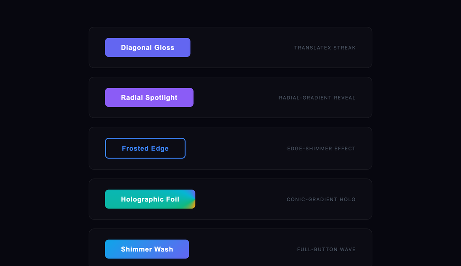
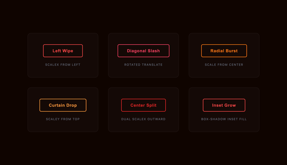
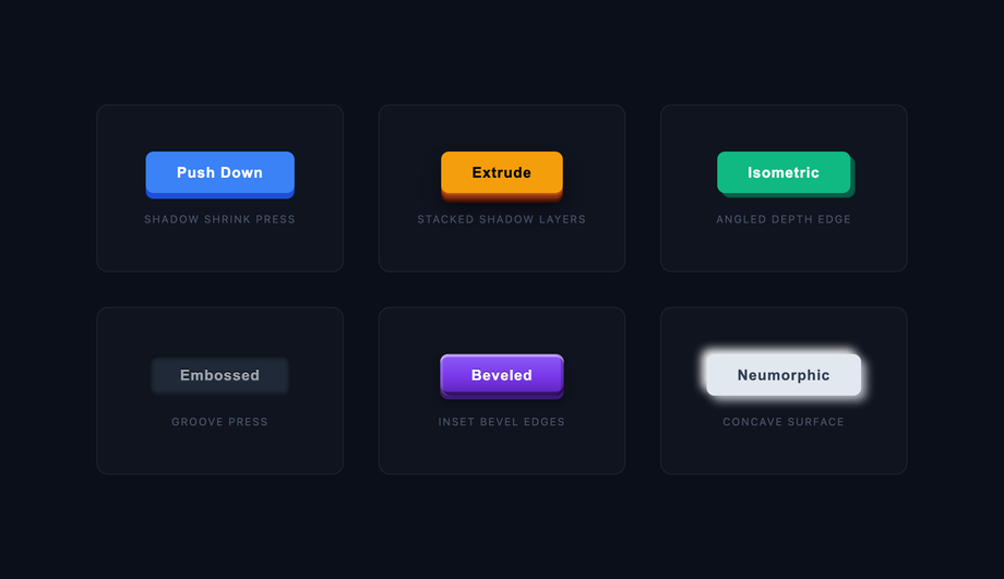
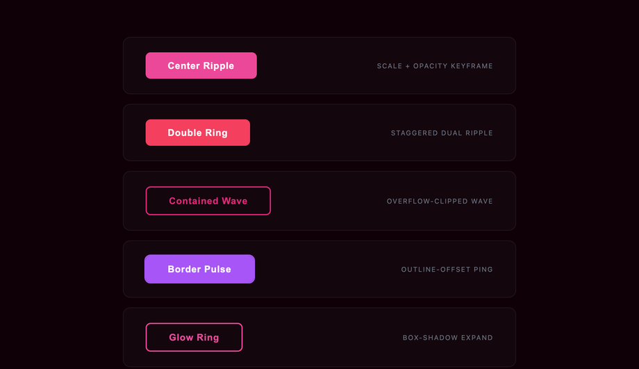
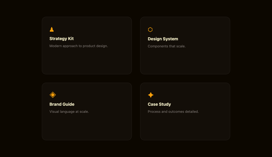
30 CSS Hover Effects
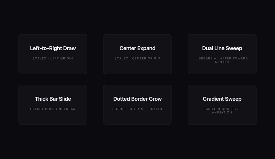
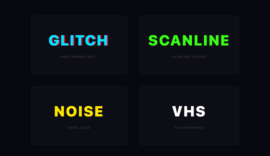
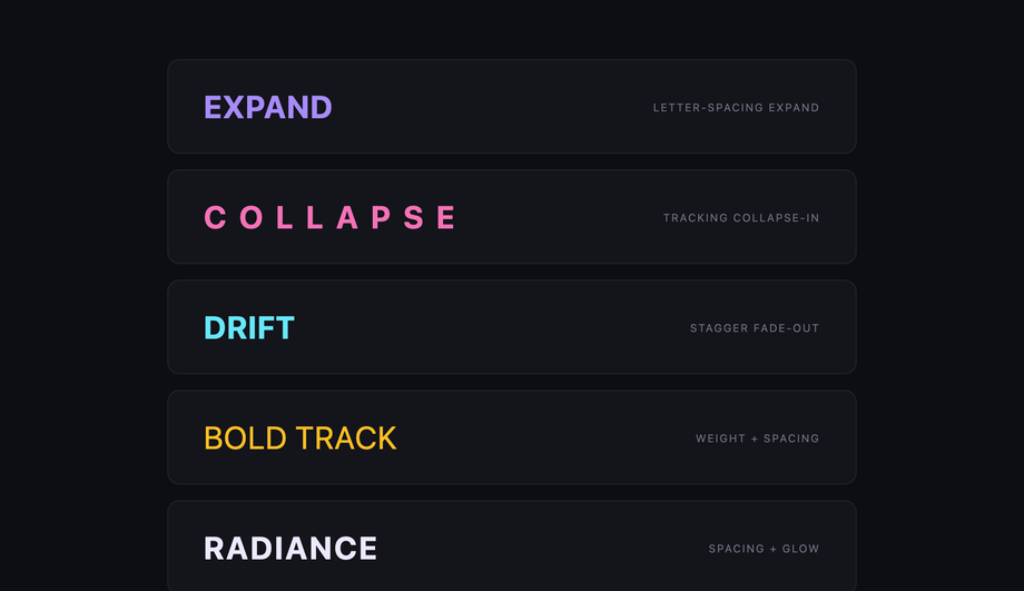
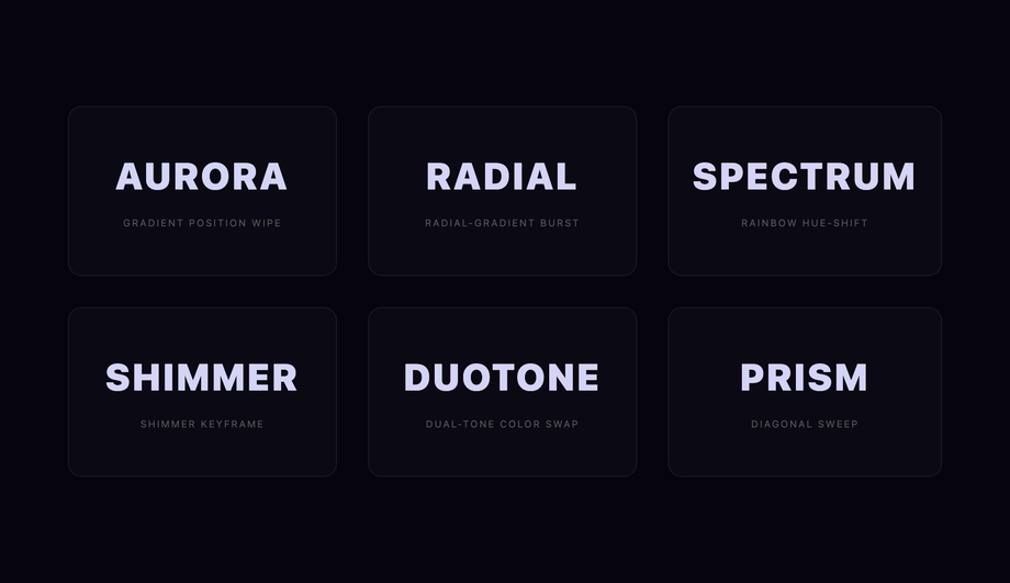
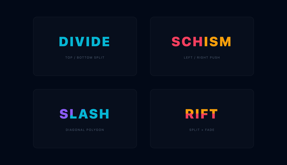
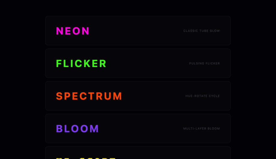
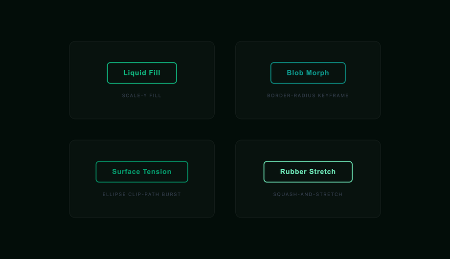
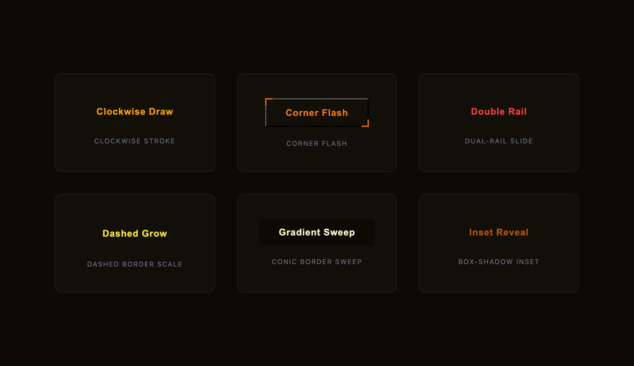
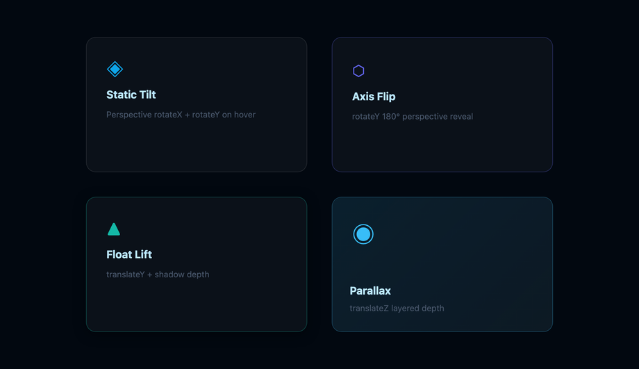
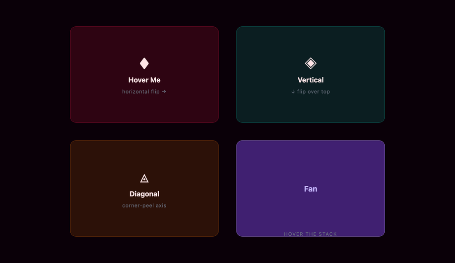
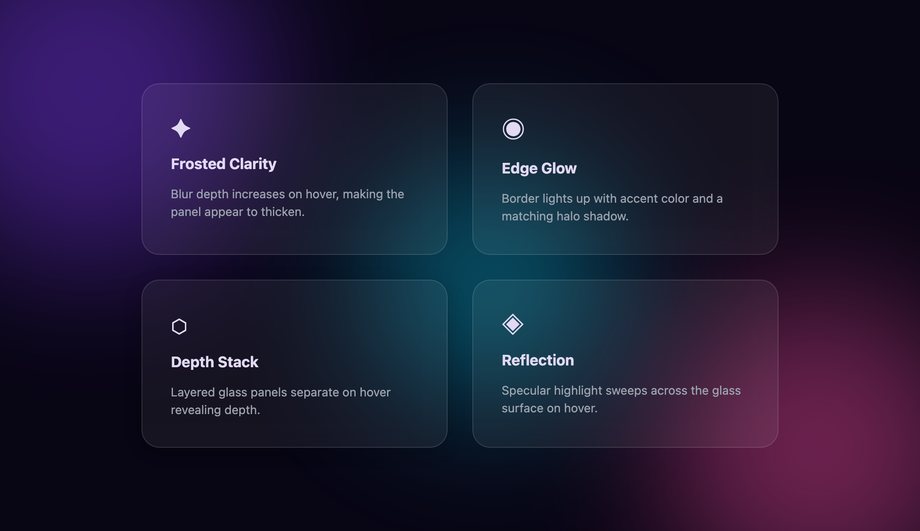
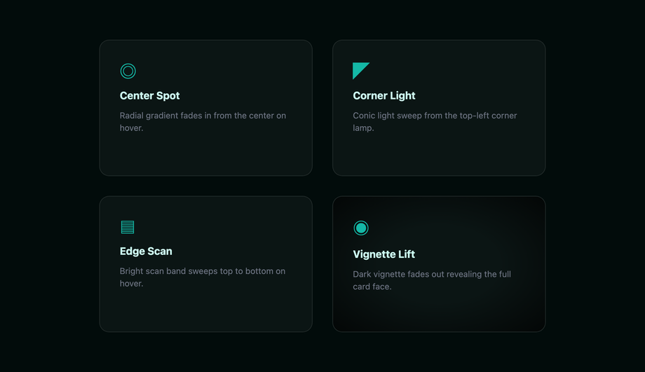
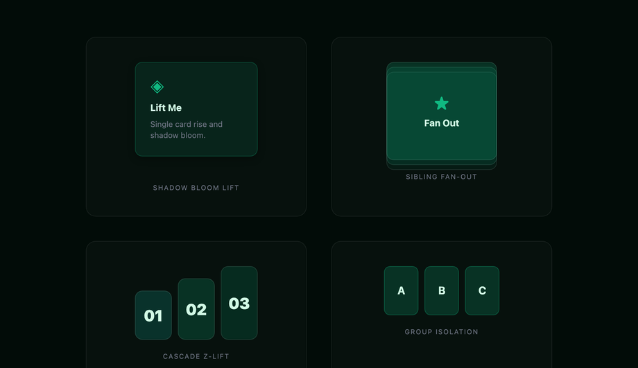
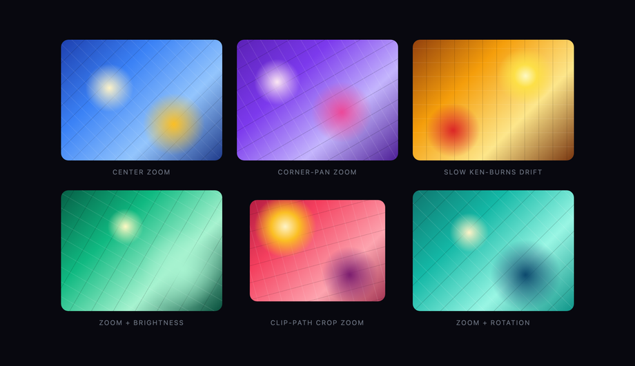
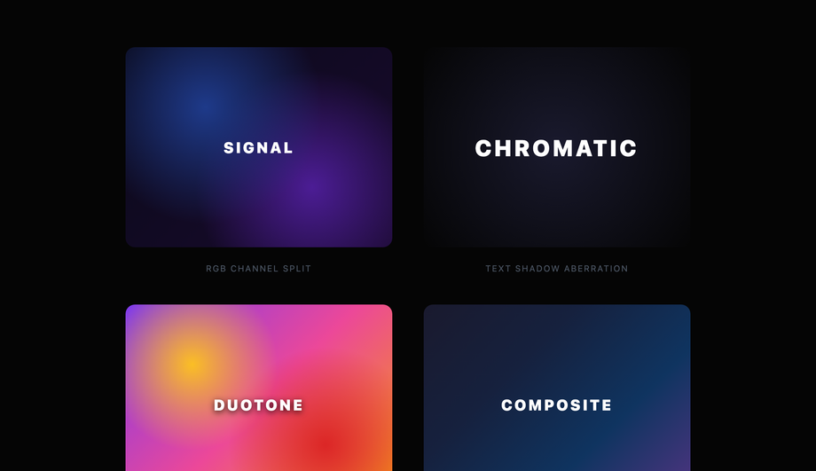
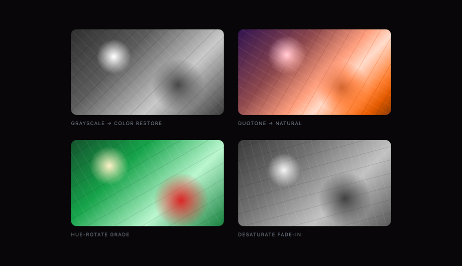
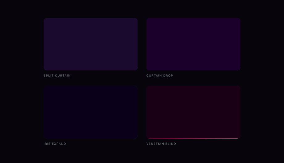
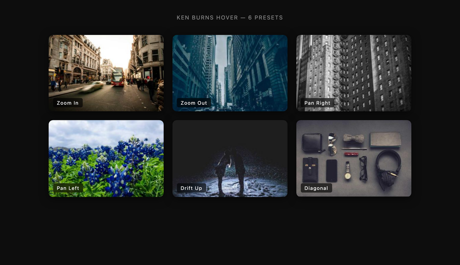
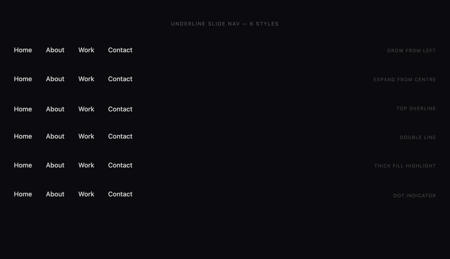
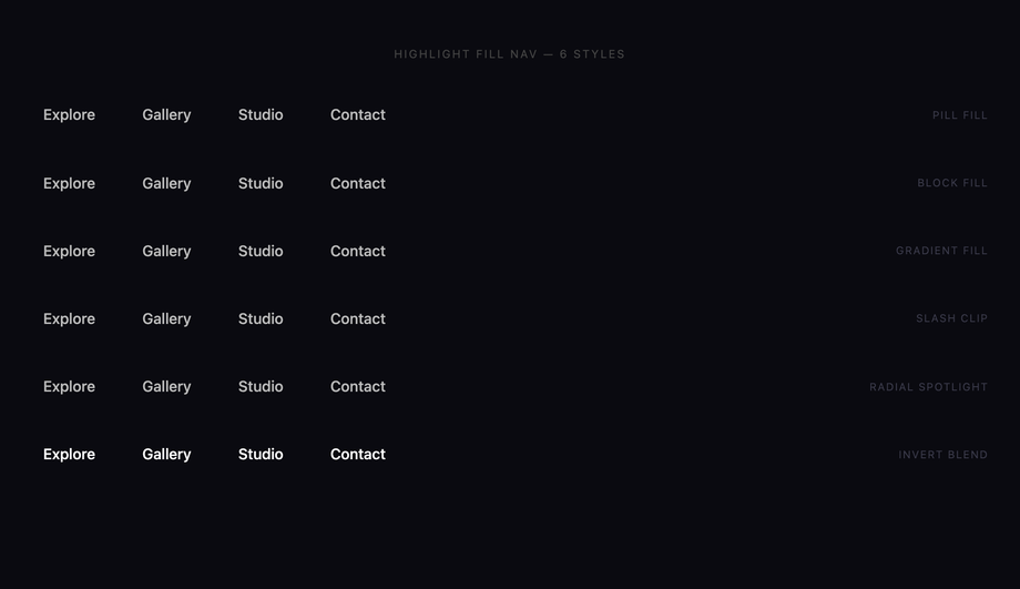
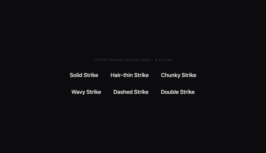
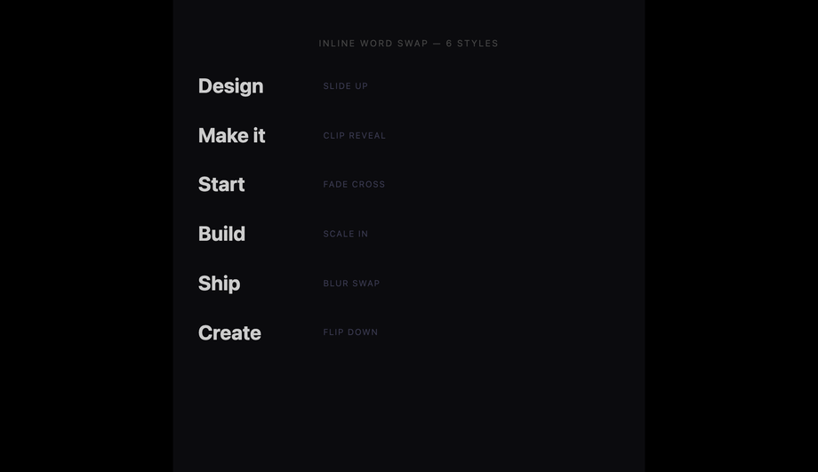
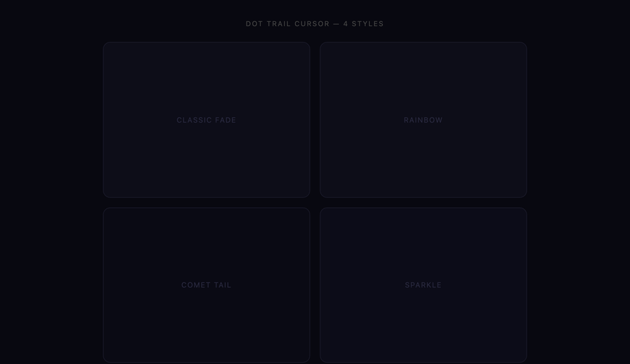
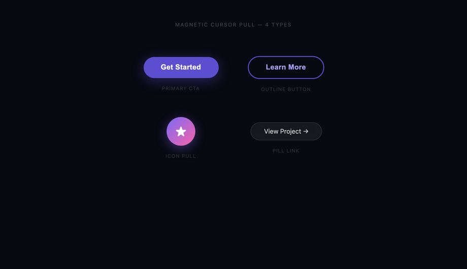
Hover effects are the most-touched interactive layer on the modern web — every visitor feels them within milliseconds of landing on your page, and bad ones make a site feel broken. These 30 hand-coded patterns cover every production use case in 2026: text effects (underline draw, glitch, letter spacing expand, gradient text reveal, split text, neon glow), button effects (magnetic liquid, border draw, shimmer shine, fill wipe, 3D press, ripple), card effects (3D tilt, flip, glassmorphism, spotlight, slide reveal, stack lift), image effects (zoom pan, color channel split, distortion, duotone, curtain reveal, Ken Burns), navigation effects (underline slide, highlight fill, strikethrough link, inline word swap), and cursor-tracking effects (dot trail, magnetic pull). 24 are 100% pure CSS (drop into any stack with zero JS); 6 use ~30-60 lines of vanilla JavaScript for pointer-tracking patterns. All respect prefers-reduced-motion, use scoped .hv-NN__* class names so multiple effects coexist on the same page without style bleed, MIT-licensed.
Frequently asked questions
Why animate :hover with transform / opacity instead of width, height, top, left, or background?
width, height, top, left, margin, padding, border-width, or font-size forces the browser to recalculate the layout of every affected element AND every descendant, on EVERY frame of the animation — that's 60 layouts per second on a 60Hz display, 120 on a 120Hz one. At 4-16ms of layout cost per frame, the main thread saturates fast and the animation drops to ~30fps. This shows up directly in your INP (Interaction to Next Paint) Core Web Vital score — the metric that replaced FID in March 2024. The 30 demos in this collection all animate transform/opacity exclusively; even color-shift hovers use opacity on a sibling overlay instead of animating background-color (which is paint-only but still has cost). Tools like Lighthouse, WebPageTest, SpeedCurve, Calibre, and Chrome's DevTools Performance panel will flag layout-triggering animations as "Recalculate Style" or "Layout" entries — that's the smoking gun. Replace those properties with their transform equivalents (scale, translate, rotate) and the entries disappear from the flame chart.Hover doesn't work on touch — should I drop hover effects on mobile?
.btn:hover, .btn:focus { ... } means keyboard users (Tab) and screen-reader users get the same visual cue desktop pointer users do. WCAG 2.4.7 requires this anyway. (2) For touch-only devices, use the @media (hover: none) media query to either suppress hover styles entirely or replace them with tap-active styles. The pattern: @media (hover: hover) { .btn:hover { ... } } — hover styles only apply on devices that have a real hover. (3) For touch-active feedback, use :active (fires on touchstart) with a slightly shorter transition than your hover version. iOS double-tap-zoom default kicks in on links — set touch-action: manipulation to disable. The 30 demos in this collection use the @media (hover: hover) and (pointer: fine) pattern so touch devices see only the static appearance, not the broken "sticky hover" state that older patterns leave on tap. Related: iOS Safari, Android Chrome, and Samsung Internet all support @media (hover: hover) since 2017.How do I make a hover effect that doesn't trigger motion sickness or migraines?
prefers-reduced-motion: reduce. Roughly 35% of adults experience some level of motion sensitivity (vestibular disorders, migraine, simple preference), and they set this OS-level preference (macOS Accessibility → Display → Reduce motion, Windows Settings → Accessibility → Visual effects → Animation, iOS Accessibility → Motion, Android Accessibility → Remove animations). Every demo in this collection wraps its continuous-animation rules in @media (prefers-reduced-motion: reduce) { .hv-NN__... { transition: none; animation: none; } } so users get the static end-state instead of a fade/slide/scale. Three failure patterns most online tutorials skip: (a) animation rules need explicit animation: none; setting transition: none alone doesn't stop keyframe loops. (b) For effects that DEFINE the interaction (e.g., the underline-draw IS the hover) — replace the motion with an instant state change, not nothing. (c) Test in real OS settings, not just DevTools emulation — older Safari versions had reduced-motion-detection bugs. WCAG 2.3.3 (Animation from Interactions) explicitly recommends this; the EU EAA and US Section 508 audits flag missing reduced-motion guards.Magnetic and 3D tilt effects need JavaScript — what's the cheapest implementation?
pointermove on the element, calculate the cursor position relative to the element's bounding box, and translate that into a CSS custom property the element's transform reads. For 3D tilt: --tx and --ty drive rotateY(var(--tx)) rotateX(var(--ty)). For magnetic: --mx and --my drive translate(var(--mx), var(--my)). Library competitor cost comparison: vanilla-tilt.js ships ~6kb gzipped for what's effectively 40 lines of pointermove logic. react-tilt wraps that in React for ~8kb. tilt.js jQuery plugin is ~10kb. GSAP can do magnetic pulls but the runtime is ~20-30kb depending on which plugins you import. Framer Motion + useMotionValue + useTransform achieves the same effect in React with ~40-50kb of runtime. The 6 JS demos here use requestAnimationFrame throttling so the pointermove handler runs at the screen refresh rate, not the (much higher) raw pointer event rate — important for low-end Android. They also use {passive: true} on the pointermove listener so scroll performance isn't blocked.Tailwind's hover: utility — when is it enough, when do you need custom CSS?
hover: variant + utilities cover the SIMPLE cases brilliantly: hover:bg-blue-600 hover:scale-105 hover:shadow-lg works for 80% of buttons. Where it breaks down: (a) Multi-element coordinated hover — animating an underline pseudo while the link's color shifts requires the underline to be a child or pseudo, and Tailwind utilities can't target ::before directly without arbitrary-variant syntax (verbose). (b) Pointer-tracking effects — Tailwind has no way to read pointer coordinates; you need JS regardless. (c) Keyframe-based effects (shimmer, neon pulse, ripple expand) — Tailwind 3.4+ added animate-[...] arbitrary values but defining @keyframes still requires CSS. (d) Multi-state choreography — when hover staggers multiple children with delays (Demo 05 Split Text), transition-delay via transition-delay-[100ms] works but the per-child stagger needs nth-child selectors that Tailwind doesn't expose as utilities. For these cases, drop into a @layer components rule with the custom selector / keyframe / nth-child math, then call it with @apply for the parts Tailwind CAN handle. The 30 demos here are written as raw CSS so they drop into any setup (Tailwind, vanilla, CSS Modules, styled-components, emotion, Vue scoped, Astro <style>) — copy the entire .hv-NN block into your stylesheet.How is this different from Framer Motion, GSAP, AutoAnimate, or react-spring?
Will hover transitions hurt my SEO via Core Web Vitals?
will-change: transform applied to dozens of elements at once — promotes them all to GPU layers, exhausting GPU memory, causing per-frame composite cost to balloon. Use will-change only on elements about to be animated; remove it once the animation completes. (c) Massive box-shadow on hover (e.g., box-shadow: 0 0 100px rgba(0,0,0,0.3)) — repaints the entire shadow area on every frame. Solution: use filter: drop-shadow() which is GPU-accelerated, OR pre-render the shadow as a pseudo-element with opacity transition. The 30 demos in this collection: 95+ Performance score on Pixel 5 baseline in Lighthouse mobile profile, all use transform/opacity only, all use will-change sparingly (only on the specific element being animated). Audit your own implementation with Chrome DevTools Performance panel, Lighthouse, or WebPageTest — look for "Layout" or "Recalculate Style" entries during hover.Which hover effect should I use for my project?
Related collections

20 CSS Animated Buttons
20 hand-coded CSS animated buttons — neon glow, ripple, 3D press, liquid fill, jelly bounce, shine sweep, animated border, moving gradient CTA, text flip, submit success state, add-to-cart progress, download icon, hamburger-to-close, toggle switch, loading spinner inside button, next/prev arrow nav, and ghost button background reveal. Half pure CSS, half lightweight JS for production interactions.

15 CSS Background Animations
15 hand-coded CSS background animations with live demos — infinite shifting gradient, floating particle bubbles, parallax starry night, clickable cyberpunk ripple, sliding geometric grid, SVG wave overlays, glassmorphism orbs, aurora borealis ribbons, matrix digital rain, mesh gradient blobs, falling snow, morphing blob, retro synthwave 3D grid, infinite scrolling diagonal marquee, comic-book halftone dots. 100% Pure CSS, no JavaScript, no canvas, no particles.js. prefers-reduced-motion respected, scoped class names, MIT-licensed.

27 CSS Button Hover Effects
27 hand-coded CSS button hover effects — 3D press, neon glow, gradient slide, border draw, liquid fill, ripple, glitch text, and kinetic flips. Every demo is pure CSS (no JavaScript, no framework), tuned for 60fps with transform and opacity, and respects prefers-reduced-motion out of the box.