12 Layouts
Every collection tagged “layouts” — each one a set of hand-coded demos with copy-paste code and a live preview.
Build UI like this from scratch: Flexbox, Grid, animations & responsive CSS
ZTM · The CSS Bootcamp · 30‑day money-back guarantee · Affiliate link
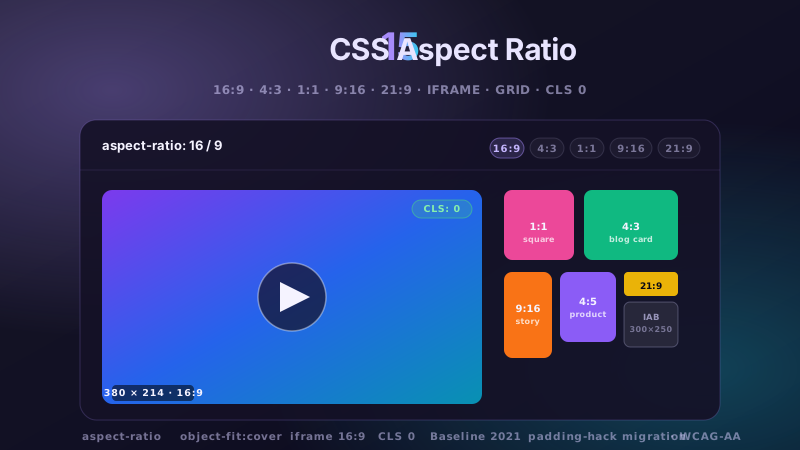
15 CSS Aspect Ratio Demos
15 hand-coded CSS aspect-ratio demos for video embeds, product galleries, IAB ad slots, native dialogs, and CLS-safe placeholders: 16:9 iframe YouTube embed with click-to-load facade + up-next rail, 21:9 full-screen hero video with min-height/max-height:100svh guardrails + Ken Burns drift, 1:1 Instagram-style square grid with 2×2 feature tile, 4:3 magazine card image cover, 9:16 vertical stories rail (TikTok/Reels/Shorts pattern) with scroll-snap + segment bars, 4:5 apparel product image gallery with radio-driven state + 1:1 thumbnails, 1:1 zoom thumbnail carousel with pointer-tracked --zx/--zy magnifier, prevent-layout-shift placeholder with live PerformanceObserver CLS meter (before/after side-by-side lab), dynamic content fallback with three policies (bend/strict/auto) via :has() toggle, IAB ad banner slots (728×90 leaderboard, 300×250 medium rectangle, 300×600 half-page, 320×50 mobile) with skeletons + container-query mobile swap, responsive modal dialog sized min(92vw, 88svh×16/9, 1080px) with @starting-style animation, responsive OpenStreetMap iframe wrapper with 16:9 → 1:1 container-query narrow swap, media query orientation live HUD + resize:both container-ratio playground, object-fit logo cloud with contain/cover/fill switcher via :has(), and side-by-side padding-top hack (height:0 + padding-top:56.25%) → modern aspect-ratio migration comparison with live ratio picker. 11 truly Pure CSS + 4 with a tiny optional vanilla JS snippet (facade swap, pointer magnifier, CLS meter, native dialog). Every demo is scoped under a unique .car-NN prefix so it drops into any project without CSS collisions, ships prefers-reduced-motion guards, and is framework-agnostic (works as-is in React, Vue, Svelte, Astro, Next.js, Remix, or plain HTML).
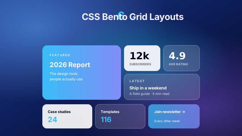
6 CSS Bento Grid Layouts
6 production CSS bento grid layouts with 12 hand-coded designs — Apple-style product showcase, SaaS feature value-prop matrix, analytics dashboard overview, creative portfolio, e-commerce category hub, and link-in-bio social hub. Each topic ships 2 sub-variants side-by-side so visitors see both a keynote aesthetic and a paper-doc variant at once. Container queries, CSS Grid, zero dependencies, copy-paste ready.
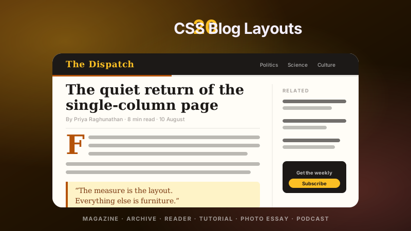
20 CSS Blog Layouts
20 hand-coded CSS blog and editorial layouts for magazine homepages, news sites, personal archives, newsletter back-issues, recipe and podcast blogs, developer tutorials, and long-form journalism. Covers a magazine homepage with hero plus editor-picks rail, a news homepage with breaking-news ticker, blog archives with sticky year separators, Substack-style issue-numbered archives, recipe card grids with prep-time badges, podcast episode lists with waveforms, long-form articles with scroll-driven reading progress, drop caps and floated pull quotes via first-letter, Medium-style 65ch centred reader layouts, dev tutorials with a sticky code panel beside prose, interview transcripts with alternating speakers, case-study pages with stat counters, video blogs with an episode rail, full-bleed photo essays, news articles with sticky related-stories sidebars, documentation pages with prev/next chapter nav, a standalone blog post card, a scroll-snap category filter bar, an inline newsletter callout that breaks out of the prose column, and a horizontal featured-post rail. 12 are pure CSS with zero JavaScript. Every layout is scoped under a .bl-NN prefix for no-collision pasting, guards prefers-reduced-motion, and ports unchanged to React, Vue, Svelte, Astro, Next.js and Tailwind.
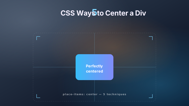
5 CSS Ways to Center a Div
5 hand-coded CSS ways to center a div: Flexbox with align-items and justify-content for both axes, CSS Grid place-items in one line and a 3×3 named-template track, absolute positioning with top/left 50% plus translate over a glassmorphism UI, margin:0 auto and the logical margin-inline:auto for inline-axis centering, and a side-by-side board comparing Flexbox, Grid, Absolute+Transform and table-cell with their trade-offs.
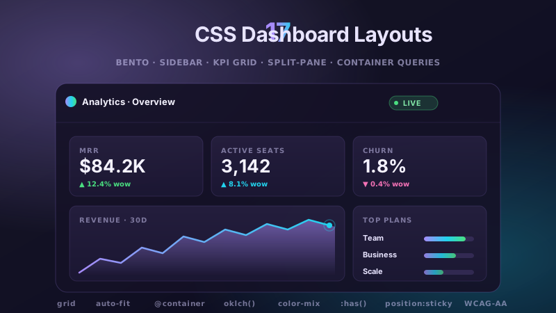
17 CSS Dashboard Layouts
17 hand-coded CSS dashboard layouts for SaaS admin panels, analytics consoles, e-commerce merchant dashboards and AI copilot apps. Covers CSS Grid bento boards, collapsible icon-rail sidebars, auto-fit KPI card grids, split-pane master-detail views, fixed-header independent scroll panels, grid-template-areas shells, off-canvas mobile drawers, container-query responsive cards, dark mode CSS variable tokens, multi-level nested navigation, sticky-header data tables, masonry column packing, full-screen 100vh consoles and top-nav tab bars.
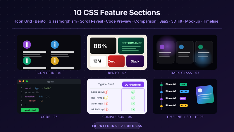
22 CSS Feature Sections
22 hand-coded CSS feature section patterns — tab-switcher product tour, alternating image rows, live metric counters, problem vs solution split, autoplay product video, integration logo strip, accordion feature cards, three-tier feature parity, security and compliance badges, API code response split, customer quote per feature, sticky-scroll storytelling, icon grid, bento asymmetric, dark glassmorphism, scroll reveal, code preview, comparison matrix, SaaS grid, 3D perspective cards, floating phone mockup, and vertical timeline.
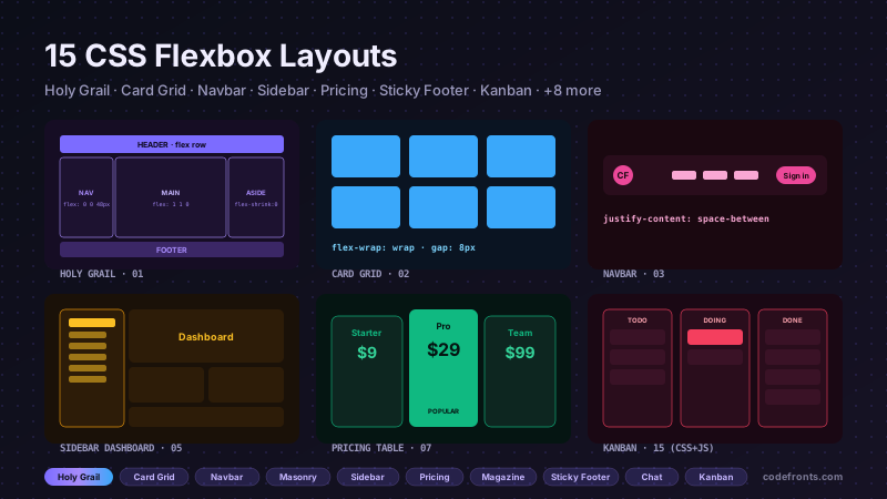
15 CSS Flexbox Layouts
15 production-ready CSS flexbox layouts with live demos and copy-paste code — holy grail page shell, responsive card grid, sticky navbar, masonry-style columns, sidebar dashboard, product cards, pricing table, magazine article, sticky footer with min-block-size: 100dvh, centered hero, vertical timeline, chat interface, mosaic gallery, two-column form, and kanban board. Every demo is mobile-first, WCAG-friendly, and works without a build step.
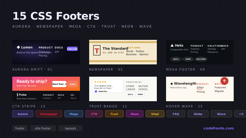
25 CSS Footer Designs
25 hand-coded CSS footer designs for SaaS marketing pages, e-commerce storefronts, agency portfolios, documentation sites, mobile apps, and local business sites. Sticky footer with flexbox and CSS grid, responsive 4-column category-link footer, SaaS mega footer with resource grid, minimalist logo + copyright, e-commerce footer with payment icons and security badges, dark mode toggle footer, local-business footer with embedded Google Maps and office hours, mobile-first collapsible accordion, social media follow icons, SaaS SOC 2 / GDPR / HIPAA compliance badge footer, animated gradient background, newspaper masthead multi-column, full-width newsletter signup, card layout with contact details, monospaced developer portfolio, audio player music website, dark mode glowing neon, centered minimalist blog, multi-column mega grid, integrated contact form + map, trust badges + guarantee icons, accordion FAQ, pre-footer call-to-action bar, multi-language + currency selector, and animated SVG wave. 16 Pure CSS + 9 Light JS. Every design scoped under .ft-NN prefix for no-collision pasting, prefers-reduced-motion guarded per WCAG 2.3.3, framework-agnostic (React, Vue, Svelte, Astro, Next.js, Nuxt, Remix, SvelteKit).
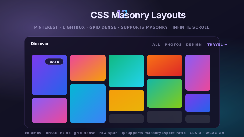
12 CSS Masonry Layouts
12 hand-coded CSS masonry layouts covering the three canonical engines (multi-column columns: walls, CSS Grid row-span lattices, CSS Grid dense auto-flow packing, flex column-wrap boards) plus the W3C native masonry spec with layered @supports fallbacks. Every real-world masonry use case: Pinterest-style image walls, <dialog>-element lightbox galleries, responsive photo grids with grid-row spans preserving reading order, blog card walls with column-span editor's-pick spans, e-commerce product listings with dense packing + feature tiles, flex column-wrap horizontally-scrolling social feeds, art-directed portfolio showcases with :has() spotlight, testimonial walls with mask-image fade + scroll-driven reveal, mixed-ratio video thumbnail galleries, quantized dashboard widget grids on 108px lattices, IntersectionObserver-append infinite scroll walls with aria-live, and the modern @supports (grid-template-rows:masonry) / display:masonry cascade with live badge showing engine status. 10 truly Pure CSS + 2 with a tiny optional vanilla JS snippet (lightbox dialog + infinite-scroll append). Every wall is scoped under a unique .msn-NN prefix so it drops into any project without CSS collisions, ships prefers-reduced-motion guards, and is framework-agnostic (works as-is in React, Vue, Svelte, Astro, Next.js, Remix, or plain HTML).
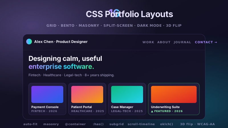
16 CSS Portfolio Layouts
16 hand-coded CSS portfolio layouts covering the exact patterns freelance developers, UX/UI designers, product designers, illustrators, photographers and agency teams actually ship for their own portfolio sites: responsive CSS-Grid galleries with fr tracks and auto-fit minmax, Apple-style bento grids, no-JS native masonry walls, sticky-sidebar flexbox splits, hover-overlay project grids with staggered scrims, scroll-snap horizontal showcases, 50/50 split-screen heroes with :has() accent recoloring, dark-mode CSS-variable token systems, single-page developer portfolios with anchor navigation and scroll-timeline progress rails, UX case-study articles with 1fr/62ch/1fr content grids, ultra-minimalist graphic-design indexes with clip-path thumb reveals, freelancer layouts with testimonials plus 3-tier pricing, beginner-friendly auto-fit card grids, 3D card-flip project tiles, full-screen 100svh hero openers with view()-timeline parallax and sticky header+sidebar app-shell templates. 14 truly Pure CSS + 2 with a tiny optional vanilla JS snippet. Every portfolio is scoped under a unique .cpl-NN prefix so it drops into any project without CSS collisions, ships prefers-reduced-motion guards on every animation, and is framework-agnostic (works as-is in React, Vue, Svelte, Astro, Next.js, Remix, or plain HTML).
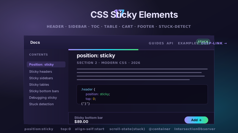
17 CSS Sticky Elements
17 hand-coded CSS position:sticky demos covering every real-world sticky use case: sticky header on scroll, sticky header that changes background when scrolled (via scroll-state() container queries), sticky shrinking navbar with animation-timeline: scroll(), stacked sticky header + secondary tabs with :has(:target) scrollspy, sticky sidebar inside flexbox with align-self:flex-start, sticky Table of Contents with IntersectionObserver scrollspy + scroll-driven progress bar, iOS-contacts sticky section headers with alphabet rail, sticky chapter card stack with view() timeline entrances, sticky table header inside scrollable div, sticky first column + header with correct z-index corner cell (Airtable/Retool/Metabase pattern), mobile sticky add-to-cart bottom bar with safe-area-inset, sticky floating promo banner with :has(:checked) dismiss, sticky checkout order summary sidebar, sticky footer to bottom of short pages via grid auto/1fr/auto, sticky social share rail (desktop-left / mobile-bottom via container query), a debug lab showing why sticky breaks when an ancestor has overflow:hidden (vs overflow:clip), and a stuck-state detection sensor using both scroll-state(stuck: top) AND IntersectionObserver sentinel fallback. 15 truly Pure CSS + 2 with a tiny optional vanilla JS snippet. Every sticky is scoped under a unique .cst-NN prefix so it drops into any project without CSS collisions, ships prefers-reduced-motion guards, and is framework-agnostic (works as-is in React, Vue, Svelte, Astro, Next.js, Remix, or plain HTML).
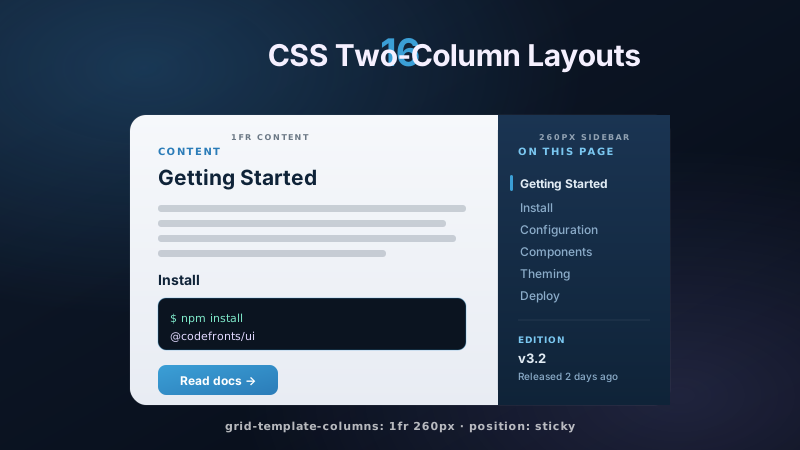
16 CSS Two-Column Layouts
16 hand-coded CSS two-column layout templates covering every real-world pattern developers need: flexbox 68/32 content+sidebar, CSS Grid stacked mobile-to-desktop responsive, fixed-left/fluid-right dashboard, exact 50/50 marketing split, two-column form checkout, sticky-sidebar docs, edge-to-edge split-screen hero, equal-height cards, hero+content header, floated legacy pattern, magazine article layout, pricing table with Pro plan elevated, product-card grid, auto-width sidebar via minmax, and pure margin/inline-block without flexbox or grid. Copy-paste HTML and CSS, WCAG 2.2 accessible, mobile-first, prefers-reduced-motion guarded, framework-agnostic.