
01. Centered Classic (opens in a new tab)
The artisanal SaaS hero — eyebrow, serif headline, prose subhead, a single deep-terracotta primary CTA flanked by a quiet ghost button. Sage on warm cream, the small-batch tools-for-makers aesthetic.
31 CSS hero sections for SaaS landing pages, dev-tool launches, app downloads, product reveals, and editorial covers — spanning centered serif and split-mockup layouts, mesh and conic-orbit gradients, glass and brutalist surfaces, terminal and bento grids, kinetic and glitch type, and parallax and liquid-glass scenes. Scoped under .hs-NN for no-collision pasting, prefers-reduced-motion guarded, framework-agnostic.
Related22 CSS Feature Sections21 CSS Pricing Sections22 CSS Headers20 CSS Diagonal Sections12 CSS Full Page Sections31 Tailwind CSS Hero Sections
Premium template pickPartner: Cruip
Affiliate linkBuilding the whole landing page, not just this section?
You just browsed 31 heroes. Cruip makes complete Tailwind CSS templates for landing pages, SaaS websites and admin dashboards, coded in HTML, React, Next.js and Vue and used by 60K+ developers. Single templates start at $49.
Cruip. We may earn a commission, at no extra cost to you.
<input type="range"> drives a CSS clip-path slider that wipes between a "before" desert scene and an "after" lush scene. Burnt orange + petrol blue + cream.writing-mode: vertical-rl. Indigo on washi-paper white, vermillion seal stamp.transform: skewY(). Mauve, dusty rose, and sage — the calm-productivity aesthetic.@property animatable angle. Gold and ember orange on jet black — the AI / launch treatment with a stellar feel.Tweak the exact look in our visual generators — no signup, instant copy-paste.
clamp() for every scale-sensitive property. Headline font-size: clamp(24px, 5vw, 64px). Padding: clamp(20px, 4vh, 80px) clamp(16px, 4vw, 40px). Section min-height stays at min-height: 100vh on the demo root so the themed background paints edge-to-edge in the playground iframe, but nested content boxes use max-width: 640px to 720px to lock a readable line length regardless of viewport width. For two-column heroes (Demos 02, 05, 09, 15, 21, 25, 26, 27, 30), the switch to single-column happens at max-width: 720px — one breakpoint, not five — which collapses grid or flex layouts predictably. Avoid fixed pixel widths anywhere except the inner mockup or object (Demo 21's .hs-21__device is 320px × 200px because the device silhouette needs a stable ratio). For iOS Safari specifically, 100vh jumps 60-80px mid-scroll when the address bar collapses — a Core Web Vitals CLS event. The site-wide recommendation is min-height: 100svh (small viewport height) instead, supported in every browser shipped since 2022. All 30 demos honor prefers-reduced-motion: reduce — continuous animations (parallax drift on Demo 25, blob motion on Demo 03, twinkle on Demo 28, orbit spin on Demo 30) are disabled per WCAG 2.3.3 for vestibular-disorder users. The animated ones also compositor-thread only their motion (transform + opacity), never margin/top/width/height, so Interaction to Next Paint (INP) stays under 200ms on mid-tier Android.radial-gradient blobs with filter: blur(60px) produce the mesh-gradient look at ~1KB of CSS (Demo 03, Demo 20); animated conic-gradient with backdrop-filter: blur(20px) saturate(140%) gives you Apple Vision Pro glass over aurora (Demo 04, Demo 30); clip-path: polygon() silhouettes plus stacked linear-gradient layers paint an editorial photograph (Demo 15 — a four-layer CSS 'photograph' of a hung chore coat, roughly 3KB); SVG-shape drift primitives (Demo 06 Video Loop Hero) fake a motion reel without licensing an MP4 or dealing with autoplay policies. For products, Demo 21 uses a diagonal linear-gradient with paired inset shadows to fake brushed-aluminium bevel in pure CSS. For scenes, Demo 25 stacks three SVG mountain ranges with staggered animation-delays for genuine parallax depth. Font-loading discipline: preload the specific weights you actually render (usually one weight per font) with link rel='preload' as='font' type='font/woff2' crossorigin or FOUT/FOUC will shift the h2 baseline and blow Cumulative Layout Shift (CLS) past the 0.1 Core Web Vitals threshold. The whole approach: images cost 40-200KB and licensing hassle for a static picture; CSS costs 1-3KB, renders instantly, respects prefers-reduced-motion out of the box, and lets you re-skin the palette by editing three hex values instead of re-commissioning a shoot.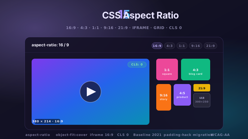
15 hand-coded CSS aspect-ratio demos for video embeds, product galleries, IAB ad slots, native dialogs, and CLS-safe placeholders: 16:9 iframe YouTube embed with click-to-load facade + up-next rail, 21:9 full-screen hero video with min-height/max-height:100svh guardrails + Ken Burns drift, 1:1 Instagram-style square grid with 2×2 feature tile, 4:3 magazine card image cover, 9:16 vertical stories rail (TikTok/Reels/Shorts pattern) with scroll-snap + segment bars, 4:5 apparel product image gallery with radio-driven state + 1:1 thumbnails, 1:1 zoom thumbnail carousel with pointer-tracked --zx/--zy magnifier, prevent-layout-shift placeholder with live PerformanceObserver CLS meter (before/after side-by-side lab), dynamic content fallback with three policies (bend/strict/auto) via :has() toggle, IAB ad banner slots (728×90 leaderboard, 300×250 medium rectangle, 300×600 half-page, 320×50 mobile) with skeletons + container-query mobile swap, responsive modal dialog sized min(92vw, 88svh×16/9, 1080px) with @starting-style animation, responsive OpenStreetMap iframe wrapper with 16:9 → 1:1 container-query narrow swap, media query orientation live HUD + resize:both container-ratio playground, object-fit logo cloud with contain/cover/fill switcher via :has(), and side-by-side padding-top hack (height:0 + padding-top:56.25%) → modern aspect-ratio migration comparison with live ratio picker. 11 truly Pure CSS + 4 with a tiny optional vanilla JS snippet (facade swap, pointer magnifier, CLS meter, native dialog). Every demo is scoped under a unique .car-NN prefix so it drops into any project without CSS collisions, ships prefers-reduced-motion guards, and is framework-agnostic (works as-is in React, Vue, Svelte, Astro, Next.js, Remix, or plain HTML).
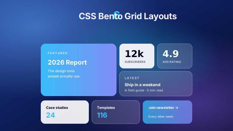
6 production CSS bento grid layouts with 12 hand-coded designs — Apple-style product showcase, SaaS feature value-prop matrix, analytics dashboard overview, creative portfolio, e-commerce category hub, and link-in-bio social hub. Each topic ships 2 sub-variants side-by-side so visitors see both a keynote aesthetic and a paper-doc variant at once. Container queries, CSS Grid, zero dependencies, copy-paste ready.
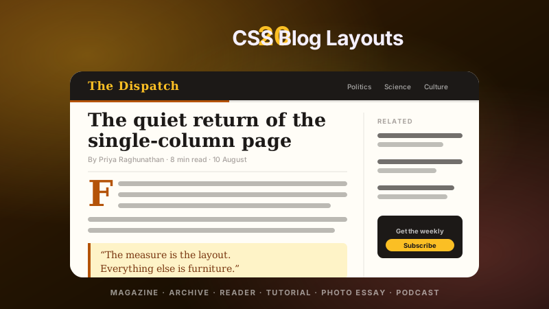
20 hand-coded CSS blog and editorial layouts for magazine homepages, news sites, personal archives, newsletter back-issues, recipe and podcast blogs, developer tutorials, and long-form journalism. Covers a magazine homepage with hero plus editor-picks rail, a news homepage with breaking-news ticker, blog archives with sticky year separators, Substack-style issue-numbered archives, recipe card grids with prep-time badges, podcast episode lists with waveforms, long-form articles with scroll-driven reading progress, drop caps and floated pull quotes via first-letter, Medium-style 65ch centred reader layouts, dev tutorials with a sticky code panel beside prose, interview transcripts with alternating speakers, case-study pages with stat counters, video blogs with an episode rail, full-bleed photo essays, news articles with sticky related-stories sidebars, documentation pages with prev/next chapter nav, a standalone blog post card, a scroll-snap category filter bar, an inline newsletter callout that breaks out of the prose column, and a horizontal featured-post rail. 12 are pure CSS with zero JavaScript. Every layout is scoped under a .bl-NN prefix for no-collision pasting, guards prefers-reduced-motion, and ports unchanged to React, Vue, Svelte, Astro, Next.js and Tailwind.


