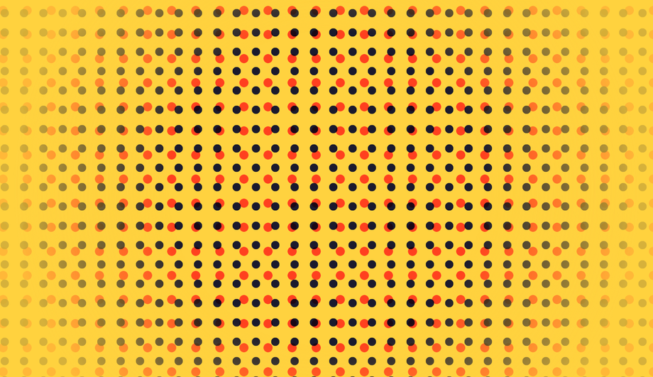
A CSS background animation is a continuous visual loop — gradients, particles, parallax stars, waves, mesh blobs, or geometric patterns — that runs behind page content to add depth and atmosphere without weighing down the page with video or canvas. These 15 hand-coded effects cover the full background-animation playbook: an infinite shifting six-color gradient, fifteen floating bubbles drifting like a lava lamp, a parallax starry-night scroller with twinkles and a recurring shooting star, a clickable TV-static surface with a CSS-only neon ripple, sliding diagonal stripes layered with a scrolling grid, three SVG waves sliding under a pulsing sun, glassmorphism orbs orbiting behind a frosted card, layered aurora ribbons over a star field, sixteen columns of falling matrix katakana, four roaming mesh-gradient blobs, three parallax snow layers, a hue-shifting morphing blob, a 3D synthwave grid receding into a neon horizon, infinite-scrolling diagonal marquee text, and animated halftone dots breathing in pop-art duotone. All 15 are pure CSS — no JavaScript, no canvas, no particles.js dependency — with semantic markup, scoped .bga-NN class names that never collide with your existing styles, prefers-reduced-motion fallbacks, and MIT licensing. Copy from any code panel and paste behind your hero, landing page, or any full-bleed section.


Frequently asked questions
How do I make a CSS background animation without JavaScript?
@keyframes for the timing curve, background / transform / filter as the animated property, and animation: name duration timing-function iteration-count on the element to bind them. The Animated Gradient demo (#01) is the canonical reference — a six-color linear-gradient with background-size: 400% 400% and an @keyframes that shifts background-position from 0% to 100% and back, run on a 30s infinite loop. Zero JavaScript, zero canvas, zero markup beyond the background container. Every one of the 15 demos in this gallery is built from this pattern; copy from any code panel and paste behind your hero or landing-page section.How do I create floating particles or bubbles in CSS without particles.js?
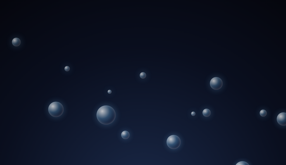
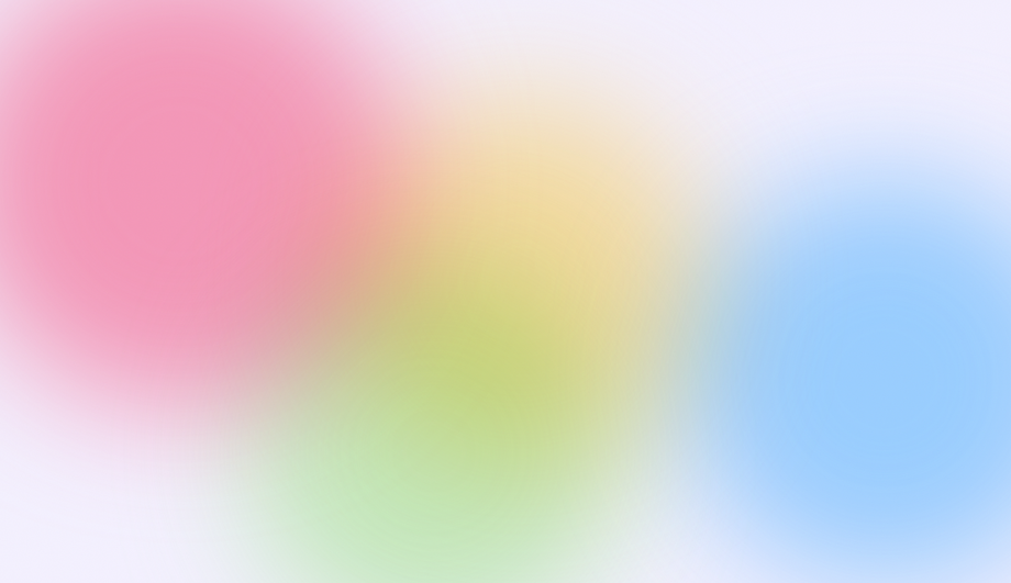
<div> elements with border-radius: 50%, randomize their starting left position and size, and apply an @keyframes rise that translates each from below the viewport (translateY(0)) up past the top (translateY(-115vh)) with subtle horizontal drift. Vary the animation-duration (8s–18s) and animation-delay (–10s to –1s; negative delays start mid-cycle so the loop appears continuous from page load) per bubble for organic randomness. Lighter than particles.js by ~25 KB and renders on every browser back to evergreen support.How do I build a parallax starry-night background in pure CSS?
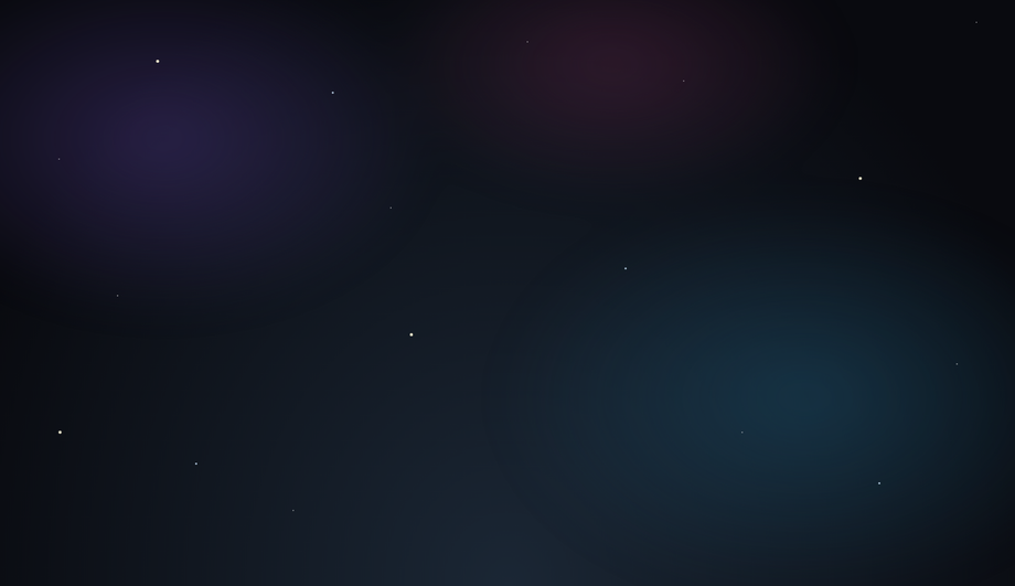
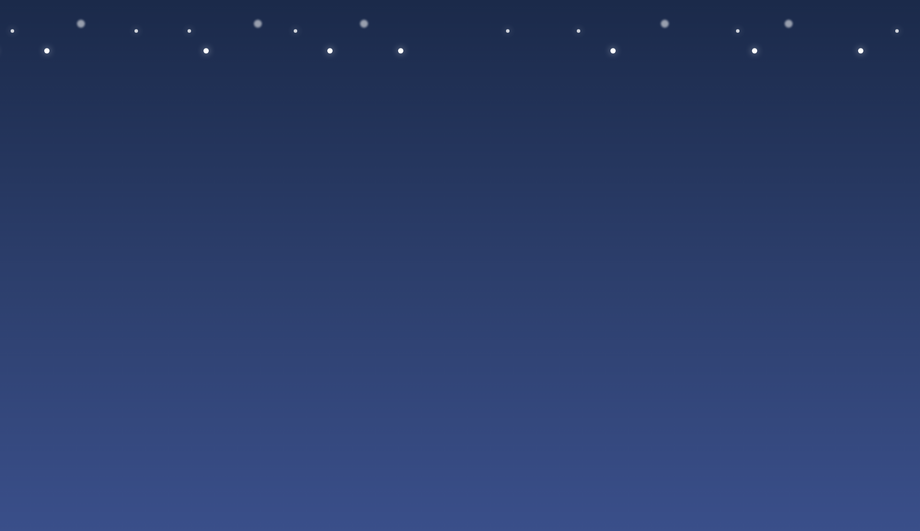
box-shadow. Place a 1px–2px ::after dot, then generate ~200 stars per layer with a comma-separated list of box-shadow values: box-shadow: 100px 200px #fff, 350px 80px #fff, .... Each layer scrolls vertically via @keyframes scrollUp at a different speed — the closer layer scrolls fastest, the deepest is slowest — which produces real parallax depth. Layer 4 holds a soft nebula glow that drifts horizontally on its own keyframe. Layer 5 is a single recurring shooting star animated with a diagonal translate + opacity fade. All five layers cost zero JS and one HTTP request.How do I make a Matrix-style digital rain background in CSS?
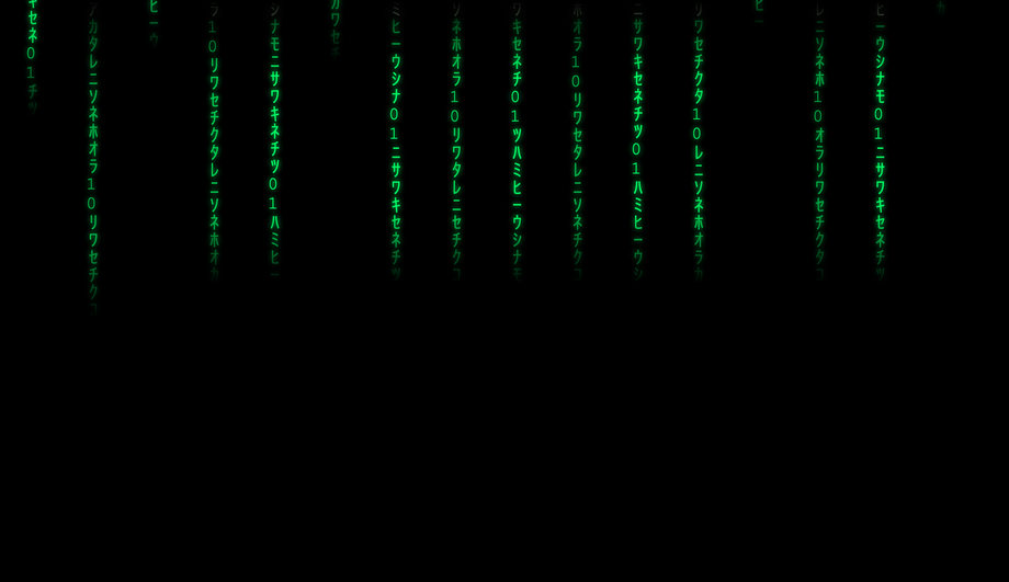
<div> columns of katakana glyphs (each glyph in its own <span>). The column is position: absolute; top: -100%; an @keyframes fall animates it to translateY(100vh) on a 4–8s loop with staggered animation-delay per column. The leading glyph in each column gets brighter white via the first span selector; the tail uses a mask-image: linear-gradient(to bottom, transparent, black 50%) for the fading trail. Pure CSS, no canvas, scales to any column count by adding more <div> elements.What's the difference between CSS background animation and a background video for a hero section?
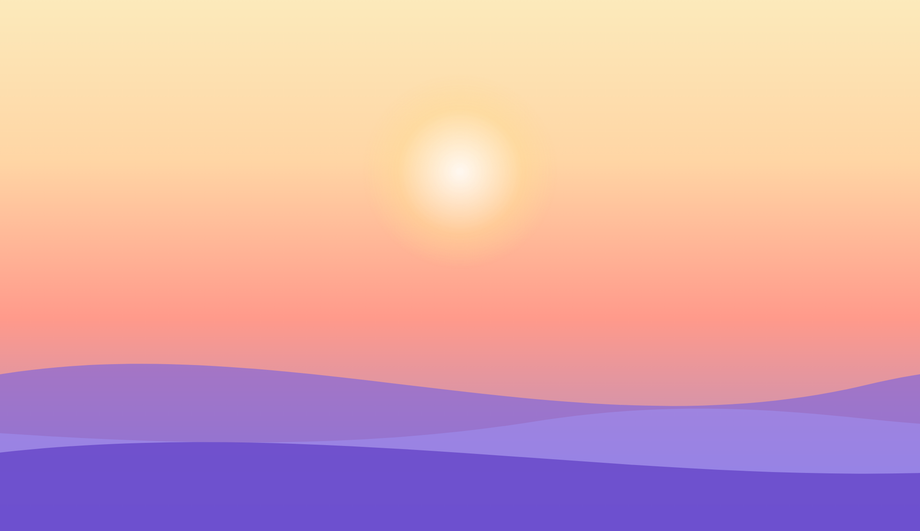
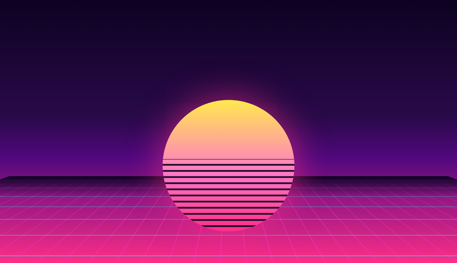
prefers-reduced-motion automatically, and never trigger autoplay UX warnings. The Video-Mimicking / Subtle Wave Overlays demo (#06) is the direct replacement pattern — three SVG wave paths sliding at staggered speeds beneath a soft pulsing sun, evoking flowing water in the same way a looping background video would, at a tiny fraction of the page weight. Use a background video only when the motion is irreducibly photographic (people, real-world scenery); use CSS for everything else.How do I make a glassmorphism background with floating orbs in CSS?
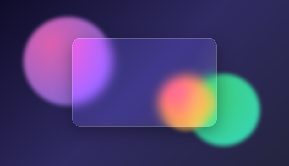
<div> orbs with radial-gradient fills and filter: blur(60px), each on its own @keyframes orbitN that translates them slowly around the viewport (different orbital paths so they don't sync up). Second, a foreground .glass card with backdrop-filter: blur(20px) and a low-opacity white background, which frosts the orbs behind it. Add -webkit-backdrop-filter for Safari. The animated sheen sweep on the glass uses a thin ::after pseudo with a 90deg linear-gradient that translates across the card on a 6s loop.How do I do a CSS click-to-expand ripple effect without JavaScript?
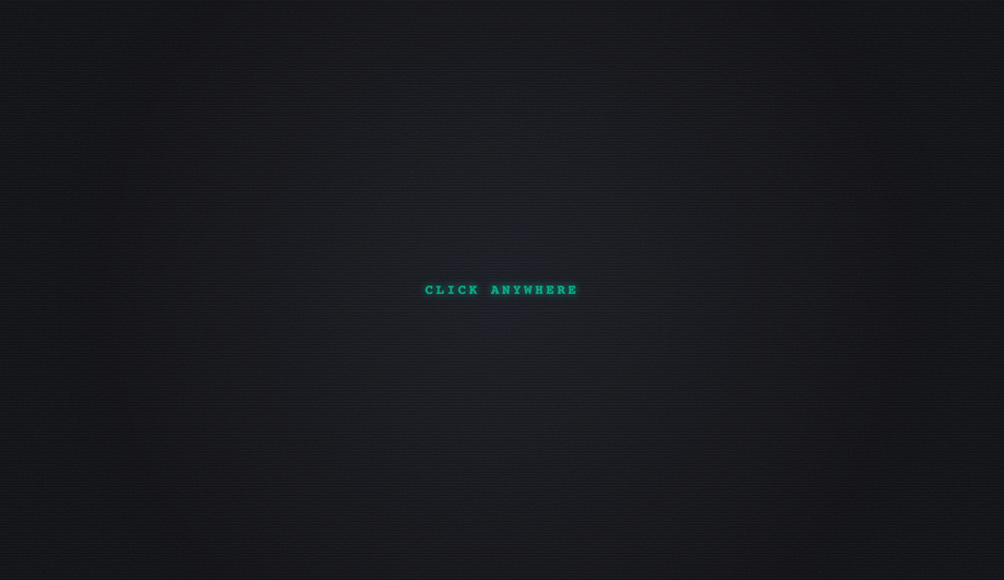
<input type="radio"> sits at the top, a <label for="..."> covers the whole scene as the click target. When the radio is :checked, a sibling .ripple element triggers an @keyframes ripple that scales it from 0 → 30 via transform while fading opacity to 0. Click anywhere → label fires → radio checks → ripple expands → animation runs once and resets. No JavaScript needed; the entire interaction lives in selectors.How do I make a CSS aurora borealis background animation?
mix-blend-mode: screen over a deep night-sky gradient. Each ribbon (.a1, .a2, .a3) is positioned absolutely, gets a different linear-gradient hue (green / cyan / purple), and runs its own @keyframes waveN that translates + skews + scales the ribbon on different speeds so they shift independently like real auroras. Behind them, a star field built from box-shadow dots twinkles via opacity animation. The whole effect runs in pure CSS, zero JS, ~80 lines.How do I build an infinite-scrolling diagonal marquee text background?
transform: rotate(-12deg), then stacks several rows each containing duplicated text wrapped in a <span>. The row uses display: flex; white-space: nowrap and animates transform: translateX from 0 to -50% on an infinite loop — because the text is duplicated, the animation appears seamless. Alternate rows use @keyframes scrollRight (opposite direction) for visual interest. Pure CSS, no JavaScript, works at any width.How do I make a synthwave / retro 80s 3D grid background in CSS?
perspective: 400px, then on the .grid element apply transform: rotateX(75deg) + a tall linear-gradient background (cyan/magenta lines on transparent) with background-size: 40px 40px for the grid pattern. An @keyframes scroll animates background-position-y from 0 to 40px on an infinite 2s loop, which creates the illusion of the grid receding toward the horizon. The sun in front is a circle with a horizontal repeating-linear-gradient for the scanline cuts. Classic 80s aesthetic, ~50 lines of CSS.Are these CSS background animations responsive and accessible?
@media (prefers-reduced-motion: reduce) and stops continuous loops for users who set that OS-level preference (motion sickness, vestibular disorders). The backgrounds are decorative — none of the visible content is encoded in the animation, so screen readers ignore them correctly. All 15 effects scale to any container width via percentage-based sizing and viewport units. The Matrix rain (#09), Marquee (#14), and Snow (#11) demos are the most density-aware — they self-adjust the number of columns/flakes/rows based on container width.Are these CSS background animations free to use?
Related collections

20 CSS Animated Buttons
20 hand-coded CSS animated buttons — neon glow, ripple, 3D press, liquid fill, jelly bounce, shine sweep, animated border, moving gradient CTA, text flip, submit success state, add-to-cart progress, download icon, hamburger-to-close, toggle switch, loading spinner inside button, next/prev arrow nav, and ghost button background reveal. Half pure CSS, half lightweight JS for production interactions.

27 CSS Button Hover Effects
27 hand-coded CSS button hover effects — 3D press, neon glow, gradient slide, border draw, liquid fill, ripple, glitch text, and kinetic flips. Every demo is pure CSS (no JavaScript, no framework), tuned for 60fps with transform and opacity, and respects prefers-reduced-motion out of the box.

33 CSS Card Hover Effects
33 hand-coded CSS card hover effects with live demos — multi-axis 3D tilt with parallax, glowing gradient glassmorphic border, image zoom with content slide-up, front-to-back 3D flip, sibling de-emphasis with :has(), minimalist elevation, plus 27 more (elastic lift, conic-gradient border, holographic foil, neon sign, glitch RGB split, magnetic float, blueprint reveal, aurora drift and more). 26 pure CSS + 7 with a small vanilla JS snippet for cursor tracking. prefers-reduced-motion respected, scoped class names, MIT-licensed.