Want to build responsive CSS Grid layouts from scratch?
You just browsed 30 layouts. Learn Grid properly: templates, named areas, placement and alignment, so every layout starts in your head, not in a copy-paste.
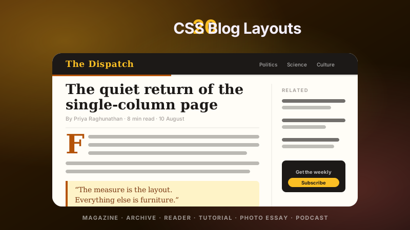
The layout every long-form article needs: body text locked to a readable 65ch measure, while images and pull-quotes break out to the full viewport width — no negative margins, no calc() hacks, no wrapper divs. One named-line grid does all of it, and any child can opt into full bleed with a single class.
A docs-style two-column grid where the table of contents stays pinned while the article scrolls past — the pattern developers fight with for hours because one missing declaration silently kills position: sticky inside grid. This demo names the culprit (align-self: start) and ships the fix.
An auto-fill photo gallery that handles mixed aspect ratios without a single media query: portrait, landscape and square media all snap to a consistent rhythm because aspect-ratio + object-fit normalise every cell. Captions ride as gradient overlays inside real <figure> elements — the markup search engines and screen readers want.
The legendary header/nav/main/aside/footer layout — the one that needed floats, negative margins and prayer for fifteen years — rebuilt as eleven lines of grid-template-areas. Fluid center column via minmax(0,1fr), sidebars that never collapse below readable, and a single media query for mobile stacking.
A dashboard data table built on grid + subgrid: the header defines the column tracks once, and every row inherits them with grid-template-columns: subgrid — so columns resize gracefully as one unit, numeric columns stay right-aligned, and status pills never wrap the layout. The upgrade path from <table> styling pain.
Editorial layering without position: absolute — two cards and a caption share overlapping grid tracks, so the composition is responsive, reflowable and reorderable. Line-number placement (grid-column: 1 / 8 vs 6 / 13) creates the overlap; z-index and a backdrop-blur chip finish the art direction.
Newsletter
Enjoying these demos? Get new ones by email.
A short email when a new collection ships. Unsubscribe any time.
The canonical three-row, three-column holy grail — presented as the teaching version: every region labelled with its grid-area name, a visible track diagram, and the exact 2000s-era problems (equal-height columns, footer at the bottom, source-order independence) annotated as solved. The reference students bookmark.
A framework-free 12-column system in eight lines of CSS — with the column overlay every design tool shows, rendered live behind real content so students can SEE spans land on tracks. Utility classes .col-1 through .col-12, a gap variable, and none of Bootstrap's 12,000 lines.
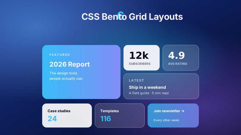
The Apple-keynote bento: a dark grid of feature tiles where one 2×2 hero anchors the composition and satellites of varied spans orbit it. Each tile owns a different oklch accent glow, hover lifts are compositor-only, and the whole board reflows to a clean 2-column stack on phones.
A print-grade opening spread on the web: a display headline that crosses the photograph, a drop cap, a hairline-ruled sidebar of standfirst text, and asymmetric column rhythm — all from one 12-column grid with overlapping placements. The layout magazines paid layout artists for, now a stylesheet.
Repeat, Auto-fit, Minmax — the single most useful line of CSS written this decade. Card grids that go 4-up, 3-up, 2-up, 1-up as the container narrows, with zero media queries. This demo ships the crash-proof 2026 version with min() and a clamp()ed floor, plus a live track-count readout so learners watch it respond.
A grid that restyles itself based on HOW MANY children it has — pure CSS, via :has() and child-counting selectors. Three tags render as roomy feature cards; six or more automatically compact into a dense chip wall. The CMS-proof layout: editors add items, the design responds, nobody files a ticket.
The staggered waterfall without a masonry library: a fine-grained row grid (grid-auto-rows: 8px) where each pin spans a per-item number of rows via one custom property. Items pack across-then-down like real Pinterest — the ordering CSS columns can't give you — and the whole wall is dense-packed against gaps.
A true interlocking honeycomb: pointy-top clip-path hexagons in flex rows that overlap the previous row by 30% of hex width, with alternate rows shifted half a hex sideways so the peaks nest into the previous row's bottom notches. Amber cells glow on hover like dripping honey. The showpiece layout for team pages, skill matrices and NFT-free hexagon needs.
Newsletter
Enjoying these demos? Get new ones by email.
A short email when a new collection ships. Unsubscribe any time.
The card-alignment problem, finally solved: titles of different lengths, descriptions of different depths — yet every title baseline, every description block and every button aligns PERFECTLY across cards, because each card inherits the parent's row tracks with grid-template-rows: subgrid. The demo shows misaligned vs aligned side by side.
The full admin-app frame: pinned sidebar, topbar with search, a 4-up KPI strip, main chart area with side panel — every region a named grid area, nested grids for the widgets, and the exact overflow discipline that keeps app shells from growing phantom scrollbars.
A three-tier pricing table where feature lists of different lengths can't misalign the CTAs: rows come from subgrid, the featured tier lifts with a scale transform (which doesn't disturb the grid), and price typography uses tabular numerals so $9/$29/$99 align by digit.
A Trello-style board built on the column-flow trick: grid-auto-flow: column + grid-auto-columns sizes every new list identically without declaring counts, the board scroll-snaps horizontally on mobile, and each column's inner card stack scrolls independently while headers stay pinned.
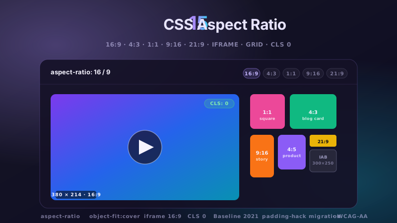
Video-platform tiles that never jump: every thumbnail slot reserves 16:9 with aspect-ratio before any media loads, killing layout shift (CLS) at the source. Includes the three ratios every product needs — 16:9 video, 1:1 avatars, 4:5 posters — coexisting in one auto-fit grid.
One card component, two layouts — decided by the card's OWN width, not the viewport. Dropped into the wide main column it goes horizontal; the identical markup in the narrow sidebar stacks vertically. This is the component-portability upgrade media queries could never deliver.
Sharp diagonal section transitions — the agency-site signature — done the maintainable way: the section skews, its children counter-skew, and the content inside is an ordinary grid that never knows it's tilted. No SVG dividers, no clip-path seams that misalign at odd viewport widths.
A hero section with real art direction: color blocks, an oversized display numeral and the headline all occupy overlapping grid regions at different z-layers, building the off-balance tension of poster design. Negative-space asymmetry from placement arithmetic — not from a designer's PNG export.
Newsletter
Enjoying these demos? Get new ones by email.
A short email when a new collection ships. Unsubscribe any time.
A hand-set photo mosaic — not a uniform grid, not random masonry, but a designed arrangement: a repeating 6-column composition where spans are chosen so tiles interlock without holes. The organic, editorial look of a curated print wall, with the repeat unit documented so you can extend it infinitely.
grid-auto-flow: dense, demonstrated honestly: numbered tiles with mixed spans, where the numbers reveal exactly which items the algorithm pulled backward to fill holes. The one grid feature that trades source order for zero gaps — and the demo teaches when that trade is safe.
An onboarding/setup timeline as a two-column grid: auto-numbered circles (CSS counters — renumber by reordering HTML) in a fixed rail, content beside them, and a connecting line drawn per-item so it starts and stops exactly at the first and last step. An <ol> underneath, as the semantics demand.
The desktop-app frame macOS made canonical: a translucent source-list sidebar with grouped sections, a unified toolbar, and a content pane that scrolls alone. Vibrancy via backdrop-filter, hairline separators at true 1px, and the grid discipline that keeps 'app chrome' rock-still while documents fly.
A native-feeling carousel with zero carousel library: a column-flow grid inside a snap container, slides centered by scroll-snap-align, momentum and touch physics free from the browser. Edge peeking shows there's more to scroll — the affordance JS sliders fake with padding math.
A stylized ops-center map interface: latitude/longitude grid lines from repeating gradients, aurora light fields blended with background-blend-mode, and location markers PLACED ON GRID CELLS — so 'pins' are grid coordinates you can read in the stylesheet, not magic-number percentages.
The 'trusted by' section done properly: an auto-fit wall where hairline dividers between every cell come from a 1px gap over a background color — one declaration replacing the border-collapse puzzle of nth-child edge cases. Logos sit grayscale at 60%, waking to full color on hover.
The final boss of grid placement: a real 18-column periodic table where hydrogen sits at 1/1, helium jumps to column 18, and the d-block gap appears because elements are PLACED, not flowed. A working sample of periods 1–4 with category coloring — the demo that proves you understand grid coordinates.
↗
Build your own
Tweak the exact look in our visual generators — no signup, instant copy-paste.
What is a CSS grid layout and when should I reach for one?
A CSS grid layout uses display: grid to position elements in two dimensions — rows and columns at the same time — using explicit tracks (grid-template-columns: 1fr 2fr 1fr), named areas (grid-template-areas), or auto-flowing patterns (repeat(auto-fit, minmax(240px, 1fr))). Reach for grid whenever your layout needs alignment across BOTH axes at once: a page shell with header / sidebar / main / footer, a card gallery that reflows across breakpoints, a magazine-style asymmetric editorial spread, a kanban board with fixed-height columns and free-height cards, a pricing table with tier-aligned features, a data dashboard whose widgets snap to a shared grid. Every demo in this collection is graded on four axes tier-1 (US/UK/CA/AU/NZ) devs actually care about: (1) MODERN CSS — subgrid, container queries, :has() quantity queries, aspect-ratio, min()/clamp() intrinsic sizing, grid-auto-flow: dense, oklch()/color-mix() palettes, logical properties for RTL. (2) SEMANTIC + ACCESSIBLE — every layout is real landmarks (<header>/<nav>/<main>/<aside>/<footer>) with <article> for cards and heading order preserved, focus-visible rings, 44px+ touch targets, prefers-reduced-motion guarded. (3) INTRINSIC SIZING — minmax(), min(), clamp(), fit-content replace hardcoded pixel widths so layouts survive any content length. (4) DROP-IN PORTABILITY — every demo scoped under .cgl-NN with tokenized colors so you can retune the palette by changing 3-6 CSS custom properties without touching layout math.
When should I use CSS grid instead of flexbox?
Grid when you need control over BOTH dimensions at once — a page layout with header / sidebar / main / footer aligned to a shared grid, a card gallery whose rows AND columns matter, a dashboard with cells of varying spans, a pricing table where three tier cards align tier-name → feature list → footer CTA across all three columns. Flexbox when you're arranging along a SINGLE axis — a navbar row, a button group, a row of pills, a stack of chat messages. The two aren't competing; they're complementary — you'll often nest flexbox inside a grid item (a card's internal header/body/footer stack). The 30 demos in this collection cover both patterns: full-page shells (Modern Holy Grail Demo 04, Full-Bleed Layout Demo 01, Sticky Sidebar Grid Demo 02) use grid; individual card interiors mostly use flex column stacks inside their grid cells.
How do I ship a SaaS dashboard layout with CSS grid (Linear / Notion / Vercel style)?
Demo 05 (Dynamic Data Grid) and Demo 16 (Dashboard Skeleton) are the reference implementations for modern SaaS dashboards. The pattern: an outer grid with grid-template-columns: repeat(12, 1fr) for the widget rail, and each widget spans grid-column: span N where N maps to its width tier — a KPI tile is span 3, a chart is span 6, a full-width activity feed is span 12. Widgets place with grid-auto-flow: dense so smaller tiles backfill holes when the layout wraps on medium screens. For the sidebar-nav shell wrap that outer widget grid in a two-column parent: grid-template-columns: 240px 1fr for the sidebar + main split, with @media (max-width: 768px) { grid-template-columns: 1fr; } to collapse the sidebar to a drawer on mobile. Linear, Notion, Vercel, Figma, Stripe Dashboard, and Airtable all ship variants of this exact recipe. Widget contents use nested flexbox for the label + value + delta arrangement so text metrics align across widgets.
How do I do a Pinterest / masonry layout in pure CSS without JavaScript?
Demo 13 (Pinterest Masonry) is the reference. Two approaches ship in the collection: (1) the traditional CSS columns approach — columns: 4 200px; column-gap: 12px; on a container and each item break-inside: avoid — which is Baseline everywhere and works today. Items fill top-to-bottom, then left-to-right (reading order breaks if that matters — check with a screen reader). (2) The newer grid-template-rows: masonry (Firefox has it behind a flag; Chrome + Safari have it as grid-template-rows: masonry in draft) — better reading order preservation but not Baseline-safe yet, so the demo ships CSS columns as the production path with a commented-out masonry rule as the forward-compat opt-in. For the CSS columns approach, if you need reading order to match visual order (accessibility + SEO signal for a portfolio), you have to reorder the DOM to match how columns pack items, which is exactly the trade-off masonry-grid was supposed to solve. Pinterest itself uses a JS-driven layout for exactly this reason; a CSS-only masonry is a good fit when reading order can be visual-column-major (photo galleries, illustration portfolios, mood boards).
How do I use CSS subgrid for aligned card content?
Demo 15 (Subgrid Card) is the reference. The problem: a row of feature cards where each card has a title + body + footer, and you want the footers to align across all cards no matter how long each card's body is. Without subgrid, the footer position drifts because each card is its own independent flex/grid context. With subgrid: the OUTER container declares grid-template-rows: auto 1fr auto (title / body / footer tracks), and each CARD sets display: grid; grid-template-rows: subgrid; grid-row: span 3 — which makes the card's INNER rows lock onto the OUTER grid's row tracks. Every card's title-row aligns with every other card's title-row; body-rows flex together; footer-rows anchor at the same y-coordinate. Baseline widely-available (Chrome 117+, Safari 16+, Firefox 71+). This is the pattern shadcn card grids, Linear dashboard tiles, and every serious pricing table converges on — before subgrid, you'd either hardcode heights (broke on i18n) or use JS to measure and equalize (broke on hydration).
How do I ship an e-commerce product grid (Shopify / Amazon / Stripe checkout)?
Demo 03 (Responsive Media Gallery) is the closest match — an repeat(auto-fit, minmax(240px, 1fr)) grid that wraps at any container width without media queries. For a full e-commerce product grid you'd nest inside each grid cell: an aspect-ratio: 4/5 media wrapper (product image), a title + price row (flex row with justify-content: space-between), a badge column (Sale / New / Bestseller), and a hover Add-to-Cart CTA that appears via :has(:hover). Shopify Dawn, WooCommerce Storefront, BigCommerce Stencil, Amazon product tiles, and Stripe Checkout item lists all use variants of this pattern. Combine with Demo 12 (Quantity Query) to change the visual density based on how many products are on screen: ul:has(> li:nth-child(4)) switches to a 4-column layout only when 4+ products exist; smaller counts get bigger tiles. This is the modern replacement for the JS-driven 'if fewer than 4 items, use different template' logic every e-commerce theme used to ship.
How do I make a CSS grid layout RTL-ready for Arabic / Hebrew / Persian?
Use LOGICAL properties everywhere instead of physical ones — every demo in this collection follows this rule. Physical: margin-left, padding-right, left: 0, border-right-width. Logical: margin-inline-start, padding-inline-end, inset-inline-start: 0, border-inline-end-width. Grid tracks: use grid-column: 1 / -1 for spanning (works in both directions) instead of grid-column-start: 1. Sizing: inline-size / block-size instead of width / height when you're expressing 'the reading direction' vs 'the block direction' (they map to width/height in LTR and swap in RTL). Padding: padding-block and padding-inline. Set dir='rtl' on the root and the entire layout mirrors automatically — no per-selector overrides needed. The one gotcha: transform-based decorations (translate, rotate) don't auto-flip; wrap those in @media (dir: rtl) or explicit RTL selectors if the visual should mirror.
How do I keep CSS grid layouts from causing Cumulative Layout Shift (CLS)?
Grid is friendlier than flexbox for CLS because every track can be sized deterministically at CSS resolution time, before content loads. Three rules: (1) Use aspect-ratio on media slots (Demo 19 Aspect-Ratio Tiles) so image containers reserve their height before the img loads — CLS penalty vanishes. (2) Use minmax() with a MIN large enough to fit your smallest realistic content but not so large it wastes space; e.g. minmax(240px, 1fr) for product cards, minmax(320px, 1fr) for dashboard widgets. (3) Avoid grid-auto-rows: auto when row heights depend on async data — pin them with grid-auto-rows: minmax(96px, auto) so the row reserves at least 96px even when data is still loading. Combine with the shimmer skeleton loader pattern (see CSS Shimmer Skeleton Cards) for zero-CLS async grids: the skeleton reserves the exact grid cell dimensions, then the real content swaps in without any reflow. Google's Core Web Vitals docks pages with CLS > 0.1; the aspect-ratio + minmax + shimmer combo keeps CLS at 0.
Do these grid layouts work in React / Next.js / Vue / Svelte?
Yes — every demo is framework-agnostic HTML + CSS. Copy the HTML into a component (JSX / template / .svelte), lift the CSS into a <style> block, CSS Module, or scoped section. Next.js App Router: the layouts sit naturally in a layout.tsx file with <main> hosting the grid children. React Server Components: no hooks needed since these are pure CSS. Vue / Nuxt: drop into any <template> with scoped styles. Svelte / SvelteKit: works in a +page.svelte or +layout.svelte. Astro: paste directly into an .astro file's template. The class prefix .cgl-NN is per-demo scoped so you can drop multiple demos into the same project without collision. Because the layouts are pure CSS (no useEffect, no requestAnimationFrame, no state), you avoid the class of 'grid doesn't render server-side' bugs that plague JS-driven layout libraries — every demo works at first paint, no hydration required.