20 hand-coded CSS rotation patterns — the transform itself, not a component that happens to spin — infinite keyframe spins, hover tilts, 3D cube faces, scroll-driven angles on animation-timeline, hue-rotate() colour cycling, and the mechanisms people are asked to build: meshed gears, a turntable at 33⅓ rpm, gauge needles, fan blades, orbits and text on a circle. Includes the transform-origin reference most rotation bugs trace back to. Scoped under .rot-NN for no-collision pasting, prefers-reduced-motion guarded, framework-agnostic.
Want to build production-ready CSS layouts, animations and UI from scratch?
You just browsed 20 rotate animations. Learn the Flexbox, Grid and animation thinking behind them, so the next component starts in your head, not in a copy-paste.
The canonical continuous-rotation recipe: one keyframe block ending at rotate(360deg), one animation shorthand with linear and infinite. Two dials run the identical four-second rotation side by side, one linear and one eased, so the stutter an eased curve creates at every cycle boundary is visible rather than asserted. Reach for this whenever something needs to turn without stopping.
A three-to-six degree tilt on hover, eased in both directions, with the transition declared on the base selector rather than inside :hover. The demo shows both versions so you can feel the difference: the broken card snaps back the instant the pointer leaves, the correct one eases out. The whole effect is gated behind a pointer query so touch users never get a stuck transform.
A reference panel for the rotate function itself: positive angles turn clockwise, negative anticlockwise, and the four angle units are shown side by side at equivalent values so 0.25turn, 90deg, 1.5708rad and 100grad land in exactly the same place. It closes with the modern independent rotate property and what it composes with that the shorthand does not.
A disclosure chevron that turns exactly 180 degrees when its panel opens, driven by a checkbox and :has(:checked) with no JavaScript. Two details decide whether it feels mechanical or broken: transform-origin: center so the caret pivots in place instead of swinging out of its box, and a transition short enough — about 180ms — to read as a switch rather than a flourish.
A timing bench rather than a loading indicator: the same rotating mark shown at four durations — 0.6s, 1.2s, 2.4s and 4.8s — with a linear and an eased pair underneath. Seeing them side by side is the only reliable way to pick a speed, because duration changes what a rotation means: urgent, working, ambient or idle.
Six faces, one rotating container, and the three declarations that make a real cube instead of a flat cross: perspective on the parent, transform-style: preserve-3d on the cube, and translateZ at half the edge length on every face. It rotates on two axes at once so the corners and edges stay legible at every frame.
Newsletter
Enjoying these demos? Get new ones by email.
A short email when a new collection ships. Unsubscribe any time.
A cover-flow rail where the angle is the point: each item's rotateY, translateZ and scale are derived from how far it sits from the active index, so the falloff is one formula rather than a pile of per-slide rules. About twenty lines of JavaScript track the index and write a custom property — every transform is computed in CSS.
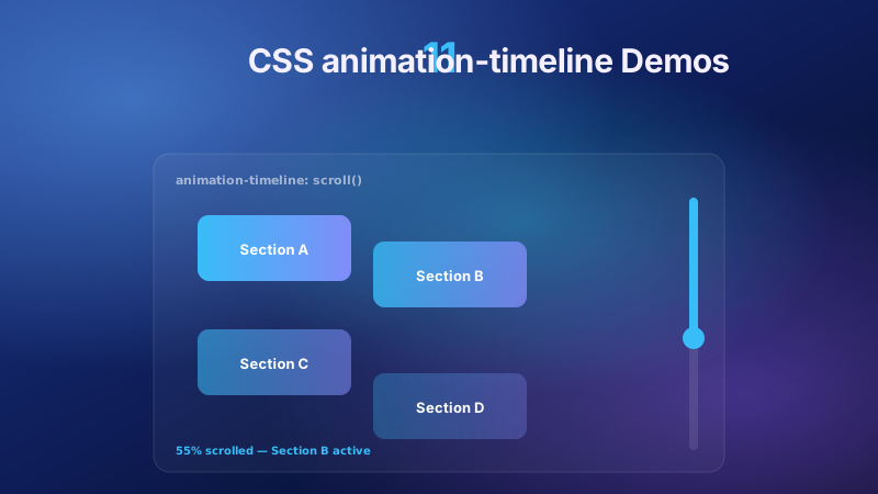
Rotation bound to scroll position with animation-timeline: view() and not a single scroll listener. Each marginal rule turns as its row passes through the scroller, driven entirely by the element's own visibility progress. The whole effect sits behind an @supports gate with a correctly-oriented static fallback declared first.
The one place in this collection where rotating does not move anything: filter: hue-rotate() turns colour around the wheel while leaving lightness and saturation where they were. Two panels cycle the full 360 degrees — a gradient field and a CSS-drawn plate — so you can see why identical source colours drift apart at wildly different rates.
rotate(45deg) translateX(120px) and translateX(120px) rotate(45deg) land in completely different places, because each function transforms the coordinate system the next one works in. Both are drawn here over the same axes so the difference is a diagram rather than a claim, followed by the modern independent properties that apply in a fixed order instead.
A three-gear train where the ratios are real: a 36-tooth wheel drives a 24-tooth and a 12-tooth, so their durations are 12s, 8s and 4s and every second gear turns the other way. Getting the inverse-proportion right is the difference between a convincing mechanism and three unrelated circles spinning at whatever speed looked nice.
A platter turning at a real 33⅓ rpm — 1.8s per revolution, not a round number that looked about right — with grooves from a repeating radial gradient, an off-centre label and a tonearm resting across the disc. Ten lines of JavaScript flip animation-play-state, so the record resumes from the angle it stopped at instead of snapping back.
A compass and a speed gauge sharing one mechanism: a needle pivoting at its base, not its centre, which makes transform-origin: 50% 100% the entire trick. The angle arrives as a registered <angle> custom property so it interpolates smoothly, and each instrument is a role="meter" carrying its real value.
Five blades built from one repeated element, each rotated to its own position around a shared origin, with the whole assembly turning as a single unit. It also tells the truth about speed: past a certain rate a bladed rotor reads as standing still or turning backwards, exactly as it does on camera, so the fix is to slow it or blur it rather than fight it.
Newsletter
Enjoying these demos? Get new ones by email.
A short email when a new collection ships. Unsubscribe any time.
A satellite circling a centre, and the choice that defines the technique: rotating a long invisible arm is the compatible way to do it, but the arm drags the satellite's own orientation around with it. Both versions run side by side — the naive one and the counter-rotated fix — with a note on where offset-path: circle() fits.
Text set around a circle with one formula and no SVG: every character gets its own span, rotated by its index times 360 over the character count, then pushed outward with a translate. The wrapper carries an aria-label with the readable string, because a screen reader announcing thirty separate letters is worse than useless.
A stack of five cards that fans into an arc, each rotated by an index-derived angle about a pivot below the deck so they pivot like cards held in a hand. The formula centres the fan for any count: angle = (index - (count - 1) / 2) x step. Twenty lines of JavaScript hold the open state, because hover alone would exclude every touch device.
One element, one rotation angle, nine different pivots, laid out in a labelled three-by-three grid — every corner, every edge midpoint and the centre. Then the three cases you actually reach for: 50% 100% for a needle or pendulum, 0 50% for a hinged door, top center for a hanging sign. Most "my rotation looks wrong" bugs are this property.
animation-play-state: paused freezes a rotation at the exact angle it had reached and resumes from there — unlike removing the animation, which snaps the element back to zero. Three mechanisms are shown together: pause on hover, pause on keyboard focus, and an explicit button. WCAG 2.2.2 requires one of them for any motion running past five seconds.
Continuous rotation is a genuine vestibular trigger, so this demo makes the guard the subject. Three tiers sit side by side — full rotation, a reduced variant that conveys the same state with a single settled angle, and complete suppression — with the media query written in both directions and a simulate toggle so you can see all three without changing your system settings.
FAQ
Frequently asked questions
How do I make an element rotate continuously in CSS?
Two declarations. Define the keyframes — @keyframes spin { to { transform: rotate(360deg) } } — then apply them with animation: spin 4s linear infinite. You do not need a from block, because the browser uses the element's current state as the implicit starting frame. The detail that matters more than people expect is linear. The default timing function is ease, which accelerates at the start and decelerates at the end; on a one-shot animation that reads as natural, but on an infinite loop the deceleration runs straight into the next cycle's acceleration and produces a visible stutter at every seam. Nothing about the code looks wrong, and the effect is subtle enough that people often blame the frame rate instead. Continuous rotation is linear; save the eased curves for finite, triggered rotations like a chevron flipping or a card fanning open.
Why does my rotation spin around the wrong point?
Because transform-origin defaults to 50% 50% — the element's centre — and most real-world rotations do not pivot there. A gauge needle pivots at its base, so it needs transform-origin: 50% 100%. A hinged door or a book cover pivots at one edge: transform-origin: 0 50%. A hanging sign swings from the top: transform-origin: top center. This is the single most common source of "my rotation looks wrong" — the angle is correct and the pivot is not, so the element swings through an arc instead of turning in place. The origin accepts percentages, keywords and lengths, and it resolves against the element's border box, which is worth remembering when padding changes the box size. Set it explicitly whenever the pivot is not the centre, rather than relying on a default that is right only some of the time.
Why do rotate and translate give different results depending on order?
Because each transform function operates on the coordinate system the previous one left behind. transform: rotate(45deg) translateX(100px) rotates the element's axes first, then moves it 100px along the rotated X axis — so it travels diagonally. transform: translateX(100px) rotate(45deg) moves it 100px along the original horizontal axis, then spins it in place at the new location. Same two functions, same values, completely different outcomes. There is no way to write the shorthand order-independently. The modern alternative is the independent rotate, scale and translate properties, which apply in a fixed order (translate, then rotate, then scale) regardless of the order you declare them in — and, more usefully, can be animated separately without one overwriting the other, which the transform shorthand cannot do.
How do I pause a CSS rotation on hover?
Use animation-play-state: paused. The important property of this approach is that it freezes the element at its current angle and resumes from exactly there — unlike removing the animation, which snaps the element back to its starting rotation and reads as a glitch. Apply it on :hover and on :focus-within together, because a keyboard user has no hover state and would otherwise have no way to stop the motion. This is not only polish: WCAG 2.2.2 requires a pause, stop or hide mechanism for any motion that starts automatically and runs longer than five seconds, which most decorative infinite rotations do. A visible toggle button is the most robust answer, since it works for every input method and does not depend on the pointer resting in a particular place.
How do I make rotation safe for people with motion sensitivity?
Continuous rotation is one of the more reliable vestibular triggers, so it deserves a real fallback rather than a token one. Wrap the animation in @media (prefers-reduced-motion: no-preference) so motion is opt-in rather than opt-out, and give the reduced case a meaningful end state — the finished position, a static angle change, or a cross-fade. The mistake to avoid is degrading to nothing: if an element only communicates its state through spinning, removing the spin removes the information. A loading indicator that stops moving must still say it is loading. Keep the reduced variant visually complete rather than blank, and test it by toggling the setting in your OS rather than trusting the media query to be right by inspection.
Is CSS rotation good for performance?
Yes, provided you rotate with transform rather than faking it. transform and opacity are compositor-only properties, which means the browser can animate them on a separate thread without recalculating layout or repainting — that is what keeps a rotation at 60fps even while the main thread is busy. Animating width, height, top or left to approximate rotation forces layout on every frame and will visibly stutter. Two further notes. will-change: transform promotes an element to its own layer and can help a heavy animation, but it costs memory per element, so apply it to the few elements that need it rather than to everything that moves. And if you are animating a custom property that holds an angle, register it with @property and a syntax of angle — an unregistered custom property is a string to the engine and will jump between values instead of interpolating.
How do I rotate an element based on scroll position?
Use animation-timeline: view(), which binds an animation's progress to an element's position in the viewport with no JavaScript and no scroll listener. A scroll event handler runs on the main thread and fires far more often than the screen refreshes, which is a well-known way to damage Interaction to Next Paint; a scroll-driven animation runs on the compositor instead. The caveat is support: Chrome shipped it in 115 and Safari in 26, but Firefox has not shipped it at all. That makes an @supports (animation-timeline: view()) gate mandatory rather than optional, with the static, correctly-oriented state declared first — otherwise Firefox users see the element frozen at its starting angle, which usually looks broken rather than merely unanimated. animation-range is worth learning alongside it, since "the rotation happens too early" is almost always a range problem rather than a timeline one.
How do these port to React, Vue, Svelte and Tailwind?
The CSS ports unchanged — every .rot-NN selector and custom property is framework-agnostic, and fifteen of the twenty demos need no JavaScript at all. Where a demo does use script, it only writes a custom property and lets the stylesheet render, so the framework layer stays thin: a useEffect that sets --rot-13-angle is the whole React integration, and the cleanup return is trivial because there is no animation loop to tear down. Tailwind ships rotate-* utilities for static angles and arbitrary values such as rotate-[17deg], but it has no first-class keyframe rotation, so the @keyframes block still lives in your stylesheet or an @layer. One trap that is framework-independent: if you toggle an animation by adding and removing a class, the element resets to its start angle each time. Toggle animation-play-state instead when you want it to resume where it stopped.