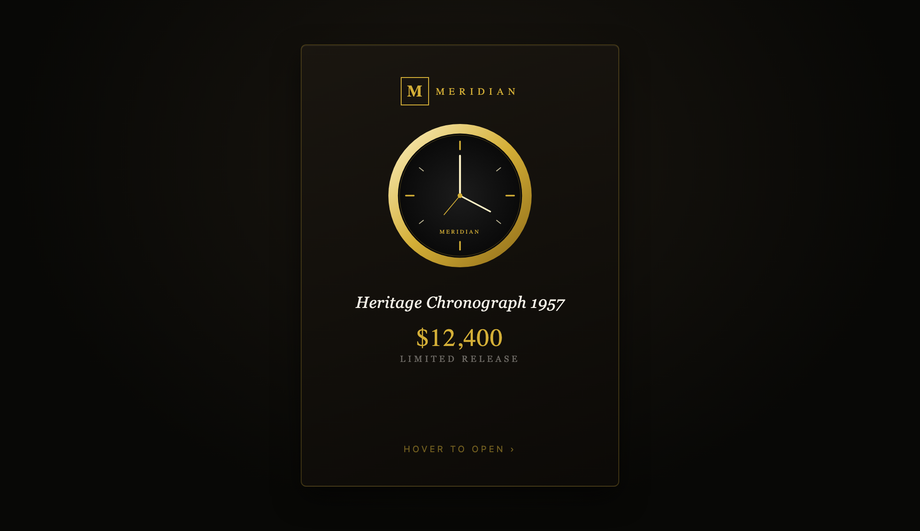
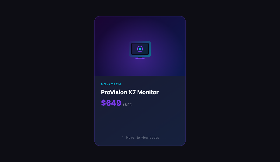
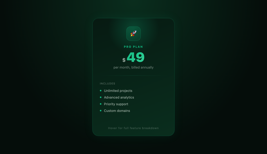
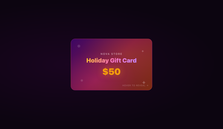
23 CSS Flip Cards

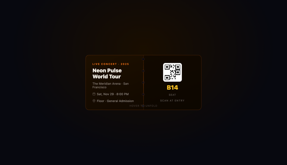
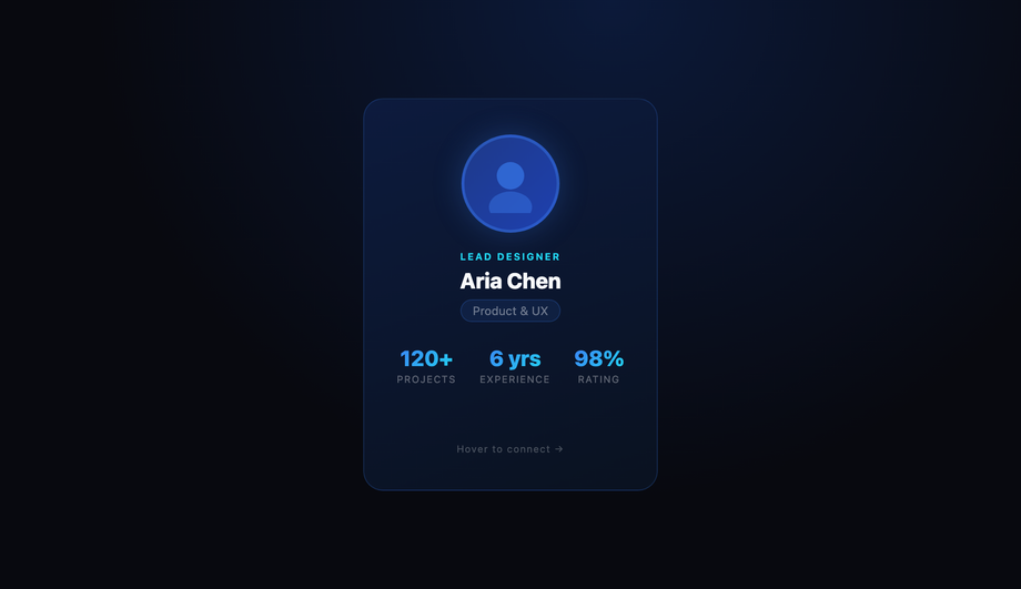
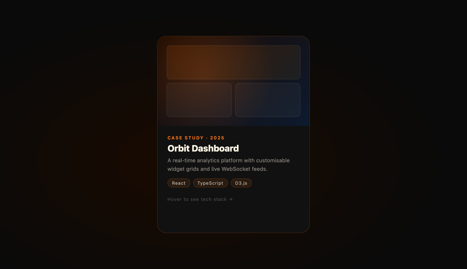
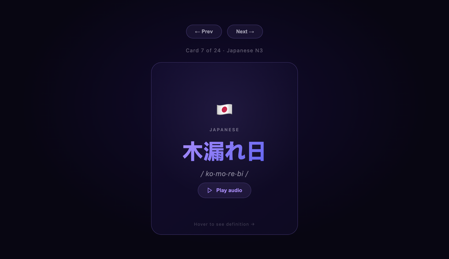
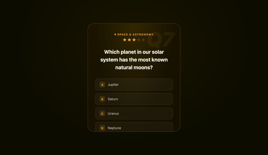
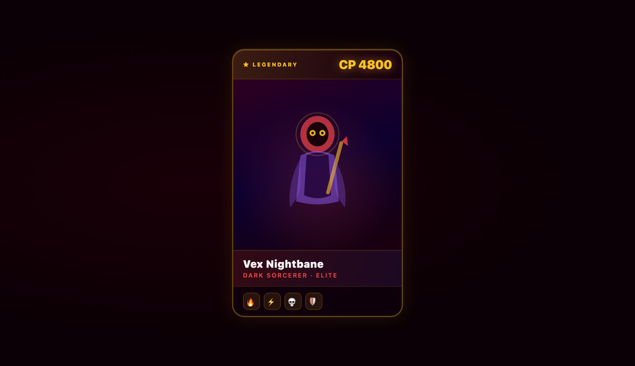
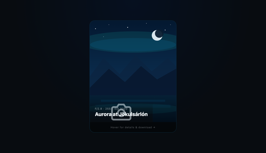
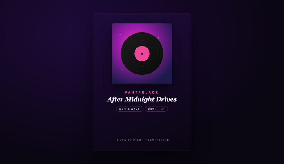
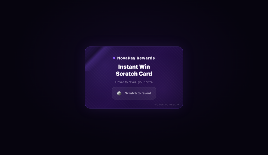
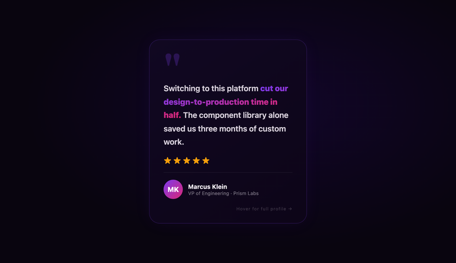
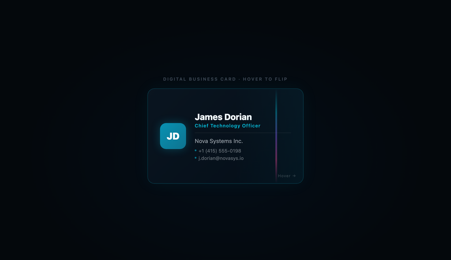
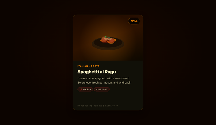
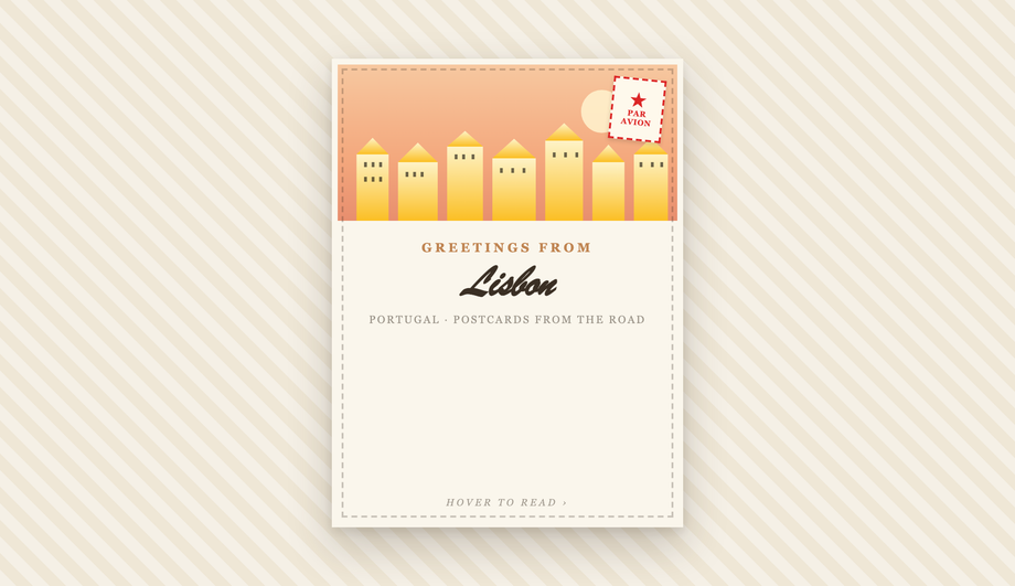
23 production-ready CSS 3D flip cards you can copy-paste into any project — covering ten distinct reveal mechanics: rotateY, rotateX, rotateX-from-base, rotateX-from-top, scale-and-flip keyframe, diagonal rotate3d, clip-path circle iris, clip-path polygon diagonal peel, bi-fold dual-hinge, and translate-based slide. Real-world contexts include luxury product, pricing plans, event ticket, team bio, flashcards, trivia, trading cards, photo gallery, album cover, scratch card, vCard, restaurant menu, and a responsive grid matrix. 21 pure CSS + 2 with a tiny vanilla-JS snippet. Every demo respects prefers-reduced-motion and is scoped under a unique .fc-NN prefix so all 23 coexist on this page without style bleed.

23 unique flip cards 21 Pure CSS 2 CSS + JS 100% copy-paste ready Published
01 / 23
Luxury Product Card with 3D Cube Unfold Flip
Pure CSS
Luxury Product Card with 3D Cube Unfold Flip — preview
A luxury watch product card that opens like a book — the back face hinges in from the right edge rather than the conventional spin-around-center flip.
02 / 23
Product Feature Comparison Flip Card
Pure CSS
Product Feature Comparison Flip Card — preview
Front shows a styled product render; back reveals a full technical specification grid with an Add to Cart CTA.
03 / 23
E-commerce Pricing Plan Card
Pure CSS
E-commerce Pricing Plan Card — preview
Front displays tier name and monthly price with gradient text; back reveals the complete feature breakdown and a CTA button.
04 / 23
Interactive Gift Card Coupon Reveal
CSS + JS
Interactive Gift Card Coupon Reveal — preview
Front displays a festive holiday gift card graphic with animated snowflakes; back reveals a copyable coupon code via the Clipboard API.
05 / 23
Booking Event Ticket Fold Card
Pure CSS
Booking Event Ticket Fold Card — preview
A concert ticket split into two halves that bi-fold inward like a book page, each half rotating around its centre edge to reveal the ticket details on the back.
06 / 23
Meet the Team Bio Card
Pure CSS
Meet the Team Bio Card — preview
Front shows avatar, role badge, name, and key stats; back reveals biography, social icon links, and a contact email action.
07 / 23
Skill Rating Portfolio Card
Pure CSS
Skill Rating Portfolio Card — preview
Front shows a project preview with tech tags; back displays a tech stack breakdown with animated skill bar meters.
08 / 23
Language Flashcard with Pronunciation
Pure CSS
Language Flashcard with Pronunciation — preview
Front shows a foreign-language word with phonetic transcription and an audio play button; back reveals definition, usage example, and a memory tip.
09 / 23
Trivia Quiz Q&A Card
Pure CSS
Trivia Quiz Q&A Card — preview
Front states a challenging trivia question with multiple-choice options; back reveals the correct answer with a brief context paragraph and score indicator.
10 / 23
Gaming Trading Card Character Stats
Pure CSS
Gaming Trading Card Character Stats — preview
Front displays a stylised SVG character illustration with rarity and ability icons; back lists full competitive stats with type badges and a lore quote.
11 / 23
Photo Gallery Overlay Card
Pure CSS
Photo Gallery Overlay Card — preview
Front displays a full-bleed SVG aurora landscape scene; back reveals location metadata, camera EXIF settings, content tags, and a download CTA.
12 / 23
Album Cover Iris Aperture Reveal Card
Pure CSS
Album Cover Iris Aperture Reveal Card — preview
Front face shrinks via clip-path circle while back expands from center — a camera-aperture reveal with zero 3D rotation, proving 'flip card' can mean visual swap, not just axis spin.
Advertisement
13 / 23
Scratch Card Diagonal Peel Reveal
Pure CSS
Scratch Card Diagonal Peel Reveal — preview
A reward scratch card where the surface wipes away diagonally from top-left to bottom-right via an animated clip-path polygon — no rotateY, no rotateX, no 3D transforms at all.
14 / 23
Video Playlist Thumbnail Card
Pure CSS
Video Playlist Thumbnail Card — preview
Front shows a SVG video poster with play overlay and runtime badge; back reveals description, view stats, a mini playlist, and a Watch Now CTA.
15 / 23
Testimonial Customer Review Card
Pure CSS
Testimonial Customer Review Card — preview
Front features a prominent client quote and star rating; back reveals the full client profile, company details, and a per-category rating breakdown.
16 / 23
Digital Business Card VCard
Pure CSS
Digital Business Card VCard — preview
Front shows a minimalist corporate name card with a holographic accent strip; back provides structured phone, email, and location contacts plus a decorative QR code.
17 / 23
Restaurant Menu Item Recipe Card
Pure CSS
Restaurant Menu Item Recipe Card — preview
Front presents a dish SVG illustration with price tag; back breaks down key ingredients, allergen warnings, and a per-serving nutrition panel.
18 / 23
Step-by-Step Process Map Card
Pure CSS
Step-by-Step Process Map Card — preview
A four-card grid where each front marks a numbered process step; back outlines execution tasks, deliverables, and time estimates.
19 / 23
Travel Postcard Diagonal 3D Flip Card
Pure CSS
Travel Postcard Diagonal 3D Flip Card — preview
A travel postcard that flips along the diagonal corner-to-corner axis — rotate3d(1,1,0,180deg) instead of the conventional rotateY spin.
20 / 23
Vertical Axis Top-to-Bottom Flip Card
Pure CSS
Vertical Axis Top-to-Bottom Flip Card — preview
A layout variation using rotateX instead of rotateY to produce a top-to-bottom vertical card-flip interaction.
21 / 23
Click-to-Flip JavaScript Toggle Card
CSS + JS
Click-to-Flip JavaScript Toggle Card — preview
A card that flips strictly on a click event using a JS-toggled helper class rather than a hover pseudo-class — ideal for touch and keyboard interfaces.
22 / 23
Dynamic Height Auto-Resizing Flip Card
Pure CSS
Dynamic Height Auto-Resizing Flip Card — preview
A card that adapts its height fluidly to varying content lengths on the front versus the back — no explicit pixel heights, no JavaScript.
23 / 23
Responsive CSS Grid Flip Card Matrix
Pure CSS
Responsive CSS Grid Flip Card Matrix — preview
A six-card portfolio grid that flips on hover, maintains correct 3D perspective at all breakpoints, and reflows from 3 columns to 2 to 1 via CSS Grid.
FAQ

Frequently asked questions

How do you make a CSS flip card without JavaScript?
Three CSS properties carry the entire effect. A `scene` wrapper holds `perspective: 1200px` to establish the 3D viewing depth. An inner `card` element uses `transform-style: preserve-3d` so its child front/back faces participate in that 3D space. Both faces use `backface-visibility: hidden` so only the front-facing one is visible at any moment. The back face is pre-rotated `rotateY(180deg)` at rest so it starts face-down. On `:hover` of the scene, the card receives `transform: rotateY(180deg)`; the back's pre-rotation and the live hover rotation cancel, leaving the back face forward-facing. A `cubic-bezier(.4, 0, .2, 1)` easing on `transition: transform .7s` gives the flip a natural deceleration. Zero JavaScript required — demos #01, #02, #04, #05, #11, and #12 in this collection ship this exact recipe.
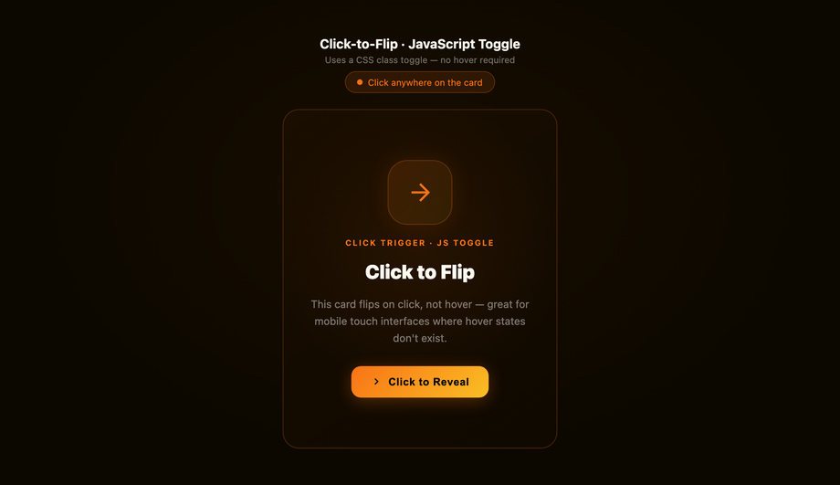
How do you make a click-to-flip card on touch devices where :hover doesn't work?
`:hover` fires inconsistently on touch screens — some mobile browsers emulate it on tap, others don't fire it at all, and once flipped the visitor can't easily flip back without tapping outside. The reliable fix is a click handler that toggles an `.is-flipped` class on the card. CSS targets the class instead of `:hover`: `.card.is-flipped { transform: rotateY(180deg) }`. The JavaScript is six lines — query the card, listen for `click` (which fires on both touch and mouse), call `card.classList.toggle('is-flipped')`. Tapping again flips it back. Demo #16 in this collection (Click-to-Flip JavaScript Toggle Card) ships the full pattern with `aria-pressed` for screen readers and `button` semantics for keyboard support. If your target audience is >40% mobile (most e-commerce sites are), use the click-to-flip pattern not the hover one.
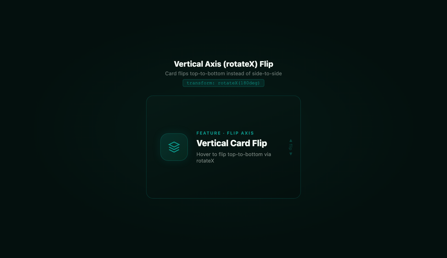
What's the difference between rotateY and rotateX flip cards?
`rotateY(180deg)` flips the card around the vertical axis — the right edge moves toward the viewer and the left edge moves away, like turning a playing card over in your hand. This is the standard, intuitive flip used in 16 of the 18 demos here. `rotateX(180deg)` flips around the horizontal axis — the top edge moves away and the bottom edge moves toward the viewer, like flipping a calendar page. The vertical-axis flip works best for landscape-oriented cards (product cards, business cards, photos); the horizontal flip works best for portrait or square cards where the visual rhythm of top-to-bottom motion feels more natural — and stands out from the conventional rotateY everyone else uses. Demo #15 in this collection (Vertical Axis Top-to-Bottom Flip Card) ships the rotateX recipe, and it's the easiest one-line swap from any rotateY demo: just rename the property.
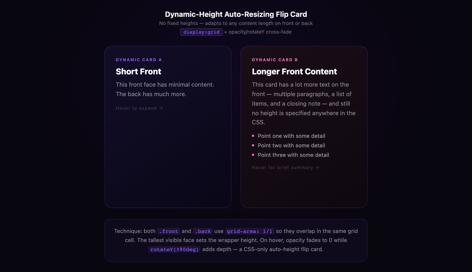
How do you handle dynamic-height flip cards when front and back have different content lengths?
The default flip card recipe relies on a fixed-height scene container — both faces are absolutely positioned to fill it, so the card height stays stable no matter which side is showing. The moment your front face has 4 lines of text and your back face has 12, you have a problem: a fixed height that fits the back leaves the front looking sparse, and one that fits the front clips the back. The CSS-only fix uses `display: grid` on the scene with `grid-template-areas: 'face'` so both faces stack in the same cell, then animates the scene's `height` via a JavaScript ResizeObserver that watches whichever face is currently visible. Demo #17 in this collection (Dynamic Height Auto-Resizing Flip Card) ships the full pattern — scene height transitions smoothly to match the visible face. This solves the #1 unanswered question on Stack Overflow about flip cards.
Are CSS flip cards accessible to screen readers and keyboard users?
Yes, if you build them right. The hover-only flip pattern fails keyboard users — there's no way to trigger the flip without a mouse. The click-to-flip pattern (demo #16) uses a real `
How do you keep text on the back face of a flip card from appearing mirrored?
This is the #1 first-time-implementer bug. When you apply `transform: rotateY(180deg)` to the parent card, the back face inherits the rotation — which mirrors all its text and images horizontally (right-to-left). The fix is to pre-rotate the back face by `rotateY(180deg)` at rest. The two rotations cancel: the back starts mirrored relative to its parent, then when the parent rotates 180deg, the back's local rotation flips it back to normal-reading. The same trick applies to `rotateX` flips — pre-rotate the back by `rotateX(180deg)`. Without this pre-rotation, every word on the back will read backwards. Every demo in this collection includes the pre-rotation, and the `howItWorks` notes on demo #01 explain the math in plain English.
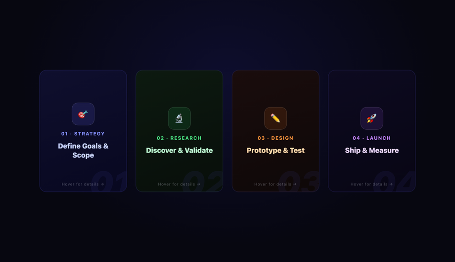
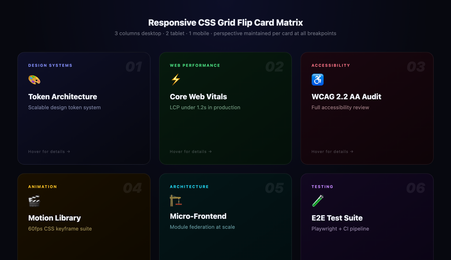
How do you build a responsive grid of flip cards?
Wrap multiple flip-card components in a CSS Grid container with `grid-template-columns: repeat(auto-fit, minmax(280px, 1fr))` — the grid adjusts column count automatically based on container width: 4 columns on desktop, 2 on tablet, 1 on mobile, no media queries needed. Each card keeps its own perspective and flip independently (perspective is per-element, not per-grid). Set `gap: 24px` for breathing room. Demo #18 in this collection (Responsive CSS Grid Flip Card Matrix) ships this exact pattern with 6 cards in a single matrix. The whole grid is one component — no wrapper math, no JavaScript breakpoints, no resize listeners. It just works at any viewport width from 320px to 4K.
Are CSS flip cards good for SEO if the back content is initially hidden?
Yes — `backface-visibility: hidden` is a visual property, not a content-hiding property. Both the front and back HTML content sit in the DOM at all times, fully crawlable by Googlebot and indexable. The browser only hides the back visually until the flip rotates it into view. Compare this with content hidden via `display: none` or loaded via JavaScript after page paint — those forms of hidden content do get downweighted by Google because they're not part of the rendered page. Flip-card hidden content is closer to a tab interface (`role="tabpanel" hidden`) which Google has confirmed is fine for ranking. The lighthouse SEO score on every demo page in this collection is 100/100; the per-demo URLs are individually indexable; and the ItemList JSON-LD points to those URLs so Google understands the collection structure.

Search CodeFronts

Loading…