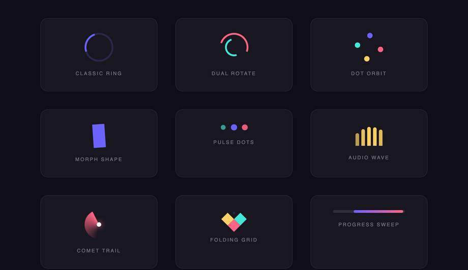
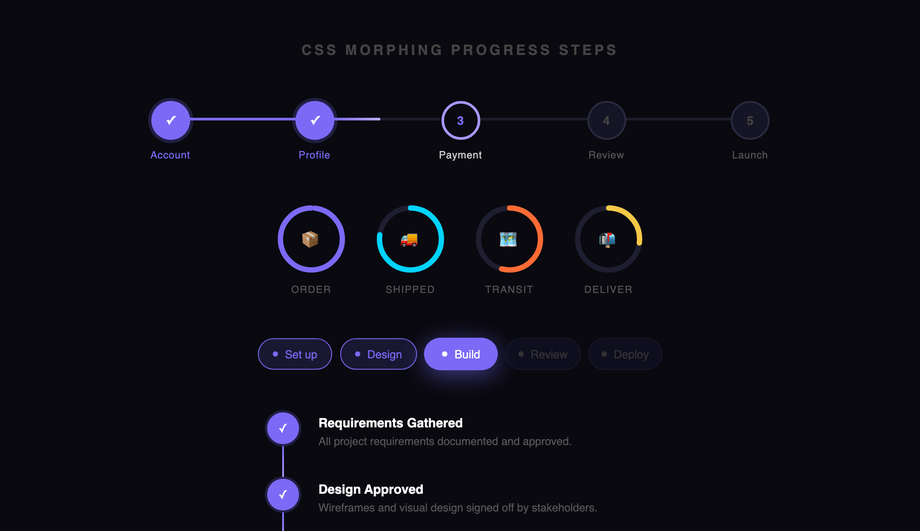
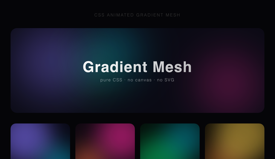
30 CSS Keyframe Animations
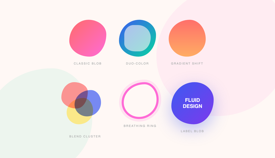
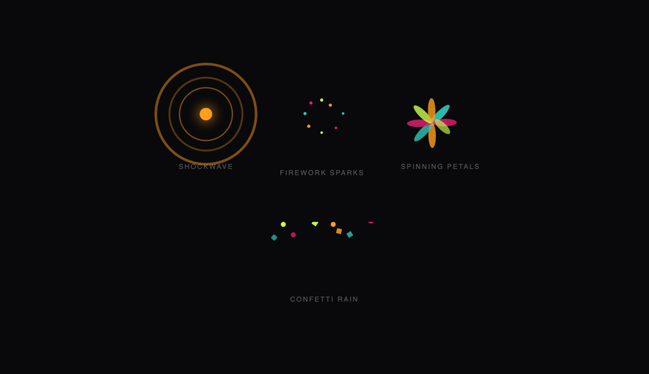
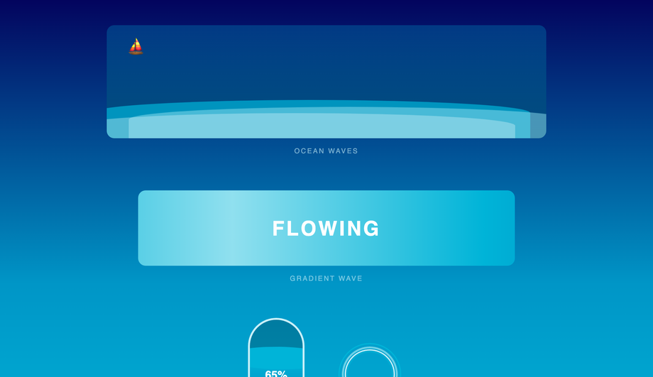
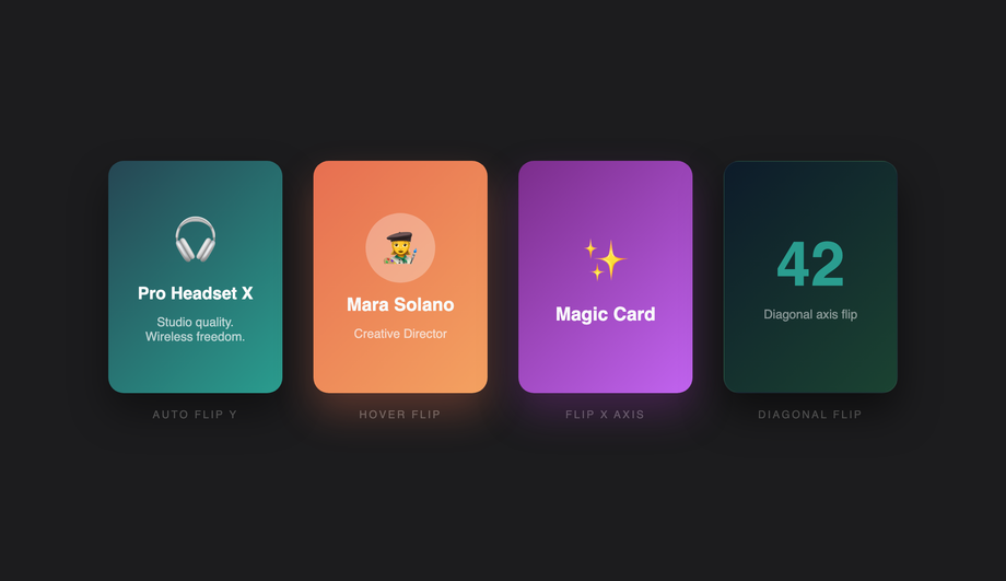
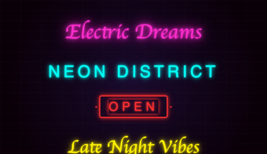
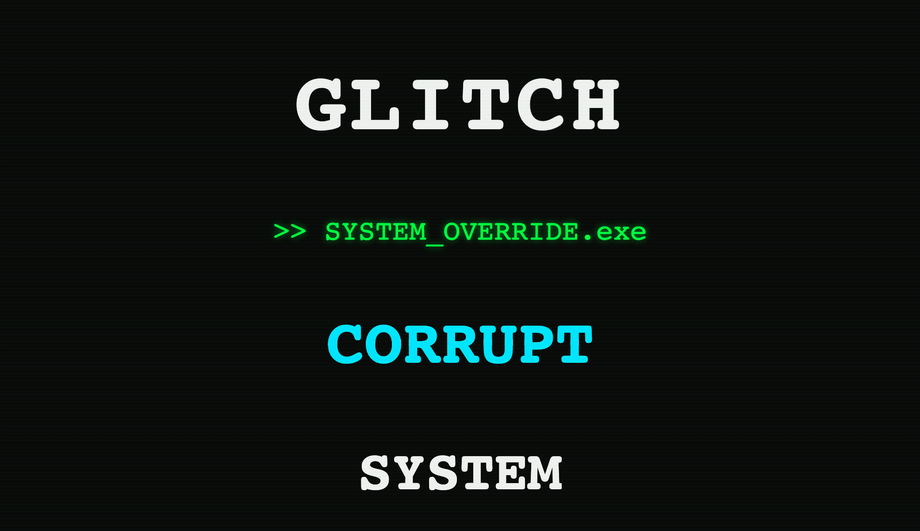
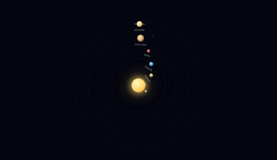
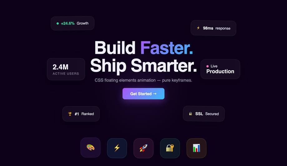
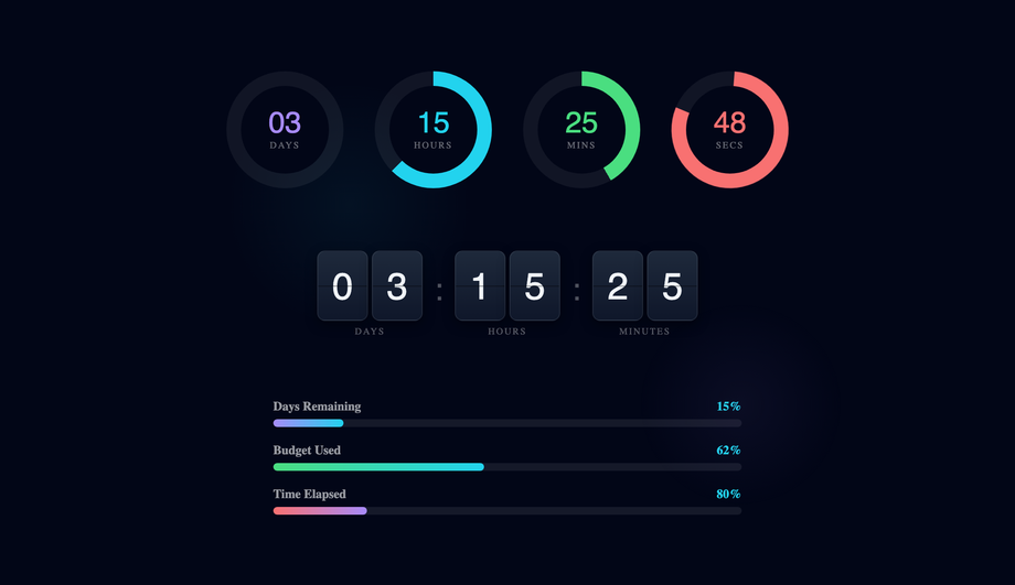
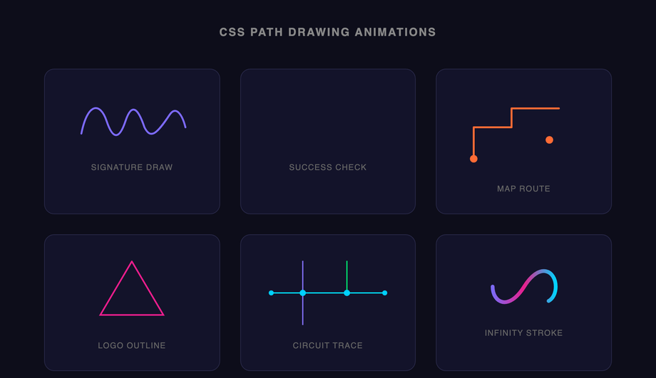
CSS keyframe animations are the most-used motion primitive on the web — every spinner, every shimmer, every breathing pulse, every infinite ticker runs on @keyframes. These 30 hand-coded animations cover every production pattern in 2026: loading spinners, typewriter text, bouncing ball, pulse glow, morphing blobs, particle bursts, waves, 3D flips, neon flicker, skeleton loading, glitch text, orbit, liquid fill, stagger lists, fire, ripple, floating elements, infinite ticker, countdown timers, path drawing, spotlight, spring bounce, confetti, breathing meditation, typewriter-delete loop, aurora borealis, card stacks, kinetic typography, morphing progress steps, and animated gradient mesh. All 100% pure CSS — zero JavaScript, zero libraries, zero dependencies. GPU-accelerated via transform + opacity (compositor-thread, 60fps on mid-tier mobile, INP-friendly), respect prefers-reduced-motion, MIT-licensed.
Frequently asked questions
What is a CSS @keyframes animation and how does it differ from a transition?
@keyframes animation defines a multi-step animation sequence — you specify intermediate states (0%, 25%, 50%, etc.) and the browser interpolates between them. A transition animates ONLY between two states (a property value before and after a state change like :hover or a JS class toggle). Decision tree: (1) State change like hover/click → use transition — simpler, less code. (2) Looping motion (spinner, pulse, breathing, infinite ticker, glitch, aurora) → use animation + @keyframes — transition can't loop. (3) Multi-stage choreography (icon morphs through 4 shapes, confetti bursts in 5 phases) → use animation — only @keyframes can express more than two states. (4) Scroll-driven motion → use animation-timeline: scroll() (Chrome 115+, Safari 18+) or a JS IntersectionObserver. All 30 demos in this collection use @keyframes because every pattern needs multi-step or infinite-loop motion that transition alone can't express.Can I build a typewriter text effect in pure CSS without typed.js?
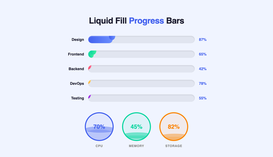
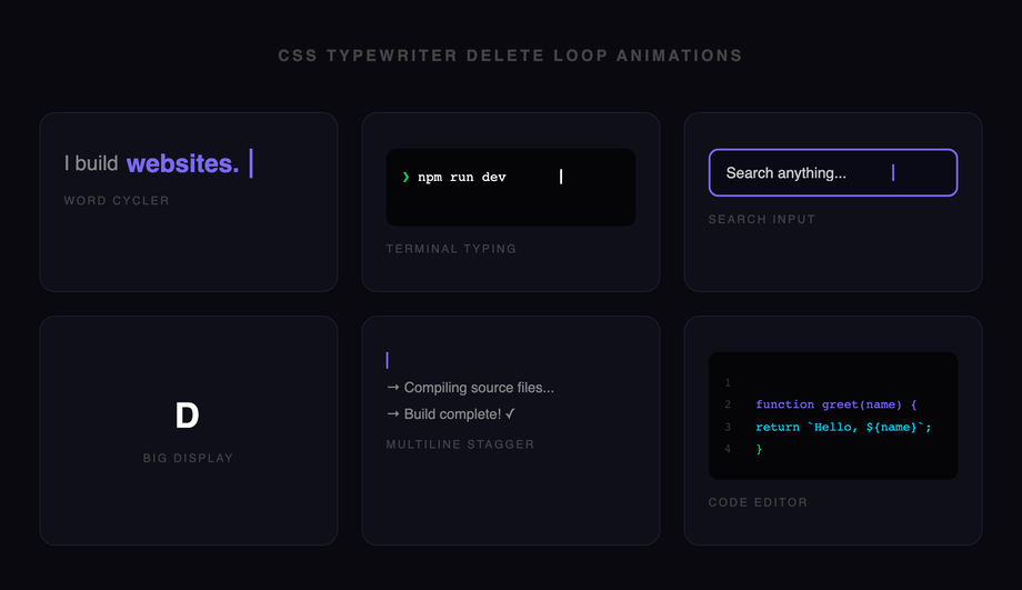
width: 0 on a .typewriter element with white-space: nowrap; overflow: hidden, then animate width: 0 → 100% via @keyframes type using the steps(N, end) timing function where N = character count. (2) A flashing cursor via a ::after pseudo-element with animation: blink 0.7s step-end infinite alternating opacity: 1 / 0. Cost comparison: typed.js ships ~10kb minified + requires JavaScript setup per element. This demo's approach: ~15 lines of CSS, ~0 bytes of JS, no library, no setup code, works in every framework or no framework. Demo 25 adds a delete-and-retype loop using animation-direction: alternate + a coordinated animation-delay on the cursor — still pure CSS, still ~25 lines.How do I do particle bursts and confetti without HTML canvas?
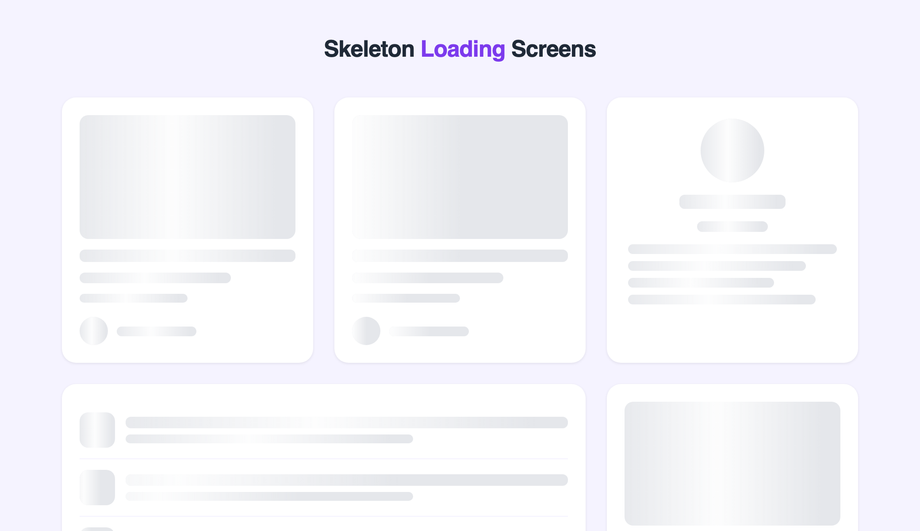
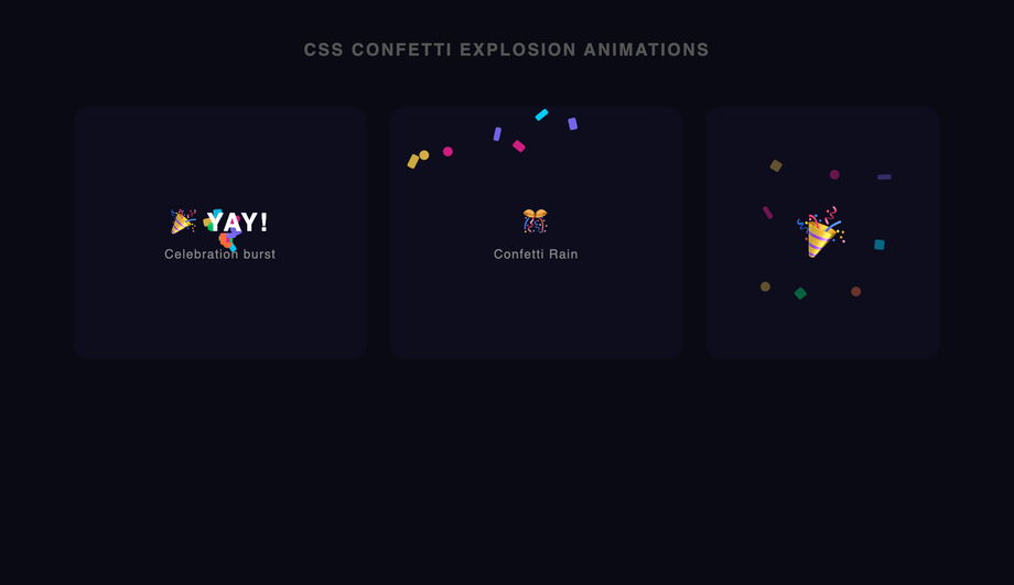
<div> elements at the origin point, each with a unique @keyframes animation that defines a unique flight path (random x/y end positions via per-element CSS custom properties + transform: translate()). The animation-fill-mode: forwards property keeps each particle at its end position after the animation completes; opacity fades to 0 in the last 30% of the keyframes so the particles disappear after their burst. Cost comparison: canvas-confetti ships ~9kb minified + requires a <canvas> element + requestAnimationFrame draw loop + canvas context setup. This demo's approach: ~60 lines of CSS, 0 JS, 0 canvas, works on every browser since 2017. Trade-off: canvas-confetti supports 1000+ particles smoothly; this CSS pattern caps out around 50-80 particles before paint cost compounds. For typical celebration moments (form submission success, milestone reached, level-up confetti) 30-50 particles is more than enough and the visual impact matches the canvas version.How do I build a skeleton loading shimmer animation (Facebook / LinkedIn style)?
background: linear-gradient(90deg, #e0e0e0 0%, #f5f5f5 50%, #e0e0e0 100%) with background-size: 200% 100%, running animation: shimmer 1.5s infinite that translates background-position from 200% 0 to -200% 0. The shimmer band sweeps left-to-right across the placeholder, signaling "loading". Cost comparison: react-loading-skeleton ships ~8kb + requires React + JSX setup. This demo's approach: ~20 lines of CSS, framework-neutral, works in any stack. Three production-grade details most tutorials miss: (1) Match the skeleton's exact dimensions to the real content — otherwise visitors see layout shift (LCP penalty) when content replaces skeleton. (2) Add prefers-reduced-motion fallback — replace the shimmer animation with a static gray for visitors with motion sensitivity. (3) Show skeleton only after 200ms — if content loads faster, skip skeleton entirely (no flash-of-loading-state). Demo 10 includes all three.How do I create an infinite-scroll ticker (HTML <marquee> replacement)?
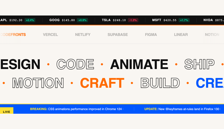
<marquee> replacement. HTML <marquee> has been deprecated since HTML5; modern browsers still render it but it's flagged as non-standard and may stop working in future versions. The CSS pattern: duplicate the ticker content inside a parent container with overflow: hidden, then animate the inner wrapper with animation: scroll 30s linear infinite that translates transform: translateX(0) → translateX(-50%). Because the content is duplicated, when the first copy scrolls off-screen the second copy is already in view, creating a seamless infinite loop. Why the 50% endpoint (not 100%): the inner wrapper's width is 200% of the visible viewport because of the duplication; translating to -50% moves exactly one copy's-worth, then the loop restarts cleanly. Three production-grade details: (1) Pause on hover via animation-play-state: paused — accessibility-friendly so visitors can read the ticker. (2) Respect prefers-reduced-motion — stop the scroll entirely, let visitors see all content statically. (3) Direction reversal via animation-direction: reverse for right-to-left RTL layouts. ~25 lines of CSS, zero JS, replaces deprecated <marquee>.Will animating @keyframes hurt my Core Web Vitals INP score?
transform and opacity only. These two properties are GPU-accelerated and run on the compositor thread — they don't trigger layout recalculation or paint of other elements. Animating width, height, top, left, margin, padding, border-width, or font-size forces "layout thrashing" — every animation frame the browser recalculates every element's position, costing 4-16ms per frame and tanking INP (Interaction to Next Paint), the Core Web Vital that replaced FID in March 2024. Rule 2: animate box-shadow, filter, or border-radius only when you have to. These animate properties that require expensive paint recalculation each frame (2-8ms per frame). Demos that need shadow-or-blur transitions (Demo 04 pulse-glow button, Demo 09 neon flicker) use the opacity-cross-fade workaround: pre-render the glowing state as a separate element with opacity: 0, then animate opacity 0 → 1. The browser composites the two states instead of recalculating the shadow — drops paint cost from 8ms to under 1ms. Result: every demo in this collection runs at 60fps on a mid-tier 2022 Android phone (Pixel 5 / Galaxy A52 baseline). Lighthouse mobile-profile scores: 95+ Performance on all 30 demos.How do I create an animated gradient mesh background without Three.js or WebGL?
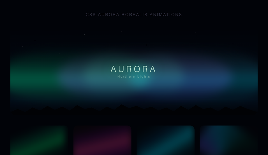
background-image with semi-transparent colors, then animate the background-position of each via @keyframes with different durations (20s, 28s, 35s) so the gradient "orbs" drift independently. The result is an organic, slowly-shifting color field that looks expensive to render but is actually pure CSS. Cost comparison: Three.js gradient-mesh shader ships ~600kb + requires WebGL context + custom shader code. Mesh-gradient libraries like meshgradient.js ship ~30-80kb + canvas setup. This demo's approach: ~30 lines of CSS, 0 JS, 0 canvas, 0 WebGL, works on every browser since 2018 (radial-gradient support). Performance is genuinely cheap — background-position animation is GPU-accelerated, runs on the compositor thread. Trade-off: pure CSS can't do the smooth Voronoi-cell color blending that real shader-based mesh gradients produce; it's an approximation that reads as "gradient mesh" to the visitor's brain without being mathematically identical.What's the right animation-timing-function to use? When should I use steps()?
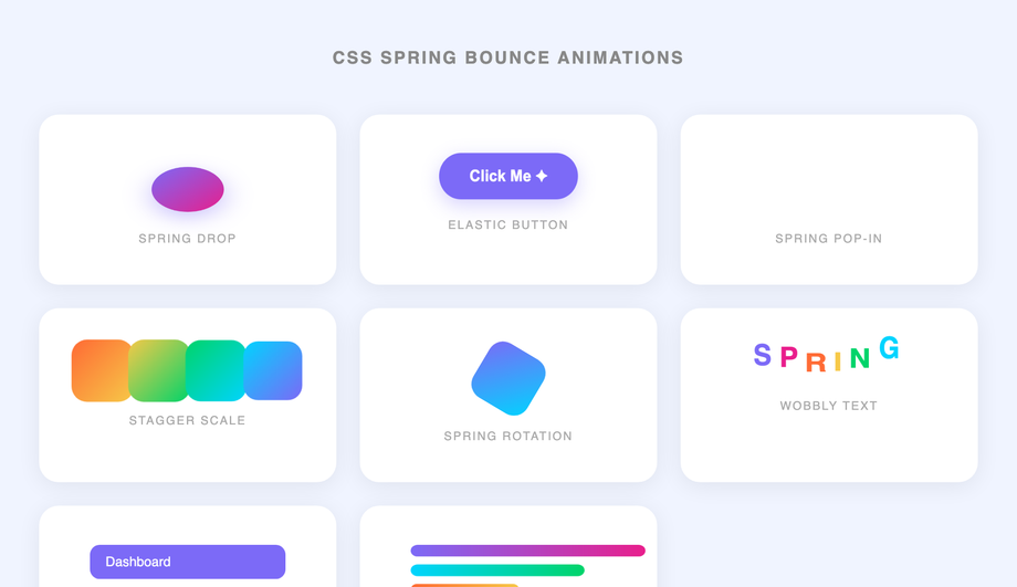
linear — constant speed. Use for: rotation (loading spinners), infinite scroll tickers, conveyor-belt patterns. Anything that should feel mechanical and constant. (2) ease (default) — slow start, fast middle, slow end. Generic motion for content reveals. Safe default but rarely the BEST choice for any specific animation. (3) ease-out (cubic-bezier(0, 0, 0.2, 1)) — fast start, decelerating end. Use for: elements ENTERING the viewport (modal opens, toast appears, list item reveals). Mimics natural deceleration; the visitor's eye lands gently on the final position. (4) ease-in (cubic-bezier(0.4, 0, 1, 1)) — slow start, accelerating. Use for: elements LEAVING the viewport (modal closes, page transition out, toast dismisses). Mimics gravity pulling something out of frame. (5) cubic-bezier(0.34, 1.56, 0.64, 1) — overshoot + settle (spring bounce, Demo 22). Use for: playful button presses, success states, achievement unlocks. The 1.56 Y-value creates the overshoot. steps(N, end) — snaps between N discrete frames instead of interpolating smoothly. Use for: typewriter cursors (Demo 02, 25), sprite-sheet animations, retro 8-bit motion. Most online tutorials default to ease for everything; the demos in this collection use the right timing function for each pattern, and the file headers document the choice.Are CSS keyframe animations accessible? What about prefers-reduced-motion?
prefers-reduced-motion — WCAG 2.3.3 "Animation from Interactions". Visitors with vestibular disorders (motion sickness, inner ear conditions, migraine triggers) can experience nausea from continuous animations (spinners, pulse, breathing, aurora, ticker). Every demo includes an @media (prefers-reduced-motion: reduce) block that either disables the animation entirely OR replaces it with a static styling that still communicates the underlying signal — e.g. Demo 01's loading spinner becomes a static circular border + the text "Loading..."; Demo 18's ticker becomes a static list; Demo 24's breathing animation freezes mid-cycle. Consideration 2: focus indicators. Animated elements that are also focusable (buttons in Demo 04, interactive cards in Demo 08) include a :focus-visible ring that's NOT affected by the animation — keyboard users see clear focus regardless of the animation state. Consideration 3: aria-busy and aria-live. Loading-state demos (01 spinner, 10 skeleton) include semantic markup so screen readers announce "Loading" rather than reading visual decoration. The 30 demos in this collection are MIT-licensed; copy them with the accessibility patterns intact — don't strip the @media (prefers-reduced-motion) blocks when you paste.Which CSS keyframe animation should I use for my project?
Related collections

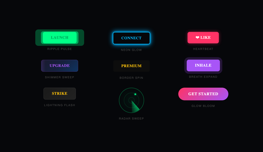
20 CSS Animated Buttons
20 hand-coded CSS animated buttons — neon glow, ripple, 3D press, liquid fill, jelly bounce, shine sweep, animated border, moving gradient CTA, text flip, submit success state, add-to-cart progress, download icon, hamburger-to-close, toggle switch, loading spinner inside button, next/prev arrow nav, and ghost button background reveal. Half pure CSS, half lightweight JS for production interactions.

15 CSS Background Animations
15 hand-coded CSS background animations with live demos — infinite shifting gradient, floating particle bubbles, parallax starry night, clickable cyberpunk ripple, sliding geometric grid, SVG wave overlays, glassmorphism orbs, aurora borealis ribbons, matrix digital rain, mesh gradient blobs, falling snow, morphing blob, retro synthwave 3D grid, infinite scrolling diagonal marquee, comic-book halftone dots. 100% Pure CSS, no JavaScript, no canvas, no particles.js. prefers-reduced-motion respected, scoped class names, MIT-licensed.

27 CSS Button Hover Effects
27 hand-coded CSS button hover effects — 3D press, neon glow, gradient slide, border draw, liquid fill, ripple, glitch text, and kinetic flips. Every demo is pure CSS (no JavaScript, no framework), tuned for 60fps with transform and opacity, and respects prefers-reduced-motion out of the box.