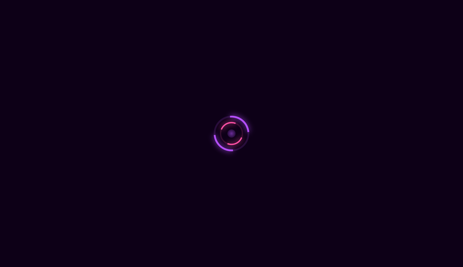
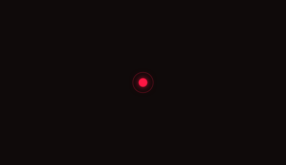
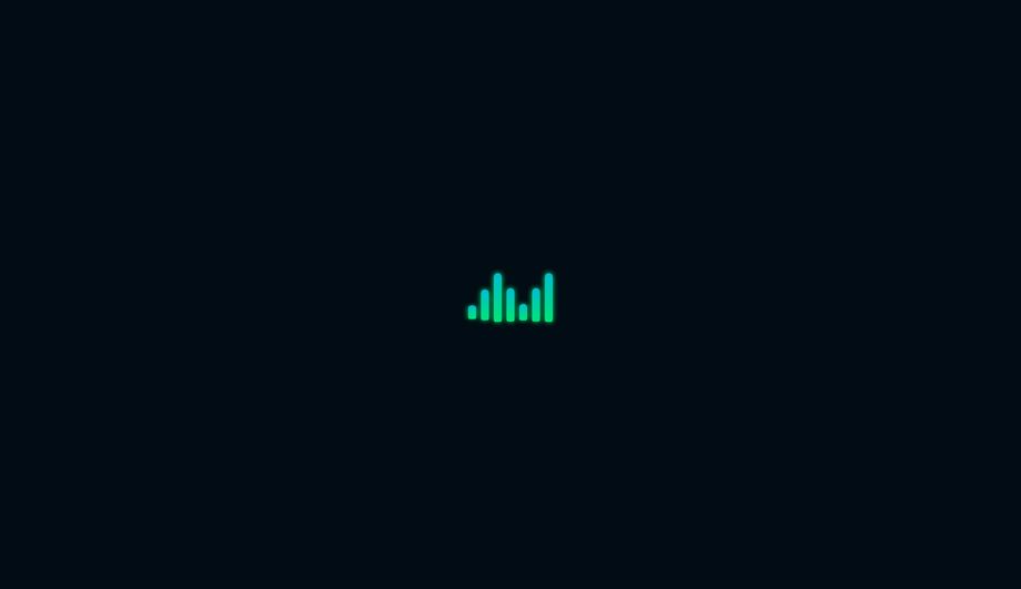
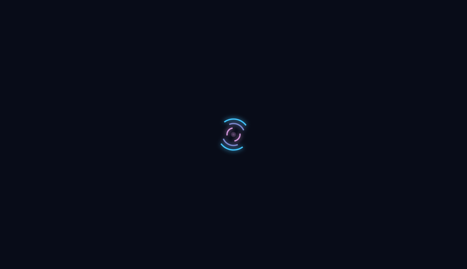
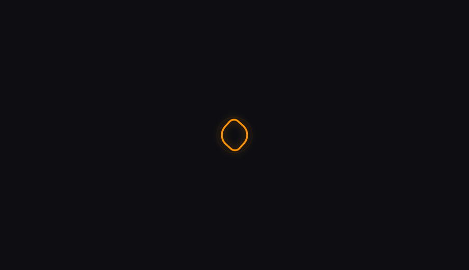
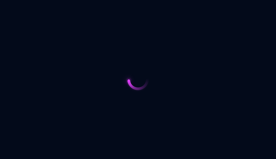
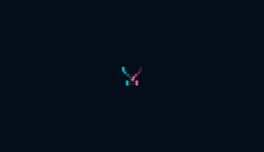
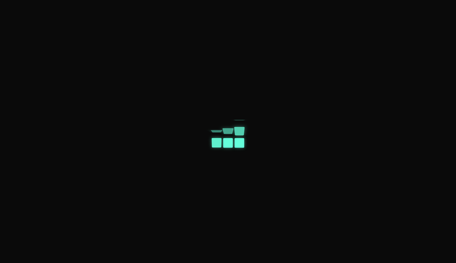
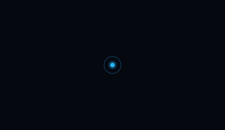
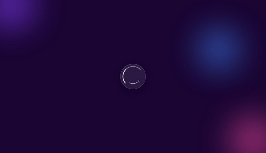
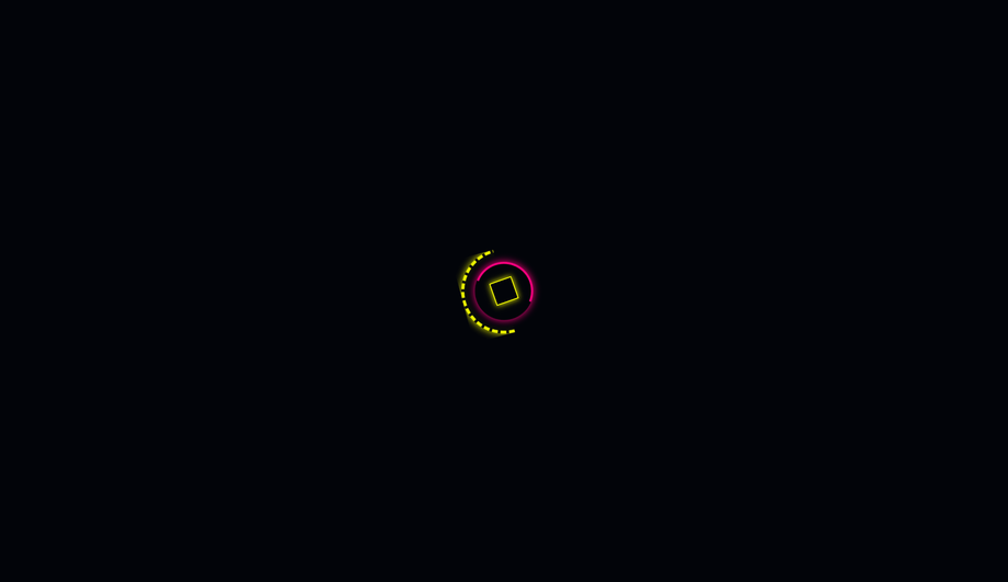
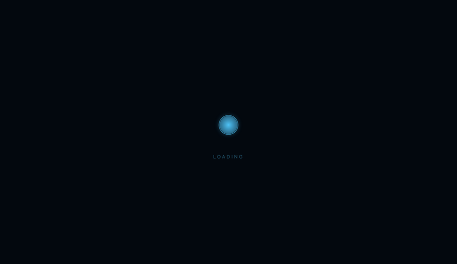
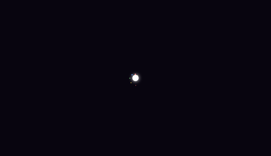
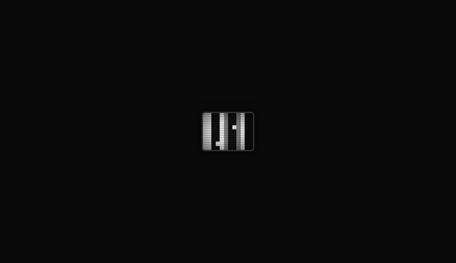
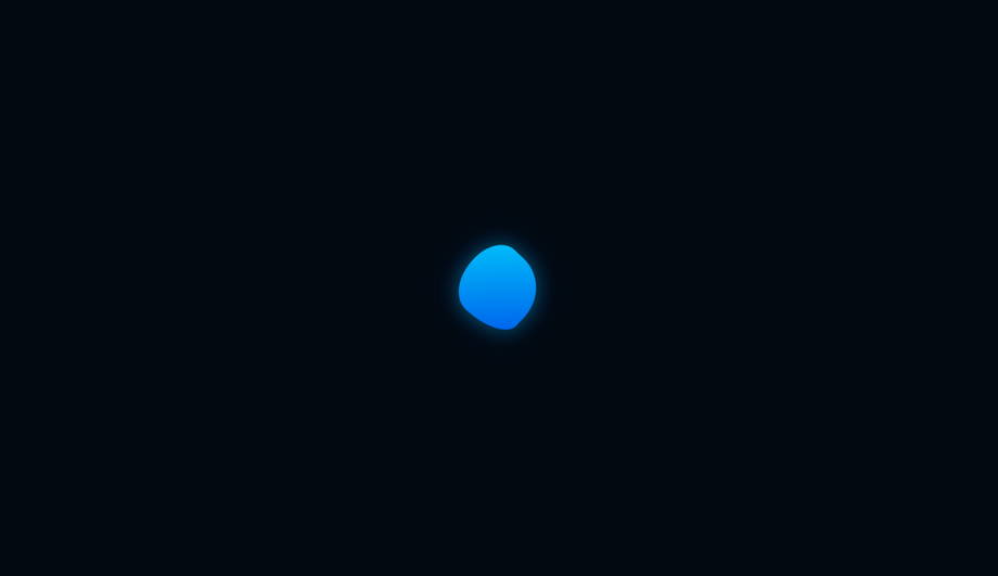
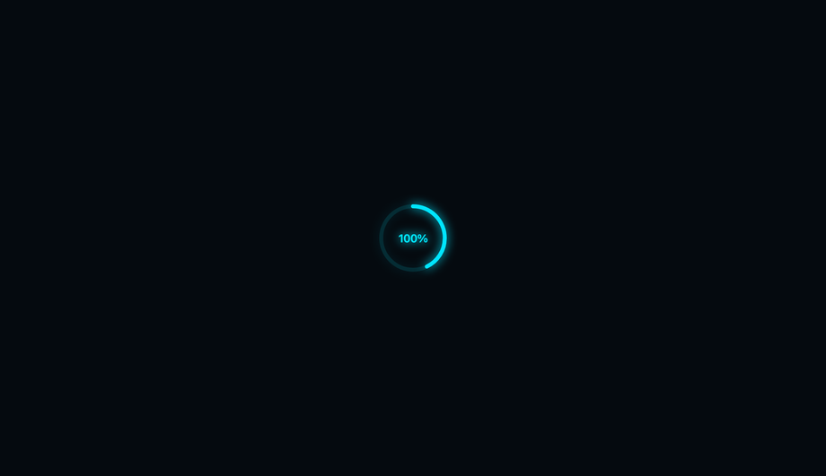
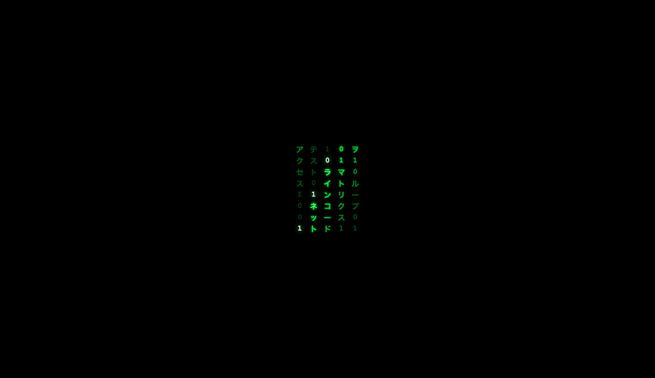
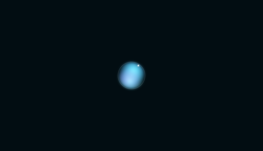
A CSS spinner signals "we're working on it" during the 200ms-3s gap between a click and a result — the visual difference between a snappy app and one that feels broken. These 25 hand-coded spinners cover every production loading-indicator pattern developers reach for in 2026: neon arc, dual counter-rotate rings, dot chase orbit, gradient conic sweep, heartbeat pulse, equalizer wave bars, stacked ring helix, morph square-to-circle, comet trail, DNA double helix, folding cube grid, ripple pulse ring, clock tick sweep, infinity loop stroke, bouncing elastic dots, spiral galaxy, glassmorphism, cyberpunk segmented ring, breathing circle, particle scatter burst, retro TV static, liquid blob, progress arc fill, matrix rain column, and aurora orb. All 100% pure CSS — zero JavaScript, zero library dependencies (no react-spinners, no SpinKit, no loading.io snippet). Every spinner respects prefers-reduced-motion, uses scoped .sp-NN__* class names so multiple spinners coexist without style bleed, ships with proper role="status" + aria-live markup for screen reader accessibility, MIT-licensed.
Frequently asked questions
What's the difference between a CSS spinner and a CSS loader?
Should I use react-spinners / SpinKit / loading.io, or build with pure CSS?
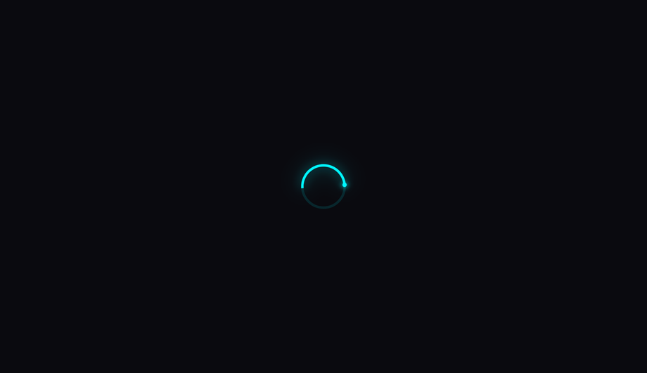
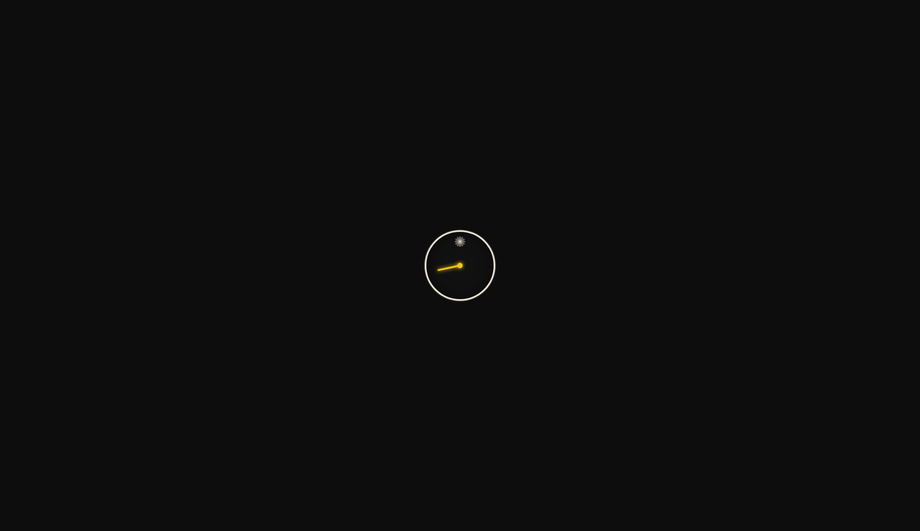
How do I add a leading-edge dot to a spinner that tracks the arc tip?
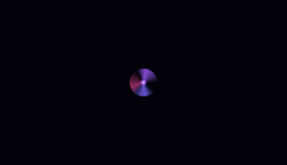
@keyframes spin animation by inheritance, so they rotate in perfect sync — the dot stays locked to the arc tip throughout the rotation. (2) Position the dot at the 12 o'clock position of the unrotated container via position: absolute; top: 0; left: 50%; transform: translate(-50%, -50%) — this centers the dot exactly on the arc midline at the top of the spinner. (3) Size the dot to match (or slightly exceed) the arc stroke thickness so it reads as a smooth rounded cap, not a notch. For a 4px-thick arc, a 4px dot creates a clean continuation; a 10px dot creates a glowing "head" effect for the comet/leading-edge look. Three production-grade details most spinner tutorials get wrong: (a) Use transform: translate(-50%, -50%) not margin hacks — translate is GPU-accelerated and won't trigger layout. (b) Apply the box-shadow glow on the DOT itself, not on the parent — the glow needs to rotate with the dot. (c) Use filter: drop-shadow on the arc instead of box-shadow — drop-shadow follows the actual arc shape (transparent borders pass through), while box-shadow applies to the bounding box.How do I implement the conic-gradient comet trail effect?
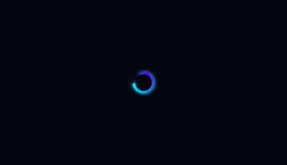
conic-gradient with 4-5 stops that fade from full color at 0° (the bright comet head) through decreasing opacity to transparent. Example: conic-gradient(var(--c) 0deg, rgba(c,0.4) 60deg, rgba(c,0.15) 120deg, transparent 180deg, transparent 360deg) — bright tip at 12 o'clock, fading tail wrapping clockwise through 180°, then a transparent gap from 180-360°. (2) Create the donut hole by layering an absolutely-positioned child div with the same background color as the page, inset:10px (half the desired ring thickness). The conic disc shows through only at the ring area. (3) Rotate the entire container via @keyframes spin { to { transform: rotate(360deg) } } with linear timing — the comet appears to sweep continuously around. Three production caveats: (a) conic-gradient needs Chrome 69+, Safari 12.1+, Firefox 83+ — universal as of 2022 but always provide a border-based fallback for legacy support. (b) The donut-hole technique breaks over images or page backgrounds with non-solid colors — use mask-image: radial-gradient(transparent 50%, black 51%) instead for composable contexts. (c) GPU layer promotion — stacking 20+ conic spinners on one page can saturate the compositor on low-end Android. For high-frequency repeat usage, limit to ~3-5 concurrent.How do I make a spinner accessible for screen reader users?
role="status" on the spinner's outer wrapper. Tells assistive tech (NVDA, JAWS, VoiceOver, TalkBack) that the element conveys status information. Screen readers announce its content politely without interrupting the user. (2) aria-live="polite" in addition to role="status" (the role implies it but explicit is more compatible). Polite = announce when the user is idle. Avoid aria-live="assertive" for spinners — assertive interrupts the user, which is jarring for routine loading announcements. (3) Visually-hidden text inside the spinner: <span class="sr-only">Loading…</span>. The visible rotation means nothing to a blind user — the hidden "Loading…" text IS the announcement. (4) Update the text when state changes. When loading completes, swap the inner text to "Loaded" or remove the spinner from the DOM. The aria-live region announces the change. (5) prefers-reduced-motion: reduce — for vestibular-sensitive users (people who experience motion sickness from continuous spinning), pause or simplify the animation. Don't just remove it (then there's no loading indication) — replace with a static "Loading…" text or a single-frame icon. Common mistake most online spinner tutorials make: animating the visual with CSS but providing ZERO aria/role markup. Blind users have no idea your app is loading. The 25 demos here ship the markup correctly out of the box.Which CSS animation property is best for spinner performance?
transform and opacity only. Both are GPU-accelerated on the compositor thread — they DON'T trigger layout recalculation or paint, so they DON'T affect INP (Interaction to Next Paint), the Core Web Vital that replaced FID in March 2024. Every spinner in this collection follows this rule — rotation uses transform: rotate(360deg), scaling uses transform: scale(...), fading uses opacity. Five spinner-specific gotchas: (a) Don't animate border-color on a loop — paint-only, but on every frame across the whole element. Cheap individually, but stacking 5+ such spinners drops FPS on mobile. (b) Don't animate box-shadow on a loop — paint + blur recalculation every frame. Catastrophic on low-end devices. Use filter: drop-shadow for shadow + animate opacity on a sibling glow overlay instead. (c) conic-gradient with animated stop positions is paint-expensive — rotate the entire conic element via transform instead. (d) backdrop-filter on glassmorphism spinners over a long page kills scroll FPS — apply only when needed, not on a 100vh sticky element. (e) Off-screen spinners shouldn't animate — use IntersectionObserver to add animation-play-state: paused when out of view. Saves battery + CPU. All 25 demos in this collection: 95+ Lighthouse Performance score on Pixel 5 baseline.How is a CSS spinner different from a CSS loader vs a CSS preloader?
window.load fires. Spinners are often USED within preloaders as the rotating element. Some teams use "preloader" specifically for initial-load full-screen UIs and "spinner" for inline UI. Most teams use the terms interchangeably.What's the right spinner size for buttons, cards, and full-page loaders?
<button disabled> <Spinner size=14 /> Saving… </button>. Card-level (replacing a chart, image, or content block): 32-48px square, centered in the placeholder space. Should be small enough that it doesn't visually dominate the card but big enough to be perceived as an intentional element (not a glitch). Inline within forms or tables: 16-24px square. Same scale as text. Modal / dialog (full-screen blocking): 48-72px. The user is staring directly at this — bigger reads as more deliberate. Often paired with text "Processing your request…" below. Full-page preloader: 64-96px, centered on the viewport. Optionally accompanied by a brand logo above the spinner. Floating action / overlay (loading on top of content): 40-56px with a subtle backdrop blur or scrim. All 25 demos in this collection default to a wrapper-sized spinner (sized via a CSS custom property like --size: 80px) — change one value to rescale for any context. Most demos use 40-80px ranges out of the box.Will spinner animations on a long page hurt my scroll performance?
animation-play-state: paused; when it scrolls back in, set running. The visible spinners animate; off-screen ones don't burn battery. ~15 lines of JS. (2) content-visibility: auto (Chrome 85+, Safari 18+, Firefox 125+) on each card. The browser automatically skips rendering off-screen cards, including their spinners. Zero JS. The future-proof approach for any long page. (3) Replace with a single global spinner — instead of 20 cards each with a spinner, show ONE "loading dashboard…" spinner at the top of the page and reveal cards as they finish loading. Simpler UX, fewer animations. This collection's spinners all use transform + opacity (GPU-friendly) and respect prefers-reduced-motion. INP impact: negligible per individual spinner. Lighthouse mobile-profile: 95+ Performance on Pixel 5 baseline with up to 5 concurrent spinners visible.Which spinner should I use for my project?
role="status" + aria-live="polite" + visually-hidden "Loading…" text out of the box, prefers-reduced-motion respected, MIT-licensed.Related collections

20 CSS Animated Buttons
20 hand-coded CSS animated buttons — neon glow, ripple, 3D press, liquid fill, jelly bounce, shine sweep, animated border, moving gradient CTA, text flip, submit success state, add-to-cart progress, download icon, hamburger-to-close, toggle switch, loading spinner inside button, next/prev arrow nav, and ghost button background reveal. Half pure CSS, half lightweight JS for production interactions.

15 CSS Background Animations
15 hand-coded CSS background animations with live demos — infinite shifting gradient, floating particle bubbles, parallax starry night, clickable cyberpunk ripple, sliding geometric grid, SVG wave overlays, glassmorphism orbs, aurora borealis ribbons, matrix digital rain, mesh gradient blobs, falling snow, morphing blob, retro synthwave 3D grid, infinite scrolling diagonal marquee, comic-book halftone dots. 100% Pure CSS, no JavaScript, no canvas, no particles.js. prefers-reduced-motion respected, scoped class names, MIT-licensed.

27 CSS Button Hover Effects
27 hand-coded CSS button hover effects — 3D press, neon glow, gradient slide, border draw, liquid fill, ripple, glitch text, and kinetic flips. Every demo is pure CSS (no JavaScript, no framework), tuned for 60fps with transform and opacity, and respects prefers-reduced-motion out of the box.