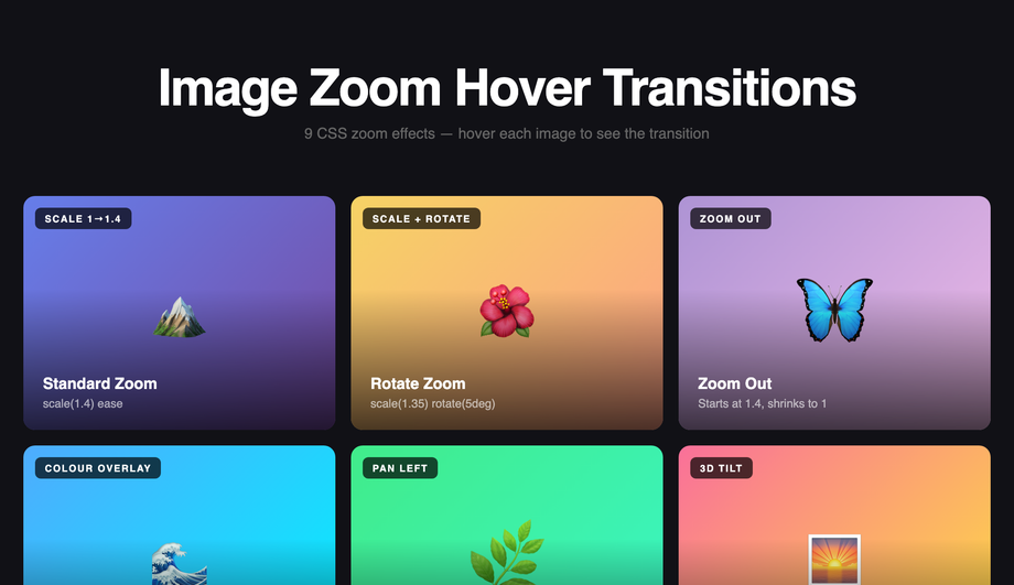
22 CSS Transition Effects
A CSS transition is the smooth animated change between two states — the most-used motion primitive on the web in 2026. These 22 hand-coded transition effects cover every production pattern: button hover, scroll-reveal, flip cards, text reveal, image zoom, modal open/close, page transitions, ripple, magnetic hover, 3D card tilt, glassmorphism, staggered lists, cursor trails, progress bars, and more. All GPU-accelerated (transform + opacity only — no layout thrashing, 60fps on mid-tier mobile), respect prefers-reduced-motion, and ship MIT-licensed. Drop into any stack: React, Vue, Svelte, Astro, Rails, plain HTML — no framework dependencies.


Frequently asked questions
What is the difference between a CSS transition and a CSS animation?
transition animates a property between two states — usually triggered by a state change like :hover, :focus, :checked, or a JavaScript class toggle. You declare the start state, declare the end state, and CSS interpolates between them. animation + @keyframes runs a multi-step sequence over time (can have 2, 5, or 50 intermediate states), runs on page load or via class toggle, can loop infinitely, and can chain via animation-delay. Decision tree: (1) State change like hover or click → use transition — simpler, fewer keystrokes, less code to maintain. (2) Looping motion (spinner, pulse, marquee, breathing button) → use animation — transition can't loop. (3) Multi-stage choreography (icon morphs through 4 shapes) → use animation — only @keyframes can express more than two states. (4) Scroll-driven motion → use animation-timeline: scroll() (Chrome 115+, Safari 18+) or a JS IntersectionObserver-triggered transition. All 22 demos in this collection use the right tool for each pattern.How do I add button hover transitions without :hover breaking on touch devices?
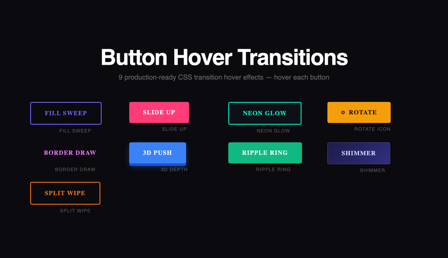
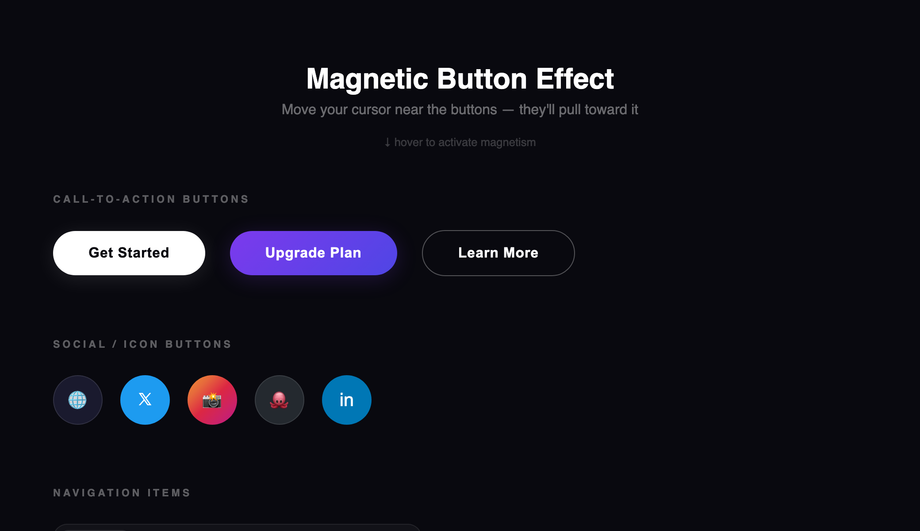
:hover alone for state changes — it fires inconsistently on touch (some browsers fire :hover on tap and leave it stuck until another tap elsewhere; others skip it entirely). Three production-grade fixes that this demo applies: (1) Pair :hover with :focus-visible so keyboard users get the same visual feedback. (2) Add @media (hover: hover) wrapper around hover-only effects (cursor-attraction, magnetic pull, image zoom) so they don't fire weirdly on touch — only when a real mouse cursor is detected. (3) Use :active for tap feedback on mobile — the brief touchdown state gives users confirmation their tap was registered. The 9 button variants in Demo 01 (fill sweep, slide-up, neon glow, rotate icon, border draw, 3D depth, ripple ring, shimmer, split wipe) are each a self-contained CSS class you can copy into any button — semantic HTML, no library, ~10-25 lines of CSS per variant.How do I do scroll-reveal animations without AOS.js, Framer Motion, or GSAP?
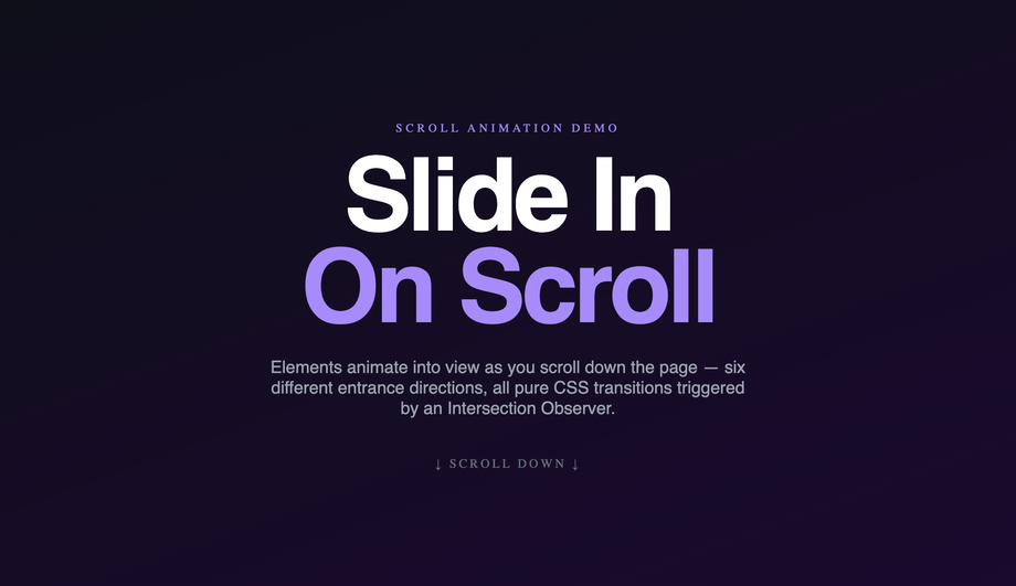
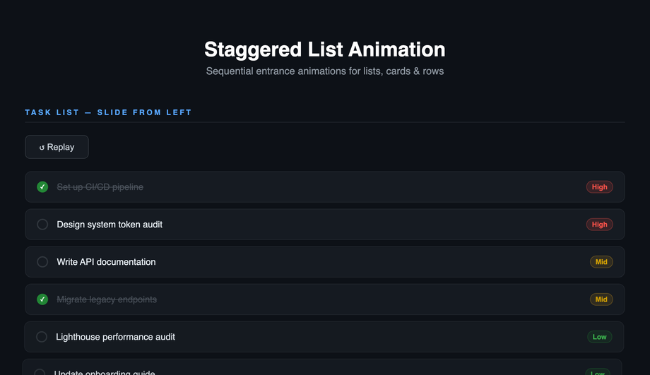
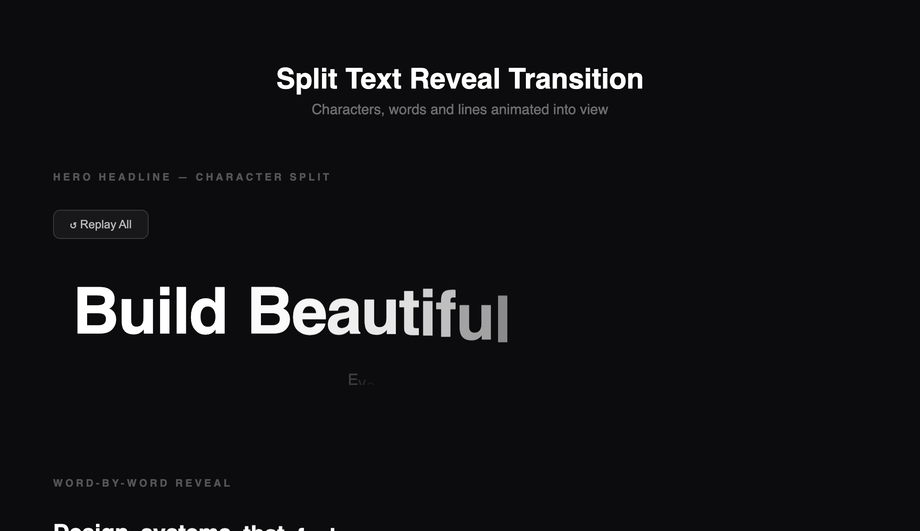
whileInView requires React + ~140kb motion library. GSAP ScrollTrigger is ~70kb. This demo's approach: ~15 lines of vanilla JavaScript using IntersectionObserver. The pattern: each .reveal element starts with opacity: 0; transform: translateY(40px). A single IntersectionObserver watches all .reveal elements; when one enters the viewport, JavaScript adds an .is-visible class. The CSS .is-visible rule transitions opacity to 1 and transform to 0 over 0.7s. Total: ~600 bytes, zero dependencies, works in every framework or no framework. Plus the prefers-reduced-motion query disables the transform entirely for visitors with the OS preference set. Demo 18 adds staggered transition-delay values (100ms × index) so list items cascade in sequence instead of appearing simultaneously.How do I build a production-grade 3D flip card transition?
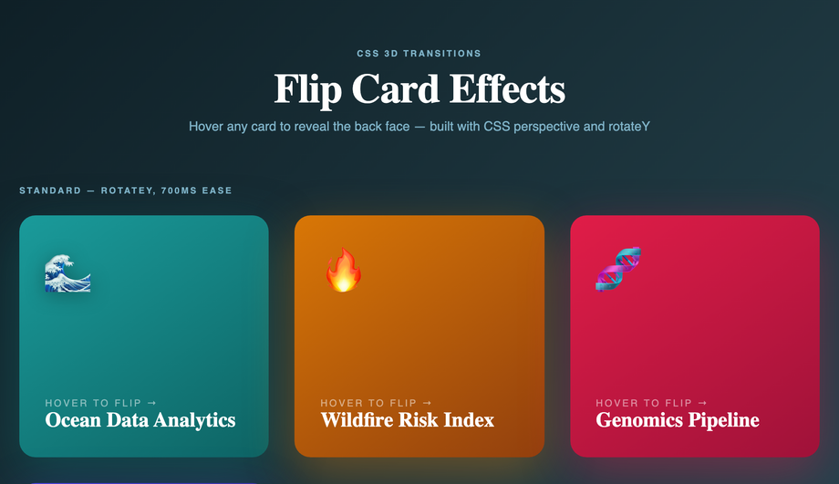
perspective: 1000px on the parent scene container — this creates the 3D viewing distance. Without it, the rotation looks flat / glitchy. (2) transform-style: preserve-3d on the inner card flipper — without this, child elements collapse to 2D when the parent rotates. (3) backface-visibility: hidden on both faces — without this, you see the back of the front face mirrored through the card when it's mid-rotation. The flip itself is a single transition: transform 0.6s cubic-bezier(.22,1,.36,1) + transform: rotateY(180deg) on hover. Most tutorials skip backface-visibility or only apply it to one face — the result is text appearing backward during the flip. Bonus production detail: add will-change: transform on the flipper so the browser promotes it to a GPU layer before the animation starts, preventing first-frame stutter. Pure CSS, zero JavaScript.How do I do page transitions in vanilla CSS / JS (Next.js / Vue Router / Astro alternative)?
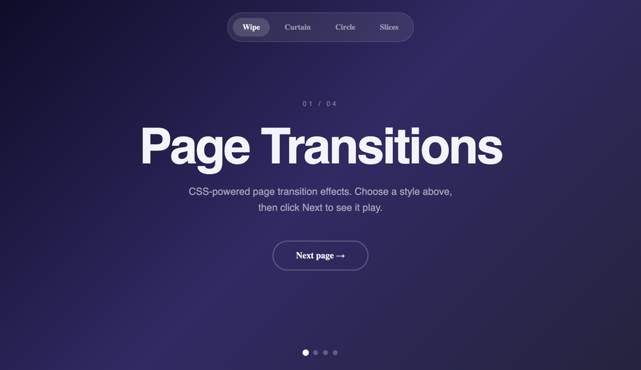
document.startViewTransition(() => updateDOM()) — the browser automatically captures before/after snapshots and crossfades them. To customise: add CSS rules targeting ::view-transition-old(root) and ::view-transition-new(root) with custom animations (slide, fade, scale, blur). Demo 12 ships 4 transition variants: fade, slide-left, scale-up, blur-cross — switch between them with a button. Why use this over Framer Motion's AnimatePresence or Next.js page transitions: (a) zero bundle cost — it's a browser API. (b) cross-framework — works in Astro, Next.js, vanilla HTML, Vue Router, SvelteKit — anywhere you can call startViewTransition(). (c) GPU-accelerated — transitions run on the compositor thread, no React reconciliation pause. Fallback for older browsers: feature-detect document.startViewTransition and fall back to a synchronous update (no animation, page still works). ~30 lines of JS.How do I build modal / dialog open-close transitions without animation libraries?
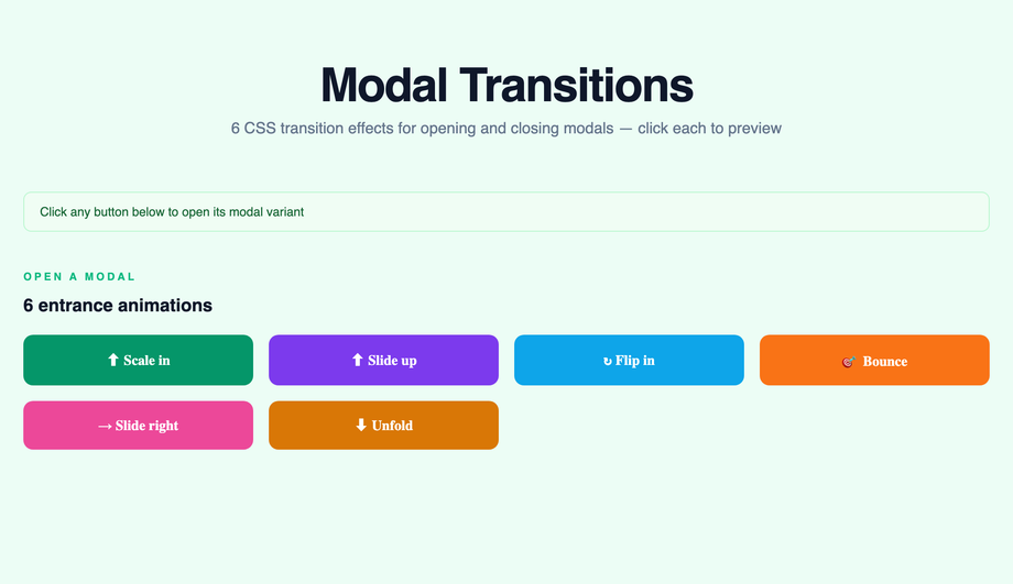
<dialog> element + CSS transitions. The platform-modern approach: semantic <dialog id="myModal">, opened with modal.showModal() (which provides focus-trap, Esc-to-close, and scroll-lock for free — no library needed), closed with modal.close(). Animate the open with @starting-style (Chrome 117+, Safari 17.5+, Firefox 129+) for the entry transition: @starting-style { dialog[open] { opacity: 0; transform: scale(0.9); } } dialog[open] { opacity: 1; transform: scale(1); transition: all 0.3s; }. For the close: transition-behavior: allow-discrete + display: block in the closed state. Cost comparison: Framer Motion's <AnimatePresence> + a custom dialog implementation = ~140kb React + Motion + focus-trap libraries. This demo's approach: ~25 lines of vanilla JavaScript (open/close handlers + backdrop click) + ~40 lines of CSS. Zero library bundle, full keyboard accessibility from the native dialog element, works in every framework. Browser support: native <dialog> is Chrome 37+, Safari 15.4+, Firefox 98+ — universally supported as of 2024.How do I create skeleton loader transitions (Facebook / LinkedIn style)?
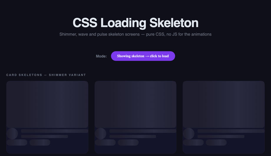
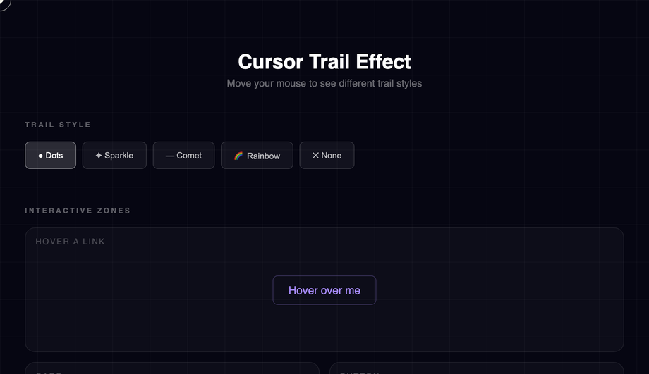
background: linear-gradient(90deg, #e0e0e0 0%, #f5f5f5 50%, #e0e0e0 100%); background-size: 200% 100% and runs animation: shimmer 1.5s infinite that animates background-position from 200% 0 to -200% 0. The shimmer band sweeps across the placeholder, signaling "loading" without a spinner. JS toggles the skeleton state — replace skeleton DOM with real content when fetch completes. Cost comparison: React Skeleton library ships ~8kb + requires React. This demo's approach: ~20 lines of CSS, framework-neutral, works in any stack. Three production-grade details most tutorials miss: (1) Match the skeleton's exact dimensions to the real content — otherwise users see layout shift (LCP penalty) when content replaces skeleton. (2) Add prefers-reduced-motion fallback — replace the shimmer animation with a static gray for visitors with motion sensitivity. (3) Show skeleton only after 200ms — if content loads faster, skip skeleton entirely (no flash-of-loading-state).How do I build a cursor trail effect (Awwwards-winning sites style)?
pointermove across the viewport, JavaScript captures the cursor coordinates and spawns trail dots at decreasing opacity values that follow the cursor with a slight lag. Three implementation strategies, ranked by performance: (1) Best — recycle a fixed pool of 20-30 trail dots, updating their transform position with each move event. No DOM creation/destruction in the hot path → 60fps even on mid-tier mobile. (2) OK — spawn new dot per move event, remove via animationend — works but creates DOM churn that can stutter at high mouse speeds. (3) Avoid — Canvas trail with requestAnimationFrame redraw — looks great but eats 8-15ms scripting per frame, tanking INP score on lower-end devices. This demo uses approach (1) — ~80 lines of vanilla JS, no library. Three production gotchas: (a) Skip on touch devices via matchMedia('(hover: none)') — pointer-move on touch is gesture-not-cursor. (b) Respect prefers-reduced-motion — disable the trail entirely for vestibular-sensitive visitors. (c) Cap the trail at 30 dots maximum — beyond that, the visual gets noisy and the perf cost compounds.Will animating box-shadow, filter, or background-color hurt my Core Web Vitals INP score?
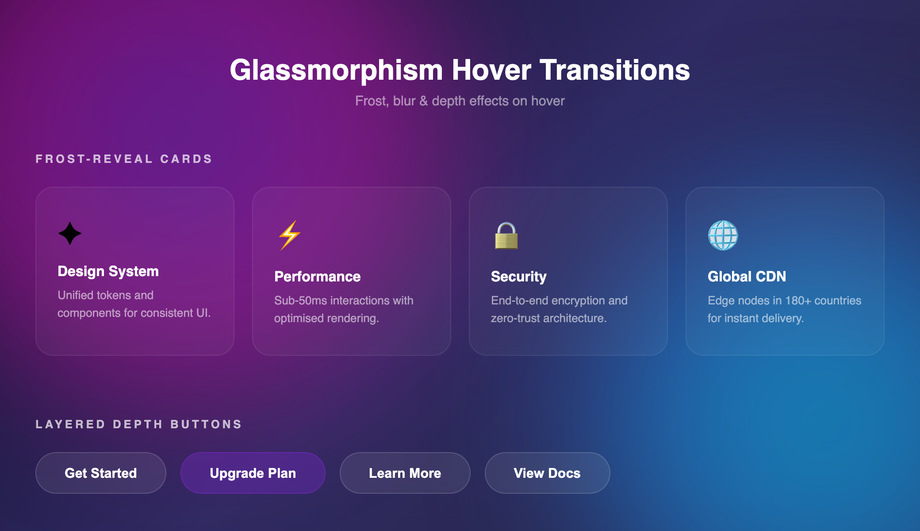
box-shadow and filter can hurt INP significantly; animating background-color is usually fine. Here's the breakdown. Animatable on the compositor (cheap, 60fps): transform (translate/rotate/scale), opacity. These don't trigger layout or painting — they run on the GPU thread. All 22 demos in this collection use these primarily. Animatable but expensive (paint cost per frame): background-color, color, border-color — these require repainting the element each frame, costing 2-4ms per frame. Usually fine for a single element; tanks INP if you animate 50+ elements simultaneously. Avoid animating: box-shadow, filter: blur(), border-radius, width, height, top, left, margin, padding. These trigger expensive recalculations — animating filter: blur(0px) → blur(20px) on hover can cost 16-30ms per frame, single-handedly failing INP. Workaround for shadow / blur effects: pre-render the blurred/shadowed state as a separate element with opacity: 0, then transition opacity 0 → 1 on hover. The browser composites the two states instead of recalculating the filter — drops paint cost from 30ms to under 1ms. Demo 17 (Glassmorphism Hover) uses this opacity-cross-fade trick for the backdrop-filter blur.Which CSS transition effect should I use for my project?
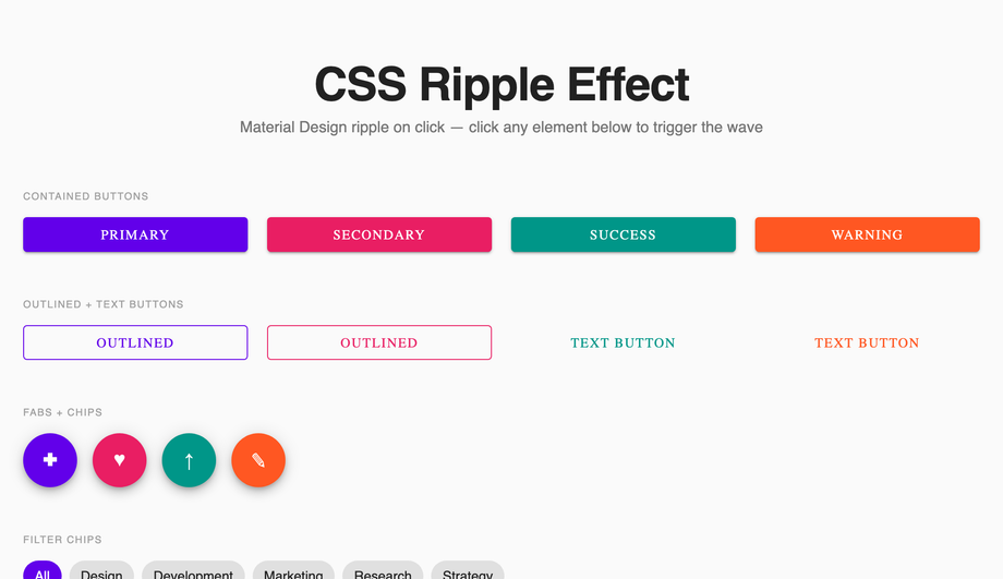
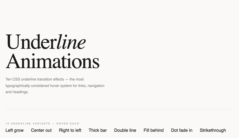
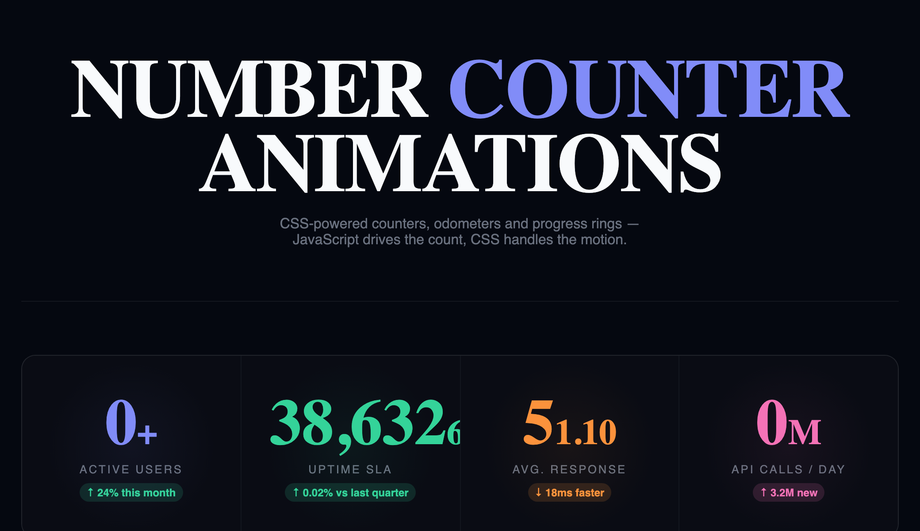
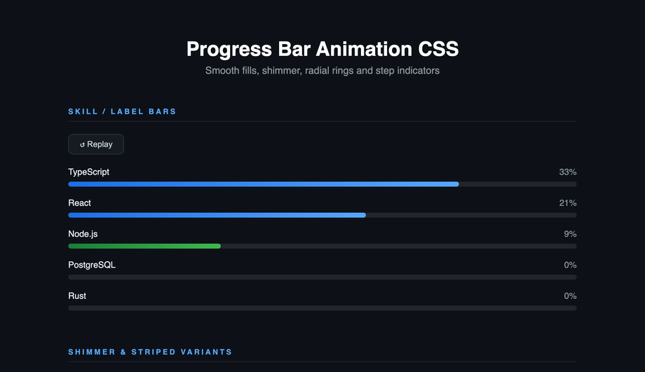
<dialog>. SPA-like page transitions: Demo 12 — uses View Transitions API. Material click feedback: Demo 13 (Ripple on Click). Link hover states: Demo 14 (Underline Animation). Stats / metric blocks: Demo 15 (Number Counter). Glassmorphism brand: Demo 17 — frosted glass hover. Awwwards-style portfolio: Demo 19 (Cursor Trail) + Demo 20 (Magnetic Button). Progress / completion indicator: Demo 22 (Progress Bar). All 22 demos respect prefers-reduced-motion, are MIT-licensed, GPU-accelerated, and work in every framework or no framework.Related collections

20 CSS Animated Buttons
20 hand-coded CSS animated buttons — neon glow, ripple, 3D press, liquid fill, jelly bounce, shine sweep, animated border, moving gradient CTA, text flip, submit success state, add-to-cart progress, download icon, hamburger-to-close, toggle switch, loading spinner inside button, next/prev arrow nav, and ghost button background reveal. Half pure CSS, half lightweight JS for production interactions.

15 CSS Background Animations
15 hand-coded CSS background animations with live demos — infinite shifting gradient, floating particle bubbles, parallax starry night, clickable cyberpunk ripple, sliding geometric grid, SVG wave overlays, glassmorphism orbs, aurora borealis ribbons, matrix digital rain, mesh gradient blobs, falling snow, morphing blob, retro synthwave 3D grid, infinite scrolling diagonal marquee, comic-book halftone dots. 100% Pure CSS, no JavaScript, no canvas, no particles.js. prefers-reduced-motion respected, scoped class names, MIT-licensed.

27 CSS Button Hover Effects
27 hand-coded CSS button hover effects — 3D press, neon glow, gradient slide, border draw, liquid fill, ripple, glitch text, and kinetic flips. Every demo is pure CSS (no JavaScript, no framework), tuned for 60fps with transform and opacity, and respects prefers-reduced-motion out of the box.