The navbar carries the brand the moment a visitor lands. These 8 hand-coded navigation bar patterns cover the surfaces that matter — a responsive editorial hamburger drawer for a literary magazine, a luxury fashion mega menu with 4-column hover panels, a floating glassmorphism pill nav over a living aurora background, a GitHub-dark collapsible vertical sidebar with tooltip-on-collapse, a sustainable brand sticky navbar that compresses gracefully on scroll, a creative agency full-screen overlay with two-panel curtain wipe, a navbar with a built-in light/dark theme toggle and a live token preview, and a minimalist editorial navbar with three distinct underline hover animation techniques. Every demo is wrapped in its own scoped class so all eight render on the gallery page without bleed.

2 pure CSS6 light JSPublished

Related11 CSS Glassmorphic Sticky Navbars20 CSS Responsive Navbar Designs22 CSS Headers15 CSS Navigation Menu Designs

Responsive CSS Navbar with Hamburger Menu — preview
01 / 08CSS + JS

Responsive CSS Navbar with Hamburger Menu

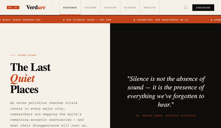
A literary-magazine editorial navbar UI in ink and paper — proving that a responsive hamburger nav can carry serious typographic identity instead of disappearing into a sans-serif default. Top bar with a numbered issue badge (No. 47), a Playfair Display wordmark with italic rust accent, a column-ruled link list (Features / Culture / Opinion / Science / Archive) with a rust underline sweep on hover, a search icon button, and a black "Subscribe" CTA. On mobile (<900px) the desktop links hide and a 1.5px-line hamburger appears; clicking it morphs the three lines into an X and reveals a full-bleed dark drawer with six numbered category tiles (each with a Playfair label + monospace subtext) and a footer row carrying the tagline + "$9/mo" subscribe CTA. Below the navbar a rust-colored marquee ticker scrolls four headline items. Playfair Display + DM Mono. Best for editorial publications, online magazines, literary sites, indie newsletter brands, content-led marketing pages.

PublishedUpdated
CSS Mega Menu — preview
02 / 08Pure CSS

CSS Mega Menu

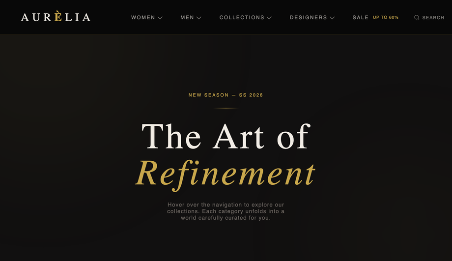
A luxury fashion mega menu navbar UI in deep void black with gold #c9a84c accents and Cormorant Garamond display type — proving a mega menu can carry editorial weight without the SaaS-default look. Top bar with a serif-italic "Aurèlia" wordmark and a 5-item menubar (Women, Men, Collections, Designers, Sale). Hovering Women drops a 4-column panel (Ready to Wear + Accessories + By Occasion link lists with New badges + an italic editorial card "The Art of Understated Power"). Men opens a 4-column with grooming + AW26 lookbook card. Collections shows a 4-up grid of seasonal collection cards (Lumière Douce SS26, Nuit Blanche Pre-Fall, Jardin Sauvage Capsule, Maison Éternelle Bridal). Designers gives a featured list + 12-tile A–Z directory + Voices from the Atelier interview card. Right-rail has Search, Account, and a gold-bordered Bag CTA with a "3" counter. Cormorant Garamond + Jost. Best for luxury fashion e-commerce, boutique storefronts, jewellery sites, perfume houses, premium B2C navigation.

PublishedUpdated

Glassmorphism CSS Navbar — preview
03 / 08Pure CSS

Glassmorphism CSS Navbar

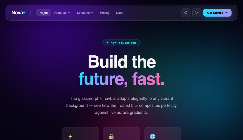
A pill-shaped glassmorphism navbar UI floating 20px above the wrapper edge, built with backdrop-filter:blur() over a living aurora gradient background — proving that frosted-glass navbars composite cleanly against any vibrant scene. Four blurred radial-gradient orbs (violet, cyan, rose, green) drift in mix-blend-mode:screen across a deep #050311 backdrop, with a fractal noise overlay for grain. The pill nav itself has Syne wordmark + cyan dot, divider rule, link list with active-pill state + glowing cyan dot indicator, two has-drop dropdown triggers that reveal nested glassmorphic panels with icon tiles (⚡ Analytics, 🧠 AI Studio, 🔗 Integrations / 🏢 Enterprise, 🚀 Startups, 🎓 Education), Search + Theme icon buttons, and a cyan-to-violet gradient "Get Started" CTA. Below, a gradient-clipped "Build the future, fast." hero with three frosted demo cards. Syne + Inter. Best for SaaS product sites, AI/ML company landing pages, modern marketing chrome, cyberpunk-inflected dashboards.

PublishedUpdated

Vertical CSS Sidebar Navigation — preview
04 / 08CSS + JS

Vertical CSS Sidebar Navigation

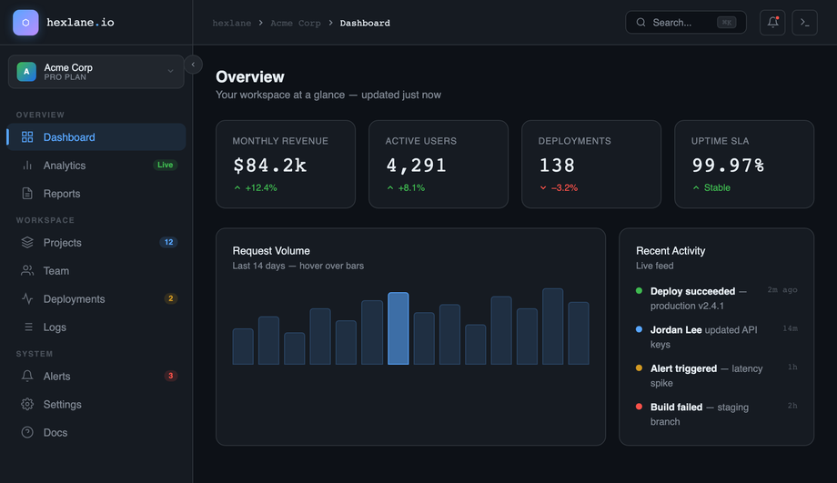
A GitHub-dark-inspired collapsible sidebar navbar UI for a SaaS dashboard — proving that the canonical 240px ↔ 64px sidebar collapse pattern can carry a complete information density. Sidebar with gradient hex logo, a circular collapse-toggle button that rotates 180° on click, a workspace selector card (Acme Corp / Pro Plan), three nav sections (Overview / Workspace / System) with mono-uppercase labels and colour-coded badges (Live green, "12" blue, "2" orange, "3" red), and a bottom user row with gradient avatar. On collapse the entire 240px width animates to 64px — every label, badge, and the workspace info smoothly fade out — and tooltips appear on hover via a data-label attribute. The main pane carries a sticky topbar (breadcrumb / ⌘K search / notifications dot / command icon) and the actual dashboard content: 4-up stat cards (Revenue $84.2k +12.4%, Active Users 4,291, Deployments 138 −3.2%, Uptime 99.97%) plus a 14-bar Request Volume chart + Recent Activity feed. IBM Plex Sans + IBM Plex Mono. Best for SaaS admin panels, developer tools, internal dashboards, analytics platforms, B2B product chrome.

PublishedUpdated

Sticky CSS Navbar on Scroll — preview
05 / 08CSS + JS

Sticky CSS Navbar on Scroll

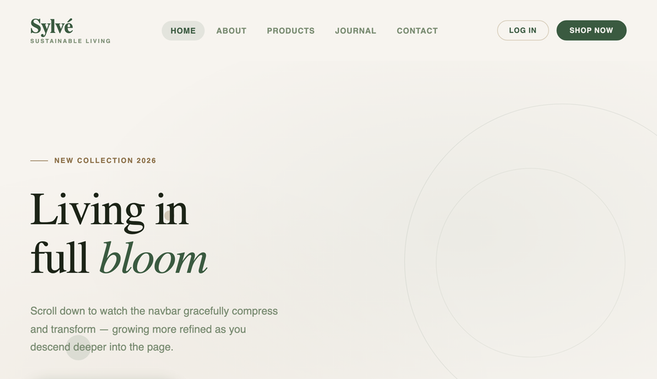
A sustainable lifestyle brand navbar UI that gracefully compresses on scroll — proving the right way to do scroll-transforming sticky navigation without janky reflow. The navbar starts at 96px tall with a large Fraunces serif "Sylvé" wordmark and a "Sustainable Living" sub-tagline beneath; as the page scrolls past 60px, a single class toggle (driven by IntersectionObserver scoped to this demo) compresses the bar to a 60px frosted-glass version, fades the sub-tagline out, and shrinks the wordmark to 1.3rem — all via pure CSS transitions, no JS animation loop. A 3px lime-to-clay gradient progress bar tracks reading depth at the very top of the wrapper. Below the navbar is a sage-and-sand long-form page: decorative circles in the hero, Fraunces italic "earth in mind" headline, a 3-up Regenerative/Zero-Waste/Transparent feature grid, a sage pull-quote divider, and a "Slow Living" journal section that gives readers reason to scroll. Fraunces + Mulish. Best for sustainable brands, lifestyle e-commerce, editorial product sites, slow-content brands, marketing pages that need scroll-aware chrome.

PublishedUpdated

Full Screen Overlay CSS Menu — preview
06 / 08CSS + JS

Full Screen Overlay CSS Menu

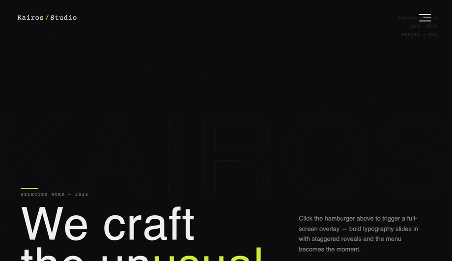
A creative-agency full-screen overlay menu navbar UI for Kairos/Studio — proving that hamburger nav can be the headline interaction instead of an afterthought. Minimal dark header with a Space Mono "Kairos/Studio" wordmark (lime slash) and an asymmetric three-line hamburger button (28/18/28 px). Clicking the burger triggers a two-panel curtain wipe (panel 1 #09090b + panel 2 #0f0f11 with a 0.05s delay) that fills the demo, then reveals five giant Bebas Neue stacked menu items (01 Work / 02 Studio / 03 Services / 04 Journal / 05 Contact) that slide up from below with staggered 50ms-step delays. A right sidebar panel fades in showing selected work links, a pulsing-lime "Available for projects" status dot, and four monospace social links. Hover any item: text turns lime, a lime arrow slides in. Closing reverses the curtain. The demo page itself carries a giant "KAIROS" outlined-stroke background letterform, a corner deco block, a randomised 5x5 dot grid, and a "We craft the unusual." hero with a lime CTA. Bebas Neue + Outfit + Space Mono. Best for creative agency sites, design studios, motion/portfolio brands, asymmetric editorial sites, full-bleed creative landings.

PublishedUpdated

CSS Navbar with Dark Mode Toggle — preview
07 / 08CSS + JS

CSS Navbar with Dark Mode Toggle

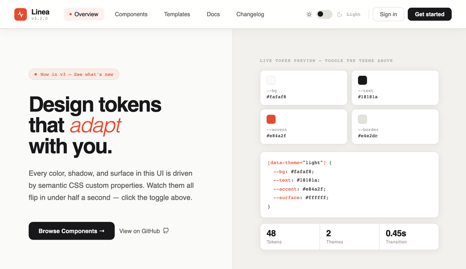
A CSS navbar with a built-in dark mode toggle that flips the entire UI in under half a second — proving that semantic design tokens beat a prefers-color-scheme media query when you want users to control the theme themselves. The frosted backdrop-filter navbar carries a Linea wordmark + version chip, 5 active-dot nav links (Overview / Components / Templates / Docs / Changelog), and a custom track-and-thumb theme toggle that transitions between sun and moon icons with a 0.45s ease. Click triggers a radial flash overlay that ripples outward as the body recolors. Below the navbar: a hero with a live token preview panel (4 swatch cards for --bg, --text, --accent, --border updating their hex values in real time) + a [data-theme] CSS code block that re-renders + a stats strip (48 Tokens / 2 Themes / 0.45s Transition). Bottom features grid covers semantic-token theming, CSS-only transitions, WCAG AA contrast, and localStorage persistence. Epilogue + Fira Code. Best for design system docs, developer tool sites, modern SaaS landing pages, theme-toggle component galleries.

PublishedUpdated

CSS Navbar with Underline Hover Animation — preview
08 / 08CSS + JS

CSS Navbar with Underline Hover Animation

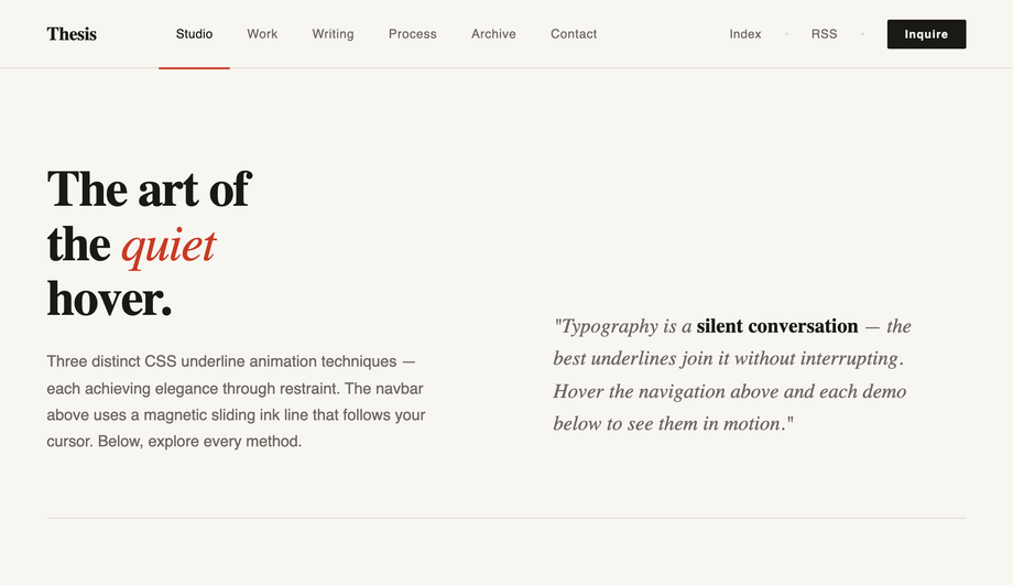
A minimalist CSS navbar with three distinct underline hover animation techniques side-by-side — proving that the most elegant nav effects come from doing less, not more. Variant 1 (the production nav at top) uses a JS-driven magnetic ink line: a single absolutely-positioned 1.5px rail glides between hovered items via getBoundingClientRect, with a red static line marking the active item. Variant 2 is pure CSS — each link owns an ::after pseudo-element that starts at left: 50%; right: 50% (zero width, centered) and expands outward to the padding edge on hover, blooming symmetrically. Variant 3 uses the same ::after trick but transitions only one edge, producing a left-anchored directional wipe. The page includes a Libre Baskerville serif "art of the quiet hover" hero, an A–Z alphabet ticker where every letter gets the underline treatment, and a 4-row showcase list where each title gets a 2px red underline wipe on hover. Libre Baskerville + Instrument Sans. Best for editorial sites, personal portfolios, design studio navs, content-led blogs, minimalist typography-first layouts.

PublishedUpdated

FAQ

Frequently asked questions

What's the right CSS navbar pattern for my site?
Match the pattern to the content density and the brand voice. A content site with 4-7 top-level destinations should use the editorial bar from demo 1 (Verdure) — the column-ruled link list reads as discipline and editorial weight, not as 'tech startup default'. An e-commerce site with deep taxonomy needs the mega menu from demo 2 (Aurélia) so visitors can drill into the third level (Ready to Wear → Coats → Trench) without three page loads. A SaaS marketing page with a vibrant gradient hero is the natural home for the glassmorphic pill from demo 3 (Nōva) — the frosted blur is the whole pitch. A product dashboard with deep navigation needs the collapsible sidebar from demo 4 (hexlane). A scroll-heavy storytelling page (lookbook, manifesto, journal) benefits from the sticky-compress nav in demo 5 (Sylvé). A creative agency or portfolio site that wants the menu to BE the moment chooses the overlay from demo 6 (Kairos).
How do I make the responsive hamburger menu accessible?
Three rules. (1) The trigger is a real <button type="button"> with aria-label="Open menu" and aria-expanded that syncs to open state — screen readers announce the state change. (2) The drawer panel has aria-hidden that flips with the open class so it's not in the accessibility tree when collapsed. (3) Focus is moved to the first interactive item in the drawer when it opens, and Escape closes it. Demo 1 (Verdure) wires the first two; the third is one extra line per project. Don't rely on a CSS-only <input type="checkbox"> hamburger — screen readers can't announce checkbox states as menu states, and keyboard focus order breaks across the trigger/panel split.
Why does the mega menu use hover instead of click on desktop?
Demo 2 (Aurélia) opens its 4-column panels on :hover and :focus-within — that's the e-commerce-store convention because shoppers in a hurry want zero-click navigation. The CSS uses position: static on the trigger <li> plus an absolute-positioned .mega that spans the full nav width, which keeps the panel anchored to the nav even when triggers shift sideways at different viewports. The two-state interaction (:hover opens, mouse-out closes) needs no JS, but the trade-off is accessibility: keyboard-only users need :focus-within for the same behaviour, which the demo provides. Touch devices fall back to the click semantics that <button> provides naturally.
How does the collapsible sidebar shrink without breaking the layout?
Demo 4 (hexlane) uses a single CSS custom-property pair — --nb-sdb-sidebar-w: 240px and --nb-sdb-sidebar-collapsed: 64px — applied as width on aside. When the JS toggles .collapsed, every label, badge, and the workspace info animates opacity and width: 0 together (so they collapse cleanly to the icon-only rail without leaving ghost whitespace). The main pane uses flex: 1 so it expands to fill the freed space automatically. Tooltips appear via data-label attribute + ::after pseudo-element shown only on .collapsed .nav-item:hover — no JS tooltip library needed. The whole collapse is a 220ms cubic-bezier(0.4, 0, 0.2, 1) transition that finishes before the user can perceive jank.
Won't `position: fixed` navbars look broken inside an embedded gallery card?
Yes, and that's why this collection re-scopes every position: fixed element to position: absolute (or position: sticky where the demo genuinely wants to track wrapper scroll). The source mocks all use fixed because they assume they own the viewport. Inside our gallery each demo is wrapped in .nb-XX and the bar is bounded to that wrapper, so multiple demos render side-by-side without their nav chrome colliding. Demo 5's sticky scroll uses an IntersectionObserver bound to the hero sentinel — when the host page scrolls past the demo's hero, the navbar gets the .scrolled class. Demo 6's overlay menu's Escape listener is bound to the wrapper instead of document, so closing one demo's menu doesn't close another's.
How is each demo's CSS kept from leaking into the others?
Every navbar is wrapped in its own scoped class — .nb-hbg (editorial hamburger), .nb-mga (luxury mega menu), .nb-gls (glass pill), .nb-sdb (sidebar), .nb-stk (sticky scroll), .nb-ovl (overlay). All :root { --foo: … } design tokens from the source mocks are re-scoped to .nb-XX { --nb-XX-foo: … } so they don't leak to the host page or collide with the host's own custom-property names. Body-level styles (background, font-family, padding, overflow, display: flex for the sidebar layout) are re-applied to the wrapper. The same scoping discipline used in the minimalist UI and neon collections — six full-page navbar mocks coexist on the gallery.

Related collections

32 CSS Accordions — Vertical & Horizontal preview

32 CSS Accordions — Vertical & Horizontal

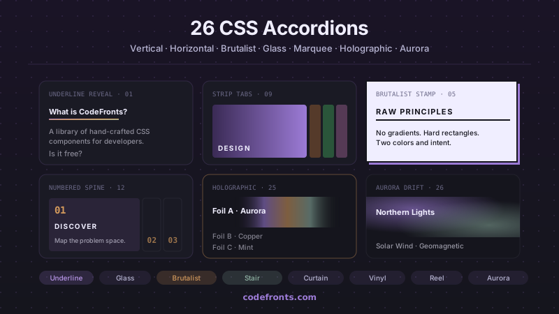
32 free CSS accordions covering pure-CSS FAQ blocks with details/summary, mobile navigation menus, e-commerce filter sidebars, nested tree views, exclusive single-open groups and smoothly animated height:auto — plus 26 visual variations in vertical, horizontal and hybrid layouts. Copy-paste HTML and CSS, no JavaScript.

39 CSS Breadcrumbs preview

39 CSS Breadcrumbs

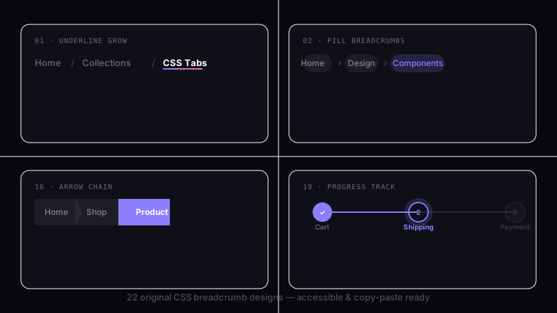
39 hand-coded CSS breadcrumbs — Schema.org BreadcrumbList Microdata + WCAG 2.2 accessible (Google Rich Results eligible), :has() responsive collapse, dark/light theme toggle with color-mix, Shopify/Amazon e-commerce filter chip removal, Vercel/Linear/Notion SaaS dashboard app-shell pattern, Docusaurus/Mintlify sticky scroll-shrink header, Amazon-style dropdown sibling menus, NFT/Web3 holographic shimmer (@property + conic-gradient), SaaS marketing gradient text, Airbnb filter chip with container queries, editorial blog wave underline, developer docs one-click path copy (Clipboard API), and 26 more. Semantic HTML: <nav aria-label='Breadcrumb'> + <ol> + aria-current='page'. Framework-agnostic, MIT-licensed.

26 CSS Circular Menus preview

26 CSS Circular Menus

26 hand-coded CSS circular and radial menu designs, from the floating-action FAB speed dial and dashboard radial hubs to game-style pie-slice wheels, SVG gooey metaball fans, hexagonal honeycombs, iris-aperture reveals, orbiting satellites on offset-path, compass-rose directional nav, sci-fi HUD rings, glassmorphism popovers built on the native Popover API, vinyl-record players, and full-takeover nebula overlays on native dialog. Every design uses CSS trigonometry (sin(), cos()) or the counter-rotation trick for positioning, ships real keyboard navigation, aria-labels on icon-only buttons, and a prefers-reduced-motion guard. Copy-paste HTML, CSS and vanilla JS with zero framework dependencies — MIT licensed.

Search CodeFronts

Loading…