11 CSS Header Designs
11 hand-coded CSS header designs covering the most-searched patterns: pure-CSS sticky header with scroll-timeline, CSS Grid mega menu, glassmorphism, full-screen hamburger overlay, vertical sidebar, three-level nested dropdown, shrinking-on-scroll, and four more. Every demo runs zero scripting on the main thread — the JS-driven alternatives most tutorials teach hurt INP and Core Web Vitals; the CSS equivalents here cost 0ms.
Frequently asked questions
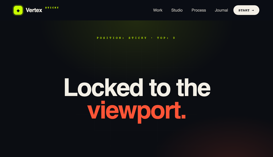
How do I make a CSS sticky header that solidifies on scroll WITHOUT JavaScript?
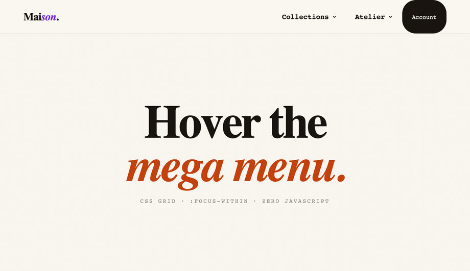
window.addEventListener('scroll', …) in JavaScript to toggle a class on the header when scroll position passes a threshold. That works but it costs you: scroll listeners run on every scroll event, which hurts INP (Interaction to Next Paint) scores on Core Web Vitals and creates visible lag on lower-end mobile devices. The modern pure-CSS way uses scroll-timeline + animation-timeline CSS properties (Chrome 115+, Safari 18+, Firefox 130+). Demo #01 ships the canonical reference — position: sticky for the lock-to-top behavior, then a scroll-linked CSS animation defined with @keyframes + animation-timeline: scroll(root) that interpolates the background opacity and backdrop-filter from 0 → 1 as the page scrolls past the first 80px. Zero JavaScript, zero scroll listeners, zero CWV impact. Most "sticky header on scroll" tutorials still teach the JS pattern because they predate the spec — a real 2026 gap.How do I build a CSS mega menu that's keyboard-accessible without JavaScript?
:focus-within on the parent <li> opens the menu panel when ANY descendant element receives focus. Combined with :hover on the same parent (for mouse users) and the menu panel's own opacity + visibility transitions, you get full keyboard navigation (Tab through items, panel stays open while inside) plus pointer hover, all from CSS. The JavaScript-driven "open menu on click, close on outside-click" pattern most articles teach is fragile (have to handle keyboard, Escape, focus-trap, click-away) and slower. :focus-within hands all that to the browser. Works in every evergreen browser since 2018 and is one of the most underused CSS selectors.Pure CSS hamburger menu — really no JavaScript at all?
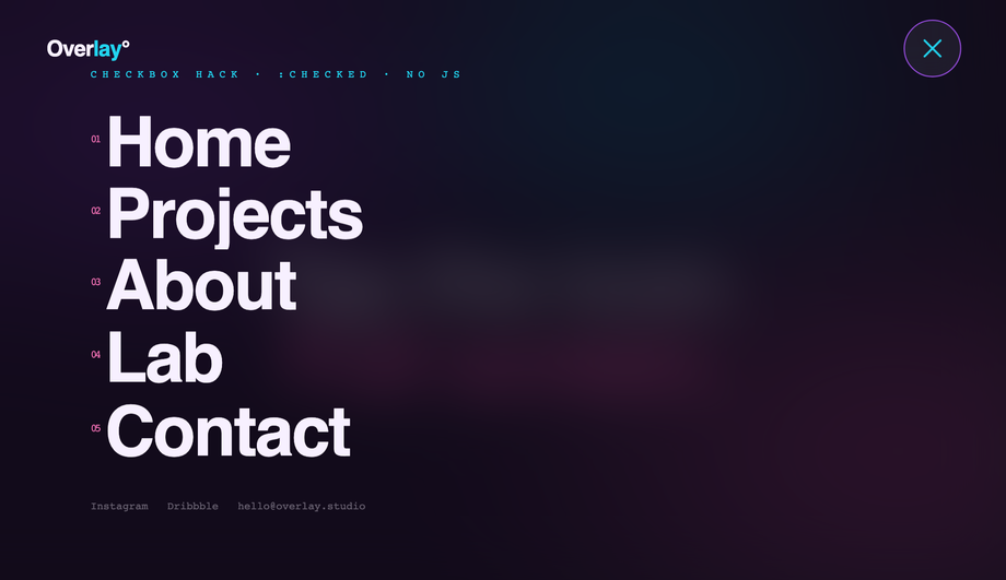
<input type="checkbox"> acts as the state machine. A <label for="toggle-id"> covers the visible hamburger button — clicking the label flips :checked on the input, and CSS sibling selectors (~, +) project that state down into the overlay panel, the bars-to-X morph, and the staggered link entrance animations. Zero JavaScript. Full keyboard support (Space/Enter activates the label since it's tied to a focusable input). Works back to evergreen browser support. Most "hamburger menu" articles reach for JS by default — the checkbox-hack pattern is a real competitor gap. Pair this with a clip-path: circle() reveal for the editorial overlay aesthetic.How do I make a glassmorphism header that actually blurs the content behind it?
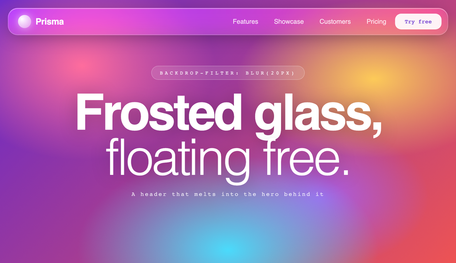
background: rgba(255, 255, 255, 0.6) for the semi-transparent base, (2) backdrop-filter: blur(20px) saturate(160%) for the actual blur, and (3) -webkit-backdrop-filter: blur(20px) saturate(160%) for Safari (Safari historically prefixed this property and the spec still recommends both). Most "glassmorphism header" tutorials online use only the semi-transparent background and skip backdrop-filter entirely — the result looks washed out, not glassy. Add an inset highlight via box-shadow: inset 0 1px 0 rgba(255,255,255,0.4) for the soft top edge that makes it read as physical glass. Browser support: Chrome 76+, Safari 9+ (with -webkit- prefix), Firefox 103+ — full evergreen coverage.How do I animate an announcement bar collapsing when dismissed?
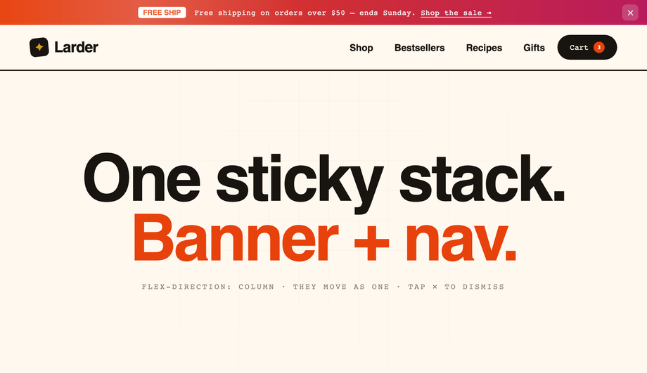
grid-template-rows: 1fr → 0fr trick, the same 2022 technique that finally fixed "animating to auto-height." The announcement bar's container has display: grid; grid-template-rows: 1fr; transition: grid-template-rows 0.4s. Inside, the actual content lives in a child with overflow: hidden. When the dismiss checkbox is checked, grid-template-rows: 0fr smoothly collapses the container to zero height — the animation works at any content length, no fixed max-height guess, no JS measurement. Most "announcement bar" articles teach the max-height: 200px → 0 approach which is fragile (the 200px guess might be too low for longer banners and jumps instead of animating). grid-template-rows is the better answer. Chrome 117+, Safari 17.4+, Firefox 121+ — all evergreen majors as of 2026.Should I use Flexbox or CSS Grid for a header layout?
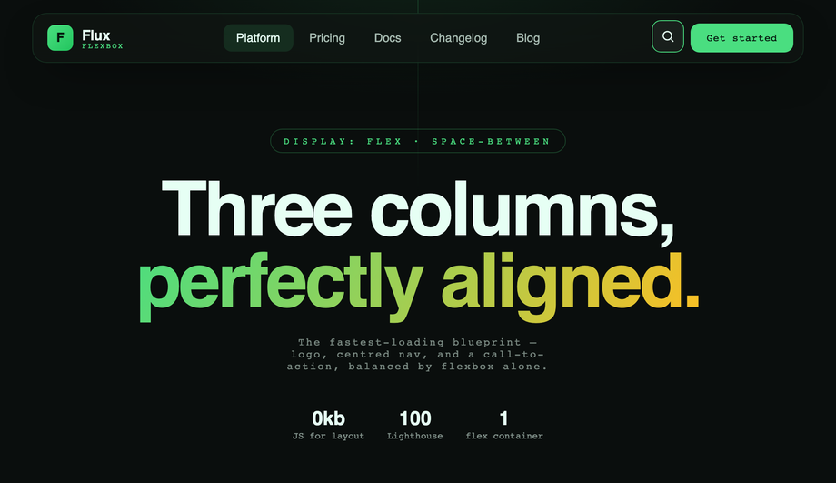
display: flex; justify-content: space-between; align-items: center pattern (Demo #03). It's the fastest, lightest layout — no track definitions to maintain, browser parser eats it instantly. Use CSS Grid when the header has multi-row structure: announcement bar + nav + sub-nav, or a mega menu panel that needs 3 named columns (Demo #02 uses Grid inside the mega menu panel for exactly this). Rule of thumb: if it's 1D (one row OR one column), Flexbox; if it's 2D (rows AND columns), Grid. Both demos here ship the canonical reference implementation so you can see the cascade decisions side-by-side.What's the performance impact of a JS-driven sticky header vs a CSS-only one?
window.addEventListener('scroll', updateHeaderClass) pattern) runs on every scroll event, which on a typical mobile device is 60-120 calls per second. Even a 1ms handler queues up 60-120ms of JS work per second of scrolling, directly pushing your INP (Interaction to Next Paint) toward the failing-CWV threshold of 200ms. The CSS scroll-timeline alternative (Demo #01) runs entirely on the browser's compositor thread — zero main-thread cost, INP unaffected. On a Pixel 5 throttled to 6× slowdown (Lighthouse's mobile profile), a JS scroll-linked header costs ~80ms of scripting time per scroll second. The CSS version costs 0ms. For sites where CWV affects rankings (Google has confirmed this since 2021), the CSS pattern is strictly better. Most "sticky header" tutorials online don't mention this trade-off — a real competitor gap for SEO-conscious developers.Are these CSS header designs responsive and accessible?
<a> or <button> (or label-wrapped input) — no clickable <div>s, so keyboard navigation and screen readers work without JS. Demo #02's mega menu uses :focus-within so tabbing into a menu item opens the panel, and Tab continues through the panel's links before moving to the next nav item — the keyboard-equivalent of hover. Every demo respects @media (prefers-reduced-motion: reduce) and disables continuous transitions for visitors with that OS preference. All 6 demos are MIT licensed for both personal AND commercial use — no attribution required, though a link back to codefronts.com is appreciated.What's a two-tier (double-decker) header and when should I use it?
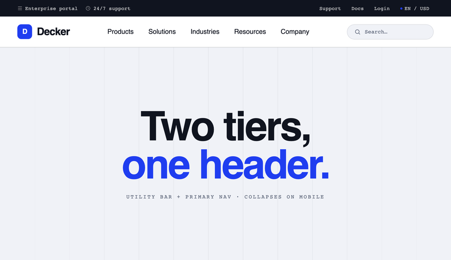
<header> element — a slim utility bar on top (Support, Docs, Login, language/currency switchers, account links) above a larger primary navigation row (main menu, logo, CTA). Demo #07 ships the canonical reference, built with CSS Grid so both rows are children of the same grid container and the top tier can be selectively hidden via a media query on mobile to reclaim space. Use this pattern for enterprise SaaS, B2B software, e-commerce sites with both customer-facing and account/admin nav, and documentation sites where you need to expose secondary actions without burying them in a dropdown. The trade-off is vertical space — you're committing 80-100px of viewport to chrome, so it works best on content-dense pages where the user is going to scroll anyway. Bad fit for landing pages where every pixel above the fold sells the hero.How do I add animated hover effects to nav links in pure CSS?
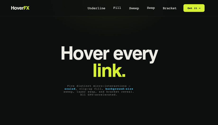
::after bar with transform: scaleX(0) at transform-origin: left that scales to 1 on hover — direction-aware, GPU-composited, costs zero CLS), clip-up text fill (a duplicated label positioned absolutely with clip-path: inset(100% 0 0 0) that reveals on hover), background-size gradient sweep (background-image gradient with background-size: 0% 100% growing to 100% on hover), dual-layer label swap (two stacked spans, one translated below the box, both translate up in unison on hover), and bracket reveal (two ::before/::after brackets that translate inward on hover). All five use only transform and opacity — properties the browser composites on the GPU without triggering layout or paint. That keeps your Core Web Vitals score at 100/100 and avoids the jank that comes from animating width, height, or margin (the common but wrong approach in many tutorials).How do I build a vertical sidebar navigation that doesn't overlap content?
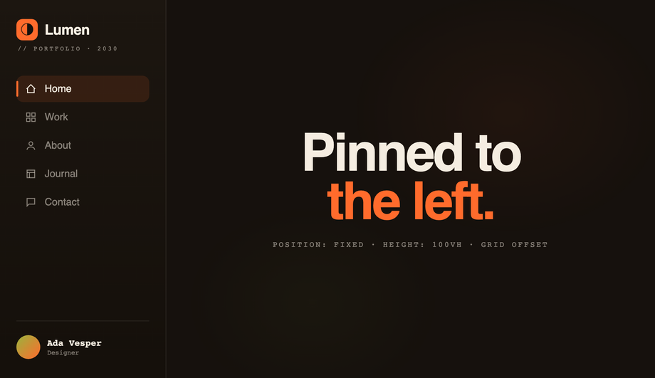
position: fixed; left: 0; top: 0; height: 100vh; width: 240px so it stays put as the page scrolls. The trick most tutorials miss: the page content needs padding-left: 240px on its container OR (better) a parent display: grid; grid-template-columns: 240px 1fr wrapper so the content area is mathematically offset by exactly the sidebar's width — no overlap, no margin guessing. Demo #09 uses the grid approach because it survives content reflow better. On mobile (≤720px), the demo reflows the sidebar into a bottom bar (position: fixed; bottom: 0; height: 64px; width: 100%) — the same component, transformed for the form factor instead of duplicated. Active-state indicator bar animates between items via ::before + top transition. Used by Stripe, Vercel, and Linear for their dashboard navigation patterns.How do I build a three-level nested dropdown menu in pure CSS?
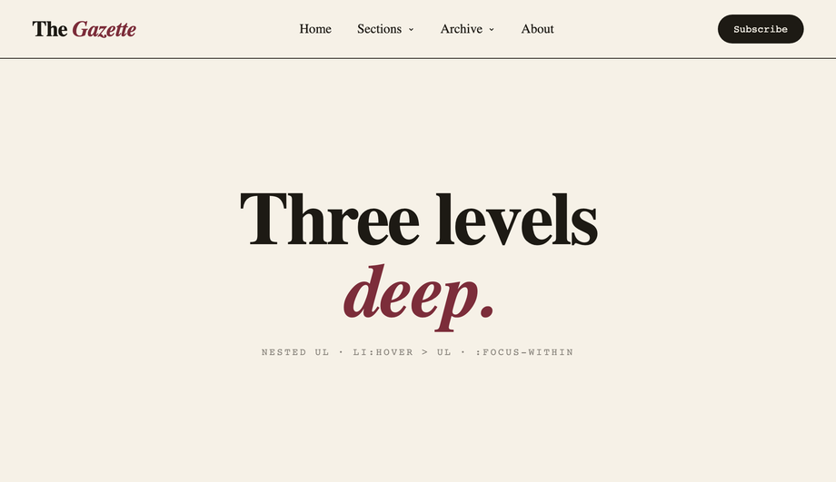
<ul> / <li> / <ul> markup — no JS at all. Sub-lists are absolutely positioned children that are hidden via opacity: 0; visibility: hidden; pointer-events: none by default, then revealed via li:hover > ul AND li:focus-within > ul so both mouse AND keyboard work. Level three flies to the RIGHT of its level-two parent via left: 100%; top: 0 on the third <ul> so the cascade reads like a tree. The non-obvious bit: a transparent hover bridge (a ::before pseudo-element spanning the gap between trigger and panel) so the menu doesn't close while your mouse traverses the gap — most pure-CSS nested-menu tutorials skip this and the menu becomes frustrating to use. All keyboard-accessible: Tab moves through items in source order, focus-within keeps parent menus open while you're inside a sub-level. Editorial Newsreader serif on cream with hard editorial shadows.How does a shrinking-header-on-scroll effect work without JavaScript?
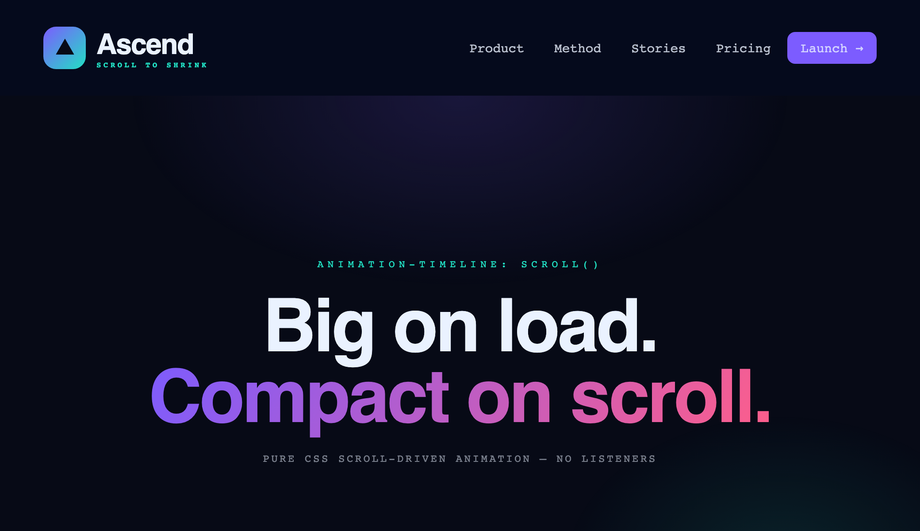
animation-timeline: scroll(root) property family covered in Demo #01's sticky-header solidify, but applied to MORE properties to produce the compaction effect. As you scroll from 0 → 80px, the header interpolates: height from 88px → 56px, padding from 24px → 12px, the logo's font-size from 24px → 17px, border-radius from 0 → 28px (so it visually rounds into a floating pill), and backdrop-filter from 0 → blur(20px). All in one @keyframes block, zero scroll listeners, runs entirely on the compositor thread. The competitor gap: every tutorial I've seen for "shrinking header on scroll" uses a JS scroll listener with requestAnimationFrame and class toggles. That's ~80-120ms of main-thread work per scroll second on a throttled mobile device, directly counted against your INP score. The CSS version costs 0ms. Browser support: Chrome 115+, Safari 18+, Firefox 130+. We include an @supports (animation-timeline: scroll()) fallback so older browsers see the compact state by default instead of a stuck expanded header.Which header should I use for my project?
.csh-NN class names so you can copy multiple onto the same project safely.Related collections

CSS Center a Div
The complete guide to centering a div in CSS in 2026 — covering all 5 production techniques with live interactive demos. <strong>Flexbox</strong> (the modern default, works for 95% of cases): <code>display: flex; align-items: center; justify-content: center</code> on the parent. <strong>CSS Grid</strong> (one-line shorthand): <code>display: grid; place-items: center</code>. <strong>Absolute positioning + transform</strong> (for overlays and modals): <code>position: absolute; top: 50%; left: 50%; transform: translate(-50%, -50%)</code>. <strong>Margin auto</strong> (for block elements with a known width): <code>margin: 0 auto</code> (horizontal only) or <code>margin: auto</code> with <code>position: absolute</code> + <code>inset: 0</code> (both axes). <strong>All methods side-by-side comparison</strong> — see every technique render the same content with visible axis crosshairs so you can see exactly where each method lands the element. All 5 demos are 100% pure CSS, MIT-licensed, copy-paste ready, with detailed explanations of which method to use when. Works in every modern browser (Chrome, Safari, Firefox, Edge), no JavaScript required.

10 CSS Feature Sections
10 hand-coded CSS feature section templates covering the patterns landing pages actually need in 2026 — icon grid with stats strip, Apple-style bento grid layout, dark glassmorphism with animated blobs, scroll-reveal alternating rows, developer SDK with syntax-highlighted code preview, side-by-side comparison table with pricing cards, full SaaS hero with mesh-gradient + social proof, 3D mousemove tilt cards, parchment-cream floating phone mockup, and Linear-style product roadmap timeline. 7 of 10 demos are 100% pure CSS — drop into any stack. The 3 JS-enhanced demos (scroll-reveal, 3D tilt, timeline-glow) degrade gracefully if JavaScript is disabled. Every demo respects prefers-reduced-motion, uses scoped .fsNN__* class names so multiple can coexist, and ships MIT-licensed.

15 CSS Flexbox Layouts
15 production-ready CSS flexbox layouts with live demos and copy-paste code — holy grail page shell, responsive card grid, sticky navbar, masonry-style columns, sidebar dashboard, product cards, pricing table, magazine article, sticky footer with min-block-size: 100dvh, centered hero, vertical timeline, chat interface, mosaic gallery, two-column form, and kanban board. Every demo is mobile-first, WCAG-friendly, and works without a build step.