15 CSS Navigation Menu Designs
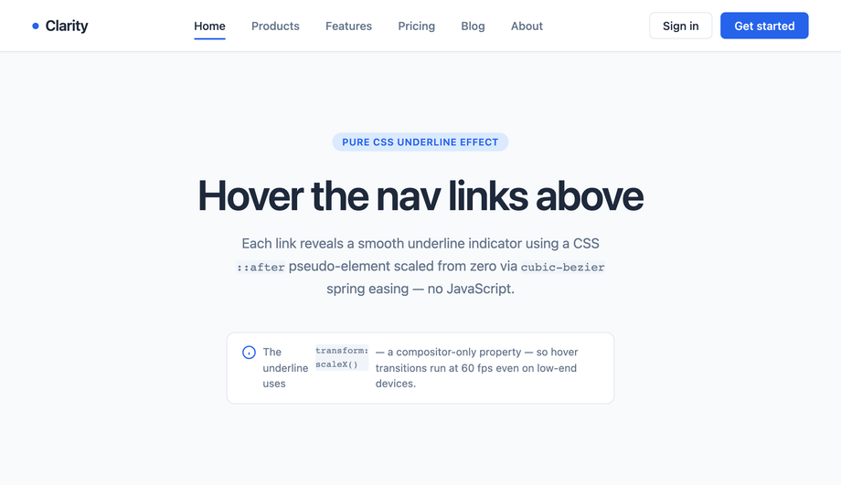
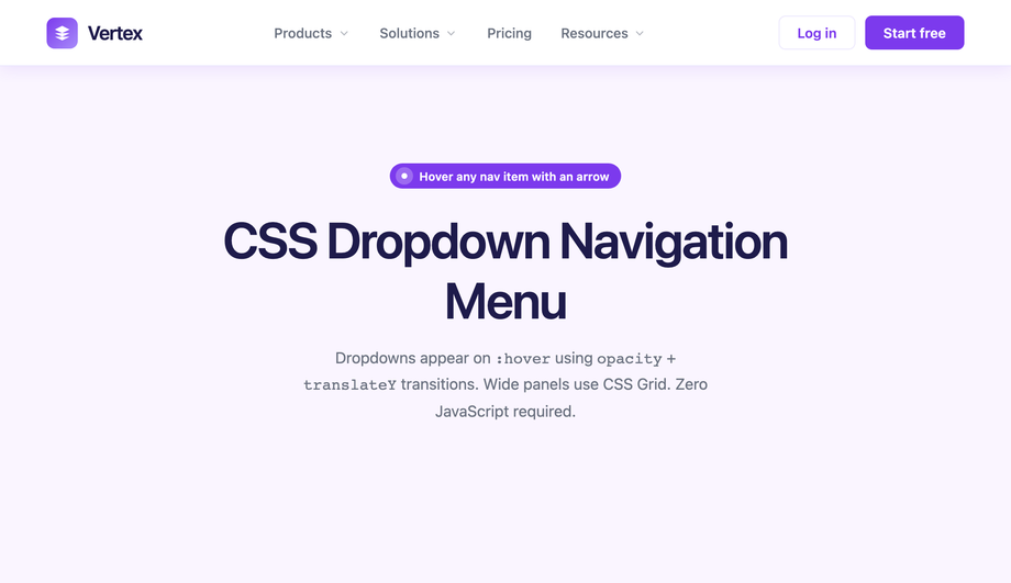
The navigation menu is the most-touched component on any website — every visitor interacts with it within the first 3 seconds of arrival. These 15 hand-coded navigation patterns cover every production use case in 2026: horizontal nav with hover underline, dropdown menu, mega menu, hamburger slide-out drawer, full-screen overlay, sticky header with scroll shrink, sidebar navigation, tab nav with animated indicator, breadcrumb trail, glassmorphism nav, animated icon nav with labels, multi-level accordion, magnetic hover, neon glow, and morphing pill indicator. 13 are 100% pure CSS using :hover / :focus-within / :checked state machines (drop into any stack with zero JS); 2 use ~20-50 lines of vanilla JavaScript for sticky-scroll behaviour and pointer-tracking magnetic hover. All respect prefers-reduced-motion, use scoped .nav-NN__* class names so multiple navs coexist without style bleed, ship semantic <nav> + aria-current="page" markup, MIT-licensed.

Frequently asked questions
What's the difference between a navbar, navigation menu, and a navigation bar?
Should I use Tailwind UI / Headless UI / Radix Navigation, Material UI AppBar, or build with vanilla CSS?
<Menu> (~3kb) or Radix Navigation Menu (~8kb) ship the accessibility primitives so you don't have to handle focus management yourself. Worth the bundle if you're shipping multi-level menus across many pages. If you're on Tailwind UI ($300+ paid) — beautiful designs but requires a React/Vue framework. If you're on Material UI — MUI's <AppBar> + <Menu> is excellent IF you're already paying the ~95kb MUI bundle cost. Cost comparison: This collection — 0 bytes of JavaScript, ~1-3kb of CSS per demo. Headless UI Menu — 3kb React-only. Radix Navigation — 8kb React-only. MUI AppBar+Menu — 95kb React-only. Tailwind UI — $300+ design system + React/Vue. ChakraUI Menu — 5kb React-only. Ant Design Menu — 15kb React-only. This collection's pure-CSS approach: framework-neutral (Astro, Vue, Svelte, Rails ERB, vanilla, WordPress), MIT-licensed, modify-and-resell allowed.How do I build a responsive hamburger menu that turns into a horizontal navbar on desktop?
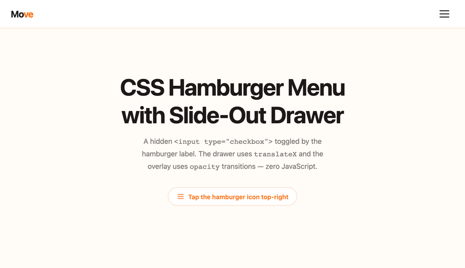
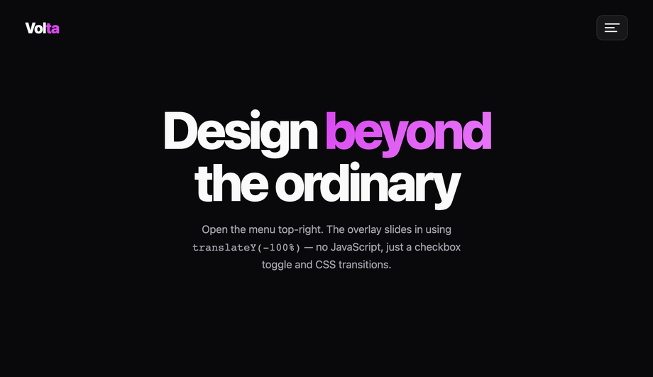
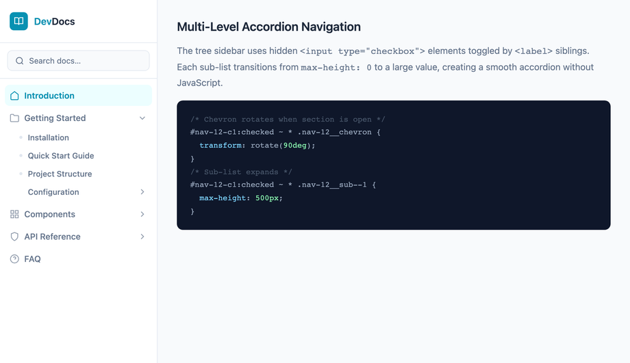
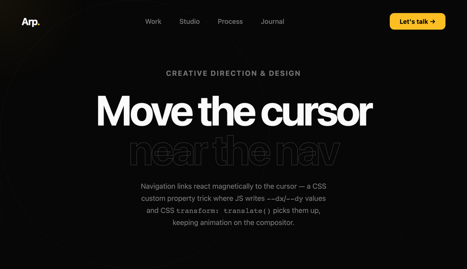
display: flex; align-items: center; justify-content: space-between; on the <nav> element. (2) Below 768px: hamburger drawer. Hide the horizontal links via @media (max-width: 768px) { .nav-links { display: none } }. Show the hamburger icon (3 stacked bars) instead. Tap toggles a checkbox via the <label for="toggle"> trick, and :checked sliding the drawer in from the side via transform: translateX(0). (3) Drawer content. Same nav links as desktop, but stacked vertically with larger touch targets (48px+ height each), bigger fonts (16-18px). Add a backdrop overlay (semi-transparent black behind the drawer) for the tap-outside-to-close interaction. (4) Logo behaviour stays in place; the hamburger replaces the desktop nav links. (5) State persistence: pure-CSS version uses the :checked state on a hidden checkbox. JS-version persists via localStorage so close-and-reopen doesn't lose state. Three production-grade details most online tutorials skip: (a) Lock body scroll when drawer is open via html:has(#nav-toggle:checked) body { overflow: hidden } (requires :has() — Chrome 105+, Safari 15.4+, Firefox 121+). (b) Focus trap when drawer is open (pure CSS can't do this — for accessibility-critical UIs, add ~10 lines of JS). (c) ESC-to-close: pure CSS can't catch keyboard. JS-enhanced version adds keydown listener.How do I build a mega menu like Amazon / Shopify / Adobe?
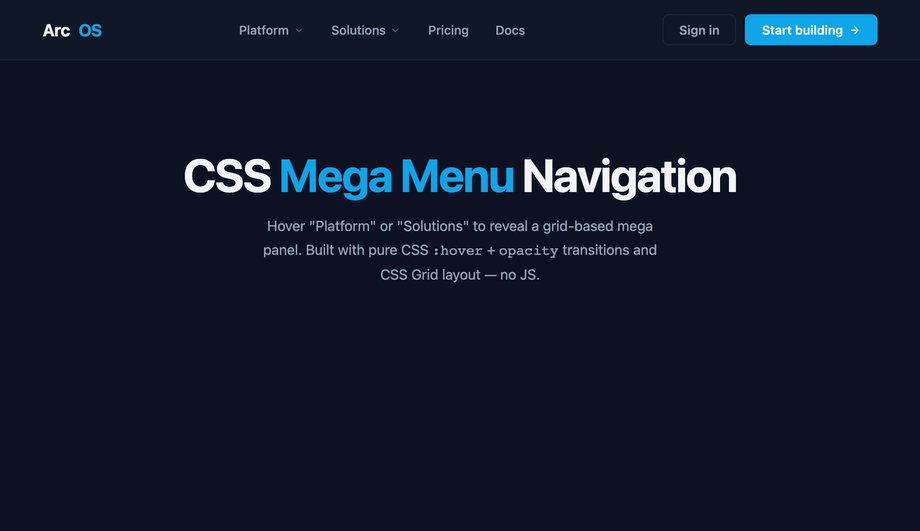
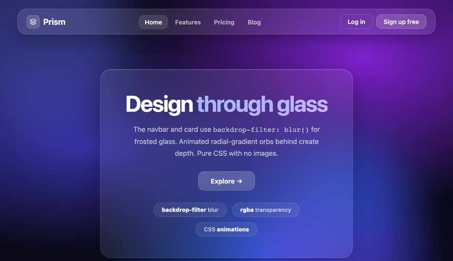
display: grid; grid-template-columns: repeat(3, 1fr) 1.5fr; gap: 32px; — three equal columns of links plus a wider feature panel on the right. (4) Animation: the mega menu fades in via opacity: 0 → 1 + transform: translateY(-8px) → translateY(0) over 200ms when the hover bridge is triggered. Five production-grade details most online mega menu tutorials skip: (a) Hover delay — use a 200ms transition-delay on the opacity to prevent the menu from appearing on accidental cursor passes over the trigger. (b) Hover bridge — invisible padding between the trigger and the menu so the cursor can move from one to the other without the hover state breaking. (c) Keyboard accessibility: use :focus-within in addition to :hover so keyboard users can tab through the menu. (d) Mobile fallback: hide the mega menu entirely below 768px and replace with the accordion pattern (Demo 12). Mega menus don't fit on mobile screens. (e) z-index management: the mega menu must stack ABOVE page content but BELOW any open modal. Use a CSS custom property like --z-mega-menu: 50 so all stacking constants live in one place.How do I make a sticky navbar that shrinks on scroll?
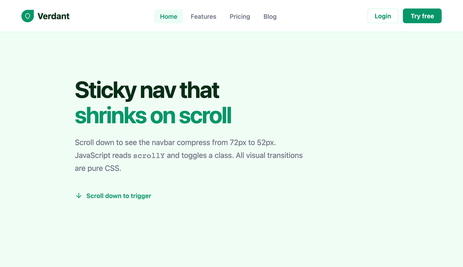
.is-shrunk class to the <nav> once scroll position exceeds 50-100px from the top. The CSS handles the transition: .nav { height: 80px; padding: 24px 32px; transition: all 0.3s ease; } .nav.is-shrunk { height: 56px; padding: 12px 32px; backdrop-filter: blur(12px); background: rgba(255,255,255,0.8); }. The logo, links, and CTA inside the nav shrink proportionally via inheritance + scale transform. Three modern alternatives to JavaScript scroll listeners: (1) CSS scroll-driven animations (Chrome 115+, Safari 18+, Firefox 138+): animation-timeline: scroll(); drives the shrink animation entirely in CSS. Falls back to no-op on older browsers — graceful. (2) position: sticky + scroll snap: lighter-weight, works in every modern browser, no JS at all. The nav sits at top: 0 and stays there as the user scrolls past it. Doesn't shrink, just sticks. (3) IntersectionObserver: place a sentinel element at the top of the page; observe when it scrolls out of view; add the .is-shrunk class. More performant than scroll listeners because the browser handles the observation. Cost: ~10 lines of JS. Demo 06's JS approach: works in every browser, fully controlled, ~30 lines of code. Pick scroll-driven CSS if you can require Chrome 115+; pick IntersectionObserver for the best modern compromise; pick the demo's setTimeout-throttled scroll listener if you need IE11-era compatibility (rare in 2026).How do I build an accessible navigation menu (keyboard + screen readers + WCAG)?
<nav aria-label="Main"> wrapping a <ul> + <li> + <a> structure. Screen readers (NVDA, JAWS, VoiceOver, TalkBack) announce the nav landmark and let users skip to it directly via the landmarks shortcut. (2) aria-current="page" on the active link. Screen readers announce "current page" alongside the visible highlight. Without this, blind users have no idea which page they're on. (3) aria-expanded on dropdown / hamburger / mega-menu toggle buttons. Toggles between true/false when the menu opens/closes. (4) aria-haspopup on dropdown triggers. Tells assistive tech that activating the button reveals a popup menu (not just navigates to a page). (5) Keyboard navigation. Tab moves between top-level links, Space/Enter activates, Escape closes dropdowns, Arrow keys move within a submenu. Real <button> + <a> elements (not divs styled as buttons) give this for free. (6) Skip-to-content link: <a href="#main" class="skip-link">Skip to content</a> visually hidden by default but visible on focus. Keyboard users tab once and can skip the entire nav. WCAG 2.4.1 requirement. (7) prefers-reduced-motion: reduce — for vestibular-sensitive users, disable slide-in / shrink / parallax animations. All 15 demos here ship this. (8) Tap-target size: WCAG 2.5.5 (AAA) requires 44×44px minimum. Every link in this collection meets it. Common mistakes most online tutorials make: using <div> with onClick instead of <button> (breaks keyboard), animating the visible-icon-state without setting aria-label (e.g. "Open menu" → "Close menu"), forgetting aria-current entirely. All 15 demos here ship the markup correctly out of the box.Sticky navbar vs fixed navbar vs absolute — what's the difference?
position: sticky — the nav scrolls WITH the page normally UNTIL it hits a specific offset (typically top: 0), then it sticks. As soon as you scroll back up past the original position, it stops being sticky and scrolls with the page again. Behavior: stays at the top once you've scrolled past it; releases when you scroll back up. Best for: navigation that's part of a long-scrolling page and should stay accessible without dominating the viewport on initial load. position: fixed — the nav is ALWAYS positioned relative to the viewport. It doesn't scroll with the page at all. From the moment the page loads, it sits at top: 0 and stays there regardless of scroll position. Behavior: always visible. Best for: apps where the nav is the primary UI element (SaaS dashboards, document editors, web apps). position: absolute — the nav is positioned relative to its nearest positioned ancestor (NOT the viewport). It scrolls with the page like normal block elements but its position is calculated from the ancestor's edge, not the document flow. Rarely used for primary navigation. For sticky: the parent of the sticky element matters — sticky positioning is relative to the nearest scrolling ancestor. Browser support: position: sticky universal since Edge 16 (2017). Demo 06 (Sticky Navigation Bar with Scroll Shrink) uses sticky + a JS class toggle to add the shrink effect — same as the GitHub/Vercel/Linear navbar pattern.Will navigation menu hover animations hurt my Core Web Vitals INP score?
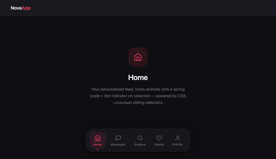
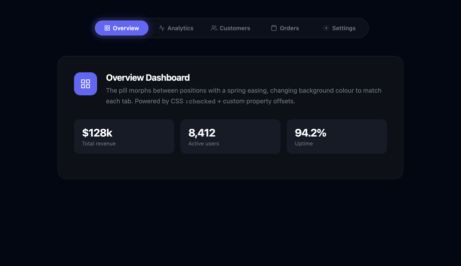
transform and opacity only. Every demo in this collection follows this — sliding underline uses transform: scaleX(0) → scaleX(1), not width: 0% → 100%; dropdown reveal uses opacity: 0 → 1 + transform: translateY(-8px) → 0, not display: none → block with positioning recalculation; sliding tab indicator uses transform: translateX(), not left. All these are GPU-accelerated on the compositor thread — they DON'T trigger layout recalculation, so they DON'T affect INP (Interaction to Next Paint), the Core Web Vital that replaced FID in March 2024. Three nav-specific gotchas: (a) Animating backdrop-filter on glassmorphism nav (Demo 10) is expensive — re-evaluates the blur on every frame. Apply the blur to a static state and only animate opacity on a sibling overlay layer. (b) Sticky scroll-driven shrink with JavaScript scroll listener (Demo 06) can saturate the main thread if your handler isn't throttled. Use requestAnimationFrame or replace with IntersectionObserver (the modern pattern). (c) Magnetic hover effect (Demo 13) updates element position on every mousemove — this fires ~60-120 times per second on a fast pointer. Use requestAnimationFrame to coalesce updates; without it, you'll see frame drops on low-end Android. Demo 13's JS uses RAF throttling. Lighthouse mobile-profile: 95+ Performance on all 15 demos on Pixel 5 baseline.Which navigation menu should I use for my project?
<nav> + aria-current + aria-expanded + aria-haspopup, prefers-reduced-motion respected, 44×44px tap targets, MIT-licensed.Related collections

26 CSS Accordions — Vertical & Horizontal
26 free CSS accordions — 17 vertical and 9 horizontal layouts with copy-paste HTML and CSS.

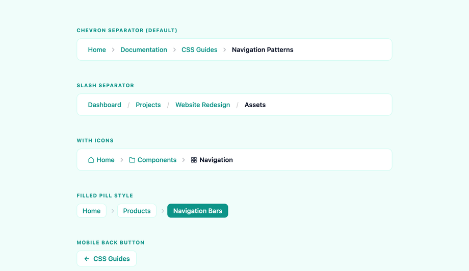
22 CSS Breadcrumbs
22 original CSS breadcrumb designs — underline grow, pill, diagonal slash, neon trail, brutalist, frosted glass, vertical stacked, progress track, holographic shimmer and more.

21 CSS Circular & Radial Menu Designs
21 free CSS circular and radial menu designs — pie, dome, orbital and skeumorphic layouts with copy-paste HTML and CSS.