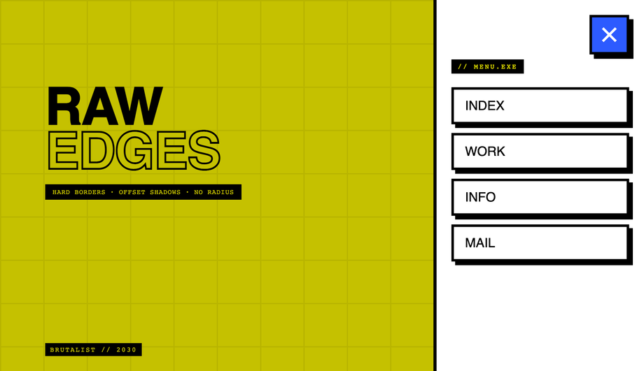
20 CSS Hamburger Menus
A CSS hamburger menu is a three-bar icon button that toggles a hidden navigation panel — the dominant mobile-nav pattern across the modern web. These 20 hand-coded designs span the full hamburger playbook: a pure-CSS checkbox-hack toggle with circular clip-path reveal (no JavaScript), three side-by-side icon morph personalities (bars→X, fold, pinch), a full-screen editorial overlay, a true push-canvas slide-out sidebar, a responsive 860px-breakpoint navbar, a floating corner FAB with radial bloom, a Tailwind CDN build, a real Bootstrap 5 reskin, a WCAG-2.2-compliant pattern with aria-expanded + focus trap + Escape handler, the modern grid-template-rows: 0fr → 1fr accordion trick, six pure-CSS icon hover micro-interactions, a glassmorphism blur overlay, a PWA-style bottom nav with floating launcher, a three-level nested <details> accordion, a flexbox right-aligned navbar, a circular clip-path ripple expand, a scroll-linked shrinking sticky header, a neumorphic soft-UI toggle, a brutalist hot-yellow bordered version, and a 3D perspective + rotateY push that rotates the whole page canvas back on open. 16 ship a short vanilla JS snippet (most are 5-15 lines); 4 ship no custom JS (one uses the Bootstrap bundle library, the other three are pure CSS). Every demo has scoped .chm-NN class names that never collide with your existing styles, prefers-reduced-motion fallbacks, and MIT licensing — copy from any code panel and drop into your nav.

Frequently asked questions
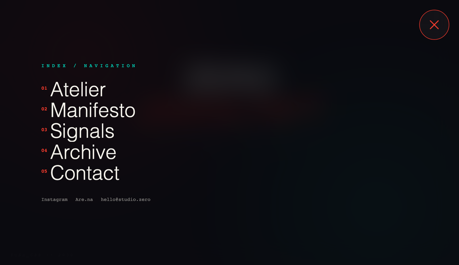
How do I make a hamburger menu with pure CSS — no JavaScript?
<label> covers your hamburger button and points to the checkbox via for="toggle-id". Clicking the label flips :checked on the input, and CSS sibling selectors (~, +) project that state down into the menu panel, the bar icon, and any backdrop. The Pure CSS Hamburger Menu demo (#01) is the canonical reference — it ships a circular clip-path reveal, staggered link animations, and the bars→X morph entirely from #nav-toggle:checked ~ ... selectors. Zero JavaScript, full keyboard support (the label is focusable and Space/Enter toggle the checkbox), and works back to evergreen browser support. The CSS Slide Down Dropdown demo (#10) shows the same technique with the modern grid-template-rows: 0fr → 1fr trick for buttery vertical height transitions — no fixed max-height needed.How do I animate the hamburger bars into an X (or other morphs)?
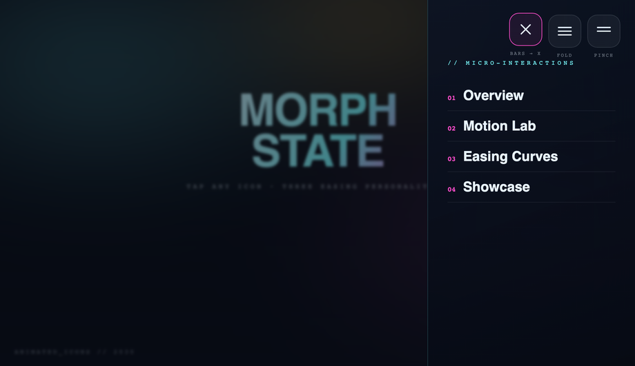
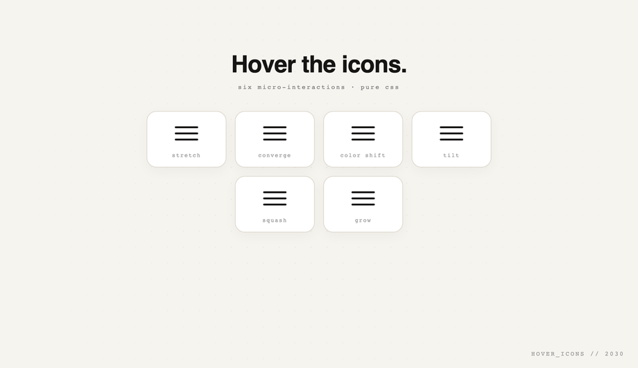
<span> bars inside the button, give each a transition, then on the open state apply: top bar rotates 45° and translates down to overlap the middle, bottom bar rotates -45° and translates up to overlap the middle, middle bar fades to opacity: 0 (or scales to 0). The Hamburger Menu with Morphing Icon Animations demo (#02) ships THREE different morph personalities side-by-side — bars→X (rotate + translate), fold (top + bottom rotate inward toward center), and pinch (middle bar shrinks while top + bottom converge) — so you can compare the spring vs. ease curves and pick the one that fits your brand. Each costs ~10 lines of CSS.What's the accessible hamburger menu pattern? (WCAG 2.2 compliant)
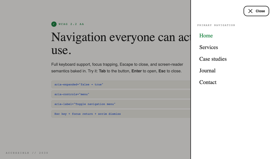
<button> not <div> for the trigger so it's keyboard-focusable + Enter/Space activatable for free, (2) aria-expanded="false" on the button that toggles to true when open so screen readers announce state, (3) aria-controls="menu-id" linking the button to the panel it controls, (4) aria-label="Open menu" on the button since it's icon-only, (5) a visible :focus-visible ring with 3:1 contrast against the surface, (6) Escape closes the menu and returns focus to the trigger, (7) a focus trap inside the open menu so Tab cycles through links instead of escaping to the page beneath. Many "accessible hamburger" listicles online stop at aria-expanded + aria-controls and miss focus trap + return — both are required for WCAG 2.1.2 (No Keyboard Trap inverse) and 2.4.3 (Focus Order).Should I use a hamburger menu on desktop?
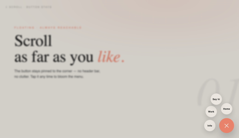
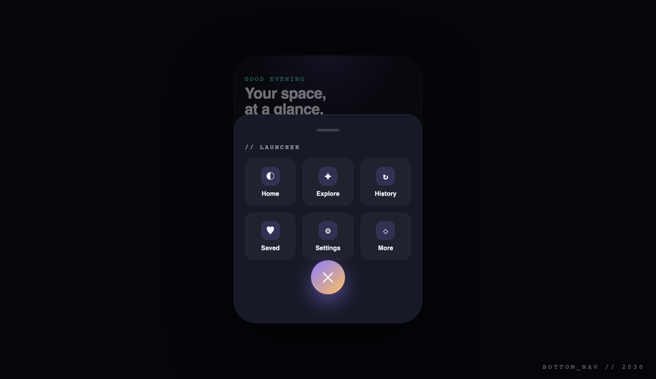
How do I build a slide-out sidebar / off-canvas menu in CSS?
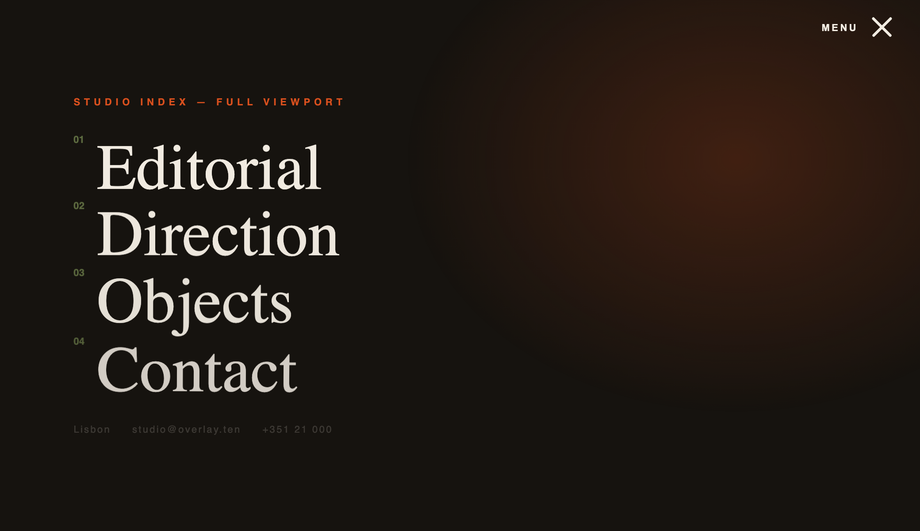
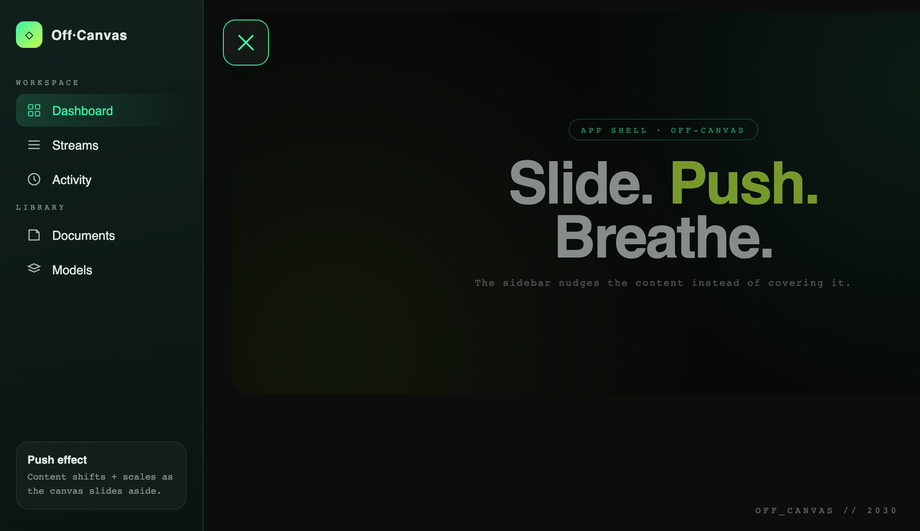
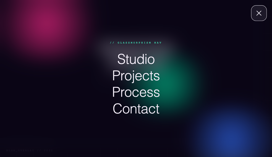
position: fixed; left: 0; top: 0; height: 100vh; transform: translateX(-100%) so it starts hidden off-canvas. On open, transform: translateX(0). For a true push-canvas effect (sidebar pushes the page content right instead of overlaying), apply transform: translateX(280px) scale(0.95) + border-radius: 24px to the main canvas at the same time. Add a semi-transparent backdrop-filter: blur scrim that fades in to provide depth + a tap-target to close. The Full Screen Blur Overlay demo (#12) uses the same technique with full-viewport coverage instead of a side panel.How do I make a CSS hamburger menu with Tailwind CSS?
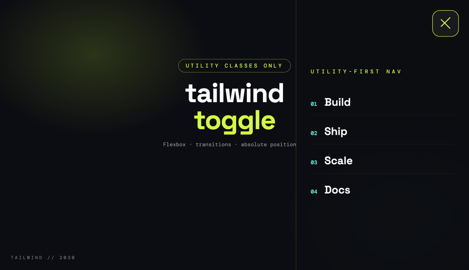
cdn.tailwindcss.com) with a custom config that sets an acid/sky/plum palette, then builds the trigger and the slide-in panel entirely from utility classes — flex items-center justify-center for the bars wrapper, fixed inset-y-0 right-0 w-80 for the panel, transition-transform translate-x-full for the off-canvas position, with aria-expanded hooks for the open state. The morph is JS-driven (toggles classes) so Tailwind's static utilities can describe both states. Drop the snippet into any Tailwind project — no extension to your config needed beyond the custom palette.How do I make a CSS hamburger menu with Bootstrap 5?
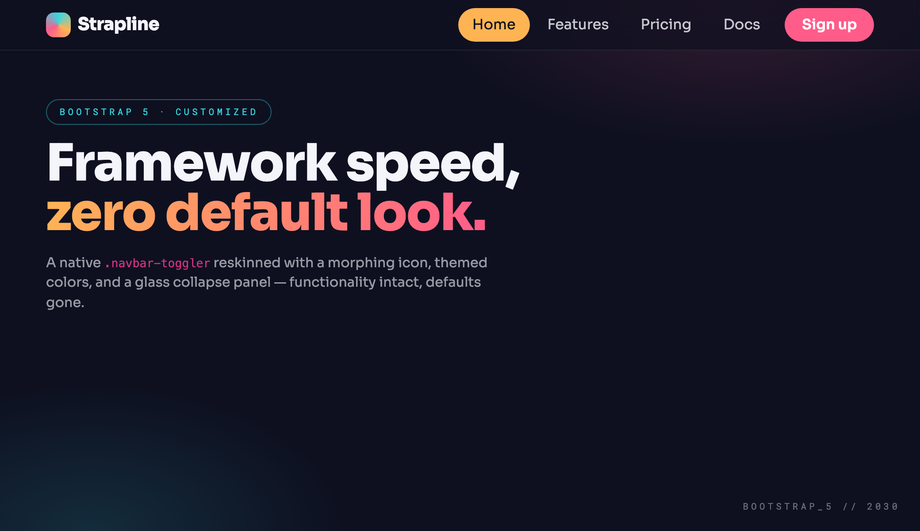
.navbar-toggler + data-bs-toggle="collapse" + data-bs-target="#nav" pattern but reskins the default look completely — themed conic-gradient mark on the bars, morphing icon transition, glass collapse panel via backdrop-filter on the dropdown. Bootstrap's bundle.js handles the collapse mechanics natively (Bootstrap 5.3.3 here); your CSS is just visual polish on top of .navbar-toggler[aria-expanded="true"]. Drop into any Bootstrap 5 project — the markup is standard Bootstrap, just with extra theming classes.How do I animate menu reveal with the modern grid-template-rows trick?
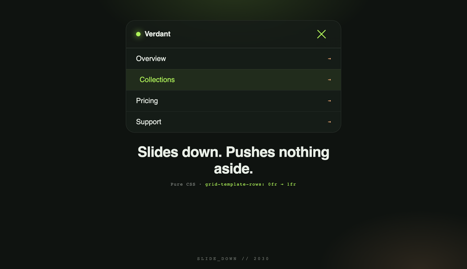
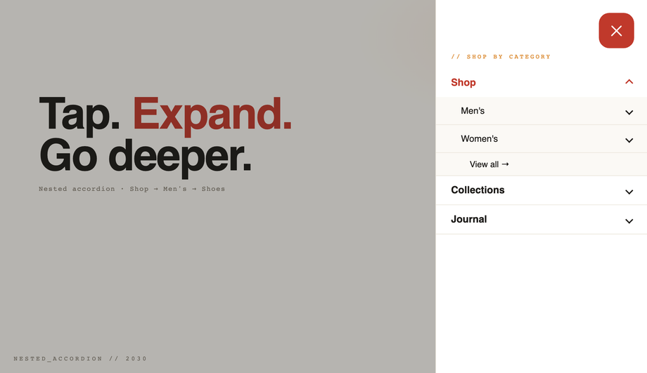
display: grid; grid-template-rows: 0fr; transition: grid-template-rows 0.4s. Inside, the actual content lives in a child with overflow: hidden. When the menu opens, change grid-template-rows: 1fr and the container smoothly animates to the natural content height — no fixed max-height guess, no JS measurement, works at any content length. Browser support: Chrome 117+, Safari 17.4+, Firefox 121+ — all evergreen majors as of 2026.Which of the 20 demos need JavaScript? Are they accessible without it?
<button>), the link list is in the DOM (just hidden behind a closed state), and the page remains usable. The WCAG-accessible demo (#09) is the gold standard for the noscript case: even without JS, screen readers still see the menu links in source order via the aria-controls + the panel's stable DOM position.How do I do a 3D canvas push effect (whole page rotates back on menu open)?
.canvas element with transform-style: preserve-3d on a parent .scene that has perspective: 1200px. On menu open, the canvas gets transform: rotateY(-25deg) translateX(180px) scale(0.85), revealing a sidebar that's been sitting behind it (z-positioned with translateZ(-200px)). The whole thing eases on a cubic-bezier(.7, 0, .2, 1) curve so the motion feels weighty. About 15 lines of CSS + a 3-line toggle. Used by Carbon Five and a few high-profile portfolios as a wow-factor mobile pattern.How do I make a neumorphic hamburger toggle?
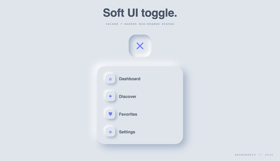
#e0e5ec) with two box-shadows on the button — top-left light highlight + bottom-right dark shadow — to make it look extruded. On press, swap those to inset versions and the button reads as pressed-in. The hamburger bars themselves change color to match the new depth (slightly darker when sunken). Pair with restrained motion (no bouncy springs) — the aesthetic is contemplative, not playful.Are these CSS hamburger menus responsive, accessible, and free to use?
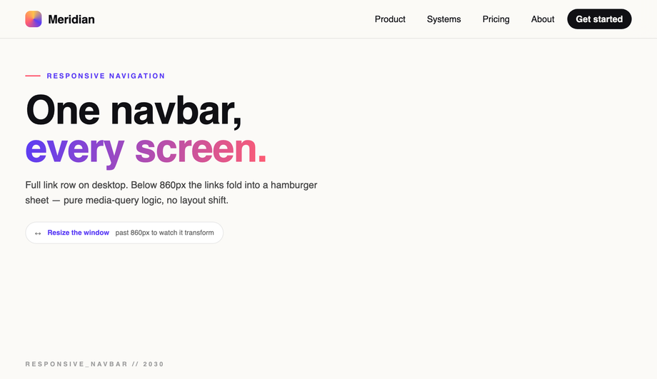
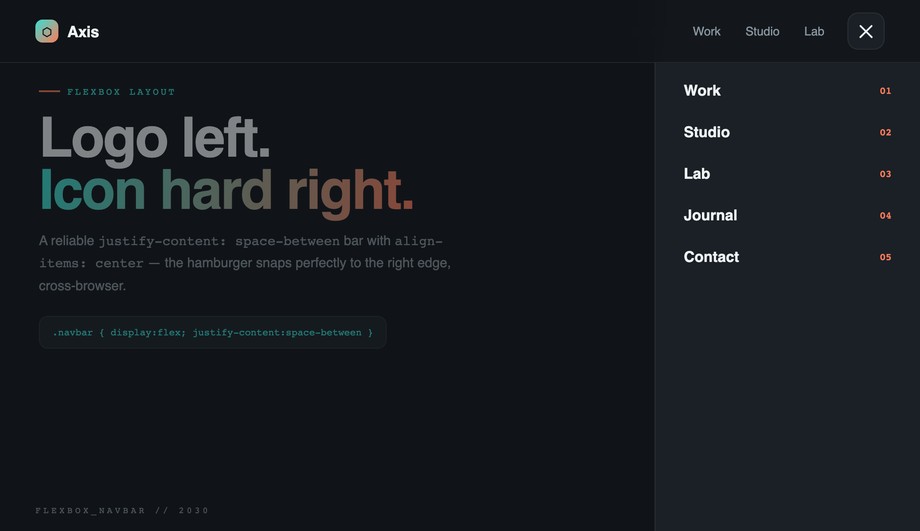
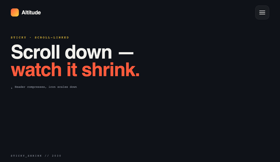
@media (prefers-reduced-motion: reduce) and disables continuous transitions for users with that OS preference. Every clickable surface is a <button> or proper anchor (no clickable <div>s). Keyboard focus works without JS. The Responsive Navbar demo (#05) and Sticky Shrinking Header demo (#17) include real media-query breakpoints so they adapt to viewport changes. All 20 demos are MIT licensed and free for personal AND commercial projects — no attribution required, though we appreciate it if you link back to codefronts.com.Related collections

26 CSS Accordions — Vertical & Horizontal
26 free CSS accordions — 17 vertical and 9 horizontal layouts with copy-paste HTML and CSS.

22 CSS Breadcrumbs
22 original CSS breadcrumb designs — underline grow, pill, diagonal slash, neon trail, brutalist, frosted glass, vertical stacked, progress track, holographic shimmer and more.

21 CSS Circular & Radial Menu Designs
21 free CSS circular and radial menu designs — pie, dome, orbital and skeumorphic layouts with copy-paste HTML and CSS.