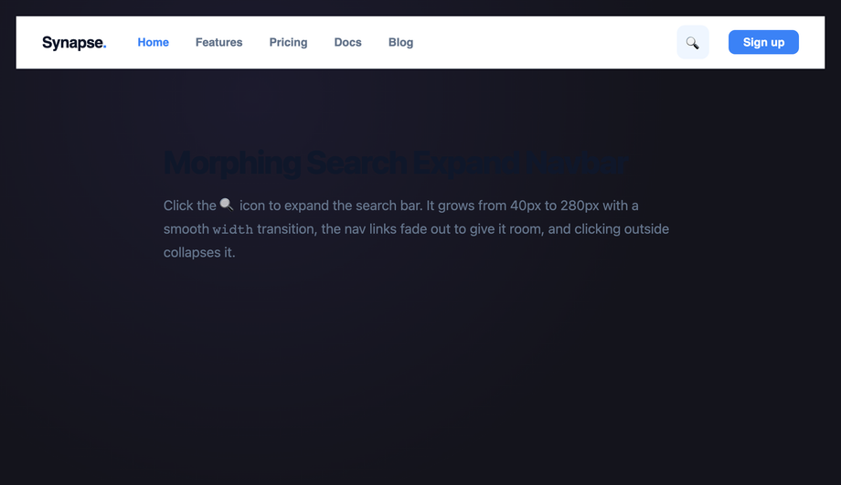
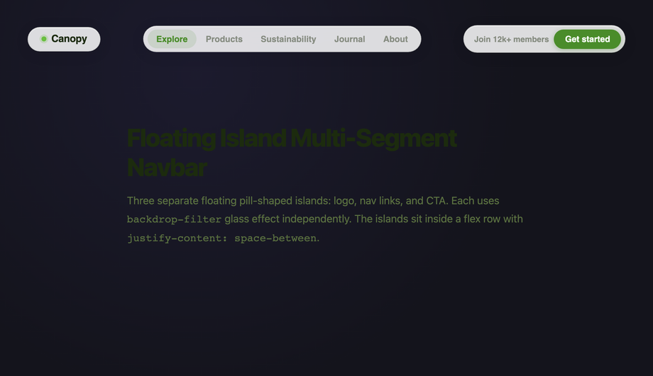
20 CSS Responsive Navbar Designs
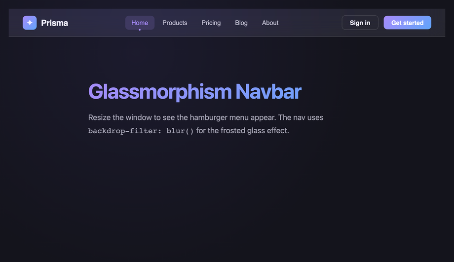
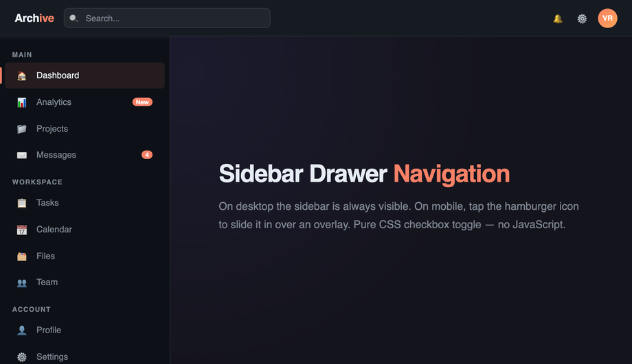
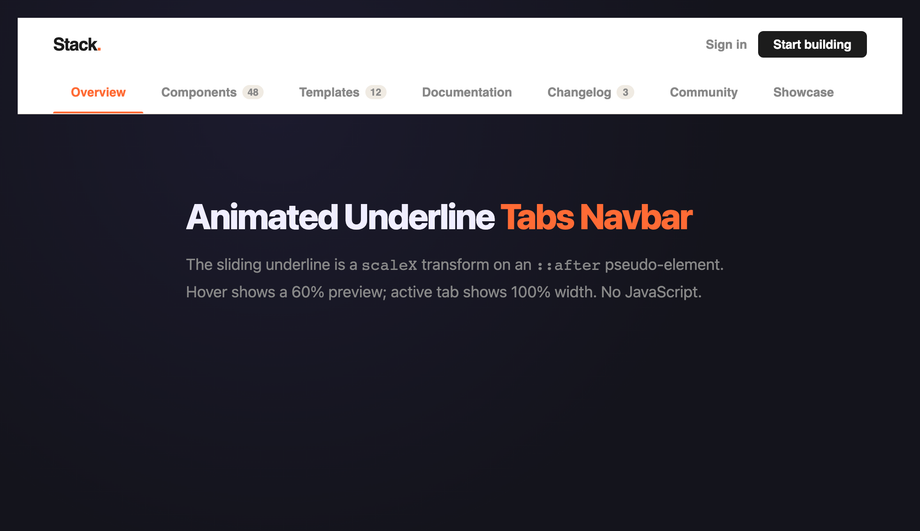
A responsive CSS navbar is the chrome at the top of every page — the single most-used component on the web. These 20 hand-coded designs cover the full modern navbar playbook — glassmorphism, mega menu dropdown, sidebar drawer, animated underline tabs, pill highlight, scroll-shrink, neon, reading-progress, bottom tab bar, gradient border, centered logo, fullscreen overlay, morphing search, floating island, scroll-spy and more. Every demo uses scoped .nav-NN class names that never collide with your existing styles, honours prefers-reduced-motion, and ships under the MIT license.
Frequently asked questions
What is a responsive navbar and which design pattern should I use?
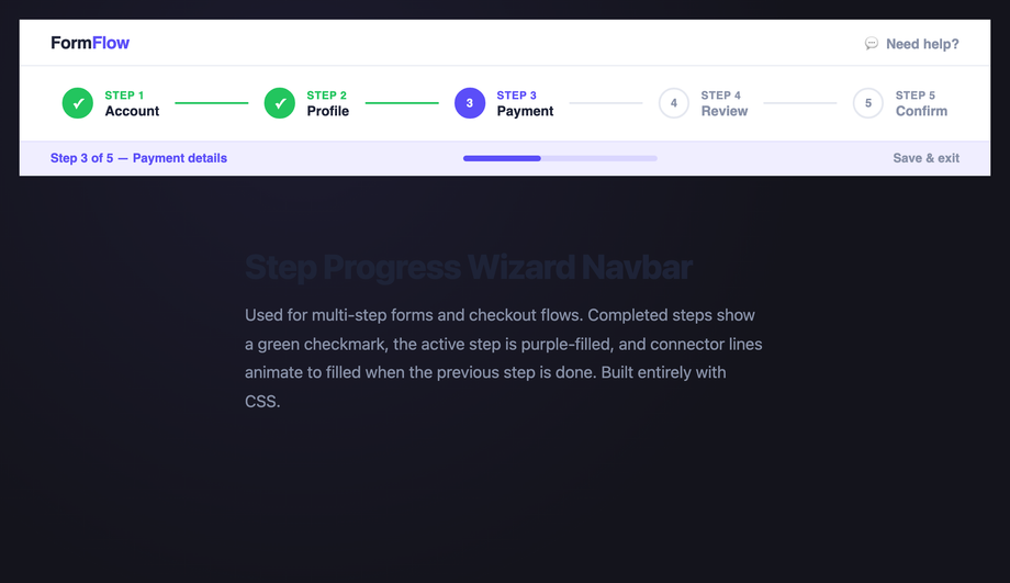
.nav-NN so you can copy multiple patterns into the same page without style collisions while you decide.How do I make a sticky shrink-on-scroll navbar WITHOUT cumulative layout shift?
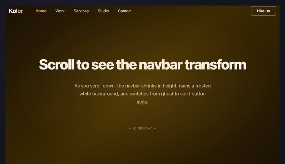
height on the layout (e.g. height: 80px) and shrink only the internal elements (logo size, padding, font-size) via a .is-shrunk class. Demo #06 (Scroll-Aware Shrink Navbar) ships this pattern: the outer nav stays at fixed height: 80px sticky-positioned, an IntersectionObserver toggles .is-shrunk on scroll, and the children animate their own dimensions inside the constant outer box. Modern alternative (Chrome 115+, Safari 26+): use scroll-driven animations with animation-timeline: scroll(root) instead of an IntersectionObserver — zero JavaScript, GPU-accelerated, no main-thread scroll listener. The CSS export in Demo #06 includes both implementations so you can pick based on browser support targets.When can a responsive navbar be pure CSS, and when do I need JavaScript?
:hover on desktop and :focus-within for keyboard), hamburger toggles (checkbox-hack with hidden input + sibling selectors), animated underlines (:hover + ::after pseudo), pill highlights (:has() in modern browsers or radio-button state machines), and most static layout patterns. JavaScript is required for: scroll-spy active highlighting (you need IntersectionObserver or scroll-driven animations with the new animation-timeline: scroll()), reading-progress bars that track exact scroll percentage, focus traps inside fullscreen overlay menus (WCAG 2.4.3 requires it for modal-like UI), Escape-key dismissal, and persistent state across page navigations. We ship 14 pure-CSS demos and 6 with a vanilla-JS snippet (no framework, no library, no jQuery) for the patterns that genuinely require it. Each JS snippet is 5–30 lines and lives in the demo's JS tab — copy alongside the CSS tab and drop into a <script> at the bottom of your page.The mega menu accessibility gap — what do most tutorials get wrong?
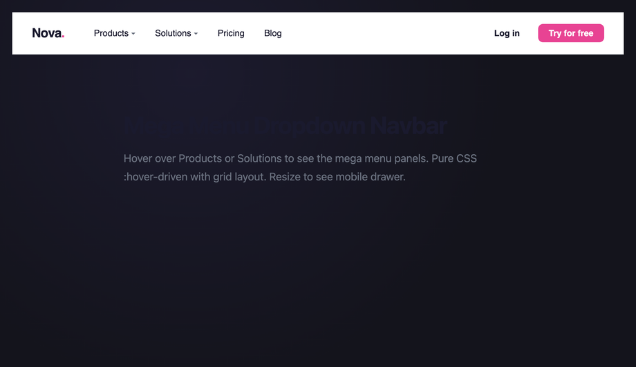
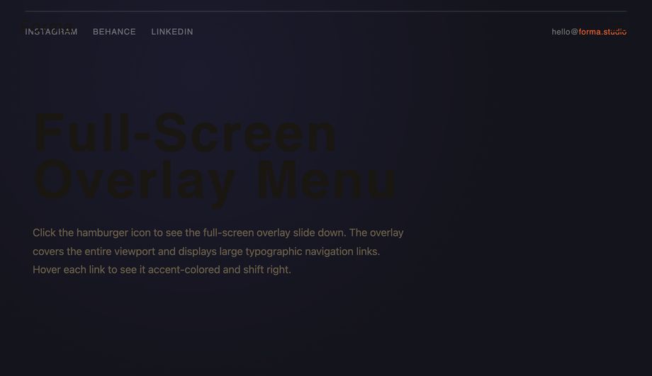
:hover opens / :hover closes. That breaks keyboard users (Tab can't enter the panel because hover is mouse-only) and screen-reader users (the open/closed state isn't announced). The WCAG 2.2 / Section 508 / EU EAA accessible pattern requires: (1) :focus-within opens the panel on keyboard focus (works alongside :hover), (2) aria-expanded="true|false" on the parent trigger announces the state, (3) aria-haspopup="menu" tells screen readers there's a submenu, (4) Escape key closes the panel and returns focus to the trigger, (5) arrow-key navigation within the panel (Roving tabindex pattern), (6) the panel itself uses role="menu" with children as role="menuitem". Demo #02 (CSS Mega Menu Dropdown Navbar) ships the full pattern, and Demo #14 (Full-Screen Overlay Menu) implements a complete focus trap with focus return on close. Tools to audit: axe DevTools, Lighthouse, WAVE, NVDA + screen reader testing — every one of these will catch the missing aria-expanded that 90% of tutorial mega menus ship without.How does my navbar compare to Tailwind UI, shadcn/ui, MUI, Chakra, or Bootstrap navbars?
NavigationMenu + DropdownMenu primitives. Material UI / MUI: ships <AppBar> with Material aesthetics and ~95kb bundle cost. Chakra UI: composable but you assemble nav from Flex + Menu primitives. Ant Design: ships <Menu mode='horizontal'> with enterprise-friendly defaults. Bootstrap 5: ships .navbar + .navbar-collapse with the canonical mobile collapse pattern. This generator vs. all of the above: these are EDITABLE source CSS / HTML / JS — copy what you like and customize freely (brand color, exact corner radius, specific hover behaviour). Use the component libraries when you want a complete design system in 30 seconds. Use these demos when you want fine control or when you're building your own design system from scratch and need the source CSS to inform your token decisions. Drop any demo's CSS into our converter to see the Tailwind utility-class equivalent.How do I implement scroll-spy active-section highlighting?
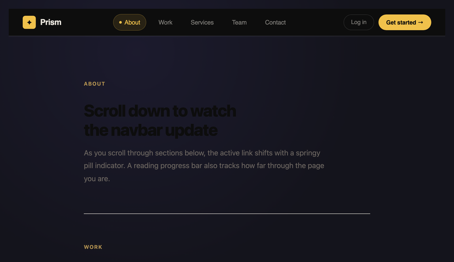
IntersectionObserver to watch each section enter/leave the viewport and toggle .is-active on the matching nav link. Demo #20 (CSS Scroll Spy Active Highlight Navbar) ships this pattern in ~15 lines of vanilla JS: const obs = new IntersectionObserver(entries => entries.forEach(e => { if (e.isIntersecting) document.querySelector(`a[href="#${e.target.id}"]`).classList.add('is-active'); }), { threshold: 0.5 }); then iterate all section[id] elements and observe them. The IntersectionObserver is GPU-friendly and doesn't run on every scroll frame like a manual window.scroll listener would. Modern alternative (Chrome 115+ / Edge 115+ / Opera 101+; partial Safari 26+ / Firefox 134+): CSS scroll-driven animations via animation-timeline: view() let you do scroll-spy entirely in CSS — animate --active custom property as each section scrolls through the viewport, then use :has() + @scope to flip the matching nav link's color. Zero JavaScript. Demo #20's CSS includes a commented-out scroll-driven-animations version next to the IO implementation.Hamburger menu vs. bottom tab bar vs. fullscreen overlay — which mobile navigation pattern?
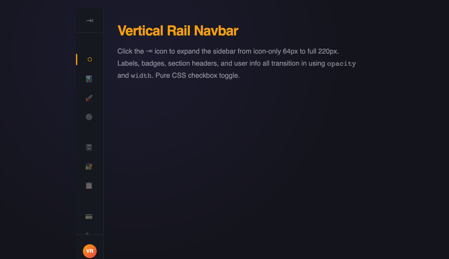
@media queries.Why does my navbar cause cumulative layout shift (CLS), and how do I fix it?
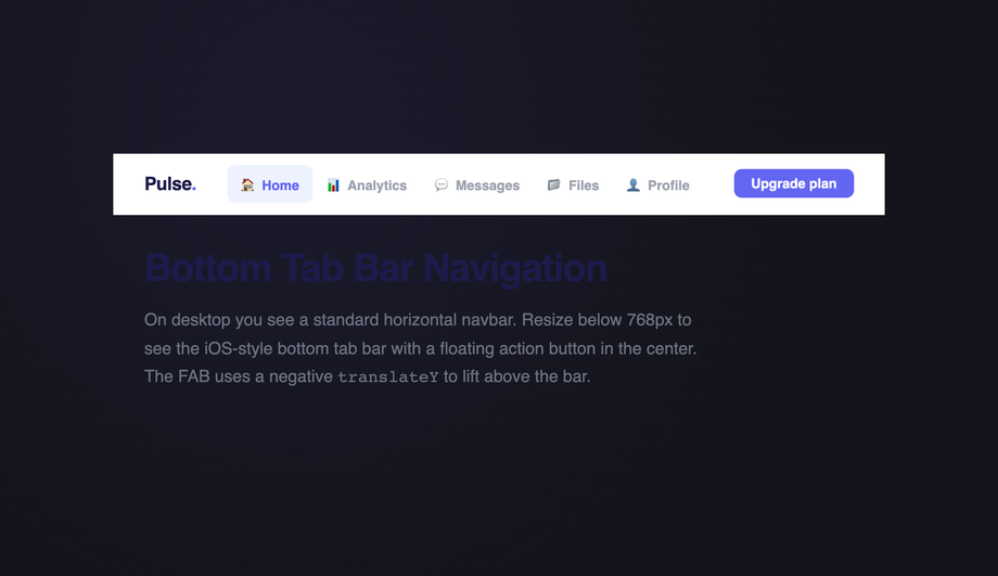
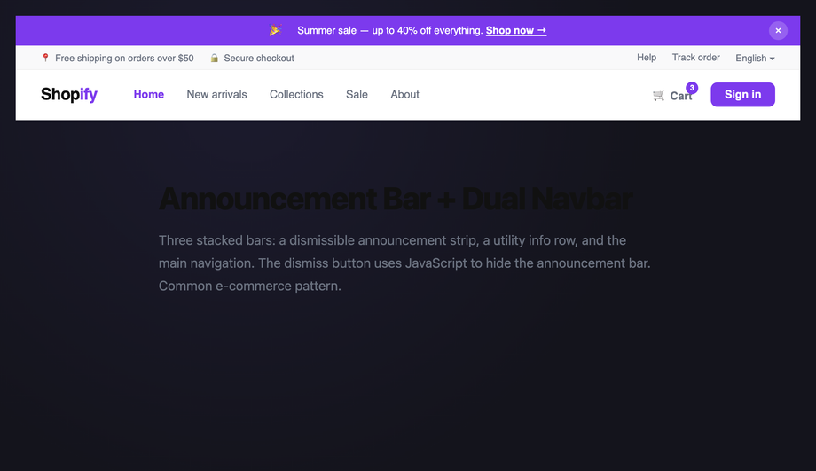
font-display: optional or font-display: swap + size-adjust in @font-face. (2) Shrink-on-scroll without fixed height: the navbar's height changes on scroll → entire page-below-navbar shifts up. Fix described in FAQ #2 — keep outer navbar height constant, shrink only inner elements. (3) Logo image with no dimensions: image loads asynchronously and reflows the layout. Fix: width + height attributes on <img>, or aspect-ratio: 4/1 on the logo container. (4) Mobile hamburger toggle uses display: none → block: the menu's opening shifts content. Fix: use transform: translateY() + height: 100dvh on an overlay (no layout impact). (5) Sticky positioning glitch: position: sticky on a navbar inside an overflow: hidden parent silently fails on some browsers. Fix: move sticky to a direct child of <body> and ensure no ancestor clips overflow. Tools to verify: Chrome DevTools Performance Insights, Lighthouse, Core Web Vitals report in Google Search Console, axe DevTools, WebPageTest filmstrip.Should I use a bottom tab bar on web like iOS / Android apps do?
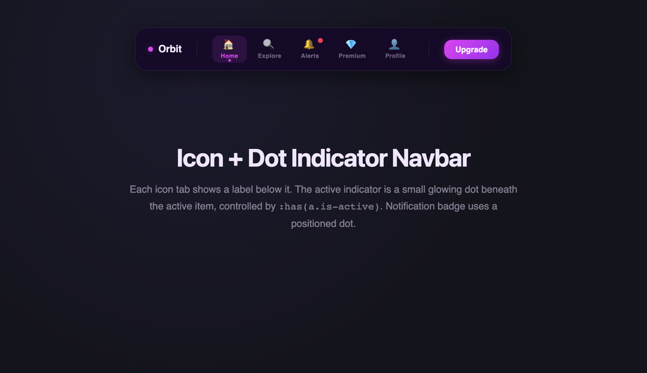
max-width: 720px via media query, hidden at desktop where a conventional top navbar takes over. Add padding-bottom: 72px to main on mobile so the fixed bottom bar doesn't overlap content. Use 3–5 tabs maximum (more than 5 reduces tap accuracy). Each tab needs a 24×24px icon minimum + label below ≤ 12px. Mark the active tab with both color AND a small indicator (icon dot, top border, or fill) — color alone fails WCAG 1.4.1 (Use of Color).Are these responsive navbars free, accessible, and how do I attribute them?
<nav> + <ul>/<li> structure, aria-current="page" on the active link, aria-label on icon-only buttons, visible :focus-visible rings, aria-expanded on toggles, focus trap on modal-like overlays, Escape-key dismissal, and proper landmark roles so screen-reader users navigate them correctly. Continuous animations honour prefers-reduced-motion: reduce. The collection ships ready to pass WCAG 2.2 AA — verify with axe DevTools, Lighthouse, or WAVE before shipping to EU EAA / US Section 508 / UK Equality Act audits.Related collections

26 CSS Accordions — Vertical & Horizontal
26 free CSS accordions — 17 vertical and 9 horizontal layouts with copy-paste HTML and CSS.

22 CSS Breadcrumbs
22 original CSS breadcrumb designs — underline grow, pill, diagonal slash, neon trail, brutalist, frosted glass, vertical stacked, progress track, holographic shimmer and more.

21 CSS Circular & Radial Menu Designs
21 free CSS circular and radial menu designs — pie, dome, orbital and skeumorphic layouts with copy-paste HTML and CSS.