
01. CSS Image Hover Zoom In Card (opens in a new tab)
The classic card micro-interaction where the image scales up inside its clipped container boundary without shifting the surrounding grid.
A CSS image hover effect transforms an image when the cursor enters it — zoom, color swap, overlay caption reveal, 3D tilt, ripple, flip, glow border, or neumorphic depth lift. The dominant pattern for e-commerce product cards, portfolio thumbnails, team avatars, blog feature images, and editorial hero banners. These 20 hand-coded designs cover the full image-hover playbook — zoom-in card, hover reveal text, e-commerce product swap, blur overlay, slide-up caption, grayscale-to-color, color tint, neumorphic depth, glassmorphism, neon border, clip-path morph, 3D tilt, shining glare, split transition, ripple, spinning avatar, fullscreen bg swap, masonry zoom, icon reveal, and 3D card flip. Every demo uses scoped .ih-NN class names that never collide with your existing styles, honours prefers-reduced-motion, preserves CLS via aspect-ratio, and ships under the MIT license.
Related30 CSS Hover Effects33 CSS Card Hover Effects22 CSS Image Galleries20 Tailwind CSS Image Hover Effects
Course pickPartner: Zero to Mastery
Affiliate linkWant to build production-ready CSS layouts, animations and UI from scratch?
You just browsed 20 image hover effects. Learn the Flexbox, Grid and animation thinking behind them, so the next component starts in your head, not in a copy-paste.
Every ZTM course in one membership: $25/month, paid yearly at $299 · 30‑day money-back guarantee
The CSS Bootcamp. We may earn a commission, at no extra cost to you.
.card { overflow: hidden; } .card img { transition: transform .5s cubic-bezier(.25,.46,.45,.94); } .card:hover img { transform: scale(1.06); } — three primitives layered: (1) overflow: hidden on the parent so the scaled image is clipped at the card boundary, (2) transition: transform on the image (NOT on the parent) so the GPU composites the scale without triggering layout, (3) :hover selector on the PARENT (not the image) so the cursor over the caption area still keeps the zoom active. This is the everyone-reaches-for-first recipe Demo #01 demonstrates. The 2026 modern upgrade: pair with @property --tilt typed angles for 3D tilt (Demo #12) and animation-timeline: scroll() for scroll-driven reveal alternatives. The collection ships 20 effect-focused patterns from the simplest zoom (#01) to complex 3D card flips (#20).filter-driven color changes (grayscale, blur, saturate), clip-path reveals, background-image transitions. 18 of 20 demos ship zero JavaScript. JavaScript is required when: the effect tracks the actual cursor position inside the element with pixel precision (Demo #12 3D tilt needs pointermove coordinates → maps to rotateX / rotateY values), the effect needs to toggle a class on a parent element when the user enters / leaves (Demo #17 fullscreen bg swap — though this could also be done with :has() in modern browsers, the JS version is broader-compatible), or the effect responds to scroll position with pixel-precise mapping (use animation-timeline: scroll() instead — pure CSS, modern browsers only). Mobile touch caveat: :hover on touch devices is sticky — once tapped, the hover state persists until the user taps elsewhere. The collection uses @media (hover: hover) media queries on the most critical demos (#03 product swap especially) so touch users don't get stuck in mid-hover state. Modern alternative: :has() selector (Chrome 105+, Safari 15.4+, Firefox 121+) replaces some JS class-toggling — Demo #17's pattern could be rewritten .hero:has(.card-1:hover) { background-image: var(--card-1-bg) } in pure CSS for the latest browsers.whileHover, overkill for static-class hover patterns. GSAP + ScrollTrigger: ~30KB total, justified for orchestrated multi-image hero sequences but heavy for product cards. What you LOSE by using libraries: 10-70KB JavaScript per page, an external dependency to update + audit for CVEs, slower First Contentful Paint / Largest Contentful Paint, mobile-touch hover quirks the library may not handle. What this collection gives you: 18 of 20 effects in 30-80 lines of CSS that ship inline with your HTML — zero bundle cost, zero npm dependency, zero CVE surface, faster Core Web Vitals. Reserve Vanilla-Tilt / Framer Motion for app dashboards where you need orchestrated multi-element sequences.:hover + @keyframes in @media (prefers-reduced-motion: reduce) { transition: none; transform: none; } so motion-sensitive users see the static image. WCAG 2.2 SC 2.3.3 (Animation from Interactions) requires this. 2. Keyboard / focus state: :hover alone doesn't fire for keyboard users tabbing through links. Pair every :hover rule with :focus-within or :focus-visible so tabbed cards reveal the same overlay. The demos do this by default. 3. Mobile-touch sticky hover: on touch devices the first tap triggers :hover and the second tap fires the click — confusing. Fix: wrap hover-specific rules in @media (hover: hover) so touch users get tap-to-click without the intermediate sticky state. 4. Text-over-image contrast: caption overlays (Demos #02, #04, #05) need WCAG 1.4.3 AA 4.5:1 contrast against the WORST-case image pixel — semi-transparent dark overlay (rgba(0,0,0,.55)+) under the text is the universal fix. 5. alt attribute: every <img> in the demos has descriptive alt text. Decorative images use alt="". Regulatory frameworks: EU EAA (June 2025 enforcement), US Section 508, Canada ACA, UK Equality Act 2010, Australian DDA all require WCAG 2.2 AA — image hover lawsuits routinely surface contrast failures + missing alt + sticky-touch issues.aspect-ratio CSS — fluid containers can't reserve vertical space until the image loads. (3) Web-font swap (FOUT) on caption text that overlays the image causes the overlay box to resize. (4) JavaScript-driven layouts (Demo #18 masonry) that compute positions after first paint. Fixes baked into every demo: (1) aspect-ratio: 4 / 3 (or whatever the design uses) on the image container — reserves vertical space before the image loads. (2) Explicit width and height attributes on the <img> tag — the browser's intrinsic size calculation kicks in immediately. (3) loading="lazy" on below-the-fold images so the initial render doesn't block on image bytes. (4) object-fit: cover on the image inside the aspect-ratio container so the image fills the reserved box without stretching. Lighthouse-friendly pattern: <div class="card" style="aspect-ratio: 4/3"><img src="..." width="800" height="600" loading="lazy" alt="..."></div>. Tools: Chrome DevTools Performance Insights (Layout Shift detail), Lighthouse, PageSpeed Insights, Web Vitals extension, Core Web Vitals report in Google Search Console.group-hover:scale-105, hover:scale-110, hover:grayscale-0, hover:brightness-125 as built-in utilities. The 3-utility pattern: <div class="group overflow-hidden rounded-lg"><img class="transition-transform duration-500 group-hover:scale-105" ... /></div>. Our CSS to Tailwind converter handles the conversion automatically. Tailwind UI ($300+/yr/dev license): ships a handful of image-hover patterns inside e-commerce / marketing component bundles. shadcn/ui (React + Radix): does not ship image-hover components; the community recommends Magic UI or Aceternity for animated thumbnails. Magic UI: includes "Marquee", "Animated Beam", "Border Beam" — overlap with this collection's neon border (#10) and shining glare (#13). React-only. Aceternity UI: ships "3D Card Effect" (similar to our #12 tilt), "Image Comparison Slider", "Wobble Card". React + Framer Motion bundle. Material UI / MUI: sx={{ '&:hover img': { transform: 'scale(1.1)' } }} via emotion. Chakra UI: _hover={{ transform: 'scale(1.05)' }} shorthand. Ant Design / Mantine / HeadlessUI / Radix UI: no first-class image hover components — userland. This collection gives you the same effects framework-agnostic (drop into any React, Vue, Svelte, Astro, Next.js, plain HTML), zero JavaScript for 18 of 20 demos, and no paid licenses.:hover on the first tap and then click on the next tap. This means tapping a hover card once shows the hover state but doesn't navigate — users have to tap twice. The hover state then "sticks" until they tap elsewhere on the page. Three fixes: 1. @media (hover: hover) media query: wrap hover rules in this query so they only apply to devices with a true hover capability (mouse / trackpad). Touch users get the static image + a single tap that navigates. This collection uses @media (hover: hover) on every effect where the hover-stuck state would confuse users (Demos #03 product swap, #02 reveal text). 2. @media (pointer: fine): similar — only fires when the user has a precise pointer device. 3. Pair :hover with :focus-within: keyboard / touch focus triggers the same overlay. Other mobile gotchas: 1. transform: scale performance on low-end Android: large images scaled via CSS can cause repaints. Add will-change: transform + transform: translateZ(0) to force GPU compositing. 2. filter: blur performance: blurring large images on iOS Safari 16.x drops frames. Use sparingly + add backdrop-filter alternative when possible (modern browsers). 3. Image loading on slow networks: loading="lazy" + srcset + sizes + fetchpriority="low" on below-the-fold cards so the hero loads first.@property (Chrome 85+, Safari 16.4+, Firefox 128+) registers a CSS custom property with a typed syntax. Without it, animating --angle: 0deg → 360deg is impossible — browsers treat untyped custom properties as strings and jump to the final value with no interpolation. With @property --angle { syntax: '<angle>'; inherits: false; initial-value: 0deg; }, you can animate conic-gradient(from var(--angle), ...) smoothly. For image hovers specifically, this unlocks two patterns the collection demonstrates: 1. Smooth conic-gradient border rotation (Demo #10 Neon Border) — without @property the border-color hop is jerky; with it, the rotation is buttery-smooth on the GPU. 2. Tilt angle interpolation (Demo #12 3D Tilt) — pointer coordinates update CSS custom properties that drive rotateX(var(--rx)) rotateY(var(--ry)); with @property the transitions between mid-tilt positions interpolate smoothly rather than snapping. @supports gate for fallback: wrap @property-dependent rules in @supports (background: linear-gradient(in oklch, red, blue)) — this feature gate correlates 1-to-1 with @property support, providing a clean progressive-enhancement boundary. Older browsers get a static border / non-interpolated tilt; modern browsers get the smooth GPU version. Why this matters for Core Web Vitals: @property-driven CSS animations run on the compositor thread, keeping the main thread free for user input. Lower Interaction to Next Paint (INP) scores than JS-driven equivalents.prefers-reduced-motion: reduce, pairs :hover with :focus-within for keyboard users, wraps hover-only rules in @media (hover: hover) for touch devices, and uses aspect-ratio + explicit width/height to prevent CLS. Verify your specific brand images and overlay contrast with axe DevTools, Lighthouse, WAVE by WebAIM, or the WebAIM Contrast Checker before shipping to EU EAA / US Section 508 / Canada ACA / UK Equality Act / Australian DDA audits — the demos are AA-compliant by default but final image content and layout context matter. Related collections: CSS Hover Effects (broad catalog, 30K vol), CSS Button Hover Effects (27 demos), CSS Image Gallery (16 demos — masonry / lightbox / filmstrip layouts), CSS Text Animations (25 demos). Related tools: CSS to Tailwind converter, CSS Filter generator.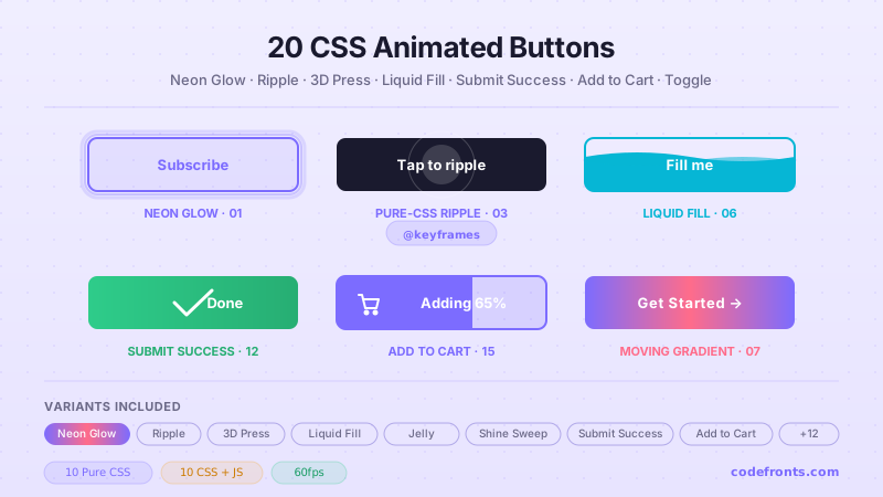
20 hand-coded CSS animated buttons — neon glow, ripple, 3D press, liquid fill, jelly bounce, shine sweep, animated border, moving gradient CTA, text flip, submit success state, add-to-cart progress, download icon, hamburger-to-close, toggle switch, loading spinner inside button, next/prev arrow nav, and ghost button background reveal. Half pure CSS, half lightweight JS for production interactions.
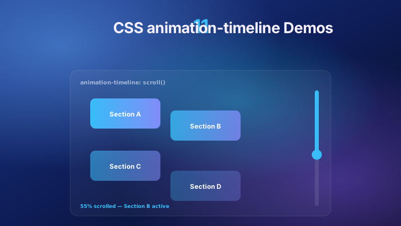
11 pure CSS animation-timeline demos built on the W3C scroll() and view() spec — reading progress bar, view-timeline fade & reveal, shrinking sticky header, stacking cards, horizontal scroll section, parallax hero, container shadow indicators, reverse-scroll columns, text scrim reveal, cover card to sticky header, and image zoom / clip-path wipe. Zero JS, off the main thread, Core Web Vitals safe. Copy-paste ready.
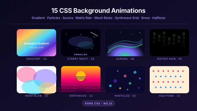
25 hand-coded CSS background animations for SaaS hero sections, developer tool documentation, agency portfolios, gaming and Web3 landing pages, seasonal e-commerce campaigns, and dark-mode dashboards. Covers full-screen gradient shifts, animated mesh gradients, aurora borealis glow, cursor spotlight follow, interactive water ripples, dot grid and diagonal stripe patterns, SVG grain and noise texture overlays, topographic contour lines, layered SVG waves, plasma and lava lamp fluids, bokeh light blur, particle constellation networks, matrix digital rain, synthwave 3D perspective grids, starfield warp speed, CRT scanline overlays, fog and mist drift, morphing organic blobs, floating glassmorphism orbs, halftone dot patterns, starry night skies, floating geometric shapes, rising bubbles, and falling snow. 20 are pure CSS with zero JavaScript; the 5 that need it use vanilla canvas or pointer tracking with no dependencies. Every background animates compositor-only properties so it never blocks the main thread, is scoped under a .bga-NN prefix for no-collision pasting, guards prefers-reduced-motion, and ports unchanged to React, Vue, Svelte, Astro, Next.js and Tailwind.


