16 CSS Image Gallery Designs
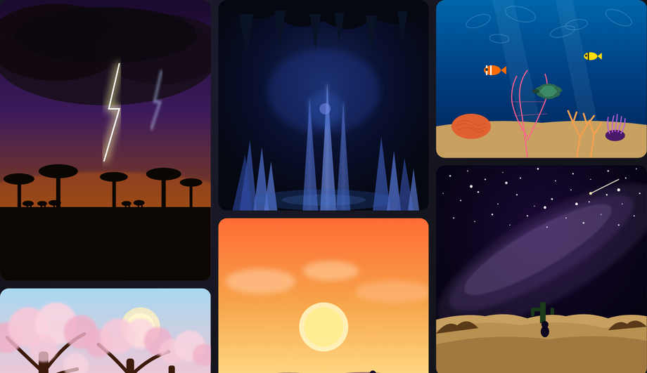
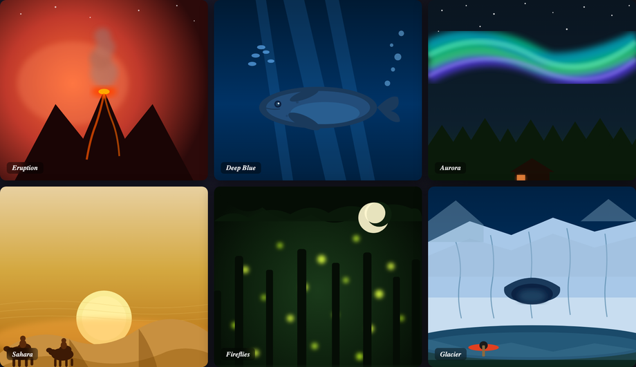
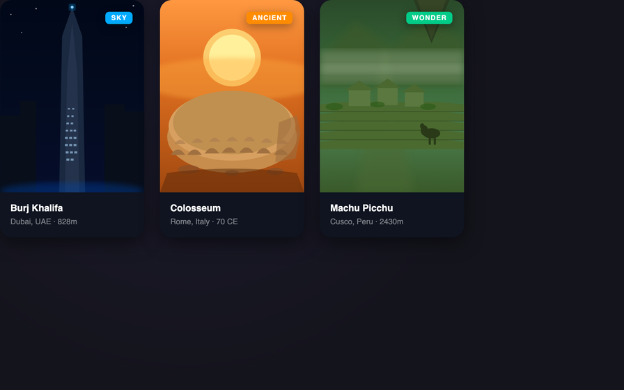
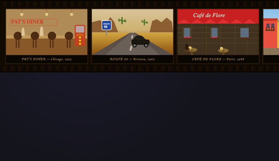
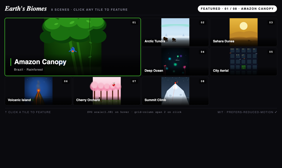
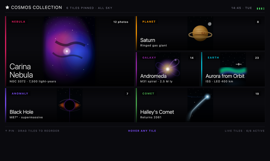
A CSS image gallery arranges photos in a grid, carousel, or stacked layout with hover effects, lightboxes, or auto-advancing slideshows — the dominant content pattern for portfolios, e-commerce, photo blogs, and editorial sites. These 16 hand-coded designs cover the full modern gallery playbook — CSS columns masonry, lightbox overlay, infinite scroll filmstrip, polaroid stack, tilt parallax cards, magazine layout, mosaic zoom, metro tile grid, perspective depth stack, diagonal slice reveal, glassmorphism hover cards, 3D cube viewer, scattered photos, Ken Burns slideshow, and accordion. Every demo uses scoped .ig-NN class names that never collide with your existing styles, honours prefers-reduced-motion, and ships under the MIT license.
Frequently asked questions
What is a CSS image gallery and which layout pattern should I pick?
.ig-NN class names so you can drop multiple onto the same page without conflicts.Can I build an image lightbox with pure CSS? (no JavaScript)
:target pseudo-class. Wrap each thumbnail in <a href='#image-1'>, then a fullscreen overlay with id='image-1' that's opacity: 0; pointer-events: none at rest. When the URL hash matches (:target), the overlay becomes opacity: 1; pointer-events: auto and the image appears. Close with a sibling link <a href='#close'> or by hashchange. Demo #02 ships this pattern with the modern alternative: the checkbox-hack (hidden <input type='radio'> + sibling selectors) which avoids polluting browser history with hash entries — important for back-button UX. Modern alternative (Chrome 114+, Safari 17+, Firefox 125+): the HTML Popover API with popover='auto' and popovertarget gives you a native top-layer overlay with built-in click-outside-close + Escape dismissal — zero JavaScript needed for a complete a11y-compliant lightbox. For production sites: a 30-line vanilla JS lightbox is often simpler than the CSS gymnastics — adds keyboard nav (arrow keys), pinch-zoom, swipe gestures, and analytics. The :target / checkbox-hack approach is best for marketing pages where no-JS is a hard requirement.How does this compare to lightGallery, PhotoSwipe, Fancybox, Lightbox2, Magnific Popup, react-image-gallery?
How do I make an image gallery WCAG-accessible? What about alt text and lightbox a11y?
alt text on EVERY image — not alt='' (which marks the image decorative). Describe what's in the photo as if you were narrating it to a friend on the phone. For a wedding gallery, alt is 'Bride and groom kissing under a cherry blossom arch at sunset', NOT 'IMG_4523'. 2. Lightbox aria pattern: when an image opens fullscreen, the lightbox is a MODAL DIALOG — needs role='dialog' + aria-modal='true' + aria-label (e.g. 'Image viewer'). Focus must move INTO the lightbox on open and RETURN to the trigger thumbnail on close (focus trap inside until close). 3. Keyboard navigation: Escape closes the lightbox. ArrowLeft / ArrowRight navigate prev/next image. Tab cycles between Prev / Image / Next / Close inside the modal. 4. Screen reader announcement: when navigating to next image, announce the new image's caption via aria-live='polite' region. 5. Decorative captions: caption text duplicates alt text? Mark caption as aria-hidden='true' to avoid double-announcement. Mismatched? Mark the image's alt as the more-descriptive of the two. Regulatory frameworks: WCAG 2.2 (especially 1.1.1 Non-text Content), EU EAA (June 2025), US Section 508, Canada ACA, UK Equality Act. Test with axe DevTools, Lighthouse, WAVE, NVDA / VoiceOver. Demo #02 ships the full lightbox a11y pattern.How do I prevent layout shift (CLS) and slow LCP in my image gallery?
width and height on <img>: this lets the browser reserve layout space BEFORE the image downloads, preventing the content shift when images load late. Modern browsers compute aspect-ratio from these attrs automatically. 2. loading='lazy' on below-the-fold images: browser-native lazy loading, zero JS. The first 2-3 images visible above the fold should be loading='eager' + fetchpriority='high' so LCP fires fast. 3. Responsive images with srcset + sizes: serve a 400px-wide image to mobile, 1200px to desktop, etc. — saves 60-80% of bytes on mobile. Use the <picture> element for art-direction (different crop for mobile vs desktop). 4. Modern image formats: AVIF (best compression, ~50% smaller than JPEG), WebP (good browser support, ~30% smaller), with JPEG fallback. <picture> + <source type='image/avif'> + <source type='image/webp'> + JPEG <img> fallback. 5. CDN with on-the-fly resizing: Cloudinary, ImageKit, Cloudflare Images, or Vercel Image Optimization let you request image.jpg?w=400&format=auto and the CDN serves the optimal format/size per request. Tools: Chrome DevTools Performance Insights, Lighthouse, PageSpeed Insights, WebPageTest, Web Vitals extension. Every demo in this collection uses inline SVG art (zero HTTP requests, infinite scalability, zero CLS) — but for production, swap the SVG <svg> for <img loading='lazy' srcset='...' width='...' height='...' alt='...'>.Pure-CSS vs JavaScript image galleries — when do I need JS?
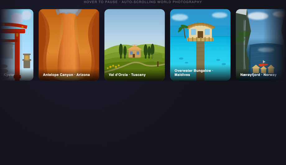
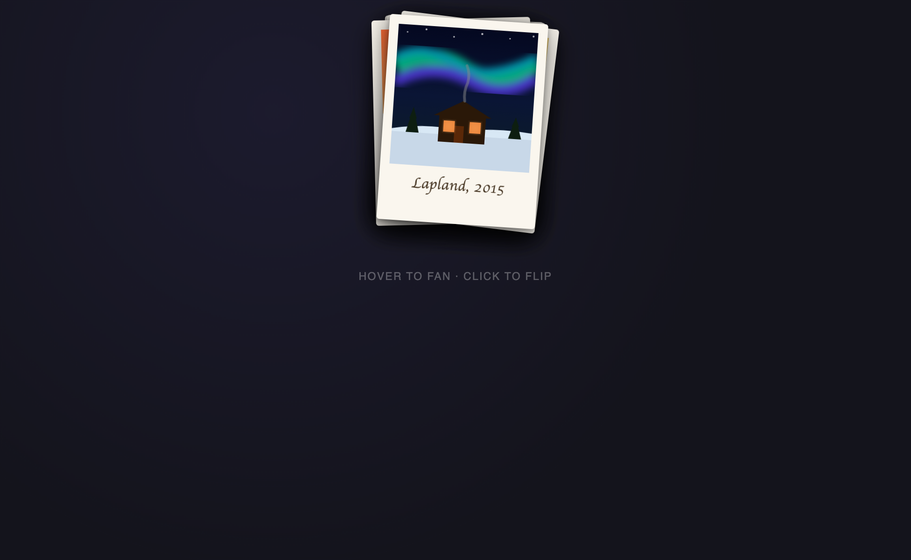
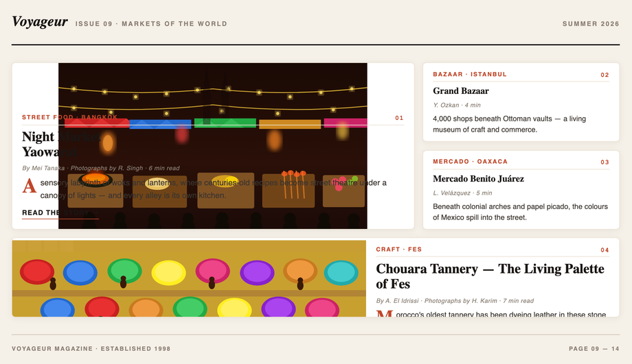
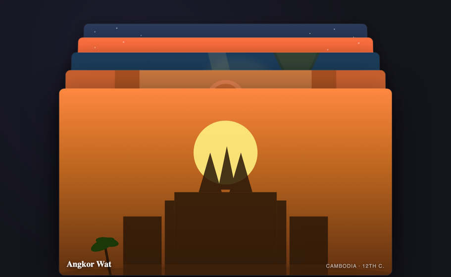
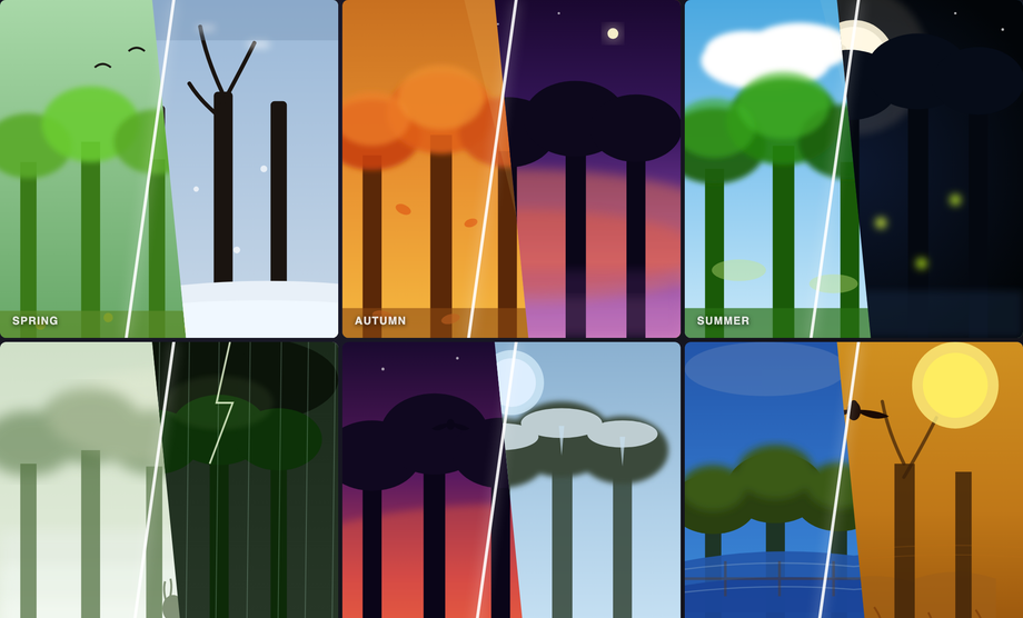
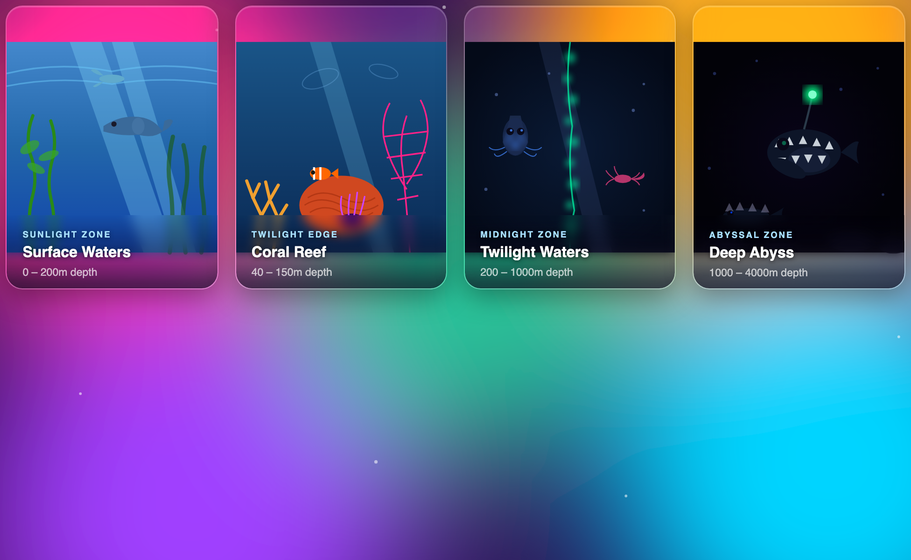
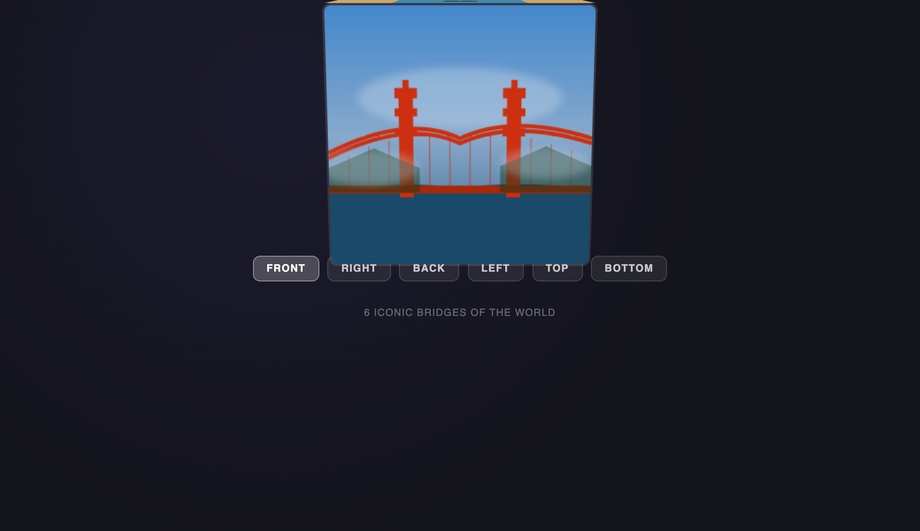
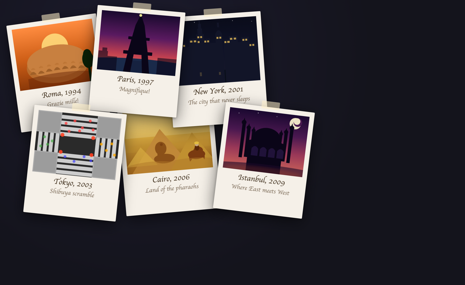
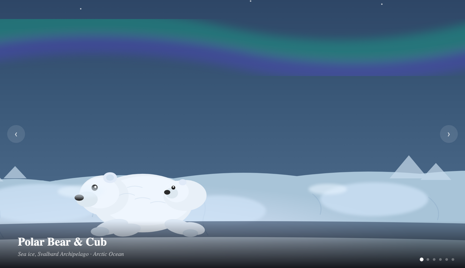
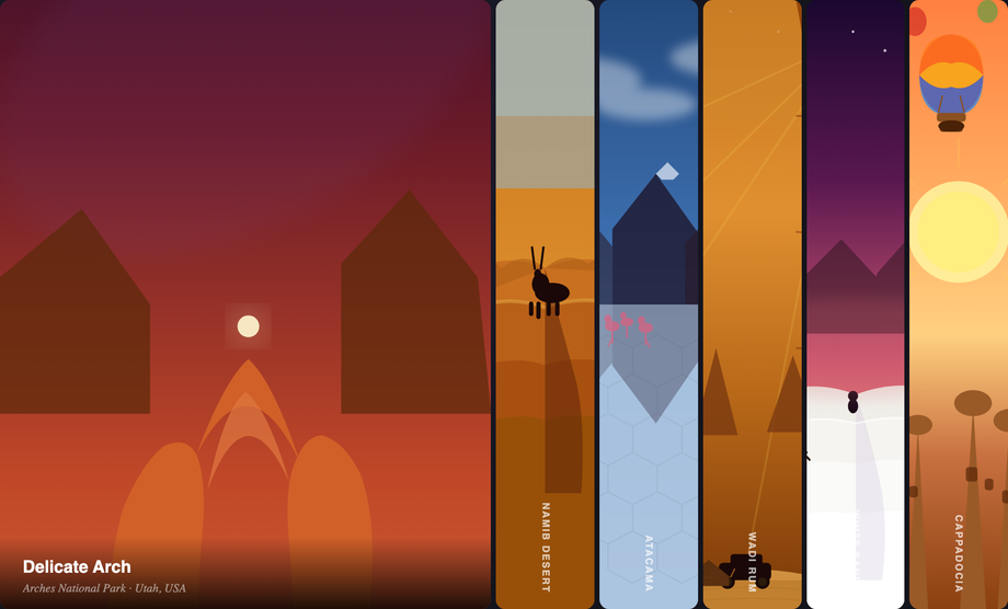
columns or the new grid-template-rows: masonry behind a flag), hover effects (zoom, caption reveal, parallax-tilt approximation), lightbox via :target or checkbox-hack (Demo #02 ships both), CSS-only image accordion (Demo #16 — uses radio inputs + sibling selectors), perspective stacks (Demo #10), polaroid scattered layouts (Demo #14 — using :nth-child rotations), magazine asymmetric grids (Demo #09 — CSS Grid + named areas), metro tile uniform grids (Demo #08), diagonal clip-path reveals (Demo #11), and glassmorphism hover (Demo #12). JavaScript is required for: true infinite scroll (DOM-injecting new images as user scrolls — Demo #03), real mousemove-driven parallax tilt (CSS-only tilt approximations exist but mousemove gives pixel precision — Demo #05), filmstrip carousel auto-advance + swipe gestures (Demo #06), 3D cube viewer with arrow navigation (Demo #13), random rotation generation for scattered layouts (Demo #14 picks random angles per session), Ken Burns slideshow auto-advance + manual nav (Demo #15), keyboard arrows + focus management inside the lightbox (Demo #02's JS-enhanced variant). Modern alternatives: scroll-snap-type: x mandatory + scroll-snap-align: start gives you a swipe carousel WITHOUT JavaScript (Chrome 69+, Safari 11+, Firefox 68+). @scroll-timeline + animation-timeline: scroll() let you do scroll-driven parallax effects in pure CSS (Chrome 115+). The 'CSS or JS?' line is moving — re-evaluate every 2 years.Tailwind, shadcn/ui, MUI, Chakra image gallery — how do these compare?
grid grid-cols-3 gap-4 for grid, columns-3 break-inside-avoid for masonry). Tailwind UI ($300+/yr) ships a few gallery templates. Our CSS to Tailwind converter handles paste-conversion of any demo here. shadcn/ui: no dedicated gallery; community pattern uses Tailwind grid + Dialog component for lightbox. Material UI / MUI: ships <ImageList> + <ImageListItem> components for masonry/standard/quilted/woven grids — convenient but adds ~15KB to bundle. Chakra UI: no dedicated gallery; compose with <Grid> + <Image>. Ant Design: <Image.PreviewGroup> ships a built-in lightbox with prev/next + zoom — most feature-complete out of all React libraries. Mantine: <SimpleGrid> + <Image> for grid; community packages for masonry. react-photo-album (~12KB): the dominant 'justified row' gallery library (Flickr-style). This collection vs all of the above: 16 layout patterns, framework-free CSS that drops into ANY of these libraries. Use the demos as design references — copy a CSS pattern into your MUI / Chakra / shadcn project; the underlying CSS works regardless of framework. For lightbox specifically, MUI ImageList and Ant Design Image.PreviewGroup are production-ready out of the box; consider those if you're already in their ecosystem.Real masonry with CSS — what's the difference between columns, Grid masonry, and JavaScript libraries?
columns: 3 (Demo #01) — the long-standing pure-CSS approach. Browser flows items top-to-bottom in each column, then left-to-right across columns. Pros: zero JS, automatic. Cons: visual reading order doesn't match DOM order (item 4 might appear in column 2 even though item 3 is in column 1) — bad for accessibility and sequential reading. 2. CSS Grid masonry: grid-template-rows: masonry + grid-template-columns: repeat(3, 1fr) — the modern proposed standard. Items flow left-to-right (matching DOM order, fixing the columns issue), then top-down into the shortest column. Currently behind a flag in Firefox (about:config layout.css.grid-template-masonry-value.enabled); Chrome and Safari haven't shipped yet as of 2026 mid-year. 3. JavaScript libraries (Masonry.js ~30KB, Bricks.js ~10KB, react-masonry-css ~5KB, react-photo-album ~12KB): compute item positions imperatively and use absolute positioning. Cons: bundle weight, requires re-layout on resize/image-load, can cause CLS. Pros: works everywhere, controls reading order strictly. Recommendation: for marketing pages where reading order doesn't matter (Pinterest-style discovery), use CSS columns (Demo #01). For chronological content (blog grid, photojournalism timeline), wait for grid-template-rows:masonry to ship in Chrome/Safari OR use a small JS library that preserves DOM order. Avoid the heavy libraries for new projects.Should I lazy-load every image? When does lazy loading HURT performance?
loading='lazy' defers loading until the image scrolls near the viewport — saves bandwidth and improves Time-to-Interactive. But applied wrong, it HURTS Core Web Vitals. Rule 1: NEVER lazy-load above-the-fold images. The first hero image, the first 2-3 visible gallery thumbnails, the LCP candidate — all must be loading='eager' (the default) PLUS fetchpriority='high' on the LCP image specifically. Lazy-loading the LCP image delays it by ~500-1000ms while the browser figures out 'is this in viewport yet?', tanking your LCP score. Rule 2: loading='lazy' is browser-native, not a JS library. Don't combine native lazy with a JS lazy library (Intersection Observer pattern) — they double-defer and cause flashes. Pick one. Rule 3: fetchpriority matters more than people realize. fetchpriority='high' on the LCP image, fetchpriority='low' on below-the-fold images (combined with loading='lazy'). The browser prioritizes high-priority downloads even when network is congested. Rule 4: decoded vs not-yet-decoded. decoding='async' on every image lets the main thread paint before the image is decoded — pairs naturally with loading='lazy'. The complete recipe: <img src='...' srcset='... 400w, ... 800w, ... 1200w' sizes='(max-width:600px) 100vw, 33vw' loading='lazy' decoding='async' width='400' height='300' alt='...' fetchpriority='auto'>. For the hero image, swap loading='lazy' → loading='eager' and fetchpriority='auto' → fetchpriority='high'. Verify with Lighthouse, PageSpeed Insights, Chrome DevTools Performance Insights.Are these image gallery designs free, accessible, and how do I attribute them?
<img>, real <a>, real <button> where appropriate), honours prefers-reduced-motion: reduce (animations fall back to instant transitions), and the lightbox demo includes the full a11y pattern (focus trap + Escape key + aria-modal). When swapping the inline SVG placeholders for real <img> elements in production, REQUIRE alt text on every image (see FAQ #4). Verify your specific use case with axe DevTools, Lighthouse, WAVE, NVDA / VoiceOver screen reader testing — the demos are AA-compliant by default but real-world a11y depends on the alt text you write and the context you embed them in.Related collections

30 CSS Badges
30 hand-coded CSS badges spanning collectibles, status indicators, certifications, notifications, membership tiers, and live-data displays. Upload progress, typing indicator, scrabble tile, keycap shortcut, transit indicator, origami medal, hreflang, E-E-A-T, crawl status, schema, search intent, core web vitals, ECG, build pipeline, countdown, live price, file extension, dice, signal bars, reading time, aurora, vaporwave, risograph, wax seal, conference lanyard, botanical tier, cyberpunk glitch, art deco, brutalist status, holographic.

14 CSS Banners & Alerts
Hand-coded CSS banner and alert patterns covering every notification surface a real product needs — dismissible alerts, sticky announcements, semantic status alerts, cookie consent, form validation, toasts, live-update banners, and promotional hero banners. Pure CSS plus scoped JS — no framework, semantic HTML, accessibility-first, copy-paste ready.

19 CSS Blockquote Designs
19 hand-coded CSS blockquote designs — pull quotes, testimonials, speech bubbles, tweet style, newspaper drop-caps, code comments and more. Semantic HTML, copy-paste ready.