10 CSS Feature Sections
A CSS feature section is the second band of a landing page where you turn the hero pitch into 4–8 concrete reasons to keep reading. These 10 hand-coded sections are full-bleed marketing-page starters — find-and-replace the headline, swap the icon strings, paste your stat numbers, ship. 7 of 10 are pure CSS (drop into any stack: Astro, Vue, Rails, plain HTML); 3 use a small IntersectionObserver or mousemove handler that degrades gracefully if JS is disabled.
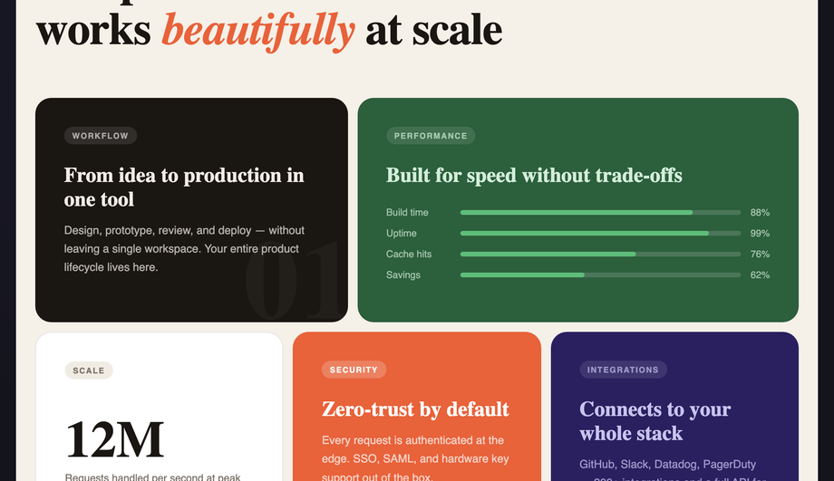
Frequently asked questions
What is a CSS feature section?
Should I use a Tailwind UI feature section or build with pure CSS?
What's the difference between an icon grid feature section and a bento grid layout?
How do I do scroll-reveal feature cards without AOS.js or Framer Motion?
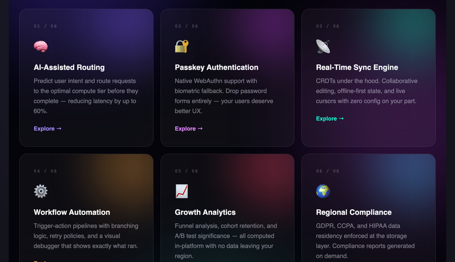
IntersectionObserver — no library required. The pattern: each `.fs04__row` starts with opacity: 0; transform: translateY(40px). A single `IntersectionObserver` watches all rows; when one enters the viewport, it adds an .is-visible class. The CSS .is-visible rule transitions opacity to 1 and transform to 0 over 0.7s. Compare costs: AOS.js ships ~22kb minified for this same effect. Framer Motion's `How do I do 3D card tilt on mousemove without it breaking on touch / when combined with hover transitions?
transform: perspective(800px) rotateX(0) rotateY(0) at rest. On mousemove within the card bounds, JS calculates the cursor's offset from the card center as a -1 to +1 value on each axis, then applies rotateY(cursorX * 10deg) rotateX(-cursorY * 10deg). Three gotchas most tutorials miss: (1) Always reset on mouseleave with a 0.4s cubic-bezier transition — without this the card stays tilted after the cursor leaves the card boundary. (2) Skip on touch devices via matchMedia('(hover: none)') — mousemove fires erratically on touchscreens and creates a janky tap experience. (3) Compose transforms, don't overwrite — if you also have a CSS transform: translateY(-2px) hover state, the JS-applied inline transform will clobber it. Solution: write the inline transform as perspective(800px) translateY(-2px) rotateX(...) rotateY(...) so all values coexist. Demo 08 handles all three correctly.How do I do a feature comparison table ("Typical SaaS vs Our Platform") in pure CSS?
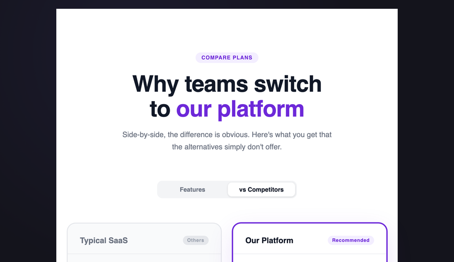
grid-template-columns: 1fr auto auto with semantic <dl> rows for accessibility. Pure CSS, no JS.How do I render a feature section with syntax-highlighted code preview without bundling Prism or Highlight.js?
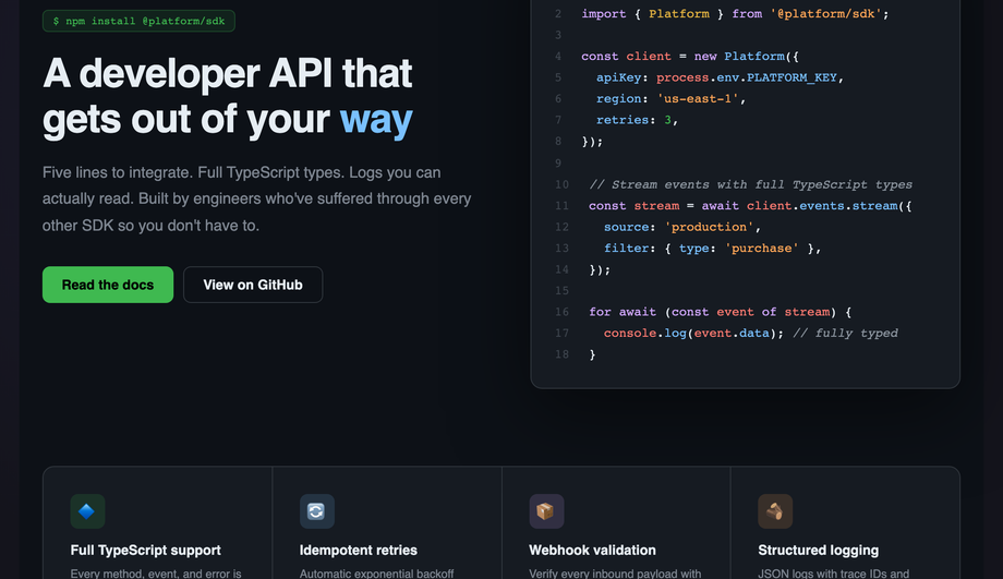
<span> colorization — no JS syntax highlighter required. The pattern: write the code as plain HTML, wrap each token in semantic spans (<span class="k">const</span> for keywords, .s for strings, .c for comments, .n for numbers, .f for function names), and style them in CSS with the GitHub Dark palette. Cost comparison: Prism.js ships 4-25kb depending on languages, runs JS to tokenize on every page load. Highlight.js is 30-50kb minified. Demo 05's approach: 0 JS bytes, no FOUC (no flash of unhighlighted code), works at build time. Trade-off: you write the markup manually instead of pasting raw code. For marketing-page code previews showing 10–20 lines of "how easy is our SDK" code, this is the right call. For developer documentation with hundreds of code blocks, use a build-time highlighter like Shiki (server-side, zero client JS) instead.How do I build a Linear-style product roadmap timeline as a CSS feature section?
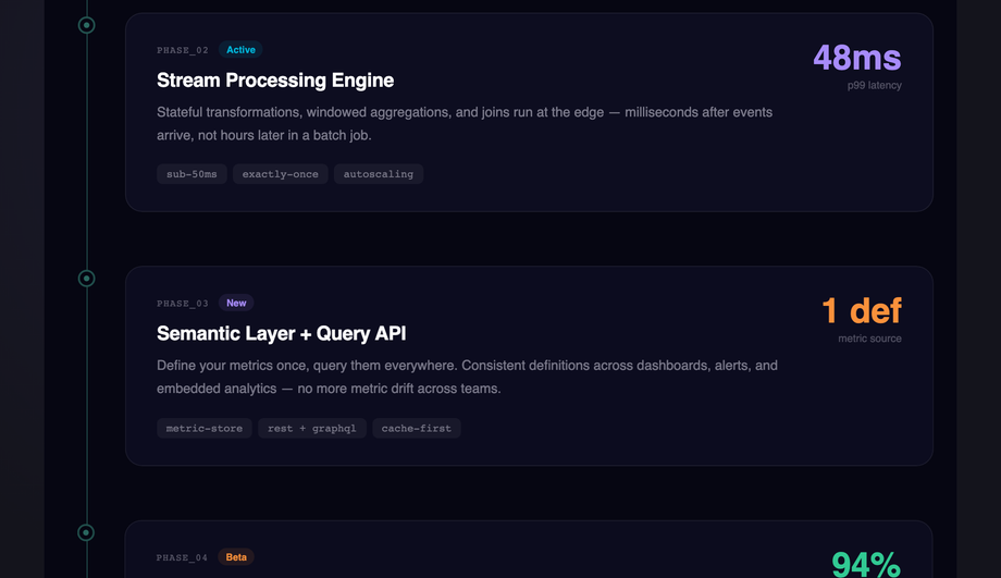
animation: travel 8s infinite sliding from top to bottom, giving the timeline a "living" feel without being distracting. (2) Per-phase staggered reveal via IntersectionObserver — cards fade in with a 100ms delay per index so they cascade as the visitor scrolls. (3) Status badge color semantics — green for Live, blue for Active, purple for New, amber for Beta, gray for Coming — visitors map the visual quickly because the convention matches Linear/GitHub/Notion. Best for: product roadmap pages, changelog pages, "what we shipped this quarter" announcements. Pairs naturally with Demo 06 (comparison table) on the same pricing/about page.Which feature section should I use for my project?
.fsNN__* class names so multiple can coexist on the same project without collision.Related collections

CSS Center a Div
The complete guide to centering a div in CSS in 2026 — covering all 5 production techniques with live interactive demos. <strong>Flexbox</strong> (the modern default, works for 95% of cases): <code>display: flex; align-items: center; justify-content: center</code> on the parent. <strong>CSS Grid</strong> (one-line shorthand): <code>display: grid; place-items: center</code>. <strong>Absolute positioning + transform</strong> (for overlays and modals): <code>position: absolute; top: 50%; left: 50%; transform: translate(-50%, -50%)</code>. <strong>Margin auto</strong> (for block elements with a known width): <code>margin: 0 auto</code> (horizontal only) or <code>margin: auto</code> with <code>position: absolute</code> + <code>inset: 0</code> (both axes). <strong>All methods side-by-side comparison</strong> — see every technique render the same content with visible axis crosshairs so you can see exactly where each method lands the element. All 5 demos are 100% pure CSS, MIT-licensed, copy-paste ready, with detailed explanations of which method to use when. Works in every modern browser (Chrome, Safari, Firefox, Edge), no JavaScript required.

15 CSS Flexbox Layouts
15 production-ready CSS flexbox layouts with live demos and copy-paste code — holy grail page shell, responsive card grid, sticky navbar, masonry-style columns, sidebar dashboard, product cards, pricing table, magazine article, sticky footer with min-block-size: 100dvh, centered hero, vertical timeline, chat interface, mosaic gallery, two-column form, and kanban board. Every demo is mobile-first, WCAG-friendly, and works without a build step.

15 CSS Footer Designs
15 hand-coded CSS footer designs — aurora-drift, newspaper masthead, mega multi-column, CTA stripe, trust badges, vinyl record, neon sign, FAQ drawer, language switcher, hover wave and more. Copy-paste ready.