20 hand-coded CSS blog layouts for magazine homepages, news sites, personal archives, newsletter back-issues, recipe and podcast blogs, and long-form journalism. Covers full page templates — magazine grids, sticky year separators, Medium-style 65ch readers, drop caps and floated pull quotes, dev tutorials with a sticky code panel, photo essays, and sticky related-story sidebars. 12 are pure CSS with no JavaScript. Scoped under .bl-NN for no-collision pasting, prefers-reduced-motion guarded, framework-agnostic.
Designing the whole screen, not just this section?
You just browsed 20 layouts. Untitled UI is the Figma UI kit 380,000+ designers use: 10,000+ components and 420+ ready page examples in Pro, with a matching React library on Tailwind CSS. Figma Pro is a one-time purchase from $129.
A full publication front page in one grid: an oversized lead story, a four-up secondary grid whose cards align to the pixel via subgrid, and an editor's picks rail that is a sticky column on the desktop and a scroll-snap strip on a phone. No JavaScript — the entire responsive behaviour is grid-template-areas plus one container query.
A dense, information-first news front page: a live breaking bar that scrolls headlines with a CSS-only marquee (pausable, reduced-motion safe, and not the deprecated <marquee>), a five-region grid with a lead story, a most-read column, and a two-row wire feed. Eight lines of JS keep the clock ticking — everything else is CSS.
The archive page a writer actually wants: every post since 2021 in one scannable column, grouped by year, with year labels that stick to the side of the viewport as you scroll past them. Pure CSS position:sticky — no scroll listeners, no IntersectionObserver, no library.
A newsletter archive that reads like a back catalogue: issue numbers in a mono gutter, an inline subscribe block that sits inside the list after the third issue (where conversion actually happens), free/paid badges driven by a data attribute, and a sort toggle that reverses the visual order with flex-direction instead of re-rendering the DOM.
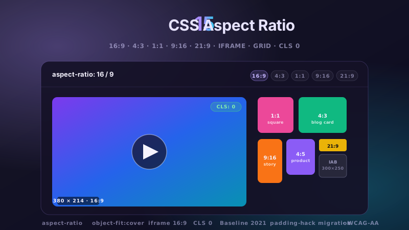
An image-first recipe index where nothing ever jumps: every photo is aspect-ratio-locked so the grid reserves its space before a single byte of image downloads. Prep-time and difficulty badges float over the image, the metadata strip aligns across all cards, and each card is a real link region — the whole card is clickable without nesting anchors or faking it with JavaScript.
A podcast index built for scanning: three-digit episode numbers in a mono gutter, a 44px play button that morphs to pause, duration and season chips, and a CSS-only waveform that animates only for the playing row. The waveform is 32 divs with a random --h — no canvas, no audio-analyser, no 40kb wave library.
Newsletter
Enjoying these demos? Get new ones by email.
A short email when a new collection ships. Unsubscribe any time.
The reading-progress bar without the scroll listener: animation-timeline: scroll() ties a scale-x animation directly to the document's scroll position, so it runs off the main thread and costs nothing. Wrapped around it, a proper long-form page — full-bleed hero, breakout figures, a sticky chapter rail and a 68ch measure.
Print typography, done properly on the web: a three-line drop cap using initial-letter with a hand-tuned ::first-letter fallback, pull quotes that float into the measure and let text wrap around them, small caps for the opening line, and hanging punctuation. Every effect is one CSS rule — no spans, no wrapper divs, no JS.
The reading layout that quietly beats every clever one: a single centered column measured in ch, line-height that scales with the measure, spacing set by the flow rather than per-element margins, and breakout media that escapes the column without a single negative margin. This is the baseline every article page should start from.
The layout every good tutorial converges on: steps scroll on the left, the code stays put on the right. Tabs between files are pure CSS (:checked + sibling selectors), line numbers are CSS counters, and the only JavaScript is a five-line clipboard copy. The sticky panel becomes a collapsible block on mobile instead of a squashed column.
A transcript that actually reads like one: questions in a condensed sans, answers in a serif at reading size, speaker avatars that stick beside their turn, and timestamps in the margin. Built on a <dl> — the semantically correct element for Q&A — with attribute-driven speakers so a three-way panel needs no new classes.
A case-study page that earns its claims: stat counters that count up on scroll using @property + a scroll-driven animation (yes, animated numbers with no JavaScript), a draggable before/after image comparison built on clip-path and a range input, and testimonials that don't look like a template.
The two-pane video page: a 16:9 player that never letterboxes, a description block with a real expand/collapse using <details>, and an up-next rail whose active row is driven by one data attribute. Selecting an episode swaps the poster, title and metadata in place — twelve lines of JavaScript, no framework, and the rail becomes a horizontal scroll-snap strip on mobile.
A visual story where the photographs run the page: edge-to-edge plates, a sticky-image chapter where text scrolls over a held frame, diptych pairs that share a caption, and captions set small and quiet in the margin. Chrome is deliberately almost absent — no sidebar, no share bar, no related rail, nothing competing with the image.
Newsletter
Enjoying these demos? Get new ones by email.
A short email when a new collection ships. Unsubscribe any time.
The workhorse news template: article body on the left at a strict measure, a related-stories rail on the right that sticks through the read, a key-points summary box at the top (the thing readers actually use), and an inline “read next” card that appears mid-article without breaking the column.
A three-column docs page done right: collapsible section nav on the left (native <details>, no JS), the article in the middle at a 72ch measure, an “on this page” rail on the right, and prev/next chapter cards at the foot that show where you are going, not just an arrow. Includes the details every docs site forgets — a version badge, a copy-anchor affordance on headings, and a note/warning callout system.
One card, engineered properly — because the card is the component you will paste into forty templates. Author row, reading time, tag chips, a bookmark toggle that works with zero JavaScript (a hidden checkbox), and a container query that re-lays the whole thing out based on the slot it lands in rather than the viewport. Drop it in a sidebar and it stacks; drop it in a main column and it goes horizontal.
A filter bar that survives real use: a search field with a clear button, a horizontally scrolling chip strip with scroll-snap and edge fade masks, live result counts, and an empty state. Filtering is fifteen lines of vanilla JS over the DOM, announced politely to screen readers — the accessibility half every filter UI skips.
The mid-article subscribe block that converts without wrecking the read: it breaks out wider than the measure using named grid lines (never negative margins), validates with :user-invalid so no error appears until you have actually finished typing, and shows a real success state driven by :valid — all without JavaScript.
A featured rail that is a scroller, not a carousel — native scrolling, native keyboard support, native momentum on touch, with scroll-snap-type: x mandatory doing the alignment. A scroll-driven progress bar tracks position in pure CSS, and the arrow buttons are eight lines of scrollBy for mouse users who want them.
FAQ
Frequently asked questions
What is the ideal line length and type scale for a blog layout?
The single highest-leverage decision in a blog layout is the measure — the width of the reading column. Aim for 60-75 characters per line, which in CSS is simply max-inline-size: 65ch. The ch unit is the width of the digit zero in the current font, so it tracks your typeface rather than guessing a pixel value. Below about 45 characters the eye returns too often and rhythm breaks; above roughly 85 it loses the start of the next line. Pair it with a line height around 1.6-1.7 for body copy, tightening toward 1.2 for large headings, since generous leading helps at small sizes and looks slack at display sizes. For fluid sizing use clamp() rather than breakpoint steps: font-size: clamp(1rem, 0.95rem + 0.25vw, 1.125rem) scales smoothly without a jump at an arbitrary width. Two finishing touches that cost one line each: text-wrap: balance on headings so a title never leaves one orphaned word on its own line, and text-wrap: pretty on paragraphs to prevent single-word last lines. Demo 09 is the reference reader layout.
How do I let images break out of the article column?
This is the layout problem every blog hits: the prose wants a narrow measure, but hero images and pull quotes want the full width. The clean modern answer is a named grid on the article with three column tracks — full-bleed, a wide breakout, and the content measure — using grid-template-columns: [full-start] minmax(1rem,1fr) [content-start] min(65ch, 100% - 2rem) [content-end] minmax(1rem,1fr) [full-end]. Every child defaults to the content column via grid-column: content, and anything that should escape simply says grid-column: full or grid-column: breakout. No negative margins, no calc(50% - 50vw) hacks, and nothing breaks when the container is not the viewport. The older negative-margin technique still appears in tutorials and it fails in two common cases: inside a container with padding, and when a scrollbar makes 100vw wider than the actual content box, producing horizontal overflow. If you need to support it anyway, overflow-x: clip on the wrapper contains the damage. Demos 07, 14 and 19 use the named-grid approach for full-bleed heroes, photo essays and inline newsletter callouts respectively.
How do I build a sticky sidebar that behaves correctly?
position: sticky fails silently more often than any other CSS layout property, and it is almost always one of three causes. First, the sticky element's parent must be taller than the element — sticky positions within its containing block, so if the sidebar's parent is exactly as tall as the sidebar there is nowhere to travel. In a grid this bites when align-items: stretch makes the sidebar column full-height; set align-self: start on it. Second, any ancestor with overflow: hidden, auto or scroll silently makes itself the scroll port and the sticky stops working — use overflow-x: clip instead when you only meant to kill horizontal scroll. Third, sticky needs a threshold: top: 0 alone is fine, but if you have a sticky site header, offset by its height with top: calc(var(--header-h) + 1rem) or the sidebar will slide underneath it. For a related-stories rail that is taller than the viewport, make the rail itself scrollable with max-height: calc(100vh - 2rem); overflow-y: auto. Demo 15 implements the full pattern.
What is the right HTML structure for a blog post?
Getting this right serves accessibility and SEO with the same markup, so it is worth doing once properly. The post is an <article>, and its heading is the page's single <h1>. Metadata goes in a <header> inside the article, with the publication date as a real <time datetime="2026-08-10"> so machines get an unambiguous value while humans read the formatted version. Section headings step down without skipping levels — an <h2> never jumps to <h4>, because screen reader users navigate by heading level and gaps read as missing content. Images that carry meaning use <figure> with <figcaption>, and decorative ones get an empty alt="" rather than being described. A related-posts rail is a <nav aria-label="Related stories">, not a bare div. Author details belong in the header near the byline rather than only in a footer bio. On the SEO side, this structure maps directly onto Article structured data — headline, datePublished, author, image — so you are not writing the same information twice in two formats.
How do I build a reading progress bar for a long article?
The modern approach needs no scroll listener at all. Scroll-driven animations bind a keyframe animation to scroll position: animation: grow linear both; animation-timeline: scroll(root block) with keyframes moving transform: scaleX(0) to scaleX(1). Because it runs off the main thread, the bar stays smooth even while JavaScript is busy. Scale rather than animating width — width triggers layout on every frame, transform does not. To track only the article rather than the whole page, give the article view-timeline-name: --article and point the bar at it, so progress starts at the first paragraph instead of the masthead. For browsers without scroll timelines, a rAF-throttled listener writing a single custom property is about fifteen lines and the visual CSS stays identical; gate it behind CSS.supports('animation-timeline', 'scroll()') so modern engines never run it. On accessibility: a progress bar that merely duplicates the scrollbar is decoration and should be aria-hidden; one that communicates something the scrollbar does not needs role="progressbar" with a live aria-valuenow. Demo 07 ships both paths.
Which blog layout fits which kind of publication?
Match the layout to how people actually arrive and what they do next. A magazine or news homepage with a dense grid works when you publish daily and readers browse — the grid signals volume and freshness, and the breaking-news bar earns its place only if it genuinely changes. A personal or dev blog is better served by a chronological archive with sticky year separators: low volume, high intent, and readers often want to see the whole body of work. Newsletter archives suit an issue-numbered list because subscribers think in issues, not dates, and an inline subscribe form converts best mid-list rather than in a modal. Recipe and photography blogs are image-first, so lock the aspect ratio and let the picture lead. Developer tutorials benefit from the two-column sticky code panel — readers scroll prose while the relevant code stays visible, which removes the constant scroll-back. Long-form journalism and case studies want the centred single-column reader with breakout images, because anything in the margins competes with a piece someone committed ten minutes to. The general rule: the more the reader has committed, the less chrome the layout should have.
Are these blog layouts accessible and fast?
Yes, and layout is where both are won or lost. Every template uses semantic sectioning — article, header, nav with a discernible label, figure and figcaption — so assistive technology gets structure rather than a soup of divs. Heading levels never skip. Every interactive control is a real button or a with a visible :focus-visible ring at 2px minimum and 3:1 contrast, and hit targets are at least 44 by 44 CSS pixels. All motion is guarded by prefers-reduced-motion: reduce. On performance, the layout choices matter more than any script: images carry explicit dimensions or a locked aspect-ratio so cumulative layout shift stays at zero, which is the single most common blog CLS failure. Fonts should use font-display: swap with a metric-compatible fallback so text is readable during load without reflowing. The sticky sidebars and progress bars animate compositor-only properties, never width or top. And because 12 of the 20 need no JavaScript at all, there is nothing to hydrate before a reader can start reading.
How do these port to Astro, Next.js, WordPress and Tailwind?
These are page layouts rather than components, so they usually become a layout file or template rather than a widget. In Astro — which is what this site runs on — a blog layout is a .astro file in src/layouts/ with a <slot /> where the content collection renders; the CSS drops in unchanged, and 12 of the 20 need no client directive at all because they ship no JavaScript. In Next.js App Router, the equivalent is layout.tsx for the shell plus a page component for the article body; only the reading progress, filter bar and a few interactive demos need 'use client'. For WordPress, the markup maps onto single.php and archive.php, or a block theme's templates/single.html; the scoped class names avoid collisions with whatever the parent theme already ships, which is the usual pain there. Ghost and Hugo follow the same shape with their own template syntax. For Tailwind v4, the grid track definitions and the named breakout columns are worth keeping as plain CSS in a @layer rather than translating to utilities — a grid-template-columns with named lines is far more readable as CSS than as an arbitrary-value class.