12 CSS Full Page Sections

12 hand-coded full-page scroll sections for product tours, portfolios, and one-page marketing sites. Covers native scroll-snap-type panels that replace fullpage.js with no JavaScript, scroll-snap-stop to stop fast flicks skipping sections, sticky stacking panels, scroll-driven parallax, and horizontal full-screen sliders. Panels use 100dvh so the mobile address bar never jumps the layout. Scoped under .fps-NN for no-collision pasting, prefers-reduced-motion guarded, framework-agnostic.

10 pure CSS2 light JSPublished

Related20 CSS Diagonal Sections31 CSS Hero Sections18 CSS Scroll Progress Bar22 CSS Parallax Effects

CSS Scroll Snap Full Viewport Sections with 100dvh — preview
01 / 12Pure CSS

CSS Scroll Snap Full Viewport Sections with 100dvh

The reference build for the whole collection: four snapping full-viewport panels sized with 100dvh, plus a fourth panel deliberately built on 100vh so you can see the mobile bug it causes. A side-by-side device diagram shows exactly what the collapsing address bar does to vh, and a unit table settles dvh vs svh vs lvh once and for all.

Published

CSS Full Page Scroll Snap Without JavaScript — preview
02 / 12Pure CSS

CSS Full Page Scroll Snap Without JavaScript

The library replacement: a four-section one-page scroller built from three CSS declarations and nothing else — no fullpage.js, no observers, no 60 kB of script. A side rail of anchor links jumps between sections using native scroll-behavior, and an honest trade-off panel lists exactly which library features you give up.

Published

CSS Scroll Snap Stop to Prevent Skipping Sections — preview
03 / 12Pure CSS

CSS Scroll Snap Stop to Prevent Skipping Sections

Two live scrollers side by side, identical except for one declaration. Flick the left one hard and it flies past two panels; flick the right one and scroll-snap-stop: always catches it at the very next panel. Only a handful of production sites use this property — this demo shows what it fixes, and the one case where it hurts.

Published

CSS Sticky Stacking Panels on Scroll — preview
04 / 12Pure CSS

CSS Sticky Stacking Panels on Scroll

Five full-height panels that pin at the top and stack over one another like a deck of sheets — each one parking 1.4 rem lower than the last so every previous panel keeps a visible tab. Built from position: sticky and a per-panel index variable, with no JavaScript and no scroll listeners, and it degrades to a plain scroller wherever sticky is unavailable.

Published

CSS Full Page Sections with Sticky Dot Navigation — preview
05 / 12Pure CSS

CSS Full Page Sections with Sticky Dot Navigation

Six full-viewport panels with a fixed dot rail down the right edge. Every dot is a real anchor with a label, so it is keyboard reachable and screen-reader announced — and the active dot grows and fills as its panel passes, driven by view-timeline-name plus timeline-scope rather than a scroll listener. Where scroll-driven animation is missing, :target keeps the active state working.

Published

CSS Scroll Spy Active Link State Without JavaScript — preview
06 / 12Light JS

CSS Scroll Spy Active Link State Without JavaScript

A docs-style top nav whose active link lights up as each full-viewport section passes — the lozenge behind the word fills and the label goes solid, driven entirely by view-timeline-name and timeline-scope. A ten-line IntersectionObserver runs only to keep aria-current truthful, and doubles as the visual fallback where scroll-driven CSS is missing.

Published

CSS Scroll Driven Section Parallax Backgrounds — preview
07 / 12Pure CSS

CSS Scroll Driven Section Parallax Backgrounds

Four full-viewport panels where the photograph, a colour wash and the headline each travel at a different rate as the panel crosses the scrollport — real depth from animation-timeline: view(), no scroll listener and no background-attachment: fixed (which simply does not work on iOS). Under prefers-reduced-motion every layer locks into place.

Published

CSS Full Page Section Reveal and Scale Effect — preview
08 / 12Pure CSS

CSS Full Page Section Reveal and Scale Effect

Each incoming panel rises from scale(.92) and 30% opacity to full size exactly as it snaps into place, then recedes the same way on the way out — a single scroll-driven keyframe set doing both halves of the transition. Only scale and opacity animate, so the whole effect runs on the compositor at 60fps.

Published

CSS Full Page SaaS Product Feature Showcase — preview
09 / 12Pure CSS

CSS Full Page SaaS Product Feature Showcase

The applied template: five full-viewport panels — hero, two feature panels with real interface mock-ups, a metrics panel and a closing call to action — for a release-orchestration product called Cadence. Pure CSS, inline SVG icons, no images to wait on, and copy you can swap for your own product in one pass.

Published

CSS Full Screen Portfolio Gallery Scroll Sections — preview
10 / 12Pure CSS

CSS Full Screen Portfolio Gallery Scroll Sections

Five full-viewport panels, one project each: a full-bleed photograph, a serif project title, and a role / year / discipline line set in monospace. object-fit: cover keeps every image undistorted at any aspect ratio, and the next panel's rounded top edge always shows so the reader knows there is more work below.

Published

CSS Horizontal Scroll Snap Full Screen Panels — preview
11 / 12Pure CSS

CSS Horizontal Scroll Snap Full Screen Panels

Five full-viewport panels that scroll sideways with scroll-snap-type: x mandatory — and flip to a vertical stack under 48 rem, because horizontal scrolling on a phone is hostile. Chapter anchors, a visible next-panel edge, keyboard arrow support from the native scrollport, and no JavaScript at all.

Published

CSS Accessible Scroll Snap with Keyboard Navigation — preview
12 / 12Light JS

CSS Accessible Scroll Snap with Keyboard Navigation

The panel that makes the pattern shippable: proximity snapping so nothing traps a keyboard user, arrow / Page Up / Page Down / Home / End navigation that also moves focus, a skip link past the whole scroller, one labelled <section> per panel, a polite live region announcing position, and prefers-reduced-motion turning snapping and smooth scrolling off entirely.

Published

FAQ

Frequently asked questions

How do I build full page scroll sections in CSS?
Three declarations carry the whole pattern. The scroll container gets scroll-snap-type: y mandatory, each panel gets scroll-snap-align: start, and each panel is min-height: 100dvh so it fills the viewport. That is the entire mechanism — no library, no JavaScript, no scroll hijacking. The detail that trips people up is which element is the scroll container. If the page itself scrolls, put the snap properties on html; if a wrapper scrolls, that wrapper needs overflow-y: auto and a bounded height, or it never becomes a container at all and the snap properties do nothing. Every demo here uses an inner scroller with overflow-y: auto; height: 100dvh, which is also what makes them work inside an embedded preview. Use min-height rather than height on panels so content taller than the viewport can still grow instead of being clipped.
Why does my full page section jump on mobile Safari?
Because 100vh on iOS means the viewport with the address bar hidden, not the viewport you are actually looking at. On load the bar is visible, so a 100vh panel is taller than the visible area and its bottom is cut off; as you scroll the bar collapses, the viewport grows, and everything jumps. The fix is 100dvh — the dynamic viewport height, which tracks the visible area as browser chrome appears and disappears. There are three related units worth knowing: svh is the smallest viewport (chrome visible), lvh is the largest (chrome hidden), and dvh moves between them. For snapping panels dvh is almost always what you want, since the panel should match whatever the user can see right now. A common belt-and-braces pattern is min-height: 100vh; min-height: 100dvh; so older browsers get the legacy value and modern ones override it.
How do I stop scroll snap from skipping sections?
Add scroll-snap-stop: always to each panel. By default a fast flick or a hard trackpad swipe can carry the scroll past several snap points before it settles, so a user aiming for section two lands on section four and misses your content entirely. scroll-snap-stop: always forces the scroll to come to rest on every snap point it passes, one panel per gesture, which is what people expect from a full-page scroller. It goes on the children, not the container — putting it on the scroller does nothing. Support is good across evergreen browsers and it degrades harmlessly: where it is unsupported you simply get the default skipping behaviour, so no fallback is needed. Use it deliberately, though. On a long list it makes scrolling feel laborious, since the user must gesture once per item. It suits a handful of full-page panels, not a fifty-item feed.
Should I use scroll-snap-type mandatory or proximity?
mandatory always snaps to the nearest point, so the scroll can never rest between panels. proximity only snaps when the scroll ends near a point, leaving the user free to stop anywhere. For a clean full-page scroller mandatory is the right default: it is the whole reason the layout feels deliberate. There are two cases where it actively hurts. First, when a panel is taller than the viewport — mandatory snapping can fight the user trying to read the overflow, and in the worst case makes content unreachable. Second, sticky stacking effects, where mandatory snapping competes with the pinning and produces a visible stutter. Both demos here that use sticky stacking or prioritise keyboard access deliberately use proximity. The rule of thumb: if every panel fits the viewport exactly, use mandatory; if any panel might overflow, use proximity and let the user drive.
Is scroll snap accessible?
It can be, but it is one of the easier patterns to get wrong. The main hazard is keyboard users: if focus moves to an element inside a panel while mandatory snapping is active, the browser can fight the focus scroll and effectively trap someone mid-panel. Keep every panel a real section with its own heading and make sure Tab order follows visual order, so keyboard navigation moves through panels naturally. Arrow keys, Page Up and Page Down should all work — they do by default on a native scroll container, and they break the moment you hijack scrolling with JavaScript, which is a good reason not to. The second requirement is motion. Snapping plus scroll-behavior: smooth is exactly the sort of movement that triggers vestibular symptoms, so both should be switched off entirely inside @media (prefers-reduced-motion: reduce). Every demo here does that, and the result is an ordinary scrolling page rather than a degraded one.
How is this different from fullpage.js?
fullpage.js predates native scroll snapping and solved the problem with JavaScript, listening for wheel and touch events and animating the scroll position itself. That works, but it hijacks scrolling: momentum feels wrong, keyboard and screen-reader behaviour has to be re-implemented, and you carry roughly 20KB before writing any of your own code. Native scroll-snap-type does the same job in three declarations with no script, and because the browser is still doing the scrolling, momentum, keyboard keys, find-in-page and accessibility all keep working for free. What you give up is the programmatic API — there is no moveTo(3) method, no per-section callbacks, no built-in continuous-loop mode. If you need to drive the scroller from application code, one line of element.scrollIntoView() covers most of it. For the common marketing or portfolio case, the native approach is smaller, faster and more robust.
Why is my scroll snap not working?
Almost always one of four things. First, the snap container is not actually a scroll container — scroll-snap-type only takes effect on an element that scrolls, which means it needs overflow: auto or scroll plus a constrained height. A div that grows with its content never scrolls and never snaps. Second, the alignment is on the wrong element: scroll-snap-align belongs on the children, not the container. Third, the children are not direct children — snap alignment only applies to the container's own children, so an extra wrapper in between silently breaks it. Fourth, an ancestor has overflow: hidden, which can make the intended container inert. One more that catches people out: if you set snapping on html but a wrapper element is actually doing the scrolling, the properties apply to something that never moves. Check in DevTools which element has a scrollbar before debugging anything else.
How do these port to React, Vue, Svelte and Tailwind?
The CSS ports unchanged — every .fps-NN selector and custom property is framework-agnostic, and 10 of the 12 designs need no JavaScript at all. The natural component boundary is a Scroller wrapper that owns overflow-y, height and scroll-snap-type, plus a Panel child that owns min-height: 100dvh and scroll-snap-align. Consumers then compose panels freely without touching the mechanism. Watch one framework-specific trap: in single-page apps a route change often needs the scroller reset to the top, and because the scroll container is your wrapper rather than the window, window.scrollTo(0, 0) does nothing — you need a ref to the scroller element. For Tailwind the properties map directly to snap-y, snap-mandatory, snap-start and h-dvh, all first-class utilities, so this pattern is one of the cleanest to express in utility classes.

Related collections

15 CSS Aspect Ratio Demos preview

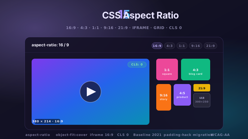
15 CSS Aspect Ratio Demos

15 hand-coded CSS aspect-ratio demos for video embeds, product galleries, IAB ad slots, native dialogs, and CLS-safe placeholders: 16:9 iframe YouTube embed with click-to-load facade + up-next rail, 21:9 full-screen hero video with min-height/max-height:100svh guardrails + Ken Burns drift, 1:1 Instagram-style square grid with 2×2 feature tile, 4:3 magazine card image cover, 9:16 vertical stories rail (TikTok/Reels/Shorts pattern) with scroll-snap + segment bars, 4:5 apparel product image gallery with radio-driven state + 1:1 thumbnails, 1:1 zoom thumbnail carousel with pointer-tracked --zx/--zy magnifier, prevent-layout-shift placeholder with live PerformanceObserver CLS meter (before/after side-by-side lab), dynamic content fallback with three policies (bend/strict/auto) via :has() toggle, IAB ad banner slots (728×90 leaderboard, 300×250 medium rectangle, 300×600 half-page, 320×50 mobile) with skeletons + container-query mobile swap, responsive modal dialog sized min(92vw, 88svh×16/9, 1080px) with @starting-style animation, responsive OpenStreetMap iframe wrapper with 16:9 → 1:1 container-query narrow swap, media query orientation live HUD + resize:both container-ratio playground, object-fit logo cloud with contain/cover/fill switcher via :has(), and side-by-side padding-top hack (height:0 + padding-top:56.25%) → modern aspect-ratio migration comparison with live ratio picker. 11 truly Pure CSS + 4 with a tiny optional vanilla JS snippet (facade swap, pointer magnifier, CLS meter, native dialog). Every demo is scoped under a unique .car-NN prefix so it drops into any project without CSS collisions, ships prefers-reduced-motion guards, and is framework-agnostic (works as-is in React, Vue, Svelte, Astro, Next.js, Remix, or plain HTML).

6 CSS Bento Grid Layouts preview

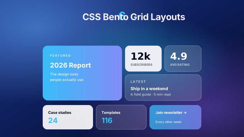
6 CSS Bento Grid Layouts

6 production CSS bento grid layouts with 12 hand-coded designs — Apple-style product showcase, SaaS feature value-prop matrix, analytics dashboard overview, creative portfolio, e-commerce category hub, and link-in-bio social hub. Each topic ships 2 sub-variants side-by-side so visitors see both a keynote aesthetic and a paper-doc variant at once. Container queries, CSS Grid, zero dependencies, copy-paste ready.

20 CSS Blog Layouts preview

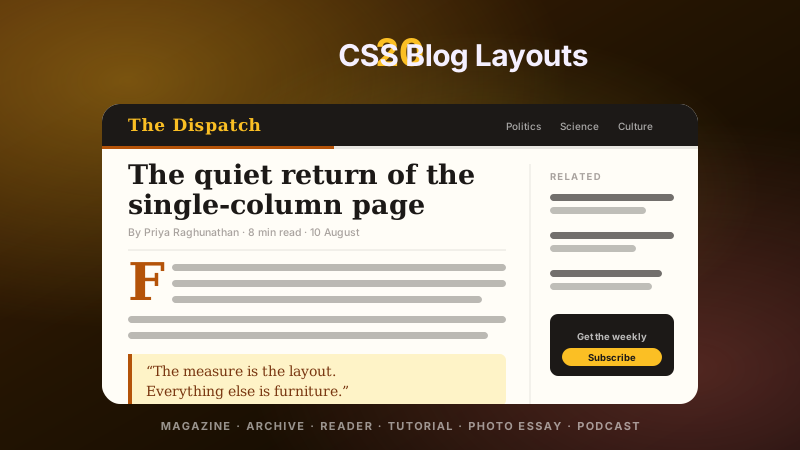
20 CSS Blog Layouts

20 hand-coded CSS blog and editorial layouts for magazine homepages, news sites, personal archives, newsletter back-issues, recipe and podcast blogs, developer tutorials, and long-form journalism. Covers a magazine homepage with hero plus editor-picks rail, a news homepage with breaking-news ticker, blog archives with sticky year separators, Substack-style issue-numbered archives, recipe card grids with prep-time badges, podcast episode lists with waveforms, long-form articles with scroll-driven reading progress, drop caps and floated pull quotes via first-letter, Medium-style 65ch centred reader layouts, dev tutorials with a sticky code panel beside prose, interview transcripts with alternating speakers, case-study pages with stat counters, video blogs with an episode rail, full-bleed photo essays, news articles with sticky related-stories sidebars, documentation pages with prev/next chapter nav, a standalone blog post card, a scroll-snap category filter bar, an inline newsletter callout that breaks out of the prose column, and a horizontal featured-post rail. 12 are pure CSS with zero JavaScript. Every layout is scoped under a .bl-NN prefix for no-collision pasting, guards prefers-reduced-motion, and ports unchanged to React, Vue, Svelte, Astro, Next.js and Tailwind.

Search CodeFronts

Loading…