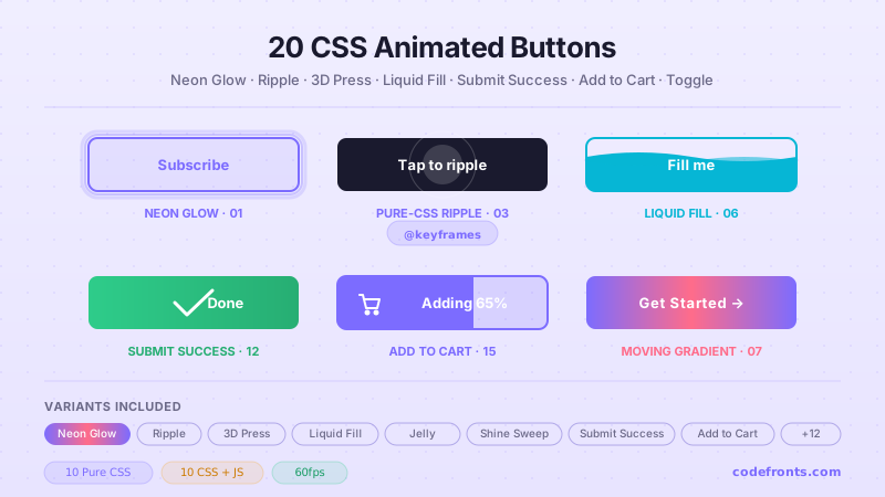
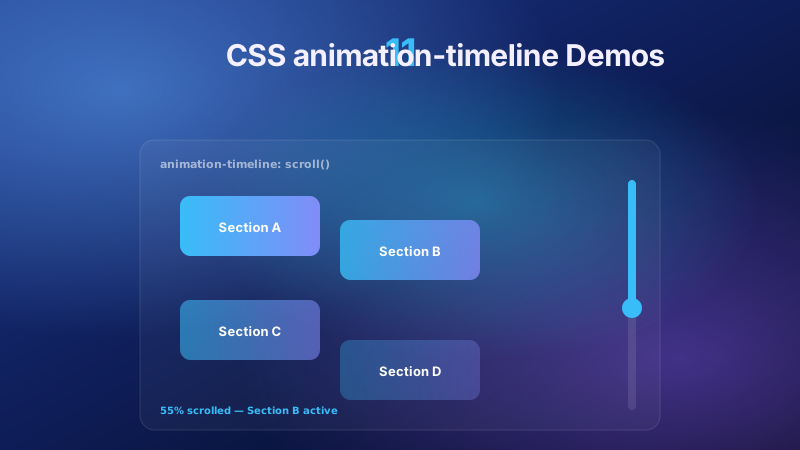
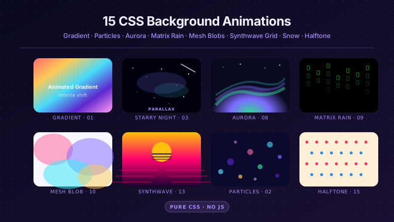
30 hand-coded CSS shake animation topics, each shipping 2–3 side-by-side variants so you can pick the exact treatment for your surface — form-error recoils, login box shakes, button attention wiggles, notification bell rings, cart wiggles, icon micro-interactions, elastic springs, 3D judders, and hit-damage / screen shakes for browser games. Every form demo pairs motion with color + border + aria-invalid so the state reads without motion perception. Scoped under .shk-NN for no-collision pasting, prefers-reduced-motion guarded, framework-agnostic.
Want to build production-ready CSS layouts, animations and UI from scratch?
You just browsed 30 shake animations. Learn the Flexbox, Grid and animation thinking behind them, so the next component starts in your head, not in a copy-paste.
The definitive invalid-input shake, three ways: a zero-JavaScript version driven entirely by the :user-invalid pseudo-class, a re-triggerable JavaScript pattern with proper ARIA wiring, and a playful shake-no / nod-yes field that answers invalid AND valid input with motion.
Two ways to shake an entire form on a failed submit: the production JavaScript pattern (intercept submit, shake the card, announce the error politely, settle into a success state when fixed) and a zero-JS fallback where fieldset:has(:user-invalid) recoils the moment the browser flags any field.
The two password shakes every product ends up needing: a desktop unlock screen whose field recoils on a wrong password (with a caps-lock warning, because that's why half of all passwords fail), and a mobile-style 4-digit PIN pad whose dots rattle and flush red before clearing for another try.
Two 'wrong value' flavors that go beyond format validation: a promo-code field that shakes when the code exists in the wrong universe (with a working demo code), and a pure-CSS quantity stepper that rattles via :out-of-range the instant the number leaves its min/max window.
The keyframes themselves, put under glass: an anatomy specimen that replays the classic decaying shake on a loop next to its actual keyframe table, and an amplitude scale where the same input box shakes at 2px, 6px and 12px so you can pick a violence level by feel instead of by guessing.
Shaking the message instead of the box: an inline field error that drops in and rattles exactly once as it lands (so the eye snaps to the words), and a full 'ACCESS DENIED' terminal stamp with a per-word tremble that intensifies on hover.
Newsletter
Enjoying these demos? Get new ones by email.
A short email when a new collection ships. Unsubscribe any time.
Validation failure as choreography: a checkout form that shakes only its invalid fields — staggered 70ms apart so the eye is led down the fixlist in order — and a pure-CSS counterpart where the submit button itself wobbles and refuses while the form still contains an invalid field.
The classic, done properly twice: a dark glassmorphism login whose card recoils with translate + rotate on wrong credentials (plus a lockout counter that escalates the copy), and a minimal light version that needs zero JavaScript — the card shakes via form:has(:user-invalid) the moment either field goes bad.
Hover-shake with two opposite intents: an eager gift-claim CTA that wiggles happily for as long as you hover (rotation, soft, inviting), and a destructive 'Delete forever' button that buzzes with a hard steps() vibration — the same trigger reading as 'yes please' in one and 'are you sure?' in the other.
Click-shake both ways: a pure-CSS :active vibration you feel for exactly as long as the button is held (zero JS, zero cleanup), and the production JavaScript pattern — every click replays a decaying shake via the animationend cleanup, with a live counter proving that attempt #14 shakes exactly like attempt #1.
The keyframe cookbook: four buttons carrying the four base shakes (horizontal, vertical, rotate, chaos) with their frame tables on the card, and a tunable specimen where amplitude and speed are CSS custom properties you flip live — one @keyframes rule, infinite variants.
Attention shakes that convert without harassing: a product card whose Buy Now wiggles for half a second every four seconds (the idle-loop trick — one animation, mostly silence), and a flash-sale bar where the CTA pairs its shake with a shine sweep and a live countdown so urgency has a reason.
The quiet end of the spectrum: filter chips with a 1px micro-jitter that makes them feel alive under the cursor, and an icon dock whose tools tilt ±2° with a soft lift — both calibrated so users register 'responsive', not 'animation'.
The disabled-button problem solved twice: a pure-CSS version where hovering the wrapper makes the dead button shake its head and float its reason ('accept the terms first'), and the full JavaScript pattern that catches clicks on a wrapper — because disabled buttons swallow their own click events — then shakes, explains, and unlocks live when the checklist completes.
Newsletter
Enjoying these demos? Get new ones by email.
A short email when a new collection ships. Unsubscribe any time.
A bell that actually rings, not a div that rotates: the swing pivots from the mount point (transform-origin at the top), decays like real physics, and repeats politely every few seconds while the badge pings — plus a hover variant where the clapper counter-swings against the shell for a two-part mechanical ring.
Add-to-cart with mass: a shop row where every add makes the cart wiggle and its badge bounce up a number, and a 'catch' variant where a dot physically arcs from the button into the cart — which squashes on impact and wiggles it off. The item's arrival is the animation; no toast needed.
A padlock with opinions: poke the vault lock and it shakes the attempt off (shackle rattling harder than the body, like metal on metal), flip the access toggle and the shackle swings open with a gold glow — plus a pure-CSS paywall card whose corner lock wiggles a polite 'members only' on hover.
Card-scale shake in two temperaments: a polaroid that jiggles like it was just picked off a desk (rotation around its center, shadow deepening as it lifts), and a glass feature tile that shivers in 3D — rotateY jitter inside a perspective parent with a specular highlight racing across on the same clock.
Badges that refuse to be ignored: a sidebar rail whose alert count rattles on a polite schedule (with a ping halo, while read items sit still), and a CI status pill that keeps twitching until you actually click resolve — state-bound motion that stops the moment the state does.
A heart with a pulse: the like button idles on a double-beat (lub-dub, like a real heartbeat), shakes eagerly when hovered, and on click bursts — scale pop, particle ring, count bump — then rests filled. Plus a pure-CSS 'save' pill where pulse and shake chain on hover alone.
The hungriest trash can on the web: drag a file chip over the drop zone and the lid swings open while the can rattles in anticipation; drop, and the chip is swallowed with a gulp squash. Plus a list variant where hovering a row's delete button flaps the lid — a one-hover preview of what the click will do.
The X-axis shake as a wall chart: a large specimen looping the canonical decaying keyframes above a live amplitude graph (each bar = one keyframe's offset, drawn in CSS), and a side-by-side of the two horizontal personalities — eased decay ('human') versus steps() buzz ('machine') — so you can feel why easing choice matters more than pixel values.
Newsletter
Enjoying these demos? Get new ones by email.
A short email when a new collection ships. Unsubscribe any time.
The vertical axis has different physics: a jackhammer specimen that hammers downward with asymmetric frames (fast down, slow up — impacts are one-sided), and a landing thud where a dropped card hits, compresses, and rings out a decaying vertical shudder with a dust-line flash.
Skew is the shake that deforms: a jelly sticker that wobbles like gelatin when hovered (skewX oscillating around a bottom anchor), and a racing 'speed shiver' banner where a hard forward lean plus micro-skew jitter makes a static element look like it's doing 200km/h.
Controlled violence: a hazard console whose panel shakes at full amplitude (±12px, ±3°, steps(2), high frequency) behind an arm/disarm switch — because aggressive motion must always be startable and stoppable — and a containment-breach alert that escalates through three intensity stages the longer it goes unacknowledged.
Shake as atmosphere: a handheld-camera badge that drifts ±1px on a slow irregular loop (the motion you sense rather than see), and a lounge of cards trembling at different phases and periods — nth-child desync that makes a whole layout feel alive without a single synchronized frame.
Elasticity two ways: a card you 'pull and release' whose snap-back rides the modern linear() spring curve (one keyframe pair, the easing does ALL the physics), and a rubber-band pill that stretches on hover and twangs back with chained overshoot keyframes for browsers where you want full control of every bounce.
The Z-axis joins the shake: a holo boarding pass whose layers sit at real translateZ depths inside a perspective camera — jitter the card and parallax happens for free — and a coin that wobbles on rotate3d like it was dropped on a table, settling from wild precession to flat.
Game feel in the DOM: a battle card that takes hits — knockback shake away from the blow, floating damage numbers, white hit-flash, HP draining to a knockout tilt — and a combo trainer where rapid hits scale the shake's amplitude through a CSS custom property, so the tenth hit rattles harder than the first.
Full-screen impact, engineered safely: a detonation stage where the entire scene shakes on multi-axis keyframes with a flash and vignette pulse (shaking a wrapper div, never body), and a rumble lab with a live intensity slider — @property-registered custom properties driving amplitude and rotation so you can dial the earthquake from 0 to 10.
FAQ
Frequently asked questions
What is a CSS shake animation and what is the canonical recipe?
A CSS shake animation is a short, rapid horizontal (or occasionally vertical / skew / 3D) oscillation of an element's transform — used almost exclusively as a micro-interaction to signal state change: form validation failure, wrong password, button attention pull, notification arrival, cart item added, incoming hit / damage in a browser game, or a full-viewport screen shake for a big narrative moment. It's distinct from bounce (a vertical elastic drop / settle), glitch (a RGB channel-split chromatic aberration), wobble (a slower rotational sway), and pulse (a scale-based attention loop). The canonical recipe in 20 lines: @keyframes shake { 10%, 90% { transform: translateX(-1px); } 20%, 80% { transform: translateX(2px); } 30%, 50%, 70% { transform: translateX(-4px); } 40%, 60% { transform: translateX(4px); } } paired with .shake { animation: shake 0.5s cubic-bezier(.36,.07,.19,.97) both; transform: translate3d(0, 0, 0); backface-visibility: hidden; perspective: 1000px; }. The critical details most tutorials get wrong: (1) animate transform only — NEVER margin / left / right, those trigger layout thrash and scrollbars dance during the shake; (2) use asymmetric offsets (10%/20%/30% etc.) rather than a plain sine wave — real shakes decay, they don't cycle; (3) force GPU compositor promotion with translate3d(0,0,0) + backface-visibility: hidden so the animation runs on the compositor thread (zero INP hit); (4) animation-fill-mode: both so the element returns to its rest position cleanly after the shake; (5) wrap in @media (prefers-reduced-motion: reduce) { animation: none; } — non-optional per WCAG 2.3.3. This collection ships 30 topics × 2–3 variants each covering every canonical use case: invalid-input error shakes, form-submit failure recoils, password wrong-attempt shakes, hover attention wiggles, notification bell rings, cart wiggles, icon micro-interactions, and gaming screen shakes.
Which shake animation should I pick for my use case?
Decision rule by intent. Form field validation errors (invalid email, wrong password, missing required field): topics 01–07 — the classic translateX shake paired with a red border + inline error message (never just the shake — WCAG 1.4.1 Use of Color forbids relying on motion alone). Login box wrong-password recoil: topic 08 — same technique scoped to the whole card, not just the input, so the visual weight matches the emotional weight of a failed auth. Button hover attention pull (CTAs, sale banners, limited-time offers): topics 09–13 — subtle 2–3px shakes triggered on :hover, always paired with a color/scale change so touch users still get feedback. Buy-now / add-to-cart CTA: topic 12 — the retail attention-shake used by Amazon / Shopify / Etsy default themes to break tunnel vision on a static product page. Disabled state feedback: topic 14 — a soft shake when a user clicks a disabled button, communicating "this is intentionally blocked" better than a static grey pill. Notification bell arriving: topic 15 — the SaaS / Slack / Discord / GitHub pattern where a bell wiggles when a new notification lands, drawing eye to the badge count. Shopping cart add-to-cart: topic 16 — the e-commerce affordance that confirms the item was added AND says "go check your cart." Lock icon wrong password: topic 17 — a small icon shake in the auth field, complements the form shake above. Alert badge / notification count: topic 19 — periodic gentle shake to draw attention without spamming motion. Heart / like button: topic 20 — the Instagram / Twitter / TikTok double-tap shake-and-pulse combo. Trash icon drag-over: topic 21 — the drag-and-drop trash affordance shake, signalling the drop target is active. Continuous gentle wiggle: topic 26 — decorative onboarding pointers, notification-empty state loading, error-empty state. Elastic spring shake: topic 27 — modern linear() spring easing (Chrome 113+, Safari 17.2+, Firefox 112+) for the newest tier of natural motion. Web game hit damage: topics 29–30 — HTML5 game UI-layer damage cues (health bar hit, boss attack), works alongside canvas / WebGL for the actual gameplay. Rule of thumb: always pair shake with a non-motion cue — color, border, icon, text — so the state reads without motion perception (see the accessibility FAQ below).
How do I re-trigger a CSS shake animation on repeated invalid submissions?
This is the single most-common CSS shake bug: a user submits an invalid form, sees the shake, corrects nothing, submits again — and the shake doesn't fire the second time. Reason: CSS treats the animation as already-applied; adding the same class twice in a row doesn't restart it. Three approaches, ranked from correct to deprecated. 1. animationend cleanup (recommended): on invalid submit, add the .shake class → let it play → in the animationend event listener, remove the class. On next invalid submit, add the class again → animation fires cleanly. Code: function shakeIt(el) { if (el.classList.contains('shake')) return; el.classList.add('shake'); el.addEventListener('animationend', () => el.classList.remove('shake'), { once: true }); }. The { once: true } auto-cleans the listener; the initial guard prevents re-adds mid-shake. This is what every demo in topics 01–08 uses. 2. Modern :user-invalid pseudo-class (Chrome 119+, Safari 17+, Firefox 88+): CSS can now trigger the shake purely on the browser's native validation state — input:user-invalid { animation: shake 0.5s both; }. Each time the browser flips :user-invalid from off → on (i.e., the user tries to submit and validation fails), the animation replays automatically. Zero JavaScript. Fallback to approach 1 for older browsers via @supports (selector(:user-invalid)). 3. The void-offsetWidth reflow hack (DEPRECATED — do not use): el.classList.remove('shake'); void el.offsetWidth; el.classList.add('shake');. The void el.offsetWidth forces a synchronous layout reflow, which resets the animation state. It works, but it's a 10–30ms main-thread block per shake — measurable INP hit, especially on mid-tier Android. Every 2019-era tutorial recommends this pattern; it's since been superseded by animationend cleanup (no reflow, no INP cost) and :user-invalid (no JS at all). Bonus gotcha: if your form uses React / Vue / Svelte, the framework may batch state updates and skip the class-toggle. Add the class via a ref imperatively OR use flushSync (React 18+) to force the intermediate render.
Are CSS shake animations accessible? What about WCAG 2.3.3, prefers-reduced-motion, and vestibular disorders?
Shake animations are one of the highest-risk motion patterns for accessibility. Four concerns matter. 1. Vestibular disorders (35% of adults): WebAIM's most-cited statistic — approximately 35% of adults have some form of motion sensitivity (vestibular disorders like Ménière's disease and BPPV, migraine triggers, ADHD visual-processing differences, PTSD-related photosensitivity, cyclical vertigo). Rapid horizontal shakes are one of the strongest triggers — they simulate the exact sensation vestibular sufferers experience during a vertigo episode. WCAG 2.3.3 Success Criterion (Animation from Interactions) explicitly requires that non-essential animation be disabled when prefers-reduced-motion: reduce is set. Every demo in this collection ships@media (prefers-reduced-motion: reduce) { .shake { animation: none; } } AND a non-motion fallback — a solid red border + inline error message so the state still reads. 2. Motion is never the sole signal (WCAG 1.4.1 Use of Color, applied to motion): a form field shake alone is not a valid error indication. The user with reduced motion disabled sees nothing. Every demo pairs the shake with (a) a color change (usually red-500), (b) a border-style change (dashed or thicker), (c) an inline text error (aria-live="polite" region), AND (d) the aria-invalid="true" attribute for screen readers. Removing any one weakens the accessibility signal. 3. Semantic HTML for form validation: use <form novalidate> so you can control validation timing (the browser's default HTML5 validation is jarring and hard to style). Every input has required / type="email" etc. so :user-invalid and aria-invalid work. Error text sits in an aria-live="polite" region below the field so screen readers announce it without interrupting the user mid-typing. 4. Regulatory frameworks: US ADA + Section 508 + EU EAA (enforcement began June 2025) + Canada ACA + UK Equality Act 2010 + Australian DDA all require WCAG 2.2 AA compliance for public-facing digital products. Lawsuits under all six have specifically cited animations that didn't honour prefers-reduced-motion. Domino's Pizza (2019, US Supreme Court denied cert) and Beyoncé.com (2019) both involved this exact issue. Test in browser: Chrome DevTools > Rendering panel > "Emulate CSS media feature prefers-reduced-motion" > reduce. Then submit every form on the page — the shake should NOT fire, but the error state should still communicate.
CSS shake vs Animate.css .shake vs Framer Motion / GSAP / anime.js — how do they compare?
Animate.css (~70KB minified, ~200K weekly downloads): the OG animation library. Its .shake class matches roughly what this collection ships as topic 01, but the whole library ships together — you can't tree-shake a single animation. If you only need shake, this collection's ~40-line snippet is 99.5% smaller than the whole Animate.css bundle. Framer Motion (~60KB minified, ~5M weekly downloads): React-specific, declarative API. Shake via <motion.div animate={{ x: [0, -4, 4, -4, 4, 0] }} transition={{ duration: 0.5 }}>. Adds 60KB of runtime just for shake — worth it if you already use Framer Motion for other animations, wasteful otherwise. GSAP (~23KB core, free): general-purpose animation engine. GSAP's shake is via gsap.to(el, { x: 'random(-4, 4)', duration: 0.05, repeat: 10, yoyo: true }). More flexible but same story — 23KB core + GSAP-specific API to learn. anime.js (~17KB): shake via anime({ targets: el, translateX: [-4, 4, -4, 4, 0], duration: 500 }). Same tradeoff. react-shake / shake.js / wobble.js: single-purpose libraries. Even at 2–5KB, they're dependencies to update + audit for CVEs. Web Animations API (WAAPI, native): el.animate([{ transform: 'translateX(-4px)' }, { transform: 'translateX(4px)' }, { transform: 'translateX(0)' }], { duration: 500 }). Zero deps, works in every modern browser, but requires JS to trigger. What this collection gives you: pure CSS keyframes + optional animationend cleanup JS (10 lines). Zero bundle cost, zero runtime dependency, zero CVE surface, faster First Contentful Paint. For the 90% of shake use cases (form errors, button attention, notification bell, cart wiggle), the pure-CSS approach wins on every Core Web Vitals dimension. Reach for a library only if you (a) already use it for other animations, (b) need runtime-computed shake intensity (dynamic amplitude based on user data), or (c) need chained shake sequences with precise callbacks.
Tailwind / shadcn / MUI / Chakra / Mantine / Ant Design shake — how do these compare?
None of Tailwind UI (paid, ~$300/yr/dev), shadcn/ui, Material UI (MUI), Chakra UI, Ant Design, Mantine, HeadlessUI, or Radix UI ship a first-class shake animation component or utility. Shake is one of the animations these libraries intentionally leave to userland because the specific use case (form error / button attention / notification bell / cart wiggle / game damage) determines the amplitude, duration, and easing so heavily that a one-size-fits-all abstraction fails. Tailwind v3 / v4 recipe: extend your config with a keyframes definition + animation utility, then use animate-shake on the element. keyframes: { shake: { '10%, 90%': { transform: 'translateX(-1px)' }, '20%, 80%': { transform: 'translateX(2px)' }, '30%, 50%, 70%': { transform: 'translateX(-4px)' }, '40%, 60%': { transform: 'translateX(4px)' } } }, animation: { shake: 'shake 0.5s cubic-bezier(.36,.07,.19,.97) both' }. In Tailwind v4 (CSS-first config): @keyframes shake { ... } @utility animate-shake { animation: shake 0.5s cubic-bezier(.36,.07,.19,.97) both; }. Every demo in this collection includes the equivalent Tailwind arbitrary-utility recipe in its customization field. shadcn/ui: does not ship shake; the community pattern is to write the keyframes in your global CSS + add the class conditionally in the component. Chakra UI: has <Box animation={${shakeAnim} 0.5s}> with a keyframes helper — closest to first-class support but you still author the shake yourself. MUI / Material UI: sx={{ animation: 'shake 0.5s' }} + a global keyframes definition. Same as Chakra. Ant Design / Mantine / HeadlessUI / Radix: no built-in shake; author your own or copy from this collection. Recommendation: the shake is small enough (~40 lines including the reduced-motion guard) that authoring it once in your global CSS + calling it via any of the above libraries is faster than reaching for a shake-specific dependency. Every demo in this collection is drop-in ready — copy the css tab into your global stylesheet, copy the class name into your framework of choice, done.
What's the correct semantic HTML pattern for a CSS shake on form validation error?
The technique-only recipe is easy; the semantic HTML around it is where most implementations fail accessibility audits. Here's the complete pattern used across topics 01–08. 1. Form element: <form novalidate> — the novalidate attribute disables the browser's default validation UI so you can control the timing (browser default fires on blur, which is jarring during typing). 2. Input with real validation attributes: <input type="email" required aria-invalid="false" aria-describedby="email-error">. The type="email" and required attributes enable the browser's constraint validation API — you can then use input.validity.valid in JS and input:user-invalid in CSS. The aria-invalid starts "false"; JS flips it to "true" on validation failure so screen readers announce the error state. The aria-describedby links to the error message container. 3. Error message region: <div id="email-error" role="alert" aria-live="polite"></div>. The role="alert" + aria-live="polite" combination announces the error to screen readers without interrupting the user mid-typing. Populate the div's textContent with the human-readable error on validation failure; clear it on success. 4. Label: real <label for="email">Email address</label> — never rely on placeholder alone; the placeholder disappears on focus and screen readers don't announce it as reliably. 5. Submit handler: form.addEventListener('submit', e => { e.preventDefault(); if (!form.checkValidity()) { shakeInvalidFields(form); return; } submitForm(); });. The checkValidity() call runs constraint validation without showing the browser's default popup. shakeInvalidFields iterates form.querySelectorAll(':invalid'), sets aria-invalid="true", updates the error message, and adds the shake class with the animationend-cleanup pattern from the re-trigger FAQ above. 6. Success reset: on successful submit, clear aria-invalid, empty the error region, and remove the shake class. Regulatory context: this exact pattern is what ADA / Section 508 / EU EAA / WCAG 2.2 AA audits expect. Skip any step and you fail on WCAG 4.1.3 (Status Messages) or 3.3.1 (Error Identification) or 1.4.1 (Use of Color). Every form demo in this collection ships all six steps.
Screen shake / hit damage for web games — CSS vs canvas vs WebGL?
Depends on what layer of the game is shaking. Rule of thumb: use CSS for UI-layer shakes (health bar hit, damage number pop-in, HUD flash, game-over overlay); use canvas / WebGL for gameplay-camera shakes (the actual game viewport). CSS wins for UI-layer damage cues (topics 29–30 in this collection): the health bar, mana bar, damage-number pop-ins, boss-attack warnings, HUD flashes, victory/defeat overlays all live in HTML above the game canvas. A CSS shake on <div class="hud"> costs zero canvas render time, runs on the compositor thread (no game loop stall), and is trivially disabled via prefers-reduced-motion. Pattern: @keyframes hit-shake { 0%, 100% { transform: translateX(0); } 20%, 60% { transform: translateX(-8px); } 40%, 80% { transform: translateX(8px); } } applied on hit-detection via a class toggle. Canvas / WebGL wins for camera shake: when the entire game viewport needs to shake in response to a big attack, explosion, or environmental event, you need to shake the render context itself — otherwise UI-layer shake looks disconnected from the gameplay it's reacting to. In canvas: ctx.translate(shakeX, shakeY) inside the game loop, with shakeX and shakeY decayed each frame. In WebGL (Three.js / Babylon / PIXI): apply the shake to the camera transform. Combining both: the strongest game-feel combines a subtle camera shake in canvas with a punchy CSS shake on the HUD elements — the two motions layer to create the "something big just happened" feeling without either being overwhelming alone. Performance ceiling: CSS shake on 5+ HUD elements simultaneously stays at 60fps on mid-tier Android. Canvas shake at 60fps depends entirely on your render complexity — profile with Chrome DevTools Performance panel. Reduced motion: game camera shake is arguably essential to gameplay (damage feedback), so prefers-reduced-motion should either scale it down to 20% amplitude OR replace it with a screen-flash / border-flash + damage-number pop-in. Never silently drop the damage cue — the user still needs to know they took a hit. Framework libraries: Phaser 3 has camera.shake(duration, intensity); PIXI.js has @pixi/filter-shockwave; Three.js requires manual camera shake. All good for the gameplay layer. This collection covers the CSS/UI-layer half.