
01. CSS Cyberpunk Glitch Text (opens in a new tab)
Neon pink and cyan RGB-channel split glitch over a deep dark background, with clip-path horizontal slice displacement that fires at asymmetric intervals on an Orbitron-style headline.
16 production-grade CSS glitch text effects you can copy-paste into any project — from 90s broadcast cyberpunk to AI-era model artifacts. The 14 broadcast patterns cover the full classic catalogue: cyberpunk RGB-split, VHS scanlines, Matrix scramble, 404 corruption, hover burst, neon glow, horror twitch, hacker terminal, and more. Plus two AI-era originals built for this collection: LLM Token Stream Glitch (ChatGPT-style streaming with mid-sentence hallucination correction) and Diffusion Decode Glitch Text (text crystallizing from glyph noise the way Stable Diffusion renders words in images). All scoped under .gt-NN for no-collision pasting, every animation prefers-reduced-motion guarded, WCAG 2.3.3 compliant.
Related30 CSS Text Animations20 CSS Neon Text Effects20 CSS Text Gradient Effects
Course pickPartner: Zero to Mastery
Affiliate linkWant to create eye-catching CSS effects like these from scratch?
You just browsed 16 glitch text effects. Learn the advanced CSS behind them: gradients, clipping, masking, blend modes and filters, so the next effect is yours, not a copy-paste.
Every ZTM course in one membership: $25/month, paid yearly at $299 · 30‑day money-back guarantee
Advanced CSS for Web Design. We may earn a commission, at no extra cost to you.
data-text attribute matching its text content, then attach two pseudo-elements (::before and ::after) absolutely positioned over the original via position: absolute; inset: 0. The ::before is coloured red and offset 2-3px to the left; the ::after is coloured cyan (or magenta) and offset 2-3px to the right. Use content: attr(data-text) so the pseudos automatically inherit the same text. Animate a clip-path: polygon(...) keyframe on each pseudo to slice horizontal bands at different vertical positions every 100-200ms, paired with small transform: translateX() displacements. The base text remains readable at all times; the RGB-split pseudos provide the glitch atmosphere. Demo 01 (CSS Cyberpunk Glitch Text) ships the canonical 4-keyframe version with a 2-second loop and bonus text-shadow outer-glow.animation-play-state: paused toggle** — declare the keyframe animation on the element with animation-play-state: paused by default, and switch to running on :hover. The animation does not restart; it picks up where it left off. Smoothest UX, but the animation needs to start somewhere — at idle the pseudos can be set to opacity: 0 so nothing renders. **(b) animation: name 0.35s steps(1) forwards only on :hover** — the animation is declared inline within the :hover selector. Cleaner cascade but every hover-in restarts the animation from frame zero, which is fine for short bursts. Demo 02 (CSS Glitch Text Hover Effect) uses pattern (b) with a 0.35-second burst that ramps through 4 displacement frames and snaps back to readable. The ambient baseline ghost-shadow gives a cue that the text is glitchable even before hover.setInterval (typically 50-80ms) replace each character one at a time with a random glyph from a charset (cyberpunk demos use Greek letters + math symbols + Cyrillic plus standard ASCII for visual density), progressively settling each character to its true value. The pattern: maintain an array of { char, settled } objects, on each tick pick the lowest-index unsettled character, give it a random() chance to settle (≈30%), and re-render the full string. A 12-character word settles in ~1.5 seconds. Total weight: ~30 lines of vanilla JS. Demo 04 (Matrix Text Scramble Glitch) ships the full recipe with a charset of 60 mixed glyphs and a terminal-prompt frame around it. This is the Anime.js or GSAP SplitText alternative without their 17-23KB dependency.repeating-linear-gradient over the text via a ::after pseudo-element. The pattern: background: repeating-linear-gradient(to bottom, transparent 0px, transparent 2px, rgba(0,0,0,0.18) 2px, rgba(0,0,0,0.18) 3px). That creates a 3-pixel cycle of transparent-transparent-dark-dark, which reads as horizontal scan-bands. To make it feel like actual CRT, add pointer-events: none so the overlay does not interfere with text selection, set position: absolute; inset: 0 so it covers the whole text container, and animate background-position-y from 0 to 4px over ~200ms with infinite looping to make the scanlines slowly drift. For full retro authenticity, also add text-shadow: 1px 0 cyan, -1px 0 magenta underneath for the chromatic VHS-tape bleed. Demo 03 (Retro VHS Scanline Glitch) ships the complete recipe with a fake 00:47:22:14 timecode + REC indicator for atmosphere.@media (prefers-reduced-motion: reduce) guard that strips the animation entirely — animation: none on every animated selector. WCAG 2.3.3 (Animation from Interactions, Level AAA) requires that users with vestibular sensitivities can disable non-essential motion. Beyond reduced-motion, two more rules: (1) Never use continuous auto-play glitch on *key headings* or *body text* — the eye-jitter slows reading speed by 20-40% (W3C usability research). Reserve continuous glitch for decorative or hero elements; use hover-triggered or one-shot reveal animations for important text. (2) Maintain at least 4.5:1 contrast on the underlying text colour even when the RGB-split pseudos are at peak displacement. The two channel colours are decoration; only the base text colour counts for accessibility contrast. Run the Lighthouse / WAVE / axe DevTools accessibility check on every page with glitch text — they catch contrast violations the human eye misses.clip-path: inset() creates **banded distortion** — chunks of the text appear shifted while other chunks stay in place, producing the authentic torn-data look of a Lucas Bebber chromatic-aberration glitch. transform: translate() alone moves the *entire text* as a unit, which looks more like a polished UI tremor than a real glitch. For genuine VHS / scanline / corruption aesthetics, use clip-path. For subtle hover feedback or smooth elastic shake effects, use translate. The two combine well: demo 01 uses clip-path to slice 3 horizontal bands of the headline, then applies different translate values to each band so they shift left/right independently — the chunkiness comes from clip-path, the directional motion from translate. clip-path is more expensive to animate (the browser recalculates the geometry every frame); translate runs on the GPU compositor and is essentially free. So for fast 60fps glitches, prefer translate; for the slow dramatic burst keyframes, clip-path is fine.--glitch-intensity: 1, --glitch-color-1: #ec4899, --glitch-color-2: #22d3ee, --glitch-speed: 4s. Then reference them in every animated rule: animation: gt-XX-slip var(--glitch-speed) steps(1) infinite, color: var(--glitch-color-1), transform: translateX(calc(-4px * var(--glitch-intensity))). JavaScript (or a sibling-element selector like :hover or :has()) can update the variables and every dependent rule recomputes — no need to re-declare keyframes. For Tailwind users, expose the variables via arbitrary-value syntax: [--glitch-intensity:1.5]. Common variables to expose: intensity (multiplier on all displacements), the two channel colours, the loop speed, and the slice band height. Demo 06 (Subtle Ambient Glitch Loop) uses three CSS variables so the same demo can render at 'enterprise-quiet' or 'cyberpunk-loud' just by tweaking values.glitch.js is 8KB gzipped + requires DOM injection, glitched-text is 5KB + React-only with no SSR support, react-glitch-effect is 12KB + ships unused TypeScript bindings even in JS projects. For a hero headline that uses 30 lines of CSS, importing 8-12KB of JavaScript is wasteful — and worse, those libraries hide the actual CSS techniques behind their API, so you cannot customize the glitch's character (band height, displacement amplitude, channel colours) without forking the library. This collection ships the raw CSS so you can paste it into any framework, any project, any rendering pipeline — Astro, Next.js, SvelteKit, Eleventy, vanilla HTML, Webflow, even Squarespace. Zero dependencies, MIT-licensed, SSR-safe by default, copy-paste ready. The 14 demos cover the full spectrum: subtle ambient to violent corruption to interactive hover to scripted Matrix scramble.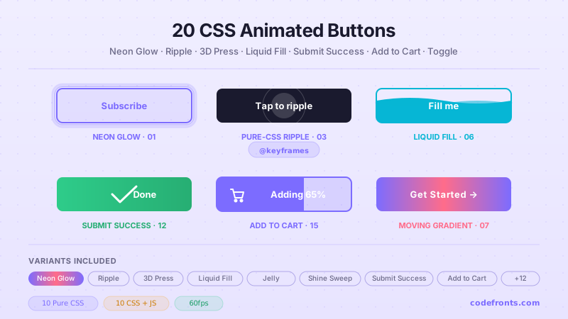
20 hand-coded CSS animated buttons — neon glow, ripple, 3D press, liquid fill, jelly bounce, shine sweep, animated border, moving gradient CTA, text flip, submit success state, add-to-cart progress, download icon, hamburger-to-close, toggle switch, loading spinner inside button, next/prev arrow nav, and ghost button background reveal. Half pure CSS, half lightweight JS for production interactions.
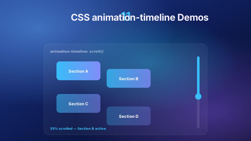
11 pure CSS animation-timeline demos built on the W3C scroll() and view() spec — reading progress bar, view-timeline fade & reveal, shrinking sticky header, stacking cards, horizontal scroll section, parallax hero, container shadow indicators, reverse-scroll columns, text scrim reveal, cover card to sticky header, and image zoom / clip-path wipe. Zero JS, off the main thread, Core Web Vitals safe. Copy-paste ready.
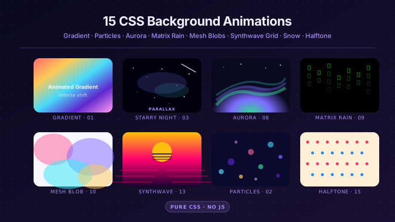
25 hand-coded CSS background animations for SaaS hero sections, developer tool documentation, agency portfolios, gaming and Web3 landing pages, seasonal e-commerce campaigns, and dark-mode dashboards. Covers full-screen gradient shifts, animated mesh gradients, aurora borealis glow, cursor spotlight follow, interactive water ripples, dot grid and diagonal stripe patterns, SVG grain and noise texture overlays, topographic contour lines, layered SVG waves, plasma and lava lamp fluids, bokeh light blur, particle constellation networks, matrix digital rain, synthwave 3D perspective grids, starfield warp speed, CRT scanline overlays, fog and mist drift, morphing organic blobs, floating glassmorphism orbs, halftone dot patterns, starry night skies, floating geometric shapes, rising bubbles, and falling snow. 20 are pure CSS with zero JavaScript; the 5 that need it use vanilla canvas or pointer tracking with no dependencies. Every background animates compositor-only properties so it never blocks the main thread, is scoped under a .bga-NN prefix for no-collision pasting, guards prefers-reduced-motion, and ports unchanged to React, Vue, Svelte, Astro, Next.js and Tailwind.


