12 CSS Infinite Marquee Designs

12 hand-coded CSS infinite marquees — from the "as seen in" press logo bar under a SaaS hero, to a B2B client logo wall, sponsor & exhibitor tier rows, e-commerce USP text tickers, live stock and crypto price tickers, dismissible flash-sale announcement bars, testimonial card rails, portfolio tech-stack scrollers, image brand walls, vertical agency-services columns, and physics-driven draggable + scroll-velocity reactive marquees. Every loop is transform-only (compositor-cheap, 60fps, CLS 0), pauses on hover + :focus-within + a :has(:checked) checkbox for full WCAG 2.2.2 compliance, and falls back to a plain scrollable strip under prefers-reduced-motion. Scoped under .mqs-NN for no-collision pasting, prefers-reduced-motion guarded, framework-agnostic.

9 pure CSS3 light JSPublished

Related20 CSS Scroll Animations14 CSS Typewriter Effect Designs11 CSS Page Transitions

"As Seen In" Press Logo Marquee (Pure CSS, Seamless Loop) — preview
01 / 12Pure CSS

"As Seen In" Press Logo Marquee (Pure CSS, Seamless Loop)

The classic trust-builder under a hero section: a grayscale press-logo strip that scrolls forever with zero JavaScript, fades out at both edges with a CSS mask, wakes to full color on hover, and ships a real WCAG-compliant pause button wired entirely with :has() — the exact pattern SaaS landing pages use for 'as seen in Forbes / TechCrunch' bars.

Published

B2B Client Logo Wall — Two-Row Counter-Scrolling Marquee — preview
02 / 12Pure CSS

B2B Client Logo Wall — Two-Row Counter-Scrolling Marquee

An agency-grade client wall: two logo rows gliding in opposite directions at slightly different speeds, wrapped in badge-style logo cards that lift on hover while the whole wall pauses — the counter-motion reads as 'lots of clients' at a glance without a single line of JavaScript.

Published

Sponsor & Exhibitor Banner with Gold / Silver Tier Rows — preview
03 / 12Pure CSS

Sponsor & Exhibitor Banner with Gold / Silver Tier Rows

Built for event and conference landing pages: a compact sponsor strip where the Gold tier scrolls large and slow (maximum eyeball time per sponsor) and the Silver tier runs smaller and faster below it — tier hierarchy expressed purely through size and speed, in a sliver of vertical space.

Published

Feature / USP Text Ticker — E-commerce Benefit Marquee — preview
04 / 12Pure CSS

Feature / USP Text Ticker — E-commerce Benefit Marquee

The workhorse of e-commerce headers: an uppercase benefits ticker ('Free worldwide shipping • 30-day returns • 24/7 support') that loops seamlessly, slows to half speed on hover so it stays readable, and collapses to a static wrapped list for reduced-motion users — nothing is ever lost, only the motion.

Published

Live Stock / Crypto Price Ticker with Green-Red Deltas — preview
05 / 12CSS + JS

Live Stock / Crypto Price Ticker with Green-Red Deltas

A Bloomberg-style terminal strip for fintech and crypto sites: tickers, prices and percentage deltas glide by in tabular-figure monospace while a tiny JS loop nudges the numbers every 2 seconds — the marquee itself stays 100% CSS, so updates never stutter the scroll, and green/red states are announced with real +/− characters, not color alone.

Published

Flash Sale Announcement Bar — Fast, High-Contrast, Dismissible — preview
06 / 12Pure CSS

Flash Sale Announcement Bar — Fast, High-Contrast, Dismissible

The urgency pattern e-commerce lives on: a fast, high-contrast marquee bar pinned to the top of the page shouting a limited-time offer, with a working promo-code link, a dismiss button that collapses the bar with pure CSS (:has() + a checkbox), and a grid-template-rows animation so the page content slides up smoothly instead of jumping.

Published

Auto-Sliding Testimonial Marquee — Card Rail with Focus-Safe Pause — preview
07 / 12Pure CSS

Auto-Sliding Testimonial Marquee — Card Rail with Focus-Safe Pause

The modern replacement for testimonial carousels: customer quote cards drift by slowly enough to read, freeze the moment a cursor or keyboard focus enters the rail, and lift softly on hover — no dots, no arrows, no slider library, and every quote remains real selectable text a visitor can copy.

Published

Portfolio Tech Stack Marquee — Developer Skills Scroll — preview
08 / 12Pure CSS

Portfolio Tech Stack Marquee — Developer Skills Scroll

The 'Skills' section upgrade for developer portfolios: technology chips with monogram icons drifting in a slim rail, each chip snapping to full color and lifting on hover, plus a direction toggle (a checkbox flipping animation-direction with :has()) that doubles as a tiny easter egg for visitors who find it.

Published

Image-Heavy Brand Wall — Multi-Row Masonry Marquee Background — preview
09 / 12Pure CSS

Image-Heavy Brand Wall — Multi-Row Masonry Marquee Background

A full-bleed, three-row wall of mixed-width imagery drifting at three different speeds and directions — the 'living moodboard' agencies and creator brands run behind hero copy. Rows use varied tile widths and subtle tilts so it reads masonry, a dark scrim keeps foreground text at AAA contrast, and the whole wall is aria-hidden because it is decoration by design.

Published

Vertical Infinite Marquee — Agency Services Column — preview
10 / 12Pure CSS

Vertical Infinite Marquee — Agency Services Column

The agency-hero staple: a vertical column of services scrolling upward beside bold static copy, with a top-and-bottom mask fade and one 'live' highlighted row at center height — the same duplicated-group math as horizontal marquees, rotated 90 degrees with flex-direction:column and translateY.

Published

Draggable Marquee with Inertia — Grab, Throw, Auto-Resume — preview
11 / 12CSS + JS

Draggable Marquee with Inertia — Grab, Throw, Auto-Resume

The tactile showpiece: a project-card marquee you can grab with mouse or touch and throw — it coasts with real inertia, decays back to cruising speed, and never shows a seam because position wraps with modulo math. One requestAnimationFrame loop drives everything; CSS keyframes are deliberately NOT used, and the demo explains why that trade is correct here.

Published

Scroll-Velocity Reactive Marquee — Speed & Skew Follow the Page — preview
12 / 12CSS + JS

Scroll-Velocity Reactive Marquee — Speed & Skew Follow the Page

The award-site flourish: a giant outlined-text marquee that idles at a lazy drift, then accelerates, skews and even reverses with the user's scroll — scroll down fast and the words whip left with a speed-lean; flick up and they swing back. One rAF loop, one scroll listener, and lerp smoothing doing all the choreography.

Published

FAQ

Frequently asked questions

How do I make a CSS infinite marquee with a seamless loop?
Use the duplicated-group pattern. Wrap your content in a viewport with overflow: hidden, then place TWO identical content groups inside it as flex children with a gap. Animate each group's transform from translateX(0) to translateX(calc(-100% - var(--gap))) — exactly its own width plus one gap. At the moment the animation restarts, the second copy is standing pixel-perfectly where the first one started, so the reader sees no jump. No measured widths, no JavaScript, no resize listener. Every demo in this gallery uses this pattern, and it's why the loops read as seamless at any content width, at any browser zoom level, at any screen size. Common mistakes: animating to translateX(-100%) WITHOUT compensating for the gap (creates a stutter equal to the gap width every cycle), animating left or margin-left instead of transform (triggers layout every frame — tanks INP), and forgetting to set aria-hidden="true" on the duplicate group (screen readers announce every item twice).
Is the HTML <marquee> tag still supported and should I use it?
The <marquee> element was deprecated in HTML5 and formally removed from the HTML Living Standard. Browsers still render it for backwards compatibility, but Chrome and Firefox now emit a deprecation warning in DevTools, iOS and Android WebView support is inconsistent, and screen readers don't announce it as any meaningful element. Every accessibility, performance, and SEO audit will flag it. The replacement is a CSS-only marquee — the duplicated-group pattern above. Every demo in this gallery is a drop-in replacement: seamless loop, pause-on-hover, keyboard-operable pause button via :has(:checked), prefers-reduced-motion fallback to a plain horizontal scroll region, and full accessibility. Copy-paste one demo, delete your old <marquee> element, ship. No library needed.
How do I pause a CSS marquee on hover in an accessible way?
WCAG 2.2.2 (Pause, Stop, Hide) requires a way to stop any moving content that lasts more than 5 seconds. The best implementation combines three signals: .mqs-01:hover .mqs-01__group { animation-play-state: paused } pauses on mouse hover, .mqs-01:focus-within .mqs-01__group { animation-play-state: paused } pauses when any focusable child receives keyboard focus (so Tab-into a link pauses the loop, which is the whole point — you can't click a moving target), and a real pause control via .mqs-01:has(#pause:checked) .mqs-01__group { animation-play-state: paused }. The pause control is a native <input type="checkbox"> styled as a button — keyboard-operable for free, announced by screen readers as a real checkbox with pressed/unpressed states, zero JavaScript. Every demo in this gallery ships all three signals. Note: hover-only pause fails on touch devices, so the visible pause button is the critical fallback — hover is a nice-to-have.
How do I make a CSS marquee respect prefers-reduced-motion?
Wrap the animation in a media query: @media (prefers-reduced-motion: reduce) { .mqs-01__group { animation: none } .mqs-01__viewport { overflow-x: auto } }. The animation stops entirely, and the viewport becomes a regular horizontal scroll region so the reader can browse the content at their own pace. Never just animation-duration: 0s — that leaves the transform stuck mid-cycle and content invisible past the edge. Always fall back to a real scroll region so no content is lost. Roughly 35% of adults have some vestibular sensitivity where continuous horizontal motion causes discomfort; this fallback isn't optional. Every demo in this gallery ships the fallback. Test it by opening System Preferences → Accessibility → Reduce Motion (macOS) or Settings → Accessibility → Motion (Windows/iOS/Android) — the marquee should stop instantly on every demo.
Should I use a library like Swiper, Splide, or Marquee3k instead?
No — and this is exactly the case where the platform ships a better version than any library. Swiper is 200+ KB gzipped and designed for carousels with pagination, not seamless loops. Splide is 45 KB and requires JavaScript initialization + resize listeners. Marquee3k is 4 KB but adds runtime DOM manipulation and mutation observers. The CSS-only pattern in every demo here is 0 KB of JavaScript, works before hydration in SSR frameworks, survives print and reader modes, respects prefers-reduced-motion without a JS handler, and pauses on hover / focus / checkbox via :has(). Modern browsers ship the whole feature at the compositor layer. The three demos in this gallery that DO use JavaScript (live price ticker, draggable inertia, scroll-velocity reactive) use it for logic that CSS genuinely can't do — price data updates, pointer-event physics, scroll-velocity math. Never for the loop itself.
How do I make a draggable marquee with inertia (grab and throw)?
Combine three pieces of state: pointer capture, a running translate transform, and a decay loop. On pointerdown, call element.setPointerCapture(e.pointerId) so subsequent events fire on the marquee even when the pointer leaves the element. On pointermove, add the delta X to the transform: --drag: calc(var(--drag) + \${dx}px). On pointerup, sample the last few frames to compute velocity (pixels per millisecond), then in a requestAnimationFrame loop apply velocity *= 0.94 per frame and update --drag until velocity falls below a threshold. Then hand back to the CSS marquee animation. The 0.94 damping factor is the sweet spot — feels natural without oscillating. Demo 11 in this gallery is the full pattern. The seamless-loop math still works because the drag transform is a modulo of the total content width — dragging past a group boundary snaps back invisibly.
How do I make a scroll-velocity reactive marquee (skew on fast scroll)?
Track scroll delta in a requestAnimationFrame loop: const delta = window.scrollY - lastY; lastY = window.scrollY. Clamp the delta to a reasonable range (say -40 to 40) and write it to a CSS custom property on the marquee root: element.style.setProperty('--velocity', delta). Then in CSS, use that property to drive both the animation speed and a skew transform: animation-duration: calc(var(--speed) - abs(var(--velocity)) * 0.1s); transform: skewX(calc(var(--velocity) * 0.4deg)). Fast scrolling accelerates the marquee AND tilts it in the scroll direction — the classic "speed feels fast" effect popularized by Cuberto and portfolio sites. Demo 12 in this gallery ships the full pattern. The trick is abs() in the duration calc (available since Chrome 125 / Safari 17.4) — without it, scrolling up would reverse the animation speed and read as broken.
Are these marquees safe to copy-paste into an existing project?
Yes — every demo is scoped under a unique .mqs-NN wrapper (mqs-01, mqs-02, …, mqs-12), so any two demos coexist on one page with zero style bleed. All @keyframes are prefixed mqs-NN- to avoid name collisions, and every input id or checkbox is namespaced mqs-NN-*. Continuous motion is guarded with @media (prefers-reduced-motion: reduce) on every demo. No external dependencies, no framework, no runtime JavaScript on the 9 Pure CSS demos. The 3 CSS+JS demos (price ticker, draggable, scroll-velocity) ship self-contained event handlers that attach via document.querySelectorAll, so pasting the HTML+CSS+JS into a fresh index.html produces a working demo with no build step. MIT licensed for personal and commercial projects, no attribution required.

Related collections

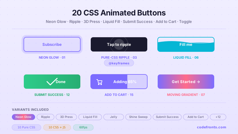
20 CSS Animated Buttons preview

20 CSS Animated Buttons

20 hand-coded CSS animated buttons — neon glow, ripple, 3D press, liquid fill, jelly bounce, shine sweep, animated border, moving gradient CTA, text flip, submit success state, add-to-cart progress, download icon, hamburger-to-close, toggle switch, loading spinner inside button, next/prev arrow nav, and ghost button background reveal. Half pure CSS, half lightweight JS for production interactions.

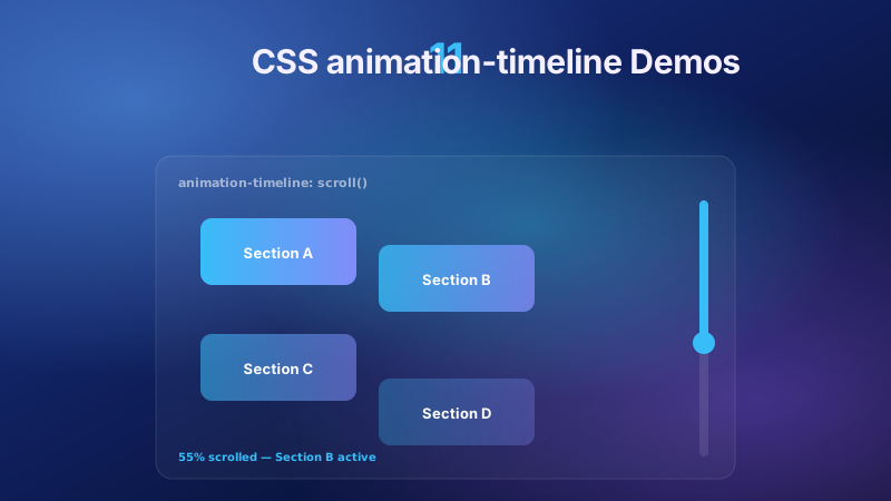
11 CSS animation-timeline Demos preview

11 CSS animation-timeline Demos

11 pure CSS animation-timeline demos built on the W3C scroll() and view() spec — reading progress bar, view-timeline fade & reveal, shrinking sticky header, stacking cards, horizontal scroll section, parallax hero, container shadow indicators, reverse-scroll columns, text scrim reveal, cover card to sticky header, and image zoom / clip-path wipe. Zero JS, off the main thread, Core Web Vitals safe. Copy-paste ready.

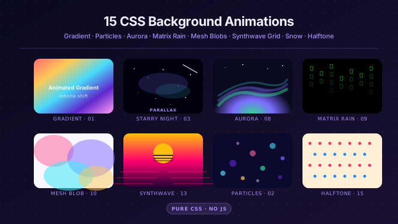
25 CSS Background Animations preview

25 CSS Background Animations

25 hand-coded CSS background animations for SaaS hero sections, developer tool documentation, agency portfolios, gaming and Web3 landing pages, seasonal e-commerce campaigns, and dark-mode dashboards. Covers full-screen gradient shifts, animated mesh gradients, aurora borealis glow, cursor spotlight follow, interactive water ripples, dot grid and diagonal stripe patterns, SVG grain and noise texture overlays, topographic contour lines, layered SVG waves, plasma and lava lamp fluids, bokeh light blur, particle constellation networks, matrix digital rain, synthwave 3D perspective grids, starfield warp speed, CRT scanline overlays, fog and mist drift, morphing organic blobs, floating glassmorphism orbs, halftone dot patterns, starry night skies, floating geometric shapes, rising bubbles, and falling snow. 20 are pure CSS with zero JavaScript; the 5 that need it use vanilla canvas or pointer tracking with no dependencies. Every background animates compositor-only properties so it never blocks the main thread, is scoped under a .bga-NN prefix for no-collision pasting, guards prefers-reduced-motion, and ports unchanged to React, Vue, Svelte, Astro, Next.js and Tailwind.

Search CodeFronts

Loading…