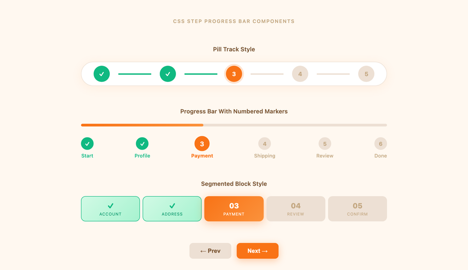
12 CSS Steppers
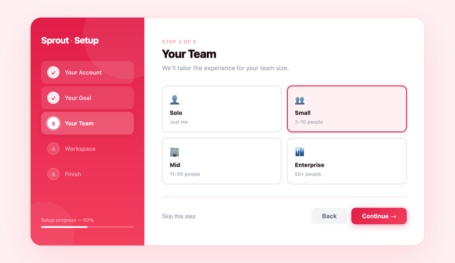
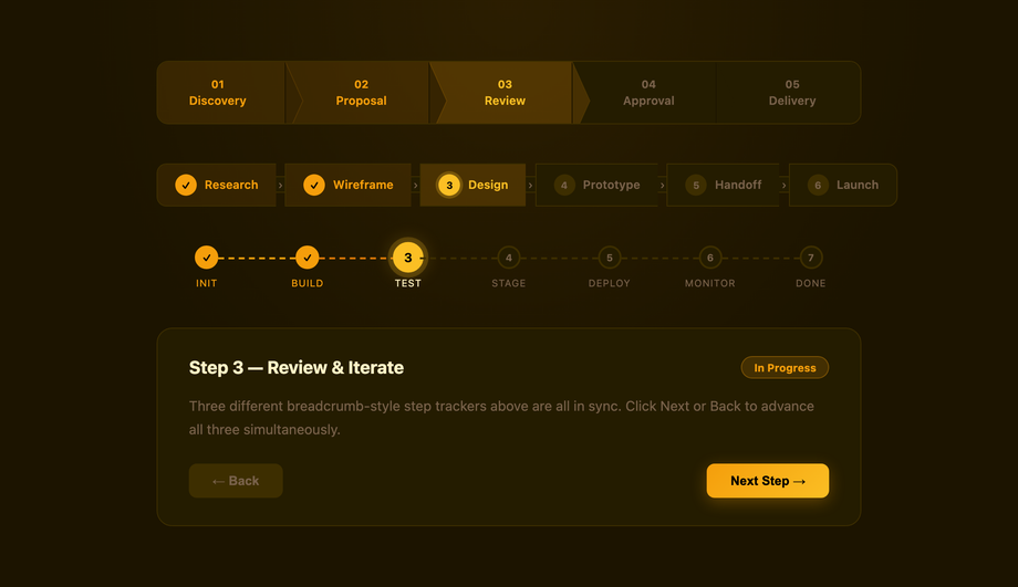
A stepper UI guides users through a multi-step flow — checkout, onboarding, signup wizard, survey — by visualising progress, current step, and what is still ahead. These 12 hand-coded steppers cover every production pattern: horizontal multi-step form wizard, numbered progress bar, e-commerce checkout with order summary, vertical timeline, animated icon steps, onboarding flow, breadcrumb tracker, validation states (success/error/warning), circular SVG progress, glassmorphism, dark mode, and animated connector lines. All semantic HTML with proper aria-current="step" and aria-valuenow, scoped .stp-NN__* class names so multiple steppers coexist on the same page, respect prefers-reduced-motion, and ship MIT-licensed. 11 use vanilla JavaScript for step navigation; 1 is fully static (Demo 03 — useful as a display-only checkout indicator).


Frequently asked questions
What is a stepper UI component and when should I use one?
Should I build with Material UI's Stepper or vanilla CSS?
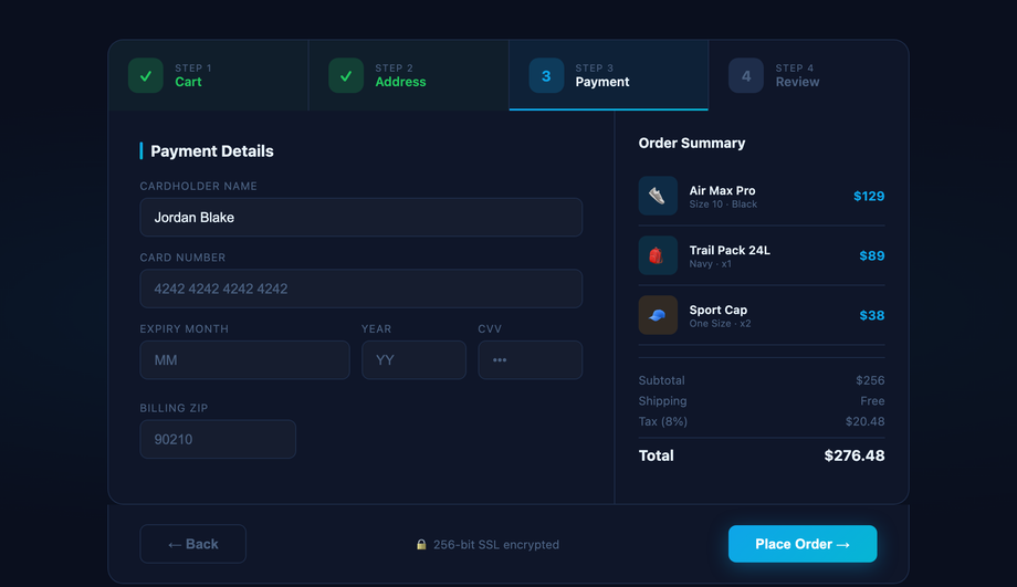
<Stepper> component is excellent if you're ALREADY on React + MUI — it ships with the rest of the MUI bundle (~95kb gzipped) so the marginal cost is zero. If you're NOT on React+MUI (Astro, Vue, Svelte, Rails ERB, plain HTML, WordPress) — installing MUI just for a stepper adds 95kb to your bundle for one component. This collection's 12 steppers drop in as semantic HTML + scoped CSS with zero framework dependencies. The 11 JS-enhanced demos use ~30-50 lines of vanilla JavaScript each — no library imports, no React/Vue/Angular tie-in. Aesthetically, the multi-step form (Demo 01), checkout (03), and circular progress (09) match MUI's production polish without the framework lock-in. Tailwind UI's stepper costs $300+ and ships as React JSX. Ant Design's <Steps>, Chakra UI's stepper, react-step-wizard, react-stepper-horizontal all add 8-50kb to your bundle. MIT-licensed, free, modify-and-resell allowed.How do I build a checkout stepper (Stripe / Shopify style)?
sessionStorage with the step data serialised as JSON. (b) Disable the active-tab click handler for FUTURE steps so users can't skip validation. (c) Show validation errors per step, not on the final review screen — the user lost context by then. ~50 lines of JS, fully framework-neutral.How do I add validation states to a stepper (success / error / warning)?
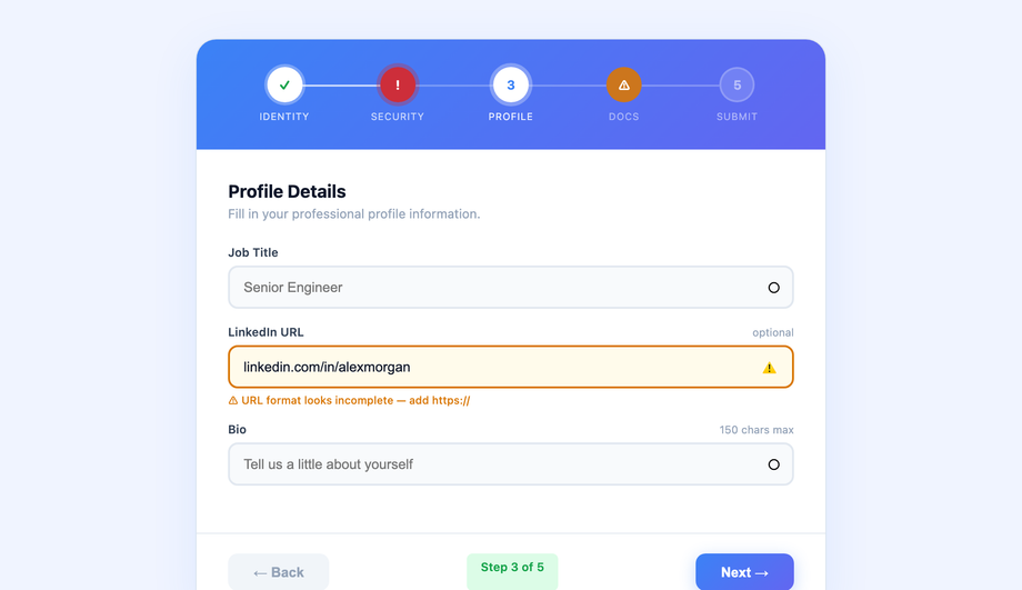
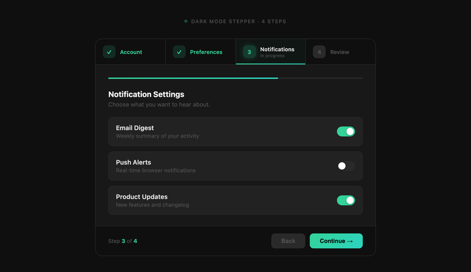
.is-done, .is-error, .is-warning, and .is-active. The standard "done / active / inactive" tri-state most steppers ship loses information when validation fails. Production-grade implementation: Done = green circle with white checkmark (✓), green connector line ahead; Error = red circle with white X mark (✕), red connector line to the next step, red helper text below the step label; Warning = amber circle with exclamation mark (!), amber connector, "some fields need review" text; Active = blue ring with the step number, gradient connector ahead in muted color; Inactive = gray circle with number, gray connector. JavaScript validates each step on "Continue" click and adds the appropriate class to the step element. Screen reader support: use aria-invalid="true" on error steps and aria-describedby pointing to the helper text. ~40 lines of JS.What's the difference between vertical and horizontal stepper layouts?
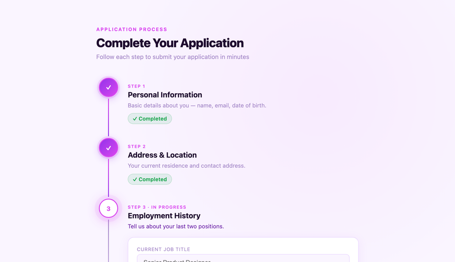
flex-direction from row to column. Most stepper libraries default to horizontal-only; vertical is the gap.How do I build an accessible stepper (keyboard navigation + screen readers)?
<nav aria-label="Steps"> as the outer wrapper, <ol> for the step list, <li> per step. Don't use divs styled as buttons — use real <button> elements so keyboard activation works automatically. (2) aria-current="step" on the active step. Screen readers announce "current step" alongside the step label so users know where they are without seeing the visual highlight. (3) aria-valuenow / aria-valuemax on the outer container — turns the stepper into a programmatic progress bar. For visitors using a screen reader, this announces "Step 3 of 5" as they navigate. (4) Keyboard arrow navigation. Left/Right arrow keys move between sibling steps; Enter activates. Tab order keeps the next/back buttons reachable. Focus management: when the active step changes, move focus to the new step's first focusable field — visitors using a keyboard never lose their place. Common mistake most tutorials make: relying purely on visual color difference (green checkmark) without text labels — colorblind users can't distinguish done from active. Always pair color with a glyph (✓ vs number) or aria-label text.How do I build a circular SVG progress stepper without a library?
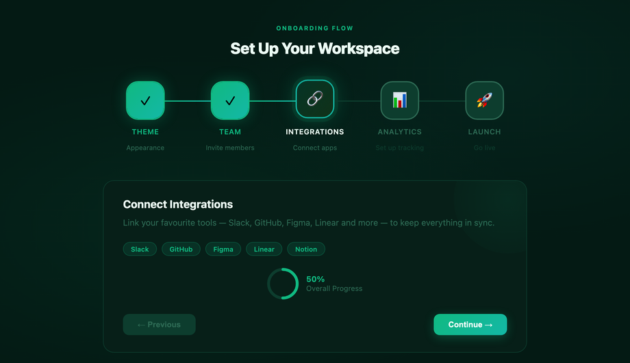
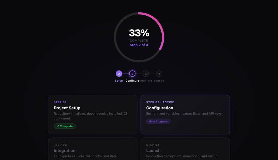
<circle> elements at the same center+radius. The first (background) draws a full circle in a muted gray. The second (progress) has stroke-dasharray="circumference" (e.g. 188 for r=30) and stroke-dashoffset initially set to the full circumference (no visible stroke). JavaScript calculates current progress as (currentStep / totalSteps) * circumference and updates stroke-dashoffset = circumference - progress. The progress stroke fills clockwise as steps complete. Inside the circle, an <text> element shows "3/5" or a percentage. Cost comparison: react-circular-progressbar ships ~5kb minified + requires React. This demo's approach: ~30 lines of CSS + ~20 lines of vanilla JS, no library. The CSS transition: stroke-dashoffset 0.6s ease-out animates smoothly between step changes. Add transform-origin: center + transform: rotate(-90deg) on the progress circle so the stroke starts from the top (12 o'clock) instead of the right (3 o'clock default).How do I build an onboarding stepper (Notion / Linear / Vercel style)?
Will animating connector lines / step transitions hurt my Core Web Vitals INP score?
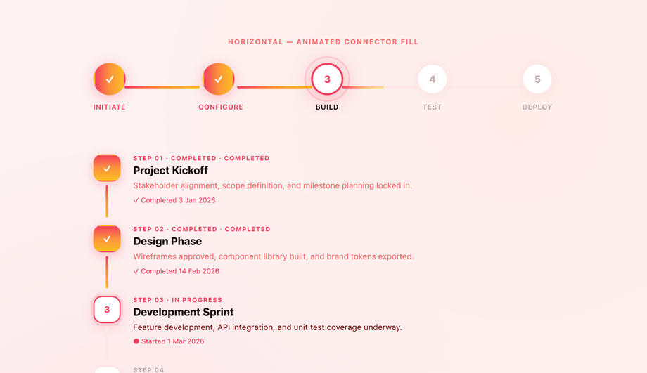
transform and opacity only. All 12 demos in this collection follow this — connector line growth (Demo 12) uses transform: scaleX(0) → scaleX(1) with transform-origin: left, not width: 0% → 100%. Scaling is GPU-accelerated on the compositor thread; animating width forces layout recalculation on every frame, costing 4-16ms per frame and tanking INP (Interaction to Next Paint), the Core Web Vital that replaced FID in March 2024. Two production gotchas specific to steppers: (a) SVG stroke-dashoffset animation (Demo 09 circular progress) IS expensive — each frame recalculates the stroke path. Mitigate by setting will-change: stroke-dashoffset on the progress circle so the browser promotes it to a GPU layer. (b) Animating background-color on step state change (gray → green when step completes) is a paint cost (~2-4ms per frame). Acceptable for one-off step transitions; would tank INP if you animated all 5 steps simultaneously. Demos in this collection sequence step state changes serially, not in parallel. Lighthouse mobile-profile scores: 95+ Performance on all 12 demos on a mid-tier Pixel 5 baseline.Which stepper should I use for my project?
aria-current="step" + aria-valuenow, respect prefers-reduced-motion, MIT-licensed.Related collections

22 CSS Button Group Designs
22 dynamic CSS button groups with motion-driven interactions — plasma loops, holographic gradients, magnetic discs, wormhole tabs, particle aurora. Pure CSS or light JS, copy-paste ready.

43 CSS Button Designs
43 hand-coded CSS buttons — real-world materials like brushed brass and vinyl, interactive use-case buttons (add-to-cart, download, like, delete), and click-effect studies: magnetic mercury ripple, brutalist glitch, neon plasma burst, clay press, ink spread, and particle shards.

27 CSS Calendar Designs
27 hand-coded CSS calendar designs covering every search intent for 'css calendar' — pure-CSS calendar (no JavaScript), CSS Grid layouts, glassmorphism widgets, brutalist designs, dark mode UIs, neumorphic cards, horizontal timelines, sidebar widgets, booking date-range pickers, CSS Grid advent calendars, Fluent / Material Design, circular / radial layouts, retro neon cyberpunk, 3D flip cards, isometric dashboards, split-screen heroes, liquid micro-interactions, bento grid booking, vintage paper tear-offs, vertical timelines, kinetic typography, and slanted diagonal grids. 1 truly pure-CSS, 26 with small vanilla JS snippets for event handling. Scoped class names that never collide, prefers-reduced-motion respected, MIT-licensed.