32 CSS Floating Action Button Designs
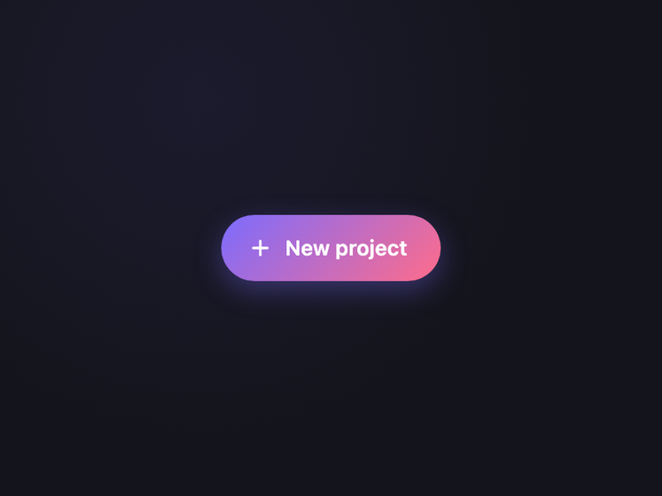
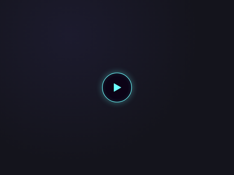
A floating action button (FAB) is a fixed-position button that surfaces the most important action on a screen. These 32 hand-coded designs are ready-to-ship FABs for chat windows, compose actions, scroll-to-top, and quick-add controls — copy the markup, wire your handler, and ship.

Build your own
Tweak the exact look in our visual generators — no signup, instant copy-paste.
Frequently asked questions
What is a floating action button (FAB)?
When should I use a FAB on my site?
Should I build a FAB myself or use Tailwind UI / Material UI?
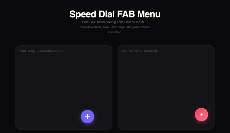
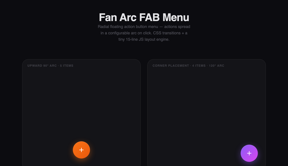
How do I create an expanding FAB menu (speed dial pattern)?
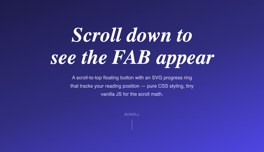
<input type="checkbox"> as the state holder, a <label> styled as the FAB body, and the :checked selector to toggle the visibility/transform of the child action buttons. transform: translateY(0) and opacity: 1 when checked; transform: translateY(20px); opacity: 0; pointer-events: none when unchecked. Add per-button transition-delay values (0ms, 60ms, 120ms, …) for a cascading reveal. No JavaScript needed. The fan arc variant (Demo 06) is the same pattern but uses transform: rotate(angle) translateY(distance) per child so they spread radially instead of stacking vertically — needs ~10 lines of JS to position children dynamically based on the FAB's screen position.How do I make a scroll-to-top FAB with a progress ring?
stroke-dasharray equal to its circumference. JavaScript reads window.scrollY / (document.body.scrollHeight - window.innerHeight) as a 0-to-1 progress value, then sets strokeDashoffset = circumference * (1 - progress) on the foreground circle — the stroke fills clockwise as the visitor scrolls down. The button only appears after scrolling past 200px (CSS opacity transition + JS classList.toggle). Click handler calls window.scrollTo({ top: 0, behavior: 'smooth' }). Total: ~25 lines of JS. Works in every modern browser; degrades to a hidden button if JS is off.How do I build a draggable / movable FAB that the user can reposition?
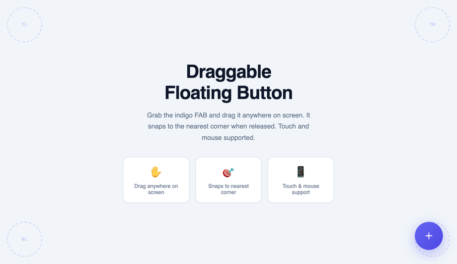
pointerdown/pointermove/pointerup work uniformly across mouse + touch + pen. The Mouse Events API has a separate touch fallback that breaks on hybrid devices. (2) Constrain to viewport bounds — clamp the drag position to [0, window.innerWidth - fabWidth] on each axis, otherwise users drag the FAB off-screen and can't drag it back. (3) Snap to nearest edge on release — like Facebook Messenger Chat Heads, the FAB should snap to the nearest left/right edge of the viewport on pointerup. Use a CSS transition for the snap animation. The Demo 12 implementation also leaves a fading .trail dot animation during the drag for visual feedback. ~60 lines of JS.How do I make a magnetic-hover FAB (cursor attraction effect)?
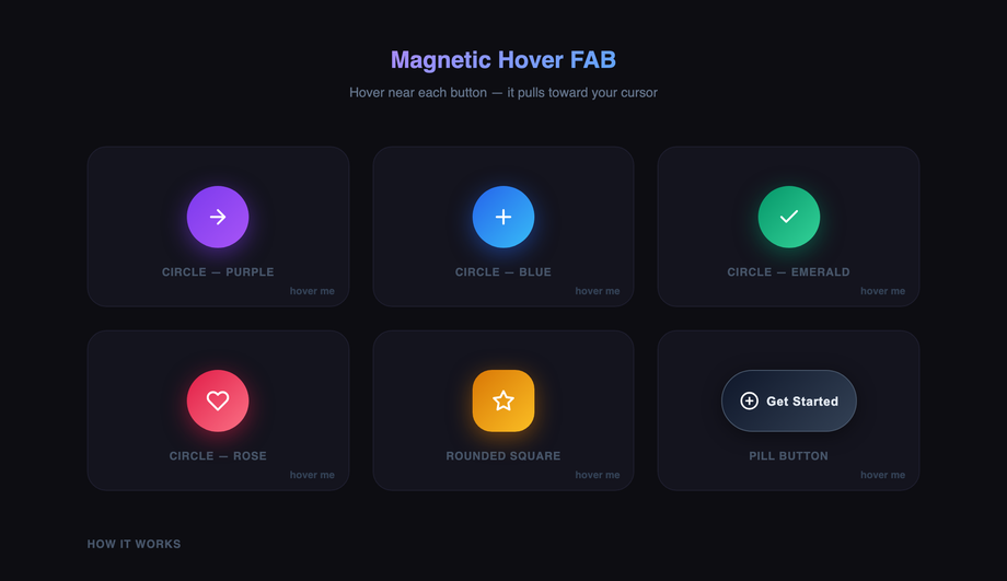
mousemove within a hover-detection radius (typically 100-150px around the button center), JS calculates the offset between the cursor and the button center, then applies transform: translate(cursorOffsetX * strength, cursorOffsetY * strength) on the button — where strength is ~0.3 for a subtle pull. The button "reaches toward" the cursor as it approaches. On mouseleave, smoothly transition back to translate(0, 0) with a cubic-bezier(.22,1,.36,1) easing for the springy return. Two gotchas: (a) skip the effect on touch devices via matchMedia('(hover: none)') — magnetic hover doesn't translate to taps and creates janky pinch-zoom interference. (b) the inner icon should counter-translate at half strength so it stays roughly centered relative to its starting position, otherwise the icon flies off the button. ~30 lines of JS.How do I add a notification badge to a FAB (count indicator)?
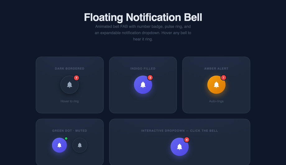
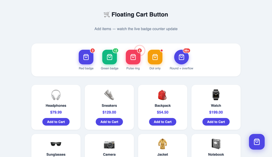
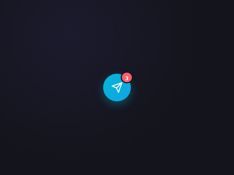
@keyframes ring when a new notification arrives (triggered by JS adding a .ringing class). Demo 14 (Floating Cart Badge) ships the e-commerce pattern — a circular counter showing total cart items, increments with a tiny scale(1) → scale(1.3) → scale(1) bounce when items are added, and the FAB shows a slide-down list of recently added items on hover. Both demos respect prefers-reduced-motion: the pulse/ring/bounce animations freeze for visitors with the OS preference set. The badge text uses semantic HTML with an aria-label="5 new notifications" for screen reader support.Can I build a floating chat widget (Intercom / Crisp / Drift style)?
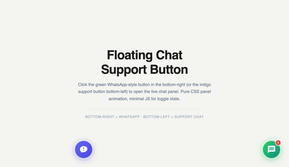
transform: scale(0) → scale(1) + transform-origin: bottom right so it animates out from the FAB's position rather than dropping in. The icon morphs from chat-bubble to X (close) via two stacked SVGs cross-fading. The demo also includes a setupChat(triggerId, panelId) helper so the same UI can host WhatsApp/Telegram/email channels — pass different IDs, different greetings render. ~60 lines of JS. Easy to wire to a real backend (Pusher, Supabase Realtime, Firebase) by replacing the demo's send-message handler.Are these FABs accessible? What about screen readers and keyboard navigation?
<button> elements — never divs styled as buttons. Browsers handle focus, Enter/Space activation, and screen reader semantics automatically. (2) Descriptive aria-label on every button — "Add new task", "Open chat", "Scroll to top", "Toggle dark mode" — never just "button" or the visible icon character. (3) Visible focus states — every FAB has a :focus-visible ring (typically outline: 2px solid currentColor; outline-offset: 4px). (4) 44×44px minimum tap target — WCAG 2.5.5 Target Size (Enhanced). Even the "mini" size variants (Demo 01) have an invisible larger hit area via padding. (5) Continuous animations honour prefers-reduced-motion — pulse, ring, ripple, magnetic-hover all freeze for visitors with the OS preference set. (6) Semantic state announced — speed dial uses aria-expanded, notification badges use aria-live="polite", the cart counter has aria-label="5 items in cart".Should a FAB be position:fixed or position:absolute?
position: fixed with bottom: 24px; right: 24px for the standard "persistent FAB" pattern that stays in the bottom-right corner regardless of scroll position. Use position: absolute when the FAB belongs to a specific section/card and should scroll with it (rare). The 24px offset is the Material Design specification; iOS Human Interface Guidelines prefers 20px. On mobile, increase to bottom: 80px when the page has a bottom navigation bar so the FAB doesn't overlap. For pages with a footer, watch for FABs overlapping footer content — either auto-hide the FAB when the footer enters the viewport (IntersectionObserver) or use position: sticky; bottom: 24px on a wrapper element inside the main content area so the FAB stops at the footer boundary.Which floating action button design should I use for my project?
.fbNN-* or .cfb-* class names so multiple can coexist, ship semantic HTML with aria-labels, and are MIT-licensed.Related collections

22 CSS Button Group Designs
22 dynamic CSS button groups with motion-driven interactions — plasma loops, holographic gradients, magnetic discs, wormhole tabs, particle aurora. Pure CSS or light JS, copy-paste ready.

43 CSS Button Designs
43 hand-coded CSS buttons — real-world materials like brushed brass and vinyl, interactive use-case buttons (add-to-cart, download, like, delete), and click-effect studies: magnetic mercury ripple, brutalist glitch, neon plasma burst, clay press, ink spread, and particle shards.

27 CSS Calendar Designs
27 hand-coded CSS calendar designs covering every search intent for 'css calendar' — pure-CSS calendar (no JavaScript), CSS Grid layouts, glassmorphism widgets, brutalist designs, dark mode UIs, neumorphic cards, horizontal timelines, sidebar widgets, booking date-range pickers, CSS Grid advent calendars, Fluent / Material Design, circular / radial layouts, retro neon cyberpunk, 3D flip cards, isometric dashboards, split-screen heroes, liquid micro-interactions, bento grid booking, vintage paper tear-offs, vertical timelines, kinetic typography, and slanted diagonal grids. 1 truly pure-CSS, 26 with small vanilla JS snippets for event handling. Scoped class names that never collide, prefers-reduced-motion respected, MIT-licensed.