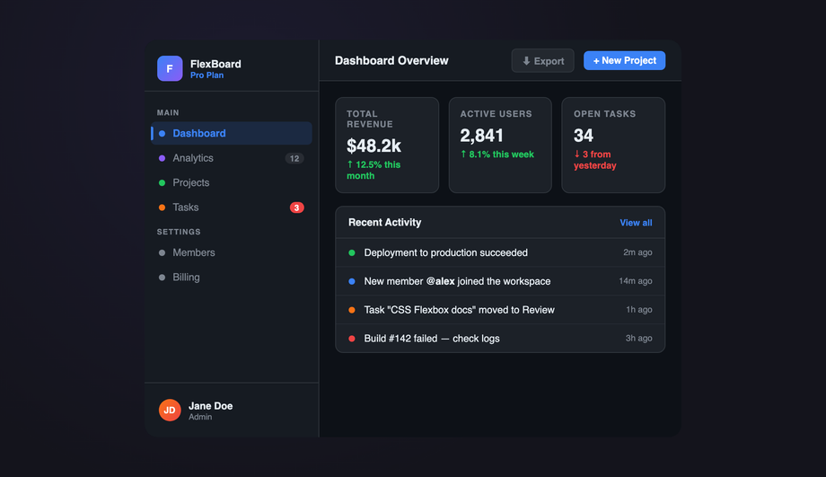
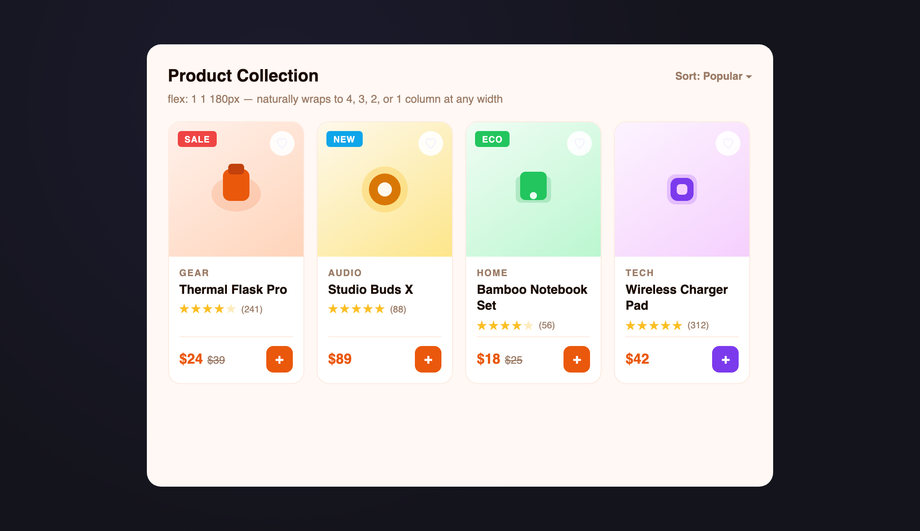
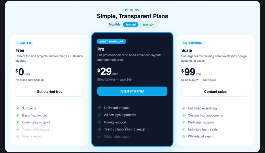
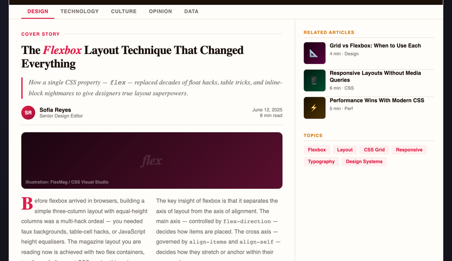
15 CSS Flexbox Layouts
A CSS flexbox layout uses native display: flex to arrange items along one axis with intelligent sizing, spacing, and alignment. These 15 hand-coded layouts are production-ready flexbox templates for the patterns developers ship every day — holy grail page shells, responsive card grids, sticky navbars, sidebar dashboards, pricing tables, sticky footers, kanban boards, chat interfaces and more. Copy the CSS, drop in your content, and ship.
Frequently asked questions
What is a CSS flexbox layout?
When should I use flexbox instead of CSS grid?
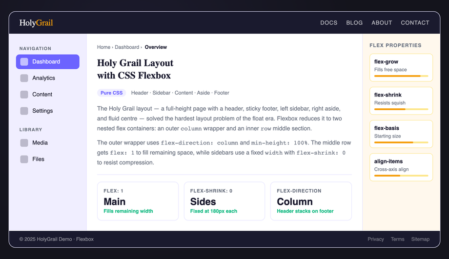
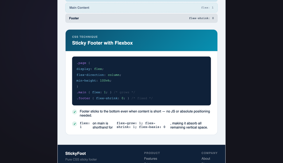
How do I build a sticky footer with flexbox in 2026?
Are these flexbox layouts WCAG-accessible?
Why does my flexbox text overflow its container?
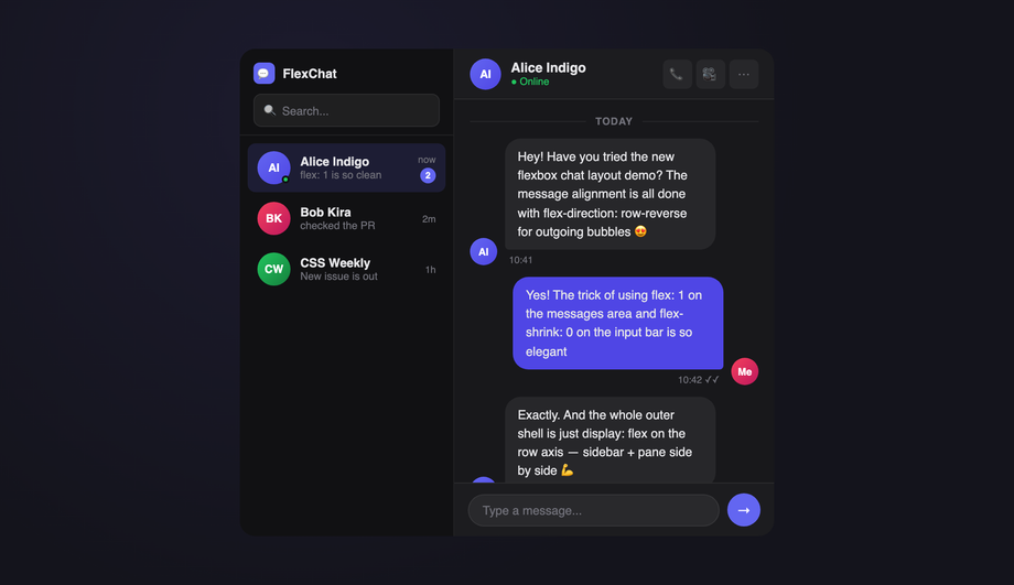
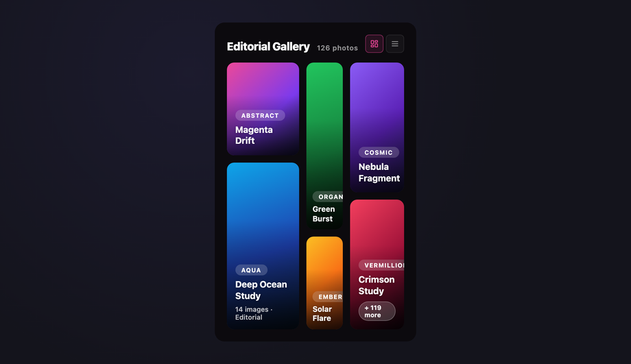
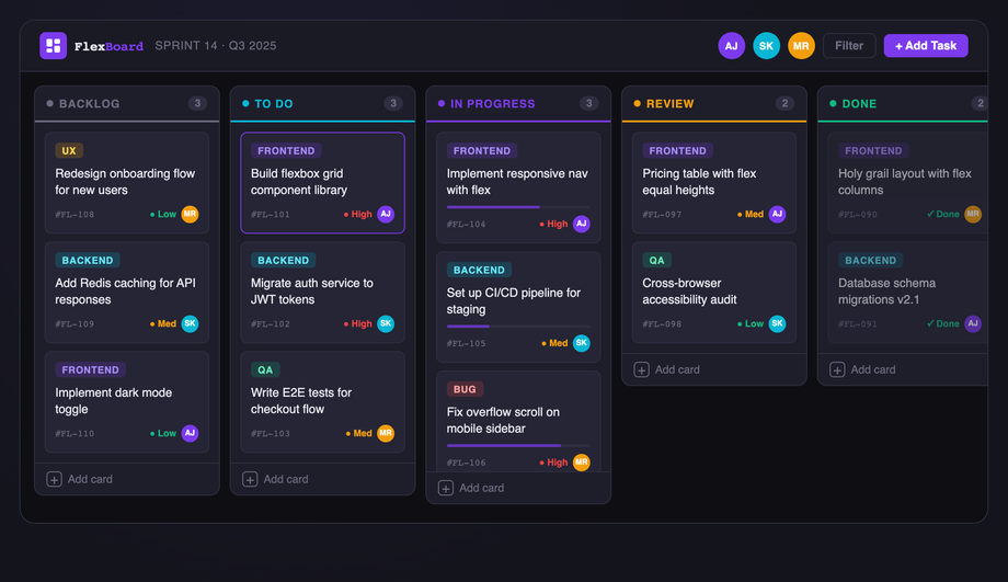
` block inside a flex child can push the whole container wider than its parent and break the layout. The fix is one line: `min-width: 0` on the offending flex child. This unlocks the normal CSS overflow behavior (`overflow: hidden`, `text-overflow: ellipsis`, `white-space: nowrap` then work as expected). Pair it with `flex: 1 1 auto` for shrinkable text content and `flex-shrink: 0` for fixed-width siblings (icons, indicators). This is the single most common flexbox bug — every demo in this collection that has shrinkable text content (chat #12, navbar #03, magazine #08) applies the `min-width: 0` defensively so it never bites users who copy and adapt the code.How do these flexbox layouts compare to Tailwind, Bootstrap, MUI, Chakra, and shadcn/ui?
What's the right flexbox alternative to CSS masonry?
Are these CSS flexbox layouts free and how should I attribute them?
Related collections

CSS Center a Div
The complete guide to centering a div in CSS in 2026 — covering all 5 production techniques with live interactive demos. <strong>Flexbox</strong> (the modern default, works for 95% of cases): <code>display: flex; align-items: center; justify-content: center</code> on the parent. <strong>CSS Grid</strong> (one-line shorthand): <code>display: grid; place-items: center</code>. <strong>Absolute positioning + transform</strong> (for overlays and modals): <code>position: absolute; top: 50%; left: 50%; transform: translate(-50%, -50%)</code>. <strong>Margin auto</strong> (for block elements with a known width): <code>margin: 0 auto</code> (horizontal only) or <code>margin: auto</code> with <code>position: absolute</code> + <code>inset: 0</code> (both axes). <strong>All methods side-by-side comparison</strong> — see every technique render the same content with visible axis crosshairs so you can see exactly where each method lands the element. All 5 demos are 100% pure CSS, MIT-licensed, copy-paste ready, with detailed explanations of which method to use when. Works in every modern browser (Chrome, Safari, Firefox, Edge), no JavaScript required.

10 CSS Feature Sections
10 hand-coded CSS feature section templates covering the patterns landing pages actually need in 2026 — icon grid with stats strip, Apple-style bento grid layout, dark glassmorphism with animated blobs, scroll-reveal alternating rows, developer SDK with syntax-highlighted code preview, side-by-side comparison table with pricing cards, full SaaS hero with mesh-gradient + social proof, 3D mousemove tilt cards, parchment-cream floating phone mockup, and Linear-style product roadmap timeline. 7 of 10 demos are 100% pure CSS — drop into any stack. The 3 JS-enhanced demos (scroll-reveal, 3D tilt, timeline-glow) degrade gracefully if JavaScript is disabled. Every demo respects prefers-reduced-motion, uses scoped .fsNN__* class names so multiple can coexist, and ships MIT-licensed.

15 CSS Footer Designs
15 hand-coded CSS footer designs — aurora-drift, newspaper masthead, mega multi-column, CTA stripe, trust badges, vinyl record, neon sign, FAQ drawer, language switcher, hover wave and more. Copy-paste ready.