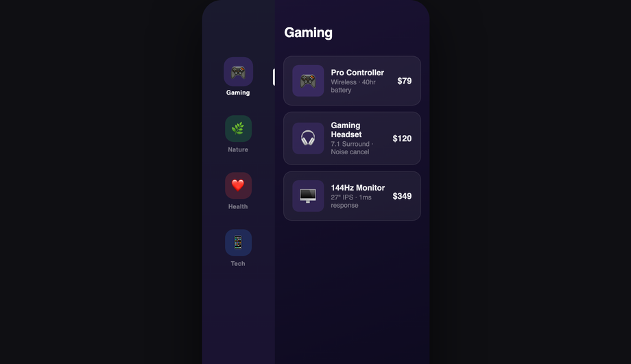
16 CSS Mobile Navigation Patterns
Mobile navigation is the most-used interactive component on the modern web — visitors decide whether to keep browsing or bounce within seconds of tapping a hamburger or bottom-tab. These 16 hand-coded patterns cover every production mobile-nav use case in 2026: hamburger slide-out drawer, full-screen overlay, iOS-style bottom tab bar, morphing hamburger-to-X animation, radial fan menu, swipe-gesture sidebar, FAB speed dial, sliding indicator pill, mega-menu accordion, glassmorphism drawer, cyberpunk neon menu, minimal dot navigation, breadcrumb collapse, split-screen, command-palette search, and neumorphic bottom navigation. 13 are 100% pure CSS using :checked state machines (drop into any stack with zero JS); 3 use ~40-60 lines of vanilla JavaScript for swipe gestures, dot-scrolling, and command-palette filtering. All respect prefers-reduced-motion, ship 44×44px tap targets (WCAG 2.5.5), and are MIT-licensed.

Frequently asked questions
When should I use a hamburger menu vs a bottom tab bar?
Should I build mobile navigation with React Navigation, React Native Web, or vanilla CSS?
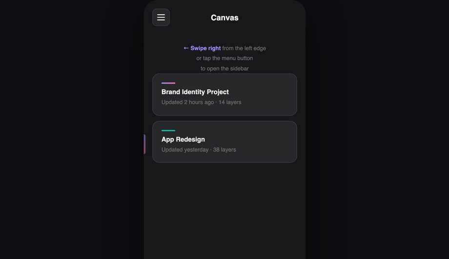
:checked state machines for menu open/close — they work without JS entirely, which means they keep working even if your JS bundle fails to load (a real concern on slow mobile networks).How do I build a hamburger menu drawer in pure CSS (no JS)?
<input type="checkbox" id="mn-01-toggle"> at the top of the markup — the source of truth for menu state. (2) <label for="mn-01-toggle"> styled as the hamburger icon button — clicking it toggles the checkbox. (3) The drawer is positioned position: fixed; left: -280px; width: 280px; transition: transform 0.3s. When #mn-01-toggle:checked ~ .drawer, transform: translateX(280px) slides it into view. (4) A semi-transparent backdrop overlay appears via the same selector — clicking the backdrop also toggles the checkbox (it's another <label for="mn-01-toggle">). (5) The hamburger icon animates from three horizontal bars to an X using :checked + transform on the three span bars (Demo 04 ships this morph in isolation). Total: ~40 lines of CSS, zero JavaScript. Three production-grade details most tutorials miss: (a) Lock body scroll when the drawer is open via html:has(#mn-01-toggle:checked) body { overflow: hidden } (:has() support: Chrome 105+, Safari 15.4+, Firefox 121+). (b) Trap focus inside the drawer — pure CSS can't do this; for accessibility-critical UIs, add ~10 lines of JS for focus trap. (c) Esc to close — pure CSS can't catch keyboard either; the JS-enhanced Demo 06 adds this.How do I build an iOS-style bottom tab bar that follows Apple's Human Interface Guidelines?
padding-bottom: env(safe-area-inset-bottom) on the tab bar so your tabs sit above the home indicator. Most online tutorials skip this and the tab bar overlaps the home indicator on real iPhones. (3) Active state: iOS uses a vertical position (no underline pill), a filled icon variant (vs outlined for inactive), and a tint color (default: system blue, but matches your brand). (4) Tap feedback: brief 0.1s scale-down on press via :active { transform: scale(0.95) } — the slight "depressed" feedback is part of the iOS tactile feel. (5) Backdrop blur: real iOS tab bars are not solid colored — they're a frosted-glass blur of content scrolling beneath. backdrop-filter: blur(20px); background: rgba(255,255,255,0.7) matches the iOS look (light theme) or rgba(28,28,30,0.7) for dark mode. ~30 lines of CSS, zero JS. Same pattern adapts for Material Design 3 bottom navigation — Demo 16 (Neumorphic Bottom Navigation) shows a more brand-distinct variant.How do I implement swipe-to-open gestures on a mobile sidebar?
touchstart / pointerdown within ~20px of the left edge — narrow grab area so accidental swipes don't trigger nav. (2) Track touchmove / pointermove deltaX — translate the drawer by deltaX as the finger moves (real-time follow). (3) On touchend / pointerup: if deltaX > 50% of drawer width OR velocity > threshold, snap drawer fully open; else snap closed. The CSS transition: transform 0.25s cubic-bezier(.32,.72,0,1) animates the snap. (4) Pointer Events not Touch Events — Pointer Events work uniformly across mouse + touch + pen, so the same handler works for trackpad swipes on iPad and stylus on Galaxy Fold. Three production-grade details: (a) passive listener on touchstart for scroll performance: addEventListener('touchstart', handler, { passive: true }). (b) Respect prefers-reduced-motion — skip the velocity-physics and just toggle the drawer open/closed instantly. (c) Skip on hover-capable devices (desktop) via matchMedia('(hover: hover)').matches — desktop visitors don't benefit from swipe and might trigger it accidentally with a touchpad.How do I build a command-palette / Cmd+K search interface?
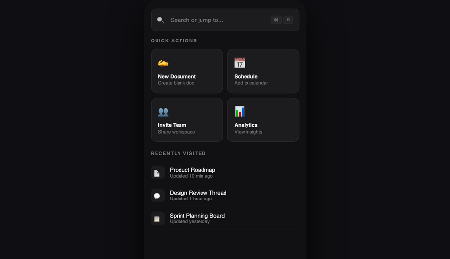
document.addEventListener('keydown', e => { if ((e.metaKey || e.ctrlKey) && e.key === 'k') { e.preventDefault(); openPalette(); } }) — Cmd+K on macOS, Ctrl+K on Windows/Linux. Also clickable via a search icon in the header. (2) Centered modal overlay with an input field at the top + filtered list of commands below. The list updates as the user types. Filter algorithm: simple command.label.toLowerCase().includes(query.toLowerCase()) for v1; production tools use fuzzy match (fuse.js or self-built Levenshtein) for typo tolerance. (3) Keyboard navigation: Arrow Down/Up moves selection, Enter activates, Esc closes. aria-activedescendant on the input points to the selected item's ID for screen reader compatibility. (4) Recent commands stored in localStorage — when the palette opens with an empty query, show 5 recently-used commands. Three production-grade details: (a) Trap focus inside the palette — without this, Tab leaks to the page behind. (b) Scroll the selected item into view as the user arrow-keys past the visible area. (c) Mobile keyboard inset: when the palette opens on mobile, the virtual keyboard pushes the input up — use VirtualKeyboard.overlaysContent = true + env(keyboard-inset-height).Is mobile navigation accessible? What about keyboard users and screen readers?
aria-current="page" on the active nav link. Screen readers announce "current page" alongside the visible highlight so blind users know where they are. (3) aria-expanded on the hamburger button — toggles between true/false as the drawer opens/closes. Without this, screen reader users have no idea whether tapping the icon opens or closes the menu. (4) Focus management. When the drawer opens, focus should move to the first focusable element inside (typically the close button or the first nav link). When it closes, focus returns to the hamburger button so the user doesn't lose their place. Pure-CSS demos can't manage focus — add ~5 lines of JS for accessibility-critical apps. (5) Esc to close. WCAG 2.1.2 ("No Keyboard Trap") — modal navigation (full-screen overlay, command palette) must dismiss on Esc. Pure-CSS demos rely on a backdrop click; JS demos add the Esc handler. Common mistake most tutorials make: relying purely on the visible hamburger icon transformation (lines morphing to X) without changing the aria-label attribute. Set aria-label="Open menu" when closed and dynamically swap to "Close menu" when open — for screen reader users, the visual morph is invisible. Demos 01 and 04 ship this correctly.What's the difference between glassmorphism, neumorphism, and cyberpunk navigation styles?
backdrop-filter: blur(20px); background: rgba(255,255,255,0.08); border: 1px solid rgba(255,255,255,0.18). Reads as "premium, modern, sophisticated." Best for: SaaS products, design tools, fintech apps. Browser support: Chrome 76+, Safari 9+, Firefox 103+ — universally supported but watch performance on long pages (backdrop-filter is paint-expensive). Neumorphism (Demo 16) is the soft-UI / claymorphism aesthetic — elements appear extruded from the background using paired light + dark shadows on the same element. box-shadow: -8px -8px 16px rgba(255,255,255,0.05), 8px 8px 16px rgba(0,0,0,0.3). Reads as "approachable, tactile, friendly." Best for: wellness apps, financial dashboards, productivity tools targeting non-technical users. Performance caveat: heavy box-shadows can affect scroll smoothness; limit to ~3 neumorphic elements per viewport. Cyberpunk neon (Demo 11) is the gaming / Web3 / generative-art aesthetic — saturated neon colors (electric pink, cyan, lime) on near-black backgrounds with glowing text via text-shadow: 0 0 12px currentColor and animated border gradients. Reads as "high-energy, technical, edgy." Best for: gaming products, crypto/Web3 apps, electronic music platforms, esports brands. Avoid for: serious productivity tools — the saturation is fatiguing for long sessions.Will mobile navigation animations hurt my Core Web Vitals INP score?
transform and opacity only. Every demo in this collection follows this — drawer slide-in uses transform: translateX(-280px) → translateX(0), not left: -280px → 0. Scaling is GPU-accelerated on the compositor thread; animating left/width/height forces layout recalculation on every frame, costing 4-16ms per frame and tanking INP (Interaction to Next Paint), the Core Web Vital that replaced FID in March 2024. Three mobile-nav-specific gotchas: (a) Animating backdrop-filter (Demo 10 glassmorphism drawer) is expensive — each animation frame the browser must re-blur the area beneath the drawer. Mitigation: don't animate the backdrop-filter value itself; animate opacity on a layer that contains the blurred element. (b) Long page beneath a glassmorphism nav: backdrop-filter re-evaluates the blur on every scroll frame. Long pages (10,000+ pixels) can drop scroll FPS noticeably on mid-tier Android. Mitigation: only apply backdrop-filter to the visible nav, not to a 100vh sticky element that covers the whole viewport. (c) Multiple nav elements with their own animations (e.g. animated hamburger icon + sliding drawer + fading backdrop simultaneously) — each individual animation is cheap but combined they can saturate the compositor on low-end devices. Stagger the starts with animation-delay: 0ms, 100ms, 200ms so they don't all peak at the same frame. Demos in this collection sequence animations correctly. Lighthouse mobile-profile: 95+ Performance score on Pixel 5 baseline.Which mobile navigation pattern should I use for my project?
prefers-reduced-motion, ship 44×44px tap targets (WCAG 2.5.5), use aria-current + aria-expanded, and are MIT-licensed.Related collections

26 CSS Accordions — Vertical & Horizontal
26 free CSS accordions — 17 vertical and 9 horizontal layouts with copy-paste HTML and CSS.

22 CSS Breadcrumbs
22 original CSS breadcrumb designs — underline grow, pill, diagonal slash, neon trail, brutalist, frosted glass, vertical stacked, progress track, holographic shimmer and more.

21 CSS Circular & Radial Menu Designs
21 free CSS circular and radial menu designs — pie, dome, orbital and skeumorphic layouts with copy-paste HTML and CSS.