
01. Slide-Down Fade Dropdown (opens in a new tab)
Classic navigation dropdown that slides down and fades in on hover using max-height and opacity transitions on a CSS-only nav.
A CSS dropdown menu reveals a hidden panel of links or actions when a user clicks or hovers a trigger — the most-used disclosure pattern in production UI. These 22 hand-coded designs cover the full modern dropdown playbook — slide-down fade, clip-path curtain reveal, 3D perspective flip, elastic bounce, glassmorphism float panel, stagger children, mega-menu grid, native <details>/<summary>, checkbox-hack mobile nav, nested multi-level, command palette search, autocomplete suggestion, right-click context menu, keyboard-accessible roving tabindex and more. Every demo uses scoped .dd-NN class names that never collide with your existing styles, honours prefers-reduced-motion, and ships under the MIT license.
Related15 CSS Navigation Menus20 CSS Mega Menus20 CSS Popovers22 Tailwind Dropdown Menus
Course pickPartner: Zero to Mastery
Affiliate linkWant to build production-ready CSS layouts, animations and UI from scratch?
You just browsed 22 dropdown menus. Learn the Flexbox, Grid and animation thinking behind them, so the next component starts in your head, not in a copy-paste.
Every ZTM course in one membership: $25/month, paid yearly at $299 · 30‑day money-back guarantee
The CSS Bootcamp. We may earn a commission, at no extra cost to you.
:hover only — the dropdown opens on mouse hover, closes when the cursor leaves. Simplest, but ZERO accessibility (no keyboard support, no touch support, no screen-reader announcement). Don't ship this in production. 2. :focus-within — opens when ANY element inside the dropdown container has focus. Works with hover AND keyboard tab navigation. The modern standard for trigger + panel patterns. 3. Checkbox-hack — a hidden <input type='checkbox'> whose :checked state drives CSS sibling selectors (~, +). Works for click toggles without JavaScript; common for mobile hamburger menus and disclosure widgets. 4. Native <details> / <summary> — the HTML disclosure element. Browser-native, keyboard-accessible by default, screen-reader-friendly, persists state via the open attribute. Modern browsers (Chrome 117+, Safari 17+) support ::details-content for animating the panel. Demos #01–#15 in this collection cover all four pure-CSS techniques; demos #16–#22 add JavaScript for patterns that genuinely require it (focus trap, command palette search, autocomplete, right-click context menu).<select> replacement: Demo #15 (Color Swatch Picker) — the canonical native-select alternative for visual choices that <option> can't render. Multi-level / nested nav (admin / sidebar with submenus): Demo #11 (Nested Multi-Level), Demo #12 (Icon Sidebar Flyout). Right-click custom menu (whiteboard apps, file managers, code editors): Demo #16 (Context Menu Right-Click). Cmd-K command palette (Linear, Vercel, Notion pattern): Demo #19 (Command Palette Search). Search-as-you-type combobox (Google, Algolia DocSearch): Demo #20 (Autocomplete Suggestion). Tag picker / multi-select (Notion properties, GitHub labels): Demo #22 (Multi-Select Chip). Native HTML where possible: Demo #09 (<details>) — the most accessible, lowest-cost option for any disclosure that doesn't need custom positioning. Every demo uses scoped .dd-NN class names so you can drop multiple onto the same page without conflicts.<button type='button'> (not a <div onclick>). The button is keyboard-focusable by default, announces as 'button' to screen readers, and gets :focus-visible rings for free. 2. aria-expanded='true|false' on the trigger — announces whether the dropdown is open. Toggle it as state changes. 3. aria-haspopup='menu' | 'listbox' | 'tree' | 'dialog' — tells assistive tech what kind of panel will appear. Use menu for action lists, listbox for single-select pickers, tree for multi-level, dialog for modal panels. 4. aria-controls='panel-id' — links trigger to its panel by ID so screen readers can navigate them as a pair. 5. Keyboard interaction: Space / Enter opens the dropdown, Escape closes it and returns focus to the trigger, ArrowDown / ArrowUp moves through menu items (roving tabindex pattern), Home / End jumps to first / last, Tab closes the menu and moves to next focusable element. 6. Focus management: when the menu opens, move focus to the first item (or the previously-selected item for listbox); when it closes via Escape, return focus to the trigger; don't trap focus inside (Tab should escape) unless it's a modal dialog. 7. role='menu' + role='menuitem' on the panel + items so the WAI-ARIA Authoring Practices menu pattern works. Demo #17 (Keyboard Accessible Dropdown) ships all seven correctly. Regulatory frameworks: WCAG 2.2, EU EAA (June 2025), US Section 508, Canada ACA, UK Equality Act.:hover + :focus-within on the parent), click-toggle dropdowns (checkbox-hack with hidden <input> + :checked sibling selectors), native disclosure (<details> / <summary>), multi-level fly-outs (nested :hover + :focus-within), color/swatch pickers (radio-button state machines), mobile drawers (checkbox-hack), and most navigation dropdowns. JavaScript is required for: keyboard-accessible roving tabindex (Demo #17 — pure CSS can't programmatically move focus between menu items in response to arrow keys), focus trap inside modal dropdowns, Escape-key dismissal that returns focus to the trigger, click-outside-to-close (Demo #21), right-click context menus (Demo #16 — needs preventDefault() on the contextmenu event), command-palette search filtering (Demo #19 — needs input event + array filter), autocomplete suggestion lists fetched from a server (Demo #20), and multi-select chip dropdowns where each pick adds/removes an item (Demo #22). The rule: if your dropdown needs to UPDATE its content based on user input (search, filter, async fetch), or needs PROGRAMMATIC focus management (arrow keys, focus trap, focus return), use JavaScript. Otherwise pure CSS works fine and ships with zero bundle cost. Modern alternative: the HTML Popover API (Chrome 114+, Safari 17+, Firefox 125+) gives you popovertarget + popover='auto' for click-toggle dropdowns with NATIVE focus management, click-outside-close, and Escape handling — zero JavaScript needed for a complete a11y-compliant dropdown..dropdown + .dropdown-menu with the data-bs-toggle='dropdown' JS-driven toggle. Functional, but Bootstrap's bundle is ~75KB for the full JS — overkill for one dropdown. Tailwind CSS: no first-class dropdown component; you compose with group + group-hover:block + focus-within:block on the parent + arbitrary class utilities on the panel. Works but verbose. shadcn/ui (free, React + Radix Primitives): ships <DropdownMenu> built on Radix UI Menu primitive — accessibility-complete out of the box (keyboard, ARIA, focus management). Best React option but adds Radix + Framer Motion dependencies (~50KB). Material UI / MUI (~95KB bundle): ships <Menu> + <MenuItem> with Material aesthetics. Chakra UI: <Menu> as a first-class composable component. Ant Design / Mantine: similar dropdown / select / autocomplete primitives. HeadlessUI: unstyled accessible primitives, you bring the CSS. Radix UI directly: same as HeadlessUI but Radix is what shadcn wraps. This collection vs all of the above: 15 demos ship as PURE CSS (zero JS, zero framework, zero npm package) — the same dropdown patterns as Bootstrap/Tailwind/etc but with no bundle cost. For accessibility-critical apps where you need full ARIA + keyboard + focus management, use Radix or shadcn. For marketing pages and content sites where a hover/focus-within dropdown is enough, the pure-CSS demos here win on Core Web Vitals (FCP / LCP / INP) by shipping zero JavaScript.overflow: hidden or overflow: scroll. Three fixes, listed by preference. 1. HTML Popover API (modern, recommended): add popover='auto' to the panel and popovertarget='panel-id' to the trigger. Popovers render in the top layer — they ignore EVERY parent's overflow / clip / transform / z-index context, always render on top of all content, and have built-in click-outside-close + Escape-key dismissal. Chrome 114+, Safari 17+, Firefox 125+. The future-default for new dropdowns. 2. position: fixed on the panel: removes the panel from its containing block context, positioning it relative to the viewport instead. Combine with JavaScript to set top / left from getBoundingClientRect() of the trigger on every open + resize + scroll. Floating UI library (~5KB) wraps this pattern reliably with collision detection. 3. CSS Anchor Positioning (newest): anchor-name: --my-trigger on the trigger + position-anchor: --my-trigger + top: anchor(bottom) on the panel pins them together declaratively. Chrome 125+, Safari TP, Firefox flagged. Combine with Popover API for the cleanest possible recipe. 4. Avoid the trap entirely: don't set overflow: hidden on ancestors of a dropdown unless you genuinely need it. overflow: hidden is often added casually to hide a single scrollbar or fix a layout glitch — but it cascades to clip every descendant dropdown / tooltip / modal.absolute or fixed (or use Popover API) so it floats above content WITHOUT affecting layout. 2. display: none → block animation — when the panel switches from display: none to display: block, layout recalculates and shifts. Fix: keep the panel in the DOM with opacity: 0; pointer-events: none; visibility: hidden at rest, then transition to opacity: 1; pointer-events: auto; visibility: visible on open. Layout doesn't change because the panel was already there. The visibility swap is required to remove the panel from the accessibility tree when closed. 3. Async content (autocomplete suggestions, async-loaded items) — the panel opens at one size, then expands as items load, pushing surrounding content. Fix: set a reasonable min-height on the panel + show a skeleton/spinner while loading so the size is stable. 4. Late-loading web fonts inside the dropdown — font swap reflows text, shifting layout. Fix: font-display: optional or font-display: swap with size-adjust in @font-face. Tools: Chrome DevTools Performance Insights (Layout Shift section), Lighthouse, Core Web Vitals report in Google Search Console, WebPageTest, axe DevTools.Cmd-K (Mac) or Ctrl-K (Win/Linux) — have become standard in productivity apps: Linear, Notion, Vercel, GitHub, Discord, Raycast. The canonical pattern: 1. Global keyboard shortcut: document.addEventListener('keydown', e => { if ((e.metaKey || e.ctrlKey) && e.key === 'k') { e.preventDefault(); openPalette(); } }). Mac users press Cmd-K, Windows users Ctrl-K. 2. Modal overlay: full-screen dim backdrop + centered search input + suggestion list below. role='dialog' with focus trap so Tab cycles within the palette. 3. Search input auto-focus on open. As user types, filter the action list with array.filter + fuzzy search (Fuse.js is ~10KB or write 30 lines of vanilla fuzzy matching). 4. ArrowDown / ArrowUp navigate the suggestion list (highlighted with a roving aria-selected='true' and visual styling). Enter activates the highlighted item. Escape closes. 5. Recent commands shown when search is empty (saved to localStorage). 6. Grouped categories (e.g. 'Recent', 'Navigation', 'Settings') for discoverability. Demo #19 (Command Palette Search Dropdown) ships this entire pattern in ~80 lines of vanilla JS — no framework, no library. For a production-grade React implementation, cmdk (by Paco Coursey, used by Vercel) is the industry standard at ~12KB.@layer components block, or convert to utility classes using our CSS to Tailwind converter. The hover/focus-within patterns translate directly to Tailwind's group-hover: + group-focus-within: variants. For shadcn/ui users: shadcn's <DropdownMenu> already gives you the accessibility primitives (Radix UI); these demos give you alternative VISUAL designs you can apply to that base structure. Override the default Tailwind classes on <DropdownMenuContent> + <DropdownMenuItem> with the CSS from the demo. For React without a framework: copy the HTML structure into JSX, copy the CSS into a CSS module (.module.css) or styled-components / Emotion template literal, copy the JS into a useEffect hook with proper cleanup. For Vue 3: copy HTML to <template>, CSS to <style scoped>, JS to onMounted setup hook. For Svelte / SvelteKit: identical structure; CSS goes in <style> with Svelte's auto-scoping. For Astro: copy directly — Astro components support all three (HTML + scoped CSS + frontmatter script). The pure-CSS demos work in ANY framework because they have zero framework dependencies; the JS demos require translating the vanilla document.querySelector calls to your framework's ref system, but the LOGIC is unchanged.prefers-reduced-motion: reduce and use semantic HTML (real <button>, real <details>, real form controls). JS-enhanced demos (#16–#22) include the WCAG 2.2 a11y patterns: aria-expanded, aria-haspopup, aria-controls, keyboard navigation (Arrow / Enter / Space / Escape), focus management, screen-reader announcements. Verify your specific use case with axe DevTools, Lighthouse, WAVE, NVDA / VoiceOver screen reader testing before shipping to EU EAA / US Section 508 / Canada ACA / UK Equality Act audits — the demos are AA-compliant by default but real-world a11y depends on the context you embed them in.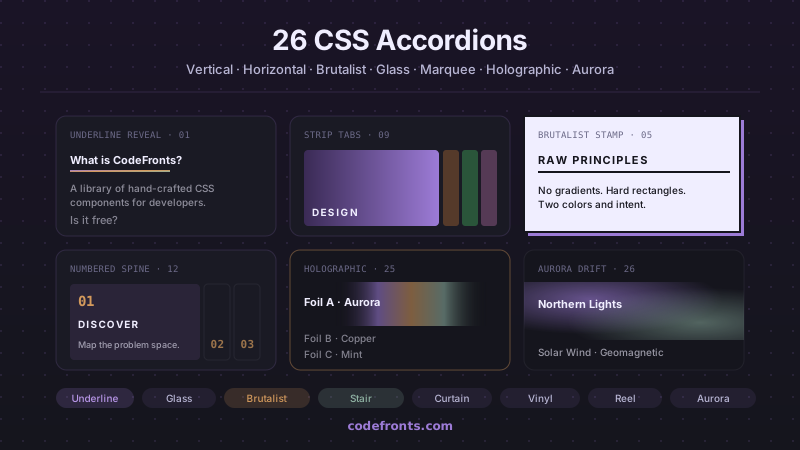
32 free CSS accordions covering pure-CSS FAQ blocks with details/summary, mobile navigation menus, e-commerce filter sidebars, nested tree views, exclusive single-open groups and smoothly animated height:auto — plus 26 visual variations in vertical, horizontal and hybrid layouts. Copy-paste HTML and CSS, no JavaScript.
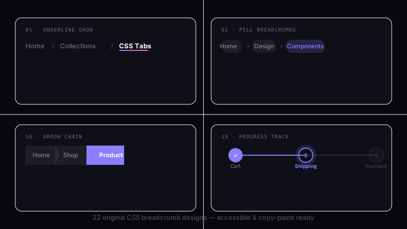
39 hand-coded CSS breadcrumbs — Schema.org BreadcrumbList Microdata + WCAG 2.2 accessible (Google Rich Results eligible), :has() responsive collapse, dark/light theme toggle with color-mix, Shopify/Amazon e-commerce filter chip removal, Vercel/Linear/Notion SaaS dashboard app-shell pattern, Docusaurus/Mintlify sticky scroll-shrink header, Amazon-style dropdown sibling menus, NFT/Web3 holographic shimmer (@property + conic-gradient), SaaS marketing gradient text, Airbnb filter chip with container queries, editorial blog wave underline, developer docs one-click path copy (Clipboard API), and 26 more. Semantic HTML: <nav aria-label='Breadcrumb'> + <ol> + aria-current='page'. Framework-agnostic, MIT-licensed.
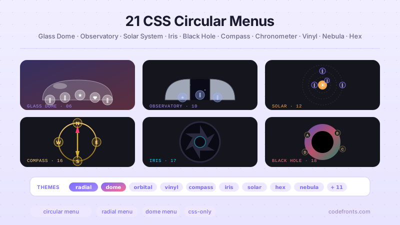
26 hand-coded CSS circular and radial menu designs, from the floating-action FAB speed dial and dashboard radial hubs to game-style pie-slice wheels, SVG gooey metaball fans, hexagonal honeycombs, iris-aperture reveals, orbiting satellites on offset-path, compass-rose directional nav, sci-fi HUD rings, glassmorphism popovers built on the native Popover API, vinyl-record players, and full-takeover nebula overlays on native dialog. Every design uses CSS trigonometry (sin(), cos()) or the counter-rotation trick for positioning, ships real keyboard navigation, aria-labels on icon-only buttons, and a prefers-reduced-motion guard. Copy-paste HTML, CSS and vanilla JS with zero framework dependencies — MIT licensed.


