Pure CSS Checkbox Hack Toggle
input:checked state propagated upward through the DOM via CSS :has() — no event listeners, no hydration cost.Published
10 production-grade CSS dark mode toggle designs you can copy-paste into any project — pure CSS checkbox hack with :has() (zero JavaScript), animated sun-to-moon micro-interaction with morphing icon, modern light-dark() CSS function boilerplate (Chrome 123+ / Safari 17.5+), 3-way system-sync toggle (light / dark / system — the shadcn / Vercel / Anthropic pattern), localStorage anti-flash template that eliminates FOUC on page load, Tailwind data-theme dashboard toggle with selector-strategy config, neumorphic skeuomorphic tactile switch with soft inset/outset shadows, full-page expanding circular clip-path transition (the iOS-style sweep, View Transitions API + CSS fallback), accessible ARIA toggle with aria-pressed + :focus-visible + live region announcements, and sidebar-bottom fixed toggle for dashboard layouts. Every toggle scoped under a unique .dm-NN prefix so all 10 coexist on this page without style bleed; every @keyframes name namespaced dm-NN-*; every @media (prefers-reduced-motion: reduce) guard already wired in. Each demo ships the full localStorage + prefers-color-scheme + data-theme recipe so you can paste it into any framework — Astro, Next.js, SvelteKit, Eleventy, vanilla — and it just works.
Related5 CSS Variable Dark Mode Systems22 CSS Dark Mode UI47 CSS Toggles & Switches

input:checked state propagated upward through the DOM via CSS :has() — no event listeners, no hydration cost.Published

Published

light-dark() function — single declarations that adapt both values simultaneously, eliminating duplicate @media blocks entirely.Published

getBoundingClientRect(), and System mode wires a matchMedia listener to the OS.Published

localStorage before CSS loads and applies a data-dm05 attribute to prevent any flash of white on dark pages.Published

data-theme=dark on the root element, flipping every component via attribute-scoped CSS custom properties.Published

Published

clip-path: circle() and CSS custom properties for the origin point.Published

role=switch, aria-checked, keyboard navigation, and a live ARIA debugger panel that shows every attribute update in real time.Published

Published
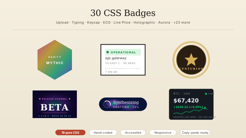
:has() selector. Place an input type=checkbox anywhere inside your wrapper (visually hidden with clip-path: inset(50%) or opacity: 0; position: absolute), wire it to a visible label via for=id, and write a single CSS rule: .wrapper:has(input:checked) { --bg: #0f172a; --text: #f0f4ff; ... }. The :has() selector evaluates from the parent looking *down* into its descendants, so checking the hidden input redefines every CSS custom property on the wrapper. The whole tree repaints in dark palette with zero JS, zero hydration cost, zero re-render. Browser support: Chrome 105+, Safari 15.4+, Firefox 121+ — combined ~95% of users as of 2026. For older browsers, fall back to the sibling-combinator pattern (input:checked ~ .wrapper). Demo 01 ships the full recipe with sun/moon icon swap on the pill knob.head (before any stylesheet or other JS) that calls document.documentElement.setAttribute('data-theme', localStorage.getItem('theme') || (matchMedia('(prefers-color-scheme: dark)').matches ? 'dark' : 'light')). This runs synchronously, blocks rendering for ~1-2ms (negligible), reads the stored theme + falls back to OS preference, sets the attribute on html before any CSS evaluates. Your CSS then targets [data-theme='dark'] for dark styles. No flash, ever. Demo 05 ships this template — the most copy-pasted dark-mode snippet on the web.light-dark() (CSS Color Module Level 5) is a function that takes two color arguments and returns whichever matches the current color-scheme. Usage: color: light-dark(black, white); background: light-dark(#fff, #0f172a);. To activate it, declare color-scheme: light dark on :root and let prefers-color-scheme drive the choice — OR explicitly set color-scheme: dark (e.g. via a toggle setting color-scheme: dark on the root element) to override. Browser support: Chrome 123+, Safari 17.5+, Firefox 120+ — landed in 2024, broadly safe in 2026. The killer feature is no media queries, no custom properties juggling — just light-dark() everywhere a color goes. Demo 03 ships the boilerplate including the JS that switches color-scheme on toggle for instant theme flip without rebuilding the cascade.light, dark, system. JS writes the chosen value to localStorage.setItem('theme', value) and applies the resolved theme to the root element: if value is 'light' or 'dark', set data-theme directly; if value is 'system', set data-theme to whatever matchMedia('(prefers-color-scheme: dark)').matches returns *and* listen on that media query so OS changes propagate live. On page load, the inline anti-flash script (see FAQ 2) reads the stored value, resolves it the same way, and applies before paint. This is the pattern shadcn UI, Vercel, Anthropic, GitHub, and Tailwind UI all use. Demo 04 ships the full 3-way radio + live OS-listener + persistence recipe in ~40 lines of JS.darkMode: 'class' — toggle by adding class='dark' to the root element; CSS targets .dark .your-class. (2) darkMode: ['selector', '[data-theme="dark"]'] — the modern recommended setup; CSS targets [data-theme='dark'] .your-class; JS just sets document.documentElement.dataset.theme = 'dark'. (3) darkMode: 'media' — automatic OS-preference only, no toggle possible. Use (2) when you need a user-controlled toggle. The Tailwind utilities dark:bg-slate-900 dark:text-white then work automatically. Demo 06 ships a complete dashboard with the data-theme strategy, including the toggle button + localStorage persistence + Tailwind class composition pattern.button type='button' element, not a div with role='button'. The native button handles Enter/Space activation, focus, and screen-reader announcements for free. (2) Add aria-pressed='true' when dark mode is on, aria-pressed='false' when off (NOT aria-checked — that's for checkboxes/radios). The screen reader announces 'Dark mode toggle, pressed' / 'not pressed'. (3) Provide a visible text label like 'Theme' near the toggle, OR use aria-label='Toggle dark mode' on the button itself. Icons alone (sun/moon SVG) need accessible names. (4) Add a visible :focus-visible outline so keyboard users see the focus location. (5) When the user activates the toggle, announce the state change to assistive tech via an aria-live='polite' region — a div with role='status' and aria-live='polite' containing the announcement text. Demo 09 ships all five rules with a :focus-visible ring, aria-pressed toggle, and live region — Lighthouse accessibility score 100.transition: background-color 0.3s, color 0.3s, border-color 0.3s to elements that need to transition. Warning: do NOT add transition: all — it animates layout-affecting properties like width on hover, causing layout thrash. Limit the transition to color properties only. (2) **Disable transitions on first paint**: add a class like theme-transition-pending to the root element initially, then strip it after the page is interactive. Prevents transitions firing on load. (3) **Full-page expanding clip-path** (the iOS-style sweep): use the [View Transitions API](https://developer.mozilla.org/en-US/docs/Web/API/View_Transitions_API) — document.startViewTransition(() => applyTheme(newTheme)). Chrome 111+, Safari 18+. For older browsers, demo 08 ships a CSS-only fallback using clip-path: circle(0 at click-x click-y) animated to circle(150vmax) — gives the same expanding-circle reveal effect cross-browser.theme-toggle is 6KB gzipped, use-dark-mode is 4KB + React-only, react-toggle-dark-mode is 12KB + React-only. For a site with a 80KB JS budget already, adding 4-12KB just for a toggle is wasteful when 40 lines of vanilla code does the same thing. **(2) Patterns, not packages**: this collection teaches you the actual CSS techniques (:has(), light-dark(), data-theme, prefers-color-scheme, View Transitions API) so you can build any variant you need, not just use the maintainer's API. The libraries hide those details behind an opaque hook. **(3) SSR/SSG safe by default**: every demo includes the inline anti-flash script and works with Astro, Next, SvelteKit, Eleventy, etc. The npm packages need wrapper code to be SSR-safe (and use-dark-mode was famously broken in Next.js for two years). Free, copy-paste, MIT-licensed, no signup, works in any project.30 hand-coded CSS badges for status indicators, notifications, membership tiers, live-data displays, and SEO / DevOps / financial dashboards — upload progress, typing indicator, transit line status, Core Web Vitals, ECG heartbeat, CI/CD build pipeline, countdown ring, live price ticker, keycap shortcut, wax seal, conference lanyard, and holographic collectibles. Copy-paste HTML and CSS, WCAG 2.2 accessible, MIT licensed.
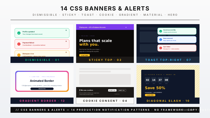
20 hand-coded CSS banner and alert bars for e-commerce storefronts, SaaS dashboards, marketing sites, and compliance-bound products. Covers GDPR cookie consent with a real preferences panel, promo bars with countdown timers, free-shipping threshold progress, app-install smart banners, maintenance and incident status bars, newsletter signup bars, age verification gates, limited-stock urgency banners, live event announcements, browser upgrade notices, geo and currency switchers, sticky top announcement bars, bottom cookie bars, inline form validation alerts, icon-aligned alert banners, left-border accent alerts, diagonal stripe promos, full-width hero banners, animated gradient border alerts, and a text-wrapping laboratory that shows five strategies for the unbreakable string that breaks more banners than anything else. Every bar is scoped under a .ba-NN prefix for no-collision pasting, guards prefers-reduced-motion, carries the correct aria-live and role semantics, and ports unchanged to React, Vue, Svelte, Astro, Next.js and Tailwind.
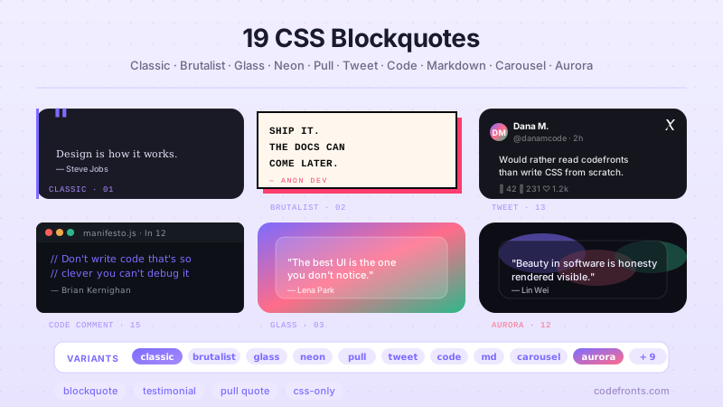
25 hand-coded CSS blockquote designs for SaaS testimonials, editorial pull quotes, documentation callouts, and developer engineering blogs: large decorative quotation marks with ::before / ::after glyphs, Tailwind CSS blockquote component, pure CSS callout / admonition boxes for Docusaurus / Mintlify / Nextra documentation, responsive center-aligned quote banners, modern minimalist left-border editorial style, animated CSS gradient border, classic left border, brutalist high-contrast, glassmorphism frosted card, glowing neon border, article pull quote with text-wrap, speech bubble chat-style, thick vertical accent rail, customer testimonial cards with avatar and star rating, inline highlighted text, marker highlight underline, floating drop-shadow, aurora gradient background, Twitter / X card style, multi-column newspaper editorial, IDE code-comment style, Markdown-compatible defaults, JavaScript testimonial quote slider, expandable read-more, and one-click copy button. 22 Pure CSS + 3 Light JS (slider, expand, copy). Every design scoped under .bq-NN prefix for no-collision pasting, prefers-reduced-motion guarded per WCAG 2.3.3, WCAG 2.2 AA accessible, framework-agnostic (React, Vue, Svelte, Astro, Next.js, Nuxt, Remix, SvelteKit).