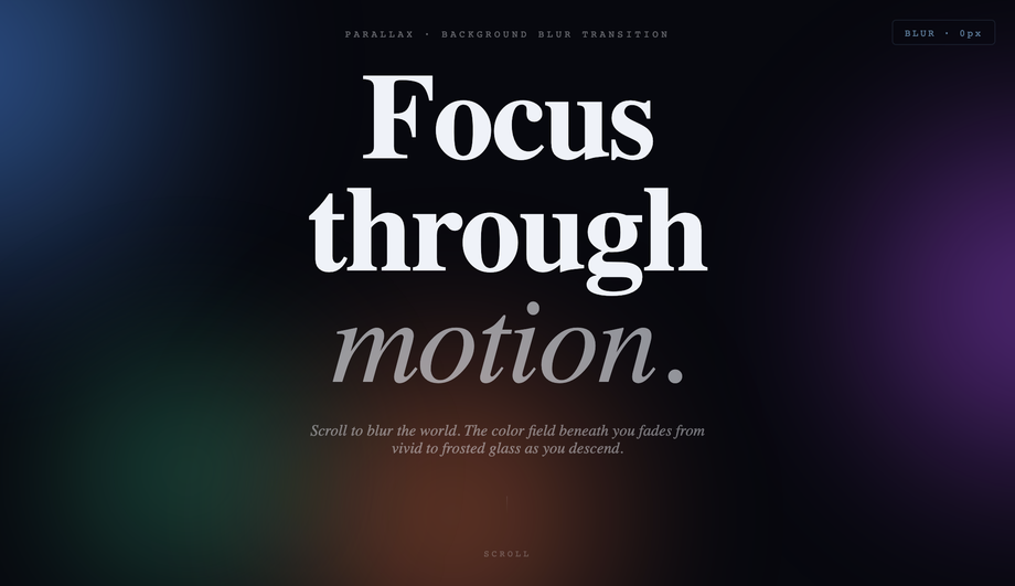
10 CSS Parallax Effects
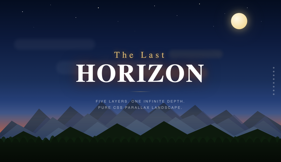
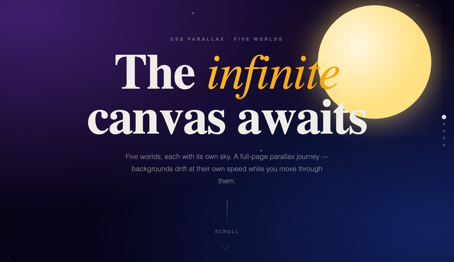
10 hand-coded CSS parallax effects covering the patterns search demand actually targets: multi-layer scroll hero, cinematic SVG landscape with 5 depth layers, sticky parallax sections (Stripe/Linear marketing pattern), multi-scene sticky-pinned parallax journey across 5 worlds, asymmetric image grid, horizontal-scroll panels driven by vertical scroll, text overlay, mouse-driven 3D card tilt, zoom-in depth, and backdrop-filter blur transition. All 10 use requestAnimationFrame-throttled scroll/pointer listeners. Every demo respects prefers-reduced-motion. MIT-licensed.

Frequently asked questions
Why doesn't background-attachment: fixed work for parallax on mobile anymore?
background-attachment: fixed on a section background — has been broken on mobile for years. iOS Safari ignored it from iOS 5 onward (Apple decided the fixed-background scroll calculation hurt scroll performance enough to skip it entirely), and modern Chrome on Android follows the same convention. The result: tutorials that teach this pattern produce sites that work on desktop but have static, unfixed backgrounds on phones — exactly where parallax is most visually impactful. Demo 01 (CSS Parallax Hero Section) uses the modern alternative: a requestAnimationFrame-throttled scroll listener that applies transform: translateY(scrollY * speed) to each layer. The layers move independently AND it works identically on mobile. ~12 lines of JS. Every demo in this collection avoids background-attachment:fixed for this exact reason.Can I do parallax effects in pure CSS without any JavaScript at all?
perspective: 1px on the scroll container, then transform: translateZ(-2px) scale(3) on background layers and translateZ(0) on foreground layers. As the viewer scrolls, deeper layers move slower because they're farther from the camera in 3D space. Limitations: requires the scroll container to own its own scroll (not body), and the perspective stacking context interferes with position: fixed elements. Approach 2: animation-timeline: scroll() / view() (Chrome 115+, Safari 18+, Firefox 130+) — the modern API binds CSS animation progress to scroll position. Powerful but has subtle quirks with position: sticky parents (the view() timeline freezes once the sticky pins) that make pinned-scene parallax harder than it looks. For most production work in 2026, a 12-line requestAnimationFrame scroll listener applying transform: translateY(scrollY * speed) is more reliable across browsers, easier to debug, and gives identical visual results. Pure-CSS parallax is a real option for hero-only / non-pinned layouts; for full-page multi-scene parallax (like this collection's Demo 04), the JS approach is the pragmatic choice.How do I build a sticky parallax section sequence (Stripe / Linear marketing-page style)?
position: sticky; top: 0; height: 100vh) so the panel pins to the viewport while the outer container's extra scroll runway provides the parallax delta. JavaScript tracks each chapter's getBoundingClientRect() as scroll moves and applies progress-based transforms (translate, rotate, opacity) to the inner content. The result: each section gets its own animated narrative beat, the visitor scrolls naturally through the page, and there's no JavaScript scroll-hijacking (a frequent UX antipattern in parallax sites). About 60 lines of JS total. Bonus: gracefully degrades to a normal scrollable page if JS is disabled — content remains accessible.What's the JS-clobbering-CSS-transforms bug, and how do I avoid it?
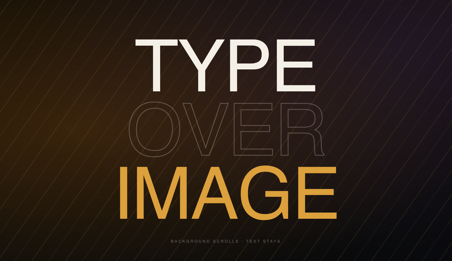
element.style.transform = \`translateY(${scrollY * 0.5}px)\` on every scroll frame, it overwrites ANY CSS transform already set on that element — including centering tricks like transform: translateX(-50%). Result: a sun that was supposed to be horizontally centered jumps to the right of where it should be, a blob that was vertically centered drops off the bottom of its panel. Two fixes: (1) Position with calc() instead of transform — use left: calc(50% - 100px) instead of left: 50%; transform: translateX(-50%). The calc approach can't be overwritten by inline transform. (2) Compose the inline transform string to preserve baseline transforms — element.style.transform = \`translateX(-50%) translateY(${scrollY * 0.5}px)\`. Demos 02 and 08 in this collection use the calc() pattern; demos 06 and 09 use composition. Most "CSS parallax" tutorials skip this nuance entirely and ship demos that visibly break.How do I create horizontal parallax scroll panels (driven by vertical scroll)?
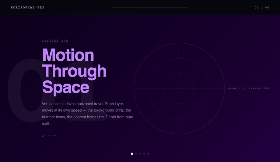
height: 500vh) to provide scroll runway. Inner is position: sticky; top: 0; height: 100vh; overflow: hidden. The track inside the sticky inner has width: 500vw with 5 panels at 100vw each. JS reads scrollY as a 0-to-(scrollDistance) value, normalizes to 0-1, and applies transform: translateX(-${progress * 80}%) on the track. As the visitor scrolls down, the track slides left and 5 panels reveal horizontally. Best for: case-study sites, product feature walkthroughs, portfolio retrospectives. ~30 lines of JS. Most articles teach "parallax" as vertical-only — the horizontal-driven-by-vertical pattern is a real competitor gap with strong WOW-factor.How do I do mouse-driven 3D card tilt parallax (Apple AirPods page style)?
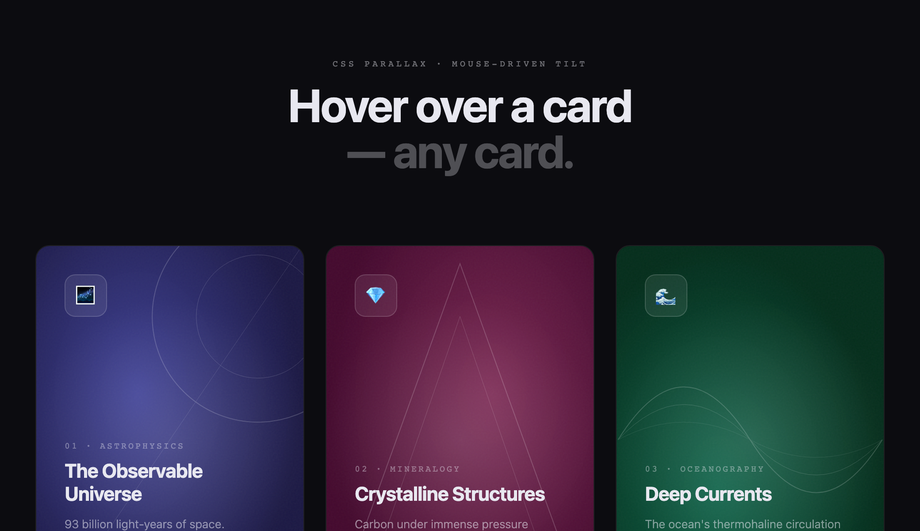
transform: perspective(800px) rotateX(0) rotateY(0) at rest. On mousemove within the card bounds, JS calculates the cursor's offset from the card center as a -1 to +1 value on each axis, then applies rotateY(cursorX * 10deg) rotateX(-cursorY * 10deg). Critical detail most tutorials skip: layered children inside the card need their own translateX/translateY offsets proportional to cursor position — that's what creates the depth illusion that the foreground icon "floats above" the background. On mouseleave, smoothly reset all transforms with a transition: transform 0.4s cubic-bezier(.22,1,.36,1). Touch handler also wired so the effect works on tablets. ~40 lines of JS.Are CSS parallax effects accessible? What about prefers-reduced-motion?
@media (prefers-reduced-motion: reduce) block that freezes parallax transforms to identity (no movement) when the visitor's OS preference says so. The JS handlers also check window.matchMedia('(prefers-reduced-motion: reduce)').matches before attaching scroll listeners — if reduced motion is on, the scroll-driven JS is skipped entirely. Result: visitors who need the reduced experience get a static, fully-readable page; visitors who want the full motion get it. Most "CSS parallax" tutorials skip this consideration entirely, which is a real accessibility liability.How does animation-timeline: scroll() compare to JS scroll listeners for parallax?
animation-timeline: scroll() is the 2024-introduced CSS API (Chrome 115+, Safari 18+, Firefox 130+) that lets @keyframes animations be driven by scroll progress instead of wall-clock time. For parallax patterns this is huge: instead of window.addEventListener('scroll', ...) + requestAnimationFrame + transform math (the JS pattern), you write a regular @keyframes + add animation-timeline: scroll(root) + animation-range: 0 100%. Browser runs it on the compositor thread. Cost comparison on a throttled mobile (Pixel 5, Lighthouse mobile profile): JS scroll-listener parallax = ~80-120ms scripting per scroll second (eats INP); CSS scroll-timeline parallax = 0ms scripting. This collection's Demos 01-10 currently use the JS pattern for broader browser support (Safari 18 only shipped in late 2025), but a future v2 may add scroll-timeline variants. Most "CSS parallax" tutorials online predate this API entirely — a meaningful competitor gap if you're optimizing for Core Web Vitals.Which parallax effect should I use for my project?
.plx-NN__* class names so multiple can coexist on the same project without collision.Related collections

20 CSS Animated Buttons
20 hand-coded CSS animated buttons — neon glow, ripple, 3D press, liquid fill, jelly bounce, shine sweep, animated border, moving gradient CTA, text flip, submit success state, add-to-cart progress, download icon, hamburger-to-close, toggle switch, loading spinner inside button, next/prev arrow nav, and ghost button background reveal. Half pure CSS, half lightweight JS for production interactions.

15 CSS Background Animations
15 hand-coded CSS background animations with live demos — infinite shifting gradient, floating particle bubbles, parallax starry night, clickable cyberpunk ripple, sliding geometric grid, SVG wave overlays, glassmorphism orbs, aurora borealis ribbons, matrix digital rain, mesh gradient blobs, falling snow, morphing blob, retro synthwave 3D grid, infinite scrolling diagonal marquee, comic-book halftone dots. 100% Pure CSS, no JavaScript, no canvas, no particles.js. prefers-reduced-motion respected, scoped class names, MIT-licensed.

27 CSS Button Hover Effects
27 hand-coded CSS button hover effects — 3D press, neon glow, gradient slide, border draw, liquid fill, ripple, glitch text, and kinetic flips. Every demo is pure CSS (no JavaScript, no framework), tuned for 60fps with transform and opacity, and respects prefers-reduced-motion out of the box.