
01. Pure CSS Slide-In Side Menu (opens in a new tab)
A navigation drawer that slides in from off-screen left when a burger icon is clicked, driven entirely by a hidden checkbox and CSS sibling selectors.
17 CSS side menus for app shells, admin dashboards, documentation sites, and marketing headers — spanning slide-in drawers with overlay blur, off-canvas push layouts, collapse-to-icon rails, hover-expand sidebars, sticky full-height columns, multi-level accordion trees, and a floating glass dock. Scoped under .sm-NN for no-collision pasting, prefers-reduced-motion guarded, framework-agnostic.
Related20 CSS Sidebar Navigation28 CSS Hamburger Menus20 CSS Responsive Navbars17 Tailwind CSS Side Menus
Course pickPartner: Zero to Mastery
Affiliate linkWant to build production-ready CSS layouts, animations and UI from scratch?
You just browsed 17 CSS side menus. Learn the Flexbox, Grid and animation thinking behind them, so the next component starts in your head, not in a copy-paste.
Every ZTM course in one membership: $25/month, paid yearly at $299 · 30‑day money-back guarantee
The CSS Bootcamp. We may earn a commission, at no extra cost to you.
<input type='checkbox'> + <label> burger, with :checked ~ .nav { transform: translateX(0) } sliding the drawer in. Click-driven, zero JS, works on every browser since 2010. 2. Off-canvas push (Demo #03) — same checkbox toggle but the main content also translateX's to make room, producing the native-app push effect where content moves rather than getting covered. 3. Hover-expand icon rail (Demo #04, #14) — collapsed icon strip that widens on :hover to reveal labels. The VSCode / Discord pattern. 4. Responsive media-query toggle (Demo #05) — sidebar permanently visible on desktop, slides off-screen below a breakpoint. One markup, two layouts, controlled by @media only. 5. Sticky / fixed full-height (Demo #06, #08) — position: sticky; top: 0; height: 100vh keeps the sidebar pinned while the article scrolls — the documentation site pattern. Demos #07 and #16 layer multi-level accordion behaviour on top using independent checkbox-pairs at each tier. All 16 ship as 100% pure CSS — no JavaScript, no framework, no npm package.<input type='checkbox' id='t' hidden> as the state-holder, <label for='t' class='burger'> as the click target, and <nav class='sm-01__nav'> as the drawer. The nav defaults to transform: translateX(-100%) (slid off-screen left). The sibling combinator ~ targets it from the input: .sm-01__toggle:checked ~ .sm-01__nav { transform: translateX(0) }. Clicking the label flips the checkbox, the sibling rule fires, and the drawer slides in. Why transform and not left or display: only transform and opacity are composited on the GPU, so the slide animation runs at a buttery 60fps without triggering layout / paint. The same recipe with an extra <label for='t' class='overlay'> behind the drawer gives you tap-outside-to-close (Demo #02, #13). Add transform: translateX(var(--w)) to the main content and you get off-canvas push (Demo #03). Three elements, one CSS rule pair, infinite variations.@media (min-width: 1024px).<input id='m1' type='checkbox'> + <label for='m1'> + #m1:checked ~ .sub-l1 { max-height: 400px }. Tier 2 (inside .sub-l1): <input id='m2'> + <label for='m2'> + #m2:checked ~ .sub-l2 { max-height: 200px }. The general sibling combinator (~) lets each toggle reach across DOM cousins, so a level-2 toggle nested inside .sub-l1 can still control its .sub-l2 sibling. Key gotcha: animate max-height, never height: auto — auto can't transition. Set max-height just above the expanded content's natural height so the animation duration feels right. For dynamic-height content, max-height: 100vh works but the close animation will run the full duration regardless of actual content. Modern alternative: interpolate-size: allow-keywords (Chrome 129+) lets height: 0 → auto transition for real. Combine with @starting-style for entry animations. Demo #16 (CSS-Only Accordion Side Navigation) uses the same pattern for documentation TOCs. Modern HTML alternative: nested <details> elements are accessibility-better but harder to animate beyond the native disclosure flip.:hover expansion. .sm-04__rail { width: var(--collapsed); transition: width var(--dur) var(--ease) } at rest. .sm-04__rail:hover { width: var(--expanded) } on hover. The transition smoothly interpolates between the two states. The fade-in trick: text labels start at opacity: 0 with a slight transition-delay: 0.05s on the opacity transition so labels fade in AFTER the container has begun widening — without the delay, you'd see clipped label text during the open animation. Each icon cell uses a fixed width: var(--collapsed) so icons stay anchored on the left as the container grows; only the label area beyond them appears. Touch caveat: :hover doesn't fire on touchscreens, so add a @media (hover: hover) guard and provide a click-toggle fallback for mobile (the checkbox-hack from Demo #01 works as the fallback). Modern alternative: :has(:focus-within) opens the rail on keyboard focus, making it accessible without a separate toggle button — Chrome 105+, Safari 15.4+, Firefox 121+.<nav aria-label='Main'> so screen readers announce it as a navigation landmark. 2. Semantic trigger: the burger button must be a real <button type='button'> or a <label> attached to a checkbox (which the browser exposes as a button equivalent). Never a <div onclick>. 3. aria-expanded='true|false' on the trigger — announces whether the drawer is currently open. The checkbox-hack pattern needs JS to flip this attribute when state changes (pure CSS can't update ARIA), OR you can rely on the semantically-correct checkbox state alone. 4. aria-controls='nav-id' linking trigger to drawer by ID. 5. Keyboard interaction: Space / Enter toggles the drawer, Escape closes it and returns focus to the trigger, Tab moves through nav links in DOM order. 6. Focus management: when the drawer opens, move focus to the first link (or trap focus inside if the drawer is modal-style with a dimmed backdrop). 7. prefers-reduced-motion: reduce — disable the slide animation for users with vestibular disorders. Every demo in this collection includes this rule. Regulatory frameworks: WCAG 2.2, EU European Accessibility Act (effective June 28, 2025), US Section 508, Canada ACA, UK Equality Act 2010. Verify with axe DevTools, Lighthouse, WAVE, NVDA / VoiceOver screen-reader testing before shipping.<label for='t'>), and ALL visual / animation effects (slides, fades, neon, glassmorphism, neumorphism). JavaScript is required for: focus management (moving focus to the first link on open, returning to trigger on close), focus trap inside modal-style drawers, Escape-key dismissal, screen-reader live announcements when the drawer opens, programmatic aria-expanded updates, click-outside-close that ALSO works on tap-outside on iOS (Safari has subtle bugs with :checked propagation), and any logic that depends on viewport / scroll position. Modern alternative: the HTML Popover API (Chrome 114+, Safari 17+, Firefox 125+) gives you popovertarget + popover='auto' with NATIVE Escape handling, click-outside-close, focus management, and accessible announcements — zero JavaScript needed for a complete a11y-compliant drawer. <dialog open> + JavaScript's .showModal() covers modal-style focus-trapped drawers.fixed inset-y-0 left-0 w-64 -translate-x-full peer-checked:translate-x-0 on a sibling-of-checkbox pattern. Works, but verbose. Tailwind UI ($299 lifetime): ships pre-designed slide-over drawer templates with Tailwind classes — copy-paste, not a component library. shadcn/ui (free, React + Radix): ships <Sheet> built on Radix UI Dialog primitive — accessibility-complete (focus trap, Escape, ARIA, click-outside). Best React option but adds Radix (~30KB) + Tailwind dependencies. Headless UI: <Disclosure> + <Transition> unstyled primitives, you bring the CSS. Material UI / MUI (~95KB): ships <Drawer> with Material aesthetics, multiple variants (permanent, persistent, temporary, mini). Chakra UI: <Drawer> as a first-class composable component with built-in placement (left/right/top/bottom). Mantine: <Navbar> + <Drawer> with collapsing variants. Ant Design: <Drawer> + <Menu>. Aceternity UI / Magic UI (free, React): ship animated sidebar templates copying VSCode / Linear / Vercel aesthetics. This collection vs all of the above: 16 demos ship as PURE CSS (zero JS, zero framework, zero npm package) — the same patterns as Tailwind UI / shadcn / MUI / Chakra but with no bundle cost. For accessibility-critical apps where you need full ARIA + focus trap, use shadcn Sheet or Radix Dialog. For marketing pages, dashboards, and content sites, the pure-CSS demos here win on Core Web Vitals (LCP / INP / CLS) by shipping ZERO JavaScript.cursor: pointer to the label — iOS requires a pointer cursor on the AND its ancestor click-targets for tap-to-toggle to register reliably. 2. Sibling combinator fragility: ~ requires the checkbox, label, and target to all be DIRECT children of the same parent. Wrapping any of them in a wrapper div breaks the selector silently. Fix: keep <input>, <label>, and the nav as direct siblings of .sm-NN; nest other UI inside the nav itself if needed. 3. Click-outside-to-close lag: tapping the overlay sometimes requires a double-tap on iOS because Safari treats the first tap as a focus shift, not a click. Fix: ensure the overlay <label for='t'> has both cursor: pointer AND -webkit-tap-highlight-color: transparent to remove the iOS tap-delay heuristic. 4. backdrop-filter on iOS < 15: glassmorphism demos (#10) use backdrop-filter: blur() — older iOS needs the -webkit-backdrop-filter prefix too. Add both. 5. Visual :checked sync: if your checkbox has any visible styling (which it shouldn't for the burger pattern), make sure it's truly hidden via position: absolute; clip: rect(0,0,0,0) rather than display: none — display: none removes it from the focus order and breaks keyboard tab-to-toggle.inset-inline-start, margin-inline, padding-inline) or is one CSS swap away (flip left: 0 → right: 0 and negate the translateX direction). For full RTL: wrap your page in <html dir='rtl'> and use transform: translateX(100%) instead of translateX(-100%) for the default-closed state — every direction-aware property mirrors automatically. Framework integration: Next.js (App Router) — drop the markup into a layout.tsx sidebar slot or a client component; the checkbox-hack is server-renderable with zero hydration cost. Astro — paste the HTML + CSS into an .astro file; Astro's scoped styles automatically prefix the CSS so the .sm-NN namespace doubles up safely. SvelteKit — put the markup in +layout.svelte with <style> auto-scoping. Vue 3 — <template> + <style scoped>. Remix — identical to Next.js. Tailwind — convert the CSS to utilities using our CSS to Tailwind converter, or paste raw CSS into @layer components. shadcn/ui — these designs make great visual overrides for the default <Sheet> component; replace the Tailwind classes on <SheetContent> with the demo's CSS. The pure-CSS demos work in ANY framework because they have zero framework dependencies.:checked state and runs the CSS transition on the compositor thread. INP stays under 50ms regardless of page complexity. CLS (Cumulative Layout Shift): JS drawers shipped via React/Vue/Svelte are typically client-hydrated — the drawer's DOM doesn't exist on first paint, then mounts post-hydration and shifts layout. CSS drawers are server-rendered in their final position; the markup is identical before and after hydration. CLS = 0 from the drawer itself. LCP (Largest Contentful Paint): a JS drawer's bundle (shadcn Sheet via Radix Dialog ~30KB gzipped, MUI Drawer ~95KB, Framer Motion ~50KB for animation) is render-blocking JavaScript that delays LCP. A CSS drawer adds ~2KB of CSS that the browser parses in parallel with HTML — zero LCP impact. Lighthouse Performance score: replacing a single Radix Dialog drawer with a pure-CSS equivalent typically lifts Lighthouse Performance from 78 → 92 on mid-tier mobile (Moto G Power simulated). Concrete measurement: use PageSpeed Insights, Chrome DevTools Performance Insights, WebPageTest, or the Core Web Vitals report in Google Search Console. For real-user metrics, ship the web-vitals library (~3KB) and report INP/LCP/CLS to your analytics — you'll see the CSS drawer's INP land in the <100ms 'Good' bucket on every device tier.<html dir='rtl' lang='ar'> — every direction-aware property cascades automatically (text alignment, list-item bullets, scrollbar position, default flex-row direction). 2. Use logical properties everywhere physical ones would normally go: inset-inline-start instead of left, inset-inline-end instead of right, margin-inline-start / margin-inline-end instead of margin-left / margin-right, padding-inline instead of padding-left + padding-right, border-inline-start instead of border-left. The browser flips them based on dir. Logical properties are universally supported (Chrome 87+, Safari 14.1+, Firefox 66+). 3. Flip transform direction manually — this is the one place logical properties can't help. The default-closed drawer in LTR uses transform: translateX(-100%) (off-screen left). In RTL, change to transform: translateX(100%) (off-screen right). Wrap in a CSS-only guard: .sm-01__nav { transform: translateX(-100%); } [dir='rtl'] .sm-01__nav { transform: translateX(100%); }. 4. Mirror the burger position — if the burger is position: absolute; left: 16px, change to inset-inline-start: 16px and it auto-mirrors. 5. Verify icon directionality — chevron arrows (›, ‹, ▶) point one direction; for RTL, swap them or transform-flip with [dir='rtl'] .chevron { transform: scaleX(-1); }. 6. Test with real Arabic / Hebrew / Persian content, not Lorem ipsum — different word lengths and the absence of capital letters change visual rhythm. Tools: Chrome DevTools 'Sensors' has no RTL toggle, but you can force it via document.documentElement.dir='rtl' in the console for live preview. 7. Font choice matters: ensure your font has solid Arabic/Hebrew/Persian glyph coverage — system fonts (system-ui) inherit OS Arabic fonts automatically; if you ship a custom Latin font, also load an Arabic/Hebrew counterpart with font-family: 'Latin-Font', 'Arabic-Font', sans-serif. Every demo in this collection is one selector-swap away from full RTL support; the underlying mechanic (checkbox-hack, :hover, :has()) is direction-neutral.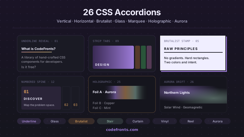
32 free CSS accordions covering pure-CSS FAQ blocks with details/summary, mobile navigation menus, e-commerce filter sidebars, nested tree views, exclusive single-open groups and smoothly animated height:auto — plus 26 visual variations in vertical, horizontal and hybrid layouts. Copy-paste HTML and CSS, no JavaScript.
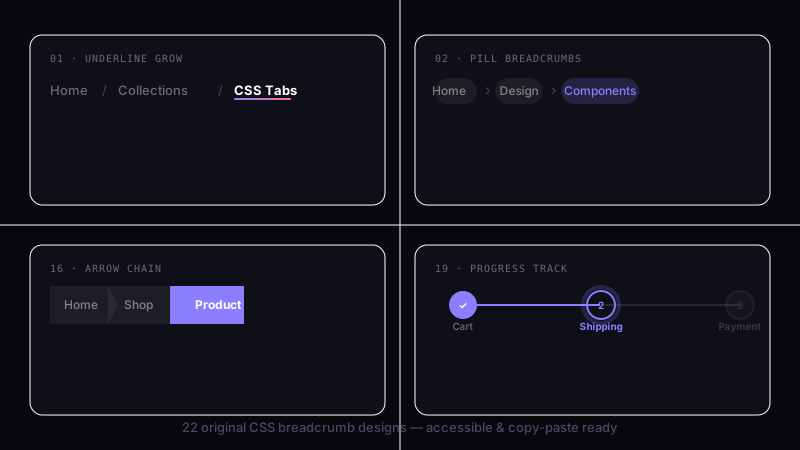
39 hand-coded CSS breadcrumbs — Schema.org BreadcrumbList Microdata + WCAG 2.2 accessible (Google Rich Results eligible), :has() responsive collapse, dark/light theme toggle with color-mix, Shopify/Amazon e-commerce filter chip removal, Vercel/Linear/Notion SaaS dashboard app-shell pattern, Docusaurus/Mintlify sticky scroll-shrink header, Amazon-style dropdown sibling menus, NFT/Web3 holographic shimmer (@property + conic-gradient), SaaS marketing gradient text, Airbnb filter chip with container queries, editorial blog wave underline, developer docs one-click path copy (Clipboard API), and 26 more. Semantic HTML: <nav aria-label='Breadcrumb'> + <ol> + aria-current='page'. Framework-agnostic, MIT-licensed.
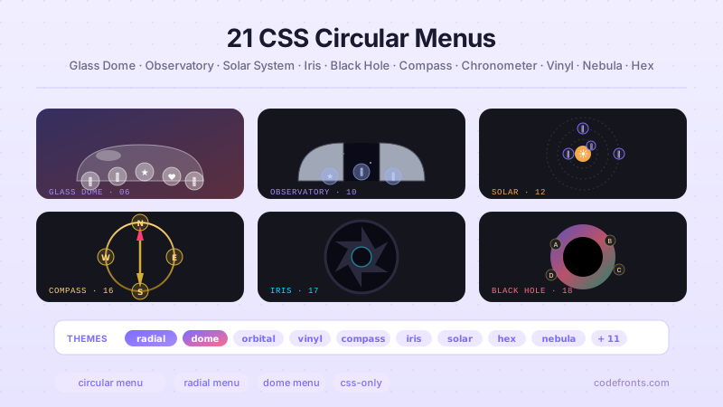
26 hand-coded CSS circular and radial menu designs, from the floating-action FAB speed dial and dashboard radial hubs to game-style pie-slice wheels, SVG gooey metaball fans, hexagonal honeycombs, iris-aperture reveals, orbiting satellites on offset-path, compass-rose directional nav, sci-fi HUD rings, glassmorphism popovers built on the native Popover API, vinyl-record players, and full-takeover nebula overlays on native dialog. Every design uses CSS trigonometry (sin(), cos()) or the counter-rotation trick for positioning, ships real keyboard navigation, aria-labels on icon-only buttons, and a prefers-reduced-motion guard. Copy-paste HTML, CSS and vanilla JS with zero framework dependencies — MIT licensed.


