CSS Center a Div
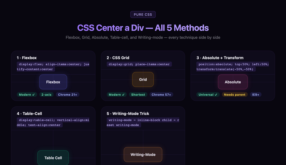
"How do I center a div?" is the most-searched CSS question of the past decade — 90,000 monthly searches and counting. The honest answer in 2026: use Flexbox (display: flex; align-items: center; justify-content: center) for almost every case. For the remaining 5% — absolutely-positioned overlays, legacy IE-compatible code, and inline element centering — pick from the four other techniques below. These 5 interactive demos walk through every production centering method side-by-side with visible axis crosshairs so you can see exactly where each technique lands the element. All 100% pure CSS, MIT-licensed, with copy-paste-ready code and explanations of which method to use when.
Frequently asked questions
What is the simplest way to center a div in CSS in 2026?
.parent { display: flex; align-items: center; justify-content: center; }That's it. Any direct child of
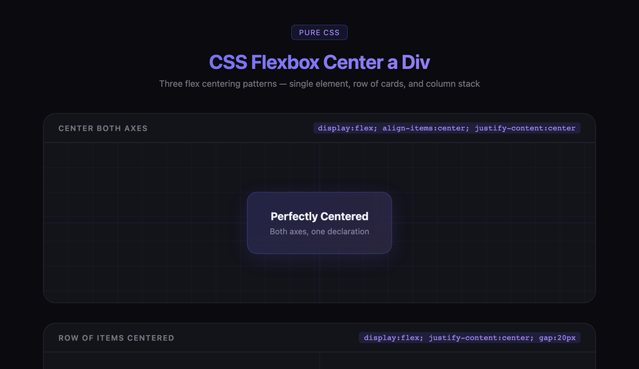
.parent — regardless of its width, height, content, or display type — will be centered both horizontally and vertically. Add min-height: 100vh to .parent if you want full-viewport centering (the classic "center this on the screen" use case). Flexbox is supported in 99.9% of browsers (Chrome 21+, Safari 6.1+, Firefox 28+, Edge 12+ — universally supported since 2014). Demo 01 (CSS Flexbox Center a Div) shows this technique with visible axis crosshairs so you can see exactly where the child lands. Why Flexbox over the alternatives: (1) two lines vs four for absolute positioning, (2) handles unknown child dimensions automatically, (3) handles multiple children automatically (just add gap: 12px), (4) responsive by default, (5) doesn't break flow / require position: absolute. The only reasons to use a different method: you need to support IE10/IE11 (extinct in 2026), the child is absolutely positioned for layering reasons, or you want a one-line CSS Grid version (also valid — see Demo 02).What's the difference between Flexbox center and Grid place-items center?
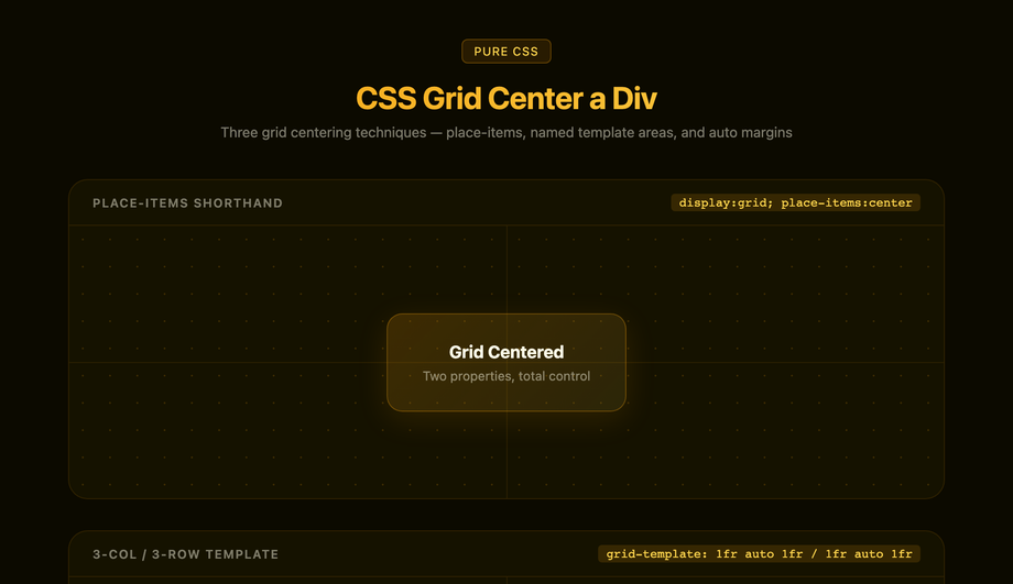
display: flex; align-items: center; justify-content: center; (three properties, or two if you skip the display shorthand). Grid: display: grid; place-items: center; (two properties, since place-items is shorthand for align-items + justify-items). When to use which: Use Grid place-items when centering a single element with no other layout concerns — it's the shortest possible centering CSS, just two lines. Use Flexbox when you need to ALSO add siblings (a row of items, a header + content layout, navigation), respond to flex-wrap overflow, or distribute space with justify-content: space-between. Flexbox is the one-dimensional layout primitive; Grid is the two-dimensional one. For pure single-element centering they're equivalent. Demos 01 and 02 render the same content using both methods so you can see they produce identical results. Performance: both are layout-engine-native (zero JS, GPU-accelerated where applicable), zero measurable difference for single-element centering.When should I use absolute positioning + transform translate(-50%, -50%) instead of Flexbox?
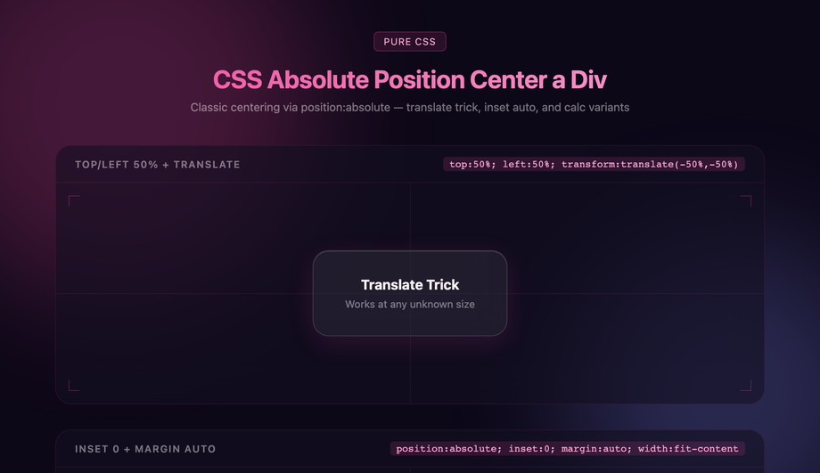
top: 50%; left: 50%; transform: translate(-50%, -50%) while the page underneath continues to flow normally. Setting display: flex on the body to center a modal would force the body into a flex layout, breaking unrelated stacking. (2) Centering a loader / spinner over a card that's loading content — same overlay-without-affecting-layout requirement. (3) Absolute children inside a positioned ancestor when the ancestor isn't already a flex/grid container and you don't want to make it one (this preserves the existing layout). Why the translate(-50%, -50%) trick: top: 50%; left: 50% alone positions the TOP-LEFT corner of the element at the parent's center — the element extends down and right. The transform: translate(-50%, -50%) shifts the element back up by half its width + half its height, so its CENTER lands on the parent's center. Works with any element size, including elements whose size you don't know in advance. Demo 03 (CSS Absolute Position Center a Div) shows this technique with the offset chain visualized.Why doesn't margin: auto work to center my div vertically?
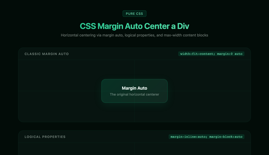
margin: 0 auto only centers a BLOCK element HORIZONTALLY within its parent, and only when the element has a defined width less than the parent's width. It does NOT center vertically — that requires either Flexbox, Grid, or absolute positioning with inset: 0. The reason is historical: margin: auto was designed in CSS 2.1 (1998) for horizontal centering of fixed-width blocks (the classic <div style="width:800px; margin:0 auto"> page-content container), and vertical auto margins on block elements compute to 0, not to auto-fill. How to make margin auto center vertically: combine with position: absolute + inset: 0 (the modern alternative to top: 0; right: 0; bottom: 0; left: 0) on the child element. With all four sides anchored, margin: auto evaluates to "divide the remaining space equally on all sides" and the element centers in both directions. Demo 04 (CSS Margin Auto Center a Div) shows both patterns: the classic margin: 0 auto for horizontal centering and the modern position: absolute; inset: 0; margin: auto for full centering. Use case for the latter: centering a known-size element inside a positioned ancestor without using Flexbox/Grid (e.g. in a CSS-in-JS context where you want to apply centering as an additive override without restructuring the layout).How do I center text inside a div?
text-align: center on the element containing the text. This is the simplest case — works for any inline content (text, links, images set to display: inline). text-align doesn't affect block elements. (2) Vertical centering of a single line of text inside a fixed-height container: set line-height equal to the container's height. height: 48px; line-height: 48px; centers a single line of text vertically. Works perfectly for buttons, badges, single-line labels. Don't use this for multi-line text — line-height applies per line, so the first line is centered and subsequent lines extend below. (3) Vertical AND horizontal centering of multi-line text inside a container: use Flexbox or Grid on the container — display: flex; align-items: center; justify-content: center; text-align: center; (the text-align is still needed because Flexbox centers the text BLOCK as a whole; text-align centers individual lines of text inside that block). For badges and pill-shaped elements: combine display: inline-flex; align-items: center; with explicit horizontal padding — that's the canonical "centered text inside a pill" pattern.How do I center an image inside a div?
text-align: center — the image (being inline) centers horizontally. To also center vertically, add display: flex; align-items: center; justify-content: center on the parent and skip text-align (Flexbox handles both). If you want the image as a block-level element (e.g., for margin: 0 auto centering): add display: block to the image, then margin: 0 auto on it. <img style="display: block; margin: 0 auto" /> centers horizontally within its containing block. For a hero image that fills its parent: use display: grid; place-items: center on the parent + object-fit: cover; width: 100%; height: 100% on the image. The image fills the container; if the aspect ratio doesn't match, object-fit crops it cleanly while keeping the center pixel anchored. For a background image that's centered: use the background-image property on the parent with background-position: center; background-size: cover. The image is a CSS background, not an <img> element, so it doesn't affect document flow.Why is my div not centering? Most common bugs.
min-height: 100vh (full viewport) or min-height: 400px (fixed) on the parent. (2) The child has margin: auto but no explicit width. margin: 0 auto centers horizontally ONLY if the block element has a width less than the parent's width. Block elements default to 100% width — they're already as wide as the parent, so there's no horizontal space to distribute. Fix: add width: 400px (or some explicit value) to the child. (3) The child is inline. If the child is an <img>, <span>, <a>, or has display: inline, margin: auto doesn't work — auto margins are ignored on inline elements. Fix: add display: block to the child, OR use Flexbox on the parent (which works for any child display type). (4) Conflicting position declarations. If the child has position: absolute or fixed, Flexbox/Grid centering on the parent doesn't apply to it (absolutely-positioned children are taken out of the flex/grid flow). Fix: either remove the position property from the child, or use the top: 50%; left: 50%; transform: translate(-50%, -50%) pattern (Demo 03). (5) The flex container has flex-direction: column but you're using justify-content expecting horizontal centering. In a column-direction flex container, justify-content controls VERTICAL alignment and align-items controls HORIZONTAL alignment — the axes swap. Fix: in column-flex, use align-items: center for horizontal, justify-content: center for vertical.How do I center a div in Tailwind CSS?
<div class="flex items-center justify-center">. Add min-h-screen for full-viewport centering. This is identical to display: flex; align-items: center; justify-content: center; min-height: 100vh in vanilla CSS — same browser support, same result. (2) Grid center (shortest): <div class="grid place-items-center">. Equivalent to display: grid; place-items: center. (3) Absolute center (for modals/overlays): <div class="absolute top-1/2 left-1/2 -translate-x-1/2 -translate-y-1/2">. Equivalent to the top: 50%; left: 50%; transform: translate(-50%, -50%) trick. (4) Margin auto horizontal: <div class="mx-auto w-96">. Equivalent to margin-left: auto; margin-right: auto; width: 24rem. The Tailwind classes compile to the same CSS as the vanilla techniques — there's no performance or bundle-size difference between writing flex items-center justify-center in Tailwind vs writing the equivalent in a .css file. Pick Tailwind if you prefer utility-first styling; pick vanilla CSS if you prefer separation of concerns. Both work, both are equally fast.How do I center a modal / popup / overlay?
display: flex; align-items: center; justify-content: center on the <body> forces the body into a flex layout, which can break unrelated layout decisions (sticky headers, sidebar columns, etc.). The canonical modal centering pattern:.modal-backdrop {
position: fixed;
inset: 0;
background: rgba(0,0,0,0.5);
z-index: 50;
}
.modal {
position: fixed;
top: 50%;
left: 50%;
transform: translate(-50%, -50%);
z-index: 51;
}The backdrop covers the entire viewport with a semi-transparent overlay (and catches click-to-dismiss events). The modal sits above the backdrop, centered both axes via the translate-50 trick. Modern alternative: use the native
<dialog> element with dialog.showModal() — the browser handles backdrop, focus trap, ESC-to-close, scroll lock automatically. Demo 03 (CSS Absolute Position Center a Div) shows the centering technique used in modals.Which centering method should I use? Decision tree.
display: flex; align-items: center; justify-content: center;. Use this unless you have a specific reason not to. You want the shortest possible CSS: Demo 02 (Grid place-items) — just display: grid; place-items: center;, two lines. Same result as Flexbox for single-child centering. You're centering a modal, popup, loader, or overlay that should layer on top of existing content: Demo 03 (Absolute position + transform) — position: absolute; top: 50%; left: 50%; transform: translate(-50%, -50%);. Doesn't affect the layout of surrounding content. You're centering a known-width block element horizontally only (e.g., the classic <div style="width:1200px; margin:0 auto"> page-content container): Demo 04 (Margin auto) — margin: 0 auto; with explicit width. You want to see all four techniques side-by-side and understand the differences: Demo 05 (All methods compared) — renders the same content using each method with visible axis crosshairs. Useful for learning, picking the right technique for a specific edge case, or as a reference page bookmark. Edge cases: For inline text centering use text-align: center (not in this demo set — it's a different mechanic). For single-line text centering inside a fixed-height container use line-height: container-height. For multi-line text centering inside a container use Flexbox + text-align: center together. All 5 demos in this collection: 100% Pure CSS, MIT-licensed, copy-paste ready.Related collections

10 CSS Feature Sections
10 hand-coded CSS feature section templates covering the patterns landing pages actually need in 2026 — icon grid with stats strip, Apple-style bento grid layout, dark glassmorphism with animated blobs, scroll-reveal alternating rows, developer SDK with syntax-highlighted code preview, side-by-side comparison table with pricing cards, full SaaS hero with mesh-gradient + social proof, 3D mousemove tilt cards, parchment-cream floating phone mockup, and Linear-style product roadmap timeline. 7 of 10 demos are 100% pure CSS — drop into any stack. The 3 JS-enhanced demos (scroll-reveal, 3D tilt, timeline-glow) degrade gracefully if JavaScript is disabled. Every demo respects prefers-reduced-motion, uses scoped .fsNN__* class names so multiple can coexist, and ships MIT-licensed.

15 CSS Flexbox Layouts
15 production-ready CSS flexbox layouts with live demos and copy-paste code — holy grail page shell, responsive card grid, sticky navbar, masonry-style columns, sidebar dashboard, product cards, pricing table, magazine article, sticky footer with min-block-size: 100dvh, centered hero, vertical timeline, chat interface, mosaic gallery, two-column form, and kanban board. Every demo is mobile-first, WCAG-friendly, and works without a build step.

15 CSS Footer Designs
15 hand-coded CSS footer designs — aurora-drift, newspaper masthead, mega multi-column, CTA stripe, trust badges, vinyl record, neon sign, FAQ drawer, language switcher, hover wave and more. Copy-paste ready.