Want to build responsive CSS Grid layouts from scratch?
You just browsed 15 card grid layouts. Learn Grid properly: templates, named areas, placement and alignment, so every layout starts in your head, not in a copy-paste.
A 6-card SaaS dashboard KPI grid with real metrics — MRR, active users, churn, NPS, deploys, uptime — each card showing the number, the delta vs last period, and a CSS-drawn sparkline. Zero JavaScript, zero chart library, drop-in for any admin dashboard or marketing stats section.
A landing-page hero with a 5-tile asymmetric photo collage on the right and a marketing headline + CTA on the left — the exact pattern Airbnb, Notion, and Linear use to combine narrative copy with visual proof on their homepage hero. Photos are CSS gradient placeholders with location labels and category pills.
A 3-tier SaaS pricing comparison grid with Starter / Pro / Enterprise plans — featured tier elevated via accent border and 'Most Popular' ribbon, every card with full feature checklist, price toggle hint, and a primary CTA. The exact pricing pattern Stripe, Linear, Vercel, and Notion all converged on.
An asymmetric testimonial wall with one featured 2x2 hero quote and 5 supporting testimonial cards — each with customer avatar, name, role, company, star rating, and quote. The exact pattern Vercel, Linear, and Stripe use on their homepages to stack social proof at scale.
A newsprint-inspired magazine-cover bento with a real masthead, display-poster headline, in-this-issue table of contents, pull-quote ribbon, and section pills — every tile carries a real editorial role (Editorial, Interview, Read Next) so the layout reads as an actual magazine spread, not a colorful dashboard.
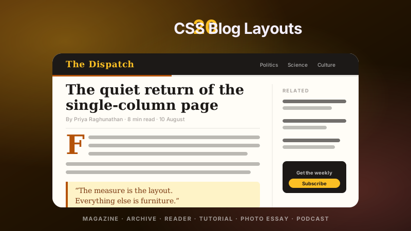
An editorial homepage layout with one hero featured story occupying the full left side and 4 supporting article cards on the right — the exact hierarchy pattern NYT, Substack, Medium, and The Verge converge on. Real bylines, real categories, real read-times, real publication dates.
Newsletter
Enjoying these demos? Get new ones by email.
A short email when a new collection ships. Unsubscribe any time.
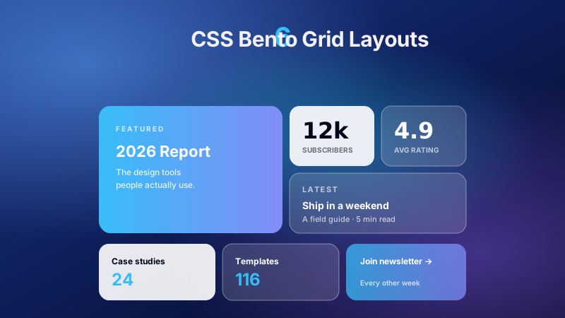
An Apple-style bento layout where one hero tile spans two columns and two rows while smaller tiles wrap around it using grid-column and grid-row spans on a dark, glow-bordered canvas.
A real product-feature bento grid on a deep carmine canvas — every tile carries a real SaaS dashboard metric, feature pill, or CTA, with a two-tone vertical duotone backdrop that swaps tones on hover via a clip-path wipe. Drop-in for marketing pages, pricing hero sections, and feature showcases.
An e-commerce grid where mismatched title and description lengths never break alignment, because every card is a column-flex item so its Add-to-Cart button always lands on the same horizontal axis.
A Pinterest-style photography wall where cards of naturally varied aspect ratios pack tightly into vertical columns using native multi-column flow, with no JS bin-packing required.
A self-adjusting editorial archive that adds or drops columns purely via grid-template-columns: repeat(auto-fit, minmax(...)) — no media queries required.
A centered profile-card directory where each circular avatar breaks the top edge of its card using a negative margin pulled over a card with extra top padding to make room.
A dense flashcard-style spec grid where hovering any tile cleanly rotates it 180 degrees on the Y axis to reveal a vivid accent-coloured backside of metrics, with the grid layout itself never shifting.
A 2x2 showcase grid where each card is a real, fully-rendered page archetype inside a browser-chrome frame — a Photo Gallery with rated photos and a carousel, a Contact Page with labelled form fields and a map, a 5-column Product Grid with prices, and a 4-column Team Grid with avatars and roles — drawn entirely with CSS divs and inline SVG so users can copy-paste any archetype directly into their project.
Newsletter
Enjoying these demos? Get new ones by email.
A short email when a new collection ships. Unsubscribe any time.
A modern responsive bento grid of Liquid Glass tiles at varying sizes, each using a different level of refraction — some tiles are flat frosted panels, others have pronounced lensed edges that bend the mesh background at their corners. A single CSS grid that reflows cleanly from desktop bento to a mobile stack.
FAQ
Frequently asked questions
How do I build a responsive card grid without writing media queries?
Use grid-template-columns: repeat(auto-fit, minmax(280px, 1fr)) on the grid container. The browser takes the available container width, divides by the 280-pixel minimum to compute how many columns will fit, then stretches each track to share the leftover space equally via the 1fr portion. When the viewport shrinks past the point where 4 columns can fit, the layout collapses to 3 columns; shrink further and it collapses to 2, then 1 — automatically, with no breakpoint code. The minimum value is the only design lever you tune. Set it to 240px for a denser archive feel, 320px for editorial spacing, 360px for marketing brochure layouts. Pair it with gap: 28px for breathing room and you have the entire layout in three CSS declarations. Demo 01 (Auto-Fit Blog Archive Grid) ships the canonical recipe with badge overlays, 16:9 media boxes, and a clamp-sized headline that never overflows narrow tracks. Use auto-fill instead of auto-fit if you want empty tracks preserved at small item counts rather than collapsed to zero width — useful for pagination placeholders.
What is a bento-box grid and how do I build one in pure CSS?
A bento-box grid is an asymmetric tile layout where individual cards span different numbers of columns and rows — usually one large feature tile paired with smaller supporting tiles, evoking the compartmentalized Japanese lunch box. The pure-CSS technique uses grid-template-areas or explicit grid-column: span N / grid-row: span N on individual cards. Define a parent grid with grid-template-columns: repeat(4, 1fr) and grid-auto-rows: 180px, then on the hero card apply grid-column: span 2; grid-row: span 2 to make it occupy a 2x2 area; smaller cards take their default single cell. The browser auto-places remaining cards into the gaps. On mobile, switch the grid to grid-template-columns: 1fr so every card stacks vertically full-width. Demo 02 (Asymmetric Bento Box Feature Grid) ships a 6-card pattern with a hero feature, two medium tiles, and three quick-link tiles — the layout is roughly 100 lines of CSS with zero JavaScript. Bento grids broke into mainstream design via Apple's 2023 keynote slides and have since become the dominant marketing feature-grid pattern.
How do I make all cards in a row the same height even when their content differs?
Three options, ordered by power. (1) **Flexbox column layout per card** — set each card to display: flex; flex-direction: column, then give the variable-length region (description text) flex: 1 so it absorbs the height difference, leaving the CTA button pinned to the bottom regardless of card content length. This is the universal pattern that works in every browser since 2017. (2) **CSS Grid align-items: stretch** (the default) — when cards are direct grid children, they automatically stretch to match the tallest sibling in the row. Combined with option (1) inside each card, the row aligns AND the button stays bottom-flush. (3) **Subgrid** (Safari 16+, Firefox 71+, Chrome 117+) — declare the parent grid with named row tracks like grid-template-rows: auto 1fr auto auto (header, body, price, button), then on each card use display: grid; grid-template-rows: subgrid; grid-row: span 4 so the card inherits the parent's row sizing and every section of every card aligns perfectly across the row. Demo 03 (Equal-Height Product Grid) ships pattern (1) + (2) for universal browser support; the subgrid technique is shown in the customization notes as a 2026-grade upgrade.
Can I build a Pinterest-style masonry grid without JavaScript libraries like Masonry.js?
Yes — column-count / column-width plus break-inside: avoid gives you authentic flowed masonry in zero lines of JavaScript. The wrapper declares column-width: 240px; column-gap: 16px, the browser computes the number of columns the way auto-fit does, then flows children top-to-bottom column-by-column. Each card gets break-inside: avoid so the browser does not slice a card across column boundaries. The result is the classic Pinterest waterfall with variable card heights flowing into the shortest column automatically. The trade-off versus a JS library: CSS columns flow vertically (top-to-bottom, then left-to-right) so the visual reading order is column-first rather than row-first, which can feel slightly off for ordered content like a chronological blog feed but is perfect for unordered galleries. A second pure-CSS approach uses CSS Grid with grid-auto-flow: dense and varied grid-row: span N values, but it needs a known row count per card. Demo 04 (Fluid Masonry Card Grid) ships the column-count pattern with photo tiles at different aspect ratios. The native CSS masonry-layout value for grid-template-rows is shipping in Chrome and Firefox behind a flag and will replace both techniques cleanly when it lands in 2027.
How do I build a team or directory grid that looks polished on every screen size?
The team-card pattern is: circular or rounded-square avatar at top, name in bold, role kicker below, optional social-link row, and a uniform card aspect ratio so every face aligns to a clean horizontal baseline. The grid uses repeat(auto-fit, minmax(220px, 1fr)) — the same auto-fit technique as a blog archive — and each card is a flex column with align-items: center so avatars stay centered when cards stretch to fill wider tracks. The avatar typically uses aspect-ratio: 1; border-radius: 50% for circular treatment, or border-radius: 24px for a softer rectangular treatment used by modern SaaS marketing sites. Role kickers go in text-transform: uppercase; letter-spacing: 0.1em to read as labels rather than body copy. Demo 05 (Team Directory Face Grid) ships the complete recipe with avatar gradients, role badges, and a clean 4-up at desktop / 2-up at tablet / 1-up at mobile breakdown via pure auto-fit. The same pattern works for testimonials, advisor lists, alumni directories, and contributor walls.
How do I build a 3D hover-flip card grid without a JavaScript framework?
Three CSS properties carry the whole effect. First, the grid wrapper gets perspective: 1000px which establishes the 3D viewing frustum every card will rotate inside. Second, each card has an inner transform-style: preserve-3d container that holds two stacked faces (front and back), each absolutely positioned with backface-visibility: hidden so only the currently-facing side renders. Third, the outer card gets transition: transform 0.6s and on hover applies transform: rotateY(180deg) to flip the inner container. The front face shows whatever your card normally displays (icon, title, summary); the back face is pre-rotated 180 degrees so it appears the right way up after the parent flip. Total CSS: about 40 lines for the whole grid. Demo 06 (3D Hover-Flip Card Grid) ships a 4-card metrics dashboard where each tile flips to reveal a specific numeric stat — exactly the pattern Stripe, Linear, and Vercel use on their marketing pages. The first card stays flipped at idle so visitors can immediately see what the back face looks like without needing to hover.
Should I use CSS Grid or Flexbox to build a card grid?
CSS Grid is the right answer for any layout where you want the parent to control the arrangement — rows, columns, gutters, and inter-card alignment all live on the grid container, which gives you a single source of truth for the layout. Flexbox is correct when cards have unequal widths and you want them to wrap naturally based on their own content length (think tag pills or filter chips), or when you are arranging the internals of a single card. The rule of thumb that has held since 2018: **Grid for two-dimensional layouts, Flexbox for one-dimensional layouts**. A card grid is two-dimensional (rows AND columns) so Grid wins. Within each card, the internal stacking (header, body, footer) is one-dimensional so Flexbox wins there. All 6 demos in this collection use Grid for the parent grid AND Flexbox inside each card for vertical stack alignment — that combination has zero downsides and works in every browser shipped since 2017. The auto-fit-minmax pattern in particular is uniquely a Grid feature; Flexbox cannot reproduce it without resorting to fixed-percentage widths that fail at edge container sizes.
How is this collection different from libraries like Bootstrap Grid, Tailwind Grid, or Material UI Grid?
Those are utility systems that wrap CSS Grid behind class names — Bootstrap exposes col-md-4, Tailwind exposes grid-cols-3, Material UI exposes a JSX <Grid item xs={4}> component. They are useful when you want a consistent design system across an app, but they ship hundreds of utilities you do not need (Bootstrap Grid alone is 70 KB of unused tokens for a single card grid use case) and they tie you to one rendering framework. This collection ships the raw underlying CSS — display: grid, grid-template-columns: repeat(auto-fit, minmax(280px, 1fr)), grid-template-areas, grid-column: span 2 — so you can paste it into any project regardless of CSS framework. It works in plain HTML, Astro, Next.js, SvelteKit, Eleventy, Webflow, Squarespace embeds, or alongside Bootstrap and Tailwind without conflicts. Each demo is roughly 60-120 lines of CSS, fully scoped under .cg-NN, zero JavaScript, and the techniques shown (auto-fit minmax, named grid areas, subgrid alignment, column-count masonry, perspective + rotateY flips) are the exact patterns that production sites at Stripe, Vercel, Linear, Apple, and Notion use. Owning the CSS means you can tune it; using a framework grid means you accept its defaults.