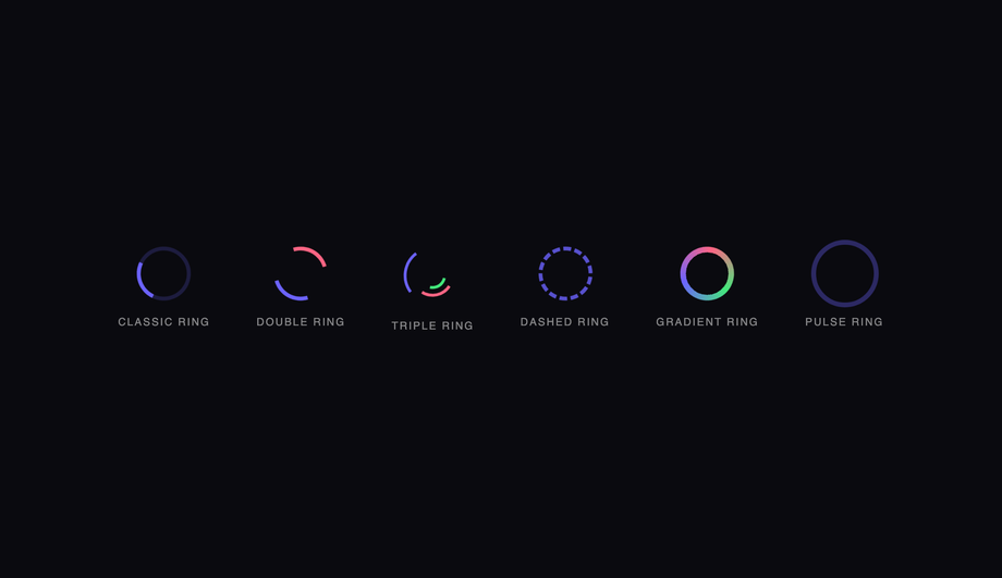
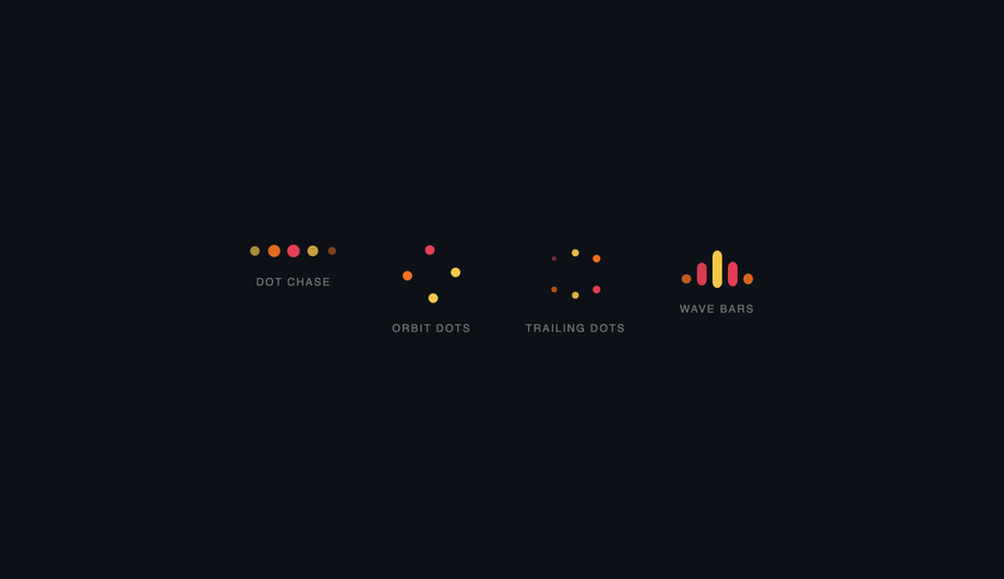
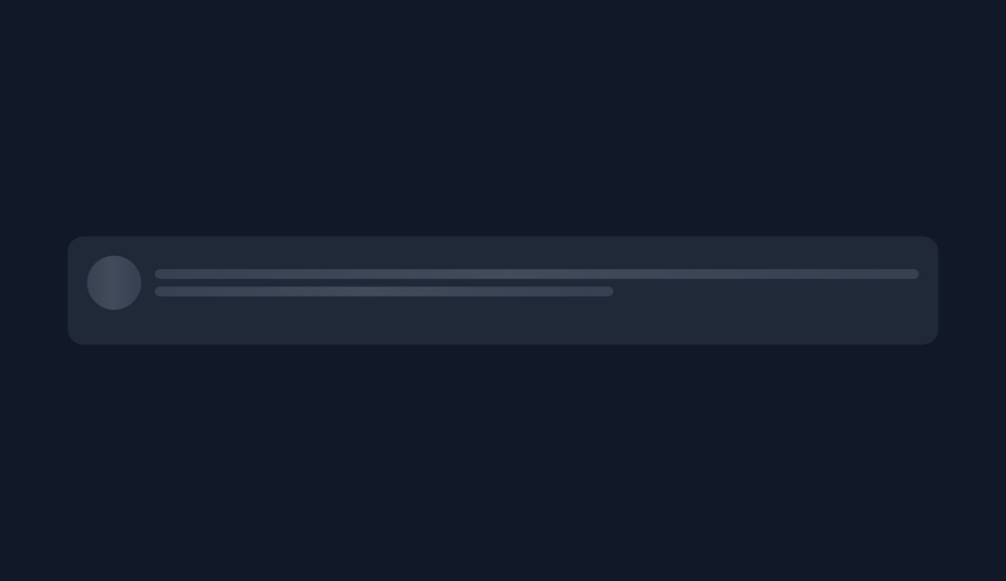
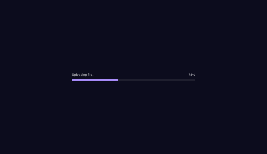
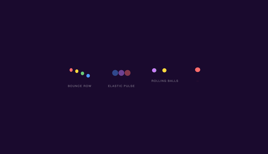
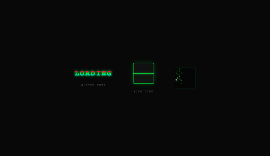
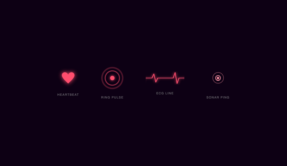
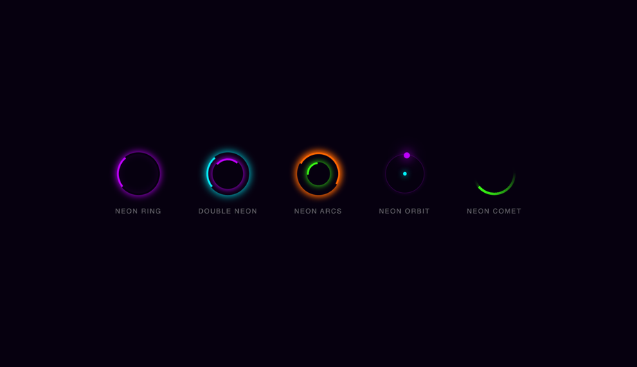
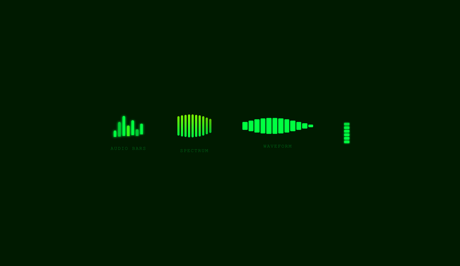
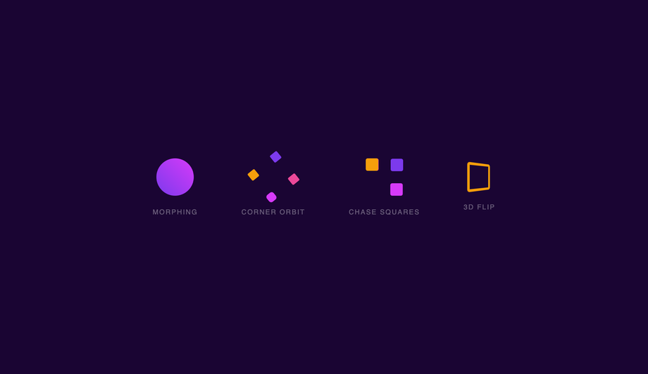
A CSS loader signals "something is happening" during the 200ms-3s gap between a click and a result — the difference between a snappy app and one that feels broken. These 20 hand-coded loaders cover every production loading-indicator pattern in 2026: spinning rings, dot chase, skeleton screens (Facebook/LinkedIn pattern), progress bars, bouncing balls, DNA helix, glitch flicker, heartbeat pulse, circular progress, liquid fill, neon arc spinners, cube flip 3D, audio wave bars, morphing squares, orbit planets, typing dots (chat indicator), staircase steps, infinity loops, gradient conic spinners, and particle burst loaders. All 100% pure CSS — zero JavaScript, zero library dependencies (no react-loading, no spinkit, no css-loaders.com snippet copy). Every demo respects prefers-reduced-motion, uses scoped .ld-NN__* class names so multiple loaders coexist on the same page, ships with proper role="status" + aria-live markup for screen reader accessibility, MIT-licensed.
Frequently asked questions
When should I show a loader vs a skeleton screen vs nothing at all?
Should I use react-spinners / react-loading-skeleton / SpinKit, or build with pure CSS?
<Skeleton width height count /> API. Great DX, but adds a React dependency you may not need. If you're NOT on React (Astro, Vue, Svelte, Rails ERB, vanilla, WordPress): all the React-specific options force you to bring React into your bundle. SpinKit / loaders.css / epic-spinners: framework-neutral CSS-only loader libraries (~2-5kb gzipped). These are essentially what this collection IS — except this collection is MIT-licensed copy-paste with 20 hand-picked patterns instead of 30-100 mediocre ones. loading.io: web tool to generate loaders, often paywalls the source code or watermarks SVGs unless you pay. This collection's 20 loaders: 0 bytes of JavaScript, ~1-3kb of CSS per demo (only the ones you use), zero framework lock-in, MIT-licensed, modify-and-resell allowed. Best fit for: marketing sites, Astro/Eleventy static sites, Rails or Django ERB templates, WordPress themes, any non-React project, and React projects where you want to avoid framework-coupled loading state libraries.How do I implement a skeleton screen (Facebook / LinkedIn / YouTube pattern)?
background-color: rgba(0,0,0,0.06) on light themes or rgba(255,255,255,0.06) on dark themes. (2) Add the shimmer effect via a linear-gradient sweep: background: linear-gradient(90deg, var(--skeleton-bg) 0%, var(--skeleton-shimmer) 50%, var(--skeleton-bg) 100%); background-size: 200% 100%; animation: shimmer 1.5s ease-in-out infinite; where the keyframe shifts background-position from 200% 0 to -200% 0. (3) Swap the skeleton for real content by setting display: none on the skeleton element + display: block on the real content when your data arrives. Three production-grade details most online tutorials skip: (a) Match dimensions exactly. If your real headline is 28px tall, the skeleton line must be 28px tall — not 16px. If the dimensions drift, the user sees layout shift when real content swaps in (terrible CLS score, Core Web Vital penalty). (b) Don't animate skeleton lines individually. 20 separate animation declarations = 20 animation frames per second × N elements. Put ONE animation on a single pseudo-element that overlays the whole skeleton card — or use a single shared keyframe via animation-delay: var(--i). (c) Respect prefers-reduced-motion. Some vestibular-sensitive users can't tolerate the shimmer sweep — fall back to a static gray rectangle. All 20 demos in this collection respect this.How do I add a circular progress loader (with percentage in the center)?
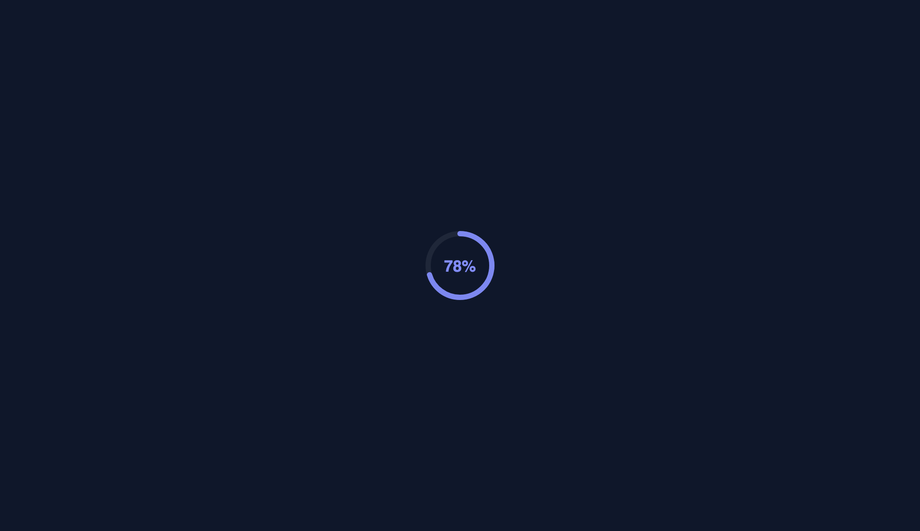
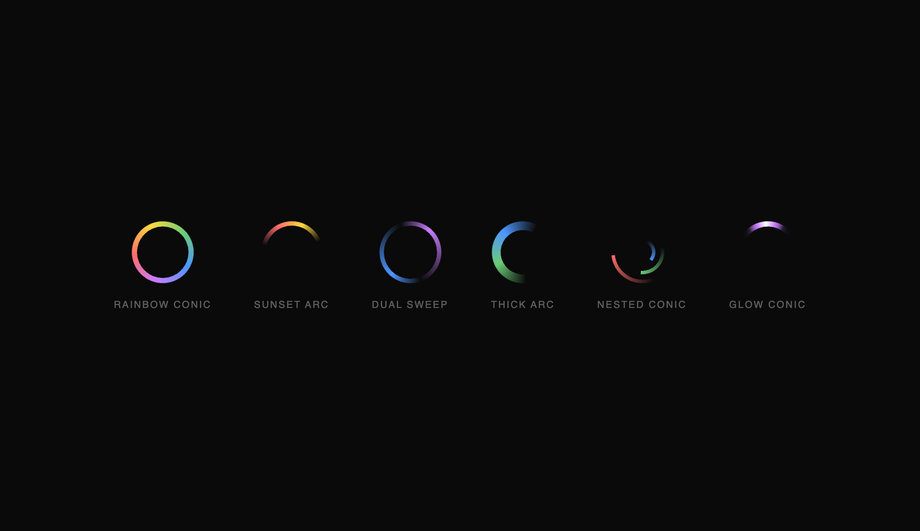
background: conic-gradient(var(--primary) calc(var(--progress) * 1%), var(--track) 0) where --progress is a CSS custom property updated via JS (or pure CSS @property animation for indeterminate). Add a circular mask via ::before { background: var(--bg); border-radius: 50%; inset: 6px; } to create the ring shape. Inside, position a <span> with position: absolute; inset: 0; display: grid; place-items: center; showing the percentage. SVG version: two stacked <circle> elements, the second with stroke-dasharray="circumference" and stroke-dashoffset animated from circumference to 0. Add transform-origin: center + transform: rotate(-90deg) so the stroke starts from 12 o'clock instead of 3 o'clock. Cost comparison: react-circular-progressbar ~5kb minified + requires React. This demo: ~25 lines of CSS, zero JS, no library. Browser support for conic-gradient: Chrome 69+, Safari 12.1+, Firefox 83+ — universally supported. The CSS transition: --progress 0.6s ease-out (with @property) animates smoothly between step changes — but it's an INP-safe transition (just paint, no layout).How do I implement the typing-dots indicator (Discord / WhatsApp / iMessage pattern)?
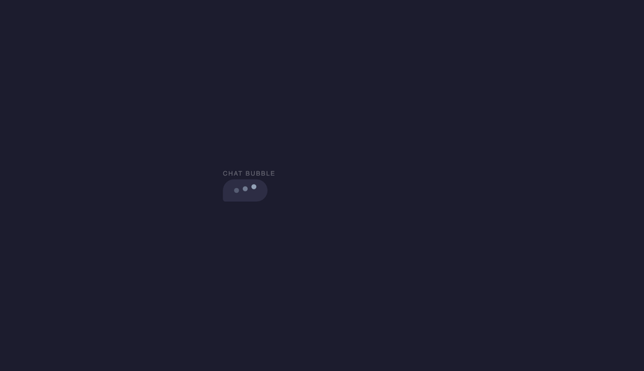
animation but staggered: .dot:nth-child(1) { animation-delay: 0s } .dot:nth-child(2) { animation-delay: 0.2s } .dot:nth-child(3) { animation-delay: 0.4s }. (3) The animation: a 1.4s loop that translates the dot upward by ~6px at the 30%-40% keyframe, then back. animation: typing-bounce 1.4s ease-in-out infinite;. Three production-grade details: (a) Use a chat-bubble container around the dots — a rounded rectangle with the message-tail SVG/CSS — so it matches the rest of your chat UI. (b) Animate transform: translateY(-6px) not top: -6px — translate is GPU-accelerated. (c) Add a fade-in/out wrapper for when the typing state toggles — the dots shouldn't pop into existence. opacity: 0; transition: opacity 0.2s then opacity: 1 when the typing flag flips. Production usage: Discord, WhatsApp, iMessage, Slack, Telegram, Microsoft Teams all use variants of this pattern. The pattern is part of the conversational UI lexicon — users immediately recognize it as "the other side is composing."How do I make a loader accessible for screen reader users?
role="status" on the loader's outer wrapper. Tells assistive tech that the element conveys status information. Screen readers (NVDA, JAWS, VoiceOver, TalkBack) announce the content politely without interrupting the user's current task. (2) aria-live="polite" in addition to role="status" (technically the role implies it, but explicit doubles up nicely for buggy older assistive tech). Polite = announce when the user is idle. Avoid aria-live="assertive" for loaders — assertive interrupts the user, which is jarring for routine "loading" announcements. (3) Visually-hidden text inside the loader: <span class="sr-only">Loading…</span> with .sr-only { position:absolute; width:1px; height:1px; padding:0; margin:-1px; overflow:hidden; clip:rect(0,0,0,0); white-space:nowrap; border:0; }. The spinning ring (Demo 01) means nothing to a blind user — the visually-hidden "Loading…" text IS the announcement. (4) Update the text when state changes. When loading completes, swap the inner text to "Loaded" or remove the loader from the DOM entirely. aria-live will announce the change. (5) prefers-reduced-motion: reduce — for vestibular-sensitive users (people who experience motion sickness from continuous motion), pause or simplify the animation. Don't just remove it (then no loading indication at all) — replace with a static "Loading…" text or a single-frame icon. Common mistake most online tutorials make: animating only with CSS without any aria/role markup. Blind users have no idea your app is loading. The 20 demos here ship the markup correctly out of the box.What's the difference between determinate and indeterminate loaders?
Will loader animations hurt my Core Web Vitals INP score?
transform and opacity only. Every loader in this collection follows this — spinning ring uses transform: rotate(360deg), not border-rotation; bouncing balls use transform: translateY(), not top; skeleton shimmer uses background-position (paint-only, not layout). All transforms and opacity changes are GPU-accelerated on the compositor thread — they DON'T trigger layout recalculation, so they DON'T affect INP (Interaction to Next Paint), the Core Web Vital that replaced FID in March 2024. Five loader-specific gotchas: (a) Don't animate border-radius on a continuous loop — repaints the entire element every frame. (b) Don't animate box-shadow on a continuous loop — same problem, plus shadows are GPU-expensive on mobile. (c) Don't use backdrop-filter on a loader that overlays a long scrollable page — backdrop-filter re-evaluates on every scroll frame, tanking scroll FPS. (d) Avoid SVG stroke-dashoffset animation for high-frequency loops — it's repaint-heavy. Use conic-gradient instead (Demo 19). (e) Limit concurrent loaders — three skeleton cards animating simultaneously is fine, but 50 stacked into a virtual-scroll list will saturate the compositor on low-end Android. Use animation-play-state: paused on off-screen skeletons via IntersectionObserver. All 20 demos in this collection: 95+ Performance score on Pixel 5 baseline. Skeleton screens actually IMPROVE perceived performance (lower CLS, lower TTI feel) compared to spinners — Nielsen Norman Group ~22% reduction in perceived wait time.How do I avoid the loader-flash anti-pattern on fast loads?
const t = setTimeout(() => setLoading(true), 200); fetch(...).finally(() => { clearTimeout(t); setLoading(false); }). Operations under 200ms = no loader shown. Operations over 200ms = loader appears after 200ms and stays until done. (2) Minimum visible duration. Once shown, the loader stays visible for at least 500ms even if the operation finishes sooner. Prevents flash from "loader appears at 195ms, disappears at 220ms" (25ms flash, terrible). Combine both for best UX: 200ms grace period + 500ms minimum visible duration. Three patterns for the loader fade: (a) Instant on, fade out — when the operation finishes, fade the loader's opacity 1→0 over 200ms then remove. Feels polished. (b) Fade in + fade out — fade in over 100ms when shown, fade out when removed. Smoothest. (c) Replace with content immediately — when content's ready, swap loader for content with no fade. Snappiest, best for skeleton screens (the skeleton IS the layout placeholder, replacing it with real content feels natural). React: useDebounce(loading, 200). Vue: <Transition appear>. Astro: CSS transitions on a class toggle. None of this is loader-design-specific — it's wrapping logic that applies to all 20 demos.Which loader should I use for my project?
Related collections

20 CSS Animated Buttons
20 hand-coded CSS animated buttons — neon glow, ripple, 3D press, liquid fill, jelly bounce, shine sweep, animated border, moving gradient CTA, text flip, submit success state, add-to-cart progress, download icon, hamburger-to-close, toggle switch, loading spinner inside button, next/prev arrow nav, and ghost button background reveal. Half pure CSS, half lightweight JS for production interactions.

15 CSS Background Animations
15 hand-coded CSS background animations with live demos — infinite shifting gradient, floating particle bubbles, parallax starry night, clickable cyberpunk ripple, sliding geometric grid, SVG wave overlays, glassmorphism orbs, aurora borealis ribbons, matrix digital rain, mesh gradient blobs, falling snow, morphing blob, retro synthwave 3D grid, infinite scrolling diagonal marquee, comic-book halftone dots. 100% Pure CSS, no JavaScript, no canvas, no particles.js. prefers-reduced-motion respected, scoped class names, MIT-licensed.

27 CSS Button Hover Effects
27 hand-coded CSS button hover effects — 3D press, neon glow, gradient slide, border draw, liquid fill, ripple, glitch text, and kinetic flips. Every demo is pure CSS (no JavaScript, no framework), tuned for 60fps with transform and opacity, and respects prefers-reduced-motion out of the box.