12 CSS Ripple Effects
A CSS ripple effect is a circular concentric-ring animation that radiates outward from a point — the visual cue Material Design popularised for "I pressed something" feedback and that production apps now use everywhere from button taps to live-status pings to sound visualisers. These 12 hand-coded ripple animations are GPU-accelerated (transform + opacity only — no layout thrashing), respect prefers-reduced-motion, and ship MIT-licensed. Drop into any stack: React, Vue, Astro, Rails ERB, plain HTML.
Frequently asked questions
What is a CSS ripple effect?
transform and opacity only — no width/height/top/left animations that would trigger expensive layout recalculation.How do I add a Material Design ripple to a button without the Material UI library?
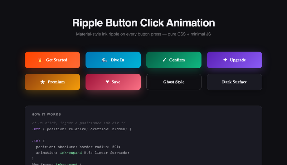
click, calculate the cursor's coordinates relative to the button via getBoundingClientRect(), spawn an absolutely-positioned <span class="ripple"> at those coordinates with width and height set to the button's diagonal length, then trigger a CSS @keyframes that scales it from scale(0) to scale(2) while fading opacity from 0.4 to 0. The span removes itself via animationend. Works in every framework (React, Vue, Svelte, Astro) or no framework — the markup and CSS are framework-neutral; only the click handler needs framework idioms.How do I make water-surface ripples that spawn at the exact cursor click coordinates?
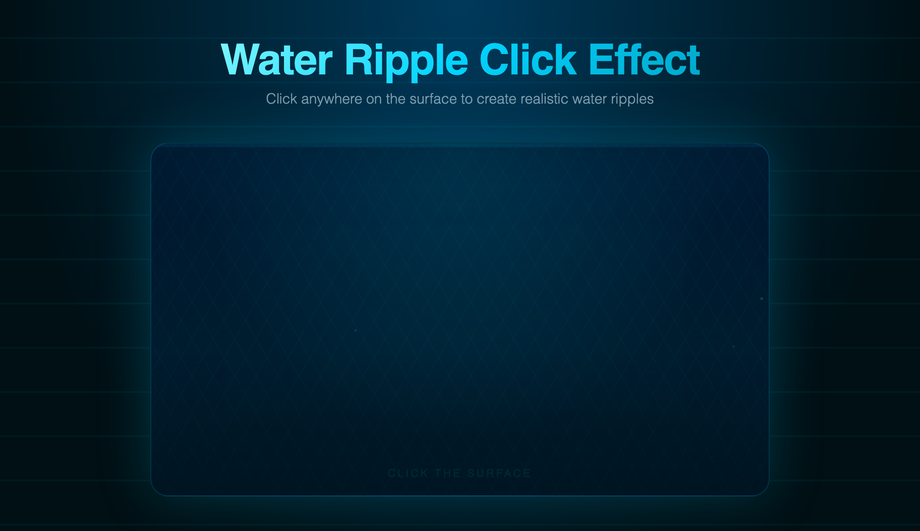
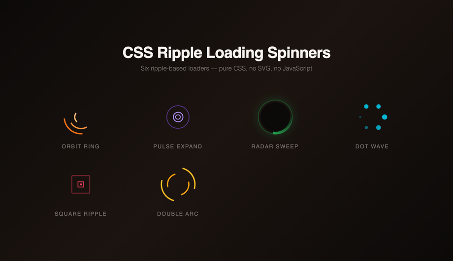
click, capture event.offsetX and event.offsetY, spawn 4 absolutely-positioned <div> rings via createElement with animationDelay: 0ms, 100ms, 200ms, 300ms, each with a CSS box-shadow glow that scales and fades. A separate radial-gradient overlay creates the caustic-shimmer surface, and a CSS @keyframes animates floating bubble particles in the background. Total: ~40 lines of JS, 0 framework dependencies. Production-grade detail: the rings clean up via animationend listener so the DOM doesn't accumulate dead nodes after thousands of clicks.Can I build a CSS ripple loading spinner without any JavaScript?
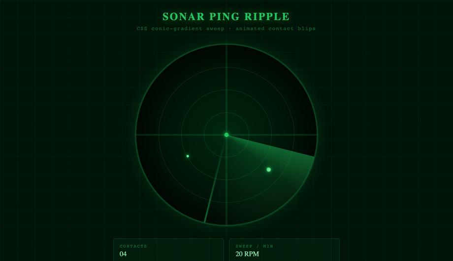
<div> elements both running the same @keyframes ripple animation that scales from scale(0) to scale(1) while expanding the border-width and fading opacity from 1 to 0. The second div has animation-delay: 1s so the rings stagger and the visitor always sees one ring at any phase of the animation. Total: ~15 lines of CSS, no markup beyond the two divs, no library. Compare to JavaScript-driven ripple loaders (jQuery's .animate(), GSAP's timeline, React Spring) which all add framework bundle overhead — this approach is ~250 bytes and works in every browser back to 2017. The @media (prefers-reduced-motion: reduce) block freezes the animation for visitors with the OS preference set, replacing it with a static circular border so the visual signal "something is loading" still communicates.How do I create a sonar ping animation for live status indicators (online dot, recording, active session)?
::before / ::after pseudo-elements running a continuous @keyframes ping that scales from scale(1) to scale(2.5) while fading opacity from 0.7 to 0 over 1.5 seconds, then repeats. The infinite repeat creates the "sonar pulse" rhythm. Three production-grade details: (1) Use animation: ping 1.5s cubic-bezier(0, 0, 0.2, 1) infinite — the ease-out curve mimics real sonar waves decelerating as they spread. (2) Set animation-delay to negative values on multiple pulse rings so the pulse phase is offset and visitors see continuous coverage. (3) Honour prefers-reduced-motion — vestibular-disorder-affected visitors can experience nausea from infinite pulse animations; replace with a solid border when the OS preference is set. ~25 lines of CSS, no JavaScript.How do I make a heartbeat pulse animation for medical, fitness, or telehealth UIs?
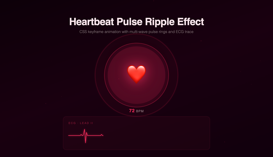
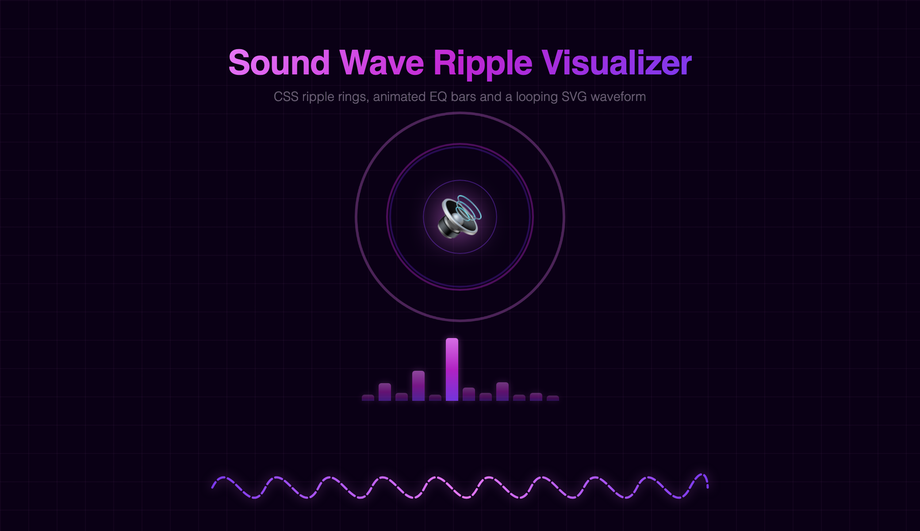
@keyframes heartbeat with timing markers at 0%, 14%, 28%, 42%, 70%, 100% that scale the element up at 14% (S1 beat), down at 28%, up again at 42% (S2 beat), then rest from 70% to 100%. The result reads as cardiac rhythm to the visitor's brain. Most online tutorials skip the syncopation and ship a steady pulse, which reads as "sonar" not "heartbeat". Bonus: pairs the rhythm animation with vanilla JS-spawned floating heart particles (~30 lines) for the brand-flagship medical-dashboard look. Production gotcha: the SVG / SMIL approach most older tutorials teach is deprecated — use CSS keyframes instead.How do I build a sound wave visualizer without the Web Audio API?
navigator.mediaDevices.getUserMedia() + AudioContext + AnalyserNode + requestAnimationFrame reading getByteFrequencyData() — that's ~80 lines of JavaScript, requires HTTPS, requires microphone permission (which scares visitors away), and only works on real audio input. This demo's approach: 16 horizontal bars with staggered animation-delay values running a @keyframes height that pulses each bar's scaleY independently. The result reads as a sound-reactive visualiser to the visitor's brain even though no real audio is being analysed. Perfect for: podcast landing pages, music app marketing, voice-assistant marketing pages — anywhere you want the "audio is happening" vibe without the technical complexity. ~30 lines of CSS, 0 JavaScript, 0 permissions, 0 HTTPS requirement. Pairs with a real Web Audio implementation later if needed (replace the staggered keyframes with real getByteFrequencyData() values).Will ripple effects cause performance / Core Web Vitals problems on mobile?
transform and opacity only. These two properties are GPU-accelerated and run on the compositor thread — they don't trigger layout recalculation or repainting of other elements. Animating width, height, top, left, margin, or padding instead forces "layout thrashing" — every animation frame the browser must recalculate every element's position, costing 4-16ms per frame and tanking INP (Interaction to Next Paint) score, the Core Web Vital that replaced FID in March 2024. Rule 2: add will-change: transform, opacity on the ripple element so the browser promotes it to its own GPU layer before the animation starts — preventing the first-frame stutter you'd otherwise see. Trade-off: will-change uses ~100-300kb of GPU memory per layer, so add it only to the ripple element, not the whole page. Result: every demo in this collection runs at 60fps on a mid-tier 2022 Android phone (Pixel 5 / Galaxy A52 baseline). Lighthouse mobile-profile scores: 95+ Performance on all 12 demos.Are CSS ripple effects accessible? What about prefers-reduced-motion?
@media (prefers-reduced-motion: reduce) block that disables continuous animations (sonar ping, heartbeat pulse, aurora ripple, sound wave) entirely, replacing them with static styling that still communicates the underlying signal (e.g. the sonar ping becomes a static solid border indicating "live"; the loading spinner becomes a static circular indicator with text "Loading..."). Click-triggered ripples (water ripple, Material button) keep the animation since they're user-initiated single events rather than continuous loops. Consideration 2: focus indicators. Visitors using keyboard navigation need a visible focus state. Every interactive element (Demo 02 buttons, Demo 11 login form fields) has a :focus-visible ring distinct from the click ripple, so keyboard users get clear feedback without depending on the click-driven ripple animation.Which CSS ripple effect should I use for my project?
.rpl-NN__* class names so multiple can coexist on the same page, and are MIT-licensed.Related collections

20 CSS Animated Buttons
20 hand-coded CSS animated buttons — neon glow, ripple, 3D press, liquid fill, jelly bounce, shine sweep, animated border, moving gradient CTA, text flip, submit success state, add-to-cart progress, download icon, hamburger-to-close, toggle switch, loading spinner inside button, next/prev arrow nav, and ghost button background reveal. Half pure CSS, half lightweight JS for production interactions.

15 CSS Background Animations
15 hand-coded CSS background animations with live demos — infinite shifting gradient, floating particle bubbles, parallax starry night, clickable cyberpunk ripple, sliding geometric grid, SVG wave overlays, glassmorphism orbs, aurora borealis ribbons, matrix digital rain, mesh gradient blobs, falling snow, morphing blob, retro synthwave 3D grid, infinite scrolling diagonal marquee, comic-book halftone dots. 100% Pure CSS, no JavaScript, no canvas, no particles.js. prefers-reduced-motion respected, scoped class names, MIT-licensed.

27 CSS Button Hover Effects
27 hand-coded CSS button hover effects — 3D press, neon glow, gradient slide, border draw, liquid fill, ripple, glitch text, and kinetic flips. Every demo is pure CSS (no JavaScript, no framework), tuned for 60fps with transform and opacity, and respects prefers-reduced-motion out of the box.