CSS SVG wave section divider pure CSS
Published
14 hand-coded CSS wave section dividers — inline SVG paths, clip-path: polygon() without SVG, mask-image data-URI, gradient masks, stacked multi-color layers, inverted curves, asymmetrical organic shapes, dark-mode light-dark() variants, animated sine transitions, and a vertical seam for split-screen layouts. The drop-in replacement for Elementor / Divi / WPBakery shape dividers — no plugin, no JavaScript, no CLS. Scoped under .wsd-NN for no-collision pasting, prefers-reduced-motion guarded, framework-agnostic.
Related20 CSS Diagonal Sections26 CSS Dividers22 CSS Split Screen Layouts31 CSS Hero Sections25 CSS Footer Designs

Published

Published

Published

Published

Published

clip-path: path(), a repeating radial-gradient mask, and an ellipse curve — all with no extra DOM node and nothing for the HTML payload to carry.Published

Published

Published

Published

Published

Published

Published

Published

Published
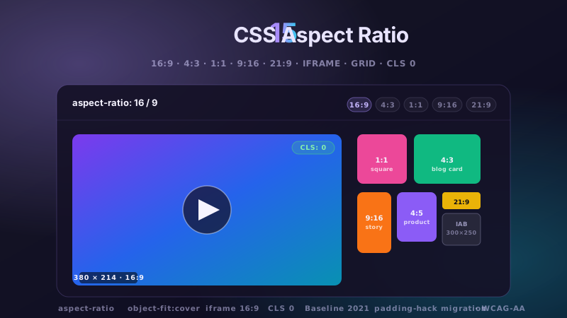
<path> filled with the colour of the section it flows into, stretched with width: 100% and preserveAspectRatio="none" so it fluidly adapts to any viewport instead of cropping. The whole divider costs zero requests, zero hydration, and produces zero CLS — unlike Elementor / Divi / WPBakery shape dividers which inject a script and measure the DOM at runtime. Set display: block on the SVG (otherwise the inline baseline leaves a 4-5px hairline gap on some browsers), and use pointer-events: none so the wave never steals clicks from buttons beneath it. Every demo in this collection follows this baseline pattern in Demo 01.clip-path: polygon(...) on the container itself — no SVG element needed. The polygon() function accepts a list of percentage points that trace the wave shape; browsers rasterise it composited on the GPU, so scrolling and resize are jank-free. The trade-off vs SVG: polygon() is a discrete list of straight-line points, so a smooth curve requires ~40-60 vertices to look organic (SVG's <path> uses Bézier curves so 4-6 control points produce the same smoothness). Demo 06 in this collection shows three clip-path polygon variants at 40, 60, and 100 points so you can pick the vertex count that balances smoothness vs stylesheet weight for your project. Browser support: clip-path: polygon() is universal since 2018 (Chrome 55+, Safari 11+, Firefox 54+); the path() function inside clip-path which lets you use full SVG path syntax is Chrome 88+, Safari 13.1+, Firefox 97+ — still safe for modern audiences but check for legacy support before using.display: inline, which reserves inline-baseline space that shows as a 4-5px transparent strip below the SVG — fix with display: block on the <svg>. (2) The default preserveAspectRatio="xMidYMid meet" preserves the source aspect ratio and center-crops horizontally, which on very wide viewports leaves gaps on the sides — fix with preserveAspectRatio="none" to force the SVG to squash to whatever width the parent gives it. (3) Sub-pixel rounding on some retina and Android displays: even after fixing (1) and (2), a 0.5px transparent hairline appears where the SVG bottom edge meets the next section — fix by extending the wave path 1px BELOW the viewBox floor (e.g. L1440,121 L0,121 Z instead of L1440,120 L0,120 Z) so the fill always overlaps the seam. Demo 08 in this collection documents all three fixes and ships a bulletproof pattern that works on iOS Safari, Android Chrome, and Firefox mobile.<linearGradient> or <radialGradient> as the wave's fill attribute — the wave path itself gets the gradient, so as the wave curves it reveals the gradient underneath in the exact shape of the curve. Alternatively, use mask-image with a data-URI SVG mask: apply a linear or radial gradient background to the section, then mask its top edge with the wave shape — the gradient shows through only where the mask allows. Demo 09 in this collection uses both techniques so you can pick whichever fits your CSS architecture. Note: mask-image still needs the -webkit-mask-image prefix for older Safari (pre-15.4) — the demos include both forms.light-dark() — the newest and cleanest: fill: light-dark(oklch(0.28 0.06 264), oklch(0.16 0.04 264)) — the browser auto-picks the light or dark value based on the user's color-scheme preference. Requires color-scheme: light dark on the root and browsers that support light-dark (Chrome 123+, Safari 17.5+, Firefox 120+). (2) For legacy support, use @media (prefers-color-scheme: dark) to override CSS custom properties: define --next: oklch(0.97 0.01 264) for light mode, then reassign inside the media query. The wave path uses fill: currentColor (or fill: var(--next)) so the single token swap re-themes the whole divider. Demo 11 in this collection shows both patterns side by side, so you can compare the modern one-liner vs the media-query approach and pick what fits your browser-support baseline.aspect-ratio, height, or a clamp()ed height. No JS measures the DOM after paint, so nothing reflows — CLS impact is exactly zero. LCP (Largest Contentful Paint): inline SVG is parsed with the HTML, no network request, no image decode — the divider paints in the same frame as the surrounding text, adding nothing to LCP. INP (Interaction to Next Paint): waves are decorative only, with pointer-events: none and no event handlers — they contribute zero to the interaction budget. Contrast with plugin-based shape dividers (Elementor, Divi, WPBakery): those inject a script that measures element widths after paint, forces a layout reflow, and often re-renders the shape on window resize — that's a real CLS + INP hit that a pure-CSS/SVG wave avoids entirely. This is why every demo in this collection ships the inline-SVG or clip-path pattern with zero JavaScript in the primary variant.15 hand-coded CSS aspect-ratio demos for video embeds, product galleries, IAB ad slots, native dialogs, and CLS-safe placeholders: 16:9 iframe YouTube embed with click-to-load facade + up-next rail, 21:9 full-screen hero video with min-height/max-height:100svh guardrails + Ken Burns drift, 1:1 Instagram-style square grid with 2×2 feature tile, 4:3 magazine card image cover, 9:16 vertical stories rail (TikTok/Reels/Shorts pattern) with scroll-snap + segment bars, 4:5 apparel product image gallery with radio-driven state + 1:1 thumbnails, 1:1 zoom thumbnail carousel with pointer-tracked --zx/--zy magnifier, prevent-layout-shift placeholder with live PerformanceObserver CLS meter (before/after side-by-side lab), dynamic content fallback with three policies (bend/strict/auto) via :has() toggle, IAB ad banner slots (728×90 leaderboard, 300×250 medium rectangle, 300×600 half-page, 320×50 mobile) with skeletons + container-query mobile swap, responsive modal dialog sized min(92vw, 88svh×16/9, 1080px) with @starting-style animation, responsive OpenStreetMap iframe wrapper with 16:9 → 1:1 container-query narrow swap, media query orientation live HUD + resize:both container-ratio playground, object-fit logo cloud with contain/cover/fill switcher via :has(), and side-by-side padding-top hack (height:0 + padding-top:56.25%) → modern aspect-ratio migration comparison with live ratio picker. 11 truly Pure CSS + 4 with a tiny optional vanilla JS snippet (facade swap, pointer magnifier, CLS meter, native dialog). Every demo is scoped under a unique .car-NN prefix so it drops into any project without CSS collisions, ships prefers-reduced-motion guards, and is framework-agnostic (works as-is in React, Vue, Svelte, Astro, Next.js, Remix, or plain HTML).
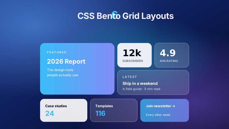
6 production CSS bento grid layouts with 12 hand-coded designs — Apple-style product showcase, SaaS feature value-prop matrix, analytics dashboard overview, creative portfolio, e-commerce category hub, and link-in-bio social hub. Each topic ships 2 sub-variants side-by-side so visitors see both a keynote aesthetic and a paper-doc variant at once. Container queries, CSS Grid, zero dependencies, copy-paste ready.
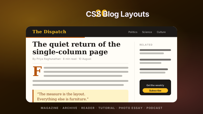
20 hand-coded CSS blog and editorial layouts for magazine homepages, news sites, personal archives, newsletter back-issues, recipe and podcast blogs, developer tutorials, and long-form journalism. Covers a magazine homepage with hero plus editor-picks rail, a news homepage with breaking-news ticker, blog archives with sticky year separators, Substack-style issue-numbered archives, recipe card grids with prep-time badges, podcast episode lists with waveforms, long-form articles with scroll-driven reading progress, drop caps and floated pull quotes via first-letter, Medium-style 65ch centred reader layouts, dev tutorials with a sticky code panel beside prose, interview transcripts with alternating speakers, case-study pages with stat counters, video blogs with an episode rail, full-bleed photo essays, news articles with sticky related-stories sidebars, documentation pages with prev/next chapter nav, a standalone blog post card, a scroll-snap category filter bar, an inline newsletter callout that breaks out of the prose column, and a horizontal featured-post rail. 12 are pure CSS with zero JavaScript. Every layout is scoped under a .bl-NN prefix for no-collision pasting, guards prefers-reduced-motion, and ports unchanged to React, Vue, Svelte, Astro, Next.js and Tailwind.