3 Responsive
Every collection tagged “responsive” — each one a set of hand-coded demos with copy-paste code and a live preview.
Build UI like this from scratch: Flexbox, Grid, animations & responsive CSS
ZTM · The CSS Bootcamp · 30‑day money-back guarantee · Affiliate link
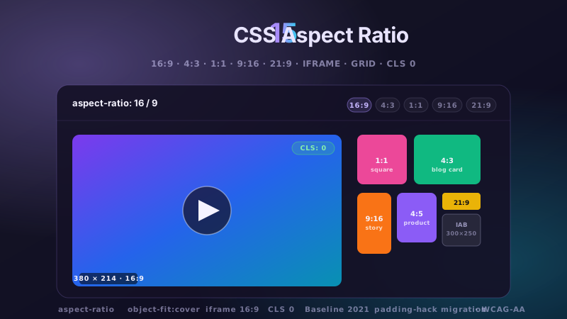
15 CSS Aspect Ratio Demos
15 hand-coded CSS aspect-ratio demos for video embeds, product galleries, IAB ad slots, native dialogs, and CLS-safe placeholders: 16:9 iframe YouTube embed with click-to-load facade + up-next rail, 21:9 full-screen hero video with min-height/max-height:100svh guardrails + Ken Burns drift, 1:1 Instagram-style square grid with 2×2 feature tile, 4:3 magazine card image cover, 9:16 vertical stories rail (TikTok/Reels/Shorts pattern) with scroll-snap + segment bars, 4:5 apparel product image gallery with radio-driven state + 1:1 thumbnails, 1:1 zoom thumbnail carousel with pointer-tracked --zx/--zy magnifier, prevent-layout-shift placeholder with live PerformanceObserver CLS meter (before/after side-by-side lab), dynamic content fallback with three policies (bend/strict/auto) via :has() toggle, IAB ad banner slots (728×90 leaderboard, 300×250 medium rectangle, 300×600 half-page, 320×50 mobile) with skeletons + container-query mobile swap, responsive modal dialog sized min(92vw, 88svh×16/9, 1080px) with @starting-style animation, responsive OpenStreetMap iframe wrapper with 16:9 → 1:1 container-query narrow swap, media query orientation live HUD + resize:both container-ratio playground, object-fit logo cloud with contain/cover/fill switcher via :has(), and side-by-side padding-top hack (height:0 + padding-top:56.25%) → modern aspect-ratio migration comparison with live ratio picker. 11 truly Pure CSS + 4 with a tiny optional vanilla JS snippet (facade swap, pointer magnifier, CLS meter, native dialog). Every demo is scoped under a unique .car-NN prefix so it drops into any project without CSS collisions, ships prefers-reduced-motion guards, and is framework-agnostic (works as-is in React, Vue, Svelte, Astro, Next.js, Remix, or plain HTML).
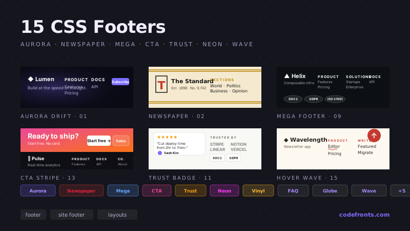
25 CSS Footer Designs
25 hand-coded CSS footer designs for SaaS marketing pages, e-commerce storefronts, agency portfolios, documentation sites, mobile apps, and local business sites. Sticky footer with flexbox and CSS grid, responsive 4-column category-link footer, SaaS mega footer with resource grid, minimalist logo + copyright, e-commerce footer with payment icons and security badges, dark mode toggle footer, local-business footer with embedded Google Maps and office hours, mobile-first collapsible accordion, social media follow icons, SaaS SOC 2 / GDPR / HIPAA compliance badge footer, animated gradient background, newspaper masthead multi-column, full-width newsletter signup, card layout with contact details, monospaced developer portfolio, audio player music website, dark mode glowing neon, centered minimalist blog, multi-column mega grid, integrated contact form + map, trust badges + guarantee icons, accordion FAQ, pre-footer call-to-action bar, multi-language + currency selector, and animated SVG wave. 16 Pure CSS + 9 Light JS. Every design scoped under .ft-NN prefix for no-collision pasting, prefers-reduced-motion guarded per WCAG 2.3.3, framework-agnostic (React, Vue, Svelte, Astro, Next.js, Nuxt, Remix, SvelteKit).
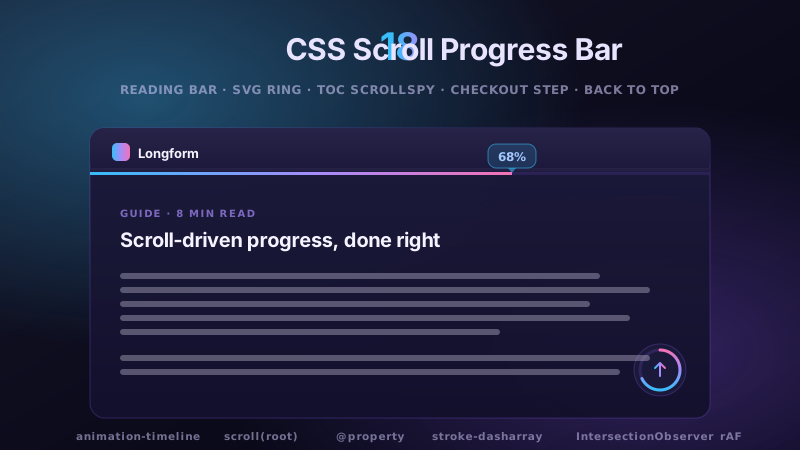
18 CSS Scroll Progress Bar
18 hand-coded CSS scroll progress bar designs for blog article readers, SaaS onboarding wizards, e-commerce checkout flows, documentation sites, image carousels, and long-form landing pages. Top fixed reading bar with animation-timeline: scroll(), sticky header with integrated glassmorphic progress bar, floating radial SVG progress ring with @property registered angle, percentage counter tooltip, back-to-top button with circular morph, gradient multi-color bar, vertical side-docked line, container-scoped inside a div, multi-section TOC tracker with IntersectionObserver scrollspy, step-segmented section-by-section bar, horizontal carousel scroll bar with snap points, e-commerce checkout step progress on scroll, signup onboarding form scroll progress with localStorage save-and-restore, Tailwind CSS @theme + arbitrary values recipe, custom ::-webkit-scrollbar with progress indicator, rainbow hue-rotating bar, cyberpunk neon glow dark mode bar, and ultra-thin 2px minimalist micro progress line. All 18 use animation-timeline: scroll() where supported with rAF scroll listener fallback for Safari + Firefox — no jank, no library, no scroll-listener anti-patterns. Every design scoped under .sp-NN prefix for no-collision pasting, prefers-reduced-motion guarded per WCAG 2.3.3, framework-agnostic (React, Vue, Svelte, Astro, Next.js, Nuxt, Remix, SvelteKit).