30 hand-coded CSS notification topics, each shipping 2–3 side-by-side variants so you can pick the exact treatment for your surface — transient toast confirmations, persistent badge counters on icons, sticky announcement banners, expandable notification panels, and browser push-style popups. Modern @starting-style + transition-behavior: allow-discrete + role="status" / role="alert" semantics throughout so notifications communicate without motion perception AND without interrupting keyboard/screen-reader users. Scoped under .ntf-NN for no-collision pasting, prefers-reduced-motion guarded, framework-agnostic.
You just browsed 30 notifications. Nucleo is a library of 44,000+ SVG icons in five families (Core, UI, Sharp, Pixel and Micro Bold), with web, Mac and Windows apps to manage them. The All Icons Bundle is $149 with lifetime updates.
The definitive slide-in toast, three ways: a zero-JavaScript version where @starting-style and transition-behavior:allow-discrete animate the toast in AND out of display:none, a production JS spawner with a linear() spring entry, auto fade-out and aria-live wiring, and an easing taster that races the same slide under three timing functions so you can feel the difference.
Auto-dismiss without a single setTimeout: a checkbox-armed toast whose enter → hold → exit lifecycle is one keyframe timeline with the hold time written as percentages, and a three-toast demo reel where staggered animation-delays choreograph an endless notification sequence that pauses when you hover it.
Countdown you can see: an undo-toast whose shrinking bottom bar IS the timer (hover pauses it, the bar's animationend dismisses the toast, so bar and lifetime can never drift), and a pure-CSS ring countdown where @property animates a conic-gradient and a registered integer counts the seconds down inside the close button.
Two stacking architectures: a flexbox column where new toasts land nearest the action and departures collapse their row with a grid-template-rows glide (no snap-reflow), and a layered deck where CSS :nth-last-child fans older toasts behind the newest — hover and the deck expands into a full flex list, exactly the pattern popularized by modern toast libraries.
Dark-mode toasts done as a system, not a re-skin: a light-dark() token sheet where flipping one color-scheme declaration re-themes every toast with zero duplicated selectors, and a true-black OLED suite built on high-contrast accent borders with the actual WCAG contrast ratios printed on each toast.
Real glass, not grey rectangles: a frosted toast floating over animated gradient orbs — backdrop-filter blur + saturate, a 1px light-catching border and an inner top highlight — plus a dark smoked-glass stack over a photograph that shows how to keep text legible on unpredictable backgrounds, with an @supports fallback for both.
Newsletter
Enjoying these demos? Get new ones by email.
A short email when a new collection ships. Unsubscribe any time.
A complete status system, not four hand-tinted divs: one .toast class whose success/error/warning/info identities are a single --hue swap fed through oklch() and color-mix() (surface, border, icon and text all derive automatically), plus a live morphing toast where a segmented control swaps data-type and the whole card cross-fades to the new state.
Two production-shaped Tailwind toasts: a success popup built entirely from utilities (ring-1, shadow-lg, backdrop-blur) with its slide-in as a one-line custom keyframe consumed via animate-[…] arbitrary values, and a responsive dark-mode-aware toast that sits full-width above the home indicator on phones and docks top-right from the sm: breakpoint up.
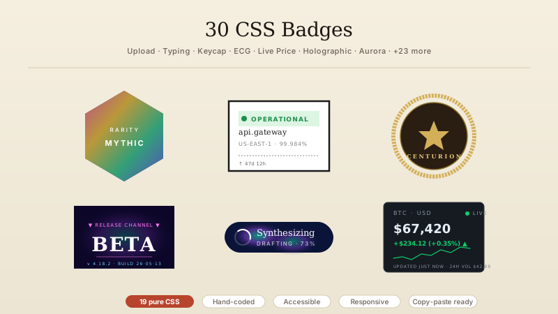
Badge anatomy that survives real numbers: a nav-bar bell whose counter grows from dot to 1-digit circle to 99+ pill without ever going oval (min-inline-size + padding, not width), popping on every change via an animationend re-trigger — plus a zero-JavaScript inbox where CSS counters literally count the :checked rows and :has() hides the badge at zero.
A status-dot system with three motion grammars (LIVE pings outward, online breathes softly, away sits still — stillness is information too), and a performance clinic that runs the same pulse two ways — animated box-shadow versus a scaled pseudo-element ring — with DevTools-verifiable labels explaining why one stays on the compositor.
The avatar badge without the white-ring hack: a mask-image radial cutout punches a true transparent gap between avatar and status dot (proven live over a shifting gradient), with a radio-driven online/busy/away switcher — and a facepile where negative-margin avatars ring themselves with the same mask trick and a +3 pill absorbs the overflow.
Two add-to-cart moments worth shipping: a fly-to-cart animation where a dot arcs from the product button into the cart along a JS-built offset-path (the badge pops only when the dot lands), and an odometer badge whose digits roll vertically on a translated strip — the counter equivalent of a mechanical split-flap.
clip-path as a badge tool, twice: an app-dock icon whose top-right corner is genuinely carved away by clip-path: path() so the count badge floats in a true notch (the SVG arc math annotated in the demo), and a merch card wearing polygon-clipped badges — a spinning 16-point starburst seal and a hexagon counter — that morph between polygon states on hover because same-vertex-count polygons interpolate.
The ping, engineered and then enjoyed: a message icon whose unread dot emits staggered double rings (the exact anatomy of Tailwind's animate-ping, annotated and improved with dead-time and a reduced-motion halo), and a full radar sweep stage — conic-gradient beam, ranging rings, blipping contacts — that shows the same ping keyframes scaling from 8px badge to 280px instrument.
Newsletter
Enjoying these demos? Get new ones by email.
A short email when a new collection ships. Unsubscribe any time.
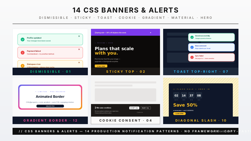
Two sticky-banner behaviors over real scrolling content: a dismissible announcement bar whose position:sticky anatomy is visible live (scroll and watch it hold the top edge) and whose dismissal collapses smoothly instead of yanking the page up — and a zero-JS scroll-driven banner that condenses from a tall promo into a slim strip as you scroll, powered by animation-timeline: scroll().
The same dismissible banner built in two eras: a 2027 version where :has() lets the banner react to its OWN close-checkbox and exit through display:none via allow-discrete, and the classic checkbox-hack (input + sibling combinator) that has worked since 2011 — styled identically so you can diff the two mechanisms line by line.
Two floating-bar temperaments: a cookie-consent bar that rises on an @starting-style transition, floats on a soft double shadow, and handles Accept/Preferences with a collapse exit — and a slim pill promo bar that shows the small-screen discipline: max-inline-size, safe-area-inset-bottom padding, and a snooze control that re-docks it as a corner chip instead of killing it.
The inline half of the status family: form-grade alert boxes (success confirmation, an error box that itemizes what failed and links each item to its field, a warning with body copy) derived from one --hue system — and a set of documentation callouts (Note, Tip, Warning, Danger) in the dark editorial style modern docs sites use, with monospace labels and quotable left-rail anatomy.
Two volumes of quiet: a maintenance ticker that scrolls its message on a seamless CSS marquee (duplicated track, masked edge fades, pauses on hover — the accessible rebuild of the <marquee> tag), and a status-page strip that cycles operational → degraded → maintenance with a breathing dot, cross-fading copy and a live 'checked Ns ago' counter.
Bell physics in two doses: a hover bell built from a two-part inline SVG whose body and clapper animate SEPARATELY (the clapper lags a beat behind the shell, which is what makes it read as ringing rather than wobbling), and an ambient reminder bell that rings a short burst every six seconds using the keyframe dead-time trick — silenced entirely by its do-not-disturb toggle via :has().
The switch pattern end-to-end: a notification preferences panel where each control is a genuine checkbox restyled into a sliding switch (spring thumb via linear(), tinted row via :has(), visible focus ring), and a mute-all panel where one master switch dims, disables and un-tints every child row — pointer-events, opacity and state, all coordinated by :has() with zero JavaScript.
Two platform-native dropdown panels: a <details> notification center whose open/close animates through ::details-content + allow-discrete (zero JS, state included), and a popover-API panel that lives in the top layer — light-dismiss, Esc-to-close and focus handling free — scaling in from the bell via @starting-style with a tiny position sync.
Newsletter
Enjoying these demos? Get new ones by email.
A short email when a new collection ships. Unsubscribe any time.
Animation-principles class disguised as a badge: a push-notification badge that arrives with real squash & stretch (drop, splat wide, rebound tall, settle — each frame annotated in the keyframes), and a pure-CSS bounce built from NOTHING but easing — one translate pair driven by a linear() bounce curve, with a ground shadow that squashes in sync.
Library-free SweetAlert energy: a success dialog whose circle sweeps shut and checkmark draws on via stroke-dashoffset (with a celebratory ring burst), and an icon lab holding all three states — draw-on check, double-stroke cross with a head-shake, pulsing warning — each replayable and each annotated with the exact dash math that drives it.
The accessibility contract made visible: a polite-vs-assertive lab where two buttons fire the same toast through role=status and role=alert while an on-screen announcement log shows exactly what a screen reader would say (and why the region must exist BEFORE the message) — plus an annotated specimen toast with numbered pins tying each WCAG checkpoint to the physical part of the toast that satisfies it.
Notifications as conversations: an invitation card with Accept/Decline whose answer morphs the card in place (accept collapses the buttons and stamps a confirmation; decline fades the card out through a grid-rows collapse), and a zero-JavaScript swipe-to-act row where scroll-snap physics reveal archive/delete actions under the card — the mobile gesture rebuilt from standard CSS.
The same notification markup rendered in three container widths side by side — @container queries morph it from full-width thumb-zone bottom bar (block buttons, 48px targets) through mid-size sheet to compact corner card, no JavaScript and no viewport queries — plus a phone-frame bottom sheet with real drag physics via scroll-snap: peek, half and full snap points, honest 100dvh sizing and a safe-area spacer.
Both halves of web push, faked faithfully: the permission flow done RIGHT — a soft in-page pre-prompt asks first, and only a yes summons the browser-chrome-style permission popup (the pattern that keeps your real permission un-burned), and a desktop OS-style push card — glass surface, app icon, actions that reveal on hover — sliding in from the top-right corner with a grouped second card behind it.
Feed architecture, twice: a timeline whose continuous rail is one border on the list (not per-item fragments), with color+shape-coded markers, semantic <time> stamps, an unread divider and staggered entry — and a day-grouped scrolling feed where each date header position:stickies inside the panel and hands off to the next, the pattern every activity log ships.
Two endgames for the floating button: a circle-to-pill FAB whose label expands through an animatable grid column (the transition-to-auto-width trick that works today, with interpolate-size noted as the 2027 one-liner), badge riding the morph — and a speed-dial FAB that blooms three labeled actions on a checkbox toggle, each springing out with its own delay, the unread badge clearing the moment the dial opens.
FAQ
Frequently asked questions
What is a CSS notification and what is the canonical toast recipe?
A CSS notification is any transient visual message a product surfaces to signal state change — arrival of new info (toast, banner, badge count), confirmation of a user action (success toast, cart-added wiggle), warning about a system state (warning banner, connection-lost bar), or urgent error (blocking alert). It's the umbrella term covering toasts (transient bottom/corner popup that auto-dismisses), banners (sticky bar across the top or bottom), badges (count indicator on an icon), alerts (inline colored block), and modals (blocking dialog — separate pattern; see our modals collection). The canonical toast recipe in ~20 lines: .toast { position: fixed; bottom: 24px; right: 24px; padding: 14px 18px; background: #fff; box-shadow: 0 10px 30px rgba(0,0,0,.15); border-radius: 12px; opacity: 0; transform: translateY(10px); transition: opacity .25s, transform .25s; } .toast.show { opacity: 1; transform: translateY(0); }. The critical details most tutorials get wrong: (1) animate transform + opacity only — NEVER top/bottom, those trigger layout thrash and adjacent elements jump; (2) use position: fixed not absolute, so the toast sticks to the viewport regardless of scroll position; (3) force GPU compositor promotion with transform: translate3d(0,0,0) or will-change: transform; (4) auto-dismiss via setTimeout paired with an animationend-based re-arm pattern (never the deprecated void-offsetWidth reflow hack); (5) wrap in @media (prefers-reduced-motion: reduce) { .toast { transition: none; opacity: 1; transform: none; } } — the WCAG 2.3.3 requirement. Modern extras (Chrome 116+, Safari 17+): @starting-style + transition-behavior: allow-discrete let you animate display: none → block for enter/exit without any JS class-toggle at all. Every demo in this collection uses one of these patterns.
Which notification pattern should I pick for my use case — toast vs badge vs banner vs modal?
Decision rule by intent. Toast (topics 01–08): transient, self-dismissing, non-blocking. Use for confirmations of user actions the user just performed — 'Saved to library', 'Payment successful', 'Message sent'. Dismisses in 3–5 seconds; user can dismiss earlier by clicking X. Never for critical info the user MUST see (they may miss it). Badge (topics 09–14): persistent count indicator on an icon (bell, avatar, cart). Use for showing quantities that persist across sessions — unread messages, cart items, unresolved notifications, pending approvals. Never animated aggressively; a subtle pulse ring (topics 10, 14) is fine, a violent shake is not — badges are ambient information, not attention grabs. Banner (topics 15–19): sticky bar at top or bottom of the viewport. Use for site-wide announcements ('Scheduled maintenance Sat 2 AM'), consent banners (cookies, GDPR), or system status ('You're offline — changes saving locally'). Persists until dismissed OR until the condition clears. Never for per-action confirmation — that's toast territory. Alert box (topic 18): inline colored block within page content. Use for state that's tied to a specific area of the page (form errors, empty-state guidance, deprecation warning on a settings section). Not a toast, not a banner — sits inline where the state applies. Modal: blocking dialog. Use when the user MUST make a decision before continuing (delete confirmation, unsaved-changes warning, payment authorization). Never for info you could show as a toast — modals are jail cells for user attention, use sparingly. Push notification (topic 28 shows the visual style — actual browser API is a separate concern): OS-level notification the user sees when your tab isn't focused. Requires Notification.requestPermission() + user grant. Use sparingly; too many kills your permission trust. Rule of thumb: if the user is looking at the screen and the info is helpful-but-not-critical → toast. If they need to know it every time they visit → badge. If it affects the whole product experience → banner. If they can't continue without responding → modal. If they might not be looking at the screen at all → push.
Toast accessibility — role='status' vs role='alert' vs aria-live='polite' vs 'assertive'?
This is the single most-missed WCAG SC 4.1.3 (Status Messages) pattern in production. The rule is not 'add aria-live="polite" to your toast div'. It's more specific. Two ARIA patterns matter, and they behave very differently:1. role="status" (implicit aria-live="polite"): screen reader announces the content AFTER the user's current speech finishes. Use for non-urgent updates — 'Saved', 'Message sent', 'Cart updated'. Never interrupts the user mid-task. This is the RIGHT choice for 95% of toasts. Pattern: <div class="toast" role="status">Message sent</div>. 2. role="alert" (implicit aria-live="assertive"): screen reader interrupts whatever the user is currently doing to announce the content immediately. Use ONLY for urgent info the user must act on RIGHT NOW — 'Session expiring in 30 seconds', 'Connection lost — changes not saved', 'Payment failed — try again'. Never for confirmations. Overusing role="alert" is the digital equivalent of a car alarm that goes off every 5 minutes — users learn to ignore it. Pattern: <div class="toast toast--urgent" role="alert">Connection lost</div>. Critical implementation detail: for the announcement to actually fire, the element must be in the DOM BEFORE the message text is set. Adding <div role="status">Saved!</div> to the DOM in one step does NOT announce reliably — screen readers only announce CHANGES to already-existing live regions. Correct pattern: (1) render an empty <div role="status" aria-live="polite"></div> on page load; (2) later, populate its textContent. The change fires the announcement. Every toast demo in this collection uses this pattern. Also: pair the ARIA with visual signals — icon + color + text, never color alone (WCAG 1.4.1 Use of Color). Every regulatory framework — US ADA, Section 508, EU EAA (June 2025 enforcement), Canada ACA, UK Equality Act, Australian DDA — treats notification accessibility failures as WCAG 2.2 AA violations. Topic 25 (Accessible CSS Toast Notification Aria Live) is the reference implementation.
How do I prevent Cumulative Layout Shift (CLS) with notifications?
CLS is one of three Core Web Vitals Google measures on every Lighthouse / PageSpeed audit and uses as a ranking signal. Notifications are a notorious CLS source. Common causes and fixes:1. Toast pushing page content down: toast rendered as a normal block element instead of position:fixed → adjacent content reflows when the toast enters. Fix: position: fixed always. The toast lives on a separate layer above the page flow; the page layout never sees it. 2. Banner appearing at the top of the page after paint: cookie consent banner mounted via JS after hydration → all page content jumps down by the banner's height. Fix: server-render the banner (Astro SSG or Next.js) so it exists in the initial HTML, OR reserve space with a placeholder <div style="height: 60px"></div> that gets replaced by the banner on hydration. 3. Notification badge causing icon to shift: badge overlays the icon using absolute positioning inside a wrapper that grows when the badge appears. Fix: position: absolute on the badge inside a position: relative icon-container of fixed size; the wrapper dimensions are set by the icon, badge overlays without affecting layout. 4. Expanding notification panel: click bell → panel drops down → content below jumps. Fix: overlay the panel with position: absolute above the content (like a dropdown), or animate content shift via height with interpolate-size: allow-keywords (Chrome 129+) which is a compositor-only animation. 5. Web font swap on the toast: FOUT (Flash of Unstyled Text) mid-animation. Fix: font-display: optional on the toast's font-face rule OR font-display: swap + set explicit width on the toast so the swap doesn't reflow. Tools: Chrome DevTools Performance panel (Layout Shift detail), Lighthouse, PageSpeed Insights, Web Vitals Chrome extension, Core Web Vitals report in Google Search Console. Every notification demo in this collection is CLS-safe by construction — position: fixed for toasts/banners, dimensioned wrappers for badges, overlay-not-push for panels.
CSS notifications vs react-toastify vs Sonner vs SweetAlert vs Notyf — how do they compare?
react-toastify (~12KB minified, ~4M weekly downloads): the OG React toast library. Feature-rich (positioning, themes, close buttons, progress bars). But React-only, and 12KB is 4× the size of the equivalent pure-CSS pattern. Sonner (~5KB, ~2M weekly downloads): Emil Kowalski's opinionated modern React toast — stackable, promise-based, elegant defaults. Shadcn's official recommendation. Excellent choice IF you're on React and need the promise API for async toasts. Overkill for simple 'Saved' confirmations. SweetAlert2 (~34KB, ~2M weekly downloads): more of a modal library than a toast library — animated success/error/warning/info icons, confirm dialogs, input prompts. Topic 24 in this collection replicates the SweetAlert-style animated icons (checkmark draw, error X draw, warning triangle) in ~40 lines of pure CSS. If you only need the icon animations, our recipe is 99% smaller. Notyf (~8KB, ~40K weekly downloads): framework-agnostic toast library, slick minimal design, no config needed. Good choice for vanilla JS projects. But you're still shipping 8KB of runtime for what topic 01 does in 30 lines. Notistack: React-specific stacking toast wrapper around Material UI Snackbar. React + MUI users only. What this collection gives you: framework-agnostic pure CSS + optional 5-line JS handlers. Zero bundle cost, zero runtime dependency, zero CVE surface, faster First Contentful Paint. For 90% of production toast needs (confirmation of user action, error message, arrival alert), the pure-CSS approach wins on every Core Web Vitals dimension. Reach for a library when you need: (a) promise-based toasts for async operations, (b) toast queuing with priority, (c) programmatic dismissal from anywhere in a large React app, (d) you already have the library as a dependency for other UI. Otherwise: copy topic 01–08 into your project and save 5–34KB.
shadcn Toast + MUI Snackbar + Chakra useToast + Mantine notifications — how do these compare?
Modern UI-library toasts, ranked by ergonomics for the tier-1 dev audience. shadcn/ui Sonner: shadcn's toast is a wrapper around Emil Kowalski's Sonner library — imperative API (toast('Saved')), promise-based (toast.promise(fetchData(), { loading, success, error })), stackable, elegant defaults. Uses Radix Toast primitive under the hood. Copy-paste into your project via npx shadcn@latest add sonner. Best-in-class for React + shadcn stacks. MUI Snackbar (~15KB when tree-shaken from MUI's 100KB+ full bundle): the OG Material Design toast. Verbose API (<Snackbar open={open} autoHideDuration={6000} onClose={handleClose}><Alert severity="success">...</Alert></Snackbar>), but comprehensive — every position, severity, action button pattern. Overkill for simple confirmations; correct for enterprise UIs already invested in MUI. Chakra UI useToast: React hook returning a toast() function. Chakra ships toast as core — no separate install. Solid choice for Chakra projects. Mantine notifications (@mantine/notifications, ~10KB): imperative API (notifications.show({ title, message })), auto-stacking, positioned queues. Excellent DX; requires Mantine's provider setup. Ant Design notification: static method notification.success({ message, description }). Popular in enterprise / dashboard products. Heavy (~40KB+ from AntD). HeadlessUI / Radix Toast: unstyled primitives — you bring your own CSS. Every demo in this collection is essentially a HeadlessUI/Radix-compatible styling layer you can drop under any of these libraries' primitives. What this collection gives you: the CSS half. Every one of these libraries handles state, positioning, stacking logic well — but their default visual styles are generic. Compose our pure-CSS animations, badges, banners, and icon transitions with any of these libraries' state machines to get production-grade visual polish without abandoning the library's ergonomics. Recipe for each library included in the demo's customization field.
Web Push Notification API vs CSS-based in-app notifications — when to use each?
Two completely different problems, often conflated. CSS-based in-app notifications (topics 01–30): visual UI elements inside your tab. Toasts, banners, badges, panels. User is looking at your site RIGHT NOW; you're changing what they see. No permissions required. Zero infrastructure — just CSS + optional JS. Works everywhere (mobile, desktop, iOS Safari, Firefox, Chrome, embedded WebViews). Web Push Notification API: OS-level notifications the user's device shows even when your tab isn't open (or the browser is closed). Requires: (1) HTTPS site, (2) Service Worker registered on your origin, (3) Notification.requestPermission() call → user must grant, (4) backend that sends push messages via Firebase Cloud Messaging (FCM), Apple Push Notification service (APNs), or a service like OneSignal / Pusher. When to use Web Push: news alerts, chat messages, order status updates, calendar reminders, e-commerce back-in-stock alerts — anything the user needs to know when they're not on your site. iOS Safari caveat: as of iOS 16.4 (March 2023), Safari supports Web Push — but ONLY for PWAs (installed apps). A regular Safari tab CANNOT request Web Push permission on iOS. This is Apple policy, no workaround. Android / desktop have no such restriction. Permission UX best practice: never call requestPermission() on page load — 99% of users deny, and denials are STICKY (browser remembers 'deny' and won't re-prompt for weeks/months). Instead: (1) explain WHY you want to send notifications in an in-app UI first (use one of this collection's toast or banner patterns — topic 28's push-notification-style popup is designed exactly for this pre-prompt UX), (2) request permission ONLY after user says 'Yes, I want notifications', (3) if denied, respect it — never re-prompt in the same session. Combining both: real products use both. In-app notifications (this collection) for foreground state changes. Web Push for background notifications when the user isn't on the site. The visual style for the Web Push notification is controlled by the OS, not you — but the pre-prompt permission-request UI is 100% yours to design (topic 28 is the canonical pattern). Alternatives to Web Push: email, SMS, native mobile push (via a React Native / Flutter wrapper), Slack/Discord webhooks — pick based on your users' habits.
Real-time notification feed architecture — how do the CSS animations connect to the backend?
Notifications rarely appear randomly — they're driven by real events on your backend (someone commented on your post, a payment succeeded, a document was shared with you). The full stack: 1. Backend event source: your API emits an event when something notification-worthy happens. Options: database triggers (Postgres LISTEN/NOTIFY, Supabase Realtime, Firebase), message queue (Redis Pub/Sub, RabbitMQ, AWS SNS), or application-layer emitters (a service call broadcasts to subscribers). 2. Transport to browser: three main options ranked by tradeoffs. (a) WebSocket: bidirectional persistent connection. Best latency, most complex infra. Libraries: Socket.IO, Pusher, Ably, Supabase Realtime, PartyKit. Use when you need <100ms latency (chat, collaborative editing, live dashboards). (b) Server-Sent Events (SSE): server-to-client only, HTTP/2 based, auto-reconnect built-in. Simpler than WebSocket, natively supported by browsers via new EventSource(url). Use for one-way push (notifications, live feeds, progress updates). (c) Polling: client calls fetch(/api/notifications/unread) every N seconds. Simplest infra, worst battery/network. Use when latency >30s is OK (email-like notifications). 3. Browser receives event → dispatches to notification UI: your JS listener converts the event payload into an in-app notification. Pattern with topic 04 (Stacked Toast Notifications): socket.on('notification', (msg) => { const toast = document.createElement('div'); toast.className = 'ntf-04a__toast'; toast.textContent = msg.text; document.querySelector('.ntf-04a__stack').prepend(toast); setTimeout(() => toast.remove(), 5000); });. The CSS handles the enter animation (@starting-style + transition: transform, opacity); JS handles append + remove. 4. Persistence + read state: unread notifications persist in your database. When user views the notification panel, mark as read via a PATCH call. Badge count on the bell icon (topic 09) subscribes to the same event stream to increment / decrement in real time. 5. Offline handling: WebSocket connections drop when the user goes offline. Handle reconnection + replay of missed events. Libraries above handle this automatically; polling handles it by design. Recommended stack for a mid-size SaaS in 2027: Supabase Realtime OR PartyKit for the transport layer, this collection for the visual layer, IntersectionObserver for read-state detection when the user scrolls past a notification. The full pattern is production-tested at Linear, Notion, Slack, GitHub, Discord.