14 Material Design CSS Components
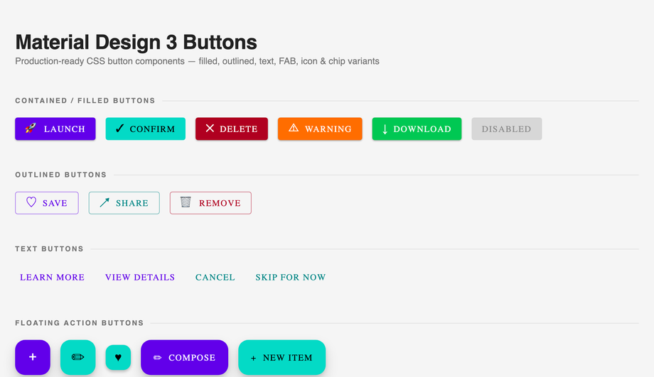
Material Design is Google's open-source design system, used across Android, Wear OS, Chrome, and Google's web properties — but reaching for the Material UI / MUI / Material Components Web library to get the look adds 50-100kb to your bundle. These 14 hand-coded components ship the canonical Material Design 3 (Material You) aesthetics — elevated buttons with ripple, rounded corners, Roboto typography, the indigo + amber palette — as 100% pure CSS. Zero JavaScript, zero library dependencies. Every interactive component (dialogs, tabs, chips, expansion panels) uses checkbox/radio state machines and CSS :checked + :has() selectors. Drop into any stack: React, Vue, Astro, Rails ERB, plain HTML. MIT-licensed.
Frequently asked questions
What is Material Design and why use it for a web project?
Should I use Material UI (MUI) or build Material Design with vanilla CSS?
How do I implement the Material Design ripple effect without any JavaScript?
<span> is spawned at the click coordinate — that requires JavaScript and you have to recalculate positions on every click. This demo's pure-CSS approach: a ::after pseudo-element with position: absolute; inset: 0; background: radial-gradient(...) center / 0 0 no-repeat. On :hover and :focus-visible, the background-size animates from 0 0 to 200% 200% over 0.4s with ease-out — creating a ripple that radiates from the button center. On :active a separate keyframe runs a faster, more contained ripple for the press feedback. Tradeoff vs JS ripple: the ripple always originates from the BUTTON center, not the click coordinate. For ~95% of UI use cases (CTAs, primary actions, navigation buttons) this is indistinguishable from a JS ripple and saves you the entire JS implementation. The 5% case where ripple-at-cursor matters (interactive canvases, design tools): use the JS approach Demo 16 in CSS Floating Buttons.How do I implement Material Design's floating label form input pattern?
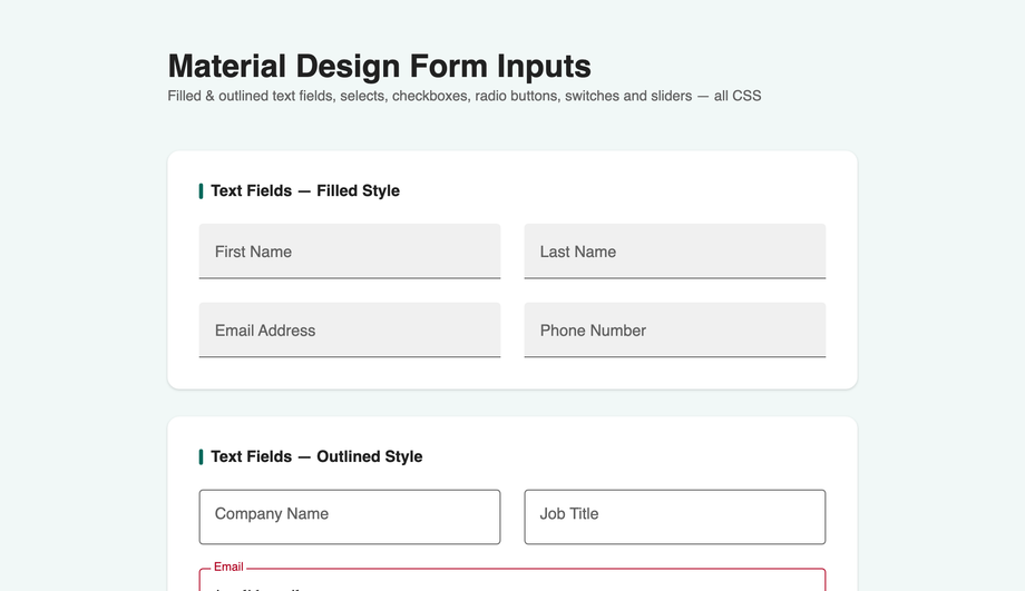
<label> sits absolutely positioned over the <input>'s placeholder area. The :placeholder-shown pseudo-class targets inputs that still show their placeholder (i.e., empty + not focused). When the input is :focus OR NOT :placeholder-shown (has content), the label translates up and scales down via transitions. The selector chain: .md-04__field input:focus + label, .md-04__field input:not(:placeholder-shown) + label { transform: translateY(-22px) scale(0.78); color: var(--md-primary); }. Three details most online tutorials get wrong: (1) Use placeholder=" " (single space) on the input, not empty — Chrome treats an empty placeholder as no placeholder and breaks the selector. (2) Animate transform not top/font-size — transform is GPU-accelerated and won't trigger layout reflow. (3) Set transform-origin: left center so the label scales from its left edge, matching Material's spec.How do I build a Material Design dialog / modal in pure CSS?
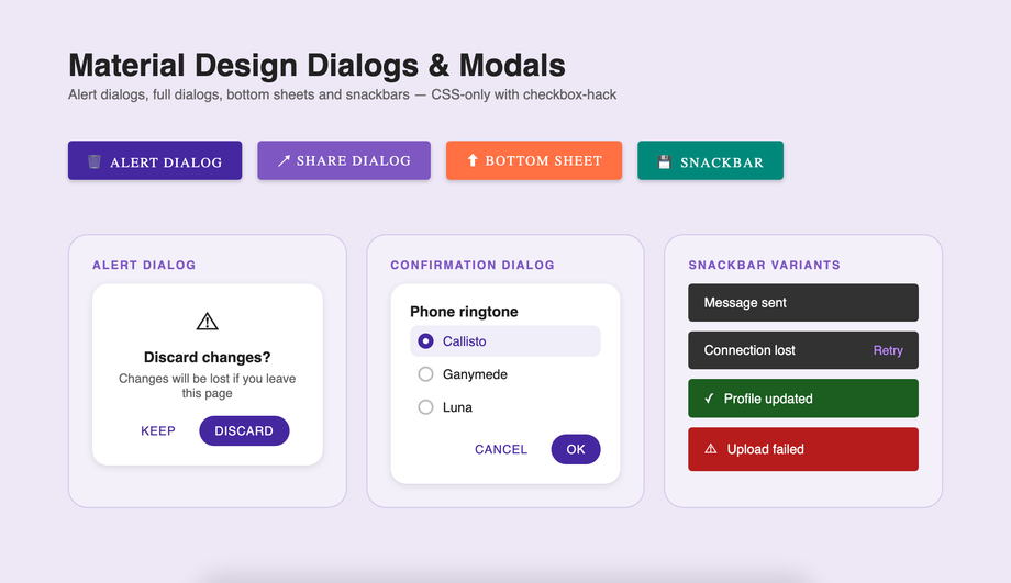
<dialog> element. The pattern: <dialog id="md-05-dialog"> contains the dialog content; an open-trigger button has a <label for="md-05-open"> + hidden checkbox; CSS shows the dialog when #md-05-open:checked ~ * #md-05-dialog matches. The modern alternative (which Demo 05 also illustrates as a snippet): <dialog> opened by modal.showModal() automatically gets focus trap, Esc-to-close, scroll lock, and backdrop — but requires one line of JS. Why the checkbox-hack version exists alongside: zero JS, works on every browser since 2016, useful for marketing pages or static landing pages where adding a JS click handler feels like overkill. Three production gotchas: (a) Focus trap — the pure-CSS dialog doesn't trap focus (Tab can leave the dialog). For accessibility-critical UIs, use the native <dialog> + JS instead. (b) Scroll lock — body still scrolls behind the open dialog unless you add html:has(#md-05-open:checked) body { overflow: hidden } (requires :has() — Chrome 105+, Safari 15.4+, Firefox 121+). (c) Backdrop click to close — works via <label for="md-05-open"> on the backdrop element.What's the difference between Material Design 2 and Material Design 3 (Material You)?
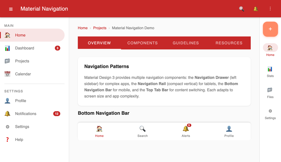
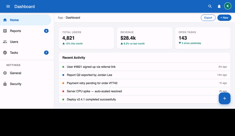
How do I build the Material Design app shell layout (drawer + top app bar)?
:checked on the hidden toggle slides the drawer in via transform: translateX(-256px) → translateX(0). (3) Main content area to the right of the drawer, with a backdrop overlay on mobile when the drawer is open. (4) A bottom navigation bar on mobile breakpoints (below 768px) — the drawer becomes a modal overlay rather than always-visible. Three production-grade details: (a) Use CSS Grid for the shell: grid-template-columns: auto 1fr on desktop, 1fr on mobile. (b) Persist drawer state via localStorage if you wire one line of JS — visitors who close the drawer want it stay closed across page navigations. (c) Trap focus when the drawer is modal on mobile — Tab order should cycle within the drawer until Esc closes it. ~60 lines of CSS, 0 lines of JS.Is Material Design suitable for non-Google products? Won't my site look like Google?
--md-primary, --md-secondary, --md-surface custom properties at the demo root, and the Material grammar carries your brand's identity. Substituting Roboto with your brand font (or with Inter, IBM Plex Sans, Geist) also differentiates the look. Most successful Material-derived products do exactly this — Slack's web app, Notion's settings panel, Linear's editor all use Material patterns with brand-specific color + typography substitutions.Is Material Design accessible? What about screen readers and keyboard navigation?
:focus-visible ring (typically outline: 2px solid var(--md-primary); outline-offset: 2px) that survives Material's ripple animation. (4) Semantic HTML. Real <button> / <input> / <dialog> / <nav> elements, not divs styled as buttons. Screen reader announcements work automatically. (5) aria-current, aria-expanded, aria-selected, aria-controls on interactive components (tabs, expansion panels, navigation links) so screen readers announce the current state. (6) prefers-reduced-motion media query on every demo — vestibular-sensitive visitors don't see ripples, slide-in panels, or other continuous motion.Which Material Design component should I use for my project?
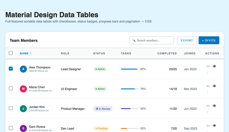
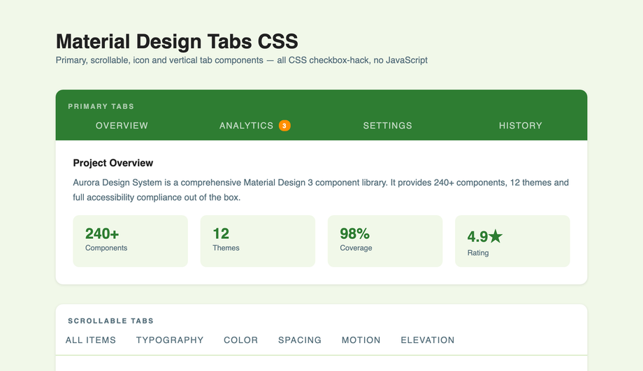
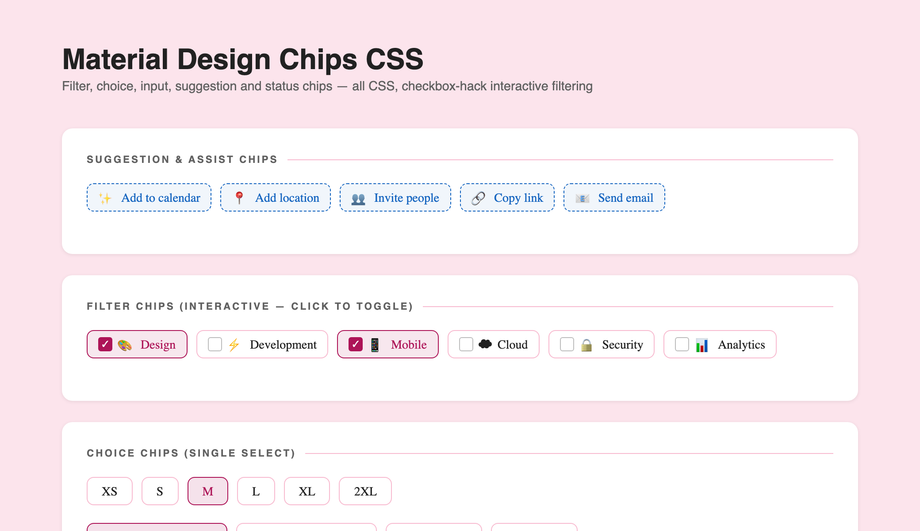
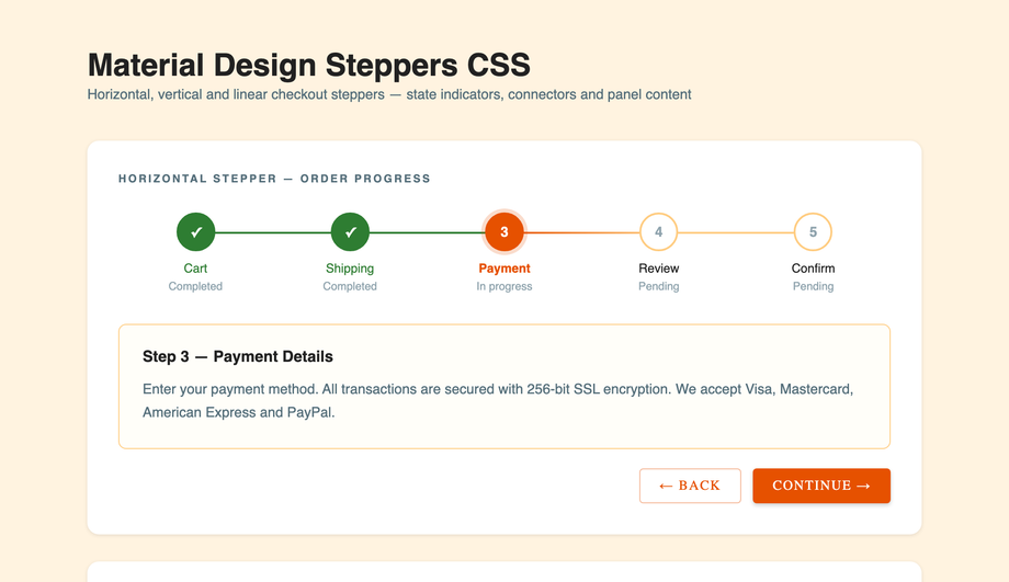
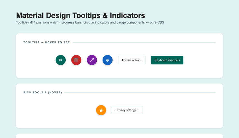
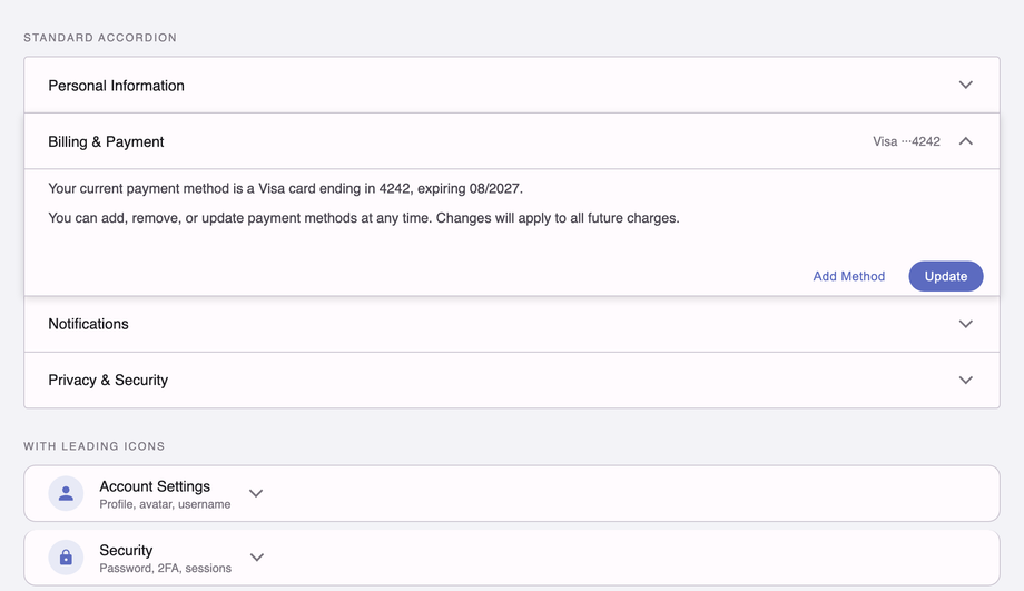
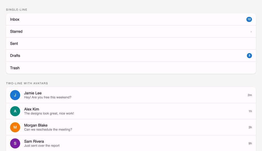
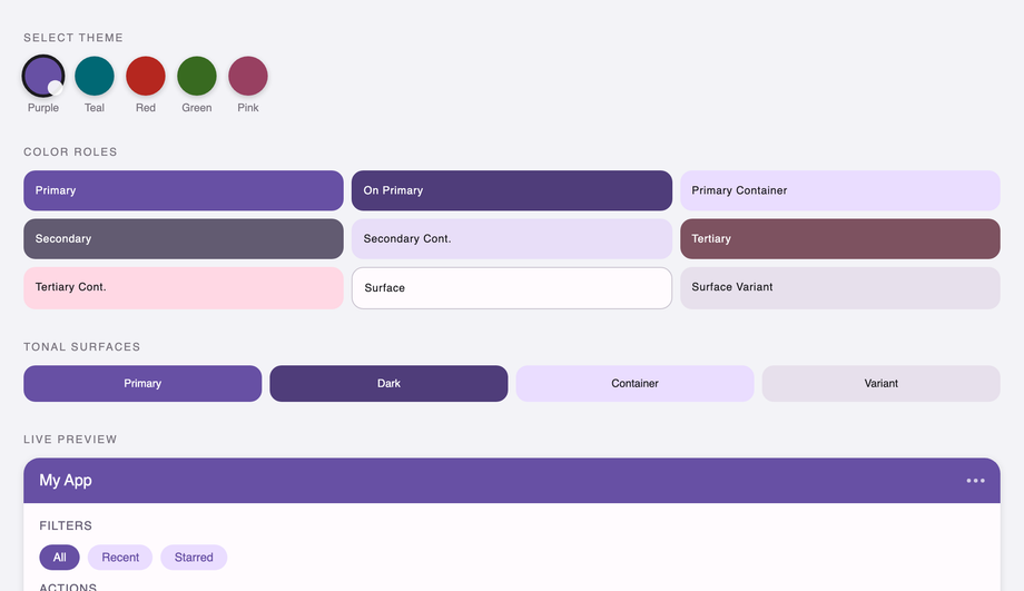
<dialog> dual implementation. Tabular data (orders, users, transactions): Demo 06 (Material Design Data Table CSS) — proper alignment, hover states, sortable column headers. Tabbed content panels: Demo 07 (Material Design Tabs CSS) — ripple-driven underline transitions. Filter / tag UI: Demo 08 (Material Design Chip CSS) — removable chips with leading icons. Multi-step form flows: Demo 09 (Material Design Stepper CSS) — vertical step indicator. Hover help / contextual info: Demo 10 (Material Design Tooltip CSS) — four directional variants. FAQ / collapsible content: Demo 11 (Material Design Expansion Panel CSS) — Material's accordion. Profile lists / contact lists / settings menus: Demo 12 (Material Design List CSS) — two-line list with avatars. Design system documentation page: Demo 13 (Material Design Color Palette CSS) — full 500-shade palette with theme switcher. Full-app skeleton: Demo 14 (Material Design App Shell Layout CSS) — drawer + top bar + content. All 14 are 100% pure CSS, MIT-licensed, framework-neutral.Related collections

9 CSS 3D Designs
9 hand-coded CSS 3D scenes built with real transforms, perspective, and preserve-3d — iridescent flip cards, a midnight coverflow carousel, kinetic tilt pricing cards, a page-turn flipbook, a Bauhaus drag-cube navigator, a modular synth control panel, a luxury hover-flip product showcase, a 5×5 spinning cube matrix, and a 60-orb DNA double helix. No WebGL, no libraries.

8 CSS Brutalist Designs
8 hand-coded CSS brutalist designs spanning raw e-commerce product cards, a bureaucratic inspection form, a dark constructivist ops dashboard, a collision-typography portfolio grid, an indie SaaS hero + pricing split, a draggable Windows 95 desktop, a three-column long-read editorial, and a stark streetwear catalog. Heavy borders, oversized type, no rounded corners.

12 CSS Dark Mode UI Patterns
12 free CSS dark-mode UI patterns — OLED true-black, single-accent surfaces, layered slate, and emissive glow effects with copy-paste HTML and CSS.