12 CSS Retro UI Designs
12 hand-coded retro / vintage UI designs covering the era-aesthetics search demand actually targets: pixel-faithful Windows 95, CRT terminal with scanlines, 8-bit pixel-art HUD, neo-brutalism, skeuomorphic cassette deck, vaporwave, retro arcade, an interactive ASCII bash shell, 90s Web 1.0 guestbook, Y2K aqua-gloss, vintage storefront, and a draggable-window desktop portfolio. 10 of 12 are 100% pure CSS — no framework dependency, no 98.css/NES.css external. MIT-licensed.
Frequently asked questions
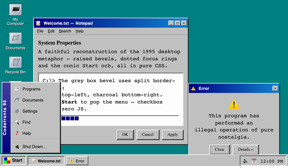
How do I build a Windows 95 UI in pure CSS without a framework like 98.css or XP.css?
border-color (top + left = white/grey light, right + bottom = dark grey/black, no gradients needed — same trick the original Windows GDI used), the iconic Start orb built with a conic-gradient for the four-color flag, a checkbox-hack Start menu (hidden <input type="checkbox"> + :checked sibling selectors so the menu opens with zero JS), dotted focus rings using outline: 1px dotted, and a working taskbar tray clock via CSS only. Fonts: Pixelify Sans + VT323 for the authentic look. Most "retro UI" tutorials online either point you at the 98.css framework or skip the raised/inset bevel mechanic entirely — both are competitor gaps fixed here.How do I make a CRT terminal effect with scanlines in pure CSS?
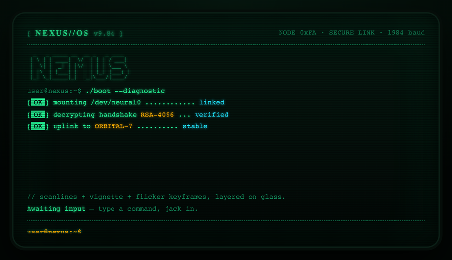
background: repeating-linear-gradient(to bottom, transparent 0 1px, rgba(0,255,0,0.04) 1px 2px) overlaid via a ::before pseudo-element. (2) Phosphor glow on text via text-shadow: 0 0 4px currentColor, 0 0 12px currentColor — the green-on-black halo. (3) Subtle curvature via border-radius + an inner box-shadow that simulates the slight pillow distortion CRT tubes had at the corners. Add a boot-reveal animation (@keyframes typing each line then a cursor blink) and the effect is complete. Most "CRT effect" tutorials reach for WebGL or canvas filters; the pure-CSS version uses zero JavaScript and runs entirely on the compositor. Browser support: every evergreen browser since 2018.How do you make 8-bit pixel-art UI elements in pure CSS without an SVG?
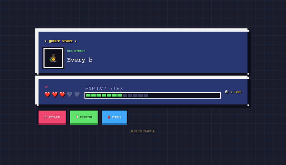
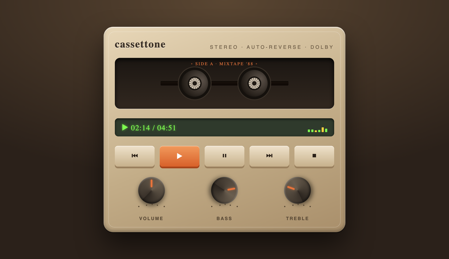
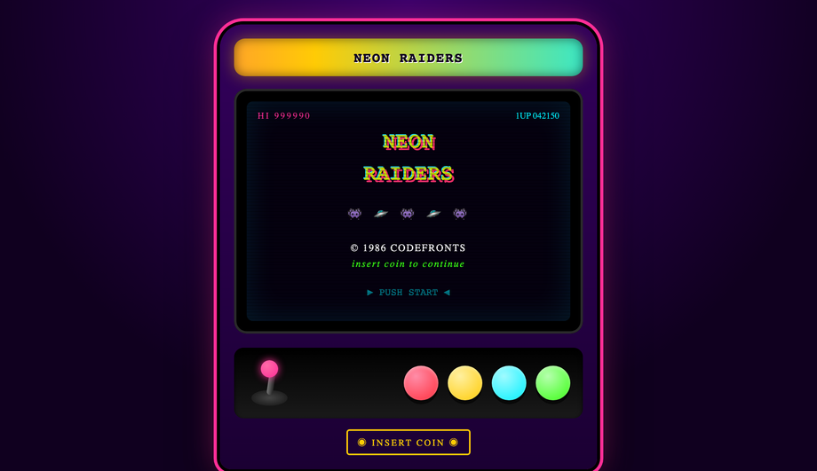
box-shadow trick — a single empty <div> (no markup overhead) becomes a multi-color pixel sprite by listing dozens of 1px-spaced box-shadow entries. Each shadow declaration places one "pixel" at an exact offset: box-shadow: 1px 0 0 #ff0, 2px 0 0 #ff0, 1px 1px 0 #f00, .... The result is a real pixel-art icon rendered in pure CSS at any size that respects image-rendering: pixelated. The same technique drives 8-bit button bevels (top edge = bright color, right + bottom = darker shade — the classic NES "3D" look). Demo #03 ships a complete HUD with health bar (chunky pixel segments), inventory grid, dialog box, and four button variants. Compared to using SVG pixel art, the CSS approach is purely declarative — no separate asset files to manage, infinitely scalable, and the colors are CSS variables you can theme.What's neo-brutalism in UI design and how do I build it in CSS?
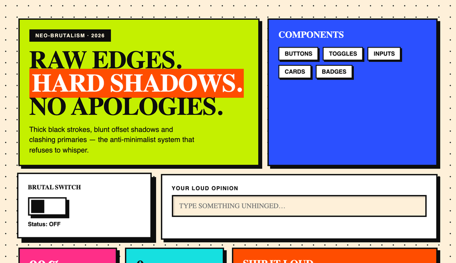
border: 4px solid #000), hard offset shadows with zero blur (box-shadow: 8px 8px 0 #000) that snap to a flat plane instead of softly fading, zero border-radius (sharp corners only), saturated primary colors on big flat fills (hot pink, electric yellow, lime green, cobalt), oversized condensed sans-serif typography (Archivo Black, Space Grotesk Bold), and visible button press — on :active the box-shadow collapses to 0 and the element translates 3px 3px to fake the depression. Demo #04 ships a complete component toggle board with checkboxes, buttons, cards, badges, and pills all in this aesthetic. Browser support: anything. The hardest part is the design discipline of NOT softening the edges.How do I make a vaporwave / synthwave background in CSS?
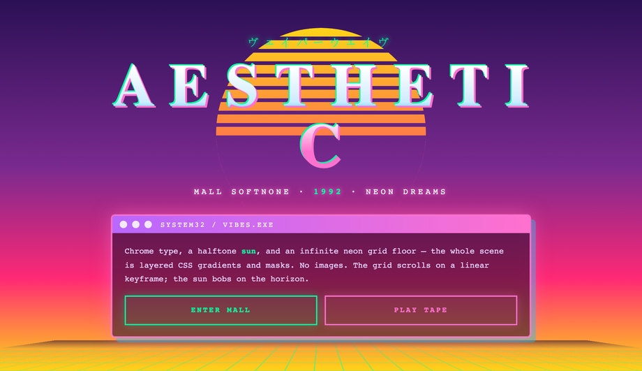
background: linear-gradient(180deg, #ff71ce, #ff8b3d, #ffea00) and a mask-image: linear-gradient(to top, transparent 0%, black 50%) so the sun fades into the horizon. (2) Perspective grid floor: a 2D grid via background-image: linear-gradient(to right, #ff00ff 1px, transparent 1px), linear-gradient(to bottom, #ff00ff 1px, transparent 1px) tilted with transform: perspective(400px) rotateX(60deg) for the iconic Tron-style receding floor. (3) Statue silhouettes / palm trees via clip-path: polygon(...) on solid fills — pure SVG-shaped CSS, no image assets. Pair with Bebas Neue or Monoton typography, the #ff71ce hot-pink + #00f0ff cyan palette, and an animated filter: hue-rotate for the optional color shift. Most vaporwave "how to" articles online show the palette and call it done — they skip the perspective grid + masked sun + clip-path silhouettes that actually make the aesthetic recognizable.What's a working ASCII art web interface and how does the bash interpreter work?
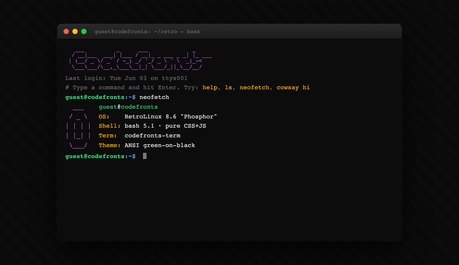
ls, cd, cat, help, clear, whoami, etc.) from a virtual filesystem and renders output in monospace text within an ASCII-bordered panel. The CSS handles the entire visual chrome — the ASCII border (built with Unicode box-drawing characters ┌ ─ ┐ │ └ ┘), the green-on-black monospace surface, the prompt cursor that blinks via @keyframes, the scrollable output history. JavaScript handles only the command parsing + virtual filesystem (~80 lines, no dependencies). Compared to a real terminal emulator (xterm.js: ~250 KB, hyperterm: even bigger), this is a stylistic ASCII shell that's perfect for a portfolio or 404 page or developer tool landing. The competitor gap: every "ASCII art on the web" article shows static ASCII figlet text; this one is actually interactive.How do I recreate a 90s website / Web 1.0 aesthetic in modern CSS?
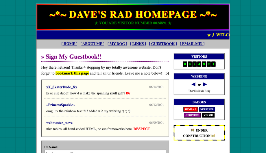
background-image with a Geocities-style starfield, a hit counter using a CSS-only animated odometer with each digit in a flipping panel, marquee text (using the modern CSS animation equivalent of the deprecated <marquee> tag — no need for the legacy element), an animated GIF placeholder using a stepped CSS animation that cycles through frames, under construction blink via animation: blink 1s step-end infinite, and a webring footer with the iconic prev/random/next links + ring buttons. Typography is Comic Sans MS (this is the one place where it's actually correct). What makes this useful in 2026: nostalgia design is a strong genre for indie SaaS, retro-themed event sites, and developer portfolios. Most "90s website CSS" tutorials online stop at the tiled background; this demo ships the full kit.What's Y2K aesthetic in web design and how is it different from vaporwave?
How do I build a draggable window / desktop portfolio in CSS + minimal JS?
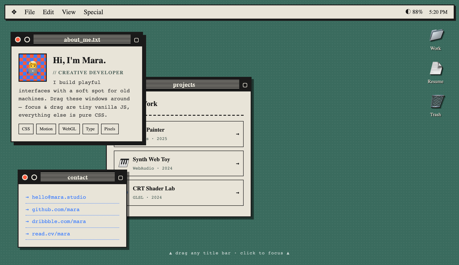
pointerdown / pointermove / pointerup to track the drag delta and update transform: translate on the active window. Falls back gracefully without JS: windows render in CSS Grid as a static portfolio layout. Used by Rauno Freiberg, Henry Heffernan, and Bruno Simon as personal-site signatures — the draggable desktop is a strong portfolio differentiator that most "portfolio template" lists skip entirely.Are these retro UI demos responsive and accessible?
<button>, <a>, <input>, or <label>-wrapped checkbox — no clickable <div>s — so keyboard navigation and screen readers work. The CRT (#02), 8-bit HUD (#03), and vaporwave (#06) demos all respect @media (prefers-reduced-motion: reduce) and disable continuous animations for visitors with that OS preference. All 12 demos are MIT-licensed for both personal AND commercial projects; copy any demo's HTML + CSS from the code panel and drop it into your project.Which retro demo should I use for my project?
Related collections

9 CSS 3D Designs
9 hand-coded CSS 3D scenes built with real transforms, perspective, and preserve-3d — iridescent flip cards, a midnight coverflow carousel, kinetic tilt pricing cards, a page-turn flipbook, a Bauhaus drag-cube navigator, a modular synth control panel, a luxury hover-flip product showcase, a 5×5 spinning cube matrix, and a 60-orb DNA double helix. No WebGL, no libraries.

8 CSS Brutalist Designs
8 hand-coded CSS brutalist designs spanning raw e-commerce product cards, a bureaucratic inspection form, a dark constructivist ops dashboard, a collision-typography portfolio grid, an indie SaaS hero + pricing split, a draggable Windows 95 desktop, a three-column long-read editorial, and a stark streetwear catalog. Heavy borders, oversized type, no rounded corners.

12 CSS Dark Mode UI Patterns
12 free CSS dark-mode UI patterns — OLED true-black, single-accent surfaces, layered slate, and emissive glow effects with copy-paste HTML and CSS.