20 CSS Gradient Text Designs
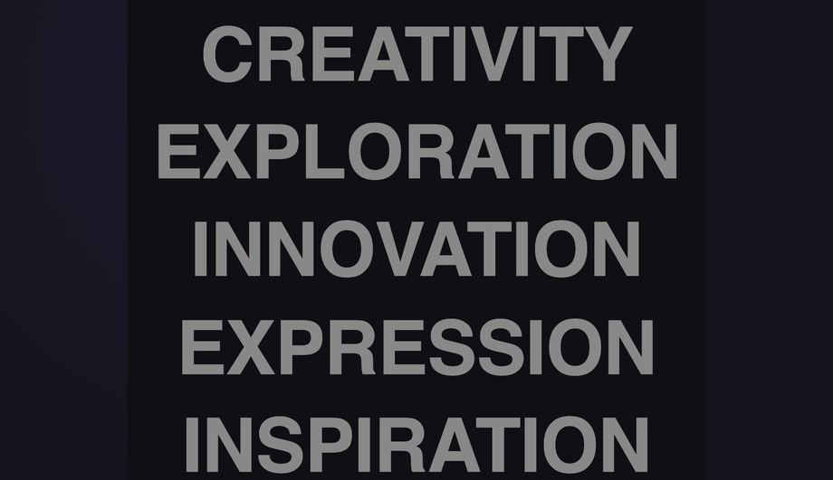
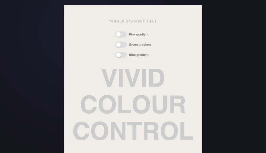
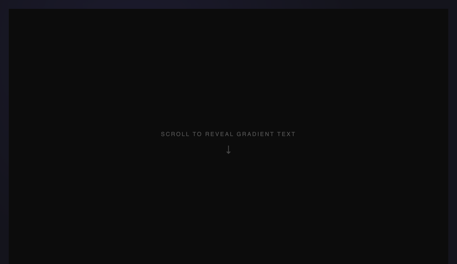
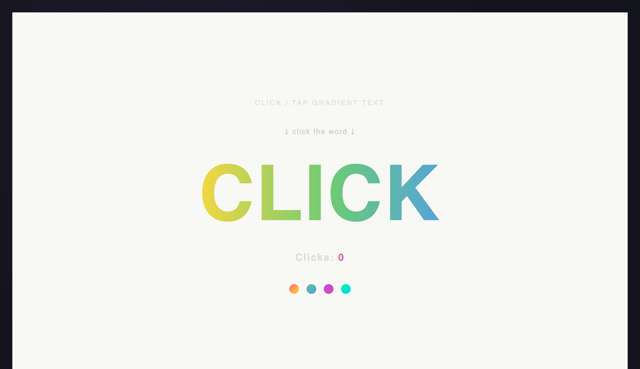
CSS gradient text uses background-clip: text to mask a gradient through the shape of a letterform — the gradient becomes the visible fill, the text becomes the clipping mask. These 20 hand-coded designs cover the full modern playbook — animated @property flow, aurora sweep, conic hue spin, per-letter rainbow wave, neon glow, outline stroke, metallic chrome/gold/copper, holographic foil, duotone, texture fills, cursor-tracked radials, glitter sparkle and more. Every demo uses scoped .gt-NN class names that never collide with your existing styles, honours prefers-reduced-motion, and ships under the MIT license.
Frequently asked questions
What is CSS gradient text and how does it actually work?
background-clip: text property to mask a gradient through the shape of a letterform — the gradient becomes the visible fill while the text glyph becomes the clipping mask. The canonical four-line recipe: (1) set a background to your gradient on the text element, (2) set background-clip: text AND -webkit-background-clip: text (Safari + older Chrome still need the prefix in 2026), (3) set color: transparent OR -webkit-text-fill-color: transparent to make the text itself see-through, (4) the gradient now shows through the letter shapes. Demo #01 (Animated Gradient Text Flow) ships the modern @property --angle typed-custom-property version that animates smoothly (the older background-position trick is jerky because percentages can't be interpolated with sub-pixel precision). The technique works for any gradient: linear, radial, conic, repeating, or animated.Which gradient text pattern should I pick for my use case?
.gt-NN class names so you can drop multiple onto the same page without conflicts.Why use background-clip: text instead of a gradient image PNG?
<h1> / <p> content — selectable by the user, indexable by Google, readable by screen readers, translatable by Google Translate / DeepL. A PNG is just an image; even with alt text, search engines and assistive tech can't extract the actual words. The only reason to use a PNG is if you need exact pixel-perfect rendering of a custom font with effects no CSS technique can produce (e.g. distressed grunge texture from a 3D render). For 99% of marketing UI, gradient text wins on every dimension.Is gradient text WCAG-accessible? Doesn't it fail contrast?
background-clip isn't supported or when prefers-reduced-motion is set (some users with cognitive disabilities find gradient text harder to read). The CSS recipe: color: #fff; background: ...; background-clip: text; -webkit-text-fill-color: transparent; — if background-clip fails, the color: #fff falls back gracefully. Regulatory frameworks that mandate WCAG compliance: EU EAA (European Accessibility Act, enforceable June 2025), US Section 508, Canada ACA, UK Equality Act.Browser support — does background-clip: text still need the -webkit- prefix in 2026?
background-clip: text reached Chrome 120+, Firefox 117+, and Safari 18.2+ — but you should still ship BOTH declarations in 2026 because Safari on iOS lags behind desktop Safari by ~6 months on user adoption (most users haven't updated past iOS 17 yet). The canonical recipe in modern code: background-clip: text; -webkit-background-clip: text; -webkit-text-fill-color: transparent; The -webkit-text-fill-color: transparent is the older Safari/Chromium way of making text see-through; modern code can use just color: transparent instead, but the -webkit-text-fill-color version takes precedence over color inheritance in some edge cases (forms, inputs) so it's the safer cross-browser default. Caniuse data: as of mid-2026, ~96% of global browser usage supports unprefixed background-clip: text; the 4% gap is iOS Safari < 16.4 and Samsung Internet < 23. Shipping both declarations costs you 30 bytes per element — cheap insurance. The Animated Gradient Flow demo (#01) ships both.How does gradient text compare to Tailwind / shadcn / MUI / Chakra / styled-components gradient text recipes?
bg-gradient-to-r from-violet-500 to-pink-500 bg-clip-text text-transparent — Tailwind doesn't have a single utility for 'gradient text', you assemble three utilities. Our CSS to Tailwind converter outputs this combination automatically when you paste a gradient-text CSS rule. shadcn/ui: doesn't ship a gradient-text primitive; you write the Tailwind classes inline or in a custom component. MUI / Material UI: pass the gradient via sx prop — sx={{ background: 'linear-gradient(...)', WebkitBackgroundClip: 'text', WebkitTextFillColor: 'transparent' }}. The camelCased React style names hide the -webkit- prefix. Chakra UI: similar pattern via the bgGradient prop + bgClip='text' — Chakra ships this as a first-class shorthand, which is nice. Ant Design / Mantine: no first-class gradient-text component; same React-inline pattern as MUI. styled-components / Emotion: identical to plain CSS inside the template literal. For complex effects (per-letter wave, cursor-tracked, scroll-reveal): every framework requires the same custom JS that we ship in the demo's JS tab — copy it as-is. The CSS-in-JS layer doesn't change the underlying technique.Why does my gradient text disappear when I add a text-shadow?
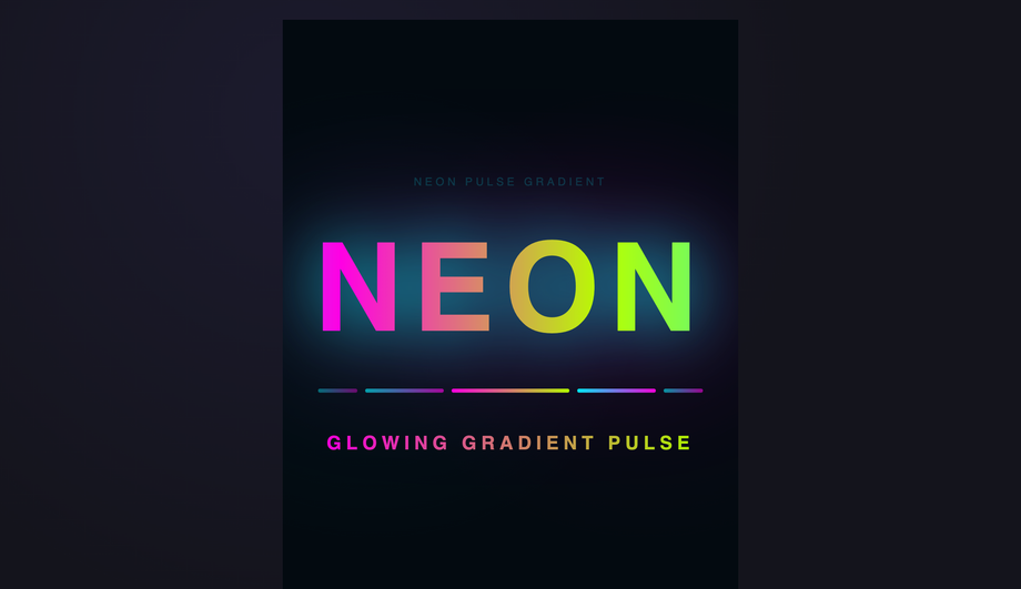
-webkit-text-fill-color: transparent (or color: transparent) makes the text glyph transparent — text-shadow then casts the shape of TRANSPARENT pixels, which means the shadow shows through and over the gradient, often producing visual chaos. The fix: use filter: drop-shadow() on the parent element instead of text-shadow on the text itself. drop-shadow respects the gradient-filled appearance because it operates on the rendered pixels, not the glyph alpha channel. The Neon Pulse Glow demo (#06) ships this pattern: filter: drop-shadow(0 0 8px rgba(255, 0, 255, 0.6)) wraps the gradient text in a magenta glow without breaking the fill. Performance note: drop-shadow is more expensive than text-shadow (it creates a paint layer); use it sparingly on hero text, not body text. Multiple shadows: stack multiple drop-shadow filters: filter: drop-shadow(0 0 8px ...) drop-shadow(0 0 16px ...) — each is its own GPU-rendered layer.How do I animate gradient text smoothly? My background-position animation looks jerky.
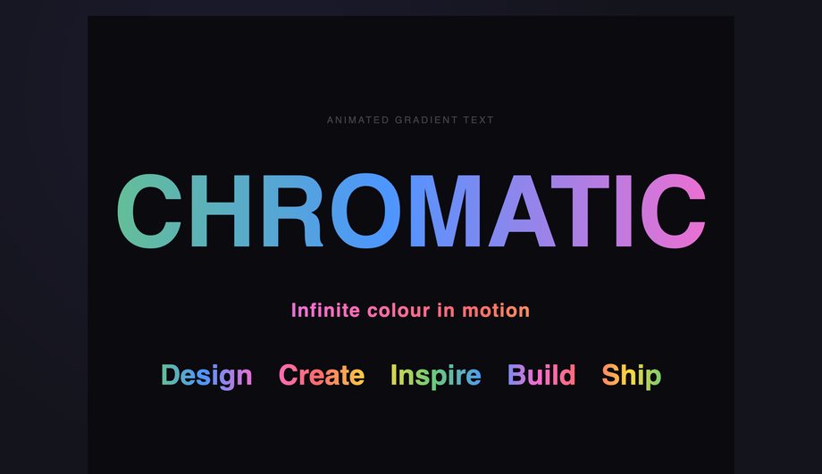
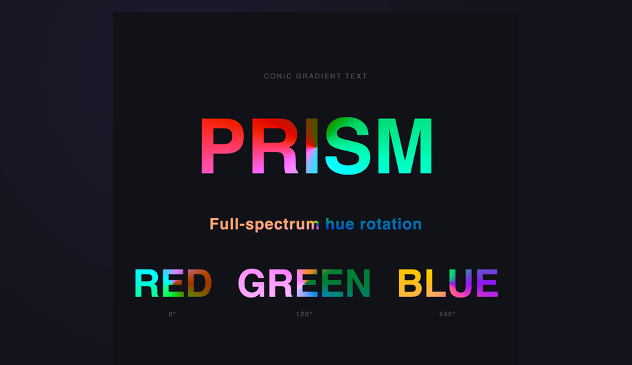
background-position from 0% 50% to 100% 50% is the legacy 2018 recipe — it animates the gradient stops shifting across the text, but because percentage values aren't interpolated with sub-pixel precision on all browsers, you get visible stuttering, especially on retina screens. The modern fix: use @property to declare a typed custom property and animate THAT instead. @property --angle { syntax: '<angle>'; initial-value: 0deg; inherits: false; } declares --angle as an actual <angle> value (not a string) so the browser can interpolate between angle values with sub-degree precision. Then write your gradient as linear-gradient(var(--angle), #f43f5e, #8b5cf6, #06b6d4) and animate --angle from 0deg to 360deg. Result: silky-smooth rotation at 120fps, GPU-accelerated, no main-thread cost. Demos #01 (Animated Flow) and #03 (Conic Hue Spin) both ship this pattern. @property is supported in Chrome 85+, Safari 16.4+, Firefox 128+ — for older browsers, fall back gracefully to the static gradient (the typed property degrades to undefined, so the gradient uses its initial value). The same trick works for any animatable gradient parameter: hue rotation, conic from-angle, radial position.Can I use OKLCH and Display-P3 wide-gamut colors in gradient text?
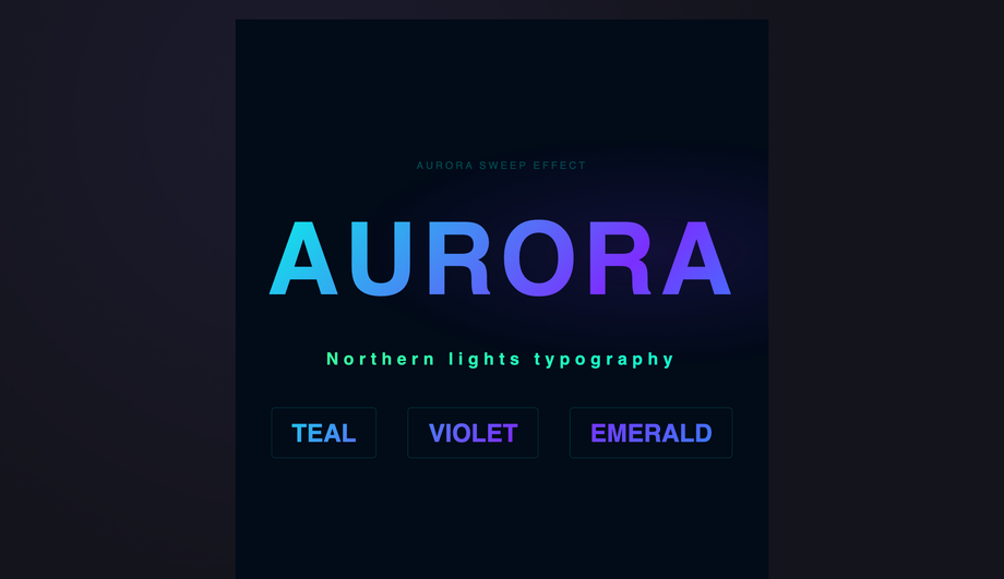
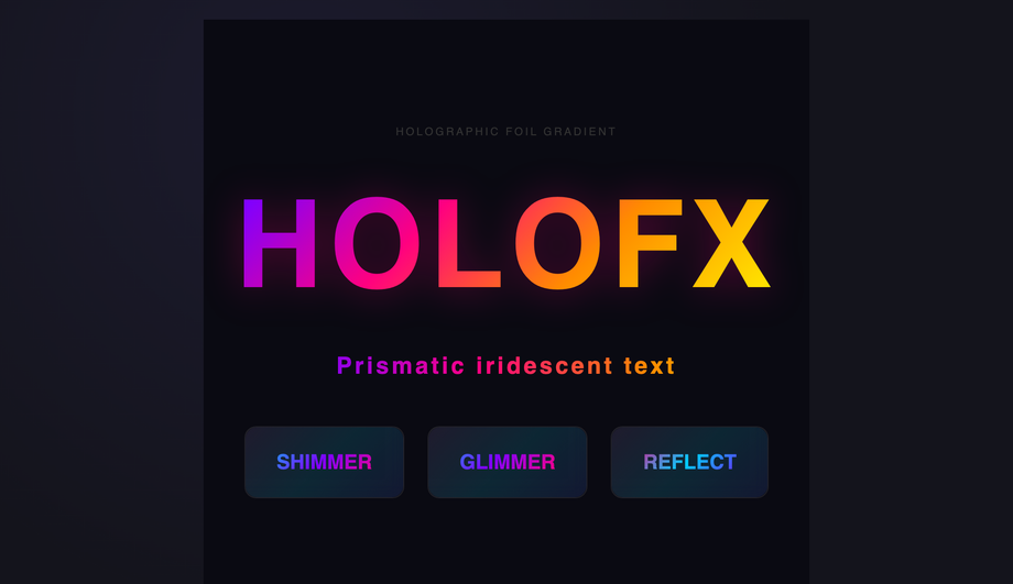
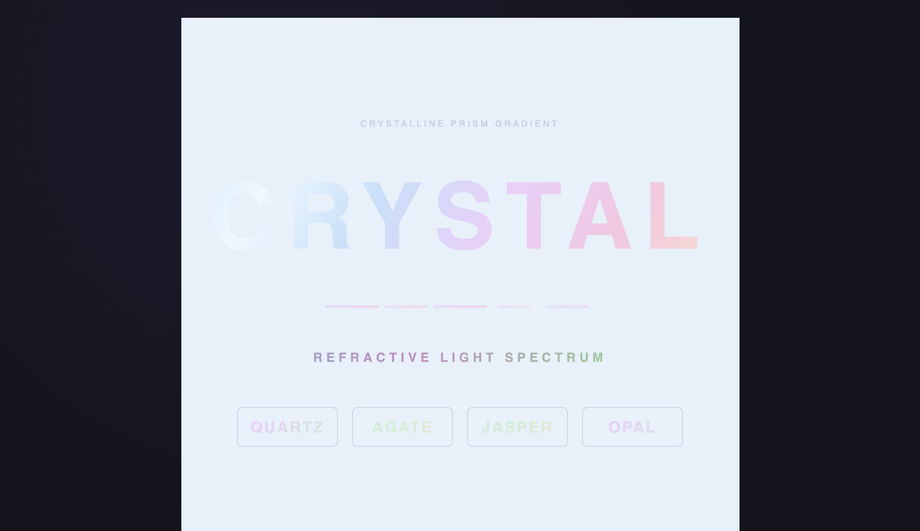
linear-gradient(45deg, oklch(0.7 0.18 30), oklch(0.7 0.18 250)) produces a clean magenta→cyan sweep where the equivalent hex gradient would muddy through grey-purple. Display-P3 (Chrome 111+, Safari 15+, Firefox 113+) extends color into the wider P3 gamut available on every Apple device since 2018, recent Pixel phones, and high-end Windows laptops. Reds and greens are ~25% more saturated than sRGB. Example: color(display-p3 1 0 0) is a more vivid red than #ff0000. Cross-browser strategy: layered declarations — color: #ff0000; color: oklch(0.6 0.25 30); color: color(display-p3 1 0 0); — browsers ignore declarations they don't understand and use the last supported one. Modern color-mix() function (Chrome 111+, Safari 16.2+, Firefox 113+) lets you blend two colors at runtime: color-mix(in oklch, #f43f5e 60%, #8b5cf6) — useful for theme-aware gradient stops. Demos #02 (Aurora) and #09 (Holographic) use OKLCH gradients; Demo #20 (Crystalline Prism) uses color-mix for the prism refractions.Are these gradient text designs free, and how should I attribute them?
prefers-reduced-motion: reduce (animations fall back to static gradients), and includes a high-contrast solid-color fallback for browsers that don't support background-clip: text. Verify your specific use case with axe DevTools, Lighthouse, WAVE, or WebAIM contrast checker before shipping to EU EAA / US Section 508 / Canada ACA / UK Equality Act audits — the demos are AA-compliant at large display sizes but body-text usage may need a different approach.Related collections

9 CSS 3D Designs
9 hand-coded CSS 3D scenes built with real transforms, perspective, and preserve-3d — iridescent flip cards, a midnight coverflow carousel, kinetic tilt pricing cards, a page-turn flipbook, a Bauhaus drag-cube navigator, a modular synth control panel, a luxury hover-flip product showcase, a 5×5 spinning cube matrix, and a 60-orb DNA double helix. No WebGL, no libraries.

8 CSS Brutalist Designs
8 hand-coded CSS brutalist designs spanning raw e-commerce product cards, a bureaucratic inspection form, a dark constructivist ops dashboard, a collision-typography portfolio grid, an indie SaaS hero + pricing split, a draggable Windows 95 desktop, a three-column long-read editorial, and a stark streetwear catalog. Heavy borders, oversized type, no rounded corners.

12 CSS Dark Mode UI Patterns
12 free CSS dark-mode UI patterns — OLED true-black, single-accent surfaces, layered slate, and emissive glow effects with copy-paste HTML and CSS.